This isn't really a competition; #1 crushes all of the rest of the banners. Long behind comes #3, then #2 and #4 (though it's a fact that overcast days are very common during the winter in much of the Nordic countries). -- ϒψιλον (talk) 10:12, 11 November 2018 (UTC)[reply]
These are great! Very difficult choice. Not so hard to pick #1 as the best, though, because the aurora and great landscape put it in a class by itself. After that, I'm going with 2, 3 and 4 in that order. I pick 2 before 3 because though 3 is beautiful, 2 shows activities a visitor could engage in. And whatever isn't otherwise used should be a banner for some article if at all possible. Ikan Kekek (talk) 23:15, 11 November 2018 (UTC)[reply]
1, 2, 3, 4. 1 is the clear winner, but I also like the ice activities in 2. I don't get 3 and 4 as being so distinctively Nordic, but that could be my lack of knowledge. AlasdairW (talk) 00:18, 12 November 2018 (UTC)[reply]
Comment. I think #3 definitely catches some of the feeling in the Nordic winter as I experience it, while most of people here will seldom experience something like #1 (and also #2 is unusual, as a traveller you have to have some luck to be there at the right time). #4 is just a ski slope as anywhere. I'd choose between 1–3 much depending on what we are trying to do. #1 is definitely an eye catcher and you can plan your visit such that you'll be there. --LPfi (talk) 09:43, 12 November 2018 (UTC)[reply]
Today is my birthday, and honestly one of the best gifts I got this year was the gift of not having to worry about making DotM banners for a while. :) I'm going to buck consensus here and say I'm not really a fan of #3. I understand what it tries to do, but the lighting conditions are exactly wrong in terms of highlighting the cascading waterfall at left - instead, it recedes into the shadows. And there's no good place for the textbox - either it covers up part of the aforementioned waterfall or else the stone building at the end of the rope bridge. For me, #2 is the most impressive, followed by #4 in second and #3 in third. -- AndreCarrotflower (talk) 23:41, 11 November 2018 (UTC)[reply]
I respect your opinion, of course, but for me those are some of the reasons why I like the picture; it's unique, a little like that one for Keenjhar Lake we had a little while ago. #3 also fits well with the description, but my worry is that #3 would stick out like a sore thumb on the main page. Maybe that's your reason for not liking it so much. --Comment by Selfie City (talk | contributions) 00:57, 12 November 2018 (UTC)[reply]
You're welcome, Andre. In a couple of weeks we'll need banners for Yaoundé, though.
Replying to SC; here is the original photo. I can't tell if it is photoshopped; the combination of high altitude and equatorial location may mean that sunlight and shadows are a bit different. -- ϒψιλον (talk) 17:53, 12 November 2018 (UTC)[reply]
I feel like the fact that we're featuring Denver in the winter, the text of the blurb which emphasizes its importance as the gateway to winter sports opportunities in the Front Range, and the fact that Denver itself lacks any single point of interest that's paramount in importance over the others all came together to sort of paint me into a corner and limit the range of subject matter that could be used for banner images. Under the circumstances I'm quite pleased with the results, but I couln't help noticing all the other source images that would have been perfect for a summer feature. Let's hear your thoughts on these three Denver banners. -- AndreCarrotflower (talk) 01:12, 31 October 2018 (UTC)[reply]
#3 is the easy winner here, with subject matter that perfectly harmonizes with the blurb text and a composition that perfectly accommodates the textbox. #1 is second; also a great banner, with the glare on the Subway sign at far left the only real problem. #2 is in third place mostly due to the strength of the competition. I think any of these banners would be worthy of the Main Page. -- AndreCarrotflower (talk) 01:12, 31 October 2018 (UTC)[reply]
My preference was actually #1 followed by #3, mainly because I find it more appealing. I still like #3 which gives a great vista of the city against the mountains, and would be fine with that. Andrewssi2 (talk) 01:21, 31 October 2018 (UTC)[reply]
A bunch of interesting banners. #1 is good for showing what Denver looks like, but the capitol building looks like the Tower of Pisa. #2 is a good picture when it comes to the caption fitting with the rest of the image, but there's not much context — it could be any U.S. state capitol building. The final one is good for showing the city in winter, but the buildings look kind of cold (in two ways) and the scene just doesn't look as appealing as it should. My preference would be #3, then #2, and last #1, but they've all got their positive and negative sides.
I'm going to go with #1, providing that we substitute text of another color (black?) to contrast more with the Christmas lights, and though I love the statehouse, #3 just very slightly over #2 for 2nd place. Ikan Kekek (talk) 02:49, 31 October 2018 (UTC)[reply]
1, 2. As already said, #1 could be rotated, but to me it's the best because it's lively, while #2 it's OK, although it doesn't depict much. #3 is boring and cold, lacking a warm feeling. --Zerabat (talk) 16:21, 31 October 2018 (UTC)[reply]
This is a banner for a December feature where the blurb is focused on skiing and snowboarding. It's not supposed to have a "warm feeling". It's supposed to be beautiful in a cold, wintry way. -- AndreCarrotflower (talk) 16:30, 31 October 2018 (UTC)[reply]
1, then 3, assuming that it is featured in December - my order would be swapped for other months. I like having a view of the capitol , but would prefer to see the whole building rather than just the dome, but the zoomed out images on commons aren't great, although I did like the one taken in 1955! AlasdairW (talk) 23:26, 31 October 2018 (UTC)[reply]
As predicted, it was incredibly difficult to find source images that accurately convey the message that transiting through the United States might not be a good idea, and as predicted, in the end I failed to come up with four options. Oh well, I'm optimistic about finding plenty of worthwhile source images for Denver, the next destination whose banners I'll be working on - and at least I got this out of the way before my own travel plans take me away from Wikivoyage for awhile.
#2 wins, and the race isn't close, even though the same source image is in use as the article's pagebanner. #1 places a distant second. #3, an image of the March 2017 "No Muslim Ban 2.0" rally in Washington, D.C., is an interesting way to approach the topic, and certainly speaks to the idea of why certain people would want to avoid transiting through the U.S. However, I also think it's too deep into political territory for us to wade, and also the background behind the textbox makes the blurb rather difficult to read. -- AndreCarrotflower (talk) 00:23, 4 October 2018 (UTC)[reply]
1, 2, and 3, in that order. I agree with AndreCarrotflower but I also think people might not realize the connection the article has to the Muslim travel ban, especially for those who stay well clear of anything political. --Comment by Selfie City (talk about my contributions) 00:30, 4 October 2018 (UTC)[reply]
I prefer #2, for the same reason I prefer the current banner — it shows the situation people making use of the article wish to avoid. #1 comes second even as it at a quick glance could be from anywhere in the world. Like other users, I'm also not so sure about the #3 banner. ϒpsilon (talk) 16:50, 4 October 2018 (UTC)[reply]
I avoid travelling via the US because I would have to pass through Immigration and Customs which is hassle and time consuming, so #2 sums up the situation well. #1 comes 2nd. AlasdairW (talk) 20:22, 4 October 2018 (UTC)[reply]
True to form, just a couple hours after I criticize myself for not uploading enough banner choices per nominee, I come back to this page and upload another trio lacking a fourth! In my own defense, the issue with Keenjhar Lake was one of lack of available source images, rather than an inability on my part to be inspired by a glut of images that all depict more or less the same thing. Avoiding travel through the United States is the next set of banners I'll be uploading, hopefully within a week or so (I'm off to Montreal on 11 October and won't be back till the 17th, and ATTTUS's chosen banner will need to be on dotm#Next change by the 20th, so there won't be much time to take care of it after my return), and that's a tough subject to depict in banner form. We'll see if I can come up with four options for that one.
But first things first: let's hear your votes on these three Keenjhar Lake banners!
I'm tempted to put the unorthodox and almost abstract #2 in first place, but the palm trees, bright sun, and aquatic vista are far more suggestive of the South Pacific than Pakistan. Therefore, the colorful #1 takes first place by a hair. #3, coming in last, is a pleasant and placid scene, but the murky colors are a drag. -- AndreCarrotflower (talk) 21:43, 3 October 2018 (UTC)[reply]
2, 1, 3 for me. The South Pacific has coconut palms; these are date or some other kind of palm that probably is not native to the South Pacific and certainly is not a typical view there. Ikan Kekek (talk) 07:23, 4 October 2018 (UTC)[reply]
All else being equal, I would really prefer to have four banners to choose from for each nominee. However, in the case of Colonia, it's the historic character of the old town that seems to be the main draw, and the "look" of the buildings there is consistent enough that a fourth banner would have been mostly redundant.
#3 would have been the runaway winner here if not for the fact that the photographer added a bunch of blurring around the margins, enhanced colors, and other artsy-fartsy crap to the original source image. I was able to crop most of it out, but you can still see some vestiges of it in, for example, the pink-walled building at the far left. Still, the presence of the classic car (which, in various states of repair, are apparently a very common sight in the Barrio Histórico) was enough to still give it a narrow victory over #1 (the Calle de los Suspiros, apparently the most-photographed street in the city) for first place. #2, the lighthouse with the ruins of the Convento San Francisco Javier beneath it, is an attractive enough image depicting one of Colonia's principal points of interest, and serves as a nice change of pace from the other two banners, but it doesn't do a very good job getting across the overall character of the place and therefore comes in last on my ranking. -- AndreCarrotflower (talk) 16:44, 3 October 2018 (UTC)[reply]
The old town indeed is the attraction in Colonia. A difficult choice here... I think I go for the old car (#3) too, but #1 is a very close behind. And #2 on the last place. --ϒpsilon (talk) 19:16, 3 October 2018 (UTC)[reply]
I'm not comfortable with the arbitrary color changes from the source image in #3, so if anyone would like to try to get a better banner from the source image, by all means, as it's clearly the best banner but we don't want it to paint a dishonest picture. Ikan Kekek (talk) 09:13, 4 October 2018 (UTC)[reply]
Not that happy about the last banner I just created out of one of my own pics, but at least we have four banners to vote among now. 3, 1, 4, 2. ϒpsilon (talk) 15:22, 5 October 2018 (UTC)[reply]
1, 3. I think 1st banner it's the most iconic depiction of the city, therefore the one I'd choose. But 3rd banner looks lovely, and 4th nice, even though it may not be as much iconic as the 1st or the 3rd. I don't think 2nd one would be good. --Zerabat (talk) 16:35, 24 October 2018 (UTC)[reply]
This was a tough one to find banners for. Not because of a lack of eligible images, but because if there are any distinguishing features of SYD that set it apart from other airports, the article makes no mention of them: no neon walkway like at O'Hare, no statues of bespectacled former presidents as in Manila, nothing like that. Regardless, let's hear your opinions on what I did come up with. -- AndreCarrotflower (talk) 23:24, 20 September 2018 (UTC)[reply]
And it's as tough to decide between these banners as it was to make them. Each of them has their strong and weak points: the first depicts the closest thing I could find to a quirky point of interest on airport grounds (this control tower with the spiral thing running around the sides popped up in a lot of the Flickr photos I filed through, and is apparently located on a grassy knoll dedicated in honor of a famous deceased planespotter - maybe this should go in "See"), but the composition is fairly humdrum. #2 shows the interior of Terminal 1 and is a good representation of the experience of a traveller passing through SYD, but it's also awfully anonymous: it could be any airport terminal. Meanwhile, #3 is a great scene of the Sydney skyline with the airport in the foreground that's marred by poor image quality. If pressed, I'd say my preference goes in descending order - #3 first, then #2 and finally #1 - but again, it's a tough decision. -- AndreCarrotflower (talk) 23:24, 20 September 2018 (UTC)[reply]
#3, while it's not a very sharp image, would be my favorite. Then #1, and then #2. However, I can imagine there are other, clearer images of the airport that do not make it look unique but would probably be my preference. I would like #2 more if the text on the top left was easier to read and didn't have that "Joe the Juice" logo getting in the way. The new banner is not perfect, but it's the best here. My new set of votes is 4, 1, 2, and 3, in that order. --Comment by Selfie City (talk about my contributions) 00:20, 1 October 2018 (UTC) New vote around 23:25, 5 October 2018 (UTC)[reply]
I would guess the fraction of users who do that is negligible – our discussions should focus on the appearance of the desktop view on desktop devices and the mobile view on mobile devices, not other very unusual setups. —Granger (talk·contribs) 00:47, 2 October 2018 (UTC)[reply]
I rarely complain about photo quality, but #3 is sort of grainy. Nevertheless, #3 is still the one I prefer. Then #2 with a bit more life than #1 which comes last. ϒpsilon (talk) 19:20, 3 October 2018 (UTC)[reply]
Sydney and Colonia happen to be some of the furthest places I've traveled to, and as we traditionally have four banners to vote from, I couldn't resist digging into my hard drive to find a photo to crop a fourth banner from. Sadly the weather was overcast in both places, and in this banner it means Sydney is sort of blurred out. :( Nevertheless, it also means the red tails of the Qantas (the Australian flag carrier and SYD is one of their home bases) and Virgin planes make a visible contrast against the otherwise grey background. Biased as I am, my new ranking is 4, 3, 2, 1. What say you? ϒpsilon (talk) 15:18, 5 October 2018 (UTC)[reply]
#4 takes second place for me, behind #3 and ahead of #s 2 and 1. Compositionally, #4 seems to be the same basic idea as #3, but the photo quality is much better (and the Qantas logo on the plane at right drives home the point all the more that this is Australia. But the weather conditions depicted in #4 are awfully uninviting. It would be in first place if the sky were blue, or even if the city skyline were more visible through the fog. -- AndreCarrotflower (talk) 00:33, 8 October 2018 (UTC)[reply]
With all this voting and vote-changing, it's kind of confusing, so I'm just checking that based on the 3, 2, 1, 0 point system I believe is used, #4 has 10 votes I believe (2 firsts and 2 seconds), #3 has 11 I believe, and from then on I think the numbers are much less. That would still put #3 on top. How much time is there left? --Comment by Selfie City (talk about my contributions) 00:45, 8 October 2018 (UTC)[reply]
It's tough to gauge, because some people only voted for their favorite one or two, and others who voted when there were only three banners to choose from didn't update their ranking when the fourth one was added. FWIW, on my ranking 4 is ahead of 3 by a point and a half. -- AndreCarrotflower (talk) 02:30, 8 October 2018 (UTC)[reply]
Don't want to be too wordy here because I'm in the middle of updating OtBP, but I do want to point out that this article still needs the copyediting and other work detailed at dotm. I will do it myself if I have to, but I'd appreciate some help. Here are four banners for a very photogenic destination; let's hear your votes! -- AndreCarrotflower (talk) 00:16, 11 September 2018 (UTC)[reply]
#1 is the obvious choice here, but the others all have their strong points and I have a hard time ranking them against each other. If pressed, I think I'd put #3 (the fountains in St. George's Square) ahead of #4 (an unidentified but handsome street) by just a smidge: sure, the architecture in the latter is interesting, but the former has an infectious sense of fun. Fort Saint Elmo in #2 is in last place mostly due to very strong competition; it's quite the attractive image and I'd have no problem seeing it on the Main Page. -- AndreCarrotflower (talk) 00:16, 11 September 2018 (UTC)[reply]
Nice banners. When I first saw the banners #2 was my favorite, but now I think #1 is actually the best. In the end of the day I think my order is 1, 3, 2, and 4. #2 would probably be my favorite if there was an area where the text could go — as it is, it conflicts the image, while in #1 it doesn't. --Comment by Selfie City (talk about my contributions) 01:07, 11 September 2018 (UTC)[reply]
It's very hard to pick between #1 and #3, but since #3 is a less common type of scene, I'll vote for #3 as my favorite, very closely followed by #1, then #2 and #4. Ikan Kekek (talk) 06:53, 11 September 2018 (UTC)[reply]
No question that my #1 choice goes to, erm, #1. The article describes Anapji Pond as a popular place for newlyweds to pose for photos, and one can certainly see why. #4, the burial mounds at Daerungwon, place a fairly distant second: they're the most important and historically significant tourist site in the city, but it's just not as picturesque an image as the first. The two images of Bulguksa Temple make up the bottom half of the hierarchy, with #3 placing third ahead of the nearly colorless #2. -- AndreCarrotflower (talk) 00:25, 7 September 2018 (UTC)[reply]
Wir fahr'n, fahr'n, fahr'n auf der Deutsche Bahn (or I guess "...auf der Deutschen Bahn" would be more grammatically correct) for September's FTT. Let's hear your votes on these banners! -- AndreCarrotflower (talk) 01:11, 5 August 2018 (UTC)[reply]
Tough, tough decision here. About the only thing I can say for sure is that #3 (the Berliner Hauptbahnhof) is in last place, mostly because the portion of the image behind the textbox is very "busy" and makes the blurb hard to read. #1 and #4 (the Hauptbahnhof in Bremen and the historic double-decker bridge over Bullay, respectively) are both lovely images, but it might not be obvious that the former is a train station and the latter is in Germany. Meanwhile, #2 (Bahnhof Hamburg-Altona) is somewhat inferior from an aesthetic standpoint, but is undoubtedly an image of a railroad station, and the architecture of the buildings in the background at right definitely has a Teutonic look. I suppose I'd put #2 in first place, #4 in second, followed by #1 and lastly #3 - but again, it's a close race, and in the final analysis I'd be perfectly okay with running any of these images on the Main Page in September. Also pinging Hobbitschuster, who should be able to weigh in on the matter with much more authority than myself. -- AndreCarrotflower (talk) 01:11, 5 August 2018 (UTC)[reply]
In my opinion, #2 and #4 are the best; it's hard to say which I like more, but I think #4 slightly better matches the "smooth sailing" caption. After this is closely #2, followed by #3, and last #1. I'm putting #3 third because it doesn't give the impression that the trains are fast, but is a little more descriptive than #1, which could be any building in Germany. Also, since it's rail travel, it seems only appropriate to include at least one train. Selfie City (talk) 01:34, 5 August 2018 (UTC)[reply]
I like the evening at the station (#2) most, and the daytime at the station (#3) comes second, I don't have any problem with busy photos. #4 is a pretty photo but the landscape sort of grabs the attention and you need to look for a while to notice the train. #1 isn't bad either, though not as good as the others and finishes last. ϒpsilon (talk) 08:43, 5 August 2018 (UTC)[reply]
This is the reason why I'm a bit of a fanatic about making sure people clearly indicate not only their first choice but also their second, third and fourth choices. In determining which is the preferred banner, I assign a banner three points for every first-place vote, two for every second-place, one for every third-place and zero for every last-place, then add the results up for each. (There have been instances where a banner has made it to the Main Page despite a different banner getting more first-place votes, and even one that got no first-place votes at all, but a lot of second-place votes.) Currently #4 has a slight lead over #2 by a score of 9 to 8.5 (Ikan Kekek did not clearly indicate whether his third-place vote went to #1 or #2, so I gave them both 0.5 points). -- AndreCarrotflower (talk) 00:10, 6 August 2018 (UTC)[reply]
The images all have upsides and downsids. #4 may be aesthetically pleasing, but it does not exactly scream "train travel". #1 shows a train station and also clearly says "Hauptbahnhof" which imho is an essential word to know for train travel in Germany. The two which clearly show trains have different issues. The Hamburg one is taken not during full daylight, but it shows relatively common rolling stock that while somewhat outdated (ICE1 or ICE2 dates to the mid/early 1990s) w:DB Class 101 dates to the mid/late 1990s can still be seen commonly on the tracks throughout the country. The Berlin image meanwhile shows a S-Bahn Berlin train, which is sui generis and a w:DBAG Class 182 which was never all that common in Germany and seems much more common in Austria. On the other hand, it shows Berlin Hauptbahnhof, perhaps the most striking new construction in intercity rail stations in the 21st century, certainly one of the most striking in Germany. So given all that, I'd go with #2 first, over #3, #1 on the third place and #4 last. Oh and yes the thing about which trains are visible might be a minor quibble, but if they are so prominently visible as to their type number being readable, even non train nerds might be inclined to look up which trains they are... Hobbitschuster (talk) 00:49, 6 August 2018 (UTC)[reply]
It's harder than you'd think to find suitable CC-compatible photos of Bronzeville. There's a whole Commons category dedicated to it, but few of the images populating it really give a sense of what the neighborhood is all about - strangely, the majority of the images have to do with Bronzeville's stations on the Metra and the "L", with the balance largely given over to random buildings of no real distinction. Same story on Flickr. Here are the two I did manage to make good use of - let's hear your votes. -- AndreCarrotflower (talk) 15:29, 4 August 2018 (UTC)[reply]
#1 is a dignified image with an uplifting message - the Victory Monument honors the WWI-era service of the all-black Eighth Regiment of the Illinois National Guard - but it just doesn't hold a candle to #2 in terms of capturing the flavor of the neighborhood. It's just a shame that the textbox obscures so much of the mural; I suppose I could shorten the blurb, but none of the information in it strikes me as expendable. -- AndreCarrotflower (talk) 15:29, 4 August 2018 (UTC)[reply]
I think #2 is the clear winner. To a casual reader #1 could be a statue of any soldier, whereas #2 makes me think of the South Side of Chicago and definitely conveys something about Bronzeville. —Granger (talk·contribs) 15:42, 4 August 2018 (UTC)[reply]
I don't like the proposed banner proposed by AlasdairW, which could be anywhere. It has the same problem as #1, really. If we did the proposed banner, it would have to be cropped, of course. But still it doesn't seem to fit the character of Bronzeville like #2 does. Selfie City (talk) 01:41, 5 August 2018 (UTC)[reply]
#2, the bird's-eye view from San Martino with Vesuvius in the background, is the runaway winner here, followed distantly by #1 (the interior of the Cattedrale di Santa Maria Assunta), #3 (the Capodimonte Palace), and lastly #4 (Castel dell'Ovo with vesuvius in the background at far left). -- AndreCarrotflower (talk) 01:23, 3 August 2018 (UTC)[reply]
It's hard to beat #2: aesthetically pleasing, includes both the city and Vesuvius, and has a perfect spot for the text. I agree with your order: 2, 1, 3, 4. —Granger (talk·contribs) 01:53, 3 August 2018 (UTC)[reply]
To me, a no-brainer: #1 is first. While #2 is technically the best, #1 is a beautiful image that stands out as soon as you see it. Yes, the caption box looks odd with #1, but still that image seems just unbelievable. After that, #3, #4, and finally #2, which could be almost any city unless you can immediately recognize the mountain on the right as Mount Vesuvius (which I'm sure would be tough for many tourists if the caption didn't closely match the image). But all of these images would work. Selfie City (talk) 03:01, 3 August 2018 (UTC)[reply]
#2 #4 #3 #1. The picture Number 2 is clearest in it being Naples and number 4 also includes Vesuvius. Number 3 is a fairly nondescript building to the uninitiated and number 1 could have been taken inside myriad catholic churches around the world... Hobbitschuster (talk) 14:34, 3 August 2018 (UTC)[reply]
#4, #2, #1. They are all good images. I prefer #4 due to the castle in the foreground, whereas the only buildings that are noticeable in #2 are not distinctive. AlasdairW (talk) 22:21, 3 August 2018 (UTC)[reply]
I couldn't find any really good images that showed the trail itself, but there was plenty to choose from when it came to scenery visible from the trail. The blurb makes it clear that hiking is involved, so I don't think that ought to be too much of a factor in judging the images. That being the case, I like #2 the best; #1 is a close second because it suffers from being a touch too dark on the right side (having the textbox there helps some, but doesn't completely negate the effect). #3 is third, and #4 is in last place - interesting composition, but a bit more abstract than the others. -- AndreCarrotflower (talk) 22:02, 20 July 2018 (UTC)[reply]
Definitely some great pictures here. For the quality of the pictures themselves, I would put #2 and #3 above #1 and #4, but the instant connection between the Incas and the mountain in #1 put that one in first place for me. After that, it's very close between #2 and #3, but I like #3 a little more than #2. Last place for me is #4, because the dimensions seem awkward and, like AndreCarrotflower stated, it's more abstract. Selfie City (talk) 22:12, 20 July 2018 (UTC)[reply]
Actually, now I have read the blurb, I think that #2 is the best. It almost exactly matches what the blurb describes, and 3 is also quite similar to the blurb, so my new order is 2, 3, 1, and 4. Selfie City (talk) 22:14, 20 July 2018 (UTC)[reply]
This is a tough choice. I think all of the banners are great. There's a trade-off between showing the mountain scenery (in 1, 2, and 3), the ruins (in 1, 2, and 4), and the trail itself (1 and 2, though 2 looks like a dirt section rather than the more characteristic stone). #1 would be ideal except that it looks slightly blurry on the left side. I'll say 2, 1, 4, 3. —Granger (talk·contribs) 01:56, 21 July 2018 (UTC)[reply]
By the way, has anyone considered putting the blurb on the right side in #2? That would of course cover some of the mountains, but it would make the ruins more visible, which is the really unique and important reason to go to the Inca Trail and where it leads, Machu Picchu. Selfie City (talk) 15:53, 22 July 2018 (UTC)[reply]
A cost-benefit analysis favors having the textbox on the left, which leaves the most interesting part of the ruins (the staircase) visible while only covering the upper half of the dull-looking stone retaining wall. On the other hand, placing it on the right would obscure precisely the most interesting part of the mountain backdrop. As Granger said in Inca Trail's dotm nomination, the ruins aren't the trail's complete raison d'être; they're just one of several elements of the experience. -- AndreCarrotflower (talk) 17:53, 31 July 2018 (UTC)[reply]
Just one banner this time - I had fully expected to have a tough time finding suitable images of this place, and I was not disappointed in that regard. On Commons and Flickr, there are pretty much no images of Goroka that are usable as banners that don't depict the Goroka Show, which is well enough given that it's quite the picturesque event, not to mention the reason that we've chosen August as the month to run the feature. But on the other hand, that doesn't allow for much thematic diversity. All the other banners I could have made would have amounted to pretty much the same thing as this one, content-wise, so here's the best of what was available. If anyone else can find a suitable alternative, by all means let's see it. -- AndreCarrotflower (talk) 18:34, 10 July 2018 (UTC)[reply]
Important note, because I know we have certain users who freak out when they see banners with images of people in them, and I don't want to have to keep explaining this every time we have one: please remember that Commons' image policy only prohibits photographs of identifiable people in certain limited circumstances, not across-the-board. In this banner, as in the Underground Railroad FTT banner discussion where the issue was also brought up, the people depicted are anonymous individuals in a public place participating in a performance that's explicitly meant to be seen by the public, so there is no legal expectation of privacy in that scenario, and no requirement for their consent to be photographed. Additionally, in the case of the Goroka image, the face paint the performers are wearing serves to further obscure their identities. By comparison, see the winning banner for Kimono buying guide's June 2014 stint as FTT, which ticks off significantly fewer of those boxes - the people depicted are anonymous and in a public place, but are not performers and their faces are not obscured - yet it still was uncontroversially deemed fit for both Commons and our Main Page. -- AndreCarrotflower (talk) 18:34, 10 July 2018 (UTC)[reply]
Actually, that (click the certain users link to understand what I mean by this sentence) didn't occur to me — my first reaction was the surprise of seeing all these people in the shocking warrior face-paint. But after looking at it a little and realizing there were no other options, I support this picture going on the Main Page. Just goes to show that I don't "freak out" when there's a picture with people in it, I'm just cautious. By the way, have you seen the below image as a potential banner? It's from the Goroka article, and doesn't look that great, but if it was cropped a little could work as a non-Goroka show alternative. The description could on either side; the reason it seems to work well on the right is that is directs attention to some of the nicer-looking buildings and trees that in the bottom-right (not bottom-center, which is where the eye goes with the description on the left). Selfie City (talk) 22:06, 20 July 2018 (UTC)[reply]
DotM banners need to have an exact 3:1 image aspect ratio, and the source images need to be at least 1700 pixels across. Neither of those things is the case with this banner. -- AndreCarrotflower (talk) 17:42, 31 July 2018 (UTC)[reply]
In addition to the usual concerns of aesthetics and relevance of image content to article content, a major factor that plays into my vote hierarchy is the question of how well the banner demonstrates that all these rugged outdoor adventures can be had only a stone's throw away from a major city. In light of that, #2 (Deep Cove) gets my vote by a hair over #3 (the Skyride up the side of Grouse Mountain). Though it doesn't look urban per se (then again, North Vancouver is a lot smaller than its neighbor to the south), the docks, boats, and shoreline buildings provide the sense that civilization is close at hand. #3 looks more urban, but the orientation of the image weirds me out: the foreground is relegated to a small patch of trees on the lower left corner, the skyline hovers near the top margin almost as an afterthought, and the snow on the ground is inappropriate for a summertime feature. #1, the Capilano Suspension Bridge, is in third - it's a prominent North Vancouver attraction and an attractive image, but compared to the others, the aesthetic is almost too minimalist. Last-place #4 (the illuminated fountain at Lonsdale Market) is still nice, just not as much so as the others, and the prominent presence of the Vancouver skyline in a banner for North Vancouver strikes me as less than ideal. -- AndreCarrotflower (talk) 18:21, 30 June 2018 (UTC)[reply]
Awesome banners! I think I like them all, but my favorite is just about #2, which is a beautiful image that works well with the text in the top-right corner. Closely behind is #1, because although I like the placement of #4, #1 is more inviting and at least seems to be more relevant. In #1, you almost feel like you're a tree or part of the forest. Next would be #4, which I think looks okay but is a little on the dark side and doesn't really address the British Columbia mountainous, forest-like feel of the region (#4 could be just about any city skyline). Last is #3 because although it has a decent concept, the image isn't so clear and all those houses in the background and the big metal object in the foreground don't combine well for good presentation. And the text and image don't work too well in a layout sense in #3. So my choices are #2, #1, #4, and #3, in that order. Selfie City (talk) 22:57, 30 June 2018 (UTC)[reply]
It wasn't laziness on my part this time - it was waiting to get a day off work so I could take some photos around town to use as source images for banners! (There are certain advantages to living on the U.S./Canadian border). I shot two of these images myself; let's hear your thoughts on all three of them. -- AndreCarrotflower (talk) 00:14, 21 June 2018 (UTC)[reply]
My preferences go in descending order from top to bottom. The minute my mind turned to the question of Underground Railroad banners, the first thing that came to me was the Freedom Crossing Monument in Lewiston. It's a pity about the lighting conditions (I did what I could with PhotoShop), but I still pick this banner as my top choice. Second-place #2 (the Gateway to Freedom International Memorial in Detroit) has better image quality, but also less context: if you don't know the stories behind this chapter of American history, you might wonder who the three figures are or what they represent. But in #1 you clearly see an escaped slave and her young child being spirited onto a boat, and yes, that's Canada in the background on the other side of the river. As for #3, the Michigan Street Baptist Church on Buffalo's East Side, it's certainly got a prominent history as a "station" on the railroad, and a visit there is a good representative example of the type of experience that awaits modern-day tourists tracing the route. But as an image, it's the least compelling of the three. -- AndreCarrotflower (talk) 00:14, 21 June 2018 (UTC)[reply]
I have to say that none of these immediately seem to be relevant when they're viewed. However, I think I largely agree with you. The first two are better than the last one; if I saw the last one, I wouldn't realize it was a "station" immediately. Of the first two, I agree that #1 is best—the appearance of #1 is better than #2 and #1 better portrays the "underground" aspect of the route. So I vote the same way: #1, #2, and #3 last. Selfie City (talk) 00:19, 21 June 2018 (UTC)[reply]
How come no-one mentioned #4? My votes would be #2, #1, #4, #3. #2 is quite clear enough in context, given that it's presented as a banner for this topic. #1 is obviously topical, but the figures in it are smaller, so I find that it has less impact. I'd like to know what body of water is behind the African-Americans in period costumes in #4, but even not knowing, the allusion is certainly clear enough - again, in context. I'd like #3 better if the church and house next to it weren't leaning, but that still would be unlikely to change my order of preferences. -- Ikan Kekek (talk) 03:23, 21 June 2018 (UTC)[reply]
#4 shows pictures of real people head-on. I'm not crazy about that picture and I still think #1 and #2 are superior. I'm finding it hard to choose between the first and the second, but the way #1 goes with the text in the top-right is better than #2, so I just about think #1 is better. Selfie City (talk) 14:43, 21 June 2018 (UTC)[reply]
(edit conflict) #4 was added later without comment by another user; I didn't even notice it until just now. I disagree that #2 is "clear in context" as the blurb by necessity only gives the bare minimum of information needed to describe the topic. I learned about the Underground Railroad in history classes all through elementary, middle, and high school and frankly, if someone else had made that same banner with that same blurb but hadn't told me it was an image of the Gateway to Freedom International Memorial in Detroit and that the sculptures were facing across the river towards Canada, even I wouldn't be completely clear on the significance of the imagery. And I think the same lack of context is a problem that plagues #4 - yes, there is a group of African-Americans in period costume, but there's no real way to link the content of the image to the Underground Railroad in particular (even for those familiar with the history of the latter) because it's not obvious in what context the photo was taken. In my mind, it could just as easily be a scene from "Gone with the Wind" or something. I think the imagery in #1 is far more explicit - rather than simply an unidentified body of water in the background, which is another thing that could signify just about anything, here we have a sculpture of a woman and her child being spirited away in a canoe, on the shore of a real-life river that marks the real-life boundary into Canada. Add to that the issue of image quality, on which it is noticeably inferior to the other three banners, and I'd rank #4 last among the four. -- AndreCarrotflower (talk) 12:48, 21 June 2018 (UTC)[reply]
And AndreCarrotflower, a picture representing the Underground Railroad shouldn't show a group of people casually standing around, having their photo taken, like #4 does. The people in this OtBP were desperately trying to get to safety, and were doing whatever they could to escape, which is better represented in #1 and #2 (especially #1) than either #3 or #4. #3's biggest problem is that most people would just think it was a church building and not realize it had any connection to the Railroad. Selfie City (talk) 16:02, 21 June 2018 (UTC)[reply]
Excellent point. And of course in those days, you had to pose a long time for a photograph. They definitely wouldn't have done that at least until they got to Canada. Ikan Kekek (talk) 04:51, 22 June 2018 (UTC)[reply]
There are pictures from the 1800's which depict The Underground Railroad and A Ride for Liberty with sufficient resolution and color/colour, but the main obstacle to portraiture is that these people intend to be inconspicuous. This is an underground railroad, where stations had to look like any other old house, church or barn of the era so as not to draw unwanted attention. Anything which looked like the stereotype of a runaway slave could put the freedom seeker at risk, after all. That leaves us with plenty of images of varying quality from the underground road, but relatively few where one could look at a single picture and immediately see that this person is on the freedom train to the promised land.
It would be a break with tradition to nominate a painting or a vintage book illustration from the 1800's as the banner image, instead of our usual approach of throwing four photographs on the wall and seeing what sticks. After all, there's no reason why a re-enactment couldn't produce a suitable photo... it's just that the few free images we have seem either to be of poor quality, contain extraneous elements (such as modern signage or electric lamps in the background) or don't make clear the concept that these people are fleeing to Canada (or New Scotland) and freedom. (And, no, this is not an OtBP. It's an itinerary, so an FTT where banner #1 is Lewiston NY (Niagara River), #2 is Detroit MI, #3 is Buffalo NY, #4 is St Louis MO (Mississippi River).)
I'm tempted to say (of the four photos above) #1, #2, #4, #3 in that order. There's no easy way for someone unfamiliar with the Underground Railroad to look at the church and realise "oh, they must be harboring/harbouring fugitive slaves!" This, historically, is by design. The road was "underground" for a reason. K7L (talk) 15:37, 22 June 2018 (UTC)[reply]
┌────────────────────────────────────────────────────────────────────────────────────────────────────┘But the question is, "what is immediately associated with the Railroad?" Number #1, yes, #2, yes, #4, no. And which one would get people interested in the topic? Again, #1 is eye-catching and interesting, and to some extent so is #2, but #3 and #4 are boring in appearance. Selfie City (talk) 16:36, 22 June 2018 (UTC)[reply]
Aside from simply being very busy (planning for my upcoming trip to Spain has taking up most of my free time the past couple weeks), one of the reasons I've let the banner-making process get away from me is that I always rue the thought of having to find source images for relatively obscure places that probably don't have much in the way of coverage on Commons or Flickr. But maybe I shouldn't worry so much about that, because first Piton de la Fournaise and now Höfn have pleasantly surprised me with the variety and quality of available material. These banners in particular were a joy to work on because, when you read the article, you see that Höfn is a place without many notable points of interest per se but with a staggering wealth of picturesque natural beauty in its environs, which means the bannermaker can pretty much jettison any consideration of what's most relevant to the tourist experience and just worry about which image is the most eye-catching. That's precisely what I did here, to IMO really nice results. Let's see if you agree, and which of these you prefer. -- AndreCarrotflower (talk) 07:10, 15 June 2018 (UTC)[reply]
I'm going to break convention here and list my preferences from worst to first. Last-place finisher #2 does a good job depicting Höfn itself, and the fishing harbor is certainly the town's economic raison d'être. But that's not what tourists come to this part of the world for: the real appeal of this place is what's outside of town, rather than in town. As such, #3 (the Jökulsárlón glacial lagoon) is enough of an improvement to earn a second-place finish: that's some undeniably stunning Arctic scenery and depicts one of the region's main points of interest as per the article, but the fact that the town itself doesn't play a part in the image itself is something I see as mildly problematic. I see #1 as the happy medium between the other two, showing Höfn's setting amidst all that resplendent natural majesty, not to mention the fact that it's the best image from an aesthetic point of view. So it gets my vote as top choice. -- AndreCarrotflower (talk) 07:10, 15 June 2018 (UTC)[reply]
I think that all of these are awesome and I think all of them would be fine for the front page (good job AndreCarrotflower!), but the placement of #1 and the fact that #1 includes both elements of #2 (the village) and #3 (the Arctic) makes it the best by a hair. Selfie City (talk) 22:29, 16 June 2018 (UTC)[reply]
I would say the best one, by a miniscule amount, is #1. #2 is good as well but is very busy and is not easily associated with Wales; the first one, though, is quite obviously Wales. #3 is far behind the other two, being just a rather blurry picture of a plastic dragon. Selfie City (talk) 13:41, 2 June 2018 (UTC)[reply]
I guess it would, but the picture would need to include more of the castle behind it, I think. Also, what about this picture (on the right) for a banner? It would need to edited, of course, but this could be an interesting one. Selfie City (talk) 15:21, 2 June 2018 (UTC)[reply]
Selfie City: I actually rather like #3; the dragon is certainly a well-known Welsh trope, and "offbeat" banners are not only perfectly acceptable but sometimes a welcome change of pace (see the banner from Kunming's October 2013 stint as DotM for another example). If not for the blurriness, the dragon would likely be my top choice; instead it's a close second behind the mountain landscape at #1. I don't care for #2 or the proposed #4. -- AndreCarrotflower (talk) 01:22, 3 June 2018 (UTC)[reply]
An interesting collection. I rate them #2, #3, #1. I like #1, but to me it looks too like views that I am familiar with in the English Lake District, but the castle seems more distinctly Welsh in style, although there are probably some similar ones in England. It is a pity that there is no wind to show the castle flags. AlasdairW (talk) 21:32, 3 June 2018 (UTC)[reply]
Folks, I'm really sorry about letting the banners get away from me. Things got unexpectedly extremely busy for me in the second half of May. In addition to these, I should have banners for July's DotM within a few days.
In a lot of cases with travel topic articles, it's really tough to figure out how to depict the subject matter in the form of a banner, and this is a classic example. Not only that, but circumstances made many of the ideas I did have impossible. What image would best represent fear of flying? Visibly nervous people on board an aircraft? Neither Commons nor Flickr had any pictures of that. Situations on board a plane that might make passengers nervous, i.e. flying through a thunderstorm? There was one grainy image on Commons of a lightning storm as seen through an airplane window that was way less than 1700 pixels wide, but other than that, no dice. So we're stuck with two new air travel-related images that are rather generic looking, plus one of the rejected banners from when we ran Frequent flyer programmes as FTT in 2015. Let's hear your votes! -- AndreCarrotflower (talk) 14:24, 1 June 2018 (UTC)[reply]
One thing that I was able to find many images of on Commons and Flickr were photos taken from airplane windows, and I imagine that looking out the window and seeing how high up they are is something that would make a nervous flyer jumpy. The only problem with #1 was the prominently visible Southwest Airlines logo on the tip of the wing, which was mitigated by some deft textbox placement, so I think I'm prepared to vote for it as my top choice among the three banners. In a rather distant second is #3, the recycled banner from 2015, while the mundane and not nerve-wracking at all #2 places last. -- AndreCarrotflower (talk) 14:24, 1 June 2018 (UTC)[reply]
I like #2 the best. The intended readers of this article are already nervous about flying, so I think it's better to use a calm image of flying that won't add to their nervousness. —Granger (talk·contribs) 03:14, 2 June 2018 (UTC)[reply]
I think we should do #3. The picture looks well-balanced. Next would be #1, and finally #2, because we don't want pictures of people who perhaps don't want to suddenly find themselves on the front page of Wikivoyage. Selfie City (talk) 13:41, 2 June 2018 (UTC)[reply]
We tend to shy away from (but don't outright forbid) photos of identifiable people being placed in prominent positions on the site, but that concern is mitigated by the fact that the people in #2 are facing away from the camera and thus not recognizable. -- AndreCarrotflower (talk) 01:28, 3 June 2018 (UTC)[reply]
Banner time (again), with a new quartet for your approval just barely in time for the deadline (again). Given that this destination is located in a region of the world with generally abysmal coverage on Wikivoyage, I was afraid this was going to be another case where suitable source images would be hard to come by, and we'd be left with less than four banners to choose from. Luckily, that wasn't the case: there's a healthy number of copyleft-compatible images of Piton de la Fournaise on Commons and Flickr, and these banners are a really good summary of the various categories of subject matter typically covered by those images.
I'm in the process of wrapping up a fairly major offwiki project and am set to start ramping up my Wikivoyage activity level again soon, so hopefully we can eventually get back to having a decent number of banner sets on deck. Until then, let's hear your votes on these four candidates for out June 2018 OtBP. -- AndreCarrotflower (talk) 02:56, 10 May 2018 (UTC)[reply]
I took a pretty big risk with Banner #4 - given that the source image is only 1276 pixels wide, or only ~75% the minimum banner width as prescribed in the guidelines at the top of this page, image quality stood to take a pretty major hit upon blowing the picture up to the proper size. But not only does this aerial view of the Dolomieu crater look fine to me, it's actually my top choice out of all of these banners mostly because it makes clear what exactly Piton de la Fournaise is: a volcano. So does second-place finisher #2, which is a more dramatic image to boot; the problem with that one is the image quality really is terrible. #1 places a distant third. -- AndreCarrotflower (talk) 02:56, 10 May 2018 (UTC)[reply]
As the others have said, #4 is the best because it looks straight at the volcano - that really "hot" attraction! Next is #2, because it illustrates what a "hot" destination it is, followed by #1, and last, #3. However, I think #1 is more eye-catching than #2, so it might be good on the front page if #4 is out of the question. Otherwise though, I think #4 is definitely the best. Selfie City (talk) 04:12, 25 May 2018 (UTC)[reply]
An improvement: these banners are up and ready to be voted on more than 24 hours before one of them is due up at dotm#Next change! As usual, let's hear your thoughts on which of these is best - especially those of ButteBag, our resident Bostonian and principal author of this article and its districts. -- AndreCarrotflower (talk) 22:47, 25 April 2018 (UTC)[reply]
The first time I ever visited Boston was in the summer of 1993 at the age of twelve, and the thing that stood out to me most - the most vivid memory I have of that trip - was the jarring anachronism of centuries-old historic buildings standing side by side with modern glass-and-steel skyscrapers. It really brought into sharp focus a lot of what the blurb talks about: these are the exact same streets where Samuel Adams, Paul Revere, and all the other greats once trod. I suspect that many other first-time visitors to Boston are left with the same impression. So #4, the image of the Old State House, is naturally my first-place choice. Second place is #3, the equestrian statue of George Washington in the middle of the Boston Public Garden - another one that marries history and modernity, albeit a bit more subtly than the aforementioned. In third place by a hair is #1, the view of Acorn Street in Beacon Hill; as for #2, the presence of the harbor is a welcome one in a banner for a DotM city in which maritime trade played such a huge role, but there's nothing terribly eye-catching about the skyline, which could be any North American city. -- AndreCarrotflower (talk) 22:47, 25 April 2018 (UTC)[reply]
Thank you again for putting these together Andre, they all look great! I would say go with your favorite, and here's my thoughts on each.
1. Acorn Street is an absolute classic. I think it's often called one of the most photogenic streets in the country. (although maybe it's just people from here saying that.) This is also a high quality image and well composed. 2. Personally, I found this image to be the most striking of the three. It's HDR without being overkill. The masted ships in the foreground connote "old", while the cityscape reminds people that Boston is in fact a modern city. 3. This is another classic shot of Boston, but the top left and right corners seem a bit empty. The atmospheric perspective on the buildings in the distance isn't really doing it for me either. 4. The Old State House is personally my favorite building, and the centuries of architectural styles together like that is really eye catching. I did use this photo (or a very similar one) on the Boston/Downtown page if that matters at all.
I would say 2, 3, 1, 4, with 2 definitely the best (the contrast between the historic vessels and the modern city), 3 and 1 both quite good in their different ways, and 4 not so good - it looks like a confused collection of buildings from a cropped picture. Selfie City (talk) 04:08, 25 May 2018 (UTC)[reply]
Fairly tough choice here; they're all pretty good. I'm going to have to go with #4 here in first place - the interior of the Imperial Harem at the Topkapi Palace in Istanbul is definitely a place where the empire's opulent wealth and the signature Ottoman architectural and decorative style are on full display. #3 is a close second: the Selimiye Mosque in Edirne is described in the article as arguably "the zenith of Ottoman architecture", the textbox fits nicely into the negative space in the upper right corner, and the bright blue sky adds a nice cheery feel. Third-place #2 is interesting as it's the only one of the banner photos not to have been taken in Turkey (it's the Ottoman-built Stari Most bridge in Mostar, Bosnia and Herzegovina) and shows the historic imperial architecture in a setting where it's integrated with a modern (or at least non-Ottoman) cityscape, which I imagine is a more realistic representation of what the traveller would see. As for last-place #1, content-wise it actually has a leg up on its competitors, with not one but two major points of interest depicted. However, visually speaking, it's the least interesting of the bunch - the smooth-faced domes of the Blue Mosque looming in the foreground in front of the Hagia Sophia give the image more of a futuristic look than a historic one, IMO. Still, again, all of these banners have something going for them, and even if consensus holds #3 to be the best of the bunch, I'd be more than happy to see it on the Main Page. -- AndreCarrotflower (talk) 05:15, 20 April 2018 (UTC)[reply]
Maybe it's because these banners are a rush job (coming only a couple of hours before one of them is due up at dotm#Next change; thank God I'm finally finished with that monstrously long Gaspé article and can take a break for a while), or maybe it's just because I'm extraordinarily tired today for some reason. But I had a hard time with my usual ritual of skimming through the article in question to get a feel for the place before brainstorming source images for banners. Instead, I took some cues from the pictures included in the article as well as simply typing "Erlangen" into the Flickr search box and seeing what I could find. In the latter case, most of the images that came up were of the old town, so that's the type of subject matter that dominates this lovely if somewhat samey selection of images. Let's hear your votes! -- AndreCarrotflower (talk) 21:47, 10 April 2018 (UTC)[reply]
#3 (the Orangerie in Schlossgarten Park) for me, please, followed by #4 (the Pauli fountain on Schlossplatz). Though the Huguenot church seems to be one of the most important points of interest in the city, the awkwardness of the angle in #1, looking up at the tower, drops it to third place. As for last-place #2, I felt it was important for the sake of variety to include the more modern-styled Siemens headquarters, but its presence directly contradicts the text in the blurb, and also the prominence of the Siemens sign strikes me as a bit unseemly. -- AndreCarrotflower (talk) 21:47, 10 April 2018 (UTC)[reply]
Siemens does indeed dominate the city (the image is of the Himbeerpalast a (former?) Siemens headquarters building. Aside from that it is also a cyclist town so an image showing bikes in some way would not be off, but perhaps there are no nice-looking images of that... Image four ironically shows the (old) Landratsamt of ERH (which is a county that does not contain Erlangen but has its headquarters there for ease of reachability) just to the left (the green building). I do consider Hugenottenplatz the heart of downtown Erlangen, but it's hart to get striking visuals there, especially when it's supposed to be a broad rather than high image... (ironically the golden arches are perhaps the most fitting building there...) The Wiesengrund is of course another beloved feature of Erlangen but it does not look at all impressive on photos... Another representative building I just thought of is Palais Sutterheim which currently houses an art museum and the municipal library but was city hall before this garish monstrosity replaced it due to the city (and its government) outgrowing the old Palais. Maybe a banner can be made from this or something in its category. Sadly my camera isn't all that good, otherwise I might get out there tomorrow or so and take a picture but nothing really immediately comes to mind... Of the existing images, I'd rank them 3,4,1,2 with the caveat that the low ranking of the Siemens building is not because it isn't representative for what Erlangen is about (it is) but that we should avoid association - even tenuous - with companies of any kind. Hobbitschuster (talk) 22:45, 10 April 2018 (UTC)[reply]
I'll see tomorrow whether I can get a shot of the fountain from the other side (with Palais Sutterheim in the Background) while not having the Norma (next to the Reformhaus but to the other side) in the picture... Hobbitschuster (talk) 23:11, 10 April 2018 (UTC)[reply]
So, err, yeah here, here and here are the altogether probably sub-par attempts I made to create banners out of the pictures I took. I do encourage others to do better, but I think if we're going for the fountain, the Palais is the more interesting backdrop than the random houses on the other side. Hobbitschuster (talk) 20:15, 11 April 2018 (UTC)[reply]
Thanks for taking the effort. I agree that the Palais would be a more interesting background, but the light and the bare trees mean that I prefer the original banner. I think that Erlangen-Banner7.JPG would now be my third choice. AlasdairW (talk) 20:45, 11 April 2018 (UTC)[reply]
All together, this is the strongest set of banners in a while, I'd say. The Bund (Banner #1) is the marquee tourist attraction in this part of Shanghai, but judging by what's written in the text of this article and its daughters, I don't think it really captures the true essence of the district. Though downtown is its historic core, Shanghai as a whole is a very new, young, and vibrant city - by that I mean the architecture is modern, new construction is constant, and it's decidedly not stuck in a time warp. I think #4 (the Jing'an Temple with a modern glass-and-steel high-rise in the background) is the best and most attractive juxtaposition of old and new, but #3 (Nanjing Road at night) is hot on its heels. The hazy shot of the Bund is in third place, while bringing up the rear is #2 - the City Temple is definitely a major point of tourist interest in downtown Shanghai, but overall, judging by the text and what I saw on Commons and Flickr, visitors shouldn't expect much in the way of traditional Chinese architecture of the type seen in this shot. -- AndreCarrotflower (talk) 02:43, 12 March 2018 (UTC)[reply]
To me, #3 is just about a perfect juxtaposition of old and new, and also the best composition of the bunch, in my opinion. #2 comes second for me, and though it's true that Shanghai has a lot less in terms of old traditional places than other cities, it does have the big Yuyuan Gardens as well as this temple. I'd rate #4 and #1 in 3rd and 4th place. The haziness of the shot of the Bund decreases its appeal to me. -- Ikan Kekek (talk) 03:09, 12 March 2018 (UTC)[reply]
I agree with the order 3, 2, 4, 1. To me, the grey area to the right of 4 is confusing and thus distracting, and 1 is too blurry. I think 3 captures the feel of downtown Shanghai pretty well, and 2 is very good too. —Granger (talk·contribs) 11:03, 12 March 2018 (UTC)[reply]
For first place, it's a very close race between #s 1 (the Australian War Memorial in Canberra) and 2 (the Shrine of Remembrance in Melbourne) - they both have that elegant symmetry and monumental Neoclassical architecture that I love so much. However, I'm going to have to give #2 an ever-so-slight lead - the openness of the surroundings gives the image a more peaceful and solemn feel than the arcades extending off to each side in #1, and the high-rise buildings in the background are a nice offset. #4, the B-52 on display at the Australian Aviation Heritage Centre in Darwin, takes third. -- AndreCarrotflower (talk) 03:58, 9 March 2018 (UTC)[reply]
IMO, #2 is far and away the best picture of this bunch, so therefore I favor it. After that, I go with #1, #4 and #3. So I see that my order is the same as yours. I have to wonder about "no war" being fought on Australia's soil, though. Weren't there wars between whites and Aborigines, or were there only massacres? Ikan Kekek (talk) 04:30, 9 March 2018 (UTC)[reply]
An earlier version of the blurb mentioned the violence against indigenous Australians by European settlers, but there was no way to fit all of that in the textbox, especially with the long and unwieldy article title taking up so much space at the top. In any event, I wouldn't call that "war" in the conventional sense - more like a centuries-long massacre, agreed - though the difference is obviously subjective. -- AndreCarrotflower (talk) 04:37, 9 March 2018 (UTC)[reply]
I am not keen on the "never been fought on its soil" words in the new blurb. This ignores the WW2 bombing of Darwin and other events. These were relatively minor compared to events elsewhere, but I don't think they should be ignored. I would suggest "Although most battles have been fought overseas, Australia features a number of military museums and memorials." AlasdairW (talk) 16:48, 9 March 2018 (UTC)[reply]
Why do we even have to address that at all? How about "Australia is notable for its many war museums and memorials" or if it's felt that more is needed, "Australia hosts many war museums and memorials to wars in which Australians have fought"? Ikan Kekek (talk) 10:20, 10 March 2018 (UTC)[reply]
I too like #2 most, then comes #3, #1 and #4. For the "no wars in Australia" issue, there indeed were confrontations between the settlers and the Aborigines. Nevertheless, (to my understanding) unlike in the Americas, the native Australians weren't able to put up much of resistance against the Europeans, so this was more of a series of massacres than wars. ϒpsilon (talk) 05:22, 9 March 2018 (UTC)[reply]
A nice selection of banners overall, with just one problem: though the Mediterranean is a region known for its sun, there's little in the way of that to be found in these banners (except for #3, which did have a nice blue sky that I had to crop out). Notwithstanding that - and notwithstanding the fact that it's also in use as the article's pagebanner, which I know is a pet peeve for some of us - Banner #1 is resoundingly in first place in my rankings. Nothing says "Greek isles" more than that. Second place is a tougher question to answer, but I'd say the silver medal goes to #2 - the grayest of all the skies, yes, but also the most iconic point of interest in all of Poros, plus a proud Greek flag and a nice expanse of negative space at left in which to place the textbox. In third by a hair is #4 - a nice scene, but we could be looking at pretty much any warm-weather coastal destination here. Last-place #3 is pleasant as well, but the weird angle is off-putting. (The reason why I didn't crop it higher is because this is a view looking from Poros across the strait to Galatas, and I felt it was appropriate to get as much as possible of the former and as little as possible of the latter in the shot.) -- AndreCarrotflower (talk) 23:57, 8 March 2018 (UTC)[reply]
Lovely banners. I'd say #1, #3, #4, #2. #1 definitely says "Greek island". The angle in #3 doesn't bother me—it's unusual, but the picture is attractive and feels like it gives me a bit of the flavor of the place. #1 and #3 both make me think, "Wow, I want to go there". —Granger (talk·contribs) 00:41, 9 March 2018 (UTC)[reply]
I'm tempted to favor #3 because of the sun, but also because I agree with Mx. Granger's appraisal of the picture. I'll agree with him/her on #1 as my first choice and #3 as my 2nd choice. I'm not sure I could choose 3rd and 4th choices. Ikan Kekek (talk) 04:28, 9 March 2018 (UTC)[reply]
To me #3 is a winner despite the lack of the sky, but #1 is not far behind. On the third place #2 and last comes #4. ϒpsilon (talk) 04:58, 9 March 2018 (UTC)[reply]
I'm sorry for coming with new suggestions this late in the process. I'm also sorry for uploading these to commons rather than Wikivoyage. (I wasn't sure how to re-upload a GNU-licensed file from commons to Wikivoyage. In case any of them are popular I hope that someone can help re-uploading them here.) Anyways, here are some alternative banners which I like. MartinJacobson (talk) 17:50, 21 March 2018 (UTC)[reply]
As always, there are two separate factors that I consider when deciding on banners: one, how attractive is the image, and two, how accurately does it depict the subject of the article and/or text in the blurb (for the purposes of this FTT, those amount to effectively the same thing). None of these banners synthesize those objectives perfectly, but I think #2 — though it's neither the most attractive image nor the most accurate reflection of the content — comes closest to a perfect marriage of the two.
If we were going solely on accuracy of the depiction, #1 would be the easy winner: hostels are first and foremost places to sleep at night, and this is certainly what a typical hostel dorm looks like. But I couldn't get the image cropped quite right, and besides, would it have killed these kids to make their beds? Because of those factors, it's in last place. On the other hand, if it were attractiveness alone, #4 would be the choice: though it's a bit too similar to the Italian Phrasebook banner of the previous month (in fact, it's located only about 30 km up the road from Passo di Sant'Antonio, in Dobbiaco), there's no denying that's some nice scenery. The problem, of course, is that there's no indication that the building in the image is a hostel. For me, those issues drop it to third place.
#2, meanwhile, is a depiction of a communal kitchen in a hostel in Barcelona: perhaps not the first room you'd think of when asked to take a photo exemplifying the subject, but every hostel worth its salt has one. What's more, it's both typical in appearance as well as brightly-colored and attractive. #3 is a close second: it's the common room of another (different) hostel in Barcelona, but to me it looks a bit fancier than your average: more like something you'd see in a bed and breakfast.
So, to recap: #2 in first, then #3, #4 and finally #1.
Banner #1 is indeed most doubtlessly a picture of a hostel. #4 looks way too posh at first glance and #3 could be a living room just as well. I know that this topic is rather difficult to encapsulate in a single image, so I think #2 wins even though I dislike the Belgian/German color scheme of the tiles. #1 would come in second even though it does not win a beauty price - neither do many hostels. Hobbitschuster (talk) 20:30, 19 February 2018 (UTC)[reply]
Looking at the feedback on image #4, I have added another view of the outside of a hostel, #5. This is Loch Ossian hostel on Rannoch Moor. This 20 bed hostel has no mains electricity, all the power comes from solar panels and the wind turbine. Most travellers get there by walking the mile from the nearest station as there is no road access. It is one of my favourite hostels. (Another favourite is Berneray, for which I uploaded an alternative , but I think that the Loch Ossian photo is more clearly a hostel.) My preference is #5, #1, #2. AlasdairW (talk) 22:00, 19 February 2018 (UTC)[reply]
Three (not four) banners for our March OtBP. The subject matter is a little samey what with all the historic buildings, but in keeping with the usual pattern lately with OtBPs, selections of possible source images on Commons and Flickr are few and far between. Let's hear your votes. -- AndreCarrotflower (talk) 20:17, 9 February 2018 (UTC)[reply]
For my money, #1 is the best. After that, I pick #3 as having a better composition than #2, although #2 has a more attractive building per se. Ikan Kekek (talk) 10:02, 11 February 2018 (UTC)[reply]
It's a close, close race between #s 2 and 4 for me. If we were featuring Valencia in any month other than March, #4 (the City of Arts and Sciences, views of which make up the lion's share of the results when you run a search on Flickr for "Valencia") would take first place, but the combination of the blurb and the strangely emotionally evocative image of the burning statue in #2 really make a strong aesthetic statement, for me at least. #1, the view down Carrer de la Pau toward the tower of the Església de Santa Caterina, takes a distant third. -- AndreCarrotflower (talk) 03:04, 30 January 2018 (UTC)[reply]
A very strong set of banners, if I do say so myself. #4 was the first source image I found - though it contains no depictions of the Italian language per se, this scene of the Grand Canal in Veniceis used as the phrasebook's pagebanner, and is such a lovely image that I couldn't resist including it. In fact, I was certain that it would earn my first-place vote, but instead - due to the fact that the colorful buildings at left make it hard to read the text blurb - it's in second place by a hair behind the simple yet elegant #1, one of a collection of plaques in Florence that quote Dante's "Divine Comedy". In third place is #3, a lovely image if perhaps not the first type of scenery that comes to mind when one thinks of Italy. #2, the signage in the front window of a cheese shop in Mantua, would the winner if we were going by volume of Italian-language text; however, aesthetically speaking it's easily the dullest of the four and is in last place for me. -- AndreCarrotflower (talk) 02:18, 19 January 2018 (UTC)[reply]
I think the first one has a certain upside in it being a (probably?) well known quote by a definitely well known author. However, he's probably not exactly how Italian today sounds like. I think the second banner also has merits as it depicts a more everyday register, but the words look a bit "scribbled" being handwritten and whatnot. I like the Venice picture aesthetically, but isn't there still a very strong Venetian dialect? Plus, there's no actual Italian words in it. The third, where's it from exactly? So I'd say 1 over 2 then 3 and 4. Hobbitschuster (talk) 11:06, 19 January 2018 (UTC)[reply]
I would say 3, 4, 2, 1. #1 is a nice picture, but I don't think reading quotes from medieval poets is what people usually use a phrasebook for. #2 is the one that most says "phrasebook", but like you said, it's not as aesthetically pleasing as the others. —Granger (talk·contribs) 13:53, 19 January 2018 (UTC)[reply]
Hard choice, there's something good about all banners. I'd go for #3 first (both signs and a landscape), #2 second (a little too much text ;)), #1 third (no problems with this one really, but the other two were better) and #4 last (I always prefer the Main Page banner to be different from the one in the article).--ϒpsilon (talk) 20:26, 19 January 2018 (UTC)[reply]
For me, #3 is my favorite, then #1, although it's in old type (v sometimes = u), then #2. #4, though it would benefit from perspective correction, is otherwise a great banner, but it's not very topical. Ikan Kekek (talk) 03:22, 30 January 2018 (UTC)[reply]
The recent trend of OtBP candidates with a severe shortage of usable source images - as we saw with Filadelfia and Ukulhas - strikes again. I'm a good deal happier with these images than with either of the aforementioned previous cases, but I was still only able to come up with two. Let's hear your votes. -- AndreCarrotflower (talk) 04:04, 9 January 2018 (UTC)[reply]
The "tropical mist" mentioned in the blurb is certainly in evidence in #2, but #1 is both a better image and a better reflection of the content of the actual article. -- AndreCarrotflower (talk) 04:04, 9 January 2018 (UTC)[reply]
Highly subjective from me, but I find that the perspective of the primate looks somewhat 'strange'. I'm not sure why.
Despite the unsightly glare on the left side of the picture, #4 is the runaway winner for me: based on what I read in the article, it seems to best convey the feel of the district, with not one but two attractions listed in the "See" section (Baiyoke Tower II in the background at left; the Victory Monument dead center) and plenty of activity on the street. #1, the riverboats docked at Pratunam Pier at the far southern edge of the district, places a distant second. In third is #2, an undeniably lovely shot of Phaya Thai Palace that's nonetheless somewhat more serene-seeming than the way the article describes Pratunam, and in last is #3, the interior of Pratunam Market: content-wise it's probably the best representation of what tourists come to this neighborhood to do, but what with the clumsily cropped heads along the bottom margin (sorry, it was the best I could do!) and the creepy-looking child mannequin peering out from the shadows at the far right, it's not a terribly attractive image. -- AndreCarrotflower (talk) 03:17, 30 December 2017 (UTC)[reply]
My order is the same as yours (#4, #1, #2, #3) for most of the same reasons. #4 not only seems to match the description reasonably well, but is also a really attractive picture. —Granger (talk·contribs) 06:21, 30 December 2017 (UTC)[reply]
Thanks for these once again, André, and the lively #4 is a winner for me as well! #1 with the shops along the canal comes second, #3 comes third (no doubts that we're on a shopping alley in Asia) and #2 which is otherwise a very pretty but maybe a little too serene comes last. ϒpsilon (talk) 09:53, 30 December 2017 (UTC)[reply]
I would prefer #3 or #1 as they are more typical for the Pratu Nam area. While #4 is without doubt an appealing image, the Victory Monument is not in Pratu Nam proper, so it is not really representative. But more importantly, we should change the blurb! Baiyoke Tower is not the tallest skyscraper anymore, it was surpassed by MahaNakhon (which is in the Silom area) last year. --RJFF (talk) 12:00, 12 January 2018 (UTC)[reply]
Thanks for the update on Baiyoke Toiwer, RJFF. I'll make sure and change the blurb before the article goes on the Main Page. As for Banner #4, here's a quote from the article: "Pratunam is used in a broad sense here, and it also includes the areas of Victory Monument, Ratchathewi and Makkasan." -- AndreCarrotflower (talk) 13:53, 12 January 2018 (UTC)[reply]
I had a lot of fun with these banners: for a change of pace, I decided to take three of the four images myself. (That included a short trip across the border to Niagara Falls, Canada a few days ago to snap the shot from which Option #2 was derived.) Let's hear your thoughts! -- AndreCarrotflower (talk) 04:18, 14 November 2017 (UTC)[reply]
#2 gets my first-place vote, and not only because I expended more effort on it than the others, nor only because this sign was the first thing I thought of when brainstorming ways to express the concept of Metric/Imperial conversion in banner form. The other images show Imperial and Metric units side by side, but this is the only image that directly has to do with the concept of converting one to the other, per se. The simply and elegantly composed #1 takes second, followed by #3, and in last place is the not-taken-by-me #4. -- AndreCarrotflower (talk) 04:18, 14 November 2017 (UTC)[reply]
All of these are useful. My favorites are #1 and #4, in that order, then #2 and #3, which is last because I'm distracted by the text on the ruler that's covered up by the text box and also partly hidden. Ikan Kekek (talk) 04:33, 14 November 2017 (UTC)[reply]
I also prefer #2, as the sign has the "metric conversion" text. Then #4 (not at all a bad banner), #1 (clean and simple indeed, even a bit too much so for my taste) and on the last place #3 (this would be my third choice if the textbox wouldn't overlap with the red text on the ruler). ϒpsilon (talk) 05:24, 14 November 2017 (UTC)[reply]
This is the most difficult so far! I actually went #4, #2, #3, #1. 4 isn't an awesome picture, but it very clearly communicates the topic. #2 is aesthetically nicer to look at. Andrewssi2 (talk) 09:00, 14 November 2017 (UTC)[reply]
Another case of few available photos on Commons and Flickr, fewer still that are large enough to assure decent photo quality at 1700 x 567 pixels. Let's hear your thoughts on the two mediocre options I was able to come up with. -- AndreCarrotflower (talk) 05:08, 5 November 2017 (UTC)[reply]
I may be a liitle early in presenting these, as Christchurch is scheduled for the start of next year, but my schedule may not permit nearer the date. All the pictures are my own photos taken in 2014 or 2016 and so are after the earthquake. AlasdairW (talk) 20:43, 3 October 2017 (UTC)[reply]
The first three views could have been taken at any time - before or after the quake.
#1 is the fountain at the main entrance to the Botanic Gardens.
#2 is w:New Regent Street, which has been rebuilt as (or better than) before
#3 is a Christchurch Tram - there is some signs of rebuilding in the background.
The other three are clearly after the quake
#4 is 185 Empty Chairs, an unofficial memorial to the 2011 quake.
#5 is a windows in the w:Cardboard Cathedral, built in 2013, the first significant post quake build.
#6 is the ruins of Christchurch Cathedral. This is a very central site, and before it was damaged, the cathedral was one of the city's main attractions.
Christchurch gets 2070 hours of sunshine per year on average (Los Angeles gets 3264, New York 2534, London 1632). I think gray weather is fairly normal, but I agree ideally we would have sunnier views. Given the changes in Christchurch's cityscape I wanted to only use recent pictures. However there are some alternatives in commons, e.g. instead of #6. AlasdairW (talk) 22:42, 3 October 2017 (UTC)[reply]
Thank you for helping out with these banners, AlasdairW. I have to strongly disagree with you about #6, though. I think the subject of the destruction that the Canterbury earthquake wrought, and particularly the fact that it and the subsequent rebirth have become tourist draws in themselves, is one that we have to tread very lightly around. Christchurch isn't about "ruin porn", which is what #6 looks like to me. I think my favorites of the lot are #s 2 and 3, with #3 taking first place because of the construction visible at the extreme right of the image. The other banners don't do anything for me one way or the other. -- AndreCarrotflower (talk) 14:38, 4 October 2017 (UTC)[reply]
Thanks, it is very useful to hear another view on this. I was thinking of removing #2 after the remark about grey weather. I wasn't sure whether we should show the quake or not and so I didn't reduce the selection to the usual 4. My personal views were influenced by having spent much longer in Christchurch in the early 2000s than recently. AlasdairW (talk) 18:51, 4 October 2017 (UTC)[reply]
AlasdairW - Until just now, I had somehow missed the part of your initial comment where you described the significance of all six images. At first I wasn't quite sure what to make of #4, but now that I know what I'm looking at, I like it very much as well. I think my order of preference is #3 first, then #2, #4, #1, #5 and finally #6. -- AndreCarrotflower (talk) 19:53, 4 October 2017 (UTC)[reply]
My order is 2, 3, 4, 5, 1, 6. I agree with AndreCarrotflower that we should avoid #6, which I think is the kind of banner that would be appropriate for a destination whose main attractions are ruined buildings (Chernobyl and Pompeii come to mind). My impression is that Christchurch doesn't fit that description. —Granger (talk·contribs) 20:02, 4 October 2017 (UTC)[reply]


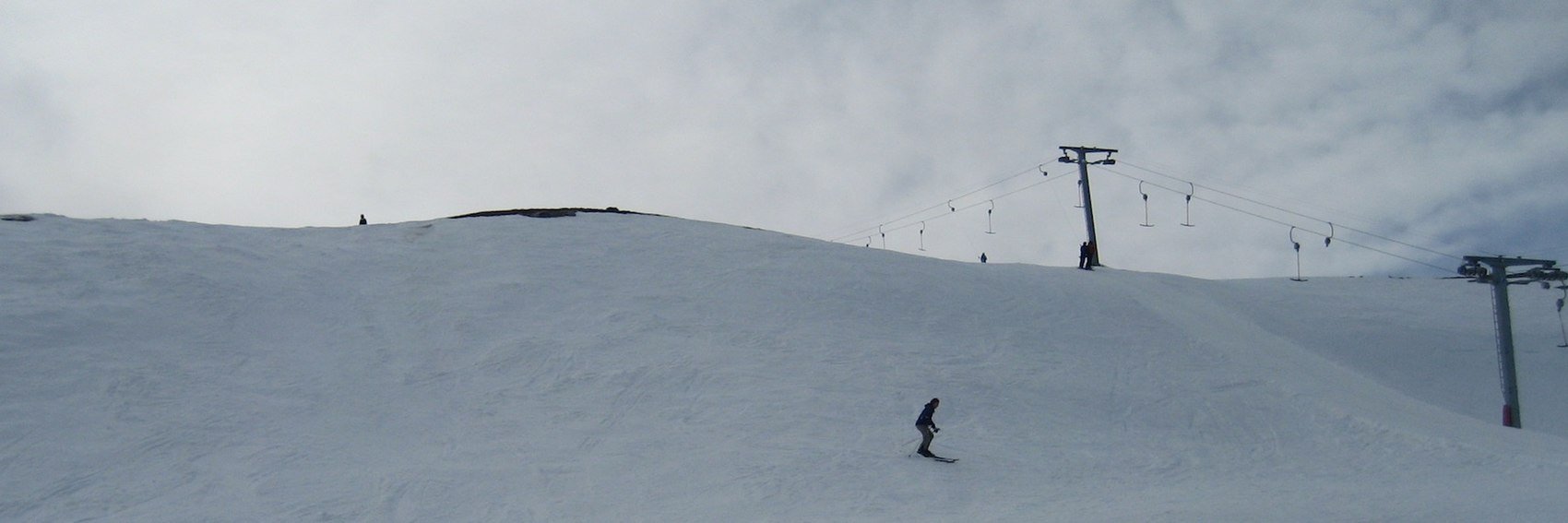


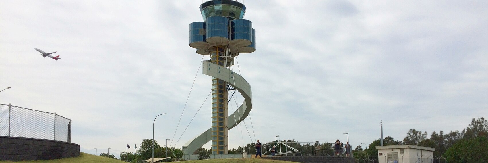


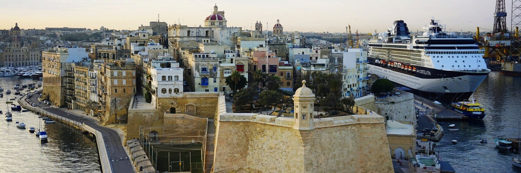


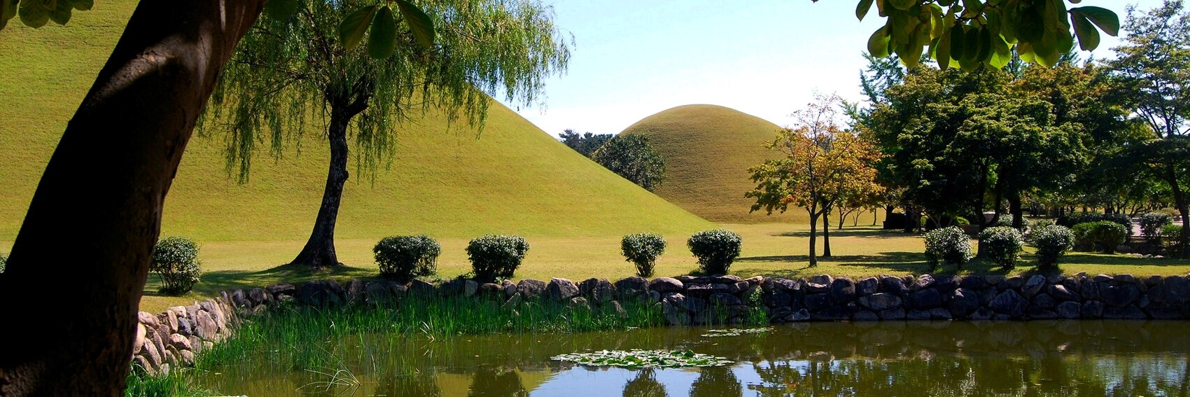

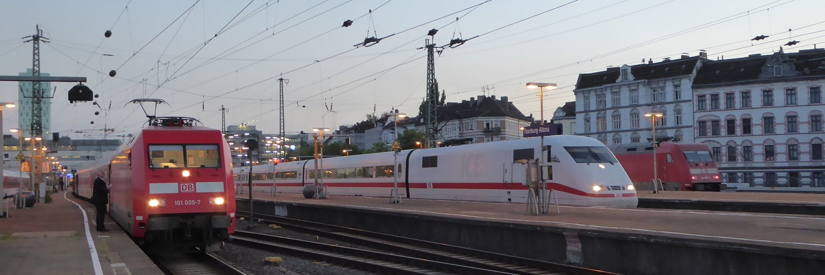


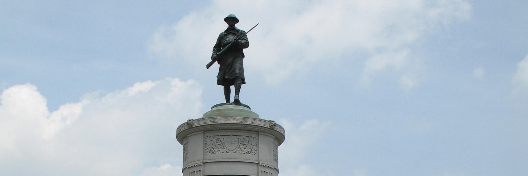

 , S. R. Crown Hall on the IIT campus. AlasdairW (talk) 22:24, 4 August 2018 (UTC)


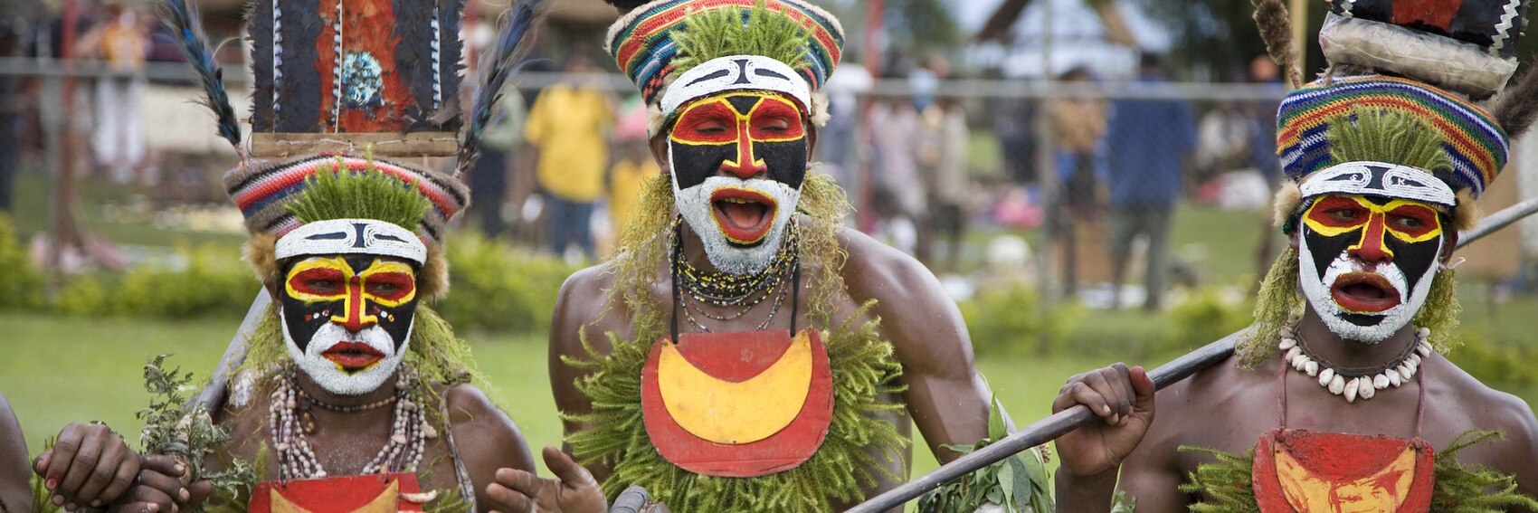


.jpg)


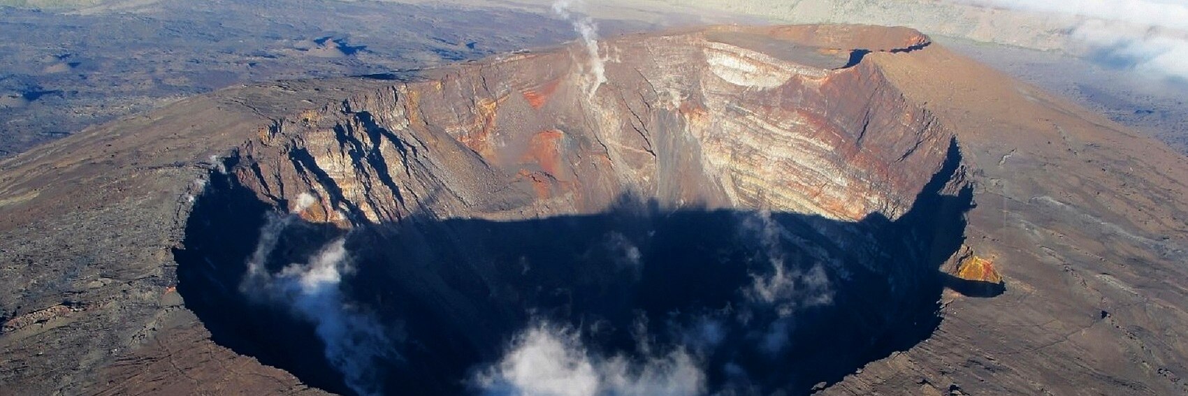


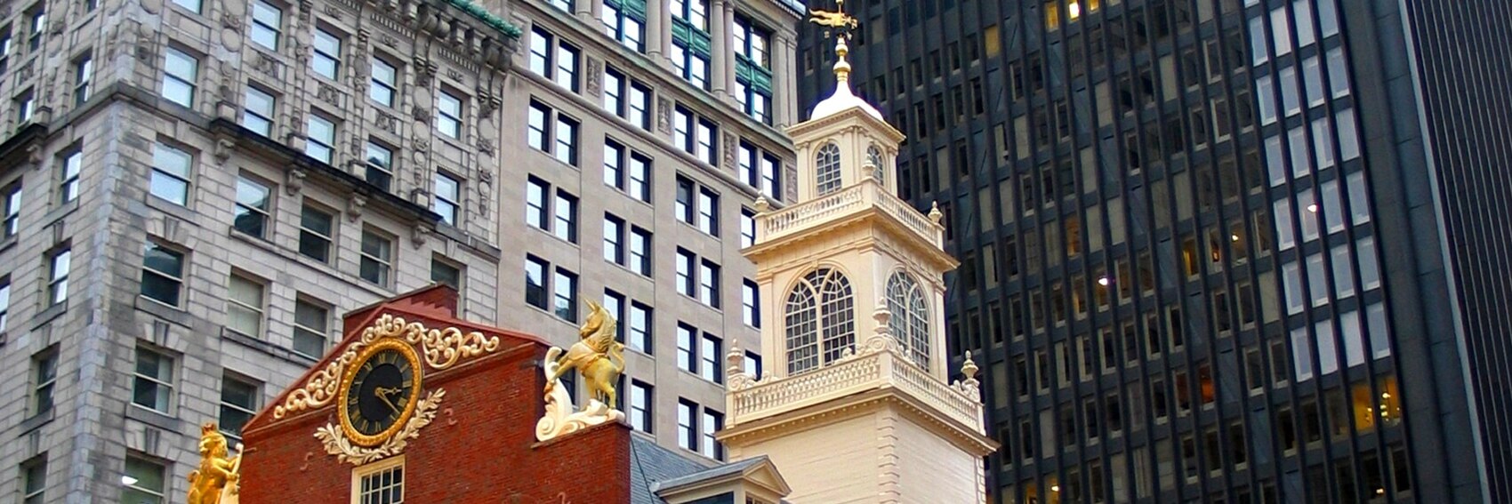


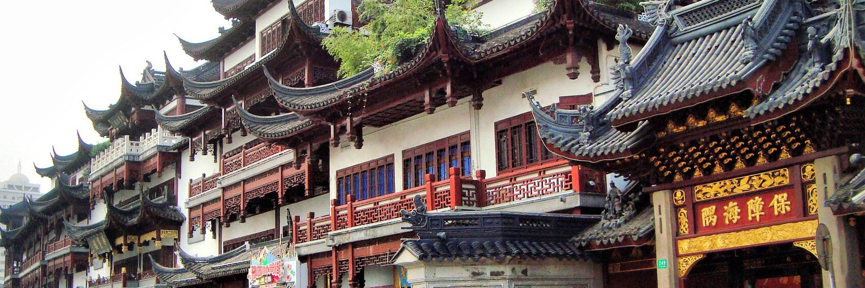


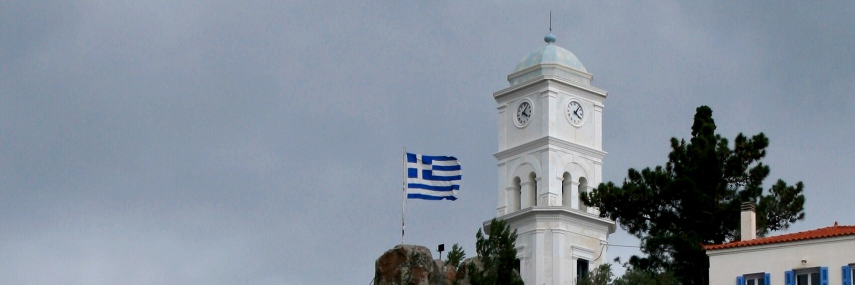


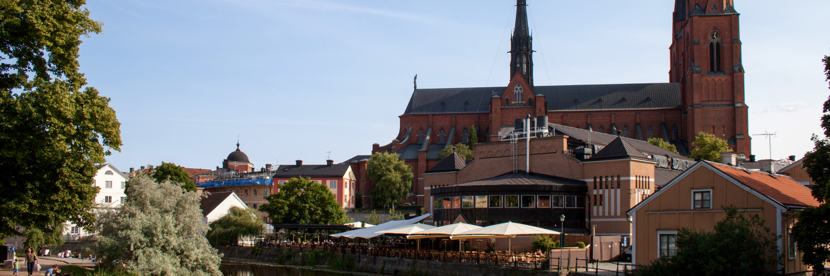


 , but I think that the Loch Ossian photo is more clearly a hostel.) My preference is #5, #1, #2. AlasdairW (talk) 22:00, 19 February 2018 (UTC)


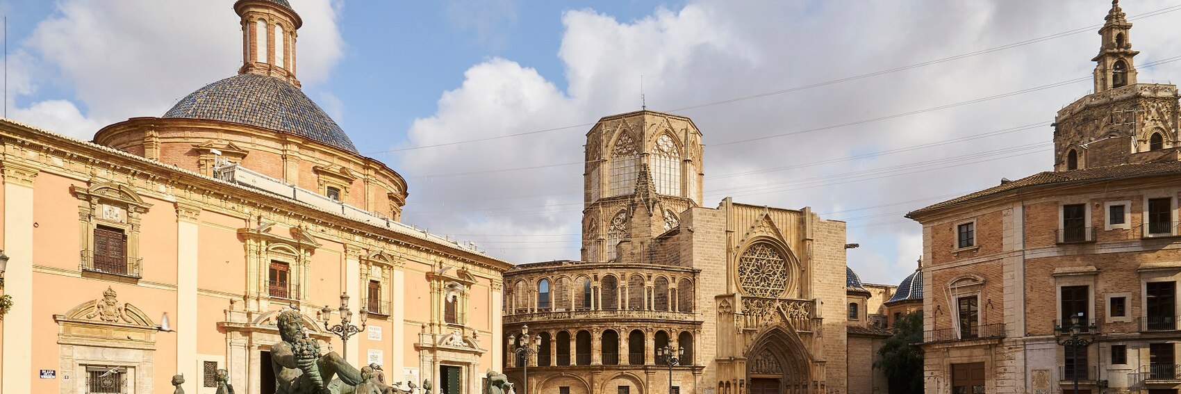


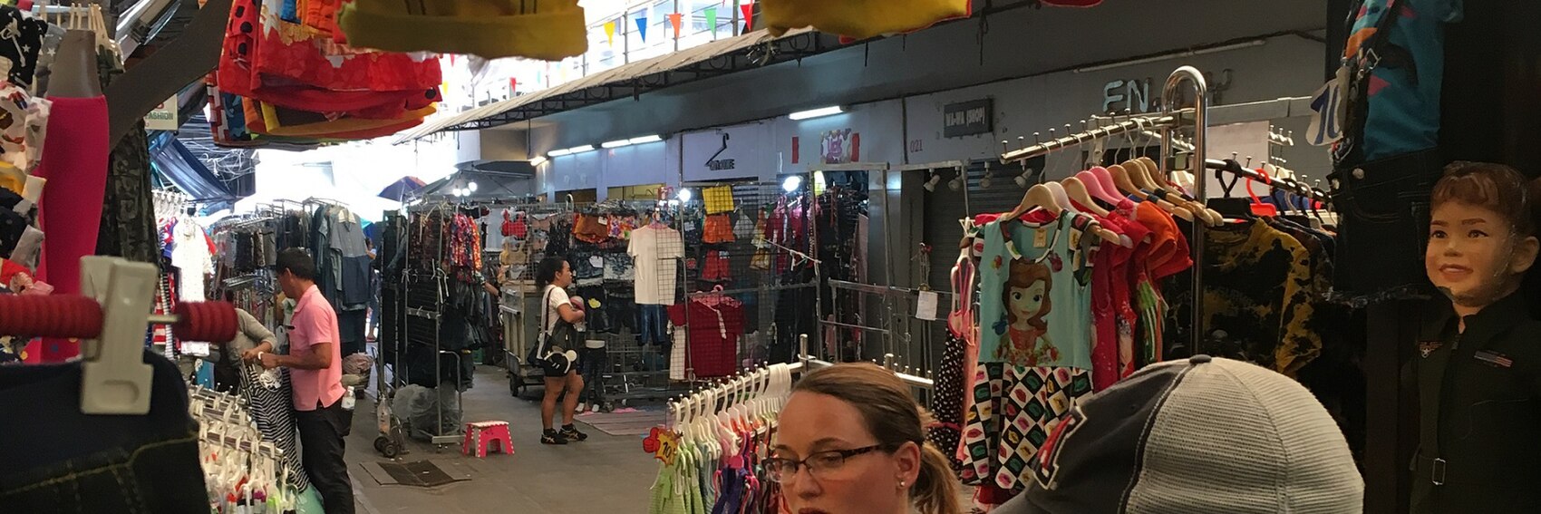


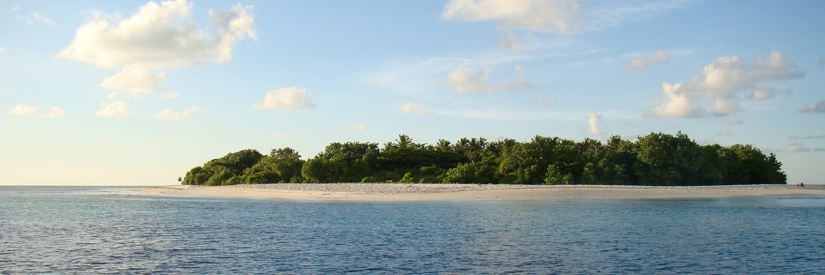


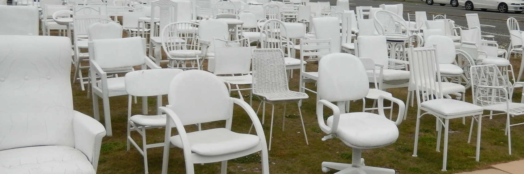

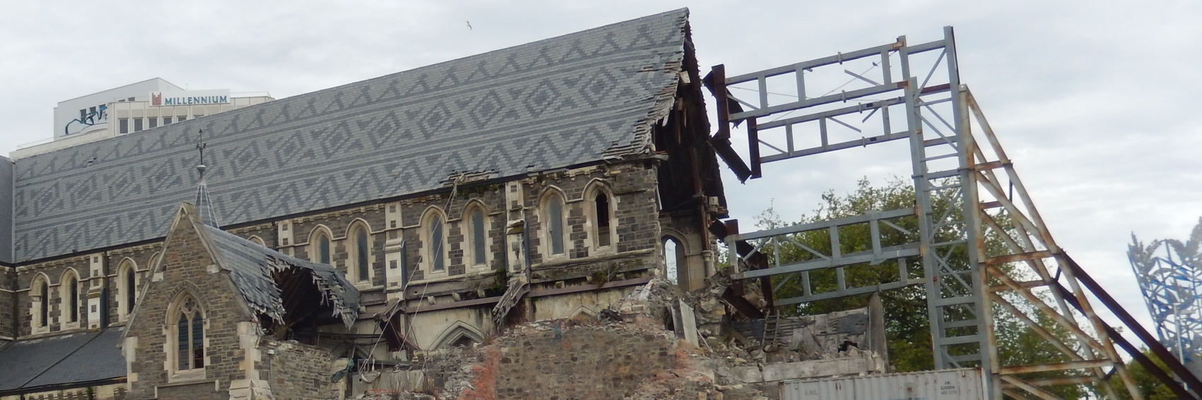
 instead of #6. AlasdairW (talk) 22:42, 3 October 2017 (UTC)