
Wikivoyage:Destination of the month candidates/Banners/Archive/2016
| DotM banner archives: 2013 • 2014 • 2015 • 2016 • 2017 • 2018 • 2019 • 2020 • 2021 • 2022 • 2023 • 2024 |
Archived banners for destinations featured on the Main Page in 2016.
Time to vote on banners again. -- AndreCarrotflower (talk) 18:27, 19 November 2016 (UTC)
![]()

![]()
![]()

![]()

- I had expected #3 to be my favorite, and for once my prediction turned out to be accurate. A superb-quality image fit for a magazine cover, exactly the kind of thing we want on the Main Page. Second is #1; third is #2 with a scene that's more mundane, but perhaps more commonly experienced by the travellers. #4 I like the idea of, but it's in last place because, despite the tweaks I did in PhotoShop, there's just no denying the fact that it's a lower quality photo. -- AndreCarrotflower (talk) 18:27, 19 November 2016 (UTC)
- I like #1 most, then #4, #3, #2. ϒpsilon (talk) 18:48, 19 November 2016 (UTC)
- My favorite is #3, then #4 because happy people are in the foreground, then #2, which as Andrew points out is mundane. #1 is in last place for me because though the scenery is nice, that thick black smoke is really unattractive. Ikan Kekek (talk) 20:02, 19 November 2016 (UTC)
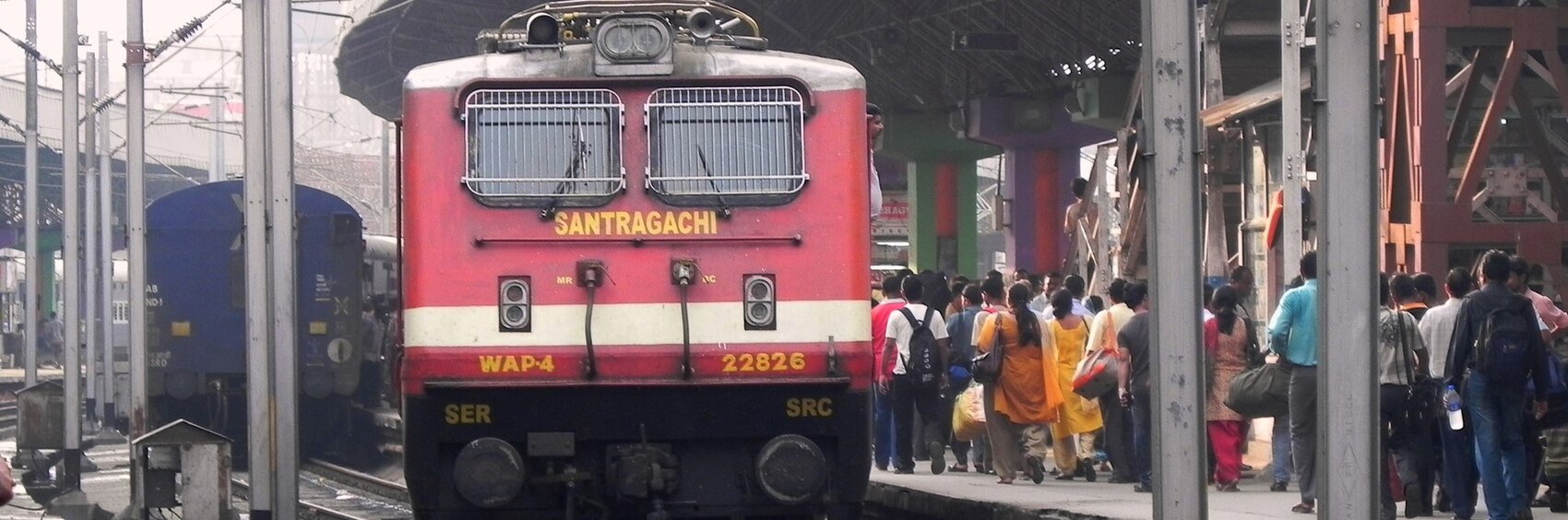
- I'd choose #1, #4, #3 and then #2. All good pictures but #1 is the most compelling for me. Ikan Kekek says the black smoke is unattractive, but for me it gives authenticity of what you could expect from this journey and extra depth. The point is that these are not super-ecological German electric trains but something that talks of travel in India. --Andrewssi2 (talk) 22:32, 19 November 2016 (UTC)
...is one article for which I had no trouble at all finding source images for banners. Let's hear your votes! -- AndreCarrotflower (talk) 20:23, 3 November 2016 (UTC)
![]()
![]()

![]()
![]()
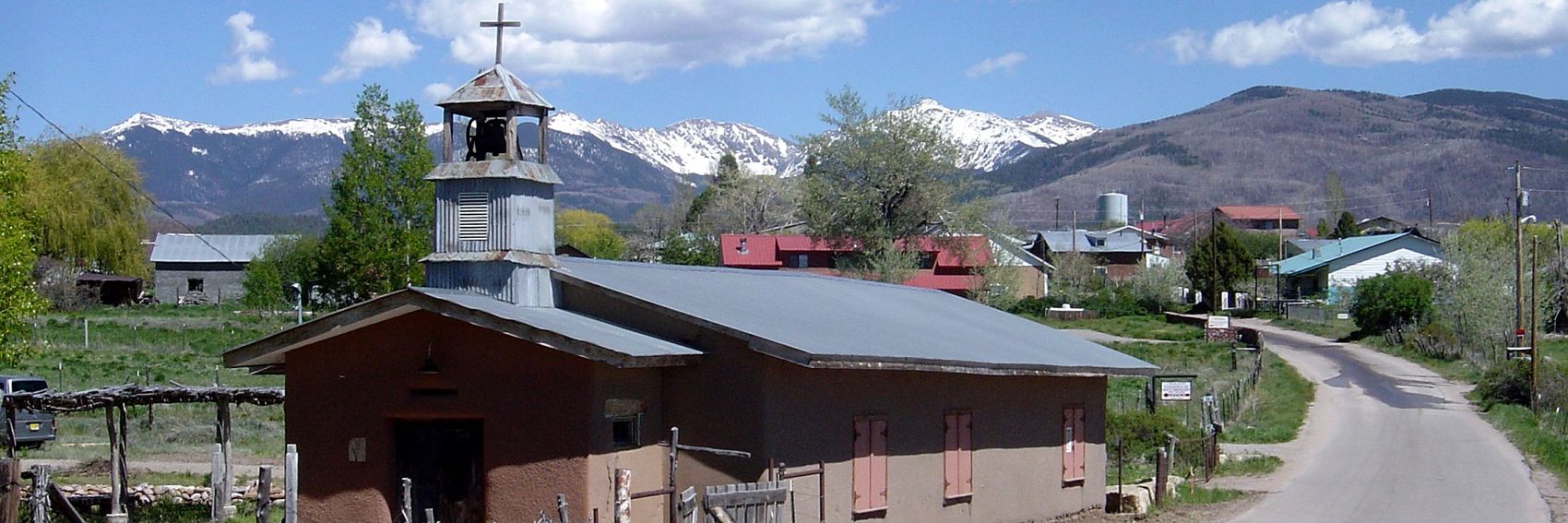
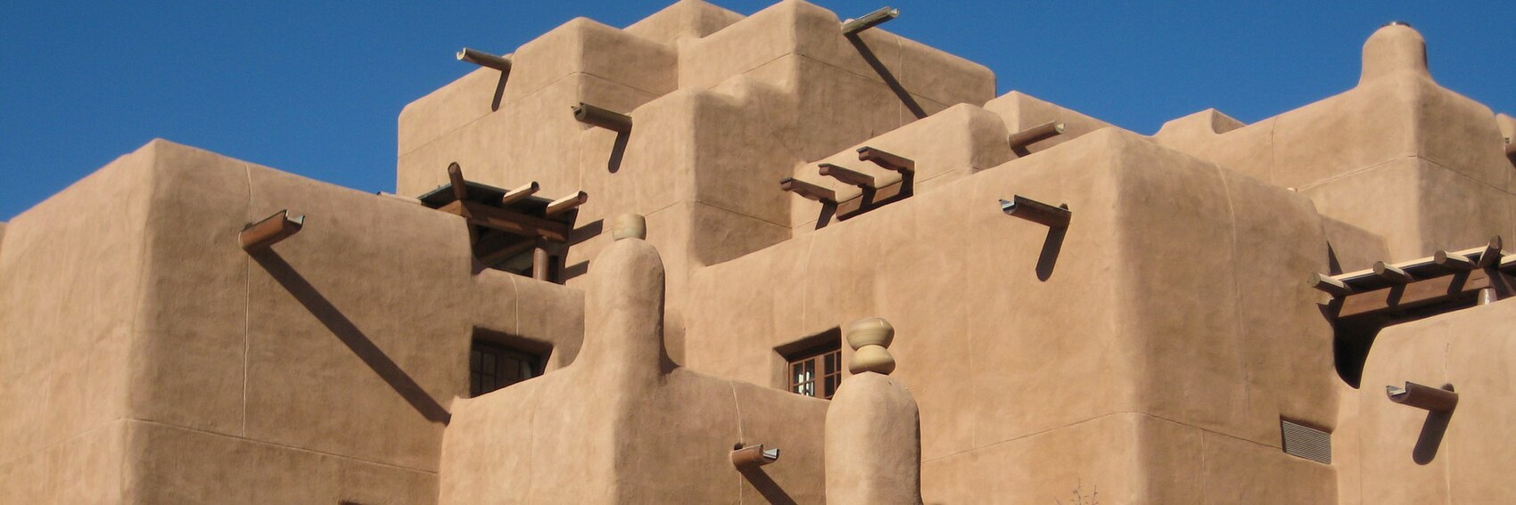
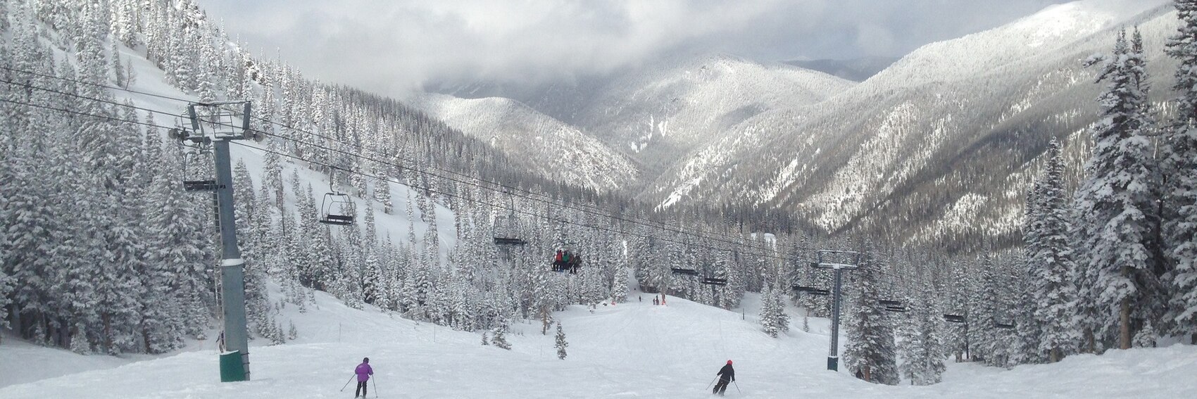
- More than any banner selection in recent memory, I'm stumped as to which one of these I like best. #1 depicts the kind of adobe architecture that's in abundance in downtown Santa Fe, which I suppose takes care of the "culture" and (perhaps, in a sense) "history" end of things, but the blurb talks up an experience that's a lot wilder and manifestly less urban than the banner depicts. #2 is the most stereotypically Southwestern-looking of the four - the kind of landscape you could picture Wile E. Coyote chasing the Roadrunner through - which cuts both ways, I suppose, in this the picture looks just as likely to have been taken in, say, Utah or Arizona. #3 would be the most seasonally appropriate image given that we've dared to schedule the article for December, but again, the picture looks oddly anonymous and looks nothing like the New Mexico most people imagine. #4 is a nice small-town scene with mountains in the background and, troublingly, a fresh coat of early-spring greenery on the ground, not at all typical of what one would see there in December.
- I suppose I'd rank them in descending order - #1 best and #4 worst - but this is a situation where I could very easily be swayed by other points of view, so let's hear them.
- I agree that it is tough to pick a favorite among these photos. However, I think #2 and #3 are the best compositions, and even though it's true that the scenery in #2 could be in another part of the Southwest, the background has the look of the endless scrubby semi-desert that I associate with New Mexico, so the combination of that with a spectacular rock formation makes it my favorite. I rate #3 second on the basis of beauty and composition. I rate #4 third, for its combination of country town foreground and snowcapped mountain background, and #1 round out my picks at fourth, partly because I don't much like the crops. Ikan Kekek (talk) 03:55, 4 November 2016 (UTC)
- #4 is my favorite, mainly because it's the one that most screams North Central New Mexico to me; it's a very unique sight that perfectly captures the beauty of this part of the world. #1 is a bit too kitschy Santa Fe for my liking. #3 is the most seasonally appropriate and I like that it breaks the stereotypical desert imagery of New Mexico, but there isn't anything all that distinctive about it, so I'm a bit "eh" overall. #2 is probably my second-favorite of these four, even if it's a little stereotypically Southwest. PerryPlanet (talk) 14:32, 4 November 2016 (UTC)
- As a huge fan of desert rock landscapes: #2 for me, please. On the second place #4 with the snow-covered Rockies in the background and a typical little village. On third place #3; it's after all winter when we feature NCNM and travelers visiting might want to pack their skis, and lastly #1 which by no means is a bad banner. --ϒpsilon (talk) 15:27, 4 November 2016 (UTC)
Back in the banner-making game. Thanks again to Ypsi for holding down the fort during my hiatus. I'll try not to let that happen again.
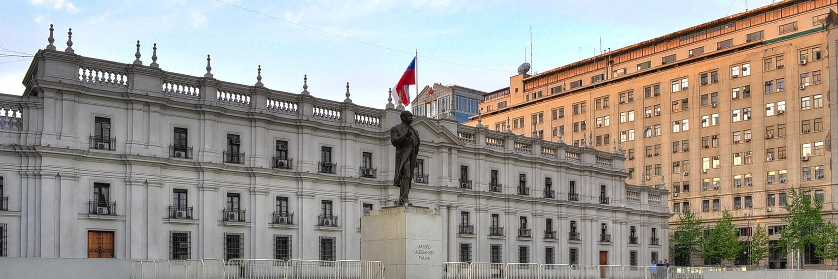
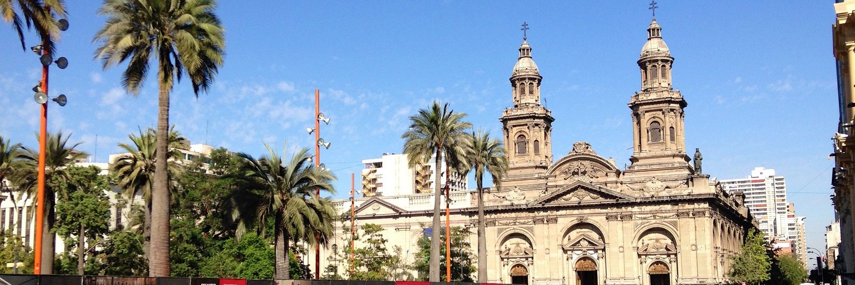
Four for Santiago in December. Vote!
-- AndreCarrotflower (talk) 18:57, 16 October 2016 (UTC)
![]()

![]()
![]()
![]()

- For me, the last three are in a close race for first place, but I'm going to put #3 ahead of #2 by a hair. While they're the same basic idea - colonial-era buildings in the historic city center - the image of Plaza de Armas is a better representation of the diversity of the city, with the modern high-rises in the background an interesting counterpoint to the old Catedral Metropolitana, while the high-contrast pattern behind the textbox in the image of the Palacio de la Moneda is quite distracting. #4, the Sanhattan skyline - which I was sure at the beginning would be a runaway winner - in third because there's really no good place for the textbox. #1, the street scene in Barrio Bellavista, is interesting, but sadly the image is of a decidedly lower resolution. -- AndreCarrotflower (talk) 18:57, 16 October 2016 (UTC)
- (edit conflict) Yay! Muchas gracias! :) I think I'm going for the Palacio first, so: #2, #4, #3, #1. ϒpsilon (talk) 19:05, 16 October 2016 (UTC)
- Okay. I moved the textbox on #4 to the right. Does that change things for anyone? (My vote stays the same.) -- AndreCarrotflower (talk) 02:27, 17 October 2016 (UTC)
- Nope, although the textbox in #4 is IMO better on the left side. ϒpsilon (talk) 04:45, 17 October 2016 (UTC)
- Good job! I think #2 is a terrific banner, and it's my first choice. I also really like #1, my second choice. #3 is my third and doesn't get a higher rating partly because it looks a bit tilted down to the left; if it were straightened, I'd have another look. I agree with you about the drawbacks of #4. If there were a way to make the text box more transparent, I'd reconsider rating it 4th of 4, although I might still rate it 3rd. Ikan Kekek (talk) 22:06, 22 October 2016 (UTC)
Made some for Cold weather too, just in case. A quite white selection of banners, unsurprisingly… ϒpsilon (talk) 18:38, 6 October 2016 (UTC)
![]()
![]()

![]()
![]()
![]()

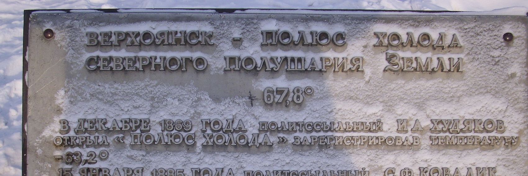
- I like the Pole of Cold plaque a lot, despite the "+" vandalism. Hence: 3, 1, 2, 4. ϒpsilon (talk) 18:38, 6 October 2016 (UTC)
- Ypsi, I had the idea earlier to recycle one of the rejected banners for last year's Winter driving FTT for consideration for Cold weather. So, I added a fifth banner to this list. If you have time, let me know where it falls in your ranking. For me, #s 4 and 5 are very close contenders for first place, but (and I hope I'm not biased here) I'm giving the edge ever-so-slightly to #5. In third place for me is #2, followed by #1. -- AndreCarrotflower (talk) 20:55, 6 October 2016 (UTC)
- I'll put it on third place (that'll result in: 3, 1, 5, 2, 4 for me). ϒpsilon (talk) 21:08, 6 October 2016 (UTC)
- For me, 4, 5, 3, 1, 2, and I think every one of the banners is good! Ikan Kekek (talk) 06:40, 7 October 2016 (UTC)
I don't want to become the permanent Main Page banner creator here. And sorry for stealing your job once again, Andre. However, it's just a little past next weekend until we're gonna need a new OtBP Main Page banner. So I made some for Lady Elliot Island. Please vote! ϒpsilon (talk) 18:38, 6 October 2016 (UTC)
![]()

![]()
![]()
![]()
- Although the banners are fairly similar, number one is still my number one, well ahead of the others. So: 1, 2, 4, 3. ϒpsilon (talk) 18:38, 6 October 2016 (UTC)
- I hope to get back to creating Main Page banners very soon. But you're doing a fine job filling in, ϒpsilon (and I won't deny it's nice to have a bit of breathing room to get other things done, both on- and offwiki!) Earlier today, before you posted these, I did some scouting through Commons to see about potential source images for LEI banners, and it looks like you used most of the ones I had in mind. That said, #1 is the clear winner here for me, followed distantly by #2 and even more distantly by #s 4 and 3, in that order. -- AndreCarrotflower (talk) 20:50, 6 October 2016 (UTC)
- Thanks. I also have things to do offwiki but how could we leave the Main Page without banners? :) ϒpsilon (talk) 21:01, 6 October 2016 (UTC)
- Good job! For me, 1, then 3 and 4 (almost a pick'em between those two) and then 2 in a distant 4th place. The blurb has a grammatical mistake: "At this island the impressive marine fauna and the corals of the Great Barrier Reef is just a dive away." That "is" should be "are". Ikan Kekek (talk) 06:37, 7 October 2016 (UTC)
- I like #1 because it's a unique perspective we don't often see in banners. Powers (talk) 21:27, 16 October 2016 (UTC)
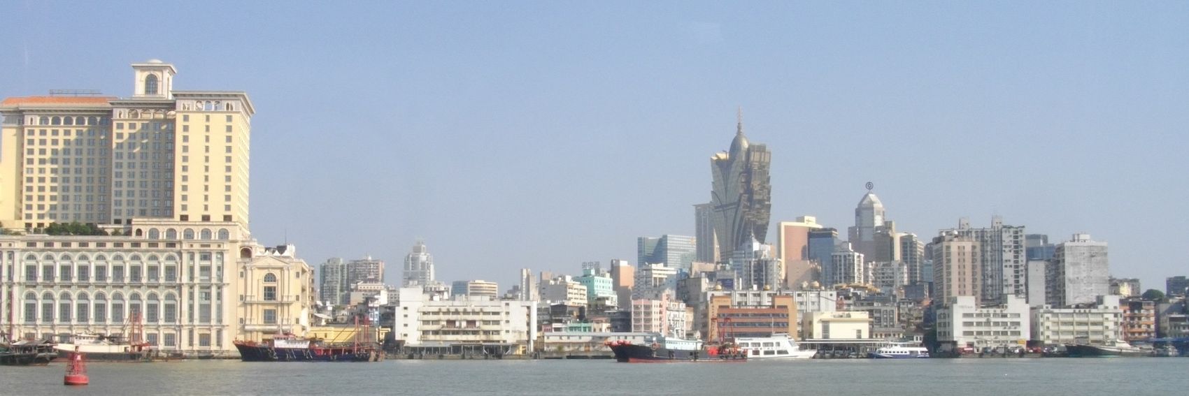
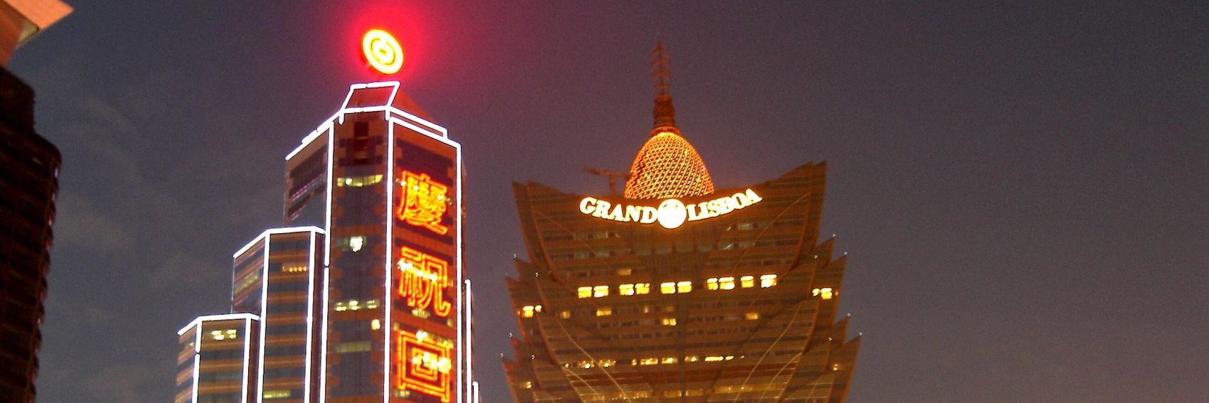
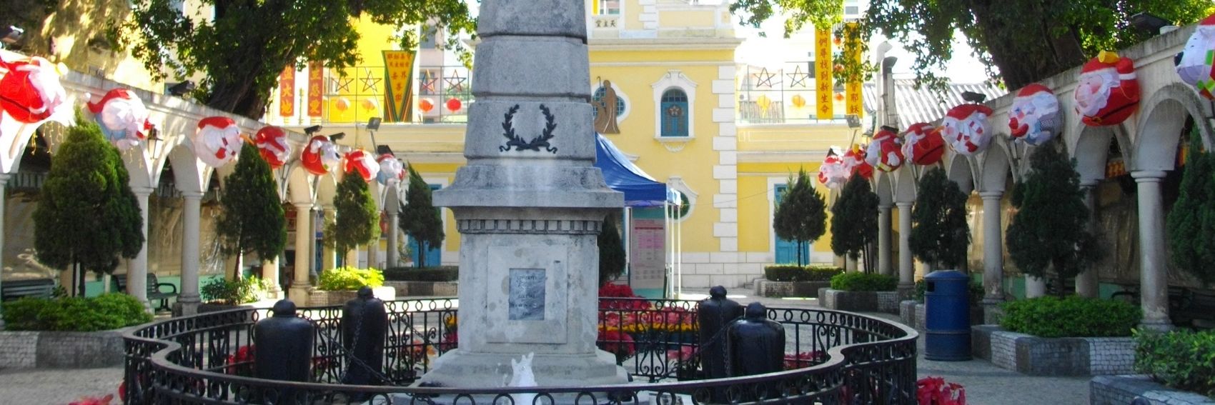
Chinese, Portuguese and modern; that's what Macau is all about! ϒpsilon (talk) 20:27, 9 September 2016 (UTC)
![]()
![]()
![]()
![]()
![]()

![]()
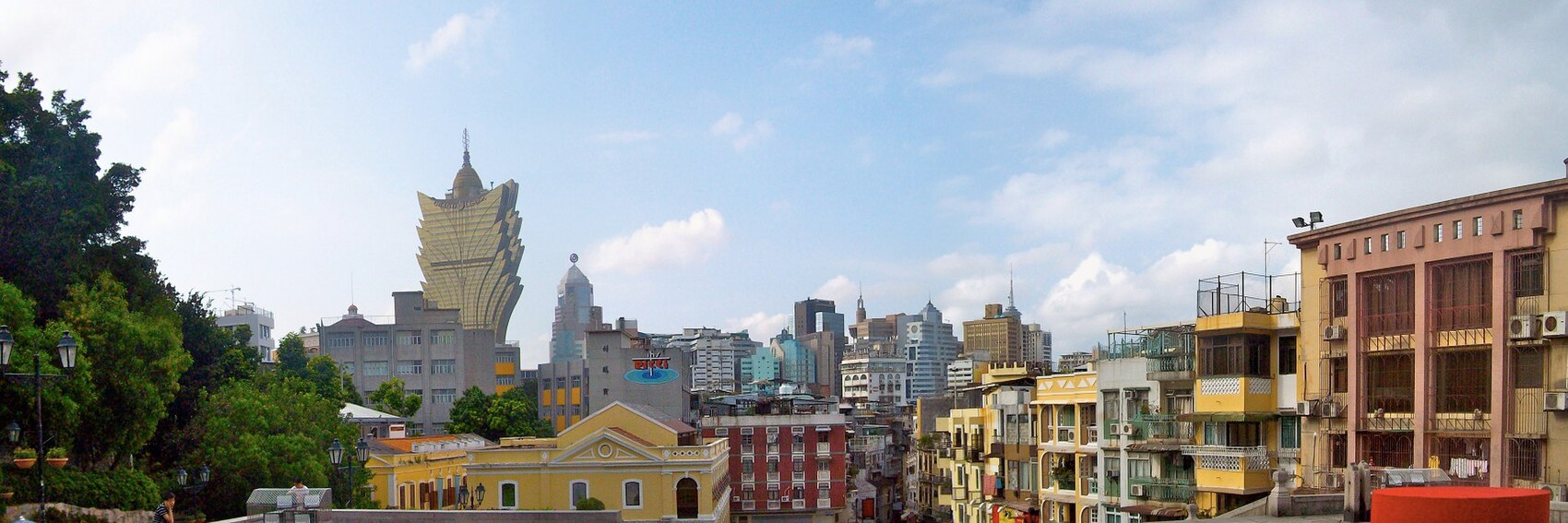
- I'm quite satisfied with this series of pics, and it's a little hard to pick a favorite. But I'll go for #2. On the second place the casino towers #3, on the third place the panorama #1 and on the last place #4 with a little of everything. ϒpsilon (talk) 20:27, 9 September 2016 (UTC)
- #1, #3 then #2, but in this case it is very close, and any of these would be quite acceptable. AlasdairW (talk) 21:38, 10 September 2016 (UTC)
- I've never been to Macau, but I'm feeling like I prefer #2, #4 and #1 in that order. The light is a bit too hazy in #3 for me to want to use it. Ikan Kekek (talk) 20:42, 11 September 2016 (UTC)
- Having been to Macau, but no gambling just sight seeing, I like #1 and #4 for what the memories do for me - #2 and #3 are good indicators of close up exerience, however for here on voyage - there is wavering between #2 and #4. JarrahTree (talk) 06:35, 2 October 2016 (UTC)
- As I was not enthusiastic about any of the original four Macau banners, I took the liberty of adding two more that, I feel, better reflect the clash of traditional Chinese, colonial Portuguese, and modern that the blurb (and the article) talks up. My favorite is #6, with #5 in second place (I love that Portuguese pavement; not so much the shadowiness of the lower right corner and the fact that I had to crop off the tops of some of the modern skyscrapers to the left). The unusual perspective of #2 puts it into third place on my list; the only mildly interesting skyline at #1 is in fourth, and #4 is in fifth.
- Ypsi, AlasdairW, Ikan, JarrahTree, and anyone who hasn't yet voted: would you care to let us know where the two new banners fall within your hierarchy?
- Excellent! Thank you for adding more choices. I would now rate them #6, #2, #4, #1, #5. The things that cause #5 not to get a higher position from me are the cut-off people and the lack of perspective correction, with buildings on the right leaning right and vice versa. Ikan Kekek (talk) 22:00, 22 October 2016 (UTC)
- 6, 2, 3, 5, 1, 4. ϒpsilon (talk) 06:54, 23 October 2016 (UTC)
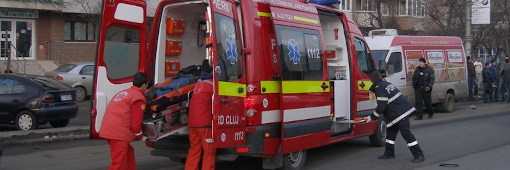
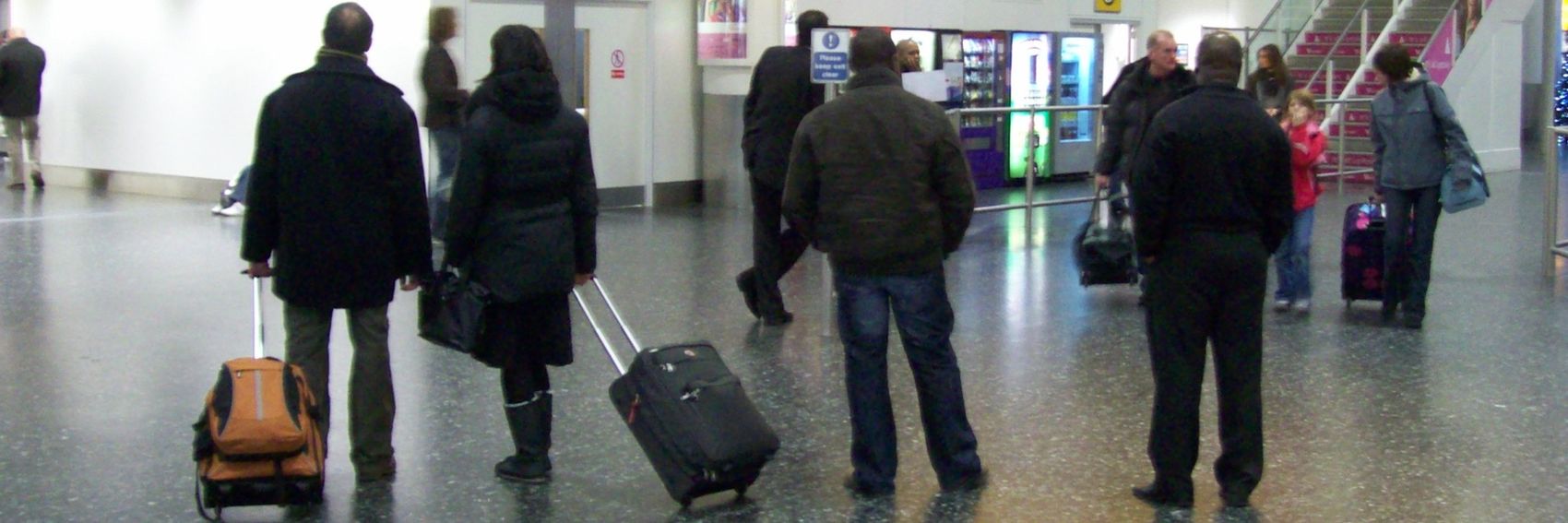
This one was a hard one to come up with photos for. I believe travel insurances are most important for cases when you get sick or have an accident during your travels. However I also made a banner with people with luggage on an airport, because a travel insurance can also be good to have for lost luggage. ϒpsilon (talk) 20:27, 9 September 2016 (UTC)
![]()
![]()
![]()

![]()
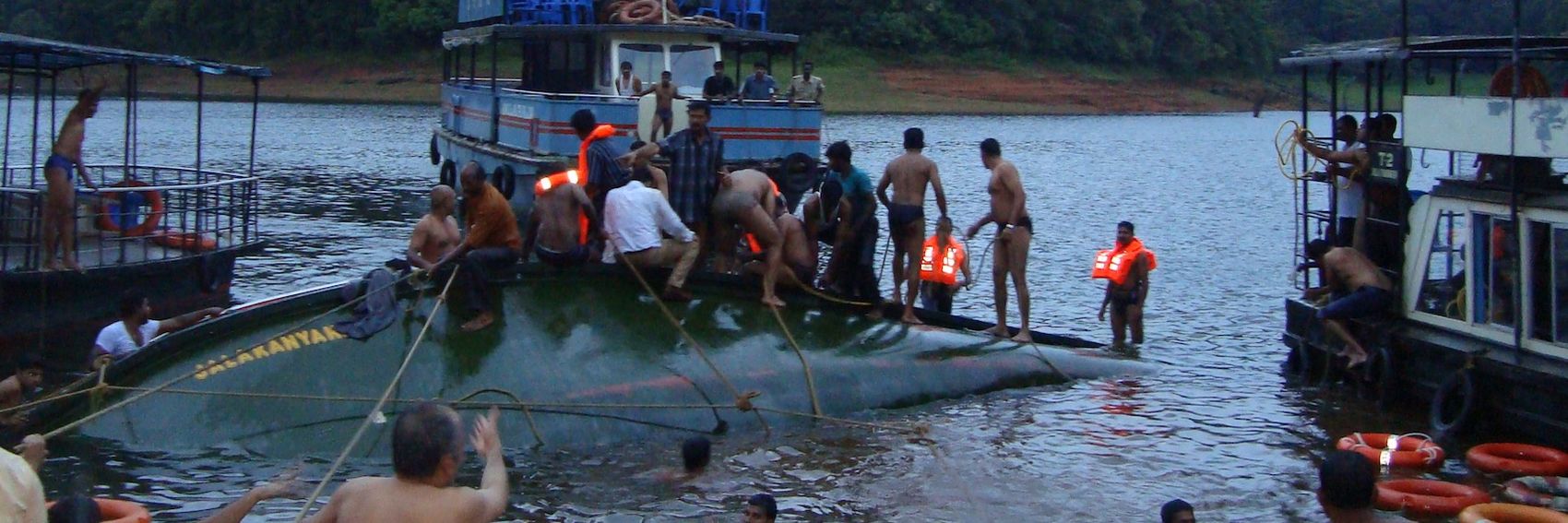
- The dramatic water rescue operation at #4 is the winner here, but #1 comes as a close second, then #3 and lastly the perhaps somewhat boring
#4#2. ϒpsilon (talk) 20:27, 9 September 2016 (UTC)
- Thanks for taking the time to do this, ϒpsilon. You voted for #4 twice. Did you mean #2 as your somewhat boring last choice? I vote for #4, #1 and then very closely followed by #3. #2 is not interesting, dramatic or specific enough for this topic, in my opinion. Ikan Kekek (talk) 01:00, 10 September 2016 (UTC)
- Yes, that was what I meant :). ϒpsilon (talk) 12:24, 10 September 2016 (UTC)
- Thanks. I prefer #3 then #1. #4 is good, but the boat capsizing is probably not covered by travel insurance. AlasdairW (talk) 21:31, 10 September 2016 (UTC)
- #1 for me, please. It gets across the same point as #4, but the image quality is much better (#4 is a bit blurry and has dark, murky colors - very unattractive for a banner image). #3 is in second place for me, followed by #4 and then #2. -- AndreCarrotflower (talk) 14:44, 11 September 2016 (UTC)
- #1 and #3 and not #4 JarrahTree (talk) 06:40, 2 October 2016 (UTC)
Andre apparently has a lot to do off-wiki, so I thought I should help out by making some new banners. For example, CdR will need one within 52 hours. So, which one would you like to see on the main page? ϒpsilon (talk) 20:27, 9 September 2016 (UTC)
![]()
![]()

![]()
![]()
- I prefer #3 with the church towers. On the second place the beach (#1) which, while nice-looking, is a bit out of town. On the third place comes #2 which sadly is a little blurry and lastly #4. ϒpsilon (talk) 20:27, 9 September 2016 (UTC)
- Thanks for making the banners! #4 seems to me to be the most distinctive very good picture. #1 is my second choice; I assume it's within city limits, but a lot of towns have beaches. However, the shape of the cliffs and so forth is somewhat distinctive. #3 has nice church towers, but they're cut off and not perspective-corrected, and the buildings to their right aren't very interesting or well focused. To me, #2, blurry and with large blown out areas, is not of high enough quality to be usable. Ikan Kekek (talk) 00:54, 10 September 2016 (UTC)
- Thank you for stepping in on this, Ypsi. It's a big help. For the Caldas banners, #4 is the winner for me by a large margin, with #3 in second place, the pleasant but anonymous #1 in third. -- AndreCarrotflower (talk) 12:59, 10 September 2016 (UTC)
- I prefer #3 followed by #4, then #1. Thanks for the selection. AlasdairW (talk) 21:26, 10 September 2016 (UTC)
I'm going to be backed up at work from now until the end of the month, and directly after that I'll be taking an end-of-summer jaunt to Montreal from the 1st through the 5th of next month (with a fortuitous window of time to update DotM on the evening of the 31st). So, these banners are an exception to the recent rule of being posted at the absolute last second. Hopefully it starts a trend.
There were so many good copyleft-compatible images of Tunis available that I couldn't narrow the choices down to just four. The lion's share of these shots were taken in the medina (old town), but I figured that was okay because that's where most of the sights covered in the article, and essentially all of the interesting images I was able to find, are located.
Let's hear your votes.
-- AndreCarrotflower (talk) 05:51, 28 August 2016 (UTC)
![]()
![]()
![]()
![]()
![]()

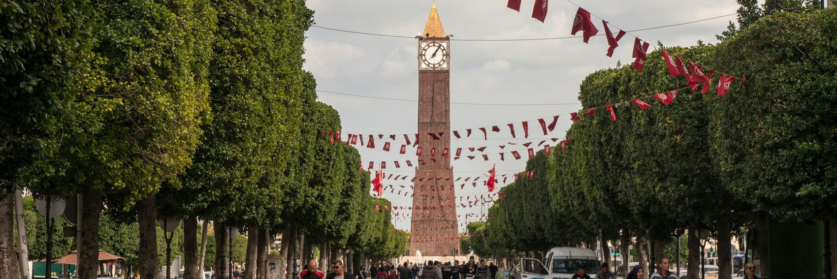
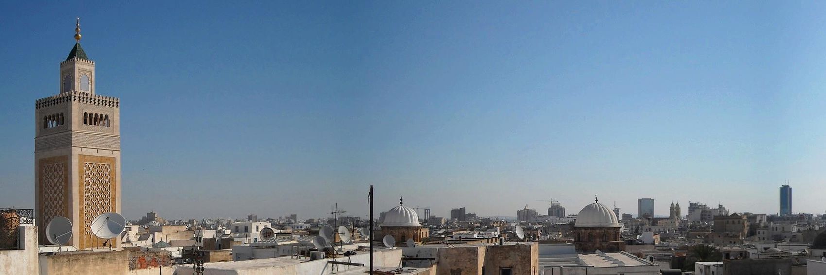
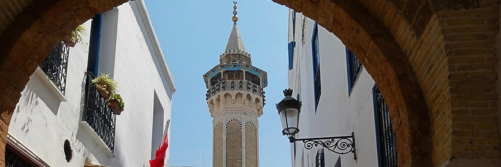
- I want so badly to choose #2. It's the most appealing image to my eyes, and it seems to cover all the bases - the wide and magnificently landscaped Avenue Habib-Bourguiba festooned with streamers of Tunisian flags, looking toward the clock tower in the center of the public plaza named for the recent revolution - but it also looks oddly anonymous to me (the article says that the clock tower is an iconic landmark of the city, but if not for the flags, there's no way in the world I'd have guessed this picture was taken in Tunisia). It's a conundrum. I hate to say it, but it drops to third place behind frontrunner #4 (the minaret of Hammouda Pacha Mosque as seen from Sidi Ben Arous Street) and runner-up #3 (the city skyline with the minaret of the Zitouna Mosque at left). Next in line is #5, where the high-contrast busyness of the colorful buildings in the medina make it difficult to read the text in the blurb; bringing up the rear is #1, which depicts an important point of interest (the Bab al-Bhar, or Porte de Paris) but, at least compared to the others, is fairly drab and colorless. -- AndreCarrotflower (talk) 05:51, 28 August 2016 (UTC)
- The most visually appealing and least clashing with the text box is indeed #4. PrinceGloria (talk) 06:38, 28 August 2016 (UTC)
- Even as we quite often have skylines as Main Page banners, I still go for #3. After this #2, #4, #5 and #1. ϒpsilon (talk) 12:20, 28 August 2016 (UTC)
- 2 is the best. The flags, which Andre inexplicably dismissed, serve to make the photo suitably Tunisian. Powers (talk) 00:52, 30 August 2016 (UTC)
- These are great banners, and I find it hard to pick between them. That said, and with the caveat that I have yet to visit Tunis, I'd pick them in this order: #2, #1, #4, #5, and then #3, which although the least interesting still has that nice minaret on the left. Ikan Kekek (talk) 20:49, 11 September 2016 (UTC)
Another set of four banners just before the buzzer. I swear, at some point in the future - probably when my offwiki life is no longer in a state of chaos - I'll get back to my target of having three months' worth of banners in reserve.
For this FTT there was no shortage of suitable copyleft-compatible material on Commons or Flickr, and I'm fairly satisfied with the end results. However, I did notice a somewhat surprising overrepresentation of desert scenery in the available images. Israel is an arid country in general, of course, but it's not all desert. So, I tried my best to work in a fair share of (scrubby, Mediterranean-style) greenery for the sake of variety. Whether I did so to an appropriate degree, you be the judge.
Let's hear your votes on these four banners.
-- AndreCarrotflower (talk) 03:33, 20 August 2016 (UTC)
![]()
![]()

![]()
![]()
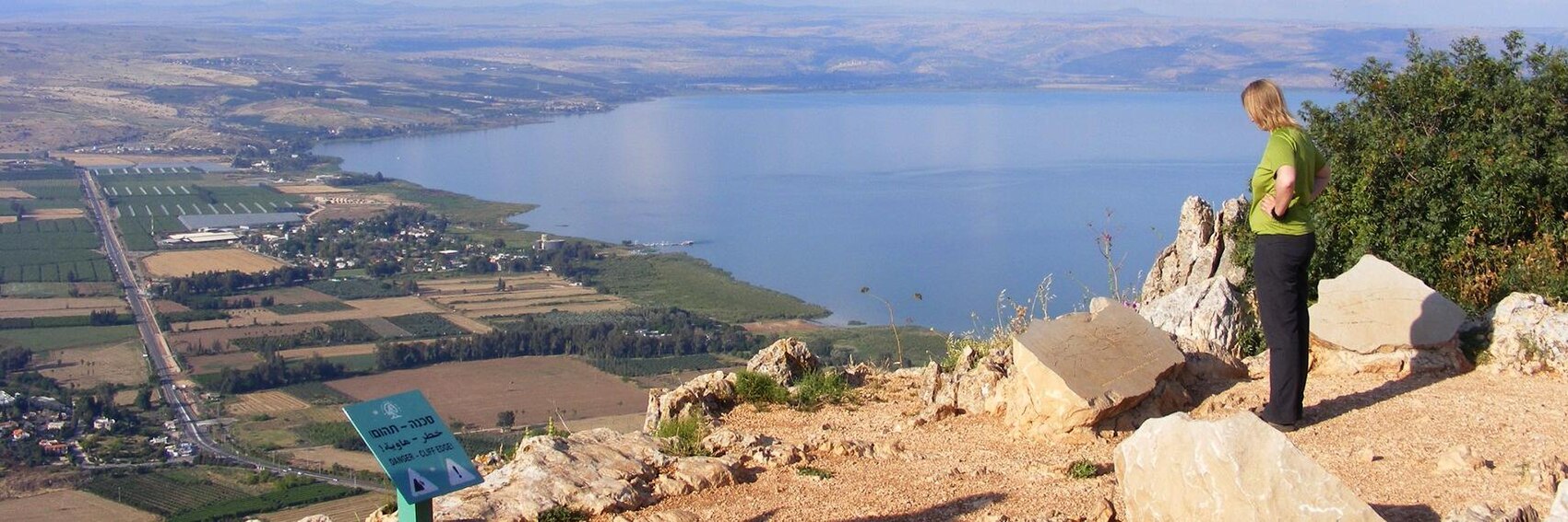
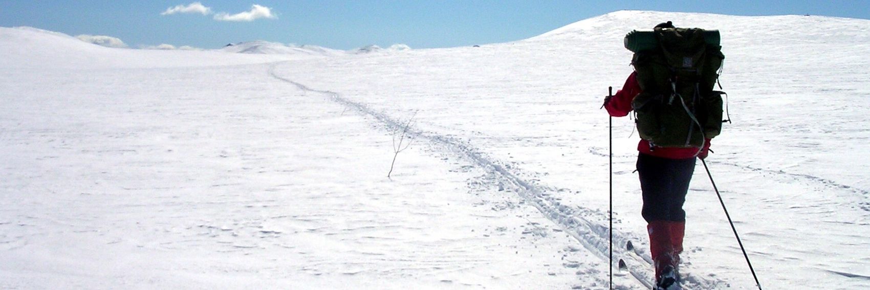
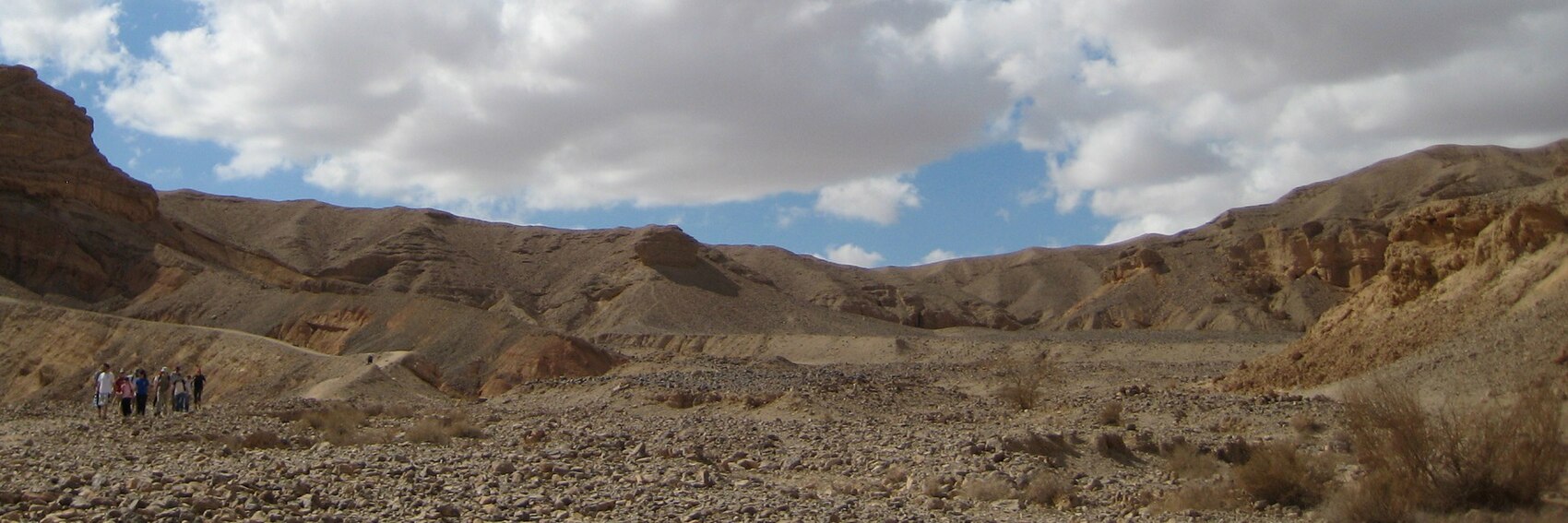
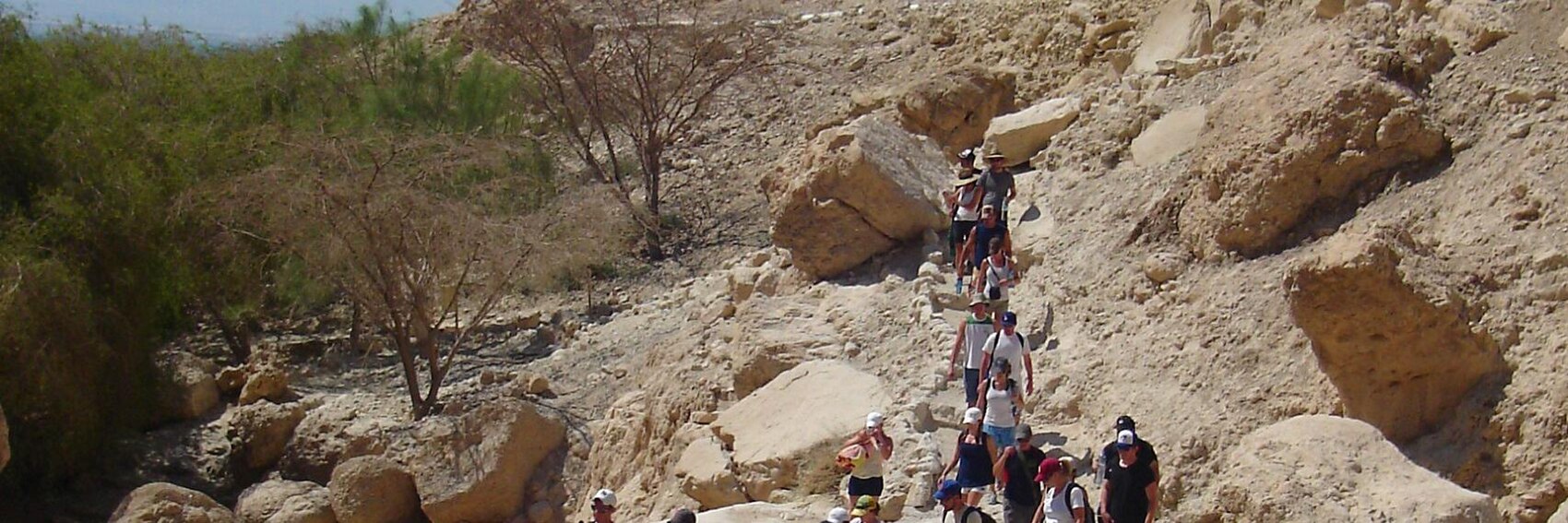
- Though the choice is almost a toss-up for me, in the end my votes go in descending order - #1, 2, 3, and finally 4. The "landscapes" mentioned in the blurb are equally "breathtaking" in the first two, but I have to give the edge to #1 because it's clearer from looking at the image that the people depicted are hiking - in #2 they might just as easily be simply admiring the view. The act of hiking is also depicted unambiguously in #3, but the scenery is quite a bit less impressive and also the large number of people in the image is a bit off-putting to my eyes - isn't hiking usually done in much smaller groups? #4 is an impressive view, but like #2, it's not clear that it's anything more than a view: the green caution sign near the bottom margin is the only (fairly oblique) clue that this place is part of a hiking trail. -- AndreCarrotflower (talk) 03:33, 20 August 2016 (UTC)
- Thank you for the banners! 3, 1, 2, 4 for me. Ikan Kekek (talk) 06:15, 20 August 2016 (UTC)
- Nice banners as always! Desert is the first thing I think of when hearing "Nature of Israel", so: 1,3,4,2 ϒpsilon (talk) 18:07, 20 August 2016 (UTC)
Let's address the elephant in the room right off the bat: I know this is far from a great selection of images. There's a real dearth of good candidates on Commons and Flickr, and most of the best were too low-res to pass even basic muster. As well, the most obvious choice of subject matter — the Big Chair — is out of contention due to FOP restrictions. Nonetheless, let's hear your votes anyway. -- AndreCarrotflower (talk) 21:46, 9 August 2016 (UTC)
![]()
![]()
![]()
![]()
![]()

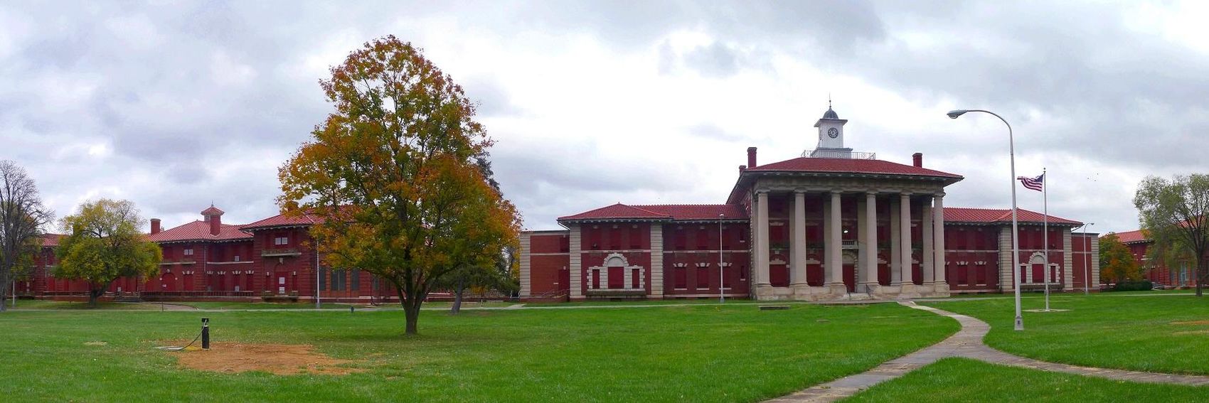
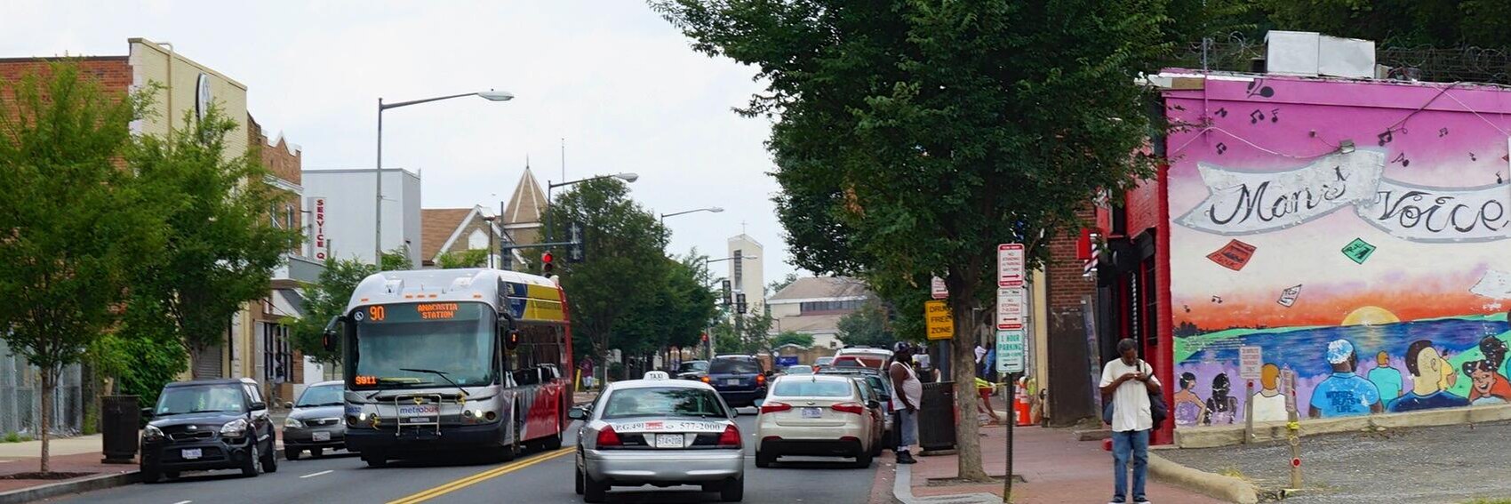
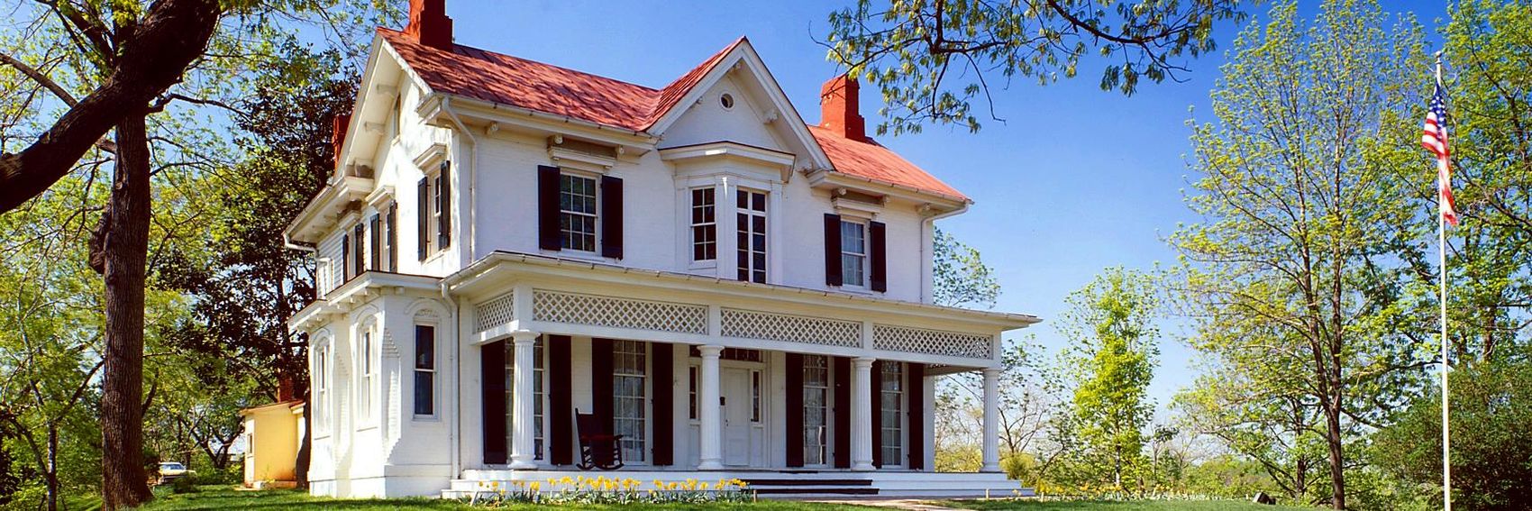
- #4 is the winner for me by a large margin, with #2 edging out #1 only slightly in a tight race for second place: while the former is the superior image, the latter depicts a scene that hews closer to the true character of the neighborhood, with one of the signs on the businesses ("Uniontown Bar & Grill") obliquely referencing the historic importance of the neighborhood as emphasized in both the blurb and the article itself. Meanwhile, in last place #3, the street-art mural at right, while interesting, doesn't redeem what is, in the end, a fairly banal street scene. -- AndreCarrotflower (talk) 21:46, 9 August 2016 (UTC)
- Our policy on non-free images allows us to use them if the subject is inherently non-free and the image is otherwise freely licensed. In what way, then is the Big Chair out of contention? Powers (talk) 23:03, 9 August 2016 (UTC)
- The legal mumbo-jumbo around when fair-use images are and are not allowed to be used was way too dense for me to navigate in the short window of time I had between getting up this morning and leaving for work this afternoon. I just figured that, after the dust-up a couple years back over the Midtown Baltimore Penn Station pagebanner, for purposes of the path of least resistance, it's best to default to assuming that a firm consensus to support an unfree image being used for a purpose like this will never be established, and certainly not in the month and a day between now and when Anacostia is due to go on the Main Page. -- AndreCarrotflower (talk) 00:55, 10 August 2016 (UTC)
- I assure you, if you have a subject you particularly would like to see in the banner, you shouldn't have a problem here. I believe the main objector to non-free images on the Main Page is no longer contributing here. Powers (talk) 01:17, 10 August 2016 (UTC)
- The legal mumbo-jumbo around when fair-use images are and are not allowed to be used was way too dense for me to navigate in the short window of time I had between getting up this morning and leaving for work this afternoon. I just figured that, after the dust-up a couple years back over the Midtown Baltimore Penn Station pagebanner, for purposes of the path of least resistance, it's best to default to assuming that a firm consensus to support an unfree image being used for a purpose like this will never be established, and certainly not in the month and a day between now and when Anacostia is due to go on the Main Page. -- AndreCarrotflower (talk) 00:55, 10 August 2016 (UTC)
- I like #1 most, but #4 isn't far behind, #3 (the street scene isn't that bad IMHO) and on the last place #2. ϒpsilon (talk) 04:22, 10 August 2016 (UTC)
- From a purely aesthetic perspective, #4 wins hands down. PrinceGloria (talk) 04:51, 10 August 2016 (UTC)
- What are the buildings in #1 and #4? I don't know this neighborhood, so I'm not sure my votes should carry much weight, but to me, #3 looks like a vibrant black neighborhood. For history, though, I think I'd vote for #4 first, then #3 for 2nd place, #1 for 3rd place, and #2 for 4th place, partly because the crop looks a bit odd to me. I'd love to see a banner with the Big Chair, though. Ikan Kekek (talk) 05:47, 10 August 2016 (UTC)
- #1 is St. Elizabeth's Hospital; #4 is the Frederick Douglass House. -- AndreCarrotflower (talk) 07:42, 10 August 2016 (UTC)
- In light of Powers' comments above, I've added a fifth banner depicting the Big Chair. It places third out of five in my ranking (#4, #2, #5, #1 and finally #3). Prince, Ikan, Ypsi: what do you think? -- AndreCarrotflower (talk) 07:42, 10 August 2016 (UTC)
- I appreciate your work a lot, but it's still #4 for me. PrinceGloria (talk) 09:59, 10 August 2016 (UTC)
- The chair banner does look interesting, but it ranks third for me too. So: #1, #4, #5, #3, #2. ϒpsilon (talk) 14:07, 10 August 2016 (UTC)
- Tossup for third or fourth for me, and I think I'll put it fourth. So #4, #3, #1, #5, #2. By the way, I just noticed an issue with the article. I'll post about it in the nomination thread. Ikan Kekek (talk) 16:46, 10 August 2016 (UTC)
When it comes to available source material for this very well touristed corner of the world, there was a real embarrassment of riches at Commons. The only real disappointment was a lack of any images of I. M. Pei's iconic Louvre Pyramid, owing to freedom of panorama restrictions. Nonetheless, I think the four images I selected from the bounty achieve the balance I sought to strike - each of the images depict an attraction of the highest prominence (there is certainly no shortage of those in the 1st arrondissement, so there'd be no excuse to do otherwise) but, between them, they show a range of distinct facets of the place. Let's hear what you all think. -- AndreCarrotflower (talk) 08:18, 30 July 2016 (UTC)
![]()

![]()
![]()

![]()
- This is a tough selection for me, one of the hardest decisions in a while. I want very badly to choose #4 as my first-place pick - it's perfectly proportioned with a beautiful blue sky as backdrop, and it depicts one of the 1st arrondissement's most famous sights (the Colonne Vendôme) as well as one of my most admired historical figures. But it's a little too minimalist, I think, to get across the real feel of the destination. So it drops down to second place in favor of #1, a nicely symmetrical view of the Conseil d'État with a pair of proud tricolores waving in the wind, and (of course) tourists milling around in the foreground. In third place is #3, the bird's-eye view of La Conciergerie and adjacent blocks on the Île de la Cité, which, better than any of the others, gets across the feel of the large, dense city that Paris is; #2 is a lovely image that looks like it might be in a quiet town in the French countryside, rather than a huge city like Paris. But, to be perfectly honest, the spread between first and last is miniscule. I'd be happy to have any of these banners on the Main Page. -- AndreCarrotflower (talk) 08:18, 30 July 2016 (UTC)
- Yes, it's not easy to choose just one of these pretty banners, but I'll pick #3 showing a lot of different things including Seine. On the second place #1, on third place #4 and lastly #2. ϒpsilon (talk) 08:39, 30 July 2016 (UTC)
- I'm going with 1, 3 and 4. 2 very noticeably lacks perspective correction, so I'd prefer if we don't use it. Ikan Kekek (talk) 09:27, 30 July 2016 (UTC)
- #1 please. #2 is weirdly cropped, #3 has Seine, which is not much of a 1e feature, and #4 is, as mentioned, too minimalistic for a district known for opulence. PrinceGloria (talk) 10:13, 30 July 2016 (UTC)
More banners. Vote! -- AndreCarrotflower (talk) 19:15, 18 July 2016 (UTC)
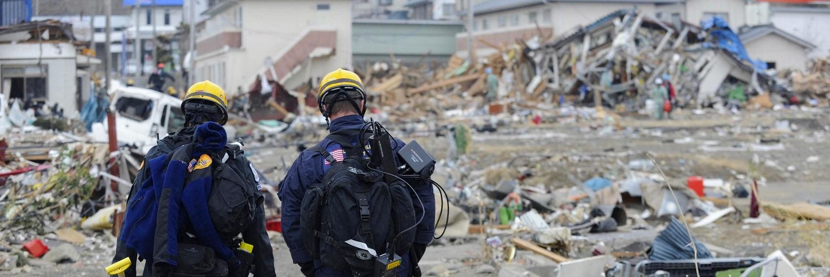
![]()

![]()

![]()
![]()

- #3 is the runaway winner here - the presence of emergency relief workers gets across the concept of "safety" much better than the other banners, and the emotional yet resolute posture of their bodies as they look over the scene of devastation really says it all. For second place I'm torn between #s 1 and 4 - the tsunami is easily the most dramatic scene of any of these banners, and the presence of people in the image really drives home the danger, yet the image quality of the latter is far superior. If pressed, I'd put #1 at second and #4 at third. Last-place #2 probably comes closest to what an average person would experience during an earthquake, but it's a bit of an ambiguous image - it could just as easily be mistaken for a generic messy room. As well, similar to #1, it's a poor-quality image. -- AndreCarrotflower (talk) 19:15, 18 July 2016 (UTC)
- 3, 4, 1, 2. ϒpsilon (talk) 19:30, 18 July 2016 (UTC)
- Great set of banners! #3 is clear winned for me, too, with #4 second. With a large gap, third place would be #2 (a burglar in a workshop? ;)). I'd have a problem with people being identifiable in #1. Danapit (talk) 08:41, 19 July 2016 (UTC)
- I don't mind saying I find this a painful set of banners to look at. That said, I agree with everyone that the concept of safety in an earthquake is best illustrated by #3. After that, I would choose #4, though based on the construction of the buildings (is that Port-au-Prince?), a clear lack of safety seems to be indicated. #2 shows earthquake damage in an apartment but seems a little weak by comparison in illustrating the overall topic. #1 is the most poignant picture to me, but it really indicates doom, rather than safety to me. I mean, what is that white man with his back to the camera doing looking at the water coming his way, and why is that other guy walking his bike laterally instead of riding it swiftly the hell out of there? Some people just look too relaxed in that picture, and I just can't support using that image. I can only hope that whoever took that photo was using a telephoto lens a safe distance away from the tsunami waves. Ikan Kekek (talk) 09:04, 19 July 2016 (UTC)
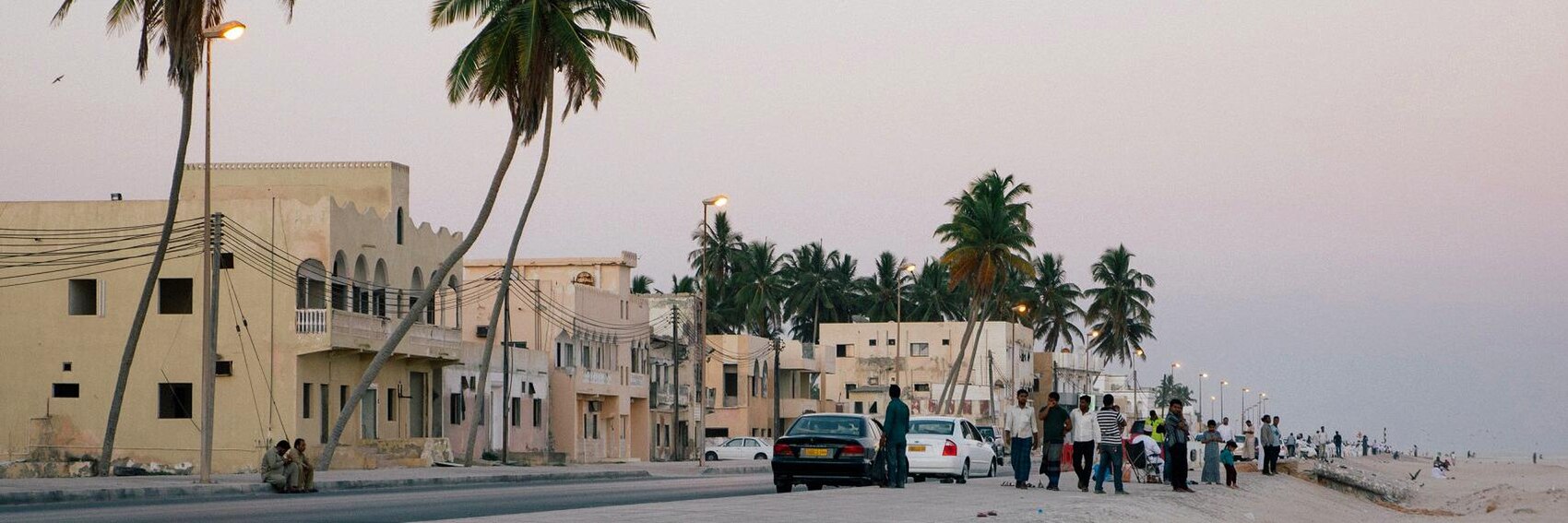
Another case of making the best of a less-than-ideal selection of banners. There were plenty of images of Salalah available on Commons and Flickr, but the vast majority of them were waterfront scenes. Of course, thematic diversity - in other words, representing as many different sides of the destination as possible, following the content of the article - is a characteristic I try very hard to include in my banner selections, which is why I'm not super happy with the fact that the banner selection this time around includes three options that depict much the same thing. I'm glad that I was able to find at least one image that was different. -- AndreCarrotflower (talk) 18:16, 9 July 2016 (UTC)
![]()

![]()

![]()
![]()
- It's a photo finish, but #4 is my first-place choice - I love that symmetry - followed by #2, which is an undeniably majestic image that's a bit too anonymous and somewhat reminiscent of the banner we ran for the nearby Musandam Peninsula as December 2013's OtBP. #3 is a very close third that might have been an easy first-place finisher if not for the hazy gray sky. #1 brings up the rear as a lovely beachfront image that suffers from not looking terribly Arabian. -- AndreCarrotflower (talk) 18:16, 9 July 2016 (UTC)
- My favorite is #3 — typical street scenes often instantly give a feel for the destination, after this the stylish and very Middle Eastern #4, on the third place the beach sunset #1 which sadly is a little blurry, and on the last place #2, which indeed is majestic but hasn't much "historic capital" in it. ϒpsilon (talk) 20:12, 9 July 2016 (UTC)
- Thanks, Andrew. I agree on #4 as 1st choice. I also agree on #2 as my 2nd choice, but I don't see a reason to think about what banner was used for an article in 2013; who else is going to think about that when looking at this? I'm pretty undecided between #1 and #3 for third place. #3 is a slightly more interesting scene, perhaps (I'm not even sure about that), but the light is dull. #1, with its rainy-looking overcast, depicts the khareef, but the street lights look like open flames in that banner. Ikan Kekek (talk) 21:12, 9 July 2016 (UTC)
- I would actually go with #2 to emphasize that Salalah is not just another chaotic arabic city, but a major resort with natural beauty as well, despite not being perhaps as affluent as Dubai or as full of meticulously detailed historic monuments as some other cities of the region. PrinceGloria (talk) 04:53, 10 August 2016 (UTC)
New banners. Vote! -- AndreCarrotflower (talk) 14:33, 29 June 2016 (UTC)
![]()

![]()
![]()

![]()

![]()
- Not a bad selection for a rush job. #s 3 and 4 are in a tight race for first, but I'm going to give the edge to #4 - I love the elegant sweeping curve in the line of buildings along the street, and I don't like the way the textbox intrudes into the top of the aerial streetscape in #3. The weird lighting scheme in #2 knocks it down to the bottom of the rank, but honestly the spread between first and last place was pretty narrow - I'd be satisfied with any of these on the Main Page. -- AndreCarrotflower (talk) 14:33, 29 June 2016 (UTC)
- #3, from one who doesn't pay much attention to the textbox as it's transparent (but again, that's my personal opinion), then #1 and right behind it #4, and far behind #2 (I too find its lighting scheme weird, almost surreal). ϒpsilon (talk) 15:24, 29 June 2016 (UTC)
- This is a city I haven't been to. That said, I'm going with the really striking #2 as my first choice. #3, my second choice, perfectly illustrates the "orderly blocks of well-preserved stone buildings" of the blurb. My third choice is #1, which I might have chosen higher if the building on the left didn't have its spire chopped off. Finally, we have #4, which to me is a less interesting scene than those shown in all the other banners but like #2, perfectly illustrates the stone buildings and like all the others is quite fine as a banner. Ikan Kekek (talk) 21:06, 9 July 2016 (UTC)
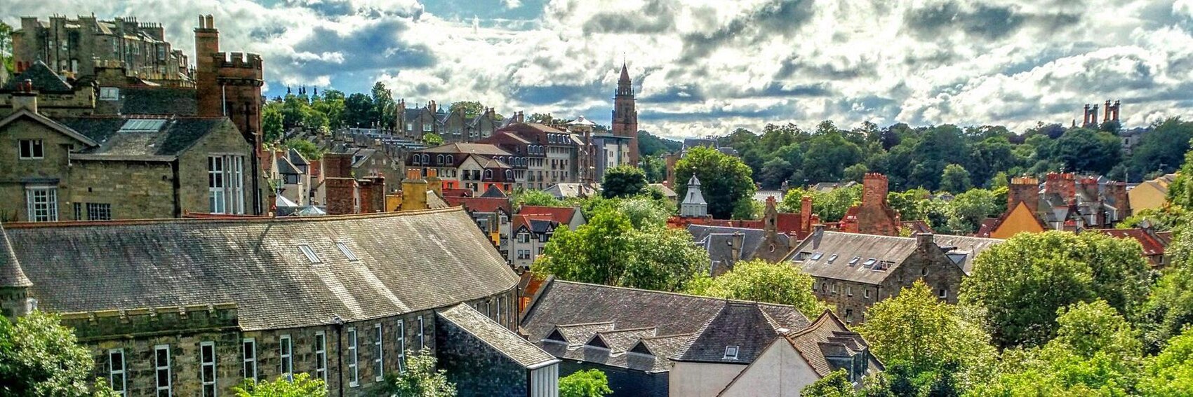
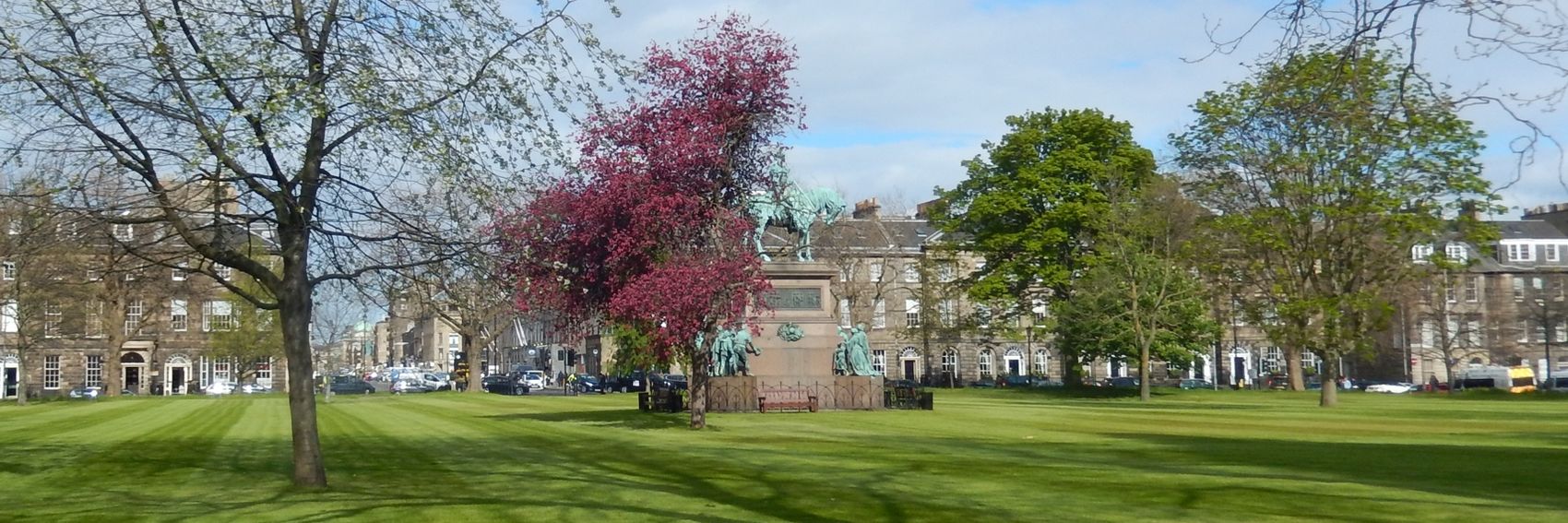
- I have added one of my own, showing Charlotte Square Gardens and numbered the pictures to make things clearer. I uploaded a second one File:NewTownEdinburghBannerMorayPlace.JPG
 , but this is probably too similar to #4 (but taken on a sunnier day). This is my first attempt at this sort of banner and it made me realise what a lot of work Andre puts into creating them.
- Of the earlier set, my first choice would be #4, followed by 1. I like the others but I think that #3 looks too similar to the banner on the article. #2 is a really nice picture, but it of the Dean Village - we include it in our New Town district, but it is much older than the New Town. I also see that the blurb has changed somewhat from the original suggestion - I think that we should mention that it is 250 years since the competition was held to design the New Town in 1766. AlasdairW (talk) 23:33, 9 July 2016 (UTC)
- I would place your #5 in fourth place behind #1. Because the main draw of the New Town is architecture and urban planning, it seems important that the banner display the orderly street grid (#3) and/or the typical type of architecture (#4) that one would see there. I prefer #1 because it shows two of the attractions listed in the See section. #6, to me, is redundant to #4.
- Regarding the textbox, I would stop short of saying that the date of the competition is an extraneous historical factoid, but the fact remains that the object of the blurb is to fit as much information as possible into the smallest amount of text possible, and if we were to include it, it would necessarily come at the expense of a great deal of the other contents of what, I think, is a well-rounded blurb. This is especially true because New Town Edinburgh is not a "timely event" feature - there are no festivals or official commemorations of the 250th anniversary that would be of interest to visitors (or are there? If there are, that might change things). It's certainly something that ought to be included in the "Understand" section, though, if it's not already.
- On the textbox, in the fifth banner I changed "in 18th-century period style" to "as planned in 1766", which I think includes the date without greatly changing the blurb, and also reflects that most New Town buildings were actually built in the 19th century. I think that any official commemorations are small scale - lectures etc. AlasdairW (talk) 14:12, 10 July 2016 (UTC)
- AlasdairW, thanks for the new banner. It would be my 3rd choice now, ahead of #1. Ikan Kekek (talk) 02:04, 10 July 2016 (UTC)
- Edinburgh is a great experience, and I remember it well as in #1, #3 and #4. I like 2 very much as it give more of a sense of the walking experience when I was there. All that aside, for a banner... #4 and #1 for me view for first place, with 3 a very close second (that bank up of double deckers brings back memories). Good selection of photos to choose from JarrahTree (talk) 09:17, 10 July 2016 (UTC)
- #2 please - all others present Edinburgh as a dreary, unwelcoming place. They may portrait it realistically, but we're a travel guide, not a documentary. PrinceGloria (talk) 10:14, 30 July 2016 (UTC)
More banners. There were plenty of images of CPH available on Commons and among the copyleft-compatible selection on Flickr, but very few of those were remarkable or identifiable as anything other than generic airport scenes. Therefore, I had to widen my net a little bit, with the result that most of these images call to mind the city of Copenhagen and/or the nation of Denmark firstly and air travel a distant second. Let's hear your votes on these images. -- AndreCarrotflower (talk) 19:59, 16 June 2016 (UTC)
![]()

![]()

![]()

![]()

- I wish I could say that #1 was my top choice as the only banner that represents both Denmark (the statue is of the Little Mermaid) and an airport in an effective and well-balanced way, but frankly the image is boring to me. Much more interesting are #3, my first place pick, and #4, which places a close second - both of which at least feature architectural elements in the background that are somewhat suggestive of an airport terminal. #1 is in third, while #2 places last. -- AndreCarrotflower (talk) 19:59, 16 June 2016 (UTC)
- My choice is #1 then #3. Unfortunately airports are often the same everywhere, but I like that #1 is clearly an airport. AlasdairW (talk) 21:56, 16 June 2016 (UTC)
- My first choice is #1. I don't find it boring but like having part of a nice sculpture in the picture, along with typical airport signage. I've gotta go with the Legos in #3 2nd. I'd choose #2 as my 3rd choice, as it's a nice composition with obvious signage. #4 is pretty but its focus is a bit diffuse, so it's my 4th choice but still not a bad banner at all. Ikan Kekek (talk) 23:14, 16 June 2016 (UTC)
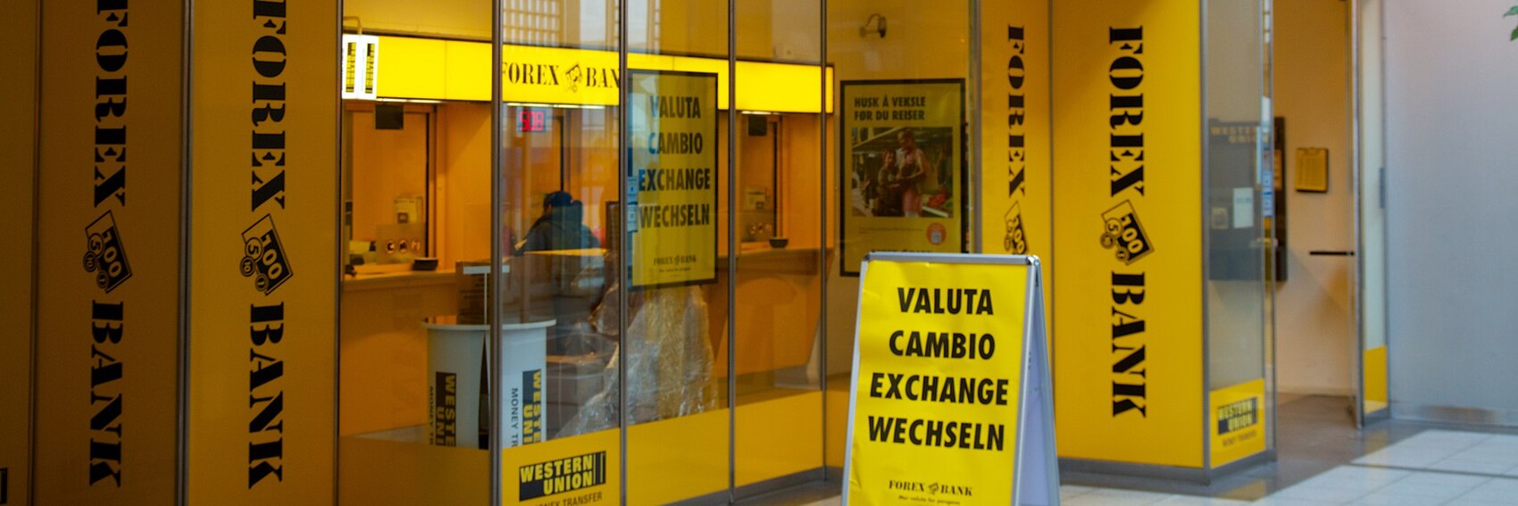
- One more vote for the little mermaid #1 from me. #2 comes second, København's sign in the morning is certainly a familiar sight. Then the interesting lamps #4 on the third place and the Legos #3 come last (Lego makes me think of Legoland in Billund on the other side of Denmark). ϒpsilon (talk) 04:56, 17 June 2016 (UTC)
- My choice is #3 then #1. Yes the Lego can be mistaken for another place, but still remains the most interesting image for me. I also think it is obviously a sculpture and not real Lego blocks. #2 and #4 are too boring to merit much interest ... Andrewssi2 (talk) 06:04, 17 June 2016 (UTC)
- I completely agree with Andre's choice here: #3, #4, #1 and #2. Lego = Denmark in my mind, so I am perfectly fine with that, because Copenhage airport is in way a "gate" to Denmark. Nice colors and composition and it is a pleasantly unusual banner for an airport, too. Danapit (talk) 09:29, 19 July 2016 (UTC)
- OMG no, #1 is infinitely superior. I don't know if you gusy connect via and/or arrive at CPH often, but I do, and #1 is CPH airport 120% and one of the best and most ingenious banners we've had, and Lego is barely traceable at CPH. There may be a Lego store or Lego ad, but it's not Billund. God, please let #1 stay it's brilliant. I feel like falling on the floor and crying that it should stay, it's so good and the Lego banner so inappropriate. PrinceGloria (talk) 06:01, 20 July 2016 (UTC)
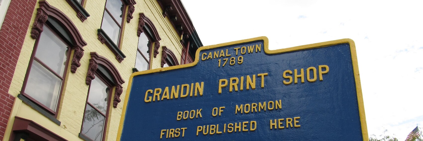
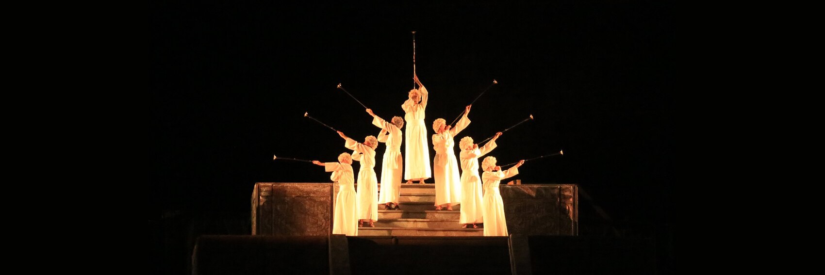
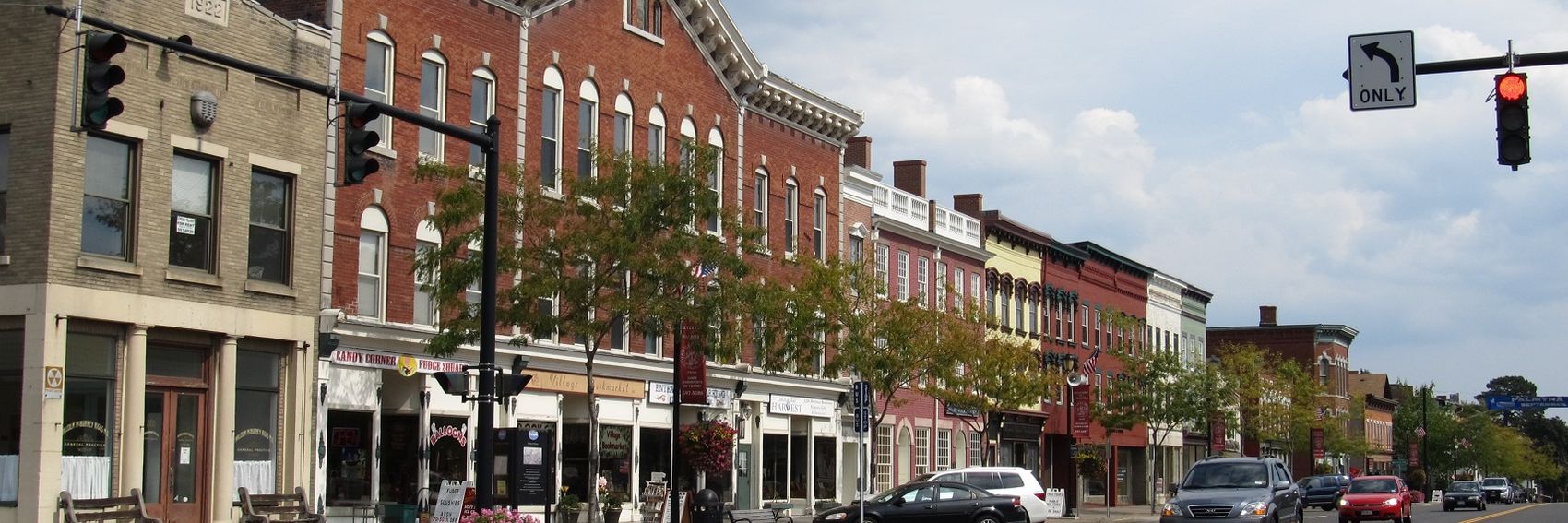
More banners for you all to choose from. I'd like to take this opportunity to ping Powers: as the principal author of this article and a resident of the general (if not exactly local) area, he is particularly well equipped to provide feedback regarding which of these banners would suit the feature best. -- AndreCarrotflower (talk) 23:12, 8 June 2016 (UTC)
![]()
![]()
![]()
![]()
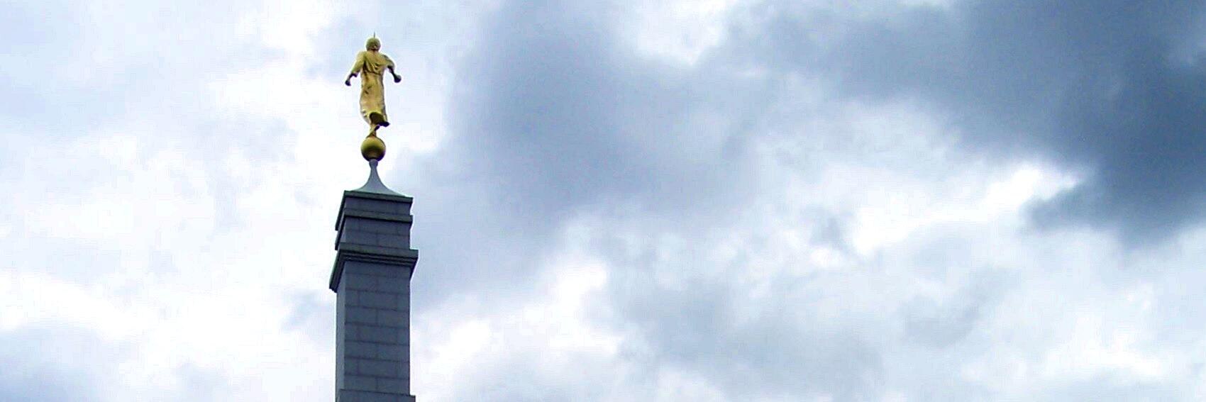
- Tough choice here; they're all pretty good. I'm going to pick #2, the heralds at the Hill Cumorah pageant, over #1 by a hair - the pageant is the reason why we're featuring Palmyra in July to begin with, and it's easily the most striking of the four images, but on the other hand #1 gives us the best of both worlds, LDS history but also a taste of the 19th-century architecture of the canalside downtown. Speaking of which, #3 comes in third place as the token non-Mormon-related banner (the article also lists plenty of attractions and activities that have nothing to do with LDS history). Finally, though it's well proportioned with the textbox blocking out nothing but negative space, I fear that the spire of the Mormon temple in #4 isn't distinctive enough to truly represent the idea of Palmyra as a whole, so it comes in last place for me. -- AndreCarrotflower (talk) 23:12, 8 June 2016 (UTC)
- Not a tough choice for me: #2 is the clear winner, for all the reasons you give. #3 second as a pleasant composition, #1 third, not higher, because of the weird non-corrected perspective. #4 is an obscure reference to this viewer but still somewhat intriguing, and brings up the rear for me. Ikan Kekek (talk) 23:24, 8 June 2016 (UTC)
- Nice banners, as usual. I'll go for #1 first, then #2, then #4 and lastly the somewhat generic #3. ϒpsilon (talk) 04:36, 9 June 2016 (UTC)
- Free images are hard to find, but this is a good selection. Now that the weather's better I may be able to get out to Palmyra and take some pictures, if I can find appropriate subjects. I like the idea of #4, but the backside of (I assume) the Angel Moroni is not particularly appealing as a subject. If it was from the other side and closer, we might have something. #2 is fairly good but I hate to duplicate banners between the front page and the main article. I think #1 is growing on me. I dismissed it at first, but it does cover a lot of ground. There's no good place for the textbox, though. Powers (talk) 20:28, 9 June 2016 (UTC)
Oh, how I wish I had owned a decent camera when I visited the Maritimes in 2009. If they were only at a decent resolution and not so grainy, there are some pictures in my own archives that would have made perfect banners. Still, there are some fairly decent selections here, so have at them. -- AndreCarrotflower (talk) 01:41, 28 May 2016 (UTC)
![]()

![]()
![]()

![]()
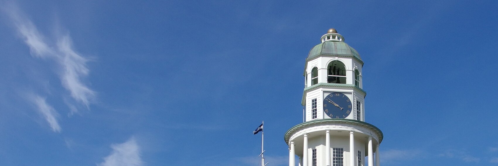
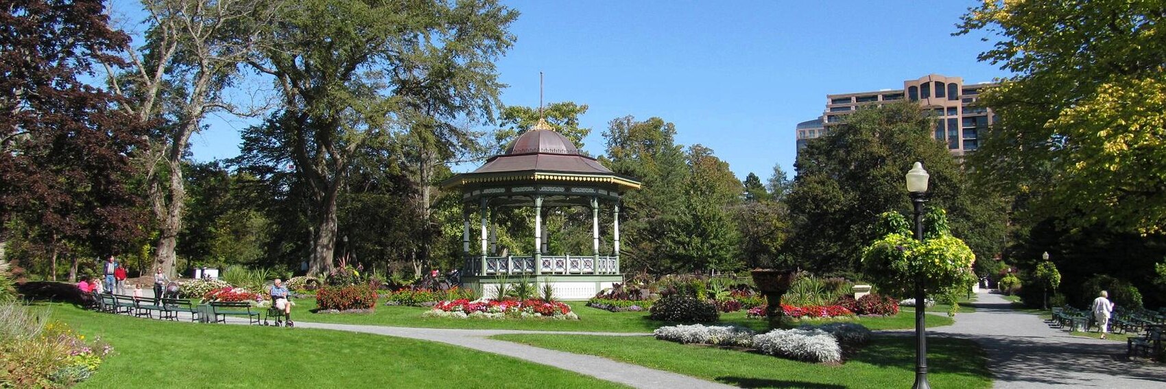
- #4 is far and away the winner here: the Town Clock is not only the unofficial symbol of the city but also emblematic of the military history discussed in the blurb. In second place is #2 - the Public Gardens were easily the highlight of my own visit to Halifax, and though it doesn't really speak to any of the salient points noted in the blurb, it's a much better image than #s 3 and 1, which take third and fourth place, respectively. While #3 is a bit grainier, the lavender-tinted dusk of the sky is far preferable to the somber gray of #1. -- AndreCarrotflower (talk) 01:41, 28 May 2016 (UTC)
- Thanks for the banners! I have yet to visit Halifax, but #2 is my favorite photo, followed pretty closely by #4. I would then go with #1 with less enthusiasm, because though it's a nice scene, it was a gray day, and that doesn't help some of the postwar buildings. I'm least enthusiastic about #3, which feels hazy and features only a few structures that are attractive to me. Ikan Kekek (talk) 09:18, 28 May 2016 (UTC)
- I prefer the clock tower #4, too. Then #3 - nice sunset/sunrise (and I like trips on urban ferries), on third place the nice park #2, and on last place the overcast #1. ϒpsilon (talk) 18:07, 28 May 2016 (UTC)
Sorry for letting the DotM banner thing get away from me again. I'll be the first to admit that conceptual topics like this, as opposed to destinations or itineraries, are my least favorite banners to create. Still, I sucked it up and came up with what I think is a decent selection to choose from. So, have at it, folks. -- AndreCarrotflower (talk) 01:54, 18 May 2016 (UTC)
![]()

![]()
![]()
![]()
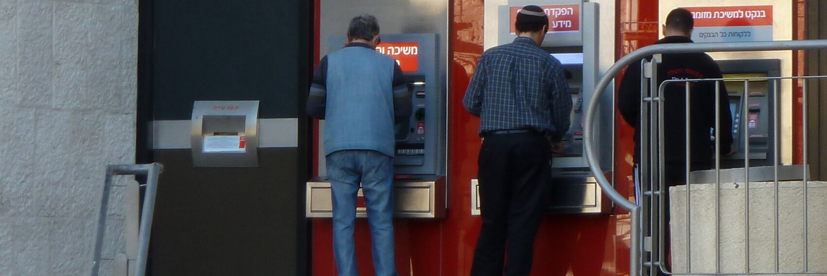
- The crisp, clean, conceptually straightforward, and artistically interesting #1 gets my top vote. It's a close race among the next three, but for second place I'll choose #4, the results of which pleasantly surprised me given the mundane appearance of the source image. The "human touch" of #3 is enough to make it avoid last place, but it's perhaps worth making note of the the personality rights warning on its source image. -- AndreCarrotflower (talk) 01:54, 18 May 2016 (UTC)
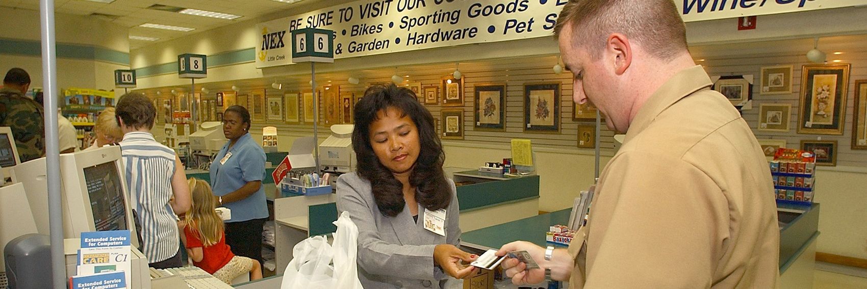
- My favorite is #2, which is a clean photo, clear, and in 4 languages. #4 is a very close second and actually has the best composition of all the banners, in my opinion. Of course it's specifically Israeli, which for most people means a place they'd have to travel to (Israel being a small country). The coins of #1 (an increasingly unimportant type of currency) and blurry wallet in the background are my 3rd-favorite of the 4 photos. I don't really like #3. OK, he's paying with a card at a cash register, but the top of his head is cut off, the woman is blinking, and we're mostly looking at a not very interesting picture of part of a store. Ikan Kekek (talk) 02:23, 18 May 2016 (UTC)
- Forex (#2) for me, please! Then #1, #4 and lastly #3. ϒpsilon (talk) 04:44, 18 May 2016 (UTC)
More banners. Vote! -- AndreCarrotflower (talk) 01:24, 18 April 2016 (UTC)
![]()
![]()

![]()

![]()

- No question here: #3 is the best of the bunch. Placing a distant second is Fenton House, #1, followed closely by the busy Hampstead High Street scene at #2 - this new trick I learned with the Stockholm banners, of playing with the width of the textbox to avoid obstructing the image without worrying about sticking to the three-line rule, is really coming in handy. #4, the view from Parliament Hill, might have been a solid second place finisher if not for the shoddy photo quality; however, instead it comes in last. -- AndreCarrotflower (talk) 01:24, 18 April 2016 (UTC)
- I guess my choices after #3, which is definitely my favorite, will surprise you: #4 and then #2. There's something that looks off to me about the colors in #1, including in the sky, and other photos I'm seeing in a Google image search don't seem to look the same (I haven't been to Fenton House). Ikan Kekek (talk) 02:36, 18 April 2016 (UTC)
- Hmm, I'll go for #1, then #3, #4 and lastly #2. ϒpsilon (talk) 04:12, 18 April 2016 (UTC)
When it comes to choosing subjects for banner photos for Huge Cities that I'm not personally familiar with, I still haven't come up with a very good system. For smaller cities and OtBPs, I usually look over the article and identify the most popular attractions within the destination (perhaps checking out some of the photos in the article itself) and come up with maybe two options that way, then go on Commons or Flickr and fill out the rest with maybe a nice skyline shot or bird's eye view, a street scene, or random stuff that's nice-looking and fits well with the 3:1 horizontal aspect ratio. But for a behemoth of an article like Stockholm that's divided into ten districts each packed with their own tourist highlights, that would be a cumbersome process. So, for these banners I went to Flickr, typed "Stockholm" into the search box, set it to display only CC-compatible photos, and just chose the best of those. The result was a series of options that's extremely heavy on scenes from the Gamla Stan, or Old Town - not much thematic diversity, but the abundance of photos from there bears witness, I guess, to the fact that Gamla Stan seems to be the predominant tourist district in the city.
Narrow thematic range aside, I'm fairly satisfied with the slate of choices this time around. Let's hear your votes.
-- AndreCarrotflower (talk) 14:49, 17 April 2016 (UTC)
![]()

![]()

![]()
![]()

- Tough, tough choice here. For my top choice it's hard to argue against #1, the sweeping panoramic view of Gamla Stan, so I won't bother. But the other three aren't far behind it. Oh, but how I wish I had been able to crop #3 so the top edge of the Swedish flag wasn't cut off at the margin - if I had been able to do that, it might have been able to knock #1 off the top spot. As it is, I place it second. (Notice also how with #3 I broke my own informal rule limiting the blurb to three lines - I figured it was a small price to pay for the textbox not obscuring the tower of City Hall.) #2 is in third place as a street scene of stately buildings in the Old Town. In #4 I also played with the width of the textbox, but it's in last place because the upper-story windows that lay behind the textbox makes it a little more difficult to read the blurb. -- AndreCarrotflower (talk) 14:49, 17 April 2016 (UTC)
- No problem with most of the banners being about gamla stan, it certainly is a very prominent part of Stockholm from a visitor's point of view. Other topics might have been Sergels torg, something from Djurgården or maybe Södermalm. Anyways, #3 is my choice with both the City Hall, ferries, bridges and the five Hötorget skyscrapers (plus the large flag gives the banner some originality, much like the travel photography banner). On the second place #1 (great shot of the old town), third place #2, and lastly #4. ϒpsilon (talk) 15:21, 17 April 2016 (UTC)
- #3,#1,#4 becuase #3 is a recognisable view of the city, and it is nice to have the flag. #1 is also clearly Stockholm. I find the restaurant awnings in #2 giving a slight suggestion of another country so it is last. AlasdairW (talk) 22:04, 17 April 2016 (UTC)
- I like all of them. I haven't been to Stockholm, so keep that in mind. For whatever it's worth, my choices are #1, #4, #3, #2. Ikan Kekek (talk) 22:44, 7 May 2016 (UTC)
In creating the banners for this feature, I at first tried very hard to seek out a contrast between them and the banner we ran for the larger Diving the Cape Peninsula and False Bay article when it was FTT in January 2013. The quite narrow thematic range of these four options shows that I didn't have much success on that front. But then I remembered that the only place the earlier banner was ever shown was on the mock-up of the then yet-to-be-deployed new Main Page that Nick had in his userspace.
Also, please make note of the alternative to the unwieldy original title of the article. It seems fine to me, but if by chance anyone has an opinion on how better to abbreviate, by all means let's hear it, along with your votes.
-- AndreCarrotflower (talk) 19:43, 7 April 2016 (UTC)
![]()
![]()

![]()
![]()

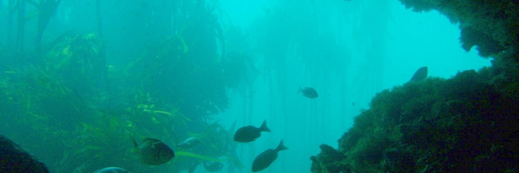
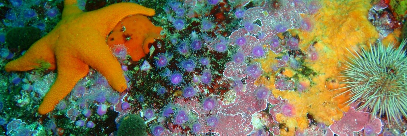
- First of all, despite my attempt to provide at least one banner that's an alternative to the expected undersea views that come with a dive feature, I think I'm going to have to put #2 - the view of the reef from the shore - in dead last place. I really tried, but there's very little in the way of CC-compatible images of Partridge Point other than underwater ones. As for which banner I do like, the top three are all very close to each other in my ranking. I think #4 is my favorite despite its similarity to the January 2013 banner, but the colorful #3 is hot on its heels in second place. The kelp forest in #1 would have made a better banner if there had been a way to crop it such that it included both the ceiling of the undersea cave and the school of fish that are now cut off by the photo's bottom margin.
- So, to recap: #4, #3, #1, and in last place #2.
- I particularly like the colours of Number 3, so would probably vote for that one, though Number 4 is second. Like you Andrew, I'd place the shore one last, so I'd put Number 3 third. --Nick talk 20:37, 7 April 2016 (UTC)
- Nick - I'm sorry, #3 is in first place or third for you? -- AndreCarrotflower (talk) 20:38, 7 April 2016 (UTC)
- Sorry - managed to confuse myself there! (Been away for a while!) To recap, in order of preference: #3,#4,#1,#2. --Nick talk 20:40, 7 April 2016 (UTC)
- Nick - I'm sorry, #3 is in first place or third for you? -- AndreCarrotflower (talk) 20:38, 7 April 2016 (UTC)
- I actually have the same ranking as Nick, #3, #4, #1, #2. ϒpsilon (talk) 17:31, 11 April 2016 (UTC)
- One more time the same :) #3, #4, #1, #2. Danapit (talk) 18:41, 11 April 2016 (UTC)
In choosing from among the few CC-compatible images of Dilijan available, I had to make the best of a bad situation. But I ended up, I think, with a halfway-decent (if not spectacular) set of options for you all to pick from. -- AndreCarrotflower (talk) 16:22, 5 April 2016 (UTC)
![]()
![]()
![]()
![]()
- #4 is the clear winner here, but there's also much to be said for #2, which includes not only the Switzerland-like scenery described in the blurb but also the Soviet 50th Anniversary memorial (why isn't that listed in "See"?) plus some of the rooftops of the town itself. #3 is in third place as the best possible example of the photos of Sharambeyan Street, most of which were too small in dimensions for use as a banner. -- AndreCarrotflower (talk) 16:22, 5 April 2016 (UTC)
- Number 4 looks beautiful, that's my favorite too. Then #1, #2 and lastly #3. ϒpsilon (talk) 16:45, 5 April 2016 (UTC)
- Good job! All these banners are fine and would be quite OK to run, providing this article really is featured. I'd pick in this order: #4, #1, #3, #2. Ikan Kekek (talk) 05:54, 8 April 2016 (UTC)
- Another nice selection. #4, #1, #2 and #3 for me, please. Danapit (talk) 18:47, 11 April 2016 (UTC)
Per Wikivoyage talk:Destination of the month candidates#10 years off the beaten path, let's celebrate 10 years of OtBP in the same way as 10 years of DotM in 2014 and put up the very first OtBP feature, Svalbard on the Main Page for one day (Svalbard was featured in May 2006 in case someone wonders, BTW it was around that time I stumbled upon WV myself for the very first time :)). Here's a selection of banners:
![]()

![]()
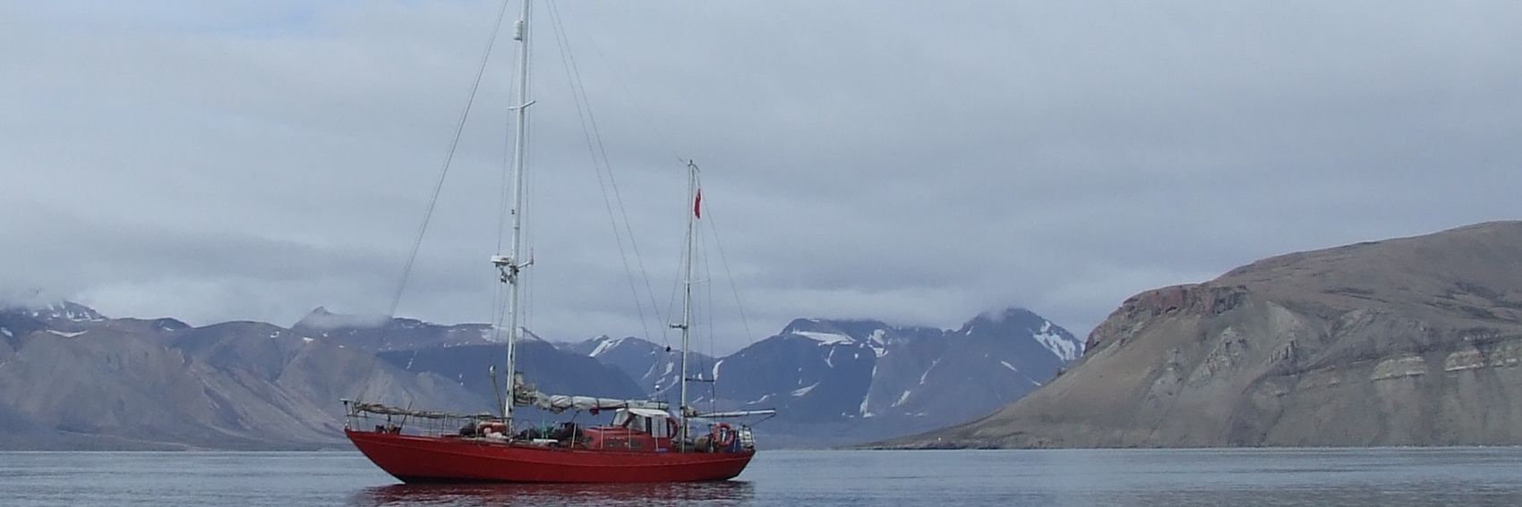
![]()

![]()

- #1, #3, #4, #2. ϒpsilon (talk) 15:58, 14 April 2016 (UTC)
- For me, #4, #2, #1, #3. #4 and #2 are really almost a pick 'em. Ikan Kekek (talk) 20:33, 14 April 2016 (UTC)
- I like #1 most, it's a clear winner for me. The picture has "far north" written on it. I'm a bit undecided about #2 and #3, but I keep them in this order - they are what pops up in my mind when reading/ hearing about Svalbard = fjords (beautiful contrast of the grayness and the colorful boat) and coal mining. #4 is last for me, but not bad, either, I just have a feeling it doesn't "say" much. Danapit (talk) 08:16, 15 April 2016 (UTC)
- I'm pleasantly surprised to see four Svalbard banners up for a vote here - when we did Geneva for the 10th anniversary of DotM, someone just whipped up a quick banner a few days before the first of the month. Thanks for going us one better, Ypsi. As for my votes, I think there's no question that #1 is the best. As Danapit said, it's got "far north" written all over it, not just with the stark landscape but also with the townscape of trailerlike modular buildings sitting on top of the permafrost. #2 is a strong second place finisher, with, I imagine, weather conditions that are more typical of the region. I'm having a hard time deciding what belongs in third place, but I'd give it to #4 by a hair. -- AndreCarrotflower (talk) 23:29, 15 April 2016 (UTC)
Things are going to be extraordinarily busy in my offwiki life for the next little while, so getting back up to my goal of three months' worth of banners created in advance will have to wait until next month. Still, as a stopgap, here's a quartet of banner selections for May 2016's DotM. -- AndreCarrotflower (talk) 01:00, 24 March 2016 (UTC)
![]()

![]()
![]()

![]()

- This was a case where I pretty much knew from the outset which banner was my top choice, and struggled to find three other images that might stand an outside chance of knocking it off its pedestal, depending on how I cropped them, positioned their textboxes, and so forth. The challenge forced me to really think outside the box with the result of probably the most creative, thematically wide-ranging set of banners I've created in recent memory, but I'm still going to have to go with the iconic shot, #3, as my first choice. It's a lot tougher for me to choose among the others, but here goes: #1 is in second place, a somewhat iconic view in its own right (looking up at the Space Needle with part of Frank Gehry's unusual Experience Music Project building at left); the peaceful-looking #4 in third place, and #2 in last place only because the large neon signs distract from the text in the textbox. -- AndreCarrotflower (talk) 01:00, 24 March 2016 (UTC)
- My first choice would be #1. #3 is the nice iconic shot, but I also find it a bit smoggy, while there's something about the composition and color of #1 that I find really vibrant and appealing, while still incorporating something instantly recognizably as Seattle. PerryPlanet (talk) 01:21, 24 March 2016 (UTC)
- Beautiful banners! I think I'm going for #3 too, then #2 (if Signs sometimes would be a chosen as FTT...), then #1 and lastly #4. ϒpsilon (talk) 05:16, 24 March 2016 (UTC)
- To me, #3 is a runaway winner! After that, #4 and #2. Question about #1: Is the view warped by funny perspective? That Gehry structure didn't exist when I visited Seattle, so the photo just looks strange to me, but I don't know how much of the strangeness is lifelike. Ikan Kekek (talk) 07:36, 24 March 2016 (UTC)
- Ikan - Well, it's Frank Gehry after all, so warpedness is par for the course. Here is a view of the same buildings from a different perfective, so you can judge for yourself. -- AndreCarrotflower (talk) 19:29, 24 March 2016 (UTC)
- I see it's even weirder than most Gehry buildings. Ikan Kekek (talk) 21:56, 24 March 2016 (UTC)
- Ikan - Well, it's Frank Gehry after all, so warpedness is par for the course. Here is a view of the same buildings from a different perfective, so you can judge for yourself. -- AndreCarrotflower (talk) 19:29, 24 March 2016 (UTC)
- I love Seattle, and these are all great pictures! I'd actually go for #2 since Pike Street Market is one of the defining places that people discover in the city. #3 is a great shot, but a bit too much like a standard postcard. Andrewssi2 (talk) 08:35, 24 March 2016 (UTC)
- I like #1 the best. Beautiful colors and an unusual composition. Second, #3: a very decent banner! Followed by a large gap and #4 and 2. Good job! Danapit (talk) 18:44, 11 April 2016 (UTC)
I suggest these two options. I'd prefer Hiroshima, but Chernobyl isn't bad either. Any more options? Danapit (talk) 13:19, 17 March 2016 (UTC)
![]()
![]()

![]()
![]()
- Danapit - I was actually working on the banners as you posted this. I'll have a few more options to add shortly. -- AndreCarrotflower (talk) 14:53, 17 March 2016 (UTC)
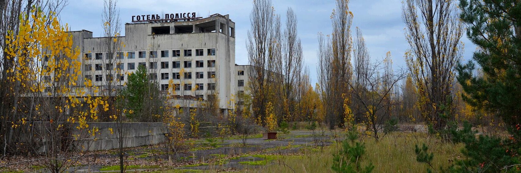
- I think I'm voting for Chernobyl #2 and Hiroshima #1 as an extremely close second, #4 Pripyat's deserted hotel (?) on the third place and #3 last. ϒpsilon (talk) 14:58, 17 March 2016 (UTC)
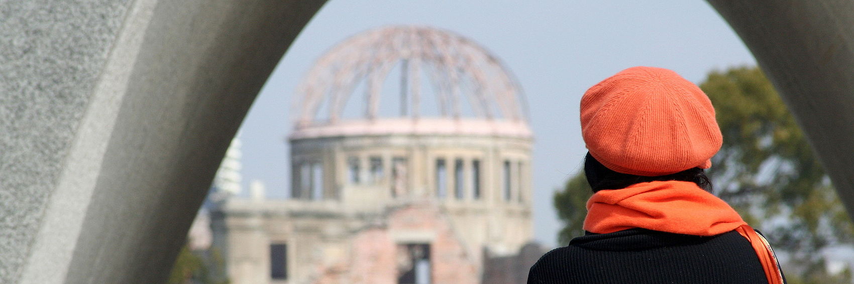
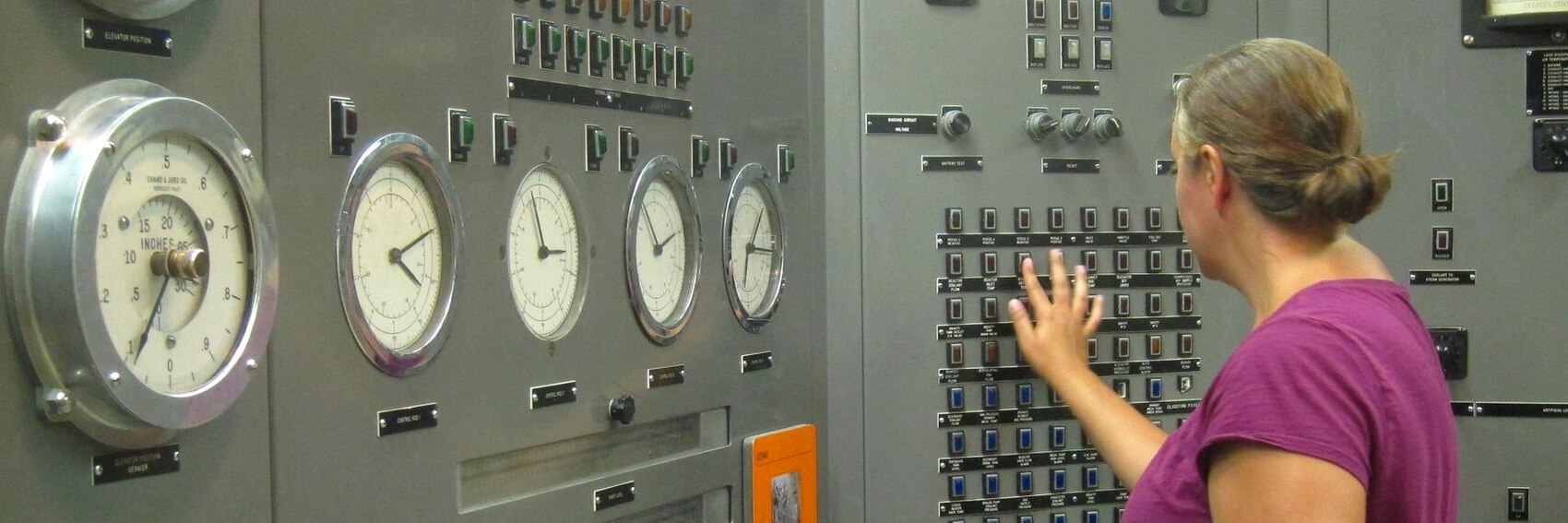
- Added two new banners, as promised. This was a hard topic to conceive of banners for, especially given the lack of much pertinent material on Commons and Flickr, so I'm glad Danapit took half the work off my hands. My votes break down as follows: #4, Pripyat, in first; #1 in second (I had a banner featuring the Hiroshima atomic bomb memorial all ready to go, but Danapit's ended up better than mine), then #3 in third (an interior shot of the museum at the EBR-I site in Idaho that does a fine job of getting across the point of some sort of science-related tourism, with the bonus that the "tourist" in the image is turned away from the camera and thus does not violate our preference against shots of identifiable people, but there's nothing in the image that really screams "nuclear" specifically), and lastly #2, another shot of Pripyat (I figured it was okay to have two, since that's by far the most famous destination for this type of tourism in the world) that doesn't do nearly as good a job of getting across the fullness of what the place is all about. -- AndreCarrotflower (talk) 15:16, 17 March 2016 (UTC)
- I find #4 the best photo in terms of composition, and it's certainly poignant, so I pick it for my first choice. I find it hard to pick between #2 and #3 for second place, but I will go with #3 for second place and #2 for third place, partly because the crane might confuse the issue of what people are looking at (Is it a construction site? Was the crane just left there because it was too radioactive to cart away?). I put the immediately recognizable picture of Hiroshima last, purely because of compositional reasons - namely, the degree of blurring. Ikan Kekek (talk) 21:04, 17 March 2016 (UTC)
- Thanks Andre for adding more options. I keep my first vote with #1. The bluring isn't a bug, it's a feature :) Next, #3: a kind of shot I was looking for but Didn't find. Pripyat #4 next, it's imo a better one to illustrate Chernobyl than than #2. Also, with some building activities related to the sarcophagus I'm not sure if this shot from 2013 is actually up-to-date. Greetings from a voyage.Danapit (talk) 11:54, 21 March 2016 (UTC)
Because of the recent volcanic eruption and subsequent mudslides that have caused us to rethink whether we ought to feature Mount Rinjani this spring as originally planned, I had been reticent to go about creating these banners, hoping some bit of information would come to light that would clarify what our plans ought to be for April. No such luck. My best guess now is that no news is good news - according to the official website, the national park is still on schedule to reopen to visitors at the end of next month, and all available information indicates that the threat of further volcanic activity is over for the time being. The good news is that the images I found were very good indeed;, and I'm really pleased with this set of banners. Let's hear your thoughts on them. -- AndreCarrotflower (talk) 04:49, 17 February 2016 (UTC)
![]()
![]()
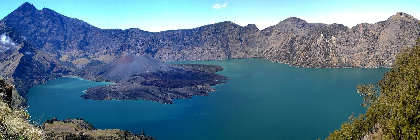
![]()

![]()

- #3 is the clear winner for me, with the hiking party at the summit looking down at the layer of cloud cover. Not only is it the most thematically appropriate of the four banners, but the image is crisp and brightly colored, and the textbox is perfectly situated away from the important content of the image. #2 and #4 are in a close race for second place; I think #4 is a more pleasant image, but I'm going to choose #2 above it anyway because it's a more typical scene for those visiting the mountain itself, rather than seeing it from a distance. Last-place #1 is conceptually interesting, with patchy clouds at more or less eye level - but it's not a particularly good image from an aesthetic point of view; kind of murky-looking. -- AndreCarrotflower (talk) 04:49, 17 February 2016 (UTC)
- My order is the same as yours: 3, 2, 4, 1. However, I also find #2 a more pleasant image than #4. Ikan Kekek (talk) 04:58, 17 February 2016 (UTC)
- I'll also go for #3, but to me #2 is very close behind. On the third place #1 and on the last place #4. ϒpsilon (talk) 05:14, 17 February 2016 (UTC)
The best set of banners in a while, if I do say so myself. What a photogenic place.
A brief note about the wording of the textbox: as you can see, the destination name displays as simply "Cartagena", without the parenthetical disambiguator. I think it's fine to keep the disambiguator in the title of the article itself, but IMO a higher bar needs to be cleared before we encumber anything placed prominently on the Main Page with any awkward wording. The "other" Cartagena, in Spain, is a tourist site of some importance, but the one in Colombia has something like three times the population, and nearly five times as many hits with the Google test (that is, ~700K for "cartagena spain" and "cartagena españa" combined, vs. ~3.3M for "cartagena colombia".) And anyway, the blurb clearly mentions that the Cartagena at issue here is the Colombian one. If anyone disagrees with that assessment, let's hear your suggestion for an alternative treatment - and of course, let's also hear which of these banners you all like best.
-- AndreCarrotflower (talk) 04:41, 30 January 2016 (UTC)
![]()

![]()

![]()

![]()
- A really, really tough choice here. It's awfully hard for me to resist choosing #1 on purely aesthetic grounds (it reminds me a lot of the Manhattan banner from back in 2014), but #3 gets the edge for me as not only a beautiful image but also a more accurate representation of the place from the perspective of the typical experience of a visitor - other than the beaches, the old walled city is the nucleus of the tourist's Cartagena. Speaking of the beaches, #4 is my third place choice - again, a very inviting image, but it looks like it could be anywhere tropical (in fact, if that image were presented to me without any context or background information, Colombia is far from the first place I'd guess it was taken). Last place #2 includes all the basic attractions that draw visitors to Cartagena - the Caribbean shore, the old city walls and fortress, the modern city - but aesthetically it's well behind the others, with a gray hazy sky. -- AndreCarrotflower (talk) 04:41, 30 January 2016 (UTC)
- Overused word, but truly, these are stunning! I feel like I've gotta go for #1 as my top choice, because it's a great panorama with water. I vote for #3 as a second choice. #2, with the fort but a gray sky, comes in third for me, and #4, which is an excellent beach photo but doesn't strike me as particularly distinctive, is fourth, because the other three all show a sense of place. Ikan Kekek (talk) 05:21, 30 January 2016 (UTC)
- Old Spanish architecture is always very beautiful so #3 is my first choice. Then #1 for the same reasons you like it, on the third place #2 with both the fort and a skyscraper skyline (would be my first choice if the sky was less hazy) and lastly #4 as it could be from anywhere in the tropics and makes me think of some small, laid-back OtBP beach destination. ϒpsilon (talk) 08:00, 30 January 2016 (UTC)
- For me, #1 is the only one that makes me want to know more about the place. #3 holds no appeal; it just looks like most any other Spanish-influenced urban residential neighborhood. Powers (talk) 15:48, 30 January 2016 (UTC)
- I like the first image. But the third one is also good. Hobbitschuster (talk) 21:28, 31 January 2016 (UTC)
- I take it no one has an issue with the textbox being labeled only "Cartagena", then, with no disambiguation? -- AndreCarrotflower (talk) 00:59, 4 February 2016 (UTC)
It was a lot less of a hassle than I imagined to find four usable source images for Ruta del Tránsito's banner. Let's hear your opinions on which ones should grace the Main Page - especially Hobbitschuster, who is the main author of the article.
-- AndreCarrotflower (talk) 00:02, 30 January 2016 (UTC)
![]()
![]()

![]()
![]()

- The bright blue sky and the perfect fit of the textbox away from the subject of the image make #4 my first choice, but #1 is hot on its heels as both a beautiful image (almost like an Impressionist painting) and a more accurate illustration of the day-to-day landscape along the route - plus the depiction of the river and the sense of travelling along it drive home the fact that this is an itinerary article. #3, the street scene in Moyogalpa, is in third place. #2, a depiction of the town of El Castillo as seen through a window in the Fortress of the Immaculate Conception, is an interesting concept that might not have placed last if I could find a better way to crop it into the 3:1 aspect ratio. -- AndreCarrotflower (talk) 00:02, 30 January 2016 (UTC)
- I like the top one because it features the river, but on the other hand you can never have enough pictures of Concepción Volcano... Hobbitschuster (talk) 00:09, 30 January 2016 (UTC)
- I like #4 the best because I find the picture of the volcanoes(? not sure if they're both volcanoes) magnificent. After that, it's very close between #3 and #1. I give the nod for 2nd place just slightly to #3, which shows a road through a town with a view of a mountain and a picture of Nicaragua on one of the signs. #1, my third choice by a hair, is a peaceful scene of a river and forest, and maybe I should rate it higher because it probably looks a lot like it did in the 19th century, when this was a more heavily traveled route. Finally, #2 is an excellent idea, but the blur on the left and right sides bugs me. Ikan Kekek (talk) 00:21, 30 January 2016 (UTC)
- Yes, they are both volcanoes. However, the lower one, Maderas has not been active in historic times. Hobbitschuster (talk) 00:55, 30 January 2016 (UTC)
- For me it is between the 2nd and 3rd. I personally like the impact of #2 the best, however not sure if it works as a banner for reasons already stated. I'd therefore go for #3 with the volcano overlooking the town. Andrewssi2 (talk) 00:28, 30 January 2016 (UTC)
- So I did some file-uploading to commons (unfortunately I cannot find the picture of El Castillo that I am sure lies on some memory stick somewhere and the one we had got deleted due to copyright concerns), maybe one or two of them might serve one of our Nicaragua articles or even this particular one... Hobbitschuster (talk) 01:35, 30 January 2016 (UTC)
- All banners look nice, as always. The volcanoes #4 is my favorite, then #1 which really tells the reader that they're in for an exciting river trip through the jungle, on the third place the colorful #3, and last comes #2 even if it's an interesting and original view (from a fort or rock formation perhaps?). ϒpsilon (talk) 07:43, 30 January 2016 (UTC)
- The image number two is shot through a "window" of El Castillo down to the town. Hobbitschuster (talk) 17:19, 31 January 2016 (UTC)
- A great selection! I find #4 best suited (Andre, maybe the pic can be cropped in a way that the coastline is horizontal), followed by the river #1 and the street scene #3. All of them would be a nice banner in my opinion and the blurb is generic enough to match with any of them. --Danapit (talk) 08:07, 1 February 2016 (UTC)
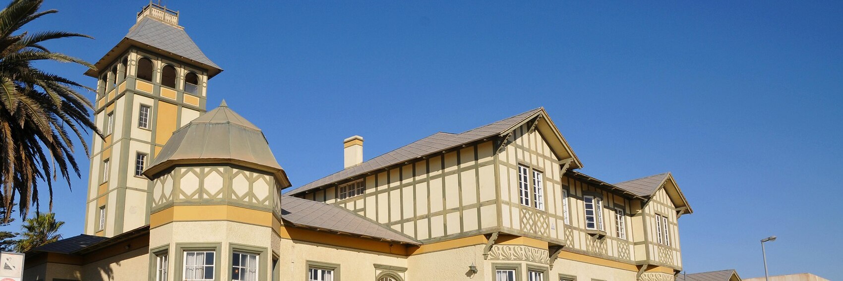
Finally I've shaken all the rust off and have come up with four banners of a quality that I really feel is up to standard. Thank you to Flickr user "Tscherno", wherever he may be, from whose feed I sourced three of these four banners. -- AndreCarrotflower (talk) 17:24, 13 January 2016 (UTC)
![]()
![]()
![]()
![]()
- Tough choice here. Swakopmund's German flavor is mentioned copiously in the blurb, which gives #s 1 and 4 an instant leg up on the competititon. But then again, the wave-beaten beach of #2, with the dunes of the Namib Desert in the background at right, are also a fitting illustration of Swakopmund as described in the article. I'm going to put #1 as my first choice (the palm tree at left seems to be saying "this may look like Germany at first glance, but think again"), then #2, and #4 as a close third (I especially like the sign advertising "ostrich leather shoes" in #4). #3 is last only because the competition is so strong: Swakopmund Jetty is one of the most popular sights in town if the article is to be believed, and if consensus favors #3 I would not be disappointed in the least. -- AndreCarrotflower (talk) 17:24, 13 January 2016 (UTC)
- I second that opinion, Andre, my choice of order is the same as yours. Ibaman (talk) 17:35, 13 January 2016 (UTC)
- I like #1 most — really cool with the desert-colored Fachwerkhaus under a palm, with the jetty (#3) taking the second place, the ads and the stars (#4) on the third place and lastly #2 because the strong competition (and the somewhat bulky white building). ϒpsilon (talk) 18:11, 13 January 2016 (UTC)
- Great selection, Andre! My ranking is: #2, #1 (both simple and clean, but #1 is more visually appealing to me), #3 (slight collision of the picture with the blurb) and #4 (a little too "crowded"). Thanks. Danapit (talk) 18:33, 13 January 2016 (UTC)
- I find #2 the best picture of the bunch, so I feel impelled to pick it as my top choice, despite its lack of Germanness. I'm very torn about second place. Arguably, #3 is the next best picture, but I think I've gotta go with #1. After that, I guess #4, though I wish the sign on the left weren't cut off, and finally #3, which is a good composition but not so interesting and shows very little obvious Germanness. Ikan Kekek (talk) 22:08, 13 January 2016 (UTC)
Sometimes it's equally as hard to deal with a massive glut of possible banners, such as in a situation like Kyoto, as it is to deal with slim pickin's in a particularly small or out-of-the-way OtBP. Going into this banner creation process, I knew very little about Kyoto - but in reading the article a little bit to get ideas for possible banner photo subjects, and then in reviewing the available options on Commons and Flickr, I got the sense that this was a city of many diverse facets: modern and traditional; urban milieux, areas with a small-town feel, even wilderness. I tried to represent as many of them as possible in the four banners I came up with - plus the cherry blossoms that are the reason why we're featuring this destination for March (thanks to our own ChubbyWimbus for the picture from which Banner #1 is sourced). Let's hear your votes! -- AndreCarrotflower (talk) 02:15, 11 January 2016 (UTC)
![]()

![]()

![]()
![]()

![]()

![]()

![]()
![]()

- I've got to go with the simple, elegant, and seasonally appropriate #1 on this, though #4 is a close second - it's a more serene and uncrowded scene than you'd expect from a city of a million and a half, and I kept remembering what Ikan had said about the lack of any real urban imagery in the Hilo banners, but there's just no denying the visual appeal there. And, judging by the endless variations of this same photo that I saw on Commons and Flickr, the view over the lake to Kinkaku-ji is one of the classic scenes of Kyoto. #2 is in third place as a lively street scene in the Gion district, a place which sees more than its share of tourists, and #3, while in last place, is an interesting juxtaposition of greenery, the city skyline, and mountains that suffers from a rather anonymous look (despite Kyoto Tower poking its head up in the middle). -- AndreCarrotflower (talk) 02:15, 11 January 2016 (UTC)
- Yes, Kyoto is a famous city of temples, though it's a pretty large city, way bigger than little Hilo. I think I've gotta go with #4 for my first choice because it's so beautiful and serene, and beauty and serenity in temples is one of the draws (probably the major draw) of Kyoto. I'm torn between #1 and #2 as my second choice, but I think I'll go with #2, which shows both the tradition and crowding of Kyoto, the big city of history. #1 is a close 3rd, and then #3, showing the position of the city with the mountains in the background, is not devoid of interest, but more or less as you said, it's not nearly as interesting a scene as any of the beautiful temples or traditional streets of the old town. Ikan Kekek (talk) 02:22, 11 January 2016 (UTC)
- We're going to feature in the Cherry blossom season, therefore #1 and #2 would fit best (well, I hope that the pinkish decoration in the street is one related to cherry blossom time). I prefer #2 from these two, I don't much like the dark shadows under the pagoda roof. As second option I would prefer
#3#4, which is the most visually appealing from all banners, however the picture must have been taken sometime in the autumn. After that#2#3 (not much of a wow-effect, and doesn't remind me of Kyoto I know, but otherwise pretty). Last, #1. Danapit (talk) 08:42, 11 January 2016 (UTC)
- Danapit, you're referring to #2 as two different pictures. Please edit. :-) Ikan Kekek (talk) 08:49, 11 January 2016 (UTC)
- I was completely confused :) Thanks, Ikan Kekek. Danapit (talk) 10:11, 11 January 2016 (UTC)
- The banner should absolutely show that it's the cherry blossom season. Therefore I say: #1, #2, #4 and #3. ϒpsilon (talk) 11:09, 11 January 2016 (UTC)
- I would go for #4 then #2. #4 is the image that it most recognisable as Kyoto. Unfortunately in a quick look I could not find any pictures in commons that had cherry blossom that also immediately "said" Kyoto. #1 is a good image, and I do recognise it as Kyoto, but I had to pause for a moment to remember where it was. AlasdairW (talk) 21:44, 11 January 2016 (UTC)
- Update - with the new submissions, my order is now 6, 7, 4. AlasdairW (talk) 21:41, 12 January 2016 (UTC)
- I really hope this isn't too annoying, but I did some search and perhaps taking somewhat different point of view from Andre. I really feel we need photos of sakura-time Kyoto. #5 and #6 are I believe clearly recognizable as Kyoto (Kodai-ji rock garden and Heian-jingu temple), #7 seem to be Heian-jingu garden. The slightly alternative #8 is a detail of the motive from #6, but I don't think it's too bad that it's not clearly recognizable as Kyoto. It fits with the blurb wonderfully. Please correct me if I'm wrong with locations - I have only visted Kyoto briefly and the authors at Flickr didn't describe the locations. So if any of #5-8 might be useful, I will upload them to WV, at the moment they are stored at commons. (
 #6 (confusingly called File:Kyoto banner cherry blossoms 5.jpg) - the favourite option - is now uploaded locally.)
- My updated vote would be: #6 (pleasing colours, good composition), #8 (I like the blossoms detail as the main motive), #5 (this shows nicely the kind of atmosphere to expect when you go watching cherry blossoms together with masses of others), #7 and #2. Danapit (talk) 09:42, 12 January 2016 (UTC)
- OK, now I have to go with #6, then #7, #4, #2, and then #5. #5 is a beautiful scene, but I feel a bit distracted by the man in the lower right who's turned to his left. I don't like #8, which is blurry (and not only the background but also all except for a few of the blossoms are blurry). I don't feel it's important for me to rank the banners beyond my 5th choice. Thanks, Danapit, for putting up some beautiful additional banners! Ikan Kekek (talk) 11:29, 12 January 2016 (UTC)
- #6, then #5, then #7. #2 and #3 are not on the same level as the others. My opinion. Ibaman (talk) 11:49, 12 January 2016 (UTC)
- Danapit - In this particular case I appreciate the new Kyoto banners; as I mentioned at the top of this section, I was a bit overwhelmed by the range of possibilities of what a Kyoto banner might depict, and it was a case where the assistance of someone who has some familiarity with Kyoto (even if only through a brief visit) would have made a huge difference. Anyway, my new banner ranking is: 7, 6, 5, 4, 1, 8, 2, 3. -- AndreCarrotflower (talk) 13:58, 12 January 2016 (UTC)
- Whoa, this is a hard choice. 7, 5, 1, 8, 6, 2, 4, 3.ϒpsilon (talk) 18:15, 13 January 2016 (UTC)
It took some real digging at Flickr and Commons, but I found a set of banners that I think are better than Hilo's.
You'll notice that the page name on the banners reads "Armenian phrasebook", without the (Eastern) qualifier. That's because consensus on the discussion about the issue that I initiated on the talk page is currently trending in favor of the (Eastern) disambiguator not being necessary enough for how awkward it makes the title. Obviously this consensus isn't set in stone yet, so if you feel strongly one way or the other about it, feel free to opine.
-- AndreCarrotflower (talk) 03:08, 8 January 2016 (UTC)
![]()

![]()

![]()

![]()
![]()

![]()

- I'm having a real problem deciding between #s 3 and 4 - #4 is beautifully composed with the textbox over a patch of cloudy sky, with the subject of the photo - the Armenian text - in the middle of the only splash of color in an otherwise drab and gray image. On the other hand, #3 has more text, and the subject matter is much more interesting (an inscription in an old monastery vs. #4's billboard for snack food). I suppose I prefer #3, but only by a hair. Of the other two, #1's fine composition earns it a third-place rank. As for #2, even though it's probably the one that best represents the kind of place a visitor to Armenia would be most likely to come into contact with the language, the text in the image underneath it makes the textbox blurb fairly hard to read. -- AndreCarrotflower (talk) 03:08, 8 January 2016 (UTC)
I've gotta vote for the old stone lettering, so #3 first. #1 and #2 both look good, but #1 is better with the text box. Actually, they're all fine, but I'm tending toward an order of 3, 1, 2, 4. Ikan Kekek (talk) 04:24, 8 January 2016 (UTC)
- Another vote for #3. It is pleasing to look at, but perhaps slightly out of focus? Next #2 (which is quite ok as probably a typical transportation scheme). Third in my ranking is #4 (the banner as a coulour element is pretty, the rest, however... kind of a mess), and I don't find #1 appealing at all. Danapit (talk) 12:26, 8 January 2016 (UTC)
- My first vote goes to #2 (a subway map?), probably a situation where visitors would urgently need a phrasebook or at least the alphabet part. Then the beautiful stone inscription #3, after this the #1 and #4 would share the third place. ϒpsilon (talk) 12:54, 8 January 2016 (UTC)
- Sorry for complicating the decision, but I have added another options: 2 variations on the same topic (Aparan Alphabet park and the statue of the 12th-century Armenian scholar Mkhitar Gosh). I think it's a pretty cool motive for the topic with sculptures of the letters of armenian alphabet. After this addition, I'm changing my score to: #6, #3, #5, #4, #2, #1 (changing my mind about the red banner - I probably like it more than the traffic sign). Danapit (talk) 14:33, 8 January 2016 (UTC)
- Interesting and beautiful banners you made, Dana. However I will still stay with the more "practical" #2. After this comes #5, #6 and then the rest of the ranking as above (#3, #1, #4). ϒpsilon (talk) 15:16, 8 January 2016 (UTC)
- I'm going to go with #6 now, with #3 next, then #1, #2 and #4. I don't feel I can support #5 because we're looking at a horse's ass. I find it pretty hard to choose between #1 and #3 for 2nd place, by the way, and almost changed my order on those. Ikan Kekek (talk) 20:21, 8 January 2016 (UTC)
- The alphabet park pictures have a certain visual appeal, but I'm not a fan of them as banners. If "Armenian alphabet" were the title of the article, I might feel differently, but personally I'd rather see an image of words and sentences than a random assortment of Armenian letters. Maybe I'm overthinking it, but it just rubs me the wrong way. -- AndreCarrotflower (talk) 00:49, 9 January 2016 (UTC)
- I love the alphabet sculpture park. It's unique; that alone makes it worth trying for the front page. Powers (talk) 03:01, 9 January 2016 (UTC)
- The alphabet park pictures have a certain visual appeal, but I'm not a fan of them as banners. If "Armenian alphabet" were the title of the article, I might feel differently, but personally I'd rather see an image of words and sentences than a random assortment of Armenian letters. Maybe I'm overthinking it, but it just rubs me the wrong way. -- AndreCarrotflower (talk) 00:49, 9 January 2016 (UTC)
Okay, I've stalled long enough - back to the banner-making game. I was hoping for better with the Hilo banners, but Commons and Flickr didn't give me a whole lot to work with. Let's hear what you think. -- AndreCarrotflower (talk) 06:28, 6 January 2016 (UTC)
![]()
![]()
![]()
![]()

- For me it's a tight race between #s 3 and 1 for first place, but my vote goes with the gardens - notwithstanding the rainbow, #1's cloudy sky gives it a gloomy look (not that that's anything unusual for Hilo, given what the article says) and it's a bit too similar for my tastes to the banner we used for Vava'u back in 2014. #4 is in third and #2 is last. -- AndreCarrotflower (talk) 06:28, 6 January 2016 (UTC)
- I actually think these banners are all pretty, though none show any built-up area of the city, really, and where are the people? Hilo is a small city, though. I don't find #1 all that similar to the Vava'u banner. I'm tending toward 3, 4, 1 and then 2 in order of my preferences. The thing that bugs me about #2 is that a deserted beach really doesn't have much to do with Hilo, as I experienced it. Ikan Kekek (talk) 07:24, 6 January 2016 (UTC)
- As you know I like banners that look interesting or has some surprising detail so... the rainbow (#1) please! After this the tropical waterfall (#4), the Japanese garden (#3) (otherwise good but it makes me think of Asia which Hawaii isn't part of) and then the slightly harsh and cloudy #2 on the last place. ϒpsilon (talk) 09:22, 6 January 2016 (UTC)
- Number 3 for me, please. I don't mind it being a Japanese garden, if I'm not mistaken Hawai has a significant Japanese cultural influence, doesn't it? Next, #1 by a whisker before #2. #2 looks a little bit generic (althoug the rocks are clearly volcanic). #4 is very dark, at least on my screen. Danapit (talk) 12:15, 8 January 2016 (UTC)
- Yes, indeed. Lots and lots of people of full or partial Japanese descent in Hawaii, although the Big Island has a larger percentage of Native Hawaiians than Oahu. Ikan Kekek (talk) 20:22, 8 January 2016 (UTC)
Whew! We now have three full months of DotM, OtBP and FTT banners on deck for the first time in God only knows how long.
Given that Antigua is supposed to be Guatemala's top tourist draw, the selection of usable photos on Commons and Flickr was pretty lackluster (especially when it comes to photos of the Arco de Santa Catalina). Nonetheless, I did the best I could and, I think, ended up with a pretty respectable quartet of options for you to choose from. -- AndreCarrotflower (talk) 23:35, 4 November 2015 (UTC)
![]()
![]()

![]()
![]()
- Tough choice here. I want very badly to pick #2, but the gray hazy sky really puts a damper on things, so it falls to third place behind frontrunner #3 (a beautifully composed and cropped shot depicting two attractions in one) and second-place #4 (again, two attractions including the one I really wanted to show on the Main Page - the Arco de Santa Catalina - but I really wish I could have focused it lower to show more of the buildings lining the street; in the source image there were a couple of tourists posing below the arch who had to be cropped out of the shot). Meanwhile, last-place #1 depicts the main item of interest in Antigua in a way that is truest among all the banners to the content of the article, but it's just not as attractive an image. -- AndreCarrotflower (talk) 23:35, 4 November 2015 (UTC)
- Excellent job - any of these would be fine to run. I like #4 the best because the volcano is perfectly framed by the gate (I'm sure the photographer was very proud). After that, I put #2 in second place - again, a fine composition with excellent framing, and I like the gated yellow clocktower topped with a cross very much. The right side is a bit hazy on my monitor, but that building doesn't feel important, so that's acceptable to me. #1 has striking ruins with beautiful decorations, but I go back and forth about the composition. I'd like to like #3 more because it's definitely a good idea, but the building looks a bit out of focus on my browser and that bothers me.
- A word about the blurb: "a wonderfully preserved array of colonial-era ruins that fell victim to a 1773 earthquake" sounds odd to me, because it can be read as saying that the ruins were in good shape until that earthquake destroyed them. How about something like this? The former colonial capital of Guatemala is a hit with fans of Baroque architecture and Latin American history, as the buildings the Spanish abandoned after a 1773 earthquake are now very well-preserved relics of a bygone era. Ikan Kekek (talk) 02:20, 5 November 2015 (UTC)
- Ikan - better now? -- AndreCarrotflower (talk) 18:50, 5 November 2015 (UTC)
- New banners to vote for? Nice! The #4 with the volcano in the arc looks really cool, so my vote goes to that one. Then #2 — colorful except for the cloudy sky. On the third place #3 with both architecture and the volcano and then lastly #1 which also by no means is a bad banner. ϒpsilon (talk) 07:19, 5 November 2015 (UTC)
- I really like #4: it's a nice composition. If the car roof could be cut off, it would be even better. Next probably #2 (plasant colours and the fog behing the gate doesn't look at all bad!) and #1 or #3 as last options, alhough both fine, too. Danapit (talk) 12:08, 8 January 2016 (UTC)
More new banners. Though I imagine mountain climbing is what comes to most people's minds when thinking of a situation when altitude sickness might strike, I have tried to make my selections represent a somewhat more diverse range of themes. Let's hear what you think. -- AndreCarrotflower (talk) 03:03, 3 November 2015 (UTC)
![]()
![]()

![]()
![]()

- #2 is the winner for me as an image that clearly shows the kind of strenuous activity that can cause or aggravate altitude sickness - but hot on its heels in second place is #4, which, though it's not as clear a representation of mountaineering per se, is a much better image from an aesthetic standpoint (its source image took second place in the Nepal national competition in Wiki Loves Earth 2014). In third place is #3 - I imagine one could be extra winded climbing those stairways at 12,100 feet (3,700m) above sea level. As for #1, the source image is a much more interesting aerial photo of La Paz, Bolivia, but its dimensions required the cityscape to be cropped off the bottom in order to show the mountaintop, which is the only thing in the source image that indicates high altitude. I thought the interesting sight of the clouds in the low foreground would make it worthwhile as a banner anyway, but the added problem of the textbox intruding into the interesting parts of the image (an even worse problem when left-aligned) knock it down to last place on my hierarchy. -- AndreCarrotflower (talk) 03:58, 3 November 2015 (UTC)
- AndreCarrotflower, thanks for the excellent banners, as usual! It's interesting to read your take on them. I actually tend to like #1 the best, because the haziness and clouds make me think of the cloudy mind a person suffering from altitude sickness might get. After that, I pick the rugged landscape of #4 and the snow scape of #2. The photo of the Potala is beautiful, but I feel like the majesty of the sight makes it seem like the banner is about the Potala, not altitude sickness, so for that reason only, I put it in last place. Ikan Kekek (talk) 04:42, 3 November 2015 (UTC)
- I also prefer #2 with the climbers. Then it's a hard choice between #4 and #1, so they will both be my second choices. Lastly #3 for the same reason as Ikan. --ϒpsilon (talk) 05:35, 3 November 2015 (UTC)
- It is a good selection - none of these would be bad. I prefer #1, as it shows height, without being specific, and so is more likely to draw the interest of those that don't go climbing or skiing. AlasdairW (talk) 00:00, 4 November 2015 (UTC)
The range of images of Ein Gedi on Commons and Flickr, while decent in number, seemed quite limited stylistically and was also very heavy-handed on the use of individual people as subjects in a way that violates the spirit of our guidelines vis-à-vis banners. I'd describe the resulting set of images as good but not great. Let's hear which one you think should go on the Main Page in January. -- AndreCarrotflower (talk) 16:23, 2 November 2015 (UTC)
![]()
![]()

![]()
![]()
- I have to go with #1 on this. It's a typical scene of the kind of wildlife you see in the Israeli desert and all that, but come on - just look at those guys. For second place it's a tight race between #2, whose juxtaposition of desert and greenery really gets across the point that Ein Gedi is an oasis; and #4, which depicts one of the more popular features of the place if the endless pictures of people swimming under Ein Gedi's waterfalls are to be believed, and which gets my second-place nod even though most of the actual falls had to be cropped off the top of the photo. #3 is a decent view of a majestic barren landscape that just doesn't have as much to attract the eye as the others. -- AndreCarrotflower (talk) 16:23, 2 November 2015 (UTC)
- Cute goats! It's #1 for me too! Then #4 which is a nice balance between greenery and dryness of the desert. #3, the nice desert landscape, comes third and #2 which is kinda hazy, last. ϒpsilon (talk) 17:06, 2 November 2015 (UTC)
- For me, 2, 1, 3, 4. 2 is a pretty good composition that really shows the oasis and the desert, and I find it OK and pretty normal that the background is a bit hazy, while the foreground is not. 1 because, as ϒpsilon said, the goats are cute, and the one in front is very much in focus, but it bugs me that the entire rest of the image is hazy. 3 is a nice view, but it is purely desert except for a small area of the picture frame in the middle right which won't be very visible at pagebanner size. 4 definitely shows a lush oasis, and maybe I should rate it higher, but I don't enjoy moving my eye around it as much as the others. Ikan Kekek (talk) 21:37, 2 November 2015 (UTC)
- Oh yes, #1 - a good break from all the landscapes and cityscapes, and a great image too. Then #2, #3, #4 for me. JuliasTravels (talk) 21:52, 5 November 2015 (UTC)
For a destination where ski season is the main draw, it's surprising how few - and how samey - the winter images of Banff are that are available on Commons. Despite that, I think I got a fairly good range of images here, both winter and otherwise. Let's see if you agree. -- AndreCarrotflower (talk) 02:11, 20 October 2015 (UTC)
![]()
![]()

![]()

![]()

- For me the choice is between #2 and #3, and it's a difficult one indeed. #2, which I'm putting down as my first choice by a razor-thin margin, depicts the Fairmont Banff Springs Hotel - and while some might argue that the use of an operating business as the main subject of a Main Page banner is perilously close to touting, there's also an argument to be made that, much like the Château Frontenac in Quebec City, the hotel serves as a tourist sight in and of itself simply due to its grandeur and opulence. And come on - it's a magnificent picture. On the other hand, #3 has a magnificence of its own, and (lack of snow be damned) the content of the image does a better job than #2 at getting across the idea that Banff is a ski town. And it's not difficult to imagine that same scene in winter with a blanket of snow on the roofs and mountain. Third-place #1, of course, expresses the idea of skiing best of all, but it's an oddly anonymous shot - this photo could have been taken any number of different places. #4, meanwhile, is a splendid image that only comes in last because of its odd composition, with the focal point of the image just above the bottom margin. (It was either that or crop off the top of Cascade Mountain in the background; I chose the lesser of two evils.) -- AndreCarrotflower (talk) 02:11, 20 October 2015 (UTC)
- It also perhaps bears mentioning that Photo #1 was taken at Sunshine Village ski resort, which is technically part of Banff National Park rather than the town itself - however, Sunshine Village is covered in Banff#Do, under "Skiing and snowboarding". -- AndreCarrotflower (talk) 02:31, 20 October 2015 (UTC)
- Yes, I do agree! I had to think hard to be able to pick a favorite from among these 4. I think I'm going to go with #4, which is majestic and breathtaking. I think I'll take #2 second, because it looks magical and fairy tale-like, but I'm torn between that one and #1, which is a perfect illustration of skiing on a beautiful slope. It's very hard to think of #3 as the worst, because it isn't: It's arguably the least great among a wonderful bunch of banners, I'd be very happy for it to run, and I'm not even sure of this order of preferences. Ikan Kekek (talk) 02:47, 20 October 2015 (UTC)
- Oh, on #2 as touting: No way! If you've got it, flaunt it! That's not inappropriate touting. Ikan Kekek (talk) 02:49, 20 October 2015 (UTC)
- My preference would be for #3, mainly because of the dramatic positioning of the mountain over the high street. Andrewssi2 (talk) 03:24, 20 October 2015 (UTC)
- I'd say #2 (almost stunningly beautiful, remotely reminds me of a hotel from a certain horror film too), #4 (panoramas into mountain valley can never go wrong) and #1 (the article is about a winter sports destination!) on a shared second place and lastly #3 (otherwise pretty but preferably not as we have a similar view as banner plus a similar photo in the article). ϒpsilon (talk) 04:45, 20 October 2015 (UTC)
- For me #2 is a clear winner. No worries about touting. It is a magnificant view, really. Next, #1, because of the skiing thing... IMO #3 or #4, while both being nice shots, won't do, because they don't depict a very desirable winter destination. Danapit (talk) 10:58, 20 October 2015 (UTC)
- Country Wife did much of the work on this article. She hasn't been active on this site for some time, but on the offchance that her attention might be caught between now and January, it would be great if she could weigh in here. -- AndreCarrotflower (talk) 15:00, 25 October 2015 (UTC)