
Wikivoyage:Destination of the month candidates/Banners/Archive/2020
| DotM banner archives: 2013 • 2014 • 2015 • 2016 • 2017 • 2018 • 2019 • 2020 • 2021 • 2022 • 2023 • 2024 • 2025 |
Archived banners for destinations featured on the Main Page in 2020.
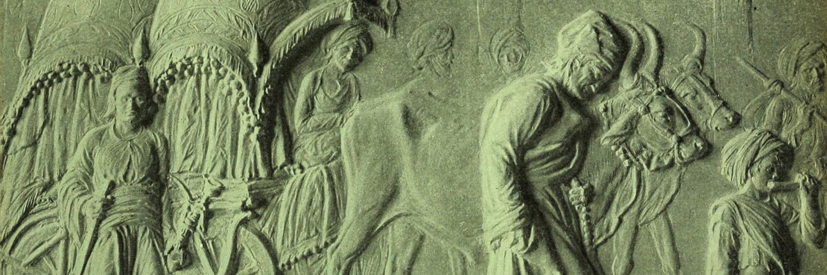
Okay, so I punted on the Kim banners. The bas relief sculptures created by Rudyard's father John Lockwood Kipling to illustrate the book seem like reasonable source material for a banner, but I think presenting any further options would require the input of someone who's actually read the book. For what it's worth, here's what I came up with. -- AndreCarrotflower (talk) 00:33, 1 December 2020 (UTC)
![]()
- I think it's a good banner, in the same style as the article.
- Pashley wrote most of the article in 2013, so he probably can give some input. --Ypsilon (talk) 15:26, 1 December 2020 (UTC)
Florida coastal beach communities are the kind of places where the scenery is pleasant enough, but all the individual towns tend to look pretty much the same. I think I did a fairly decent job pushing past that and coming up with creative ideas for these three NSB banners. Let's hear your thoughts! -- AndreCarrotflower (talk) 00:22, 21 November 2020 (UTC)
![]()

![]()

![]()
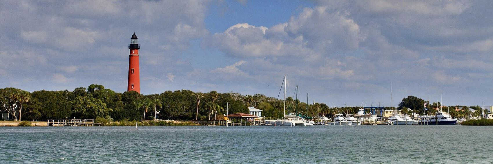
- #1 (Forster's Tern in flight at Smyrna Dunes Park) is far and away the winner IMO. A distant second is #3 (the lighthouse at Ponce de Leon Inlet). -- AndreCarrotflower (talk) 00:22, 21 November 2020 (UTC)
- Ponce De Leon is not in New Smyrna Beach, so I don't think #3 could reasonably be included. Personally I prefer #2 to #1. --Comment by Selfie City (talk | contributions) 15:43, 26 November 2020 (UTC)
- 2 really screams Florida, so I think I'll pick that one too, #1 comes close behind and #3 comes last per Selfie's comment. --Ypsilon (talk) 17:11, 26 November 2020 (UTC)
- 2, 1, 3. I especially like the tern as a photo, but #2 "sells the dream" a bit better, and birdwatching isn't mentioned once in the article before 'Go next'.--ThunderingTyphoons! (talk) 17:40, 26 November 2020 (UTC)
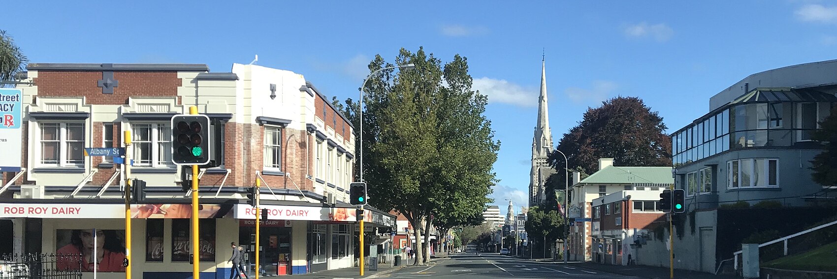
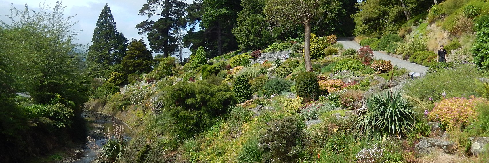
A set of banners for Dunedin. I was disappointed that many of the views, in this city of towers and steep hills, that I wanted to show didn't work in this aspect ratio.
![]()

![]()
![]()

![]()
![]()

- No 1 is the Railway Station, probably the most photographed view in the city.
- No 2 is looking along George Street to the city centre, with the Knox Church in the middle, and the Rob Roy Dairy's name reflects the Scots heritage. The photo was taken during lockdown in March which let the photographer stand in the middle of the street.
- No 3 is Baldwin Street, which regained the title of the world's steepest street in April 2020. I have updated the blurb to remove "what used to be" before "the world's steepest street".
- No 4 is my own photo, taken in December, of the Botanic Gardens, with the Water of Leith running through it.
- No 5 is my own photo of some student flats - an attempt at capturing the university side of this city where students are about a quater of the population.
I hope that I have captured some of the spirit that a visitor will find here and given you a good selection to choose from. Please give your feedback and votes. AlasdairW (talk) 23:15, 4 November 2020 (UTC)
- Thank you for picking up the slack on these banners, Alasdair. I hope to have ones for Aviation history up on this page before Iriomote gets switched in as OtBP next week.
- I like #2 best, then #1 is a close second: the "late 19th century architecture" mentioned in the blurb is better depicted in the latter, but the street scene in #2 hints at it too, along with the liveliness associated with "student life". #5 is a distant third, but depending on freedom of panorama legislation in New Zealand, may not be allowable due to the mural on the side of the building at center. Rounding out my selection are #s 4 and 3, in that order.
- Nice banners. 2, 3, 1, 5, 4. #2 is the best out of all of them at showing more of the city on a macro level, rather than focussing on one landmark; having said that, the church steeple really draws the eye along George Street. Despite bringing to mind the rather embarrassing "recount" demanded of Guinness by sore losers in Dunedin when the WR was awarded to a different street, #3 is a cracking photo of a very steep street and the position of the text box is perfect.--ThunderingTyphoons! (talk) 09:58, 5 November 2020 (UTC)
- I'd definitely add to the praise for these banners! 1, 5, 4, 2, 3 for me. Also, there should be a hyphen in "19th-century architecture". -- Ikan Kekek (talk) 12:10, 5 November 2020 (UTC)
- Hey, new banners! Thanks for making them AlasdairW! I too find it difficult to pick between the first and second one as a favorite...but... 2, 1, 5, 3, 4 --Ypsilon (talk) 19:03, 8 November 2020 (UTC)
- 1, 2, 3, 5, 4 — even though #4 is the most aesthetically pleasing IMHO. --Comment by Selfie City (talk | contributions) 15:45, 26 November 2020 (UTC)
In general, whenever I fall super far behind on banner making, it's usually because there's an article (usually a FTT) that I'm dreading making banners for because I don't have any idea what would make a good source image. This was that article for me. I surprised myself with the fact that I came up with four banners, and good ones at that. Let's see what you think of them. -- AndreCarrotflower (talk) 01:45, 11 November 2020 (UTC)
![]()

![]()

![]()

![]()

- Tough choice here. As a Modern architecture buff, I suppose I should resist the urge to immediately give #4 the top spot - on the other hand, the TWA Flight Center at JFK airport is pretty iconic and a throwback to an earlier era in civil aviation. But hopefully I won't catch too much flak for saying it's in second place by a hair behind the Wright Brothers' Flyer III on display at the Smithsonian in #3. #1 (the RAF Museum in London) is in third; I had to tilt the source photo a bit to get the most attractive crop, and I like how the end result looks almost as if it was taken from an airplane banking to the side. The sedate #2 - "Sukhoi Alley" at Moscow's Central Air Force Museum - brings up the rear. -- AndreCarrotflower (talk) 01:45, 11 November 2020 (UTC)
- 2, 3, 4, 1 for me. 1 is a little confusing to look at. 2 is the neatest photo that has planes in it, 3 shows someone at the controls of a biplane and 4 lacks a plane but is a classic airport building. Ikan Kekek (talk) 01:55, 11 November 2020 (UTC)
- I think the first one looks rather exciting, so: 1, 3, 2, 4. --Ypsilon (talk) 05:48, 11 November 2020 (UTC)
- 2, 4, 1, 3 (3 shows Orville or Wilbur? I don't know and I don't care). Nice work Andre, and BTW, happy b'day! Welcome to the "Enta Club", as we say in Portuguese. Ibaman (talk) 09:12, 11 November 2020 (UTC)
- I haven't been to any of these places, but the only one that means nothing to me on sight is #4; I wouldn't even guess it was an airport without context. The other three show beautiful aircraft, which is a must for me, and it's pretty obvious which planes from which countries are depicted in each. However, the one I like the most as a composition is Sukhoi Alley, with the slightly cleaner of the two biplane pics in second place. So, that's 2, 3, 1, 4 for me. And if it really is your birthday, then penblwydd hapus i ti!--ThunderingTyphoons! (talk) 15:01, 11 November 2020 (UTC)
- Thanks for the well wishes, everyone. I celebrated as best I could given the circumstances (COVID, a painful knee injury). -- AndreCarrotflower (talk) 00:05, 21 November 2020 (UTC)
More banners, ahead of tomorrow's OtBP changing-of-the-guard. Let's hear your thoughts on these three imiages of Iriomote. -- AndreCarrotflower (talk) 22:12, 9 October 2020 (UTC)
![]()

![]()

![]()

- Between the three of these banners, I think we've got all our bases covered in terms of what the article indicates Iriomote to be about - beaches, tropical forests, mangroves, the omnipresent sea - so I reckon they're all equally topical and the only way to judge between them is on artistic merit. That being the case, I like the striking scenery of Haemida Beach (#1) best, followed by Mariyudu Falls (#3), and finally the aerial shot of the mangroves in #2. -- AndreCarrotflower (talk) 22:12, 9 October 2020 (UTC)
- 2, 1, 3 for me. 1 is pretty dark and 3 is too dark, IMO. -- Ikan Kekek (talk) 23:39, 9 October 2020 (UTC)
- 1, 2, 3 --ThunderingTyphoons! (talk) 15:51, 10 October 2020 (UTC)
- Nice banners. #1 looks most interesting I think, then #3, and #2. --Ypsilon (talk) 10:11, 14 October 2020 (UTC)
- All are nice banners, but overall per Ypsilon I have a slight preference for #1, followed by #3 and then 2. --Comment by Selfie City (talk | contributions) 17:19, 8 November 2020 (UTC)
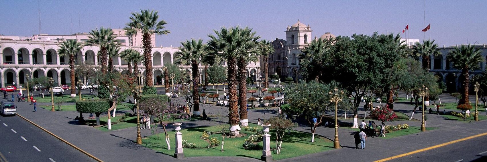
Three for Arequipa in November. Vote! -- AndreCarrotflower (talk) 00:03, 1 October 2020 (UTC)
![]()

![]()
![]()

- Descending order for me, please. #3 is a great combination of the Spanish colonial architecture touted in the blurb (albeit seen in sidelong view), volcanic scenery looming in the background, and those VW Beetles you see all over Latin America (not discussed in the blurb, but mentioned in the article itself). Exemplary photo quality, too. The resolution of #2 is only slightly lower, surprisingly enough given that the photo dates from 1998 (normally I'd be worried that such an old photo might no longer be an accurate depiction, but given that the subject is the Plaza de Armas in the Old Town, I doubt they've torn any of those buildings down for a modern glass-and-steel monstrosity or whatnot). #3 is a great image ruined by color distortion, which unfortunately I didn't notice till after I'd already made and uploaded the banner. -- AndreCarrotflower (talk) 00:03, 1 October 2020 (UTC)
- 3, 1, 2 for me, and in the blurb, I think the punctuation should be a semicolon, rather than a dash, or maybe rephrased, such as this way: "Not only is Peru's second city (also the world's alpaca capital) surrounded by volcanoes, but the lovely Spanish colonial architecture in the old town is largely built from volcanic rock!" I think you mean #1 is destroyed by color distortion. What color is the church's exterior really? White? Ikan Kekek (talk) 23:37, 9 October 2020 (UTC)
- 3, 2, 1, and I agree with the proposed rewording.--ThunderingTyphoons! (talk) 15:54, 10 October 2020 (UTC)
- I also prefer the third one, and I don't think there's much of color distortion in it. 3, 2, 1. Ypsilon (talk) 10:07, 14 October 2020 (UTC)
Guess it's time to pick the banner-making task back up. Here are four for next month's FTT, including one of the rejected banners for Tour cycling that I thought might be apropos for this topic as well. Let's hear your thoughts. -- AndreCarrotflower (talk) 23:50, 20 September 2020 (UTC)
![]()

![]()

![]()

![]()

- Hmm. I like all these banners but don't love any of them. Hierarchy-wise, I think the hitchhiker (#1) is on top, with the bicyclist (#4) and the backpacker staring out into the city street (#3) both close behind, in that order. #2 seemed to be a better idea on paper than in practice; it's not immediately apparent that the scene is inside a hostel dormitory. -- AndreCarrotflower (talk) 23:50, 20 September 2020 (UTC)
- I agree that #1 is first. He definitely looks like he's saving money on travel. I considered making #3 my second choice, but #4 is growing on me, and it's more likely that he's saving money on traveling, so like you, I'll go 1, 4, 3, and then a distant 2. Ikan Kekek (talk) 06:41, 21 September 2020 (UTC)
- I'd say 3, 4, 1, 2. #3 and #4 are lovely pictures. They look interesting and fun and make me want to go on a trip. #3 in particular manages to capture a "budget travel" feel without too much focus on any one particular aspect of budget travel. It's also nice to avoid photos of identifiable people. —Granger (talk · contribs) 17:41, 21 September 2020 (UTC)
- 4,3,1,2. Only 3 and 4 show travel that it is possible in many areas at the moment. AlasdairW (talk) 20:17, 22 September 2020 (UTC)
- Hard to pick between 3 and 1...but I say 3, 1, 4, 2. Ypsilon (talk) 15:47, 23 September 2020 (UTC)
- 3 or 4, and not 2 or 1. We can't seriously promote hitchhiking or shared dormitories during this pandemic.--ThunderingTyphoons! (talk) 16:10, 23 September 2020 (UTC)
- BTW, if it doesn't get chosen here, then #3 is also a good candidate as a banner for Arriving in a new city, nominated earlier this month.--ThunderingTyphoons! (talk) 16:13, 23 September 2020 (UTC)
- Agreed. —Granger (talk · contribs) 16:36, 23 September 2020 (UTC)
- BTW, if it doesn't get chosen here, then #3 is also a good candidate as a banner for Arriving in a new city, nominated earlier this month.--ThunderingTyphoons! (talk) 16:13, 23 September 2020 (UTC)
- We've already stated to our readers that we don't endorse the idea of travelling right now and that, at least during COVID, our featured articles should rather be construed as ideas for post-pandemic travel and/or simply enjoyable reading material. If we're going to get cold feet about showing pictures of hitchhikers or shared dormitories which would be innocuous at any other time, then the thing to do is to revisit the question of what the purpose of DotM is and whether it should continue to run during the pandemic, not to hold ourselves to a double standard and send out mixed messages vis-à-vis what we've already told our readers. -- AndreCarrotflower (talk) 23:35, 23 September 2020 (UTC)
- Perhaps that message should be updated. Many of us are travelling again, albeit in a socially-distanced way. Last week, I was in Shropshire (on the English-Welsh border); next week I'll be in Norfolk (eastern England). Both trips are with close family and are based in self-catering accommodation in rural areas reached by private car, with all public health guidelines adhered to. Other people in Europe have resumed international travel, which again if carried out correctly, without being reckless, should be safe. Everyone's mileage as to what they feel comfortable doing varies. The point is, travel per se does not cause the spread of the virus, but behaving as if there is no virus (by gathering in groups, mixing in close quarters with people you don't normally live with, and neglecting hygiene procedures) does. During the current climate, both hitchhiking and shared accommodation constitute reckless behaviour, whereas it is in fact perfectly possible to travel safely on a budget without spreading the virus everywhere you go, as long as you keep your distance from people, wear a mask in appropriate places, and regularly wash hands and surfaces. If both photos jump out at me immediately, then many others who see them will have the same reaction.--ThunderingTyphoons! (talk) 07:33, 24 September 2020 (UTC)
Only two banner selections this time, owing to scant coverage of Nkhata Bay on copyleft-compatible quarters of the Internet. When I first came to the category, there were a grand total of six images of sufficient resolution for use as a banner image. Four were of essentially the same scene of boats on the lake (the best of which I fashioned into Banner #1), another depicting a market that was quite ghastly when the 3:1 aspect ratio was applied (in the cropped version, the goods for sale at the stall looked more like piles of garbage along the side of a road), and still another anonymous view of a ferryboat. To those I added the source image for Banner #2, which I found on the otherwise equally barren Flickr.
Let's hear your votes! -- AndreCarrotflower (talk) 23:19, 10 July 2020 (UTC)
![]()

![]()
- #2 very slightly over #1. -- AndreCarrotflower (talk) 23:19, 10 July 2020 (UTC)
- You had to go through a lot of effort to make these! It's unfortunate that #1 has posterization lines all over the sky on the left, but I don't notice that so much except on my 19-inch monitor, and most people will be using either their phones or small laptops. Anyway, that photo is all about Lake Malawi, and it's serene and beautiful, so I support it. #2 seems much more nondescript to me. (By the way, it should be "lying on the beach", since it's a transitive verb, not "laying", unless we're encouraging sexual activity on the beach... :-) Ikan Kekek (talk) 23:32, 10 July 2020 (UTC)
- I prefer #1, but #2 also looks nice. And thanks for correcting the blurb, Ikan. --Ypsilon (talk) 05:15, 11 July 2020 (UTC)
- #1 is the better photo. Not the best selection, but you had to work with what was available. Hopefully featuring it will inspire some local or tourist with a camera to populate the Commons category.--ThunderingTyphoons! (talk) 13:44, 11 July 2020 (UTC)
- #2, followed by #1. --Comment by Selfie City (talk | contributions) 14:02, 11 July 2020 (UTC)
Keeping the "three months' worth of banners on deck" streak alive for another go-round. Vote! -- AndreCarrotflower (talk) 00:07, 1 July 2020 (UTC)
![]()

![]()

![]()

![]()
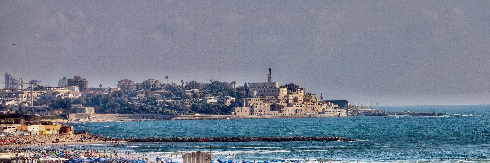
- I know we don't like skyline shots, but on aesthetic grounds alone, it's really hard to argue against #3. What a sunset! #2 - the view from the balcony of the Hotel Cinema Esther - is a close second, though, and more apropos of the blurb, depicting two elements of the UNESCO-listed "White City" of Bauhaus-influenced architecture. #1, the night view of the fountain in the center of Dizengoff Square, is third; #4, the beachfront view of the Old City, would have likely been at or near the top of my ranking but for the dismal image quality. -- AndreCarrotflower (talk) 00:07, 1 July 2020 (UTC)
- 3, 1, 4, 2. I agree that 4 would have been excellent with better image quality. —Granger (talk · contribs) 11:56, 1 July 2020 (UTC)
- 3, 1, 2, 4 per AndreCarrotflower. --Comment by Selfie City (talk | contributions) 13:14, 1 July 2020 (UTC)
- Skylines including this one are often great topics for banners on articles and the Main Page but I really like the fountain, so 1, 3, 2, 4. One more thing; it looks dangerous how the person sitting on the balcony in the Bauhaus banner! --Ypsilon (talk) 14:45, 1 July 2020 (UTC)
- All great, but 2, 3, 1, 4. The balcony figures are sculptures, methinks. --ThunderingTyphoons! (talk) 15:46, 1 July 2020 (UTC)
- LOL, you're right, I now looked up the source photo and zoomed in. :D Ypsilon (talk) 16:22, 1 July 2020 (UTC)
- Ee, it's luvly architecture, tho.ThunderingTyphoons! (talk) 16:36, 1 July 2020 (UTC)
- Yup, quite elegant. --Ypsilon (talk) 16:41, 1 July 2020 (UTC)
- Ee, it's luvly architecture, tho.ThunderingTyphoons! (talk) 16:36, 1 July 2020 (UTC)
- LOL, you're right, I now looked up the source photo and zoomed in. :D Ypsilon (talk) 16:22, 1 July 2020 (UTC)
- 1, 3, 2, 4, but they are all good. AlasdairW (talk) 20:23, 2 July 2020 (UTC)
- 4, 2, 1, 3 for me. I think I don't like #1 as a composition as much as most of you do, but if there's no photo of it in the appropriate Tel Aviv district article, there should be! Ikan Kekek (talk) 20:55, 2 July 2020 (UTC)
- I find the architecture featured in #2 nicer than #3, which bores me except that it's a nice sunset. I like #4 best because it's a nice composition in which picturesque Jaffa is in the background and beaches and the sea are in the foreground. -- Ikan Kekek (talk) 20:59, 2 July 2020 (UTC)
- To add a further comment, I'm not finding the quality of #4 dismal for a banner. Ikan Kekek (talk) 22:50, 3 July 2020 (UTC)
- Ikan Kekek - It's awfully grainy. Compare the sky in the upper left quadrant of #4 with the sky in #3. I tried editing the source image but that's one problem PhotoShop, Gimp and related programs don't solve well, at least not without reducing image quality overall. -- AndreCarrotflower (talk) 05:59, 4 July 2020 (UTC)
- I see it a little, sure, and maybe more than a little if I really focus on it, but at this size, it's not too bad. If we were looking at it at full-page size, that would be different. Ikan Kekek (talk) 06:24, 4 July 2020 (UTC)
- Ikan Kekek - It's awfully grainy. Compare the sky in the upper left quadrant of #4 with the sky in #3. I tried editing the source image but that's one problem PhotoShop, Gimp and related programs don't solve well, at least not without reducing image quality overall. -- AndreCarrotflower (talk) 05:59, 4 July 2020 (UTC)
- To add a further comment, I'm not finding the quality of #4 dismal for a banner. Ikan Kekek (talk) 22:50, 3 July 2020 (UTC)
Given the COVID pandemic and some of the projections we've been hearing about how long before things get back to normal, there's a not insignificant chance that my earlier plans to travel the Buffalo-Pittsburgh Highway once again this summer, and do a final run-through of this article before its FTT term to personally ensure its content remains accurate, might not be feasible. Thankfully, I had the presence of mind to take multitudinous photographs along my initial trips down the BPH two summers ago, with an eye toward eventually using them to illustrate the article and make Main Page banners. And, as I said over on the main DotM page, I promised myself that once the Buffalo-Pittsburgh Highway article attained Guide status, I could jump the gun a little bit and submit the banners for your consideration. So without further ado, let's hear what you have to say. -- AndreCarrotflower (talk) 20:08, 22 April 2020 (UTC)
![]()

![]()

![]()

![]()

![]()
![]()

- I'm going to do something I don't usually, and hold off on formulating my own votes until I hear what others have to say. I'm doing this mostly because I'm honestly stumped as to which I prefer. But, in this space here, let me guide you through the criteria I used in choosing source images. For me, there are three key ingredients in what the Buffalo-Pittsburgh Highway experience is all about, and they're reflected in the wording of the text blurb: "road trip", "Rust Belt history", and "Great Industrial Broadway". Respectively, Banners #4 (Route 119 just outside Punxsutawney) and #6 (roadside scenery in West Virginia) represent the road trip end of the equation, #s 3 (the Lily of the Valley Historic District in downtown Ridgway) and 5 (the J. P. Carter and Silas M. Clark Houses in Indiana) depict the elegant period architecture that testifies to the region's prosperity back in the good old days, and #s 1 (the Old First Ward of Buffalo, with the Michigan Avenue Bridge and the grain elevator district in the background) and 2 (the Domtar Paper Mill in Johnsonburg) speak of what traditional industry remains in the region today. I wish I could have found a banner that depicted two or more of those elements in one go, but I wasn't able to, so I guess it's a question of which factor you folks think is of the most importance, or else simply which banner you think is nicest looking. -- AndreCarrotflower (talk) 20:08, 22 April 2020 (UTC)
- The ones with the most character are #2 and #5. The best road trip one is #4. Since we're being unusual, I'm going to rank those three equally for now, in the hope that one of them will make the final cut, and then place the remainders as 1, 6, 3. To revisit.--ThunderingTyphoons! (talk) 13:28, 23 April 2020 (UTC)
- 1, 2, 3, 4, 5, 6. I think! That's the hardest one on which I've voted so far, probably? They're all good. --Comment by Selfie City (talk | contributions) 13:37, 23 April 2020 (UTC)
- Nice banners. I'll go for the ones with some industrial heritage in them, and then proceed to ones with road/traffic in them, so 2, 1, 4, 5, 3, 6. --Ypsilon (talk) 14:07, 23 April 2020 (UTC)
- Powers mentioned that he has some familiarity with the route as well, so I'm pinging him to see what he thinks. -- AndreCarrotflower (talk) 16:42, 23 April 2020 (UTC)
- Thanks. I'm as torn as everyone else. Had I my druthers, I'd like to see a shot of Bradford's oil refineries, but a truly good one might require a drone -- or stopping on the expressway. I would also consider a shot of the Johnsonburg Domtar plant from the new 219 bypass. With respect to the six shown here, I keep coming back to 1, 2, and 3, and hoping that it's not just because those are the three communities I've seen the most. Powers (talk) 18:46, 25 April 2020 (UTC)
- Ikan, since you just voted on the Faaborg and Chinese cuisine banners below, would you mind opining on these? Normally I don't directly solicit people's participation in this manner, but as you can see, opinions are all over the place and there's no clear direction in which consensus is trending. -- AndreCarrotflower (talk) 03:32, 1 May 2020 (UTC)
- I've looked at them but have had trouble picking between them, as they're so varied and I don't really know the route. That said, #5 is the prettiest, though the buildings are leaning a bit; #2 shows a really interesting structure, though the clouds are too blue and part of the sky seems blown; #6 and #4 are delightfully rustic; #3 is a nice small-town downtown, though shot in less than ideal light; and #1 would also be fine, for all the obvious reasons. Taking into account the criteria of distinctiveness and photo quality, my final order is different from what I laid out above: 5, 1, 2, 6, 3, 4. Ikan Kekek (talk) 03:50, 1 May 2020 (UTC)
- Thanks everyone. I had hoped I would be less confused after hearing others' thoughts, but at this point, about the only thing I can say for sure about my own opinion is I like #3 the best. The rest of the ranking, I'm going to have to think a little more about. -- AndreCarrotflower (talk) 03:55, 1 May 2020 (UTC)
- Okay. For me it's #3 in first place, #5 in second, #s 1 and 2 tied for third, #4 in fifth and #6 in last. If you're driving down the Buffalo-Pittsburgh Highway, #s 4 and 6 are by far the kind of scenery you'll be seeing through your window most often, but it's not really representative of what the article is about, nor is it immediately identifiable as pertaining to the geographic region in general - if you were given the photos without the accompanying text and asked to guess where they were taken, it could be pretty much anywhere (other than a polar icecap or a desert or such things). As for #2, it has the makings of a good picture, but I was facing into the sun when I was taking it, and given what the original looked like, the fact that my photo editing software was able to extract at least somewhat natural-looking contrast, brightness, color saturation etc. levels out of it is a miracle in itself. But I'm still not entirely happy with the way the picture looks - the blown-out look to the clouds in the sky mentioned by Ikan is a particularly glaring (literally) example of what I'm talking about. -- AndreCarrotflower (talk) 16:12, 2 May 2020 (UTC)
Judging by how busy EatchaBot has been on Commons archiving dead links from the Wayback Machine (not to mention the paltry selection of potential source images I found there), it looks like the hammer has come down at Flickr and they're starting to get serious about deleting media from inactive accounts. If true, this is going to make finding banner images tougher going forward. Here are three for our September OtBP. -- AndreCarrotflower (talk) 23:45, 10 June 2020 (UTC)
![]()

![]()

![]()

- #1 is the clear winner here. Tough choice for second, but I'm going to have to go with #3, an iconic view of the town's main drag and piazza and the sights thereon that's unfortunately marred by low resolution, rather than the higher quality but markedly less interesting street scene in #2. -- AndreCarrotflower (talk) 23:45, 10 June 2020 (UTC)
- 3, 2, 1. --Comment by Selfie City (talk | contributions) 01:22, 11 June 2020 (UTC)
- I agree completely with Andre here, except that I'd phrase it as 1 being the clear winner, 3 second and 2 unacceptable because it's an uninteresting sight, though a good composition. -- Ikan Kekek (talk) 02:32, 11 June 2020 (UTC)
- And I agree with Ikan – 1,3,2. --Ypsilon (talk) 14:27, 1 July 2020 (UTC)
1, 2, 3.1, 3, 2 --ThunderingTyphoons! (talk)15:43, 1 July 2020 (UTC)22:27, 2 July 2020 (UTC+1)
As it looks like Portland isn't going on the Main Page we have to have a replacement. At the DotM talk page I suggested to run some article that is already nominated: Bruges in September, or Nicosia in September or October. Both are good articles (says the one who's edited them :)), but as Tel Aviv is going to be featured too I think we could pick Bruges for some geographical spread.
So I made a few banners for Bruges. The first depicts the city's world-heritage listed Beguinage (convent), the second a city view with one of the canals criss-crossing the old town, the third which looks a little like the feature banner for Along the Magnificent Mile depicts the medieval Belfry of Bruges and an adjacent building, and the last one is a serene autumn afternoon scene of a canal and buildings next to it.
And should Portland against all odds be featured after all or some other article be chosen, well, then we have banners for Bruges for its slot next spring or summer. Vote! --Ypsilon (talk) 15:46, 30 July 2020 (UTC)
![]()

![]()

![]()

![]()
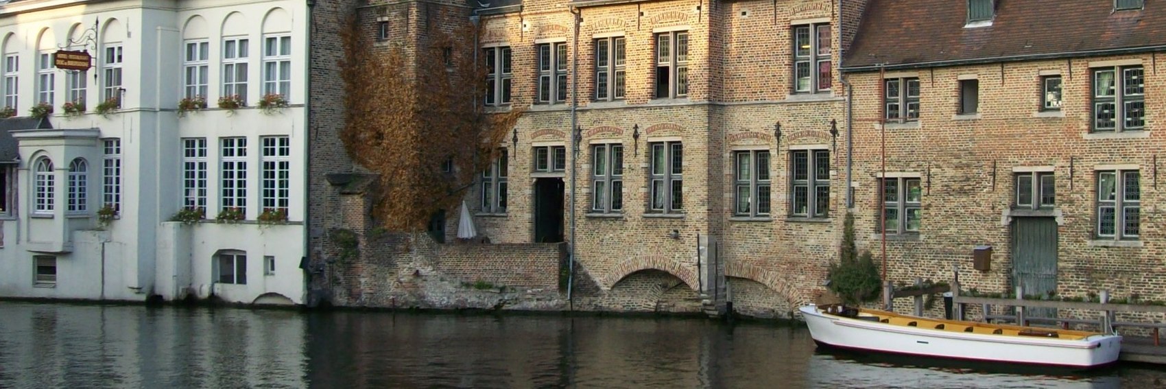
- 4, 1, 3, 2. Ypsilon (talk) 15:45, 30 July 2020 (UTC)
- 4, 2, 1, 3. Thanks Ypsilon. --Comment by Selfie City (talk | contributions) 15:51, 30 July 2020 (UTC)
- Any of these photos would be good. My order of preference is 2, 3, 4, 1. I haven't been to Bruges, but 2 shows a bunch of unique buildings plus the canal and nice stone bridge, and 3 also shows unique, beautiful buildings, though the angles are strange to me. 4 is a pleasant canal scene. The building in 1 seems least unique and the photo is also partly blown. Ikan Kekek (talk) 21:08, 30 July 2020 (UTC)
- 4, 2, 3, 1. All are good. —Granger (talk · contribs) 21:23, 30 July 2020 (UTC)
- 2, 3, 4, 1. #1 would likely be higher in the ranking were it not so overexposed; I took a stab at correcting that with my editing software, but it was too far gone. Ikan's point about the angles in #3 is well taken and to a lesser degree also applies to #s 2 and 4; when I get the chance, I will upload recropped versions of those banners with corrected perspective. -- AndreCarrotflower (talk) 21:33, 30 July 2020 (UTC)
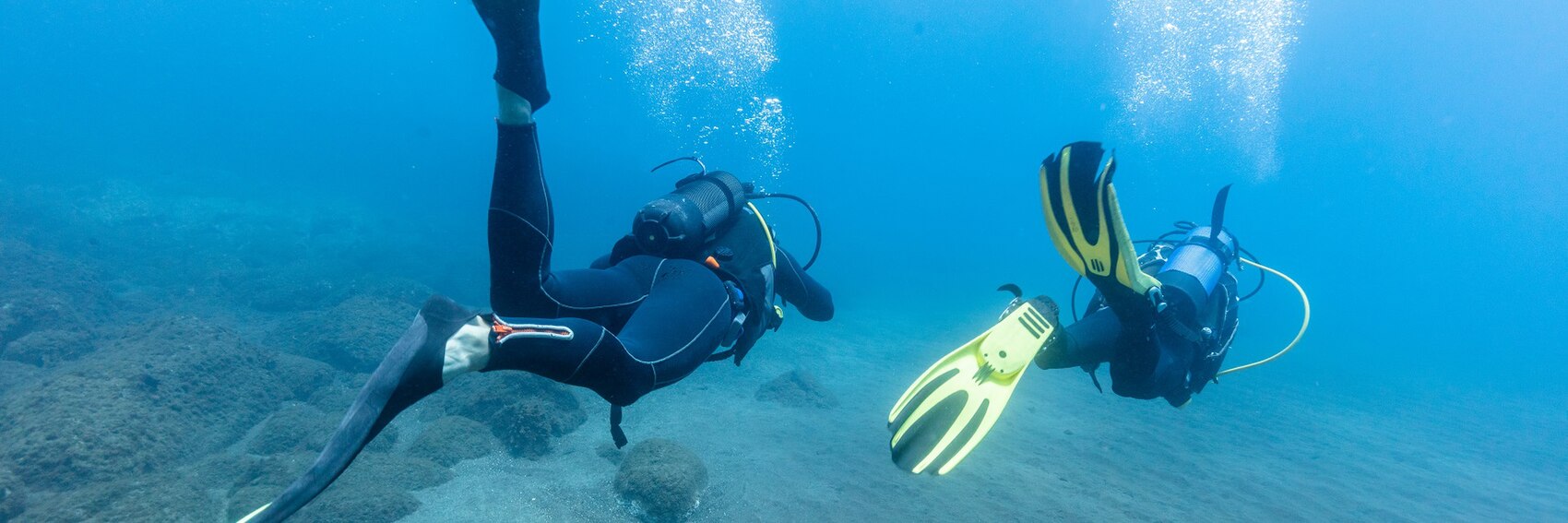
I've been taking a break from Wikivoyage lately to attend to other duties (for instance, buffing up Buffalo's presence on Commons; here's some of my recent work), but I'm popping my head back in to see to it that I don't fall behind on banners again. Here are four for our August FTT. -- AndreCarrotflower (talk) 00:09, 21 May 2020 (UTC)
![]()
![]()

![]()

![]()
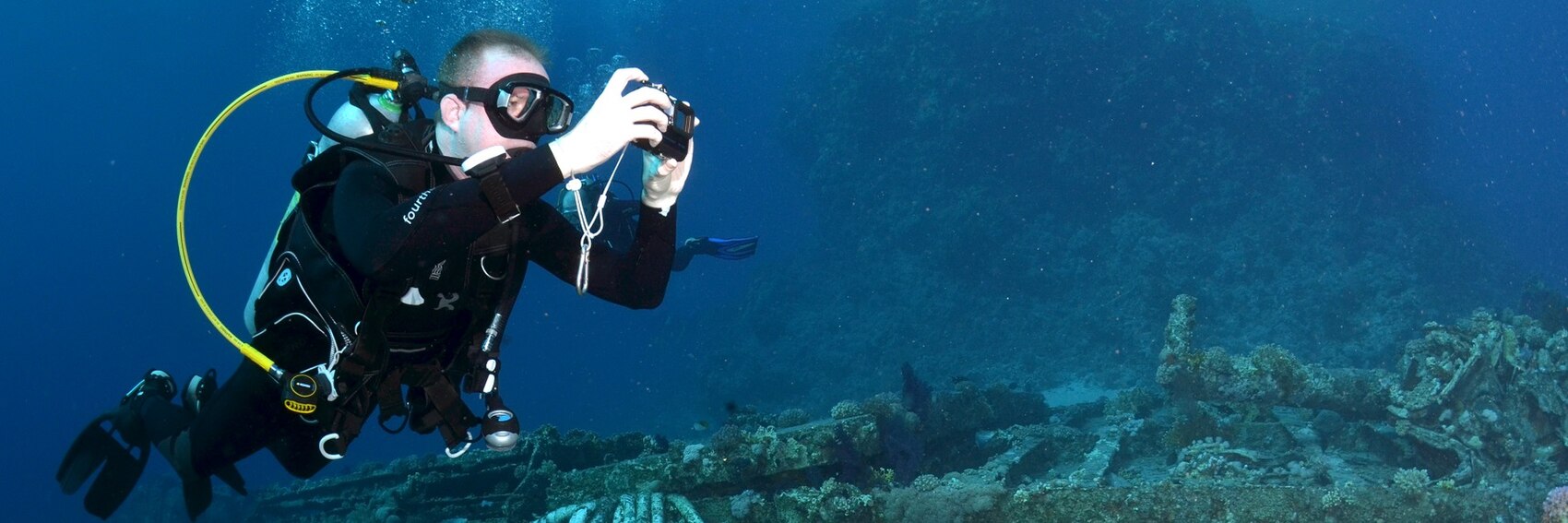
- They're all good - I'd have been seriously negligent if any of them were not good, such was the richness of the available source material - but my ranking is #2 (despite the absence of any diver per se in the image), followed closely by #4 (depicting the wreck of the Jolanda in Ras Muhammad Protected Area, Egypt), then it's a toss-up for third but I'll put #3 (nice image with the marine life, but cruddy photo quality) just ever so slightly over #1 (bo-ring). -- AndreCarrotflower (talk) 00:09, 21 May 2020 (UTC)
- 2, 4, 3, 1, but I think #2 is by far the best out of a good selection. --Comment by Selfie City (talk | contributions) 01:13, 21 May 2020 (UTC)
- I too go for #2, then 3, 4, 1. Ypsilon (talk) 19:40, 1 June 2020 (UTC)
- 2, 1, 4, 3. All good.--ThunderingTyphoons! (talk) 19:57, 1 June 2020 (UTC)
- 2 is irresistible to me. After that, I suppose I go for 3, 4 and 1 but have no strong feelings about any of them as clearly better than the others. Ikan Kekek (talk) 02:28, 11 June 2020 (UTC)
More banners, just so that the whole business about "having three months' worth in reserve" doesn't stop being true in a couple days. Prepare to be underwhelmed by these. By the looks of it, Apia is not a terribly photogenic place, nor is it much of a tourist destination in its own right. Vote anyway! -- AndreCarrotflower (talk) 01:32, 9 May 2020 (UTC)
![]()

![]()

![]()

- Judging from what I saw at Commons and Flickr, that clock tower seems to be the only thing in town that can rightly be called a "landmark", so in my estimation, it needs to be shown in the banner. That propels #2 to the front of the pack by default, and neither of the other two banners make particularly strong counter-arguments. #3, the Cathedral of the Immaculate Conception, enjoys by far the best photo quality of the bunch, which by itself is enough to earn it second place, but the architecture of the church doesn't exactly scream out "South Pacific" - the palm trees along the bottom margin are pretty much the only clue that this isn't a picture of somewhere in Europe. Last-place #1 has nice colors but really dismal photo quality, not to mention there's no good place for the textbox. -- AndreCarrotflower (talk) 01:32, 9 May 2020 (UTC)
- 3, 2, 1, based on image quality. --Comment by Selfie City (talk | contributions) 15:07, 9 May 2020 (UTC)
- Nice banners once again. 2, 3, 1. Ypsilon (talk) 15:29, 9 May 2020 (UTC)
- 3, 2, 1. The cathedral in 3 may have a European origin in its architecture, but there is something about its construction which makes it look like it is far south of Europe. 1 also has the cathedral, but the light doesn't bring it out. AlasdairW (talk) 21:49, 9 May 2020 (UTC)
- That "southern something" is the domes, common in Romanesque-style Catholic churches. Blue domes in particular are popular on Greek Orthodox churches. Looking at Apia's cathedral, it seems to mix those two styles with something more Flamboyant Gothic (the rose window à la Notre-Dame de Paris, the steeplets). Anyway, I vote 3, 2, 1 because of photo quality. Shame about #1.--ThunderingTyphoons! (talk) 19:37, 1 June 2020 (UTC)
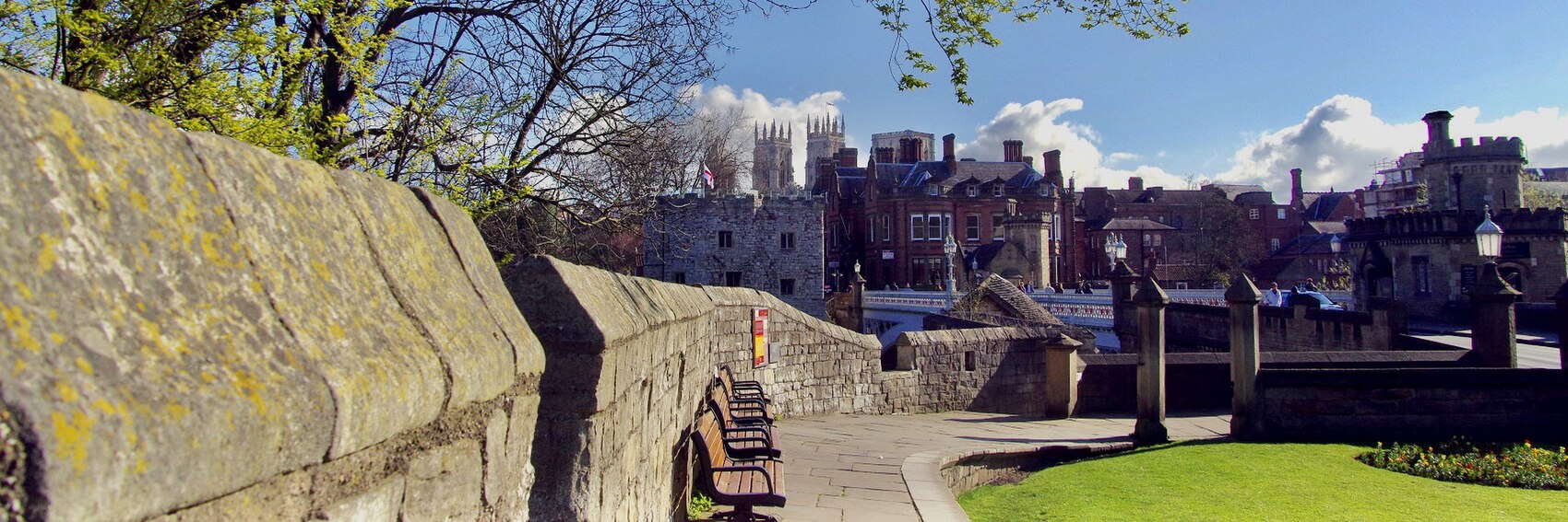
Three new banners for York - I left one space for Jamie to add his own in case he's not a fan of any of these! Let's hear your votes. -- AndreCarrotflower (talk) 03:28, 1 June 2020 (UTC)
![]()
![]()

![]()

![]()

- I like them all, but it's got to be the Minster:
#3 is my vote. #2, the Shambles, is second: an "ancient street" all right.-- AndreCarrotflower (talk) 03:28, 1 June 2020 (UTC)
- Great selection! It was difficult for me to find enough quality photos of York on Commons to illustrate the article, so am glad you've come up with these three. Absolutely right that it's got to be the Minster, though #1, where it's in the background, is my favourite. Followed by #3, then #2.
- As you invited me, I have made one banner (#4) from a photo I really like, though I'm not too sure about the results, or whether it's even the right aspect ratio. Graphics and whatnot aren't really my forté.--ThunderingTyphoons! (talk) 17:56, 1 June 2020 (UTC)
- 3, 4, 1, 2. --Comment by Selfie City (talk | contributions) 17:59, 1 June 2020 (UTC)
- ThunderingTyphoons! - good job! Your banner is clearly the best of the bunch, and the aspect ratio was correct. The only thing I did notice is that the version you uploaded was 1280px in width, whereas the specifications at the top of this page say a minimum of 1700px. Luckily, the source image had a width of 2048px, so I took the liberty of downloading the higher-res version from Commons, cropping it as closely as possible to your original, and uploading it as a new version. Also I widened the textbox a little so there were only four lines of text and less interference with the spire at the right side of the building. -- AndreCarrotflower (talk) 18:32, 1 June 2020 (UTC)
- Also, I'm dropping #2 down to last place on my ranking; I just noticed one of the shop signs in the image reads "Edinburgh Woolen Mill", which is rather less than ideal given that the article is about York, not Edinburgh. So: 4, 3, 1, 2. -- AndreCarrotflower (talk) 18:47, 1 June 2020 (UTC)
- Hard to pick between the 3rd and 4th, but I think TT's banner with the whole cathedral is slightly better, so 4,3,2,1. Ypsilon (talk) 19:43, 1 June 2020 (UTC)
- 4, 1, 3, 2. They are all good pictures, although the signs (and not just the "Everywhere Woolen Mill") spoil 2, but the classic view of the cathedral in 4 is the clear winner. AlasdairW (talk) 22:44, 1 June 2020 (UTC)
- 3, 4, 1, 2 just like SelfieCity. Ikan Kekek (talk) 02:29, 11 June 2020 (UTC)
Another set of banners. Had a harder time finding good source images for these. If I sound terse, it's because my wife just told me dinner will be ready in ten minutes. Vote! -- AndreCarrotflower (talk) 00:29, 1 May 2020 (UTC)
![]()

![]()

![]()

- Another toughy. #2 shows a multiplicity of different dishes; #1 only one dish but also a bit of the preparation process; #3 only one dish and no preparation, but it's the nicest from an artistic point of view. Another ranking that comes from my gut with no rationale: #1 in first place, #3 second. -- AndreCarrotflower (talk) 00:29, 1 May 2020 (UTC)
- While it's not fair given the currently widespread nature of the virus, I think given the context many readers will have a negative opinion of Chinese food — or anything else from China — for fear it could spread disease. Therefore, the pictures of food looking especially "clean," such as those in #'s 2 and 3, should be highlighted at this time to show that quality of the food. That's my rationale for 3, 2, 1. --Comment by Selfie City (talk | contributions) 00:36, 1 May 2020 (UTC)
- Given that Wikivoyage is not-for-profit and doesn't have any financial stake in our readers' reaction to our content, I think we are uniquely placed to, and absolutely should, ignore concerns of that nature in favor of setting an example in opposition to ethnic stereotyping. -- AndreCarrotflower (talk) 00:58, 1 May 2020 (UTC)
- That is, in essence, what I hope that kind of image would do — oppose the stereotyped viewpoint that Chinese food is "dirty." --Comment by Selfie City (talk | contributions) 01:20, 1 May 2020 (UTC)
- Given that Wikivoyage is not-for-profit and doesn't have any financial stake in our readers' reaction to our content, I think we are uniquely placed to, and absolutely should, ignore concerns of that nature in favor of setting an example in opposition to ethnic stereotyping. -- AndreCarrotflower (talk) 00:58, 1 May 2020 (UTC)
- 3, 1, 2, in order of how nostalgic they make me feel for Shenzhen. —Granger (talk · contribs) 00:53, 1 May 2020 (UTC)
- 2 by a considerable margin, and then 1 and 3. 2 shows the diversity the blurb speaks of. I like the Chinese signs in 1, but the cook looks dour. 3 is a nice steamer of dumplings but shows only one type of food. Ikan Kekek (talk) 03:13, 1 May 2020 (UTC)
- 1, 3, 2. I think I'm right in saying this is the first cuisine article to be featured, so this entire genre is new for banners. It's interesting, then, that #2 feels like we've seen it as many times as old Buddha. It's certainly the most predictable shot, and could show a "Chinese" restaurant anywhere on the planet. #3 is beautiful, and Granger's nostalgia boosts it for me. #1 shows a chef at work, which I don't think we've had before, and to me he looks like he's concentrating on his art, rather than grinning for the camera. Having a banner focusing on a person will make a refreshing change too.--ThunderingTyphoons! (talk) 10:11, 1 May 2020 (UTC)
- I like #2 most as it shows a variety of dishes, then, not so far behind #1 with the cook and patrons in the background. #3 last, because that's just one single dish. --Ypsilon (talk) 10:58, 1 May 2020 (UTC)
Flickr to the rescue on these banners - Commons' coverage was very scant indeed. Let's hear your thoughts! -- AndreCarrotflower (talk) 00:29, 1 May 2020 (UTC)
![]()

![]()

![]()
- Tough choice here. The images all have equal merits; #1 is the most pleasant aesthetically, but #2 and #3, respecitvely, represent the clock tower and the cobblestone streets mentioned in the blurb. Ultimately I think #2 is the best banner and #1 is second, but there's not really any good explanation why I feel that way; I'm just going with my gut. -- AndreCarrotflower (talk) 00:29, 1 May 2020 (UTC)
- #3 would be excellent if there were people, but it feels like it was taken during the coronavirus lockdown; it's almost eerie that no-one is present. However, it's marginally my favorite, 3, 1, 2. IMHO, the boats in #2 get in the way. --Comment by Selfie City (talk | contributions) 00:32, 1 May 2020 (UTC)
- 1, 2, 3, all good, but 1 is just lovely to me, showing village greenery and a pretty church and pleasant sky. Ikan Kekek (talk) 03:08, 1 May 2020 (UTC)
- 2, 1, 3. I was all ready to say #3 was the best, as it looks like but now can't get the comment about it showing lockdown out of my head. It also undermines the claim that Faaborg "bursts into life in the summer". The church and greenery of #1 are lovely, but the "iconic" clock tower is only in #2, plus I'm a sucker for pretty harbours.--ThunderingTyphoons! (talk) 10:16, 1 May 2020 (UTC)
- Overall, on on Commons there are actually very few photos from the town with people in them. I think I go for the harbour too, so 2, 3, 1. --Ypsilon (talk) 10:50, 1 May 2020 (UTC)
In a better world, I could have taken a quick jaunt across the border and made my own banner source images. In this wretched reality, I had to make do with a surprising dearth of material on Commons and Flickr. Oh well. Better days are coming. For now, let's hear your thoughts. -- AndreCarrotflower (talk) 03:11, 21 April 2020 (UTC)
![]()

![]()

![]()

- I'm very frustrated because these options all have the makings of great banner images, but there's something important missing in each. First of all, as someone with a decent amount of knowledge about the destination, it seems obvious to me that the Niagara Escarpment needs to figure into the banner somehow, which is a strike against #1 right off the bat. "The Mountain", as it's called, is central to the city's identity: geographically (it's a huge barrier that slices Hamilton into what essentially amounts to two separate cities with very distinct identities, with only a few very steep roads linking them), historically (the mountain marked, and to a certain extent still marks, the dividing line between rich and poor, who live above and below it respectively), and touristically (it's where you'll find the waterfalls mentioned in the blurb, which figure into #3, as well as quite a bit of parkland overlooking the skyline, as in #2). The problems, respectively, are that there's no good place to put the textbox in #2 (I tried right-justifying it too; that was even worse), and #3 lacks any indication that the article is about a city as opposed to, say, a national park. Meanwhile, despite the Mountain's absence, #1 is redeemed by the fact that it's got a perfect spot of negative space on which to put the textbox, and it depicts James Street North, ground zero for the "specialty shopping" mentioned in the blurb. It's a stumper for sure, but you want to know my votes, so here they are: #3 in first, then #1 and finally #2, but the spread is very narrow. Suffice it to say I'm even more interested than usual to hear others' takes. -- AndreCarrotflower (talk) 03:11, 21 April 2020 (UTC)
- As someone who's never even heard of the city, #3 clearly works as the best visual combination of a great image and a blurb that's fully readable. If you think it represents Hamilton the best out of all of them, despite not showing a city, that's good enough for me. Though to be sure, I do also like the shopping scene in #1, especially the view down the street into the distance (the blurb is slightly interfered with though). #2 is a non-starter as a banner, though it's a nice photo. 3, 1, 2.--ThunderingTyphoons! (talk) 11:18, 21 April 2020 (UTC)
- I agree: 3, 1, 2. —Granger (talk · contribs) 11:50, 21 April 2020 (UTC)
- All banners look nice but I'll go for #1. #3 would come second, it is a nice photo but doesn't make me think of city but a national park (maybe recent OtBP Letchworth State Park, not so far away?). If the blurb box doesn't fit in, the skyline comes last. --Ypsilon (talk) 12:59, 21 April 2020 (UTC)
- 1, 3, 2. I have to agree with others, but I think the competition is very close between numbers 1 and 3. #2 isn't as good as the other two, since the other two banners represent the city in a way that I don't think we've done before recently. --Comment by Selfie City (talk | contributions) 13:26, 21 April 2020 (UTC)
- 3, 1, 2. The waterfall is really nice, the street photo is delightfully backlit and shows a pleasant scene, but the panorama shows a bunch of boring post-war buildings and is a bit gray to boot. Ikan Kekek (talk) 22:30, 21 April 2020 (UTC)
- 3, 2, 1. At first I thought that 3 wasn't right for a large city, but then I checked the article which lists 8 waterfalls. I don't know this Hamilton, but I have been to two other cities of the same name! AlasdairW (talk) 22:21, 22 April 2020 (UTC)
- I only know Hamiltoun and Hamilton Square in Birkenhead :) --ThunderingTyphoons! (talk) 13:20, 23 April 2020 (UTC)
This nominee for FTT dates back to January 2018, which if I'm not mistaken is the longest-ever interval between nomination and Main Page tenure. It will be nice to finally see this article on the Main Page - but what banner will we use? Let's decide! -- AndreCarrotflower (talk) 03:11, 21 April 2020 (UTC)
![]()
![]()

![]()

- Is there really a question which is the best? #3 might be my all-time favorite banner ever. In a distant second place is #1, the famous façade of Amsterdam Central Station plus what I reckon is a form of "rail travel in the Netherlands", albeit not the one the article deals with. #2, the double-decker NID train departing The Hague, shows some nice modernist architecture, but the image quality leaves much to be desired. -- AndreCarrotflower (talk) 03:11, 21 April 2020 (UTC)
- I too like #3 most. For what banner comes second, I'd go for #2 as I believe that's a train going between different cities, while the one in #1 is a tram/streetcar (even if Amsterdam's railway station is in the background). --Ypsilon (talk) 12:39, 21 April 2020 (UTC)
- 3, 1, 2. #3 makes clear the location due to the flowers for which Belgium and the Netherlands are known. #2 has a similar effect, though to a lesser extent, while #1, though by no means bad, does not have the best quality, as Andre stated. --Comment by Selfie City (talk | contributions) 13:24, 21 April 2020 (UTC)
- 3, 2, 1. The flower farm in #3 makes even the garish NS livery look good. Pinging user:Wauteurz so he knows this is finally coming up.--ThunderingTyphoons! (talk) 14:28, 21 April 2020 (UTC)
- 3-1-2. Obviously #3 for me as well per reasons mentions above - it's a great photo which immediately tells you what article you're in for without having to consult the title. #1 is a great picture as well, but doesn't really work with the crop it's got if you ask me. Add to that that trams aren't covered in full depth, and it gets itself a second place. #2 shows a dated Den Haag Centraal as the decor, which looks grey and unappealing to me. (Thanks for the heads up, TT! :D ) -- Wauteurz (talk) 15:00, 21 April 2020 (UTC)
- 3, 1, 2 for me. I love the central station of Amsterdam, but photographing a tram in front of it spoils the view too much. If someone wanted to make a banner that showed just the station, I might vote differently. Ikan Kekek (talk) 22:26, 21 April 2020 (UTC)
- 3, 2, 1. A good selection, and I think it is very close between 2 & 3. AlasdairW (talk) 22:11, 22 April 2020 (UTC)
Part 2 of today's banner dump. Given the off-the-beaten-path nature of Kyrgyzstan, I was very surprised at how many good-quality images were available of Karakol. Which one is the best? Weigh in! -- AndreCarrotflower (talk) 01:30, 11 April 2020 (UTC)
![]()

![]()

![]()

- There are no onion domes, and it doesn't even look particularly Russian, but what the hell - #3 is at the top of my ranking. The bright, cheerful colors of the Dungan Mosque have won me over. #1, the Holy Trinity Church. is not to be denied either, and certainly is the best of the three at comporting with the content of the blurb. #2 is a great image whose only fault is that it's not quite as great as the others, at least in my opinion, though all in all I'd still be perfectly pleased to see it on the Main Page. -- AndreCarrotflower (talk) 01:30, 11 April 2020 (UTC)
- With that blurb, I think #1 is the only sensible option, although the images in the article itself don't really make it look particularly Russian or as if that is its main draw either. ChubbyWimbus (talk) 01:54, 11 April 2020 (UTC)
- For me, numbers 2 and 3 are equal, with #1 last. #2 and #3 are the most beautiful pictures without question. --Comment by Selfie City (talk | contributions) 02:08, 11 April 2020 (UTC)
- 2, 3, 1 for me. The landscape in #2 is pretty breathtaking. All the banners are good. Ikan Kekek (talk) 05:01, 11 April 2020 (UTC)
- I just noticed a dust spot in #3, so I'm going to flip my choices to 2, 1 and then 3. -- Ikan Kekek (talk) 13:46, 12 April 2020 (UTC)
- As Ikan, I go for the landscape #2, even as it's the same as in the article banner. On second place comes #1, and lastly #3 which, sorry to say, looks a bit unnatural to me (overly photoshopped already in the source photo?). --Ypsilon (talk) 08:14, 11 April 2020 (UTC)
- #2 may be breathtaking, but it doesn't say "city in the mountains", it just says "mountains". Both #1 and #3 demonstrate different relics of the Russian Empire, as mentioned in the blurb, and make it clear that Karakol is an urban destination, remote it may be. Between the two I slightly prefer #3, though looking on Google Images of lots of other pictures of the mosque, I also suspect it's been photoshopped. Does that matter?--ThunderingTyphoons! (talk) 13:43, 12 April 2020 (UTC)
- Photoshopped to add color? Not particularly, as long as the inaccuracies are not large or significant. --Comment by Selfie City (talk | contributions) 13:57, 12 April 2020 (UTC)
- ThunderingTyphoons - The source image is seen here. It's a good photo overall, but as you can see, it's a bit overexposed, which is especially noticeable with the patch of sky in the upper left corner. I used photo editing software to tone down the harsh highlights, which tends to have the side effect of making colors appear more vibrant. Contained within a certain parameter, I think that's fine; the operative question IMO being "does the editing make the image an unrealistic depiction of its subject". It's perhaps notable that most of the exterior photos of the Dungan Mosque on Commons exhibit the same lighting issue; here is an example of an interior photo with proper levels of exposure depicting the same color scheme on the walls, and you can see that the colors in this one are roughly as vibrant as those depicted in the banner. -- AndreCarrotflower (talk) 16:38, 12 April 2020 (UTC)
- Photoshopped to add color? Not particularly, as long as the inaccuracies are not large or significant. --Comment by Selfie City (talk | contributions) 13:57, 12 April 2020 (UTC)
A double-shot of new banners to go with the archiving of the old ones, following the recent pattern that's occurred on Main Page update days. Here's the first set, for June's DotM - let's hear your thoughts! -- AndreCarrotflower (talk) 01:30, 11 April 2020 (UTC)
![]()
![]()
![]()

![]()

- Well, "winter sports" clearly won't be depicted on the banner when featuring a Northern Hemisphere destination in June (maybe we should scrub that part out of the blurb?), so that leaves "sustainable architecture" - and I think #1, the colorful night view of the Akrobaten bridge looking toward the Grønland skyline, is clearly the best banner from both that perspective and the perspective of just plain being a great image. #4 is in last place - the fountains at Vigelandsparken certainly have an interesting look to them, but the aesthetic is probably a bit too abstract for our purposes - leaving #s 2 and 3 to duke it out for second place. It's close, but I give the slight edge to #2 (City Hall as seen from the harbor; one of the most iconic views of Oslo judging by the frequency with which the same scene is found on Commons and Flickr) over #3 (the Royal Palace with the statue of Karl XIV Johan in front; nice enough looking, but a bit of a cliché).
- So, to recap: descending order.
- #1 seems like the only option to me. #2 would be a very distant second. I think the "winter sports" line should be kept. It's just listing 2 things that the city is known for. ChubbyWimbus (talk) 01:45, 11 April 2020 (UTC)
- 1, =2, =3, 4. I have no preference between 2 and 3, but that's unlikely to matter here given the preference shown in the above two comments. --Comment by Selfie City (talk | contributions) 01:53, 11 April 2020 (UTC)
- Very interesting selection! My favorite is #1, which shows really interesting modern architecture in an interesting composition. After that, I feel like I have to go with #2 for its relaxing composition. Following that, I pick the nice equestrian statue and building in #3, though the building is looking to me like it's tilting back as it goes up. #4 is my last choice, because although it is a really interesting scene, the highlights look blown out and the backlighting doesn't serve the image well. Ikan Kekek (talk) 05:08, 11 April 2020 (UTC)
- Finally we'll see Oslo on the Main page! I would go with the royal palace first if the blurb wouldn't overlap the building. My first choice is therefore the iconic massive city hall #2, on second place comes modern Oslo #1, then the Royal palace #3 and on last place the statues #4.
- For the winter sports part in the blurb, I think we can keep it even as we run the article in the summer, as not everybody is going to travel there right away, and out of world cities, Oslo is probably the one where outdoor winter sports play the biggest role. Ypsilon (talk) 08:03, 11 April 2020 (UTC)
- Indeed, no-one will be going there right away.--ThunderingTyphoons! (talk) 22:35, 11 April 2020 (UTC)
- 1 and 2 in joint first place for me, then 3, then 4.--ThunderingTyphoons! (talk) 13:31, 12 April 2020 (UTC)
I'm much happier with how these banners came out than the Nagykanizsa ones. Your thoughts? -- AndreCarrotflower (talk) 03:51, 30 March 2020 (UTC)
![]()

![]()

![]()
- Gotta be #1 for me. A few years ago, a good friend of mine took a motorcycle trip through Patagonia (where the source image was taken) and this reminds me very much of the pictures he showed me upon his return. The others are rather far behind, but for what it's worth, #3 comes in slightly ahead of #2 on my ranking. -- AndreCarrotflower (talk) 03:51, 30 March 2020 (UTC)
- Yep, 1, 3, 2. #1 is incredible, who wouldn't want to cycle through that landscape? While #2 is already the article's pagebanner and (as pointed out by Alasdair somewhere) doesn't actually depict tour cycling, but rather a race.--ThunderingTyphoons! (talk) 10:05, 30 March 2020 (UTC)
- No. 1, per others. When you have that spectacular a scene, there's nothing more to say. Ikan Kekek (talk) 10:35, 30 March 2020 (UTC)
- 1. It is the only one which has enough luggage to be tour cyclying, and it is a good picture. AlasdairW (talk) 13:02, 30 March 2020 (UTC)
- All of them are excellent. However, I agree with the others that #1 is the best due to the backdrop, followed by #2 and then #3. --Comment by Selfie City (talk | contributions) 14:24, 30 March 2020 (UTC)
- The second banner indeed depicts a race rather than someone traveling by bike, so it needs to be the first or third. I go with #1 first for the magnificent landscape, then comes #3, and #2 on the last place. Ypsilon (talk) 07:37, 11 April 2020 (UTC)
- 1, 3, 2. All are beautiful. —Granger (talk · contribs) 03:09, 9 May 2020 (UTC)
By some minor miracle, between trips to the new apartment loading boxes and furniture I was able to steal enough time to make up the next two sets of DotM banners. Nagykanizsa was a challenge - other than the vague hints in the blurb about architecture and its status as a transportation crossroads, I couldn't really figure out what the town is known for tourist-wise, so when it came to source images for banners, the best I could do was to just pick the prettiest pictures I could find on Commons and Flickr (and pickings were slim in both cases). Let's hear your thoughts. -- AndreCarrotflower (talk) 03:51, 30 March 2020 (UTC)
![]()

![]()

![]()

- Descending order for me. Judging by the predominant subject matter of the copyleft-compatible images of Nagykanizsa, most of the photo-worthy sites in town are either beautiful old buildings or public statues and monuments, and in #1 we have both: the Monument to the 20th Patriotic Infantry Regiment standing in front of a row of buildings on the south side of Erzsébet Square. #2 - the fountain in front of (what I think is) the town hall - is nice as well, but too reminiscent of what's most likely going to be the winning FTT banner for Along the Magnificent Mile. As for #3, the Trinity Sculpture (also on Erzsébet Square) is probably the most famous (or at least most photographed) point of interest in Nagykanizsa, but it's relegated to a background role mostly by virtue of its height, which doesn't easily lend itself to such a horizontal format as a Wikivoyage Main Page banner. -- AndreCarrotflower (talk) 03:51, 30 March 2020 (UTC)
- 3, 2, 1 for me, simply because 3 seems most unusual, 2 is very nice and 1 has a nice statue but less special architecture. I'd love to hear from someone who's been there; I have not (only to Budapest). -- Ikan Kekek (talk) 10:33, 30 March 2020 (UTC)
- 3, 1, 2. --ThunderingTyphoons! (talk) 11:07, 30 March 2020 (UTC)
- @City-busz: What say you? --ThunderingTyphoons! (talk) 11:05, 30 March 2020 (UTC)
- 1, 2, 3. I'm not impressed by #3 per AndreCarrotflower. To me #1 is the best due to the statue and the signage that makes clear this is a city in the EU. #2 is nice, but doesn't leave enough open space in the photograph --Comment by Selfie City (talk | contributions) 14:27, 30 March 2020 (UTC)
- Oh, I hadn't voted on these even if I believed I had. I go with the fountain #2 first, then the well-balanced #1 close behind, and #3 a little further behind. Ypsilon (talk) 07:31, 11 April 2020 (UTC)
Water is the element these four banners have in common - I didn't intend it that way, but given that Hamburg is such a historically important port city, I'm not complaining. Again, let's hear your votes. -- AndreCarrotflower (talk) 23:23, 20 March 2020 (UTC)
![]()

![]()
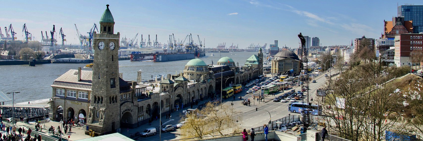
![]()

![]()

- #3 (Speicherstadt) is the easy winner here, followed by #1 (the view down the Alster toward the Jungfernstieg), and then #s 2 and 4 are in a close battle for third but I think the former wins out over the latter. -- AndreCarrotflower (talk) 23:22, 20 March 2020 (UTC)
- Another good selection, and it looks like I need to go to Hamburg. It's obvious that #4 is the comparative dud, but it's a difficult choice between the others. I really like all the cranes in #2, but in terms of mass appeal #1 or #3 are safer bets. The canal shot is the classic view with an evening twist, and the jet of water really makes that skyline. So, it turns out my order is the same as Carrotflower's - there's a first time for everything - 3, 1, 2, 4 --ThunderingTyphoons! (talk) 00:07, 21 March 2020 (UTC)
- 3, 2, 4, 1. I don't see how we can't choose #3. However, #2 is quite different in a likable way. The others are fine but don't stand out like #'s 2 and 3. --Comment by Selfie City (talk | contributions) 00:24, 21 March 2020 (UTC)
- I agree with Andre's and Thundering's order: 3, 1, 2, 4. I think 2 is nicer than 4, though, not nearly in a draw with it. Ikan Kekek (talk) 05:50, 21 March 2020 (UTC)
- Agreed, #3 is the nicest one, but #1 comes very very close behind, the Hamburg skyline on the Alster at nightfall is just great. Landungsbrücken with the cranes and cars traffic #2 is an interesting one and #4 comes last just because something has to come last. Ypsilon (talk) 13:33, 21 March 2020 (UTC)
- 2, 1, 3. I visited Hamburg long ago and 2 brings back the most memories - my ferry home left from near there. AlasdairW (talk) 22:46, 21 March 2020 (UTC)
This was one of the easiest articles in a while to find banners for. I'm really proud of them. Let's hear your votes. -- AndreCarrotflower (talk) 23:22, 20 March 2020 (UTC)
![]()

![]()

![]()
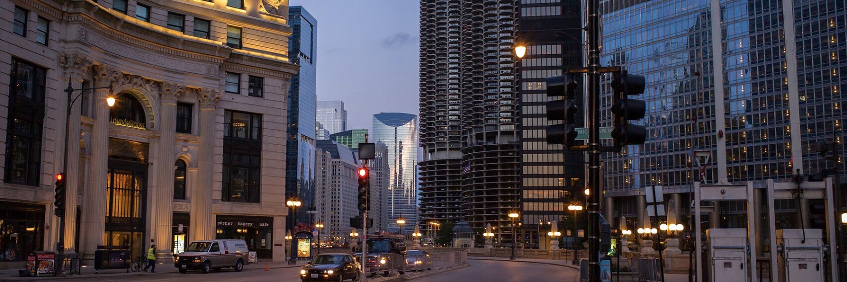
![]()

- A very, very close race. #4, the view looking upward at the old Chicago Water Tower and various high-rises from ground level, seems to cut the closest to what this itinerary is all about. #3 (looking down Wacker Drive from near the Michigan Avenue Bridge) is good too, and I like the fact that the textbox fits like a glove into that expanse of negative space in the upper right corner. #1, a distorted view of the skyline as reflected in the Cloud Gate, is the one I worked the hardest on; the image quality is the worst of the four, I think, but the sheer cleverness of the image makes me reluctant to place it any lower than third. #2 (Buckingham Fountain and the skyline behind it) is last but would be a contender for first place if only the textbox didn't clip the antennae at the top of the Willis Tower. -- AndreCarrotflower (talk) 23:23, 20 March 2020 (UTC)
- 1, 2/4 (tied), 3. Love the surreal qualities of both #1 and #4, and 1 could almost be a Dalí. #2 is also magnificent, and on my screen the spire is untouched, but unfortunately your experience won't be unique. I don't see the appeal of #3; at the end of the day it's a picture of a road. ThunderingTyphoons! (talk) 23:50, 20 March 2020 (UTC)
- At a close look, I like #3, but it's too busy to catch my eye in the right way. --Comment by Selfie City (talk | contributions) 12:21, 21 March 2020 (UTC)
- The spire is now covered. Same computer, same browser.--ThunderingTyphoons! (talk) 12:29, 21 March 2020 (UTC)
- At a close look, I like #3, but it's too busy to catch my eye in the right way. --Comment by Selfie City (talk | contributions) 12:21, 21 March 2020 (UTC)
- 2, 1, 4, 3. I like #1 for its originality, but #2 is my favorite because it does such a good job of showing the Chicago skyline. --Comment by Selfie City (talk | contributions) 12:19, 21 March 2020 (UTC)
- 4 shows contrast between old and new and is the one I like most. The nice skyline #2 comes second (I don't think the cut-off mast is that much of a problem), then #3 which also is a nice pic, and on the last place the reflection in the Cloud Gate #1 as I'm not really a fan of fisheye views. Ypsilon (talk) 13:40, 21 March 2020 (UTC)
- 2, 1, 4, 3. A good selection. 2 sums the route up well with a recognisable view. 4 shows a nice contrast, but the angle is slightly distracting. AlasdairW (talk) 22:54, 21 March 2020 (UTC)
- 2, 4, 1 and then 3 for me, and all are good! -- Ikan Kekek (talk) 03:30, 22 March 2020 (UTC)
- 4, 2, 1, 3. All are beautiful. —Granger (talk · contribs) 02:13, 11 April 2020 (UTC)
Look, the Buddha statue thing... I don't intend it as some kind of running joke. I honestly don't. Or at least I didn't in this case. For one thing, there weren't all that many usable images of Thimphu to begin with on Commons or Flickr (as evidenced by the fact that both of the other banner choices depict Tashicho Dzong), and... well, have a look at the banners first and I'll explain what I mean by that after the break. -- AndreCarrotflower (talk) 01:23, 10 March 2020 (UTC)
![]()
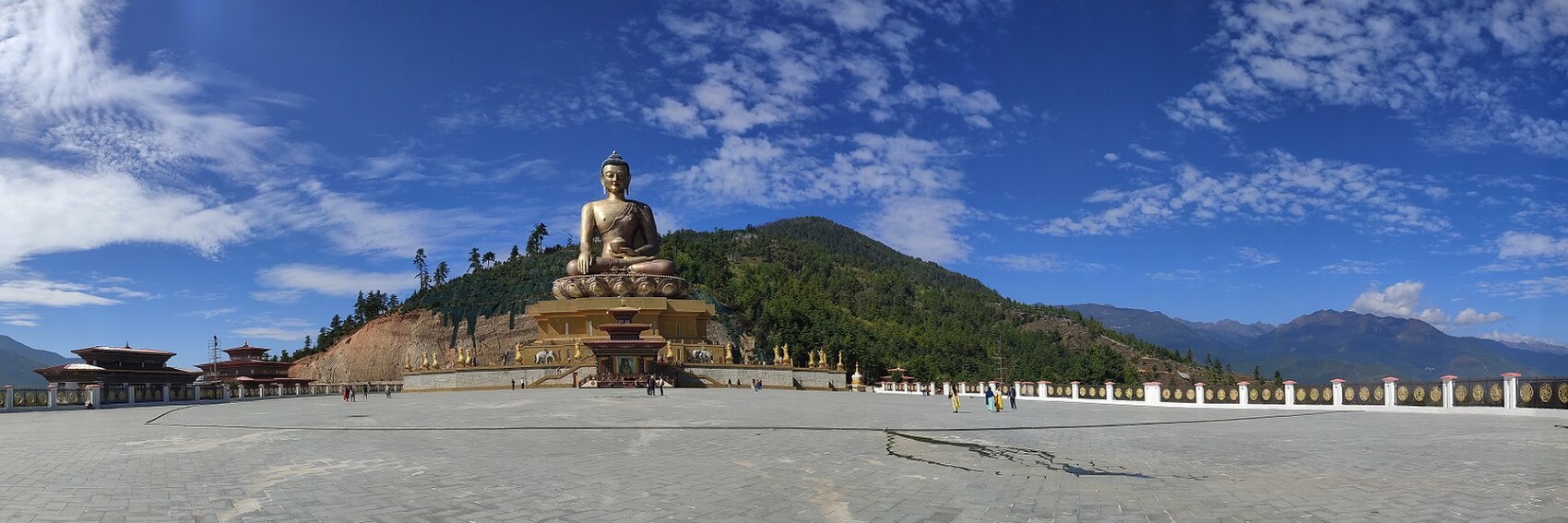
![]()

![]()

- #1, the (yes) Buddha Dordenma statue is honestly by far the best quality of the images I was able to find of Thimphu. I know we should get away from relying so heavily on this trope when featuring Asian destinations, but I think the counterargument is that this banner isn't only, or even primarily, about the statue. It's the landscape in the background that makes it. Besides, it's one of the principal points of visitor interest in the city, and it's not like just because there's one nominee depicting Buddhist imagery for a given featured article it's guaranteed to be the one that ends up on the Main Page. IIRC, the Buddha-statue banner for Nha Trang came in dead last in the vote. #3, the celebration of Tsechu Festival, is in second place; whereas #2's anonymity (it looks like it could be anywhere in the Himalayas) works against it. -- AndreCarrotflower (talk) 01:23, 10 March 2020 (UTC)
- Jeez, it is really hard to choose a favorite among these. But maybe 3, 1, 2. Ypsilon (talk) 05:16, 10 March 2020 (UTC)
- 1, 2, 3 for me. The architecture in 2 reminds me of other photos I've seen of Bhutan. —Granger (talk · contribs) 05:54, 10 March 2020 (UTC)
- 3, 2, 1. #3 is the most impressive of the banner images, followed by #2. --Comment by Selfie City (talk | contributions) 20:09, 10 March 2020 (UTC)
- All of them are so nice, but 1, 3, 2.--ThunderingTyphoons! (talk) 20:14, 10 March 2020 (UTC)
- The 2nd photo captures the "pint-sized" nature of the capital best, and then #1. #3 belies it by showing a packed crowd. On the other hand, if I disregard the blurb and just focus on what's more visually arresting, my preferences would be #3, #1 by a nose and then #2, I think (I may change my mind later). In any case, all 3 are excellent. -- Ikan Kekek (talk) 00:41, 11 March 2020 (UTC)
- To clarify, my vote is in order: 3, 1, 2. If that necessitates a change in the blurb, we can discuss that. Ikan Kekek (talk) 07:35, 22 March 2020 (UTC)
More banners. Vote! -- AndreCarrotflower (talk) 04:37, 8 March 2020 (UTC)
![]()

![]()

![]()
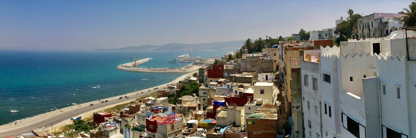
![]()
- Tough choice here. I'm going to say #1 first (the view from the gates of the Kasbah), then #4 (roundabout near the Grand Socco). The view of the city walls in #2 would have been second if there were a better place to put the textbox; instead it's in third. #3, the panoramic view of the corniche from above, is by no means a bad banner, just not quite up to the high standards of the others. -- AndreCarrotflower (talk) 04:37, 8 March 2020 (UTC)
- 1, 3, 2, 4. Can't the textbox for #2 go on the right? That might be my favourite image. But I do love #1.--ThunderingTyphoons! (talk) 15:32, 8 March 2020 (UTC)
- 1, 2, 3, 4. Agree with TT about #2. --Comment by Selfie City (talk | contributions) 20:03, 8 March 2020 (UTC)
- I had initially thought to put #2's textbox to the right, but it looked... weird and off. Maybe I'll try playing with the width of the box and/or shortening the blurb such that it stays in the area of blue sky rather than impinging on the buildings. -- AndreCarrotflower (talk) 22:05, 8 March 2020 (UTC)
- 2, 1, 3, 4. 2 is dramatic, regardless of the text box. 1 is a great perspective, so it's a hard choice. 4 is not very distinctive, but they are all good pictures. Ground Zero (talk) 15:39, 9 March 2020 (UTC)
- 2 looks really cool, that'd be my first choice too. #4 is the most realistic picture of Tangier, then comes #3 and on the last place #1 which looks kinda artificial. --Ypsilon (talk) 15:54, 9 March 2020 (UTC)
- 1, 3. A good set of banners to choose from. AlasdairW (talk) 23:29, 9 March 2020 (UTC)
- 1, 3, 2, 4. —Granger (talk · contribs) 23:59, 9 March 2020 (UTC)
- Really gorgeous banners! Very hard choice between the first 3. I suppose because #3 displays the strategic location where the Mediterranean meets the Atlantic best, perhaps it should be the top choice. After that, I'm picking #2 by a nose past #1 but it's pretty much a pick 'em between them. #4 seems less interesting, and yet it would be excellent. -- Ikan Kekek (talk) 00:36, 11 March 2020 (UTC)
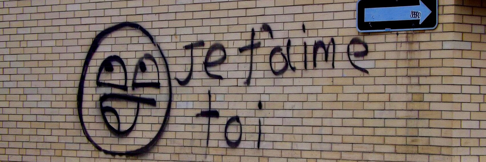
I didn't realize until just now typing these out that all three of these banners depict Quebec. Oh well. Not much geographic diversity, I guess, but a good bit of diversity in terms of contexts in which the French language is used. I'll share my thoughts (and try not to be biased about it, since I'm the photographer of two of these three images; #s 1 and 3), and you all do the same. -- AndreCarrotflower (talk) 23:31, 29 February 2020 (UTC)
![]()

![]()

![]()
![]()

![]()

![]()
- I guess #2 (the corner of rues Sherbrooke and Guy, at the west end of Montreal's "Golden Square Mile") is the highest quality image artistically, but I can't resist the infectious cheeriness of #3 (graffito in Quartier Saint-Sauveur, Quebec City) so it takes first place. #1 (sausages for sale at the Boucherie du Marché Jean-Talon in Montreal) is in last place only by virtue of the strength of the competition. -- AndreCarrotflower (talk) 23:31, 29 February 2020 (UTC)
- I don't really like #3; the photo's good, but the graffiti is bof bof, and hard to read ("Je folime toi"), so it's a non from me. Tant pis, because the other two are nice. I think I prefer #1 because, contrary to popular belief, French is not the language of love - it's the language of food! Plus, those sexy sausages could be in any one of Canada, France, Belgique or Suisse. However, I still like #2 because it's a well-framed picture and demonstrates the global reach of French, which the phrasebook takes pains to reflect. Mention bien.--ThunderingTyphoons! (talk) 00:57, 1 March 2020 (UTC)
- 2, 3, 1. It's best for the banner picture to be directly related to the subject of the article, and #2 does the best of job of being related to the language itself and nothing else by being dominated with words in French. The fact these images are all from Quebec, as AndreCarrotflower says is not a concern to me. --Comment by Selfie City (talk | contributions) 01:00, 1 March 2020 (UTC)
- I've gotta go with the sausages, so my #1 is #1. #2 is a clear example, so that's my #2 choice. #3 is cute, but it's just graffiti, so it's not essential to understand and is my 3rd choice. Any would be acceptable. Ikan Kekek (talk) 02:47, 1 March 2020 (UTC)
- 2, 1, 3 for me. I was confused by "Je faime toi." Ground Zero (talk) 03:06, 1 March 2020 (UTC)
- We do need a few options from the Old World too! So here comes couple of more banners from Francophone Europe cropped from my photo archive; #4 is a former building of the Red Cross in Geneva (currently the it houses the Museum of the Reformation), #5 a street scene with a lot of signs in Ferney-Voltaire, a French village just across the border from Geneva, and #4 a street scene in southern Paris with a warning sign for pedestrians that they need to cross two lanes (I think). 5, 1, 2, 4, 6, 3. --Ypsilon (talk) 15:30, 9 March 2020 (UTC)
- 1, 5, 2, 4. I don't like the graffiti as it is more vandalism than artistry, and the "Cross in 2 times" notice in 6 (ie cross the two lanes separately, and wait in the middle) is confusing unless it is an actual phrase in the phasebook (it isn't), but otherwise it is a good variety. AlasdairW (talk) 23:25, 9 March 2020 (UTC)
- I like #4 okay, but I'm not a fan of #s 5 or 6, as the French-language text is a minor and easily missable part of the images. -- AndreCarrotflower (talk) 00:06, 10 March 2020 (UTC)
- I still like the sausages best, and as road signs go, the one in Canada stands out more, even though French road signs are far more aesthetically pleasing than lumbering North American ones, obviously. I do like the simplicity and language focus of the Red Cross one, though, which leapfrogs to second place. Also le Croissant rouge, much like la baguette magique, never fails to make me smile. So, 1, 4, 2, 5, 3, 6.--ThunderingTyphoons! (talk) 20:27, 10 March 2020 (UTC)
- With the new banners to consider, the sausages are still my top choice, so #1. After that, my choices in order are #2, #4, #5, and #6. I accept the criticisms of the graffiti. Ikan Kekek (talk) 00:30, 11 March 2020 (UTC)
Here's something you probably weren't expecting to hear from me, especially at this juncture: I couldn't narrow down the banner choices, so I'm forced to offer up for your consideration more than the requisite four. I think you'll all agree Great Basin National Park is quite a picturesque place, and please share your thoughts on which of these five banners is the most picturesque. -- AndreCarrotflower (talk) 23:31, 29 February 2020 (UTC)
![]()

![]()

![]()

![]()

![]()
- No doubt in my mind #2 comes out the winner. I don't know if we've ever had a banner like that on the Main Page. #1 is a distant second, #3 is an even more distant third (if we use this one, we might want to tweak the blurb to highlight Lehman Cave a bit more), and the two Wheeler Peak banners are in last, #5 followed by #4. -- AndreCarrotflower (talk) 23:31, 29 February 2020 (UTC)
- I love #2 and #1 almost equally, but #2 just nudges ahead for its novelty. The others are far behind in the order of 5, 3, 4.--ThunderingTyphoons! (talk) 00:22, 1 March 2020 (UTC)
- 2, 1, 5, 3, 4. I agree with the current consensus that #2 is the best picture. --Comment by Selfie City (talk | contributions) 00:58, 1 March 2020 (UTC)
- I prefer 1, but 2 is an excellent picture. 3, 5, 4. Ground Zero (talk) 03:08, 1 March 2020 (UTC)
- 2 and 1 are almost a pick 'em for me, but I'll pick 2 as my first choice, with 1 as my 2nd choice. 5, which comes 3rd for me, is attractive and well-composed. After that, I pick the cave, #3, and then #4. So 2, 1, 5, 3, 4. And every one would be fine or better! -- Ikan Kekek (talk) 03:49, 1 March 2020 (UTC)
- My order is almost the same as Ikan's, but I like the first banner more 1, 2, 5, 3, 4. --Ypsilon (talk) 15:34, 9 March 2020 (UTC)
New banners, better late than never. Vote! -- AndreCarrotflower (talk) 01:07, 11 February 2020 (UTC)
![]()

![]()

![]()

![]()

- #4, with #1 close behind it. I didn't realize how similar #s 2 and 3 were to each other until seeing them side-by-side just now. #3 is a more accurate depiction of just how hilly the streets are in Ouro Preto if the aggregate of the photos I've seen on Commons and Flickr is accurate, but the architecture in #2 is nicer, so it takes the third-place prize for me. -- AndreCarrotflower (talk) 01:07, 11 February 2020 (UTC)
- 4, 3, 1, 2 for me. All are good. Ikan Kekek (talk) 06:06, 11 February 2020 (UTC)
- All of them are beautiful. 4, 1, 2, 3. Ibaman (talk) 11:07, 11 February 2020 (UTC)
- You know when people who've never been to Europe talk about how the likes of Quebec, New Orleans, and Boston look like European cities? Well, if you stand in the right place, and you squint... no, they're still very, very wrong. They don't look like they're in Europe, and nor should they. But this Ouro Preto place really does look like it's in Europe, and despite the fact that I know the map of Europe quite well but have never seen the words "Ouro Preto" scribbled over Iberia, I was convinced by these banners that it must be in Portugal - until I actually read the blurb. Anyway, all of that is a roundabout way of putting off deciding which out of four sublime shots is the best: 4, 1, 2, 3.--ThunderingTyphoons! (talk) 20:11, 11 February 2020 (UTC)
- Nice banners! 2, 4, 1, 3. --Ypsilon (talk) 20:18, 11 February 2020 (UTC)
- 2, 1, 4, 3. The colors don't feel quite natural on #4, and more natural colors would make me like it more. --Comment by Selfie City (talk | contributions) 21:54, 21 February 2020 (UTC)
- If you think these colors are unnatural, you should have seen how bright and garish the source image was before I toned down the levels! -- AndreCarrotflower (talk) 03:50, 29 February 2020 (UTC)
I'm sorry about my reduced presence at Wikivoyage lately. Please be assured that I'm not planning on going inactive, and that I'm working at a breakneck pace to wrap up my offwiki duties (not least because I have a big backlog of updates to the Buffalo district articles waiting for me once I'm ready to come back).
As is often the case with FTT banners, I was a bit puzzled at how to depict the concept of low-cost air travel in banner form. I have two options for you all to choose from this time, so let's hear your thoughts.
-- AndreCarrotflower (talk) 23:28, 20 January 2020 (UTC)
![]()

![]()
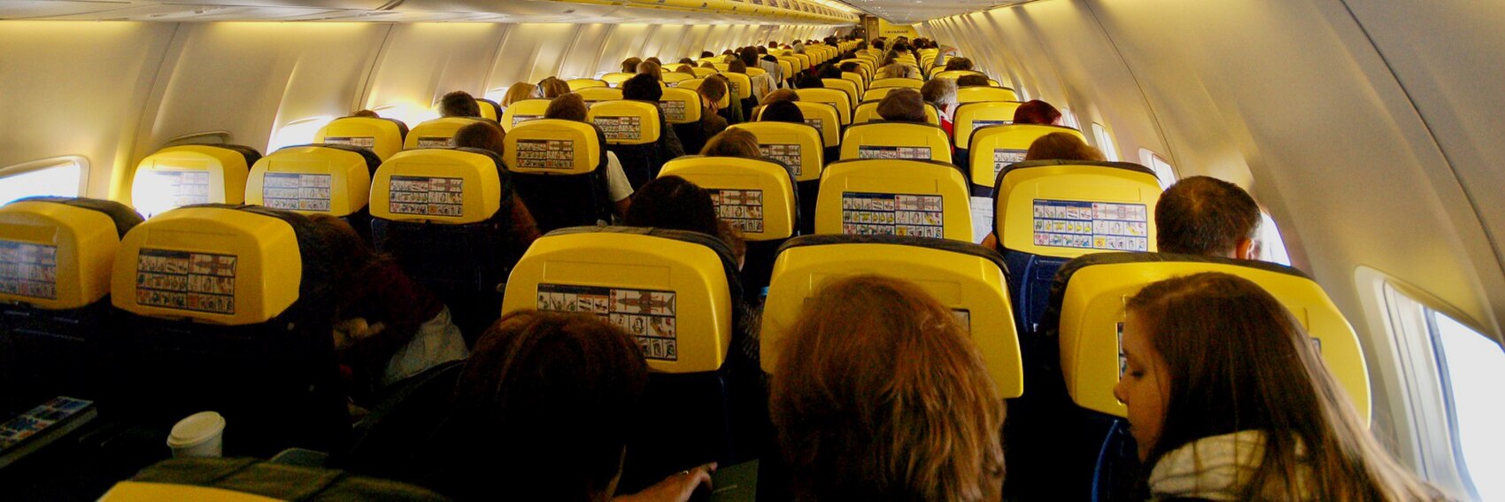
- #1 for me, please. The composition is superior, and although I know we usually try to avoid featuring trademarked logos and brand names in our banners for fear that we may give off the impression that we're advertising or endorsing certain companies, I think that's mitigated somewhat in this case by the fact that the names and logotypes of two companies in direct competition with each other are featured. #2 includes no brand names, but the lighting is less than ideal, and I don't know that it gets the point across quite as clearly - I was aiming for an image of an airplane cabin with an obvious dearth of legroom between the rows of seats. It's a relatively close second, though; I'd have no problem putting it on the Main Page. -- AndreCarrotflower (talk) 23:28, 20 January 2020 (UTC)
- Both are good, but I prefer 2. The inside of the cabin looks different quite from a flag carrier, bright yellow back of the seat when most airlines have off-white, and a safety label in place of the seat back screen. In addition it looks cramped and full. AlasdairW (talk) 00:12, 21 January 2020 (UTC)
- 1, 2. I agree with AndreCarrotflower. --Comment by Selfie City (talk | contributions) 01:01, 21 January 2020 (UTC)
- 1, 2 for me too. Ground Zero (talk) 03:57, 21 January 2020 (UTC)
- I like the composition of #2 better, and a large number of economy class seats represents the topic adequately, although EasyJet and Ryanair are even more obvious. I'll go for 2, then 1, but either would be fine. Ikan Kekek (talk) 04:00, 21 January 2020 (UTC)
- Prefer #1, could happily live with #2.--ThunderingTyphoons! (talk) 09:50, 21 January 2020 (UTC)
The exciting conclusion of today's banner dump. Vote! -- AndreCarrotflower (talk) 01:16, 11 January 2020 (UTC)
![]()

![]()

![]()

- #1, the shot of pro surfer Dusty Payne in action at the 2015 J-Bay Open, wins the top prize for me, but there's also a strong argument to be made for #2, which gets the same point across in a more placid, and more artistically abstract, kind of way. -- AndreCarrotflower (talk) 01:16, 11 January 2020 (UTC)
- #1, #2, #3. If its surf we're after at JB, then let's put that front and centre. Excellent work, as always. Ground Zero (talk) 04:00, 11 January 2020 (UTC)
- 2, 1, 3 for me. 2 is more artistic and kind of romantic to me, and suggests a moment of relaxation after an afternoon of surfing. -- Ikan Kekek (talk) 06:38, 11 January 2020 (UTC)
- Difficult choice again. When a surf movie is mentioned in the blurb we sort of have to have #2, the action-filled #3 also looks cool, #1 is not far behind the others, showing a bit more than just surfing itself. Ypsilon (talk) 16:54, 11 January 2020 (UTC)
- 2, 1, 3. The competition is between 1 and 2, since the third image could be anywhere. Both #1 and #2 are the kind of images we typically don't use as DOTM banners, and I think in this case, their being different is a good thing. This is especially true of #2, which shows a depth rarely found in the pictures we use on the main page, so I think it's the best.—The preceding comment was added by SelfieCity (talk • contribs) 19:38, 11 January 2020 (UTC)
- Have we ever had something like #1? Love it. #2 & #3 are a rather a distant joint second for me.--ThunderingTyphoons! (talk) 22:43, 11 January 2020 (UTC)
Nha Trang is best known as a beach resort, but it's also got some worthwhile cultural attractions too. I didn't want to give either side of the place short shrift, so I made two banners highlighting the former side and two highlighting the latter. Again, let's hear your votes. -- AndreCarrotflower (talk) 01:16, 11 January 2020 (UTC)
![]()

![]()
![]()

![]()

- My overreliance on Buddha statues and Buddhist imagery when making up banners for Southeast Asian destinations has been well noted in the past, but with #2, I just couldn't resist - it's such an interesting perspective, looking up from the ground at the head of the gleaming white statue with the bright blue sky as the backdrop. Plus, I've never been one to look a gift horse in the mouth. :) But I'm placing it second on my ranking after #3, which cuts to the heart of what the place is all about not only with what it depicts outright but also with what it hints at obliquely: the beach is plenty evident, of course, but also the bright lights at left and in the background give the viewer something of a glimpse of the place's equally legendary nightlife, and the high-rise building under construction speaks of the dynamic growth the city is undergoing. Bringing up the rear are, in descending order, the pleasant but anonymous bird's-eye shot of the beach in #1 (also a victim of harsh colors, which my photo editor only did so much to mitigate), and the stone towers depicted in #4: they're a vestige of the ancient Cham civilization and an important tourist site today, but given its close-up angle, the picture doesn't really make it clear what you're looking at. -- AndreCarrotflower (talk) 01:16, 11 January 2020 (UTC)
- I'd go for #3 as it is a beach place, then #1, #2, and #4. I do love the drama of #2, but I don't think that's what draws people to Nha Trang. Any if them is a big improvement from the yawn-inducing banner we have now. Ground Zero (talk) 03:59, 11 January 2020 (UTC)
- What a beautiful place! I remember it as a city that suffered from a lot of bombing and fighting during the American War (which we call the Vietnam War). I'm glad much remains to be seen. It strikes me that #1 is the prettiest photo that gives a sense of place, so that's my favorite. After that, I considered #2 and #4, but ultimately, #2 is prettier. #3 is spoiled by the nearness of the ugly high-rise construction and lacks the pretty boats that are in #1. To sum up: In order of preference, #1, #2, #4. #3 would be very disappointing to use, IMO. Ikan Kekek (talk) 06:43, 11 January 2020 (UTC)
- I should add, I wrote this up before seeing that both of the previous votes were for #3, so nothing personal, but I disagree with you guys. Ikan Kekek (talk) 06:45, 11 January 2020 (UTC)
- Hard to pick a favorite between the beach banners (or all of these banners actually), but for me too #1 is the winner, and close behind comes #3, then the well-balanced Buddha banner #2 and on the last place #4 which, as Andre said, doesn't show much of the building. Ypsilon (talk) 16:40, 11 January 2020 (UTC)
- 1, 3, 2, 4. The first picture is the best because of its view across the region and its view of the boats, which make the region clear. #3 looks less like an Asian destination. #2 and #4 are not bad pictures, but they are abstract compared to 1 and 3. --Comment by Selfie City (talk | contributions) 19:35, 11 January 2020 (UTC)
- Oh, wow you actually went with the Buddha :D Despite everything, #1 is my favourite composition; the boats, and the sea, and the city, and the mountains, and the sky; it's all wonderful. I'd be happy with #2's simplicity and serenity. #3 is for me a lovely picture ruined by the construction of that tower, which looks completely out of place in its setting (blame the planners for that one). But it does at least show what the traveller can expect from the place, unlike #4 which is a closeup of...something old, with a stray branch entering the frame and wonky camera angle not doing the composition any favours.--ThunderingTyphoons! (talk) 22:39, 11 January 2020 (UTC)
Commons has lots and lots of photographs of roads, highways, signs, onramps, offramps, etc. all over Brazil - but precious few that are interesting-looking or suitable for use as banner source images. Finding these three exceptions was like finding needles in a haystack, but I'm pleased overall with what I came up with. Let's hear how you feel. -- AndreCarrotflower (talk) 01:16, 11 January 2020 (UTC)
![]()
![]()

![]()

- Maybe it's my affinity for modern architecture talking, but I'm giving the first-place crown to #1, the cars lined up on the Eixo Monumental in Brasilia. #3, taken during a 2009 expedition into the Amazon by Jeep, is the most exciting and tantalizing of the three, albeit probably not the typical driving experience for the average tourist in Brazil. #2 is taken from an interesting perspective hovering over the road sign gantry, and the Portuguese-language text on the signs certainly makes it clear what country we're dealing with, but those are about the only argument in favor of this otherwise rather boring image. -- AndreCarrotflower (talk) 01:16, 11 January 2020 (UTC)
- I'd go with: #1, then #2, then #3. 3 is just too atypical for me. Ground Zero (talk) 03:55, 11 January 2020 (UTC)
- Question: In #1, those cars are not parked? I think the answer to that question matters. I was thinking they were parked and was going to exclude the banner on that basis although I like the composition. Ikan Kekek (talk) 06:48, 11 January 2020 (UTC)
- My ranking is sort of upside down compared to earlier users' preferences; I prefer #2 where it feels like you're starting a roadtrip to for example Rio de Janeiro, on second place the Jeep in the wilderness #3 and on last place comes #1. Ypsilon (talk) 16:27, 11 January 2020 (UTC)
- 3, 1, and 2. I originally voted in support of #2, but I've changed my mind. I think #3 is more likely to attract tourists into visiting Brazil (the goal of a travel guide) and wanting to drive there. Nothing is appealing about #2, so I have moved it to last place. --Comment by Selfie City (talk | contributions) 19:40, 11 January 2020 (UTC)
- 2, 1, 3. I like #2 for the same reasons as Ypsi; #1 is a striking image but as Ikan says the cars looked parked; #3 makes the experience look like a safari. This is a divisive one, for sure. --ThunderingTyphoons! (talk) 22:27, 11 January 2020 (UTC)
- Comment: The cars in #1 might be parked, they might be stopped at a red light, they might even be moving and the camera was set to a fast shutter speed. I don't know which of those is true, and I don't think it really matters. To me, the salient points are: 1) it's an attractive image, and 2) even if those cars are parked, it's still relevant to the subject of driving, as the cars were driven into their parking spots and will eventually be driven out of them. -- AndreCarrotflower (talk) 18:27, 12 January 2020 (UTC)
- At least for the car on the far left, the shadow on the curb, direction of the front wheel, and seemingly empty driver's seat all suggest a parked car. I'd say 3, 1, 2. —Granger (talk · contribs) 00:09, 13 January 2020 (UTC)
- Considering the photo of the BR-174 "highway" in the article, I don't think #3 is at all out of line for this topic. In view of that, my choices are #3, #2 and then #1. #1 is indeed a nice photo, though not IMO as nice as #3, but pace AndreCarrotflower's remarks about the necessity to drive into and out of parking spaces, I think "Parking in Brazil" is at most a small subchapter in an article about driving, and that some evidence of motion is probably crucial to this topic. Ikan Kekek (talk) 15:28, 13 January 2020 (UTC)
- Further to the point about which roads are and are not typical of Brazil, this is from the article: "out of the country's 1,750,000 kilometers of roads about 5.5% is paved." So it may be the roads depicted in the first two banners are atypical, while the one in the third is more common. Ikan Kekek (talk) 08:51, 14 January 2020 (UTC)
- It's part of User:Ibaman's job to travel all over Brazil, so his perspective would be very welcome here.--ThunderingTyphoons! (talk) 12:07, 14 January 2020 (UTC)
- Further to the point about which roads are and are not typical of Brazil, this is from the article: "out of the country's 1,750,000 kilometers of roads about 5.5% is paved." So it may be the roads depicted in the first two banners are atypical, while the one in the third is more common. Ikan Kekek (talk) 08:51, 14 January 2020 (UTC)
- Wow. How amazing. I live in Brasília and work not far from Eixo Monumental (#1), and very often take the BR 040 to go out of the Federal District (#2). My father hails from Rondônia (#3). I think all of them amazing and emotionally significant. However, to be impartial, I cast my vote as #3, then #1, then #2. Ibaman (talk) 12:14, 14 January 2020 (UTC)
Thanks are in order to Inas, who was the photographer of three of these four images (all except #2). Again, let's hear your votes! -- AndreCarrotflower (talk) 00:35, 11 December 2019 (UTC)
![]()

![]()

![]()
![]()

- Tough call here, but I'm going with #4 in first place (the ruins of the former penal settlement of Kingston, apropos to the "history buffs" called out in the blurb), followed closely by #2 (I don't know what this view is of, but it's gorgeous) and then #3 (the lone pine at Emily Bay, haven for the also-aforementioned snorkelers). -- AndreCarrotflower (talk) 00:35, 11 December 2019 (UTC)
- There are all really good pictures, so I'm not against any of them. My choice, in order, would be 2-1-4-3. Ground Zero (talk) 01:21, 11 December 2019 (UTC)
- Yes, all beautiful. I'm not ready to pick between them. Ikan Kekek (talk) 01:36, 11 December 2019 (UTC)
- The world heritage penal colony banner #4 is also my favorite, the other three are equally good, but #3 looks well balanced with the pine on one side and text box on the other so that comes second, then #2 which has a sort of magical feel and close behind comes #1, which hasn't, but is still a nice pic. Ypsilon (talk) 16:23, 11 December 2019 (UTC)
2, 1, 4, 3(sorry Andre, but now I'm looking at a larger screen and my favorite is #1, followed by 4, 2, and 3), but they're all decently good pictures. --Comment by Selfie City (talk | contributions) 20:33, 11 December 2019 (UTC)- My order of preference is 1, 4, 3 then 2. Not a fan of the hazy background in #2 even if it's natural. Reminds me of pollution. Gizza (roam) 21:59, 11 December 2019 (UTC)
- I've looked at them all and My vote is 4, 3, 1, 2. 4 matches the first line of the blurb, while 3, 1 and 2 are great images. —The preceding comment was added by Joshlama1 (talk • contribs)
- 1, 2, 4, 3. Love that shot overlooking the cove, so enticing. The misty woods and mountains look like Jurassic Park, or Skull Island, again really intriguing and *whispers* exotic. #4 shows the penal colony and the sea is once again glorious, but like #3 is a bit anonymous - they could both be on the west coast of Scotland, or on the east coast of Canada, for instance.--ThunderingTyphoons! (talk) 14:32, 22 December 2019 (UTC)
A thousand apologies for my inattention to banner-making over the past month or so. It has been and continues to be an extraordinarily busy holiday season (which also explains my relative absence from Wikivoyage in general), so I can't 100% guarantee the banners for January's FTT will be on time, but I don't have anything much on the docket for after the New Year, so I should be able to catch back up around that time. As you can see, I've uploaded selections for Metro Cebu as well as Norfolk Island, so we're fully stocked at this point. Keen eyes may notice that Banner #1 is identical to one of the non-winning candidates from among the Magellan-Elcano circumnavigation FTT banners from last summer. Let's hear your votes! -- AndreCarrotflower (talk) 00:35, 11 December 2019 (UTC)
![]()

![]()

![]()

![]()

- I wanted badly to vote for #3 (the costumed celebrants of the Sinulog festival on the streets of Cebu City, which takes place in January during Metro Cebu's Main Page term), but alas, it's tough to read the textbox over the backdrop of banners hanging over the street. So it falls to a close second behind #1, the statue of Lapu-Lapu that pays testament to the area's importance in the voyage of Magellan and which, according to the article, is one of its main sights today. Third place goes to #4, the sea grass-carpeted bay in the Olango Island Wildlife Sanctuary; definitely a place I'd go if I were a diver or wildlife spotter, as the blurb said. The mountains serve as a nice backdrop to the Cebu City skyline in #3, but other than that it's pretty drab and the photo quality is poor, so it comes in last on my ranking. -- AndreCarrotflower (talk) 00:35, 11 December 2019 (UTC)
- 1-4-3-2. Thanks for your work of these banners, Andrew. Ground Zero (talk) 01:24, 11 December 2019 (UTC)
- 4 is the most beautiful of the banners, but - please correct me if I'm wrong - 3 and 1 seem more clearly distinctive, so my choices in view of that are #3, then #1 and #4. We could use #2 if we didn't have anything better, but we do, and as Ground Zero said, thanks for the embarrassment of riches! Ikan Kekek (talk) 01:34, 11 December 2019 (UTC)
- I like banners with some action so to me #3 is the winner, after that the interesting looking #4, not far behind it #1 and on the last place #2 which compared to the other three looks boring. --Ypsilon (talk) 16:16, 11 December 2019 (UTC)
- 1, 4, 3, 2. Once again, coincidentally the same as GZ. --Comment by Selfie City (talk | contributions) 20:36, 11 December 2019 (UTC)
- 3-1-4-2. 4 is the most beautiful but not I'm not sure how representative it is. Gizza (roam) 22:02, 11 December 2019 (UTC)
- 3, 1, 2, 4. The festival is brill, and I can read the text fine. However, since that has been raised as an issue, is it possible to make the textbox darker / more opaque? Lapu-Lapu is cool; glad to see him back again. #2 is boring but at least shows a city, whereas there's nothing metropolitan about Olango Island, even if it is in the region covered by the article.--ThunderingTyphoons! (talk) 14:25, 22 December 2019 (UTC)