
Wikivoyage:Destination of the month candidates/Banners/Archive/2019
| DotM banner archives: 2013 • 2014 • 2015 • 2016 • 2017 • 2018 • 2019 • 2020 • 2021 • 2022 • 2023 • 2024 |
Archived banners for destinations featured on the Main Page in 2019.
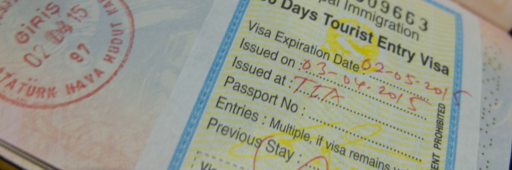
Hey, if you saw what was (or, more to the point, what wasn't) available as source images on Commons and Flickr, you'd have punted too. I always hate to have too few banner images for folks to choose from, and I really hate to have only one, but they all looked basically identical. Here's one of the few I found where both the name of the country and that of the visa applicant were either absent or croppable. If any of you folks can find an alternative image, I'd be all for it. -- AndreCarrotflower (talk) 23:49, 20 November 2019 (UTC)
![]()
- Support. This image will work for the featured travel topic. --Comment by Selfie City (talk | contributions) 02:25, 21 November 2019 (UTC)
- My order of preference, carefully considered as ever, is the following: 1.--ThunderingTyphoons! (talk) 06:52, 21 November 2019 (UTC)
- This banner represents the topic well. Ypsilon (talk) 09:52, 26 November 2019 (UTC)
- It's a hard choice, but #1 really does represent the topic clearly, so I have to vote for that one over the others. Ground Zero (talk) 01:26, 11 December 2019 (UTC)
Made the best of an extremely limited range of Copyleft-compatible source material. Let's hear your thoughts! -- AndreCarrotflower (talk) 21:47, 10 November 2019 (UTC)
![]()
![]()

![]()
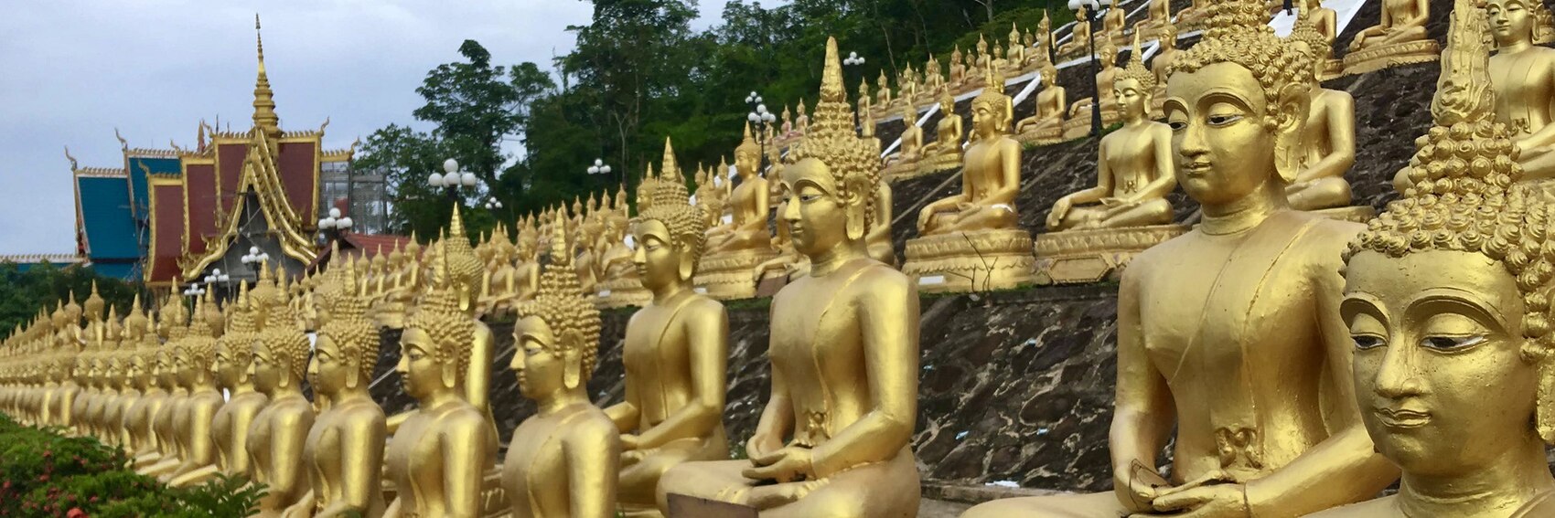
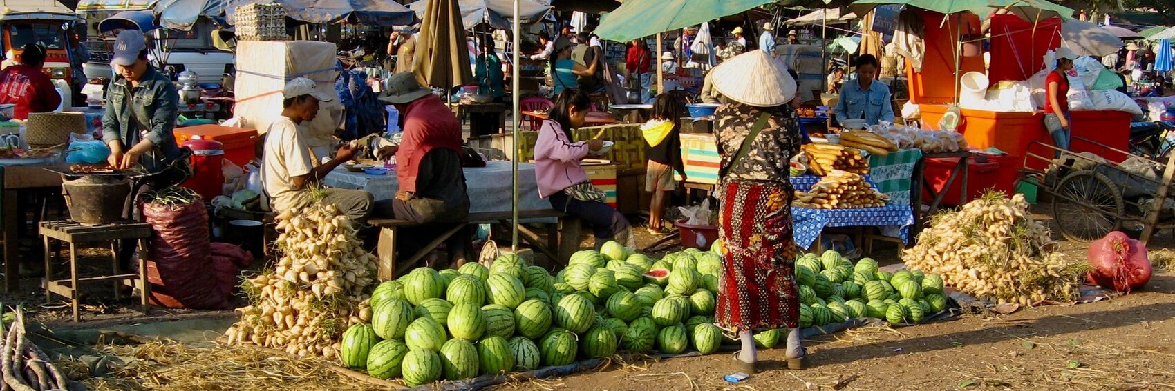
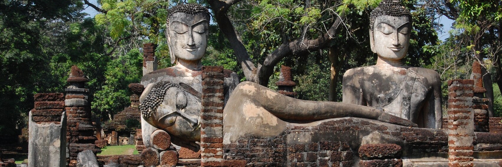
- The text in the blurb implying that Pakse is more of a jumping-off point than a destination in itself made me feel freer to include more "utilitarian" images as representative depictions (i.e. #s 1 and 2 here), but in the end there's really no contest here. The only thing that gives me even slight pause about #3 is that it seems like Buddha statues and other such Eastern religious imagery is a trope that we're maybe leaning a bit too heavily on when we feature Southeast Asian destinations (Kamphaeng Phet's banner being another recent example). For second place I guess I'd pick #2 over #1, but again, they're both way far behind. -- AndreCarrotflower (talk) 21:47, 10 November 2019 (UTC)
- I prefer #1. As ACF says, Buddha statues representing SE Asia is becoming cliché. I don't find the main road at the forefront of #2 particularly interesting. The first image illustrates the "lively markets" mentioned in the blurb. Gizza (roam) 04:52, 11 November 2019 (UTC)
- It doesn't matter to me if various places in Southeast Asia have impressive Buddha statues: #3 is the clear winner to me. After that, I prefer #1, a colorful market scene that conforms to the blurb, to #2, which is interesting to me mainly for the hill in the background. -- Ikan Kekek (talk) 05:49, 11 November 2019 (UTC)
- 2, 1, 3 per AndreCarrotflower, DaGizza, and the blurb. #2 seems to fit the blurb well by saying that "this is better than the market" displayed in #1. However, all of these are good enough to use as banner images on the main page. --Comment by Selfie City (talk | contributions) 21:27, 11 November 2019 (UTC)
- 3, 1, 2 - You can't beat a hoard (or is it a horde?) of golden Buddhas. The market is referred to in the blurb so is a fine choice. The road with traffic and ugly streetlamps is a turn off for me.--ThunderingTyphoons! (talk) 06:57, 21 November 2019 (UTC)
- {It's a horde.) Ikan Kekek (talk) 08:00, 21 November 2019 (UTC)
- My point was it could be either: hoard of treasure, horde of philosophers. But thank you.--ThunderingTyphoons! (talk) 08:40, 21 November 2019 (UTC)
- Sorry for being unimaginative. Ikan Kekek (talk) 09:05, 21 November 2019 (UTC)
- I write all my worst material before 7AM.--ThunderingTyphoons! (talk) 09:12, 21 November 2019 (UTC)
- I too go for the Golden Horde (but... aren't we talking about the opposite side of Asia here? XD), then the market and on the last place the road: 3,1,2. Ypsilon (talk) 09:50, 26 November 2019 (UTC)
For any given DotM/OtBP/FTT candidate, I really don't like offering fewer than four banner options to choose from. It's a bad habit that I've gotten into lately and am trying hard to get out of.
So I'm distinctly displeased to say that I only have three Adelaide banners to offer. There are a couple reasons for that. One, to the extent that I was able to get a feel for the place's identity - what makes it stand out from the pack - it's heavy on things that don't translate super well to pictorial format (fine dining, progressive political outlook, etc.) Normally, I'd compensate by leaning more on the aesthetic end of things and just seeking out interesting-looking images to use as source material, but that brings us to the second problem, which is that Adelaide (at least according to the impression I got from what was on Commons and Flickr) is oddly anonymous-looking. Even the heritage architecture, which Lonely Planet crows about (when you look up a destination on their website, each one starts out with a really nicely done two- or three-paragraph summary of what's interesting about the place for travellers, which I find is a good place to look when it's banner-making time and I need clues on what to look for), didn't seem different from any other Western city's stock of old buildings.
Notwithstanding all that, let's hear your opinions.
-- AndreCarrotflower (talk) 02:48, 1 November 2019 (UTC)
![]()

![]()

![]()

- For the first time that I can remember, I think all the banners are equally (and considerably) impressive in terms of how attractive the image is, so my ratings are based on how well they reflect the text blurb and/or the essence of Adelaide as described in the article. Banner #3 (Moseley Square in Glenelg as seen from the jetty) is in first place; depicting both some handsome heritage architecture (notably Glenelg Town Hall) and some of the popular beaches in Adelaide's western suburbs that aren't mentioned in the blurb but get a good bit of coverage in the article itself. #1 is in second place, the view over the River Torrens at sunset, looking toward the Festival Centre which is a venue for much of the high culture toued in the blurb. #2 (Brighton Jetty) is pleasant, and would likely be a welcome sight in December to Northern Hemisphere eyes, but in the end could be pretty much any coastal location. -- AndreCarrotflower (talk) 02:48, 1 November 2019 (UTC)
- I agree with your ranking. I'd like to request that "of course" be removed from the blurb. It's unnecessary for people who do know these things about Adelaide and insulting to those (including me) who didn't know it and want to find out more about it. I know you hate "Words to avoid", but this is an expression to avoid. Ikan Kekek (talk) 06:06, 1 November 2019 (UTC)
- 1, 2, 3, but they're all good! #'s 1 and 2 are especially good. I love the scene in #2, but then, #1 is so dramatic, lively, varied, and attractive, that I feel it's the best option. I know that's a slightly different viewpoint, but I really like #1. IMO, #1 looks more modern than #3, and modern is a major way that travel websites such as Lonely Planet make places look like great tourist destinations. --Comment by Selfie City (talk | contributions) 12:14, 1 November 2019 (UTC)
- Also, I agree with Ikan Kekek that "of course" doesn't fit and should be removed. --Comment by Selfie City (talk | contributions) 12:17, 1 November 2019 (UTC)
- Hard choice but 1, 3, 2. I nominated the article and wrote the blurb, and while I don't really know much about Adelaide, it's described as a great culinary destination (the foremost in Australia?) both in the lead and the Eat sections, so I think it's worth emphasizing that in the blurb. Perhaps "of course" isn't an appropriate expression (I didn't try to offend anyone :P), but if anyone has a better suggestion, please plunge forward and improve the blurb. --Ypsilon (talk) 19:54, 2 November 2019 (UTC)
- I don't see the need for any expression to substitute for "of course"; it's simply two superfluous words, I would think. Ikan Kekek (talk) 23:24, 2 November 2019 (UTC)
- 1, 3, 2, though none make me want to visit. Looks like Milton Keynes with better weather (I'm blaming the city, not the banner choices). --ThunderingTyphoons! (talk) 23:48, 2 November 2019 (UTC)
- 1 and 2 are the prettiest photos. Unfortunately Adelaide is not a major travel destination in Australia and there aren't any unique selling points about it. It is known as the "City of churches" (though hardly anyone outside the state would be able to name a particular church), the Australian Detroit (a city whose economy hasn't recovered after all the automotive manufacturing shut down) and a stopover for places like the Barossa Valley. To an extent its sporting venues punch above their weight but that's it. Gizza (roam) 21:52, 11 November 2019 (UTC)
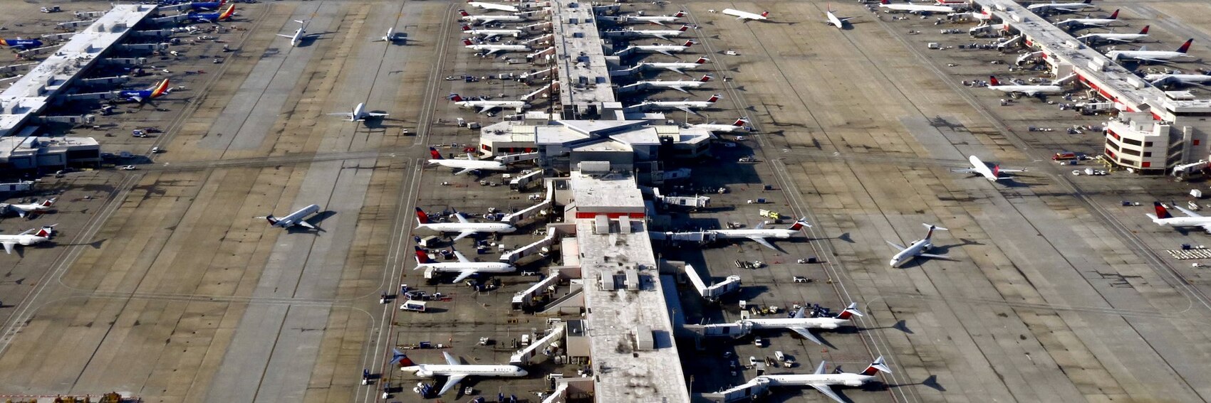
I'd like to get out of this bad habit of presenting banners for your approval just in the nick of time. But on the bright side: by virtue of the fact that ATL is unusually rich in visitor exhibits and other points of interest of a not strictly functional nature, at least there was enough material for a full-size roster of four banner options. Let's hear your votes! -- AndreCarrotflower (talk) 23:42, 20 October 2019 (UTC)
![]()

![]()
![]()
![]()
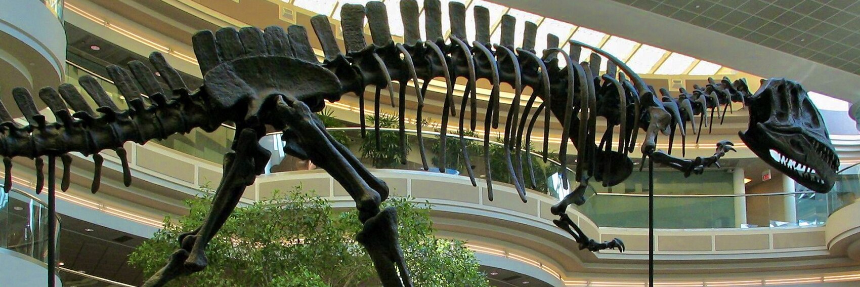
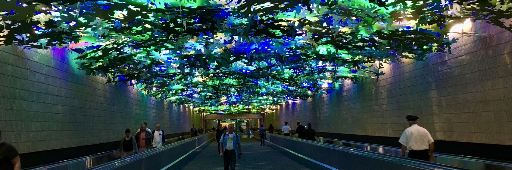
- Despite what I said in my little intro above, and despite what I was expecting to say whilst in the process of making these banners, I'm going to vote for #3 as my first choice - it may be anonymous-looking, but it does the best job of all of them in illustrating the sheer massive scale of the place, which in turn keys into the blurb in the textbox. It's a close race for second, but #2 (the forest-themed walkway between Concourses A and B; pleasantly colorful, if a bit reminiscent of the O'Hare banner from 2013) is ahead of #1 (the... actually I don't know what this is exactly, but it's neat-looking) by a hair. #4 is impressive, but it doesn't exactly scream "airport". -- AndreCarrotflower (talk) 23:42, 20 October 2019 (UTC)
- 3 followed by 4. When I look at 2, my eyes go to the man in the center. 1 is low quality. ChubbyWimbus (talk) 12:08, 21 October 2019 (UTC)
- 3, 4, 2, 1. Number 2 is also reminiscent of Manchester Airport, so let's not use that one. 1 looks like a building site, and is probably finished by now. As an image, I prefer 4 actually, but I literally just wrote the same thing as André before realising. 4 could only be improved with the theropod from #3 stomping across the tarmac. --ThunderingTyphoons! (talk) 12:32, 21 October 2019 (UTC)
- 3, 4. It would be good to tweak the text box on 3, as some of the white text on white aircraft is not clear. AlasdairW (talk) 17:15, 21 October 2019 (UTC)
- 3, 2, 4, 1. Ypsilon (talk) 07:31, 27 October 2019 (UTC)
- While I like #1, I side with the others that #3 is the best. My vote is 3, 1, 2, 4. While I've been through #2, and it's a notable, recognizable part of the airport, I don't think it's enough of one that travellers would all immediately connect it to ATL, especially if they haven't been to the airport yet. Lastly, #4 looks like an exhibit in a museum, not an airport, per Andre. --Comment by Selfie City (talk | contributions) 12:57, 27 October 2019 (UTC)
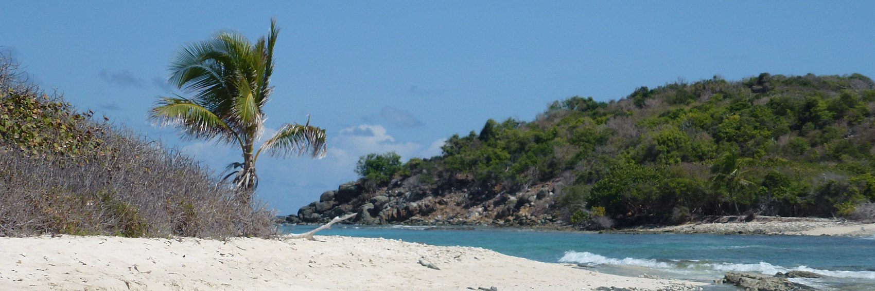
It's been a long and grueling day and I'm pretty well exhausted, so I'm not going to run off at the mouth here. But let's hear your votes on the three Jost Van Dyke banners I made earlier today. -- AndreCarrotflower (talk) 03:44, 11 October 2019 (UTC)
![]()

![]()

![]()

- #2 does the best job of the three at depicting the laid-back experience described in the blurb. #3 is second. #1 is kind of a weird one - the attraction that put JVD on tourists' radar screens in the first place was Foxy's Bar, a ramshackle little beachside watering hole that opened up in the late '60s and for whatever reason became a place for jetsetting celebrities to see and be seen, and while I'm not sure if it's Foxy's or one of the handful of other similar bars on JVD that's depicted, I think it serves as a fitting homage. The Christmas tree I'm not as sure of, but seeing as JVD will be featured on the Main Page through December 11, I don't think it's too overly out of place. -- AndreCarrotflower (talk) 03:44, 11 October 2019 (UTC)
- 2, 4/1, 3. #2 is the best. It looks good at dotm in the preview, so I think it will work well as the banner. It has a good beach feel, and the picture fits (physically) reasonablly well with the blurb. #1 is a good picture, but the blurb clashes with the image. #3 simply doesn't look impressive. --Comment by Selfie City (talk | contributions) 12:27, 12 October 2019 (UTC)
- #3 is too blurry to even be considered. #2 is the best, with #1 just behind.--ThunderingTyphoons! (talk) 14:23, 12 October 2019 (UTC)
- Difficult choice between the first and second ones, but I'll go with #1 (JVD is particularly notable for its beach bars) and then #2 just behind it. Blurry #3 comes last. Ypsilon (talk) 15:40, 12 October 2019 (UTC)
![]()
- Here's a fourth option. IMHO, it's not as good as #2 but perhaps better than the others. [I've since rated it equally to banner #1.] It doesn't fit greatly with the blurb, but it'll provide another option. It is from the "Jost van Dyke" category and "Panoramio images reviewed by trusted users" category on Commons. --Comment by Selfie City (talk | contributions) 17:49, 12 October 2019 (UTC)
- Number 1 for me. #2 may not be as blurry/noisy as #3, but it's a low-quality picture. Here's the original. Blow it up to full size and it'll be obvious. I also find the scene in #1 more idiosyncratic and inviting, and the juxtaposition of the Christmas tree and the tropical scene is part of what you experience in tropical areas that time of year. Ikan Kekek (talk) 18:44, 12 October 2019 (UTC)
- Number 1 is the only one of good enough quality to me, and it looks interesting. ChubbyWimbus (talk) 12:04, 21 October 2019 (UTC)
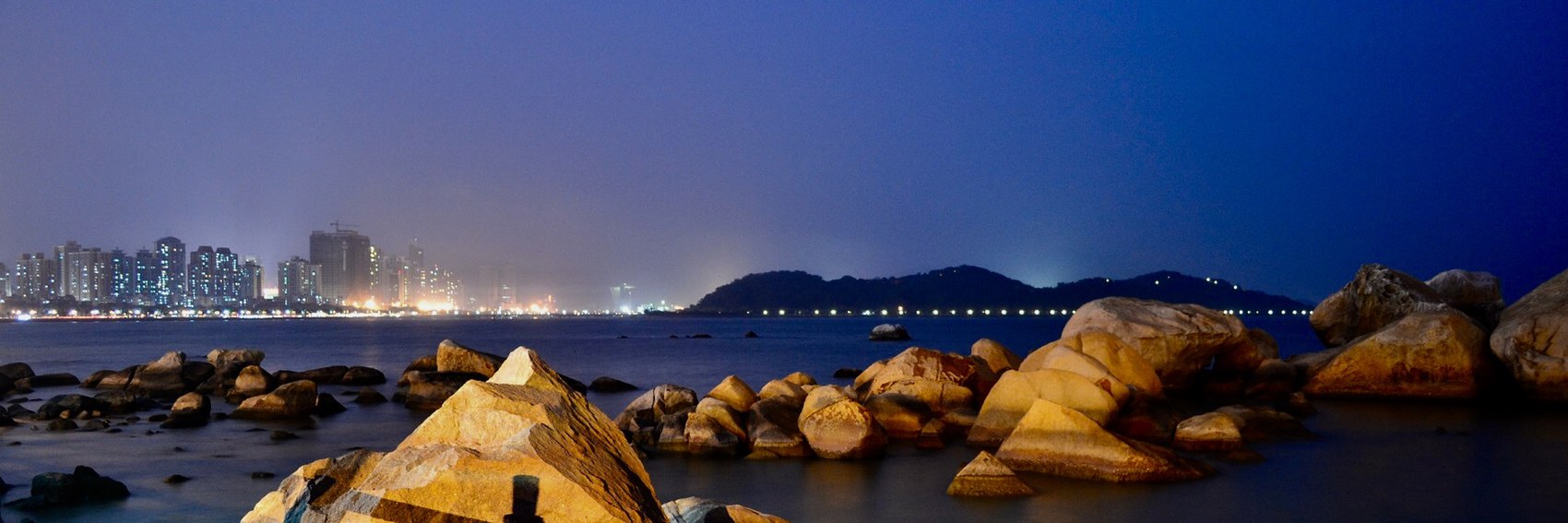
Yet another rush job. A couple non-banner-related points about this nominee:
- It needs a good deal of copyediting before it goes on the Main Page. I'll try my best to do it myself if no one gets to it before me, but my schedule in the upcoming month is looking busy.
- I wasn't able to get a terribly good sense of what Zhuhai is all about (and thus of what subjects might be suitable for DotM banners) from reading the article. Maybe someone could finesse the "Understand" section a little bit.
And one banner-related programming note:
- My banner-photography day trip to Letchworth State Park is tentatively planned for next Sunday. The weather forecast looks good; Plan B will be early the following week. The leaves will have only just begun to change color, but hey, at least it's an accurate depiction of how the place looks in October.
But I digress. Let's hear your thoughts on these banners.
-- AndreCarrotflower (talk) 22:35, 30 September 2019 (UTC)
![]()

![]()
![]()
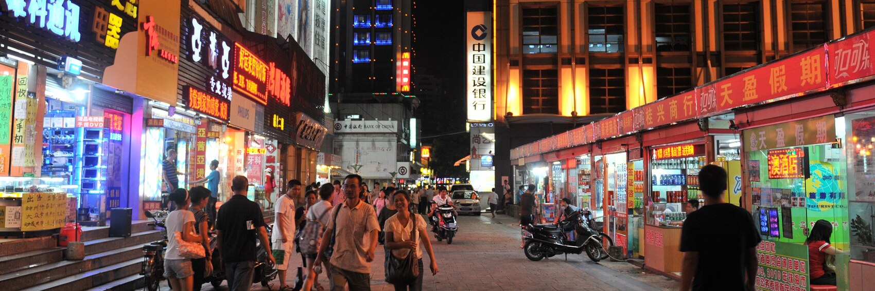
- IMO, #2 does the best at getting across what the city is about: a mix of bright lights and bustling nightlife (albeit in the distance in this shot) as well as beaches and seaside scenery. #1 is a distant second; the Fisher Girl statue is said to be a well-known symbol of the city. #3 says "lively nightlife", all right, but it's anonymous: it could be any city in the world, or at least in China given the lettering on the signs. -- AndreCarrotflower (talk) 22:35, 30 September 2019 (UTC)
- I agree with your order, though I like #1 a lot more than I think you do. #2 and #1 are both really striking to me. Thanks for your tireless work on this project! Ikan Kekek (talk) 23:18, 30 September 2019 (UTC)
- I actually prefer #3, because I like the combination "Far Eastern urban environment during nighttime". #2 is close behind, and #1 is by no means a bad banner. Ypsilon (talk) 16:35, 1 October 2019 (UTC)
- I'd say 2, 1, 3. #2 gives a good feel for what Zhuhai is like as a destination (in my limited experience): the sea, attractive landscape, and the city lights. #1 is beautiful and features the famous symbol of the city. #3 could be anywhere in China, as AndreCarrotflower said. —Granger (talk · contribs) 14:35, 4 October 2019 (UTC)
- This is an interesting group of banners. I struggle between numbers 2 and 3, but I think #2, which is (per DOTM page) slightly in the lead already, is slightly more fitting and atmospheric. #3 is slightly behind, and last, #1. --Comment by Selfie City (talk | contributions) 23:23, 5 October 2019 (UTC)
- I feel 1 and 2 match the description in the article best. They showcase the slower, cleaner, and "greener" (no actually greenery, but water is nature) sides that seem to distinguish the city. 3 to me just looks like a generic "Asia travel" picture. ChubbyWimbus (talk) 10:50, 7 October 2019 (UTC)
- 2, 1 - I like the nightime view that isn't totally urban. AlasdairW (talk) 18:35, 8 October 2019 (UTC)
- 3, 2, 1. 3 is the only one with an acceptable level of clarity, imo.--ThunderingTyphoons! (talk) 18:51, 10 October 2019 (UTC)
More banners just in the nick of time. For a rush job, I think they came out pretty well. Let's see if you agree. -- AndreCarrotflower (talk) 23:45, 20 September 2019 (UTC)
![]()

![]()

![]()

- Here's something you probably weren't expecting to read: I took the photo used for Banner #1 earlier today, but it's actually my least favorite of the three. I wanted a picture of the exterior of a hotel, and the Buffalo Grand is the most "hotel-ish" looking building I could think of near where I live, with the added bonus that it's not part of a chain and therefore there'd be less of a sense that we were advertising a particular brand. But I was really banking on the idea that the hotel sign on the upper right corner of the building would be larger and more visible (and therefore make it perfectly clear what exactly we're looking at here), and also the busy, high-contrast patterns under certain parts of the textbox makes it tough to read. A similar textbox legibility issue also knocks #3 down to second place, though it's a close second behind #2. -- AndreCarrotflower (talk) 23:45, 20 September 2019 (UTC)
- 2, 3, and then 1 — 2 has a large lead. It is the only one that really captures the hotel feeling. --Comment by Selfie City (talk | contributions) 23:50, 20 September 2019 (UTC)
- 2, 1, 3. I think 2 is the best by far. 1 is a lovely picture but it's not immediately obvious that it's a hotel, and 3 is dark and full of odd angles. The view out the window in 2 adds a nice touch too. —Granger (talk · contribs) 00:49, 21 September 2019 (UTC)
- 2, 1. 2 is the only one that shows an image which is suggestive of all hotels. The exteriors of hotels vary so much from large boring buildings like 1 to 20 room 300 year old country hotels. The old TV in 2 does look like it is an old photo, but it was taken in 2014. AlasdairW (talk) 22:20, 21 September 2019 (UTC)
- I'm already outvoted here! To me, #1 is just plain the best photo of the 3, and I find #2 boring though yes, relatively representative (far from all hotel rooms actually look like that). I don't like the photo quality for #3. So my order it #1, #2 (a distant second for me) and #3 (a distant third and not too acceptable for a feature, in my humble opinion). Ikan Kekek (talk) 23:21, 30 September 2019 (UTC)
- The second banner looks kind of harmonic and balanced. So 2,3,1. Ypsilon (talk) 16:24, 1 October 2019 (UTC)
- 2, 1, 3 for me. I wish the text was a bit more visible, but 2 has the generic "hotel" feeling that I think the article needs. #1 is a nice, high-quality photo, but I agree could just as easily be a convention center rather than a hotel. #3 has horrible picture quality. The angle/view is interesting, but it's just not up to par. ChubbyWimbus (talk) 10:45, 7 October 2019 (UTC)
- 2, 1, 3, for pretty much the same reasons as others.--ThunderingTyphoons! (talk) 18:50, 10 October 2019 (UTC)
The banners are finally here, and in my admittedly biased opinion, they were worth the wait. Let's hear your votes! -- AndreCarrotflower (talk) 00:38, 7 October 2019 (UTC)
![]()
![]()

![]()

![]()

- #3 is the winner, and it isn't close. The Upper Falls with the Portage Viaduct on top is the iconic view of Letchworth, and this image does the best job of the four at showing off what little of the fall colors are yet on display. The only quibble I have with the image, which is a minor one indeed, is that only about half of the falls are visible. The walking trail continued onward such that I could have gotten them in full view, but I had to work with the lighting conditions nature gave me (it was supposed to be a cloudy day; instead it was only partly cloudy, which meant factors such as the angle of the sun were in play). In second place is #2, the view of the Middle Falls from just below the Glen Iris Inn; it does a better job of showing off the gorge, but I don't like the angle of looking down at the falls from above. Third place #4, the view downstream from between the Middle and Lower Falls, gives you an even more accurate impression than #2 of just how high the canyon walls are; the deficiency being, of course, the lack of a waterfall. #1, the token non-gorge photograph, is predictably in last place: as the onetime home of William Pryor Letchworth himself and now that of an elegant restaurant and B&B where reservations for the foliage season sell out before the snow stops falling in spring, the Glen Iris Inn is obviously a point of interest at Letchworth - just not a scenic point of interest, which is what we're going for with these banners. -- AndreCarrotflower (talk) 00:38, 7 October 2019 (UTC)
- Stunning.
I plan to vote later.--Comment by Selfie City (talk | contributions) 00:53, 7 October 2019 (UTC) - My order is 3, 2, 4, 1, and they're all beautiful and worthy! Ikan Kekek (talk) 01:59, 7 October 2019 (UTC)
- I prefer 2, 3, 1, 4. The quality of 2 is the best, and I like the way the wordbox looks with the waterfall there. The lighting in 3 just isn't that great. ChubbyWimbus (talk) 10:39, 7 October 2019 (UTC)
- The banner definitely needs to have the canyon in it, and if the third banner is the quintessential view of the park, then I'll vote for that banner too. 3, 2, 4, 1. --Ypsilon (talk) 10:58, 7 October 2019 (UTC)
- 3, 2, 4, 1. For me, #3 is an dramatic and wonderful banner that is clearly the best (as AndreCarrotflower said in his comment, "it isn't close."), while #2 and #4 are both good pictures that are not as good as #3. --Comment by Selfie City (talk | contributions) 20:37, 7 October 2019 (UTC)
- Following a second view of the banners, I quite significantly prefer #2 to #4 for second place. While #4 is in itself dramatic, #2 has a nicer feel and quality. --Comment by Selfie City (talk | contributions) 20:39, 7 October 2019 (UTC)
- ThunderingTyphoons; AlasdairW; Granger - any thoughts? (With apologies for the pings - even though it couldn't be helped in this case, I still do feel kind of bad for only leaving a four-day window for the banner voting process. I just want to make sure that everyone who wants to vote has an opportunity to do so.) -- AndreCarrotflower (talk) 03:40, 8 October 2019 (UTC)
- 3, 2, although they are all good images, I like the views of waterfalls. AlasdairW (talk) 18:14, 8 October 2019 (UTC)
- 3, 2, 1, 4. Glad I waited to see these gorgeous shots in desktop mode. Looks like you had a good time, Andrew.--ThunderingTyphoons! (talk) 18:47, 10 October 2019 (UTC)
As promised, more banners. Vote! -- AndreCarrotflower (talk) 17:01, 16 August 2019 (UTC)
![]()

![]()

![]()

- From the article, it seemed like San Miguel de Allende was one of those places where the city itself, its vibe and ambience, is the attraction, rather than any individual point of interest. And I feel like that definitely informed the banners I made. #2 gets across that feel best, but I'm putting it in second place behind #1, the sunset view over the skyline, because that's just a spectacular image from an aesthetic standpoint. Last-place #3, the parish church of San Miguel, is an important individual POI within the town, but it's also a fairly anonymous image - don't all these big Mexican churches look more or less the same? -- AndreCarrotflower (talk) 17:01, 16 August 2019 (UTC)
- #1 is dramatic and eye-catching, so it is #1 slightly above #2. #3 is quite a way in the distance. So 1, 2, 3. --Comment by Selfie City (talk | contributions) 20:04, 16 August 2019 (UTC)
- I really like the simplicity of 3, though the blurb box is in an unfortunate place, and I doubt anywhere else in the picture would be any better. 2 is fine. I don't normally like the sort of semi-anonymous skyline picture that 1 is, but the use of light is magical. So it looks like 1 is my favourite.--ThunderingTyphoons! (talk) 20:58, 16 August 2019 (UTC)
- 1, 2, 3 per everyone else, and all are good! Ikan Kekek (talk) 04:45, 17 August 2019 (UTC)
- 1, 3, 2. I share the feelings of ThunderingTyphoons!. I usually don't like cityscapes, but this one has a special beauty that draws you in. ChubbyWimbus (talk) 10:12, 19 August 2019 (UTC)
- Looks like I haven't noticed and voted on these, but agree with you all; 1, 2, 3. Ypsilon (talk) 18:08, 24 August 2019 (UTC)
I'm going away for the weekend (yes, again), and I don't see much point in getting started on my next Wikivoyage project (updates to Buffalo/South Buffalo) until I get back. What to do, then? Hey, why not finally make some real headway on banner creation? Didn't I, at one point, want to consistently have three months' worth of banners on deck at any given time? I'm not going to have six whole more sets ready before I leave tomorrow, but I can at least whip up a couple and get a little closer to that old goal.
Here are two banner choices for The Canadian. Yes, only two. The problem wasn't a lack of available source images on Commons or Flickr, but rather that the source images tended to fall into one of four categories:
- a series of images taken in the 1970s and early '80s by some guy named Roger Puta, which are grainy and of poor quality (they appear to have been scanned from prints) and depict obsolete rolling stock;
- images of scenery taken from aboard the train that don't show the train or track itself,
- images of the train stopped at Jasper station, which, while undeniably beautiful, all depict basically the same thing (I chose the best of the bunch, which is option #2 here), and
- images that are just plain boring, and wouldn't stand a realistic chance in competition with the two you're about to see.
If any of you folks can come up with some additional options, that would be a big help; if not, be on the lookout for some San Miguel de Allende banners tomorrow and, of course, let's hear which of the following you like best.
-- AndreCarrotflower (talk) 03:57, 16 August 2019 (UTC)
![]()

![]()

- #1, the view from the "panorama car" somewhere in the forests of British Columbia, is certainly an interesting image. But there's just no denying #2. That's my pick. -- AndreCarrotflower (talk) 03:57, 16 August 2019 (UTC)
- I totally agree. We've gotta go with #2. Ikan Kekek (talk) 04:20, 16 August 2019 (UTC)
- I like the panorama car view very much; though #2 is still my pick. Ypsilon (talk) 04:41, 16 August 2019 (UTC)
- 2, 1. I like the positioning of #1, but #2 is my favorite image. --Comment by Selfie City (talk | contributions) 20:03, 16 August 2019 (UTC)
- Obviously 2, but it would be good to see 1 reused somewhere else.--ThunderingTyphoons! (talk) 20:48, 16 August 2019 (UTC)
- #1 uses the same source image as the article's pagebanner. -- AndreCarrotflower (talk) 16:01, 18 August 2019 (UTC)
Behold the long-awaited Kamphaeng Phet banners! Ostensibly, we're running this article in September to coincide with the banana festival, but the problem with that is there are no suitable photos of said festival on Commons or elsewhere within the copyleft-compatible realm. That leaves the "ancient walls, forts, temple ruins and Buddha statues", along with the question of whether to edit the blurb to de-emphasize the festival. Let's hear your thoughts on the four banners seen here. -- AndreCarrotflower (talk) 00:50, 16 August 2019 (UTC)
![]()
![]()

![]()

![]()

- I know there are those of us that don't like DotM banners to share the same source image as pagebanners, but #1 (Wat Phra Kaeo, at KPP's UNESCO-listed historical park) is such a unusual and well-composed image that I can't help putting it in first place. It's a tight race for second between #3 (Wat Phra Borommathat, the oldest temple in the complex and the only one still in use as such) and #4 (the seated Buddha at Wat Phra Si Iriyabot), but the former has a slight edge due to its bright colors and clean crisp lines. -- AndreCarrotflower (talk) 00:50, 16 August 2019 (UTC)
- I agree with your order: 1, 3, 4, 2. I don't think it's necessary to change the blurb, but if others think we should I don't feel strongly. —Granger (talk · contribs) 01:16, 16 August 2019 (UTC)
- I'll vote 1, 2, 3, 4. Ground Zero (talk) 01:47, 16 August 2019 (UTC)
- 1, 2, 4, 3 for me, as 3 feels less distinctive to me, in that it could more or less be other temples elsewhere in or near Thailand. And any of the banners would be very good! I think the blurb is OK as is. Ikan Kekek (talk) 04:19, 16 August 2019 (UTC)
- 2 looks interesting, so 2, 1, 3, 4. Ypsilon (talk) 04:43, 16 August 2019 (UTC)
- 1, 4, 2, 3. The multiple statues in #1 make it the best. @Arepticous: any thoughts? --Comment by Selfie City (talk | contributions) 20:06, 16 August 2019 (UTC)
- 1 and 3 are my favourites.--ThunderingTyphoons! (talk) 20:46, 16 August 2019 (UTC)
- 1,4,2,3 are my choices.Looks like 1 is unanimously the favorite. ChubbyWimbus (talk) 10:09, 19 August 2019 (UTC)
- Well... if i were to say, i'd probably choose the order as 1,4,2,3 just like SelfieCity suggested, in spite of it's image variations (otherwise, it would seem a bit dull). But as an alternate option i would suggest 1,2,4,3 as they show ascendance of color levels. Arep Ticous 14:52, 24 August 2019 (UTC)
- Yes; I would like #3 if it were not for the items that obstruct the image (I believe there is a long cable, for example). Thanks for your opinion, as you live in this general region of the world and it is useful to get a regionally-based opinion. --Comment by Selfie City (talk | contributions) 18:04, 24 August 2019 (UTC)
Okay, so I may have oversold the "pretty stellar" quality of my December 2012 Birmingham photos, so it won't break my heart if you don't vote for #1 or #3, the two among these four banners that represent my work. (I didn't even vote for my own!) -- AndreCarrotflower (talk) 19:46, 3 August 2019 (UTC)
![]()

![]()

![]()

![]()
- They each have their good points and bad points. #1, the view over the city from the observation deck at the Vulcan statue, is a rather generic, "Anytown USA" kind of image, but given the prominence of Vulcan Park among Birmingham's attractions, it's one that far more visitors will experience, proportionally speaking, than your average city skyline. #2, the sculpture of snarling dogs (of the type used to intimidate protesters in the 1950s and '60s) at Kelly Ingram Park, is a powerful testament to Birmingham's importance in the Civil Rights Movement, but it's a pretty intimidating and depressing image and wouldn't really serve to entice Main Page viewers to click through to the article. Given the mixed reaction to Buffalo's pagebanner a few years back, I'd say there's a good chance #3 has its doubters, but Sloss Furnaces vies with Vulcan Park for the title of foremost attraction in Birmingham, and it certainly does testify to the city's industrial past. The problem is the image quality, specifically the underexposed sky (much of which is covered up by the textbox, but it's still noticeable). What can I say, my photo editing skills back then weren't what they are today. Finally, #4, the Vulcan statue itself, also suffers from image quality issues, though not to the degree of #3.
- My ranking is as follows:
#4 at the top, then #3, then #1 and finally #2.
- I'm changing my ranking to #3 in first place, then #4, then #s 1 and 2 respectively. In my little home office area, the monitor of my computer is set up directly in front of a window, so when there's a bright backsplash of light, it tends to distort my perception of how bright or dark an image is. Now that it's night in Buffalo, I'm seeing that the overexposed sky at the upper right of #3 isn't as big of a problem as it first appeared to be. That's IMO enough to move it up to the top spot in light of the very apparent image quality problems in #4. -- AndreCarrotflower (talk) 02:51, 4 August 2019 (UTC)
- SelfieCity, please register your vote again. Textbox placement is an important consideration when choosing a banner, which you wouldn't have seen simply from viewing the images in filespace. -- AndreCarrotflower (talk) 19:46, 3 August 2019 (UTC)
3, 1, 4, 2.I still stick with #3, which is a good image that fits the description in the textbox quite well. #1 is not my favorite viewpoint but is quite dramatic. #4 is rather out of context but does fit well with the textbox (an issue you highlighted above).Lastly, the statue with the dogs in #2 is fine but seems generally irrelevant to this city.--Comment by Selfie City (talk | contributions) 19:49, 3 August 2019 (UTC)
- Thanks to your earlier comment, I have educated myself on #2 and it therefore may be worth using. My new vote is 3, 1, 2, 4, with 2 and 4 switching places. --Comment by Selfie City (talk | contributions) 19:51, 3 August 2019 (UTC)
- One note on the blurb: is "notorious" the right word? That word implies a negative connotation, doesn't it? Wouldn't a more neutral word be better here? --Comment by Selfie City (talk | contributions) 19:58, 3 August 2019 (UTC)
- "Notorious" is the right word; it was some nasty stuff that happened down there. -- AndreCarrotflower (talk) 19:59, 3 August 2019 (UTC)
- But in the text it seems that "notorious" is referring to the people protesting. --Comment by Selfie City (talk | contributions) 20:13, 3 August 2019 (UTC)
- "Notorious" is the right word; it was some nasty stuff that happened down there. -- AndreCarrotflower (talk) 19:59, 3 August 2019 (UTC)
- The thing Birmingham is known for is racist policies up to the 1960s and the civil rights movement protesting them, though I didn't realize the dog banner had to do with that. It could therefore, be a good banner for the city, though it would perhaps be better to show what else the city is known for and that'd be the steel industry. Therefore: 3, 4, 2, 1. Ypsilon (talk) 20:18, 3 August 2019 (UTC)
- @AndreCarrotflower: So, I decided I needed to get some context, and I went to w:Birmingham campaign. Basically, based on what I can see there, my point is that by using "notorious" it could look as though we are putting a bad name to Martin Luther King, Jr. when that is not our intention. That's my point. --Comment by Selfie City (talk | contributions) 20:21, 3 August 2019 (UTC)
- My votes are for #2 and #4, in that order. I don't really find the other photos too interesting, but I suppose I'd choose #1 over #3. As for the issue SelfieCity brings up, here's a possible rephrasing (in italics): "Once the South's premier industrial center and later notorious for its attempts to violently suppress the Civil Rights Movement, the "Magic City" is on the rise once again thanks to a growing population of trendy young urbanites." Ikan Kekek (talk) 01:00, 4 August 2019 (UTC)
- 1, 2, 4, 3. I agree with SelfieCity that the use of the word notorious should be revised in some way. —Granger (talk · contribs) 01:06, 4 August 2019 (UTC)
- If the status quo phrasing of the blurb is a problem, I'd sooner remove the word "notorious" than add extra length to an already lengthy blurb, as with Ikan's suggestion of "attempts to violently suppress". In fact, another strong argument in favor of toning down the intensity of the language in the blurb regarding the Civil Rights movement (and this ties into what Ypsi was getting into above) is that, in my experiences as a visitor to the South, there's an incredibly stark divide between Southern cities on the one hand and suburbs and rural areas on the other. I would rank Charlotte and Atlanta among the most tolerant places I've ever visited, and while Birmingham in my experience doesn't quite reach that level, the city is certainly bending over backwards to atone for the ugliness of the past and is already light years ahead of my own Northern hometown when it comes to harmonious coexistence between the races. It's in the suburbs and small towns where you come across the truly retrograde worldviews that are the stuff of Southern stereotypes. -- AndreCarrotflower (talk) 03:01, 4 August 2019 (UTC)
- Points well taken. Ikan Kekek (talk) 04:00, 4 August 2019 (UTC)
- Yes, I see the point. I don't have much experience of small town life in the South, but of what I have experienced, I see your point, though I would probably describe it differently ("racism" is the clearest description that comes to mind). --Comment by Selfie City (talk | contributions) 11:52, 4 August 2019 (UTC)
- Points well taken. Ikan Kekek (talk) 04:00, 4 August 2019 (UTC)
- I'll vote 2, 3, 4, 1. I wish the quality was better in 3, because it is the best fit for the blurb, although I do think for most people outside of that area, the Civil Rights Movement is almost certainly what comes to mind. ChubbyWimbus (talk) 15:34, 4 August 2019 (UTC)
- 4, 2, 3, 1.--ThunderingTyphoons! (talk) 20:43, 16 August 2019 (UTC)
Ordinarily I prefer to offer more than two banner choices, but this is a tough subject to depict using only the scant number of source-image options available at Commons and in the copyleft-compatible corners of Flickr, and I doubt I'll be able to find any more that are nearly as good as these two. Let's hear your thoughts!
Also: yay for finally not having any "banner coming soon" notifications at dotm#Next changes! I'll try and not let that happen again.
-- AndreCarrotflower (talk) 03:11, 31 July 2019 (UTC)
I have also added a third option, cropped from a picture by ThunderingTyphoons!. --Comment by Selfie City (talk | contributions) 22:12, 31 July 2019 (UTC)
![]()

![]()

![]()

- Tough one here, but I'm going with the replica of Nao Victoria visiting the port of Gijón in 2015. While the Battle of Mactan (wherein Lapu-Lapu, whose statue is depicted in #1, killed Magellan) was one of the pivotal events of the voyage, I think #2 speaks more to the concept of retracing the voyage in the present day. -- AndreCarrotflower (talk) 03:11, 31 July 2019 (UTC)
- I agree with AndreCarrotflower. It feels odd for an article about following Magellan's path to use a statue of his murderer as the representative picture. The second one is better for its spirit. ChubbyWimbus (talk) 11:29, 31 July 2019 (UTC)
I'll also vote for #2 per others. Both have good explanations for using that one. --Comment by Selfie City (talk | contributions) 11:47, 31 July 2019 (UTC)My new vote with TT's picture is 2, 3, 1. --Comment by Selfie City (talk | contributions) 22:05, 31 July 2019 (UTC)
- I agree that it's a tough choice, because while #2 is thematically the better choice, #1 is a better quality, more striking, photo, and my favourite visually. Not sure how to cast my vote really.--ThunderingTyphoons! (talk) 19:37, 31 July 2019 (UTC)
- I don't know whether this would work as a banner?

- ThunderingTyphoons! (talk) 19:42, 31 July 2019 (UTC)
.jpg)
- I've cropped a version on Commons. See:

- Same width as your previous, uncropped version. --Comment by Selfie City (talk | contributions) 21:55, 31 July 2019 (UTC)

- @ThunderingTyphoons!: Would you like to vote now? --Comment by Selfie City (talk | contributions) 22:07, 31 July 2019 (UTC)
- I still like the second banner better. The juxtaposition of the replica ship with the modern buildings and boats is a nice parallel to the concept of recreating a 16th-century voyage of discovery in the 21st. -- AndreCarrotflower (talk) 22:33, 31 July 2019 (UTC)
- Would you place #3 as second or third? --Comment by Selfie City (talk | contributions) 23:29, 31 July 2019 (UTC)
- Oh, sorry. Broke my own rule! 2, 3, 1. -- AndreCarrotflower (talk) 23:58, 31 July 2019 (UTC)
- Would you place #3 as second or third? --Comment by Selfie City (talk | contributions) 23:29, 31 July 2019 (UTC)
- 3, 1, 2 for me. I feel like there are too many unpleasant modern structures in #2. Ikan Kekek (talk) 23:45, 2 August 2019 (UTC)
- @ChubbyWimbus: I was just looking, and I noticed that you voted. Now there is a new banner, would you like to vote? --Comment by Selfie City (talk | contributions) 01:05, 3 August 2019 (UTC)
- 3, 1, 2.--ThunderingTyphoons! (talk) 07:36, 3 August 2019 (UTC)
- Is #3 perhaps now in the lead? #2 hasn't received a single point from two of the votes so far. --Comment by Selfie City (talk | contributions) 11:47, 3 August 2019 (UTC)
- The third one looks best, so 3, 2, 1. Ypsilon (talk) 19:58, 3 August 2019 (UTC)
- I guess my order would be 2, 3, 1. I think 2 has more clarity. ChubbyWimbus (talk) 15:24, 4 August 2019 (UTC)
Not much range in these banners in terms of subject matter, but by the way things sound in the article, Olomouc's main claim to fame is the meticulously preserved buildings in the old town. So let's hear your thoughts on these four banners. -- AndreCarrotflower (talk) 21:59, 20 July 2019 (UTC)
![]()

![]()

![]()

![]()
- Tough call here; they all have their strong and weak points. #1 (the Lower Square) showcases the Old Town exceedingly well, but for whatever reason, it's not mentioned as a POI anywhere in the article. #2 (the equestrian statue of Julius Caesar) addresses the alleged etymology of the city's name (which, though disputed, I think should remain in the blurb as an interesting local legend) and also sports bright colors and some interesting period architecture in the background, but it lacks a bit of the dramatic majesty of the others. Depicting the city's principal atrtraction, #3 (the Upper Square) would be the easy winner if not for one major problem: the top of the Holy Trinity Column had to be cropped off. Finally, #4 (the Hradisko Monastery) is perfectly composed with a nice expanse of negative space that fits the textbox perfectly, but it suffers both from a lower photo quality and the fact that it was taken at a time of year when there are no leaves on the trees (which is presumably not the case in August, when the article is to be featured).
- My final ranking: #1 is best, followed by #2, then #4, and finally #3. But it's a close race, without much distance between first and worst.
-- AndreCarrotflower (talk) 21:59, 20 July 2019 (UTC)
- 1, 4, 3, 2. The Lower Square should be listed in the article, no question. Banner number 4 is lower quality, and somehow reminiscent of the banner for Yuryev-Polsky.--ThunderingTyphoons! (talk) 22:51, 20 July 2019 (UTC)
- 1, 3, 2, 4. I think the image quality in 4 is just not good enough, and while I get the reasoning behind 2, I think showcasing the old buildings is a better way to draw the reader in. 1 and 3 are beautiful, especially 1. —Granger (talk · contribs) 00:00, 21 July 2019 (UTC)
- 1, 2, 4, 3.
For me, 4 and 2 are tied for second place.These were on the whole excellent banners of an excellent destination, and I thank AndreCarrotflower for doing these. I've read through his commentary, and I've used that for a couple pointers as I've worked through the options. #1 just about comes out the winner, as #3 per ACF and #4 feels distant. #2 is not naturally my kind of banner, but it's done well considering what it is trying to achieve, so it deserves a place on my list.I may separate 4 and 2 in the near future.I think #2 is slightly better for the main page than #4, so I have voted for that one. --Comment by Selfie City (talk | contributions) 12:14, 21 July 2019 (UTC)
- 1, 3, 4, 2. Thanks for making the banners. Ypsilon (talk) 12:18, 21 July 2019 (UTC)
- 4, 3, and then I'll call a tie between 2 and 1 for 3rd place because I keep going back and forth between them. And any of them would be great! Ikan Kekek (talk) 14:42, 21 July 2019 (UTC)
- 2, 1, 3, 4 I think 2 looks interesting and it is a "historic monument" which is mentioned directly in the blurb. 1 looks nice, too, though. I'm not a big fan of 3 and 4. ChubbyWimbus (talk) 11:25, 31 July 2019 (UTC)
- 1, 3, 2. A nice selection. 1 is a good view of the lower square, which is worth visiting, but doesn't have any major attractions - I will look at adding a listing. AlasdairW (talk) 21:55, 31 July 2019 (UTC)
I'm terribly sorry for letting my banner-making duties slip my mind for so long. If it's any consolation, I think these were worth the wait, and I'm working on some for Olomouc as I write this. Let's hear your votes! -- AndreCarrotflower (talk) 23:16, 10 July 2019 (UTC)
![]()
![]()

![]()

![]()

- #2 — the Latin Bridge, where Archduke Franz Ferdinand met his end — is in first place for me: it's the perfect mix of topicality and beauty, and it's an excellent showcase for the architectural mix described in the blurb. #3 is second; though I know bird's-eye views of cityscapes are something we tend to shy away from as being rather anonymous, I think it shows off the mountainous geography that's also mentioned in the blurb. The striking orange-and-yellow Town Hall in #4 is in third, and #1, the so-called Pigeon Square, is only in last place because of strong competition (in fact, it's one of the main points of tourist interest in the city). -- AndreCarrotflower (talk) 23:16, 10 July 2019 (UTC)
- Probably 2, 1, 4, 3. --Comment by Selfie City (talk | contributions) 00:17, 11 July 2019 (UTC)
- Knowing nothing about the destination, I'd say 2, 4, 3, 1. #2 and #4 in particular make me think, "I want to go there." —Granger (talk · contribs) 01:37, 11 July 2019 (UTC)
- Good point — for me, however, the telegraph cable going across #4 somewhat spoils that impression — though I didn't really notice it until you mentioned that banner. --Comment by Selfie City (talk | contributions) 01:53, 11 July 2019 (UTC)
- 2, 3, 1, 4. Ypsilon (talk) 12:15, 21 July 2019 (UTC)
- 2, 1, 4, 3 for me. I feel like the bridge has to be first, the scene in #2 is appealing, the architecture in #4 is nice, and the overall view in #3 is not as interesting as any of the others. Ikan Kekek (talk) 14:38, 21 July 2019 (UTC)
- 2 is unanimously the favorite and mine as well. ChubbyWimbus (talk) 11:22, 31 July 2019 (UTC)
It's a great disappointment to me that none of the photos from my trip to L'Anse aux Meadows in 2009 was suitable for use as a banner. Nonetheless, let's hear your thoughts on these three candidates for July's FTT banner. -- AndreCarrotflower (talk) 00:07, 21 June 2019 (UTC)
![]()
![]()

![]()

- Tough choice here. The fact that the textbox obscures the Norwegian flag in #3 is the only thing keeping it out of first place in favor of #1. -- AndreCarrotflower (talk) 00:07, 21 June 2019 (UTC)
- #1 is a great action shot. I'll say 1, 3, 2. --Comment by Selfie City (talk | contributions) 14:51, 21 June 2019 (UTC)
- Wow, #1 is a really unique image. By far the obvious choice, for me. --ThunderingTyphoons! (talk) 15:01, 21 June 2019 (UTC)
- It looks so much like the real thing, doesn't it? --Comment by Selfie City (talk | contributions) 20:46, 21 June 2019 (UTC)
Centuries-old Russian churches are the main theme in both the town and these banners, so pardon me if the selection looks a bit one-note. As for the article, there's quite a bit of work yet to be done, but I'll take care of it in a bit if no one else gets to it before me. Meantime, let's hear your votes on the latest banner foursome! -- AndreCarrotflower (talk) 00:22, 11 June 2019 (UTC)
![]()

![]()

![]()
![]()

- It's gotta be St. George's Church, not only because that's the biggest draw for visitors but also because it's the subject of the two best photos of the bunch; #2 and #4 respectively. Then comes #3. -- AndreCarrotflower (talk) 00:22, 11 June 2019 (UTC)
- Just judging according to my feelings about the quality and beauty of the compositions, I pick #3 as my top choice by plenty. After that, I feel much less strongly about the order but would go with #1, #2, #4 in that order. I don't love the wires and scaffolding and prefer for the onion domes not to be cut off. -- Ikan Kekek (talk) 01:25, 11 June 2019 (UTC)
- 3, 2, 1, 4. Nice selection. --Comment by Selfie City (talk | contributions) 01:39, 11 June 2019 (UTC)
Berlin banners. These were a rush job (as evidenced by the brevity of my remarks here), but I'd say they came out pretty damn good considering. Let's hear your thoughts. -- AndreCarrotflower (talk) 00:19, 1 June 2019 (UTC)
![]()
![]()

![]()
![]()

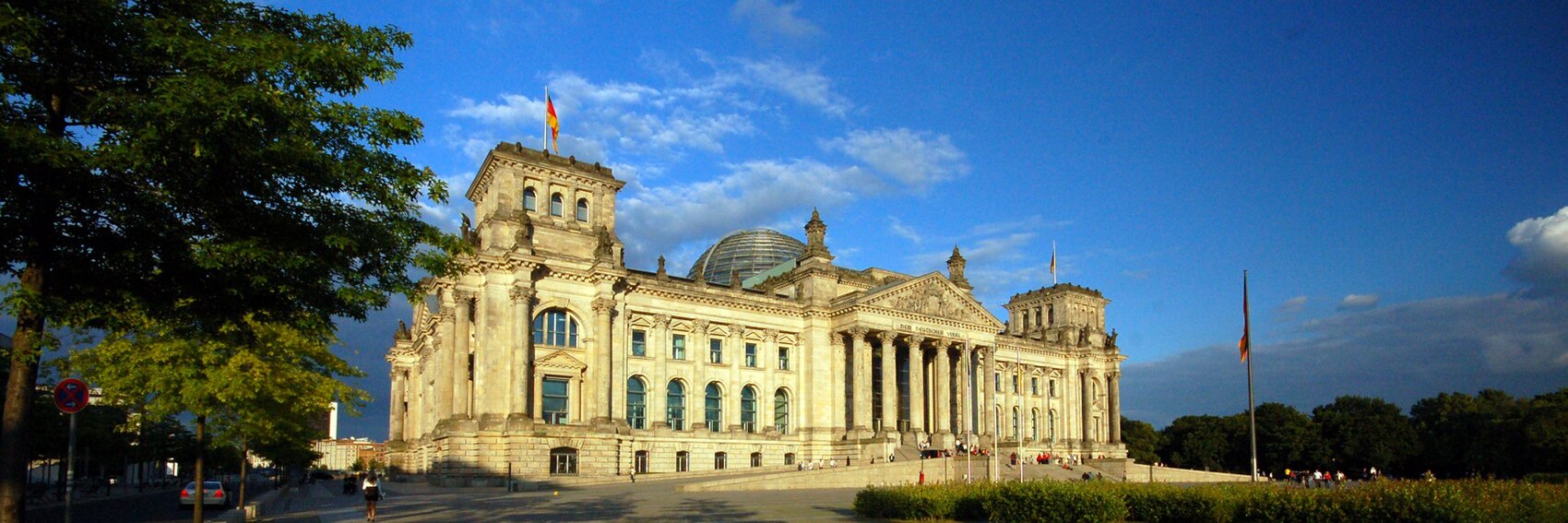
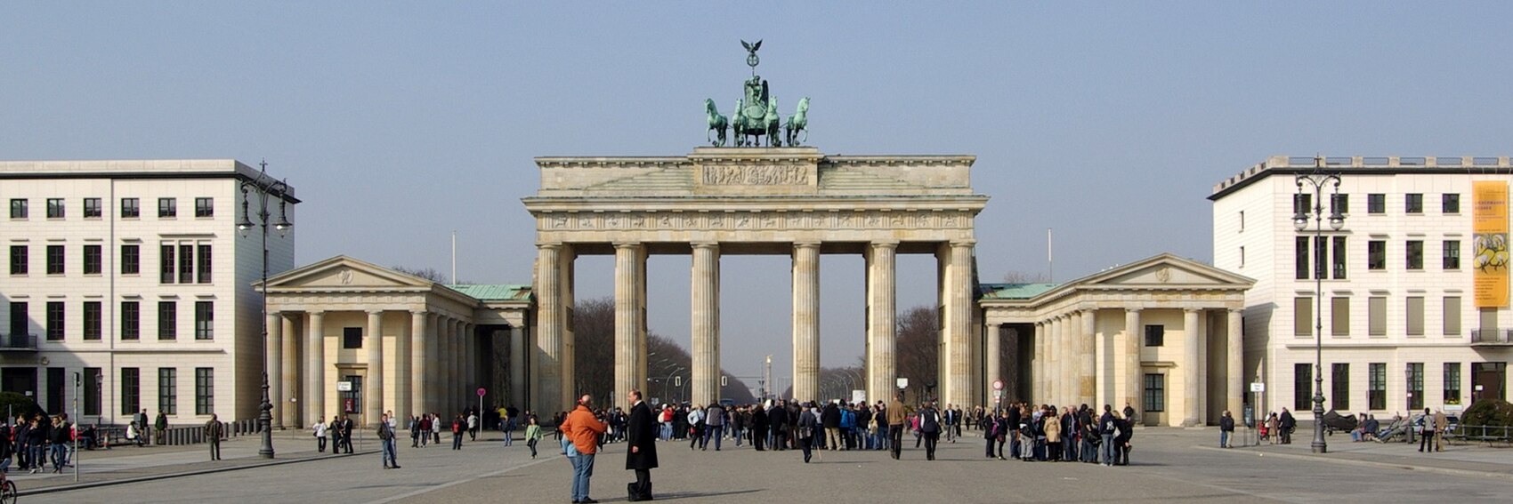
- #1 (really cool oblique view of the Reichstag) in first place, followed by #4 (the Bode-Museum at blue hour with the Fernsehturm in the background) in second, then #3 (Brandenburg Gate; an iconic site in Berlin but overall the image is kind of meh) and finally #2. -- AndreCarrotflower (talk) 00:19, 1 June 2019 (UTC)
- Hobbitschuster, I'm sure you'll have something to say here. -- AndreCarrotflower (talk) 02:05, 1 June 2019 (UTC)
- 3, 4, 1, 2; a good selection of banners overall. --Comment by Selfie City (talk | contributions) 13:45, 1 June 2019 (UTC)
- The 4th one looks so impressive so 4, 3, 1, 2. Ypsilon (talk) 13:48, 1 June 2019 (UTC)
- 1, 4, 3, 2. They are all good banners. 3 is the most recognisable image, but the text is not so clear against the buildings. 1 is also recognisable and I like the view. AlasdairW (talk) 22:37, 1 June 2019 (UTC)
- I agree with the others that they are all good banners. My favorite is #4, the Museuminsel. After that, I like #2, the Charlottenburg Palace. Then I feel #3 and #1 are kind of a pick 'em. I actually don't love the oblique angle on the Reichstag, with dark vegetation on the right and trees and shadows extending over part of the building on the left. I'd prefer a more evenly lit straight-on view, although the box would then be superimposed over part of it. Agreed that #3 is not the most exciting view of the Brandenburg Gate, but it's one of the most famous and most beautiful sights in Berlin, and we're witnessing a slice of life, so it's OK. -- Ikan Kekek (talk) 01:20, 11 June 2019 (UTC)
- Banner 2 does not look particularly "Berlin" to me. Banner 1 and Banner 3 symbolize the 20th century of Berlin with its ups and downs, indicating partition and regaining capital status. Banner 4 is an interesting mix of old and (relatively) new but it might be too dark overall. I don't particularly like showing too many German flags on banners as they are an uncommon sight (though common for government buildings such as the Bundestag). Overall, I'd say 4 then 3 then 1 then 2. That said, the grey-ish sky of 3 is more representative of Berlin than the blue sky in 1 and 4. Hobbitschuster (talk) 18:49, 11 June 2019 (UTC)
- I'll see what I can do about the problem of #4's darkness. -- AndreCarrotflower (talk) 21:25, 11 June 2019 (UTC)
Potential subject matter for these banners is limited by the facts that 1) the show itself is subject to coypright, and thus scenes from it are unavailable from copyleft-compatible sources and 2) we try not to include pictures of people in our DotM banners if we can help it. Given that, I think there's only one viable choice in terms of appropriate subject matter for a banner source image. Second only to Jerry's apartment (the set design of which may also be copyrighted, and is unavailable on Commons or Flickr in any case), Monk's Café is one of the main settings where the show took place, by far and away more so than any other point of interest listed in this article. -- AndreCarrotflower (talk) 14:50, 11 May 2019 (UTC)
![]()

- Perhaps a generic Upper West Side view might also work, but really, why bother? This is fine. Ikan Kekek (talk) 01:16, 12 May 2019 (UTC)
- Support though I would prefer to cast this vote with more knowledge of the show. --Comment by Selfie City (talk | contributions) 00:25, 21 May 2019 (UTC)
- The banner is fine. --Ypsilon (talk) 15:52, 21 May 2019 (UTC)
Such a great set of banners for such a photogenic destination. When, after a winter that was long and brutal even by Buffalo standards and a chilly and soggy first half of spring, I can be enticed by images of snow and ice, that's really something. Let's hear your votes! -- AndreCarrotflower (talk) 23:40, 10 May 2019 (UTC)
![]()

![]()

![]()

![]()

- Very tough choice here. The main attraction (reflected in the blurb) seems to be iceberg spotting on the Ilulissat Icefjord, which would give #2 a distinct disadvantage if not for what a visually striking image it is, easily the most of the four. I'd actually put it in second place behind the panoramic view of town and fjord in #3, with #1 in third and the murky, sedate #4 in last. -- AndreCarrotflower (talk) 23:40, 10 May 2019 (UTC)
- 3, 4, 1, 2. I'm just attracted to #4, but per the blurb #3 is the best in my opinion. --Comment by Selfie City (talk | contributions) 23:43, 10 May 2019 (UTC)
- Great banners — 3,2,4,1. Also, I think it'd be better to have the blurb box in the 3rd banner to the right so it wouldn't cover the houses. --Ypsilon (talk) 10:10, 11 May 2019 (UTC)
- I agree — I tried that on the DOTM page and I think it looks good. --Comment by Selfie City (talk | contributions) 14:35, 11 May 2019 (UTC)
- It blocks most of the view out to the ice fjord, but I guess I'm outvoted here. -- AndreCarrotflower (talk) 14:47, 11 May 2019 (UTC)
- OTOH it does make it easier to read the blurb text. -- AndreCarrotflower (talk) 14:52, 11 May 2019 (UTC)
- It blocks most of the view out to the ice fjord, but I guess I'm outvoted here. -- AndreCarrotflower (talk) 14:47, 11 May 2019 (UTC)
- I agree — I tried that on the DOTM page and I think it looks good. --Comment by Selfie City (talk | contributions) 14:35, 11 May 2019 (UTC)
- I was torn, but now that the text is on the right (and therefore easier to read) on #3 I think it's the clear winner. I'll say 3, 4, 2, 1. —Granger (talk · contribs) 23:22, 11 May 2019 (UTC)
- 1, 3, 2, 4 for me, and there isn't a clinker in the bunch! Ikan Kekek (talk) 01:13, 12 May 2019 (UTC)
Given that Fukuoka is IMO not a remarkably picturesque city, nor does it seem to have a marquee attraction that visitors flock to, I'm pretty pleased with how these banners came out. Let's see if you agree. -- AndreCarrotflower (talk) 16:04, 30 April 2019 (UTC)
![]()

![]()

![]()

![]()
- #1, the old turret of Fukuoka castle with the modern skyline in the background, is my favorite one of these, followed in second place by #4 (Ōhori Park is a registered Place of Scenic Beauty, but that sky is awfully gray), and then #2 (Fukuoka Tower is one of the city's main attractions, but skyline shots tend to be anonymous-looking, and this one is no different). Last-place #3 shows a bowl of hakata ramen, which is a signature dish of the region, and under other circumstances it might make for an interesting sort of offbeat banner. The problem with it is that the food is not particularly distinctive looking on its own, nor is it mentioned anywhere in the textbox blurb. -- AndreCarrotflower (talk) 16:04, 30 April 2019 (UTC)
- 2,4,1,3. I like the combination of beach and skyline. AlasdairW (talk) 22:56, 30 April 2019 (UTC)
- I haven't been to Fukuoka, but #4 is the most pleasant view, in my opinion, followed by #2 and then #1 (the buildings on the right spoil that view considerably, IMO). I'd like the ramen photo more if it had a greater depth of field, so that we could have a better view of what's in the bowl. Ikan Kekek (talk) 23:07, 30 April 2019 (UTC)
- 2, 1, 4, 3. #4 has poor quality on a large screen. (Changed order slightly because I agree with IK; #1's buildings get in the way of the caption, and vice versa. Also, the food banner is irrevelant considering the blurb) --Comment by Selfie City (talk | contributions) 00:50, 1 May 2019 (UTC)
- How large is your screen? Mine is 13 inches. How many people nowadays are looking at this site on bigger screens than that? Ikan Kekek (talk) 01:04, 1 May 2019 (UTC)
- 2, 1, 4, 3 Ypsilon (talk) 10:05, 1 May 2019 (UTC)
It's great when, just from the title of an article alone, a flood of subject matter for potential banner source images immediately springs to mind. I tried to incorporate a variety of different locations and scenes - places both within Rome itself and elsewhere in the former empire; buildings and bridges and art - and I'm really happy with these banners. Let's hear your thoughts. -- AndreCarrotflower (talk) 17:06, 20 April 2019 (UTC)
![]()

![]()

![]()

![]()

- 2, 1, 4, 3 for me. The Augustus of Prima Porta is IMO the perfect artistic summation of the greatness of Rome. -- AndreCarrotflower (talk) 17:06, 20 April 2019 (UTC)
- Really nice banners! I'll add one more, though, soon, and that's one from Ephesus. It's obviously not Rome itself but it has some amazing ruins from the days of the Empire. Recently I went on Google Maps and looked through the place on street view and it's amazing, even on there. --Comment by Selfie City (talk | contributions) 18:10, 20 April 2019 (UTC)
- On second thoughts, no. The sights in Ephesus mostly wouldn't crop well, and when they do, they look just as Greek as they do Roman, so I think these banners are better. I'll vote on them shortly, though it's difficult because they're all so good in their different ways. --Comment by Selfie City (talk | contributions) 18:16, 20 April 2019 (UTC)
- 1, 3, 2, 4. My reasoning is that, while the Coliseum picture doesn't seem quite right in terms of the width of the structure (as if it's from a panorama), it's so instantly recognizable as Roman that we ought to feature it. #3 is similarly recognizable, but not quite so much. #2 is a different kind of idea that's good and again quite recognizable but it doesn't have quite the same impact, IMO. Lastly, #4 could easily be Greek ruins, and there's also a modern scene behind, so I go in that order. --Comment by Selfie City (talk | contributions) 18:19, 20 April 2019 (UTC)
- The presence of the modern stuff in the background of #4 is intentional. The article is written to benefit tourists of the here and now who want to see Roman ruins, which in many cases are situated amidst modern-day urban environments. — AndreCarrotflower (talk) 18:31, 20 April 2019 (UTC)
- I see; that's a good idea. Still, though, the concern I would have is that the place could easily be Greek, whereas I personally think we ought to go for something that's instantly recognizable as Roman. --Comment by Selfie City (talk | contributions) 18:57, 20 April 2019 (UTC)
- The presence of the modern stuff in the background of #4 is intentional. The article is written to benefit tourists of the here and now who want to see Roman ruins, which in many cases are situated amidst modern-day urban environments. — AndreCarrotflower (talk) 18:31, 20 April 2019 (UTC)
- 3,2,1,4. Most Roman buildings that I have seen have been far from Rome, and many are in rural settings, e.g. Hadrian's Wall, and I think that the aqueduct reflects that experience. AlasdairW (talk) 22:49, 20 April 2019 (UTC)
- 3, 1, 4, 2. —Granger (talk · contribs) 00:31, 21 April 2019 (UTC)
- I think 3 is by far the best picture in the bunch; it's well-lit, which counts for a lot. My preferences would be 3, 2, 1, 4. Ikan Kekek (talk) 05:29, 21 April 2019 (UTC)
- Let's have an emperor on the front page! 2, 1, 3, 4. ϒψιλον (talk) 11:57, 21 April 2019 (UTC)
- Wow, this is one of the tightest votes in recent memory. Only one point separates first from third place. Let's continue to hear your votes, as they're more meaningful now than maybe ever before (unless you like #4, in which case you're probably SOL). -- AndreCarrotflower (talk) 03:26, 22 April 2019 (UTC)
- For me it's 2, 3, 1, 4. The Colosseum is of course what you first think of when you hear about the Roman Empire but 2 and 3 are better images, and not as cliché. Gizza (roam) 23:51, 23 April 2019 (UTC)
- So Four's out, I guess (#4 here not the number or the Miles Davis tune). --Comment by Selfie City (talk | contributions) 00:24, 24 April 2019 (UTC)
- My preference: 2, 1, 3. They are all good, though. Ground Zero (talk) 19:07, 7 May 2019 (UTC)
I'll probably try to get some more pictures in the near future that can be used here, but for now I've got four images for us to choose from, one of which is my own. --Comment by Selfie City (talk | contributions) 22:49, 29 March 2019 (UTC)
![]()

![]()
![]()
![]()
![]()

![]()

![]()
Some thoughts about each of these coming shortly. --Comment by Selfie City (talk | contributions) 22:49, 29 March 2019 (UTC)
- Unfortunately, the banners above have one frustrating problem in common: the text is hard to read when on top of the image. Apart from that, some thoughts.
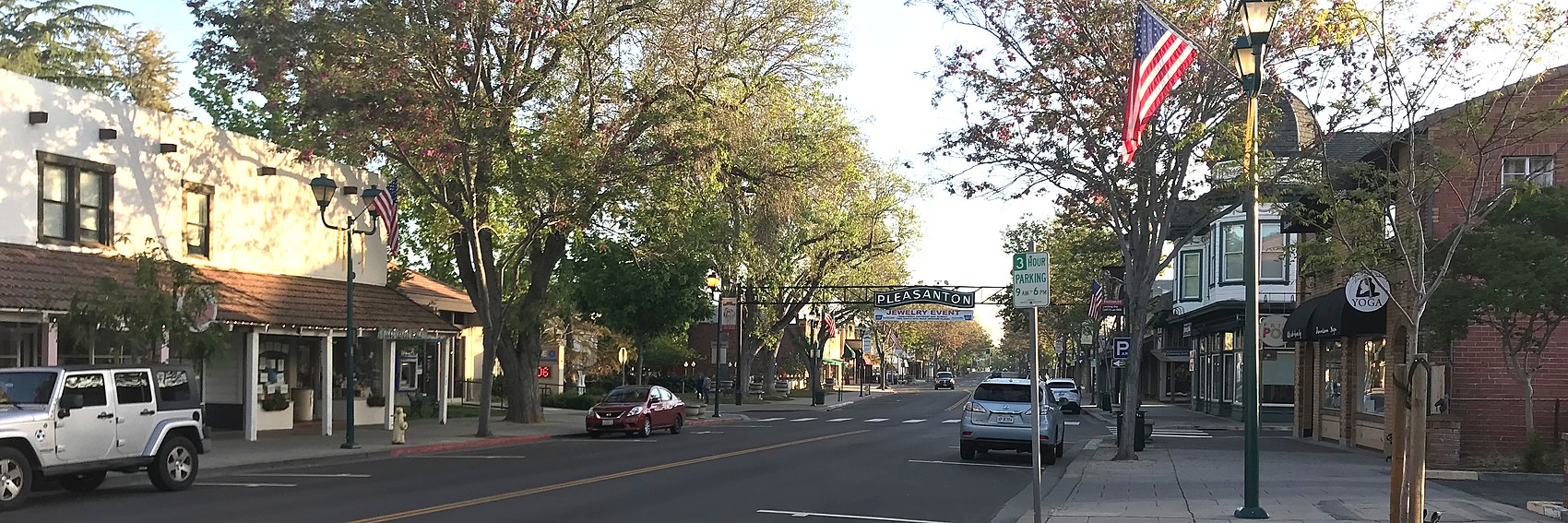
- The first banner shows the "Pleasanton sign", which is probably the most straightforward way of representing the city, since it's both a symbol of the city as it is now and also a historic remnant of the old city in historic times. However, the image isn't perfect. First of all, below the sign banners are posted continually for advertising, which spoils the picture a little. Also, the placement of some objects in the photo seems a little odd due to the crop; note the American flag in the bottom left corner, along with the street lighting, and other signs and objects partially cut off along the bottom of the banner. Lastly, the blurb goes across the text of the sign a little, and maybe more on some screens.
- The second banner shows a moderately typical downtown street scene, although there are parts of downtown much nicer than the part pictured here. This area isn't really historic, and the cars get in the way. The building on the far left (which is yellow-colored) is very recent and was built only a couple years ago, and the view of it here is not the nicest considering how nice the rest of that building is.
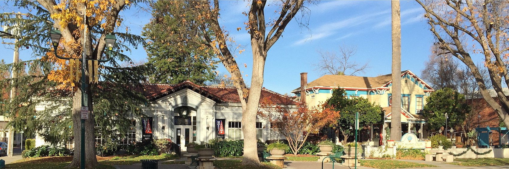
- The third banner represents a unique but interesting view of a section of town. This is what I would call the historic residential district, just a short distance from Main Street. It stretches along the busy First Street and includes a lot of brightly colored houses, many of which are Victorian in style (probably due to the time when they were built). But the problem is that most of the city doesn't have Victorian architecture — just First Street and the few streets beyond it. There's a historic church building that was featured in a famous silent film, and it's in the heart of the historic district, but I don't there are any pictures of it on Commons.
- Lastly, I took this banner myself. It has lower quality than #3 but it's still by far good enough to include. It's a fairly accurate picture of buildings in the downtown, although of course in most of the downtown area buildings are not spaced out this much. But it's not a great image, and the light is not balanced well across the image. The tree trunks, also, get in the way, making the image not so aesthetically pleasing.
- All these factors make it hard to decide, and if I take some more pictures myself I'll work hard to find some more profiles.
My favorite is probably #3, followed by #1, then #4, and then last #2, but again, I think if I take some more pictures, they could basically throw all of these out of the mix.In short, I'm sure much nicer pictures are possible, they're just not on Commons. --Comment by Selfie City (talk | contributions) 23:02, 29 March 2019 (UTC) - Just after uploading these banners, I found one [above; #5] that comes from the other side of town but has quite a few of the qualities the others don't have. It's from the northern tip of the city (actually, it's just on the boundary with Dublin to the north). This is part of the BART (Bay Area Regional Transit) network of public transport; these "trains" travel to San Francisco, Oakland, etc, and back, making them a very useful way for travelers to get to Pleasanton. Also, the image has good quality and a good space to add the blurb. Here it is:
If you couldn't tell, this is now my favorite banner, not because it depicts the best of town, but for the reasons I stated above. Of course, Northern Pleasanton residents may disagree about it "not depicting the best part of town", but that's beside the point. --Comment by Selfie City (talk | contributions) 23:13, 29 March 2019 (UTC)
- #3 is very clearly the best of the bunch (and I don't think it's that hard to read the text in the box), followed by #4 in second. #s 2 and 5 could be pretty much anywhere, and #1 doesn't really have much to offer aside from the word "Pleasanton", which is already in the textbox. -- AndreCarrotflower (talk) 01:10, 30 March 2019 (UTC)
- I'm not feeling a BART station as a good pagebanner for an article that isn't about the BART system or transportation in the Bay Area. 3, 4, 2, 1, 5 for me. -- Ikan Kekek (talk) 08:08, 30 March 2019 (UTC)
- Comment: @Mx. Granger: as a local, do you have any thoughts on these banners? Also, a point to clarify if I haven't already: my concern with #3 is that it's just not how most of the city looks. But again, I plan to take some more pictures before it goes on the main page in mid-May (which is, as I understand, when it goes on the main page) and I hope these are better. --Comment by Selfie City (talk | contributions) 00:00, 1 April 2019 (UTC)
- SelfieCity - I would wager that few if any of the banner images we've ever had on the Main Page represent "how most of the [destination] looks". You have to think like a visitor, not a local, and you have to sell the destination a little bit (I've always thought of the banner carousel as the one place on Wikivoyage where WV:Don't tout doesn't really apply). What kinds of places would a visitor to Pleasanton seek out? What will they remember about it after they get home?
- For instance: outside the touristy areas, Paris looks essentially no different than any other city in the developed world. So does that mean we should use a picture of some traffic-choked highway, cookie-cutter architecture, or random Metro station for the banner just because the vast majority of the city doesn't look like the Eiffel Tower or the Arc de Triomphe?
- Sorry, I clearly gave the wrong impression. In Pleasanton, the main historic/tourist areas are the downtown commercial district which is centered on Main Street and the residential district which is mostly to one side. I'd like to produce a banner that shows the commercial (restaurants) district and not the residential part. Similarly, a picture of country scenery would be a good choice, since you'll likely see it just before you enter the city. (Unless you come down from the north where it's developed) Maybe that is a little clearer. --Comment by Selfie City (talk | contributions) 00:32, 1 April 2019 (UTC)
- I've never been to Pleasanton, but all of the banners look like a town in the Bay Area. I like 3 and 4 the best. —Granger (talk · contribs) 01:18, 1 April 2019 (UTC)
- Sorry, I clearly gave the wrong impression. In Pleasanton, the main historic/tourist areas are the downtown commercial district which is centered on Main Street and the residential district which is mostly to one side. I'd like to produce a banner that shows the commercial (restaurants) district and not the residential part. Similarly, a picture of country scenery would be a good choice, since you'll likely see it just before you enter the city. (Unless you come down from the north where it's developed) Maybe that is a little clearer. --Comment by Selfie City (talk | contributions) 00:32, 1 April 2019 (UTC)
- #3 and #4 are nice, though not sure which I prefer between the two. I like the framing of #3 better, but the warm colours of #4 are more appealing than cold blue of #3, plus it is cool to have a photo taken by the article's main author.--ThunderingTyphoons! (talk) 21:28, 1 April 2019 (UTC)
- Interesting way of looking at it; thanks for your thoughts. --Comment by Selfie City (talk | contributions) 21:57, 1 April 2019 (UTC)
- Looks like I haven't voted on this one. I'll pick #4 as my first choice, then 1, 3, 5, 2. ϒψιλον (talk) 19:48, 6 April 2019 (UTC)
- Considering the new blurb text, #5 isn't my favorite banner anymore. I'm currently in line with the others — 3, 4, 1, 5, 2. Again though, I hope to take a picture (perhaps more) myself when I can. --Comment by Selfie City (talk | contributions) 13:42, 21 April 2019 (UTC)
- Here's the new alternative I've taken and posted of the downtown area [above; #6]. --Comment by Selfie City (talk | contributions) 16:15, 23 April 2019 (UTC)
- OK, my new order of preference is 3, 4, 6, 2, 1, 5. If you could have gotten that view of downtown in more even light, I might react differently. Ikan Kekek (talk) 23:39, 23 April 2019 (UTC)
- Sure, I'll keep trying. I took it in the morning; maybe later would be better. The problem is, the morning is when the road is quiet — otherwise it would be hard to get a picture where both sides of the road where fairly empty. --Comment by Selfie City (talk | contributions) 00:21, 24 April 2019 (UTC)
- Thanks for doing this, SelfieCity. The new one is my favorite, #3 is a close second. -- AndreCarrotflower (talk) 01:51, 24 April 2019 (UTC)
- The new one does need to be tilted a slight bit with GIMP, though, which is easy enough. -- AndreCarrotflower (talk) 01:52, 24 April 2019 (UTC)
- I can help out, but honestly, I can't tell that it's tilted. Which way would it be? --Comment by Selfie City (talk | contributions) 02:09, 24 April 2019 (UTC)
- I guess the left is low but the right is high. Is that right? --Comment by Selfie City (talk | contributions) 02:10, 24 April 2019 (UTC)
- No; actually, if you look closely at the gantry supporting the PLEASANTON sign, you can see the left side is tilted upward slightly. -- AndreCarrotflower (talk) 02:12, 24 April 2019 (UTC)
- Yes, well I should check, but I think that may actually be due to elevation change (much of the southern side of Pleasanton is as hilly as San Francisco). But I will check, soon. Since the street was originally built without pavement and then was only paved in the 1950s, the street isn't completely flat, so the sign's poles might be different in base height. (It's supported by two poles, one on each side, if I understand correctly.) --Comment by Selfie City (talk | contributions) 13:42, 24 April 2019 (UTC)
- No; actually, if you look closely at the gantry supporting the PLEASANTON sign, you can see the left side is tilted upward slightly. -- AndreCarrotflower (talk) 02:12, 24 April 2019 (UTC)
- I guess the left is low but the right is high. Is that right? --Comment by Selfie City (talk | contributions) 02:10, 24 April 2019 (UTC)
- I can help out, but honestly, I can't tell that it's tilted. Which way would it be? --Comment by Selfie City (talk | contributions) 02:09, 24 April 2019 (UTC)
- The new one does need to be tilted a slight bit with GIMP, though, which is easy enough. -- AndreCarrotflower (talk) 01:52, 24 April 2019 (UTC)
- Sorry to post yet another option, but here it is: [above; #7] --Comment by Selfie City (talk | contributions) 21:08, 28 April 2019 (UTC)
- @Ikan Kekek, Mx. Granger, AndreCarrotflower, Ypsilon: How do you guys vote now there are seven (the final 7, I hope) banners on display? --Comment by Selfie City (talk | contributions) 21:16, 28 April 2019 (UTC)
- The last two are from the same view and as such I first thought they were the same banner, but the last one is brighter. The streetscape with the city sign looks nice for a banner, though, so: 7, 6, 4, 1, 3, 5, 2. Ypsilon (talk) 10:08, 29 April 2019 (UTC)
- Forgive me, but this is getting really confusing. I took the liberty of moving all the banners to the top of the page so it would be easier to compare. SelfieCity, it looks like the last two banners are the same photograph except the second one is brighter. The differences between the two are not enough IMO to justify having two separate banners. I would just choose which one you like better and delete the other one. As for my choice, I like the newest banner best (and I prefer the darker version) and my order for the others remains the same. To reiterage: 6/7, 3, 4, 2, 5, 1. -- AndreCarrotflower (talk) 02:25, 30 April 2019 (UTC)
- The two are different pictures. Notice how the cars are different between the two, so they definitely two different images taken at different times. Thanks for voting though! --Comment by Selfie City (talk | contributions) 03:05, 30 April 2019 (UTC)
- Yes, they're 2 different pictures, but these are a lot of photos to choose from now. My preference is still for #3, then #4, #7, #6, and we probably don't need to consider the others anymore. Ikan Kekek (talk) 23:11, 30 April 2019 (UTC)
- The two are different pictures. Notice how the cars are different between the two, so they definitely two different images taken at different times. Thanks for voting though! --Comment by Selfie City (talk | contributions) 03:05, 30 April 2019 (UTC)
- My preference is 7, 4, 3. Ground Zero (talk) 19:04, 7 May 2019 (UTC)
It looks like we've now got at least one banner option for our April Fool's FTT, thanks to Ypsilon. Here are three for Kaunas, the DotM that will be replacing Istanbul in the bullpen when the latter takes its place on the Main Page on the same day as Nanotourism. Let's hear your votes! -- AndreCarrotflower (talk) 01:19, 28 March 2019 (UTC)
![]()

![]()

![]()
- When I gathered up all my source images, I was sure #2 would be my top choice. But it's got a couple of strikes against it - I had not choice but to crop it such that the pinnacle of the Town Hall's spire is off the top margin. And there's no good place for the textbox. So #3 edges into first place. The arguments in favor of that one are obvious: Freedom Avenue is cited by the article as home of some of the city's most vibrant street life, it's got the architecture mentioned in the blurb, and it doesn't take much imagination to picture "hedonistic nightlife" happening in a place like this. #1, Kaunas Castle, certainly depicts one of the city's top points of interest for visitors, but the image itself is kind of meh (not to mention more suggestive of rural countryside than an urban center with a population of nearly 400,000.) -- AndreCarrotflower (talk) 01:19, 28 March 2019 (UTC)
- For me, 1, 2 and 3 in that order. I think 1 is a more distinctive building than 2, and the white church in 3 looks overexposed. Ikan Kekek (talk) 01:42, 28 March 2019 (UTC)
- 3, 1, 2. #3 definitely in front since it looks at the scene from the viewpoint of a tourist, IMO. The other two are close but #1 is a little better. By the way, there are now 4 banners for the joke article. --Comment by Selfie City (talk | contributions) 02:54, 28 March 2019 (UTC)
- Hard choice but 2, 3, 1 (because the castle is already depicted in the article's own banner). ϒψιλον (talk) 06:36, 28 March 2019 (UTC)
- 2, 1,.................3. That picture in #2 is just so good! (I don't dispute presence of the issues Andre mentions, but equally they're not that important to me). Why can't the textbox go between the two pinnacles, i.e. in the sky? #1 looks like some farm buildings in a village somewhere, not a castle in a country's second city, but is also an attractive, well-framed picture that challenges expectations of what Lithuania 'should' look like. #3 is dull, busy, and low quality - numerous corporate logos, ugly street furniture, and an obvious light imbalance; it's horrible.--ThunderingTyphoons! (talk) 20:58, 1 April 2019 (UTC)
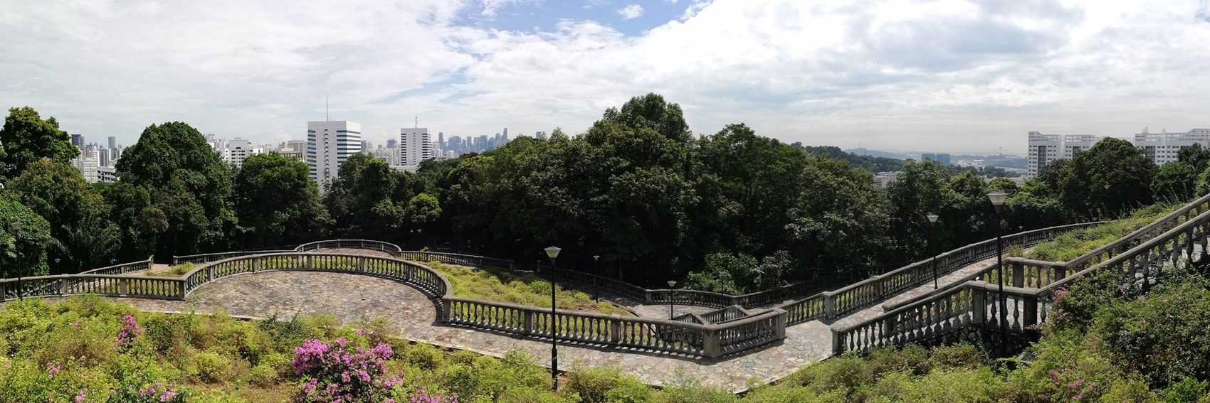
It's been a while, but it's good to be back in the banner-making game. -- AndreCarrotflower (talk) 23:46, 16 March 2019 (UTC)
![]()
![]()
![]()

![]()

- #2 and #1 are the best at getting across the idea that although the path traverses the forest, the big city is never far away. Both of the images are quite striking, but #2 has just a touch more color, drama, pizzazz. #4 is in third because I don't like the fact that I had to crop out the top of the building at right. -- AndreCarrotflower (talk) 23:46, 16 March 2019 (UTC)
- The forest and the city never quite come apart in Singapore, or at least that's my memory of it from 2002.--ThunderingTyphoons! (talk) 12:03, 21 March 2019 (UTC)
- 2, 1, 4, 3. --Comment by Selfie City (talk | contributions) 00:29, 17 March 2019 (UTC)
- Same order as SelfieCity. 2 is the clear winner. Ikan Kekek (talk) 01:01, 17 March 2019 (UTC)
- 2, 4, 3, 1. —Granger (talk · contribs) 01:22, 17 March 2019 (UTC)
- 2, 1, 3, 4. ϒψιλον (talk) 07:01, 21 March 2019 (UTC)
- 2, 4, 3, 1.--ThunderingTyphoons! (talk) 12:03, 21 March 2019 (UTC)
I did these banners a little while ago but I decided to leave a little time after I uploaded all those other banners. There were plenty of very nice images for Bouzigues, mostly by one person. Quite a few of them, however, are similar in appearance. --Comment by Selfie City (talk | contributions) 01:19, 15 February 2019 (UTC)
![]()
![]()

![]()

![]()

![]()

This is a difficult one, and relationship between text and the pictures is quite important, in my opinion. My favorite is #1, followed by #2, #3, #4, and last #5 (in order of number, as it turns out). In these last two, the text gets in the way. (However, the text is showing up blue on my screen for some odd reason, which might be affecting my opinion of the text.) #1 and #2 are definitely my favorites. --Comment by Selfie City (talk | contributions) 01:33, 15 February 2019 (UTC)
- 2, 4, 5, 1, 3, presuming that the captions don't all stay blue. Ikan Kekek (talk) 04:54, 15 February 2019 (UTC)
- All the captions on this page are now blue, for some reason. Any explanation for this?--ThunderingTyphoons! (talk) 12:01, 15 February 2019 (UTC)
- 2, 4, 1, 5, 3, though this could change when we see how readable the text is going to be. I'm not totally convinced 3 even shows Bouzigues, though it's definitely the étang de Thau.--ThunderingTyphoons! (talk) 12:00, 15 February 2019 (UTC)
- I'm not a coding genius, but is there some way that the text in the boxes could be coded to be white? (so this issue is fixed) --Comment by Selfie City (talk | contributions) 23:32, 15 February 2019 (UTC)
- I have created Wikivoyage:DOTM banners/sandbox in case anyone wants to work on the problem. --Comment by Selfie City (talk | contributions) 23:36, 15 February 2019 (UTC)
- I prefer #4, then 1, 2, 3, 5. Concerning the irritatingly ugly and in many cases almost illegible blue texts, they are also blue in the banner archives, but still white on the Main Page. Traveler100 edited Template:Banner a week ago, can that possibly have something to do with the blue texts? ϒψιλον (talk) 08:33, 16 February 2019 (UTC)
- The color issue is not to do with the edits of the banner template (that just added an image to the mobile version), somewhere in the class style sheets has changed. Not sure where but have added a fix at start of this page for now. @ARR8: any ideas what caused the change. --Traveler100 (talk) 09:25, 16 February 2019 (UTC)
- Back to normal,
thanks to whoever fixed it!Should've read your comment to the end, thanks T100 for fixing the issue! :) ϒψιλον (talk) 09:28, 16 February 2019 (UTC)- Yeah, good move adding the stylesheet back in. It happened when we moved the main page rules from common.css, which applies on every page, to templatestyles. Apparently some of those rules were for the DOTM banners, and it seems the rules were being used both here and on the main page. Since it's possible banners would be displayed on still more pages, like talk pages and such, I will add the appropriate rules to {{banner}}. ARR8 (talk | contribs) 17:32, 16 February 2019 (UTC)
- Back to normal,
- The color issue is not to do with the edits of the banner template (that just added an image to the mobile version), somewhere in the class style sheets has changed. Not sure where but have added a fix at start of this page for now. @ARR8: any ideas what caused the change. --Traveler100 (talk) 09:25, 16 February 2019 (UTC)
- The color differences definitely affected my original votes. Now I see them in white text, my votes are 2, 1, 5, 4, 3. --Comment by Selfie City (talk | contributions) 15:32, 16 February 2019 (UTC)
I have added four so far. I'm sure there are plenty of other options, I'm just making an early start. --Comment by Selfie City (talk | contributions) 23:28, 9 February 2019 (UTC)
![]()

![]()

![]()
![]()
- Of these, my favorite is #2, then #4, then #3, and last #1, which is cloudy and doesn't look like inviting as a travel destination. #2 balances bright colors with an important historic site that is fairly recognizable. --Comment by Selfie City (talk | contributions) 00:17, 10 February 2019 (UTC)
- Hard to choose, but I'd say 2, 4, 1, 3 ϒψιλον (talk) 07:59, 10 February 2019 (UTC)
- 2, 3, 1, 4. 2 and 3 depict well-known landmarks (the Bosphorus Bridge is particularly relevant to the quote), and 1 is cloudy but at least it 'looks like' Istanbul, whereas 4 could be anywhere with water.--ThunderingTyphoons! (talk) 10:21, 10 February 2019 (UTC)
- #2 is the best by far. It's a bit crooked, though; I'll try to edit it in Gimp when I get the chance. -- AndreCarrotflower (talk) 23:01, 10 February 2019 (UTC)
- You're right about that. It's not much but when you look closely, it is noticeable. It must have been like that in the original photo, since my cropping in Gimp wouldn't have made it crooked. --Comment by Selfie City (talk | contributions) 01:16, 11 February 2019 (UTC)
- 2, 3, 4, 1 —Granger (talk · contribs) 11:55, 11 February 2019 (UTC)
- Comment: #4, judging from the original image and this one, may be a panoramic image, and the strait may not actually be as curved in real life as it appears in the picture. --Comment by Selfie City (talk | contributions) 15:09, 11 February 2019 (UTC)
- I've never been to Istanbul, so my contributions here may be affected by ignorance, but my preferences are 3, 4, 2, 1. Ikan Kekek (talk) 20:31, 29 March 2019 (UTC)
See comment at Siem Reap's banner. -- ϒψιλον (talk) 16:07, 9 February 2019 (UTC)
![]()

- Also good.--ThunderingTyphoons! (talk) 16:14, 9 February 2019 (UTC)
![]()
- I have added a second one to give a choice. This tries to show the "currency swap" scam in progress, with some obsolete Czechoslaovak banknotes sandwiched between two Euro notes. This is my second attempt at getting a picture as my photo editing software would not let me save the first one as it detected a banknote! AlasdairW (talk) 23:20, 10 February 2019 (UTC)
- I really like this one. I don't even think alternatives are necessary here. Thanks for the work, Ypsilon. --Comment by Selfie City (talk | contributions) 16:32, 9 February 2019 (UTC)
- Thanks for the work, AlasdairW, but I still prefer #1. --Comment by Selfie City (talk | contributions) 01:14, 11 February 2019 (UTC)
- This is a tricky topic to make a banner for. I prefer #2, since it depicts a scam, but #1 is nice too. —Granger (talk · contribs) 11:54, 11 February 2019 (UTC)
- Yes. 2, then 1. Ikan Kekek (talk) 04:55, 15 February 2019 (UTC)
- On balance, I prefer 1 because of the presence of a man in the image. Although 2 depicts a possible scam, this is not as clear to me. However, I wouldn't regret the 2 being chosen as the banner.--ThunderingTyphoons! (talk) 10:03, 15 February 2019 (UTC)
See comment at Siem Reap's banner. -- ϒψιλον (talk) 16:07, 9 February 2019 (UTC)
![]()
![]()

![]()

![]()
- Good. --ThunderingTyphoons! (talk) 16:14, 9 February 2019 (UTC)
- The picture is OK, but the caption "Chapel Hill" is hard to read on my screen. I might look around for some alternatives if I have the time and ability. --Comment by Selfie City (talk | contributions) 16:26, 9 February 2019 (UTC)
- I've added a second choice, but it's currently a png file. Should it be a jpg? --Comment by Selfie City (talk | contributions) 23:11, 9 February 2019 (UTC)
- @SelfieCity: Photographs should almost always be jpg format. It results in a minimal reduction in quality, but also a significant reduction in file size, and so is better, especially for mobile users or those on an otherwise slow connection. If your original photograph that you cropped/edited was already a jpg, there is little reason not to keep it as a jpg (basically). PNG is usually used for computer or digital images, because the artifacts added by jpg are most visible in areas of high contrast between colors and/or straight lines, features usually absent from photos. ARR8 (talk | contribs) 23:17, 10 February 2019 (UTC)
- OK, thanks for the information. I will fix it. --Comment by Selfie City (talk | contributions) 01:13, 11 February 2019 (UTC)
 Done I just need to delete the old file. --Comment by Selfie City (talk | contributions) 02:06, 11 February 2019 (UTC)
- OK, thanks for the information. I will fix it. --Comment by Selfie City (talk | contributions) 01:13, 11 February 2019 (UTC)
- @SelfieCity: Photographs should almost always be jpg format. It results in a minimal reduction in quality, but also a significant reduction in file size, and so is better, especially for mobile users or those on an otherwise slow connection. If your original photograph that you cropped/edited was already a jpg, there is little reason not to keep it as a jpg (basically). PNG is usually used for computer or digital images, because the artifacts added by jpg are most visible in areas of high contrast between colors and/or straight lines, features usually absent from photos. ARR8 (talk | contribs) 23:17, 10 February 2019 (UTC)
- I've added a second choice, but it's currently a png file. Should it be a jpg? --Comment by Selfie City (talk | contributions) 23:11, 9 February 2019 (UTC)
- The picture is OK, but the caption "Chapel Hill" is hard to read on my screen. I might look around for some alternatives if I have the time and ability. --Comment by Selfie City (talk | contributions) 16:26, 9 February 2019 (UTC)
- My list of choices is currently 1, 2, and 3. --Comment by Selfie City (talk | contributions) 06:11, 10 February 2019 (UTC)
- 1, 2. 3 is uninteresting to me. Ikan Kekek (talk) 06:18, 10 February 2019 (UTC)
- 2, 1, and further behind 3 (which could be a good banner for Driving in the United States if it will be featured someday). -- ϒψιλον (talk) 07:54, 10 February 2019 (UTC)
- 1, 2, 3. Cars always ruin a shot, for me, unless they're the focus. And I liked 1 to begin with. --ThunderingTyphoons! (talk) 10:13, 10 February 2019 (UTC)
- 2, 1, 3. —Granger (talk · contribs) 11:49, 11 February 2019 (UTC)
- I wasn't a huge fan of any of these banners, so I added a fourth. My votes go 4, 1, 2, 3 in that order, with a wide gap between first place and the other three. ThunderingTyphoons!, SelfieCity, Ikan Kekek, and Granger - what do you think? -- AndreCarrotflower (talk) 15:59, 7 March 2019 (UTC)
- I agree, 4 is the clear winner. So my new ranking is 4, 2, 1, 3. For those who don't know, the old well depicted in banner 4 is the most important landmark and symbol of Chapel Hill and the university. —Granger (talk · contribs) 16:21, 7 March 2019 (UTC)
- 4, 2, 1, 3, with 2 and 1 very close. --Comment by Selfie City (talk | contributions) 16:38, 7 March 2019 (UTC)
- Now, my choices are 4, 2, 1. I no longer like 1 more than 2, because I like the funny angled thing in 2 and also the feeling of spaciousness on the left. Still not much interest in 3. Ikan Kekek (talk) 17:46, 7 March 2019 (UTC)
- 4, 2, 1, 3, with 2 and 1 very close. --Comment by Selfie City (talk | contributions) 16:38, 7 March 2019 (UTC)
- 4 and 1 are equal for me.--ThunderingTyphoons! (talk) 17:46, 7 March 2019 (UTC)
Soon there'll be another destination needing a banner in Wikivoyage:Destination_of_the_month_candidates#Next_change, so I figured it was needed to create some for March's featured articles. Yeah, I just made one banner for each article, so there's not much to vote for. Feel free to add more banners if you like, though I think these are pretty decent. ϒψιλον (talk) 16:07, 9 February 2019 (UTC)
![]()

![]()

![]()

![]()
- Don't wish to be too critical because I can't make any banner to replace this, but why does this not show Angkor Wat or anything remotely interesting, rather than an uninviting busy road? --ThunderingTyphoons! (talk) 16:13, 9 February 2019 (UTC)
- Angkor Wat is handled in a different article which is already a previous DotM, while the Siem Reap article focuses on the city itself, so images of the former don't qualify as banner material for the latter. Needless to say, the vast majority of the photography going on in the vicinity is focused on the former, and that's exactly the roadblock I ran into earlier when I made a go at the banners. -- AndreCarrotflower (talk) 16:19, 9 February 2019 (UTC)
This is a tough one... I just think I'll go with #1, but an alternative would be welcome. --Comment by Selfie City (talk | contributions) 16:24, 9 February 2019 (UTC)- Didn't we include those flowers for the current OttB, even though they're hundreds of miles away from the island at a botanical garden in Christchurch? If Angkor Wat is just next door, and is the main reason for visiting Siem Reap, then maybe an image of that would best serve the traveller? I appreciate it may be difficult to find a good picture of this city, but there must be many high quality images of Angkor Wat available.--ThunderingTyphoons! (talk) 16:26, 9 February 2019 (UTC)
- Sorry, I don't understand about the flowers. Otherwise, I see your point. --Comment by Selfie City (talk | contributions) 16:48, 9 February 2019 (UTC)
- See here.--ThunderingTyphoons! (talk) 16:55, 9 February 2019 (UTC)
- Sure, but what's the connection between flowers in Christchurch and the community of Siem Reap? --Comment by Selfie City (talk | contributions) 17:18, 9 February 2019 (UTC)
- See here.--ThunderingTyphoons! (talk) 16:55, 9 February 2019 (UTC)
- Sorry, I don't understand about the flowers. Otherwise, I see your point. --Comment by Selfie City (talk | contributions) 16:48, 9 February 2019 (UTC)
- Didn't we include those flowers for the current OttB, even though they're hundreds of miles away from the island at a botanical garden in Christchurch? If Angkor Wat is just next door, and is the main reason for visiting Siem Reap, then maybe an image of that would best serve the traveller? I appreciate it may be difficult to find a good picture of this city, but there must be many high quality images of Angkor Wat available.--ThunderingTyphoons! (talk) 16:26, 9 February 2019 (UTC)
- Angkor Wat is handled in a different article which is already a previous DotM, while the Siem Reap article focuses on the city itself, so images of the former don't qualify as banner material for the latter. Needless to say, the vast majority of the photography going on in the vicinity is focused on the former, and that's exactly the roadblock I ran into earlier when I made a go at the banners. -- AndreCarrotflower (talk) 16:19, 9 February 2019 (UTC)
I humbly vote for my own #2 which is called the "Victory Gate" on its original Commons file. I'm assuming this is not the same as Angkor Wat.--Comment by Selfie City (talk | contributions) 23:39, 9 February 2019 (UTC)
- Well, actually, according to w:Angkor Thom, Victory Gate is in that area. However, it's not the typical Angkor Wat picture, so maybe it could pass. --Comment by Selfie City (talk | contributions) 23:41, 9 February 2019 (UTC)
- I'm actually instead supporting #3, which I cropped from this picture. According to the person who uploaded the picture, this is in the city itself, their words are: "A covered pedestrian bridge over Siem Reap River, next to the Old Market in Siem Reap", which can be found on the upload page of the original picture. My complete list is 3, 4, 2, and 1 — sorry Ypsilon. --Comment by Selfie City (talk | contributions) 23:49, 9 February 2019 (UTC)
- 3, 2, 1, 4 for me. Ikan Kekek (talk) 06:17, 10 February 2019 (UTC)
- 2, 3, 1, 4, and thanks for helping out, SelfieCity! ϒψιλον (talk) 07:51, 10 February 2019 (UTC)
- Ypsilon, you listed 2 twice, so please correct that. Ikan Kekek (talk) 07:56, 10 February 2019 (UTC)
- 3,2,1,4.--ThunderingTyphoons! (talk) 10:10, 10 February 2019 (UTC)
- Ypsilon, you listed 2 twice, so please correct that. Ikan Kekek (talk) 07:56, 10 February 2019 (UTC)
- The problem with #2 is one of false advertising, basically. It's not simply a matter of Angkor Wat having its own dedicated article separate to Siem Reap; it's also that the Siem Reap article adheres to the distinction much more scrupulously than usual. There's very little practical information for visitors to Angkor Wat to be found; over and over again, you read variations on the theme of "Angkor Wat has plenty of its own [sights, activities, shops, restaurants, accommodations, etc.], but the city itself has worthwhile options too" whereupon plenty of the latter and none of the former are listed. We should make sure we're not leaving readers with the misconception that the article covers the temple complex in any meaningful way. (This is also where the comparison to the Chatham Islands banner breaks down; while the particular flower depicted in the banner is not located on the islands, the image is still germane to the content of the article, which covers the islands' native flora and fauna in a very in-depth way.)
- So those are my thoughts on #2. Of the other options, #1 is my favorite, but I'm not a huge fan of any of them, frankly. I will see if I can find additional choices.
- -- AndreCarrotflower (talk) 22:55, 10 February 2019 (UTC)
- Yeah, I guess #2 is of Angkor Wat, in which case, that banner should be removed from the discussion, with all the votes for it disregarded. Ikan Kekek (talk) 04:57, 15 February 2019 (UTC)
The only Copyleft-compatible photos I could find were the ones Peter Southwood originally included in the article. Poor lighting conditions (not the photographer's fault; the article indicates that's par for the course with this particular dive) limited me to two choices this time around. I tagged him in case he has additional photos that he didn't upload to Commons and might like to contribute to the cause. Let's hear your votes! -- AndreCarrotflower (talk) 00:11, 21 January 2019 (UTC)
![]()
![]()
- Each of the banners has its strengths and weaknesses. #1 shows both the wreckage of the ship and examples of the sea life you'll encounter while on the dive (the small crab just above the center of the banner), but unfortunately the latter is mostly obscured by the textbox, and then there's the matter of the blurry patch of the image in the bright part at bottom. #2, meanwhile, shows comparatively less marine life, but is much clearer, and the color scheme is much more indicative of the fact that the image was taken underwater. I prefer #2 to #1. -- AndreCarrotflower (talk) 00:11, 21 January 2019 (UTC)
- Let's face it, to the untrained eye (including my own), there's not a lot to see in either photo. Therefore, the one with the more striking colour and, as you say, more obviously underwater, is number 2. It'll make an attractive contrast to our usual banners.--ThunderingTyphoons! (talk) 09:49, 21 January 2019 (UTC)
- I agree, #2 is brighter and more interesting. If you will experience scenes like this during the dive, then these banners are perfectly suitable for representing the article on the Main Page. ϒψιλον (talk) 09:59, 21 January 2019 (UTC)
- Number 2, per others. Another disadvantage of #1 is that the banner goes across a crustacean, so that I, at least, am not quite sure what we're seeing. Ikan Kekek (talk) 14:40, 21 January 2019 (UTC)
- Neither of the banners are quality images, but it's underwater, dark, and that sort of thing, so what can you expect? Personally, I find #2 more blurry-looking than #1 (especially in the bottom right below the blurb text), but I think it works better because it serves as a better background to the blurb text than the other picture. So, order is #2, then #1. --Comment by Selfie City (talk | contributions) 04:27, 25 January 2019 (UTC)
Three new banners, the last of which is one of the rejected banners from Musandam Peninsula's December 2013 stint as OtBP. Let's hear your votes! -- AndreCarrotflower (talk) 04:39, 10 January 2019 (UTC)
![]()

![]()

![]()

- #s 2 and 3 are in a close race for first place. The former is the better of the two from an artistic standpoint, but it's stretching things a bit to say that the fjord of Khor Ash Sham is in Khasab (though, since it's covered in the "Do" section and not "Go next", it's probably admissible); on the other hand, the latter is a fully Khasab-centric scene depicting the 17th-century Portuguese fortress. If pressed, I'd place #2 ahead by a hair. #1 might be a good compromise for those who insist on a scene of the landscape and the dhows that's located directly in Khasab, but otherwise it's a distant third. -- AndreCarrotflower (talk) 04:39, 10 January 2019 (UTC)
- Very hard decision: all 3 are great! At first, I couldn't pick between them at all. However, I think I like #2 best because it looks most like a fjord and also has a dhow front and center, thereby most clearly showing Khasab as the "Norway of Arabia". I suppose I pick #1 2nd, as a craggy landscape with a desert bush and a bunch of dhows in the background. #3 is very picturesque and does include a boat, but I guess something has to be my third choice. Ikan Kekek (talk) 05:51, 10 January 2019 (UTC)
- Masterpieces! I'd agree with Ikan Kekek that #2 is best, and I'd also add a reason for my vote: the text fits perfectly with the rest of the banner image. Next, it gets very close, but I'd go with #1, and then last #3, largely because #3 doesn't look Norwegian at all. But all three are good banners, and I wouldn't oppose any of them going on the main page. --Comment by Selfie City (talk | contributions) 15:06, 10 January 2019 (UTC)
- All banners look nice, good work as usual, Andre! I vote for #3 because the fort is in Khasab. On second place comes #2 which is a little bit more lively than #1. ϒψιλον (talk) 15:15, 10 January 2019 (UTC)
- Am I too late? #2 is gorgeous.--ThunderingTyphoons! (talk) 16:30, 9 February 2019 (UTC)
The last new banners of 2018, or the first new ones of 2019, depending on your time zone. Let's hear your votes! -- AndreCarrotflower (talk) 23:09, 31 December 2018 (UTC)
![]()

![]()

![]()

- So although we're featuring it in February to take advantage of winter sports opportunities in the nearby mountains, there aren't any ski resorts close enough to Zurich to be listed in the actual article, so banners depicting skiers, chair lifts, mountains, etc. are out of the question. Nonetheless, I did limit the selection to photos taken in winter (or, in the case of #3, "seasonally ambiguous" photos without any trees or greenery, which could have been taken at any time of year). Very, very tough choice here. #1, the night view of Bahnhofstrasse with its lights, is both the "hippest" of the three banners (reflecting the wording of the blurb) and is described in the article as "[c]ertainly a must-see for every tourist in Zurich", but to my eyes it's the least impressive of the three images from an artistic standpoint, and it's awfully similar to the Denver banner that was on the Main Page just this past month. #3 is a classic city view along the Limmat River (also mentioned in the blurb), but despite its aforementioned seasonal ambiguity, one's first guess would probably be that it was not taken in winter (there's no snow to be seen, and the river is unfrozen). #2 is nice, but a bit anonymous - the architecture places the scene definitively in Europe, but not necessarily in Switzerland specifically.
- Again, tough choice, but as of now I'm going to say #2 is in first place, then #1 and finally #3. I can't guarantee I won't change my ranking based on others' arguments, though, so do chime in.
- 1, 3, 2. Normally my favorite would be #3, but the words "hipper alternative to the button-down world" make #1 more appropriate, IMO. --Comment by Selfie City (talk | contributions) 00:02, 1 January 2019 (UTC)
- Happy New Year, everyone! #3 is by far the best, in my estimation, with #2 a distant 2nd and #1 a distant 3rd to #2. And Selfie, remember that the blurb can be changed, but it does mention the "gorgeous alpine setting at the head of the Limmat River." If you like #3 best, I think you should support it. By the way, because it's not frozen, #3 is obviously not a winter pic, so if that's a very important issue... Ikan Kekek (talk) 00:41, 1 January 2019 (UTC)
- 3, 2, 1. #3 was taken at the end of March, so it is only slightly the wrong time. I don't know if the water would always be frozen in February, as the average temperature for the month is 1.3°C (34.3°F). AlasdairW (talk) 01:11, 1 January 2019 (UTC)
- Thanks for mentioning that. I was just assuming it would be cold enough. -- Ikan Kekek (talk) 04:07, 1 January 2019 (UTC)
- I like #3 most, it looks really beautiful with the riverside houses and Alps in the background. #2 comes second for me, and on the last place the more ordinary #1. ϒψιλον (talk) 07:54, 1 January 2019 (UTC)
- Number 3 is a nice shot, but looks low resolution, and the Alps that everyone's raving about can barely be seen. Bear in mind I wear glasses! Number 1 is probably what I'd think of when "Zurich" pops into my head (financial services - definitely somewhere for business not pleasure) but (a) I haven't been there, and (b) I'd prefer that preconceptions were challenged, rather than reinforced. My favourite by a long way is therefore number 2; it's colourful, characterful, and interesting, and makes me reconsider my earlier dismissal of Zurich and want to delve into the article. Happy new year! --ThunderingTyphoons! (talk) 14:18, 1 January 2019 (UTC)
- 2, then 3, both of which are lovely photos. 1 does nothing for me—it's visually not very interesting, could be anywhere, and a little blurry. —Granger (talk · contribs) 02:07, 2 January 2019 (UTC)
Right in the nick of time (again). Let's hear your votes! -- AndreCarrotflower (talk) 00:46, 21 December 2018 (UTC)
![]()

![]()

![]()
- #3 is on top for me, despite the fact that it's tough to read the blurb in front of that busy background. The palm trees and other greenery make for a pleasant backdrop, and the overall composition places the text of the sign front and center without a lot of distractions to draw the viewer's attention away. #1 is second - there's a nice sort of musical quality to the words on the sign (though it may well not be pronounced the same way I hear it in my head), and the text box does not interfere. #2 is an interesting-looking toll barrier, but that's not what this article is about, is it? Plus there's no real central focus to the image; it's sort of all over the place. -- AndreCarrotflower (talk) 00:46, 21 December 2018 (UTC)
- 3, 1, 2. Close between 1 and 2. --Comment by Selfie City (talk | contributions) 01:55, 21 December 2018 (UTC)
- 2, 1, 3. The meaning of the sign in banner #3 is obvious from the pictogram, but the other two really benefit more from a reading knowledge of Indonesian. Ikan Kekek (talk) 20:43, 21 December 2018 (UTC)
- 3,2,1. ϒψιλον (talk) 19:26, 28 December 2018 (UTC)
- 1, 3, 2. Just to complicate matters. 1 and 3 are head and shoulders above 2 for me, though between them (1 and 3) there's not much in it. --ThunderingTyphoons! (talk) 19:02, 29 December 2018 (UTC)
- Actually, I can see the reasoning behind your vote. However, on #1, try looking at the clutter and darkness of the top-left rather than the clarity of the right. --Comment by Selfie City (talk | contributions) 22:14, 29 December 2018 (UTC)
- 2, 1, 3, per Ikan Kekek's reasoning, and because the blurb is hard to read in 1 and 3. —Granger (talk · contribs) 02:09, 2 January 2019 (UTC)
Right in the nick of time. Let's hear your votes! -- AndreCarrotflower (talk) 23:20, 10 December 2018 (UTC)
![]()

![]()

![]()

- A dearth of usable source images sometimes leads to frustration, other times to outside-the-box thinking. I don't think we've ever had a banner like #1, the Chatham Islands forget-me-nots on display at the botanical gardens in Christchurch. Normally I'd dock points for the fact that the photo was not taken on the islands themselves, but its beauty, its appropriateness vis-à-vis the blurb (the Chatham Islands are the only place this flower grows in the wild), and its sheer unusualness put it in first place for me regardless. The arcadian #3 comes in a distant second. -- AndreCarrotflower (talk) 23:20, 10 December 2018 (UTC)
- I prefer #1 followed by #2, then #3. I also don't remember a banner where a beautiful flower was the focus on the image. Gizza (roam) 00:23, 11 December 2018 (UTC)
- I'd say 3, then 2. The flowers are lovely, but I can't bring myself to support a banner photo that wasn't taken in the destination. —Granger (talk · contribs) 00:28, 11 December 2018 (UTC)
2, 3, 1. I like #2 more than #3 because the barn in #3 looks very much like a California coastal scene.--Comment by Selfie City (talk | contributions) 01:16, 11 December 2018 (UTC)
- I wish #1 were taken in the Chatham Islands, but I'm going to pick it first, anyway, followed by #3 and #2. Ikan Kekek (talk) 01:22, 11 December 2018 (UTC)
- I've actually changed my mind. 3, 1, 2. #3 is better image quality than #2, and actually the flower in #1 is unique. --Comment by Selfie City (talk | contributions) 01:27, 11 December 2018 (UTC)
- 1, 3, 2. AlasdairW (talk) 10:51, 12 December 2018 (UTC)
- Hard choice, but I'll go for the flowers too. 1, 2, 3. ϒψιλον (talk) 15:29, 12 December 2018 (UTC)
- 1, 2, 3. Flowers win it for me.--ThunderingTyphoons! (talk) 16:22, 1 January 2019 (UTC)
- BTW, why is the top image a different size to the others? Is it just because it's next to the contents box? --ThunderingTyphoons! (talk) 16:23, 1 January 2019 (UTC)
- Yes, I think so. Try comparing it with an older revision. --Comment by Selfie City (talk | contributions) 17:25, 1 January 2019 (UTC)
Back to banner-making. Let's hear your votes for the first featured article of 2019! -- AndreCarrotflower (talk) 21:28, 30 November 2018 (UTC)
![]()

![]()
![]()

- Judging by the favorite photo subjects of contributors to Flickr, the Reunification Monument (#1) is pretty close to the signature attraction of Yaoundé. It's an interestingly composed image, but there's something about the street scene in #3 that really speaks to me. Combine that with the fact that there's no really good place for the textbox in #1 and that drops the monument down to second place. #2, the National Museum, is also an interesting composition, but it looks like it could be anywhere.
- To recap: 3, 1, 2.
- 3, 2, 1. --Comment by Selfie City (talk | contributions) 23:37, 30 November 2018 (UTC)
- 3 looks stereotypically African, but otherwise doesn't do much for me. I'd say 1, 2, 3, but am happy to defer to others if there's someone who knows the city. —Granger (talk · contribs) 00:32, 1 December 2018 (UTC)
- I like the monument banner most, so for me it's 1,3,2. ϒψιλον (talk) 13:56, 3 December 2018 (UTC)
- Looks like #1 and #3 are now tied for the lead. Ikan Kekek, would you care to break the tie? -- AndreCarrotflower (talk) 20:09, 3 December 2018 (UTC)
- I've had trouble choosing between them, and that's why I haven't posted anything, but I love the vitality and color of #3, which I guess is my first choice, and after that, #2, despite your point about it. #1 is undoubtedly an important monument, but the picture isn't as interesting to me. That said, I fear that I'm wrong and it's only #1 that's really distinctive, so maybe some other people should vote. Ikan Kekek (talk) 21:02, 3 December 2018 (UTC)
- Just saying, if we do pick #3, we may want to change the caption text, because while #2 implies business travel, #3 does not. I'm still a #3 supporter, though. --Comment by Selfie City (talk | contributions) 23:29, 3 December 2018 (UTC)
- The blurb text doesn't have to (and rarely does) match the image content completely, though of course the closer the match, the better. To me, #3 suggests both interesting architecture (the building at left) and a lack of tourist attractions per se. -- AndreCarrotflower (talk) 23:44, 3 December 2018 (UTC)
- The lively and colorful streetscape #3 is also a great banner and really not too far behind #1. ϒψιλον (talk) 12:24, 6 December 2018 (UTC)
- Yes, good points. --Comment by Selfie City (talk | contributions) 14:38, 6 December 2018 (UTC)