
Wikivoyage talk:Main Page Old
To view old revisions of the Main Page (prior to 4 March 2013), see Wikivoyage:Main Page/pre-WV archive.
| This page is for discussion of the Main Page only. Use the Travellers' pub to discuss Wikivoyage in general. Please read Main Page guidelines before editing the Main Page. You are welcome to try out changes in the Main_Page/Sandbox. |
Suggested Feature: Keyword Search
Realize it may involve a major software effort, but I have often visited destination pages while interested only in mention of a specific name, item or topic not specifically called out by our format. Could we find out from other contributors and/or users if such is worth the effort? Regards, jdh
- Our search function is a full-text search, so it should return any articles that mention your search term. do you have a specific example that isn't working? (WT-en) LtPowers 14:51, 30 January 2010 (EST)
Was thinking of keyword search that would apply only to all content of a "page" you've already reached, e.g., if at "Saint Thomas" and looking for "boxes", current search will return all mentions of "box", etc., anywhere in the wiki. Thanks for prompt response, dh
- That seems like a standard task for the find function built into your browser, which operates only on the current page. Ctrl-F in most software. - (WT-en) D. Guillaime 16:56, 3 February 2010 (EST)
Great idea, thanks. jh —The preceding comment was added by (WT-en) Hennejohn (talk • contribs)
Editing Discover
I've spotted a spelling error in Discover - Arc of the Covenant should be Ark of the Covenant, but can I figure out how to edit a current Discover entry to correct it?? Doh. Help? (WT-en) Andyfarrell 15:20, 4 March 2010 (EST)
- See Template:Discover, which is where the magic happens. -- (WT-en) Ryan • (talk) • 17:32, 4 March 2010 (EST)
- /scratches head/ It works but I've no idea why it works! Thanks Ryan. (WT-en) Andyfarrell 18:32, 4 March 2010 (EST)
Tromso on main page
For clarity consider inserting "beer" after Mack's. Otherwise it looks as if you are using what in England is known as a "grocer's apostrophe"!(WT-en) Shep 13:26, 15 March 2010 (EDT)
Linking to other language versions
I just went through the Main Pages and Recent Changes pages and noticed that many are not linked to all language versions.
There should be 20 links on each page, but these are short: Main Page:
- Russian
- Romanian
- Polish
- Simplified Chinese
- Dutch
- Korean
- Italian
- Hungarian
- Hindi
- Hebrew
- French
- Spanish
- German
- Catalan
- Arabic
On the "Recent Changes" pages, these are missing language links:
- German
- Arabic
- Polish
- Romanian
- Portuguese
- Dutch
- Italian
- Hungarian
- Hindi
- Hebrew
- French
- Finnish (also links to itself)
- Spanish
- Catalan
The most commonly missing one is Korean, but some are missing even more. I couldn't do anything on the specialpages in any of the language versions to add them. (WT-en) ChubbyWimbus 00:22, 18 March 2010 (EDT)
Washington D.C.
"unparalleled in size and scope throughout the history of mankind" with reference to museums. What exactly does this mean? Unparalleled in size and scope I can accept but museums have only existed for 1% of the history of mankind, if that, so it is a strange hyperbole. Or do our American friends think the history of mankind began with Columbus? (WT-en) Shep 14:56, 16 April 2010 (EDT)
- Of course not, history started with the American Revolutionary War. :)
- I read the "scope" as referring to the contents of the museums instead — which is if anything over-restrictive, since much of the Natural History museum's collection far predates mankind. Perhaps removing the words "throughout the history of mankind" would make it sufficiently clear without denigrating the range of the collections? -- (WT-en) D. Guillaime 15:16, 16 April 2010 (EDT)
- I guessed as much. Just can't resist an occasional dig at Americans! Perhaps has a collection of free, public museums unparalleled in size and scope, covering the history of mankind, and the lion's share ....? (WT-en) Shep 02:23, 17 April 2010 (EDT)
- I'll have to disagree. The museums cover not just human history, but the entirety of existence (courtesy of the astronomical-focused Air and Space Museum). And if we're going to be precise, human history goes only as far back as our stories, and our preserved stories go back only some 4,000 years. Anything before that was prehistory. Granted, museums were around for only about a fourth of that time, but if ever there were a place for superlatives, it's in the lead to a travel guide. --(WT-en) Peter Talk 09:58, 20 April 2010 (EDT)
- I guessed as much. Just can't resist an occasional dig at Americans! Perhaps has a collection of free, public museums unparalleled in size and scope, covering the history of mankind, and the lion's share ....? (WT-en) Shep 02:23, 17 April 2010 (EDT)
Kakadu offensiveness
I dont know how to edit the main page and just tried to do it for the last hour but failed. BUT PLEASE the Destination of the month - Kakadu National Park section on the Main Page is extremely offensive and needs to be edited ASAP. The Gagadju people are NOT extinct!! And articles like this one perpetuate the false portrayal of Indigenous people in Australia as historical relics instead of living, thriving, growing and changing communities like everyone else on the planet. PLEASE CHANGE IT ASAP!!! —The preceding comment was added by 109.186.102.98 (talk • contribs)
- According to Wikipedia, the language is extinct, the last speaker having died in 2002. (WT-en) LtPowers 09:00, 29 November 2010 (EST)
- to [User:109.186.102.98|109.186.102.98] : upon reading the article, i think the issue you brought is ok by now (contributor, 09:16gmt 17-03-2011)
Please edit the Kakadu feature on the main page
The Gagudju people are not extinct and nor is their language! This article is extremely offensive and perpetuates the false portrayal of Indigenous people in Australia as historical relics instead of living, growing, thriving, changing communities like everyone else on the planet. Please change it ASAP!!
- From Wikipedia and trying to find other reputable sources, it seems that there were only 6 speakers in 1981 and the last of them died in 2002. I'm sure there are many people with some Gagudju in their ancestry, but the research suggests the authentic speakers and culture are gone. Do you have some reputable source to dispute that? I have no problem changing it, but if this is fact, then it's not offensive, just a sad reality that many indigenous people are forced into. (WT-en) ChubbyWimbus 15:52, 29 November 2010 (EST)
Suggestion: Make Log-on Page Secure
As I long-on, the link shows just HTTP. If not difficult to set up, should that process not be secure? (WT-en) hennejohn 7:20 PM EST 3 Feb 2011
- Hennejohn, please just use "~~~~" to sign your posts, then you don't have to type the link, date, and time manually. Please.
As for your question, feel free to go to Wikivoyage Shared, which is where we record bugs and feature requests, and leave a note, but don't hold your breath waiting for a response from the site owners. (WT-en) LtPowers 21:19, 3 February 2011 (EST)
Mobile counterpart
Sometime now there is a mobile counterpart, not mentioned here or anywhere else, "m.wikivoyage.org".
Its content is somehow different from the content of this site. The difference is not a chronological one, because it misses info that were included earlier in the relevant pages.
Also, upon clicking on "tech requests" or "bug reports" on the left of this page, by this same present Firefox browser takes me to the mobile site, although it shouldn't.
Does anyone know anything about this, obviously relevant, site? Does anyone know how it is related, how it is copying material, why all these issues exist?
I bring this here because upon setting it locally did not get any attention. Upon bringing it to "related projects" did not have a chance either. (contributor, 9:04gmt 17-03-2011)
- The way I understood the announcement, is that m.wikivoyage.org is merely a mobile optimized mediawiki skin, running on the same database as the rest of the site. The same caching issues that have been plaguing the main site for a while, might be at play here, but I never really noticed any difference --(WT-en) Stefan (sertmann) talk 08:24, 17 March 2011 (EDT)
- Well, then check and compare these two:
It is not only the article-less towns that are not mentioned, although even these should be included. (Contributor, as above, 17:32gmt, 21-03-2011)
- The only difference I see there is that on the mobile site, the text "Nafplio - A good base to explore surrounding area which includes" is inexplicably missing. I assume it's some sort of formatting issue. There's nothing obvious that would be causing this error. You'll have to contact Internet Brands, or leave a bug report on shared; I don't think there's anything we contributors can do about it. (WT-en) LtPowers 16:01, 21 March 2011 (EDT)
- I agree, it is a strange error, contributors are not expected to know much. I was expecting that some Site Keepers would be around, but... maybe some time later. I know the history of this particular article for two years now, i have added some towns after the inclusion of the missing, so the error is not time connected.
- The only difference I see there is that on the mobile site, the text "Nafplio - A good base to explore surrounding area which includes" is inexplicably missing. I assume it's some sort of formatting issue. There's nothing obvious that would be causing this error. You'll have to contact Internet Brands, or leave a bug report on shared; I don't think there's anything we contributors can do about it. (WT-en) LtPowers 16:01, 21 March 2011 (EDT)
Also i was expecting that some words would appear somewhere here for the related mobile site, but i can see nothing at all. Even as a link "if you prefer the mobile version.." etc. This last one is more important than a missing part of an article. This is something that people involved in the infrastructure should set, i think, not contributors. (Contributor, as above, 07:57gmt, 22-03-2011)
Three months later and still not even a word or an action on the issue. Is this some kind of a secret issue? (Contributor, as above, 13:05gmt, 16-06-2011)
- I already told you where to go to leave a bug report. As you noted, there's very little we can do, even as admins. (WT-en) LtPowers 15:31, 16 June 2011 (EDT)
- Thank you LtPowers. More being the only one talking on this. But it is not about the error, so as to report a bug. The error only gave me a clue for the difference of the underlying mechanism. It is that there's a whole counterpart site growing and not even a word about it from the grower. Such as whether it is related or just a content copier, how it works etc. Not even a word that even exists one such out there, by the host/owner/creator. Anywhere. I agree about "we". But being not the initiator i cannot say/write anything about the intentions, ownership, mechanisms etc of someone else 's work. Only hypothesize. Only that on DNS level it is directing here or there by browser detection. Also that the creator probably is not interested in informing anyone for quite a long time.(Contributor, as above, 07:53gmt, 17-07-2011)
Wikievent
The link to Wikievent is incorrect and it should be http://wikevent.org/ (WT-en) –sumone10154 23:52, 30 March 2011 (EDT)
- It's not wrong; Wikevent appears to be having problems. Go to your link and try going to any other page on the wiki. (WT-en) LtPowers 09:40, 31 March 2011 (EDT)
Intro sentence needs a re-write...
"Wikivoyage is a project to create a free, complete, up-to-date, and reliable worldwide travel guide."
- Free: Yes.
- Complete: Hardly.
- Up-to-date: Compared to what?
- Reliable: Maybe, but not from what I've seen.
It's nice to be ambitious, but maybe be more truthful. --71.141.243.12 18:54, 16 April 2011 (EDT)
- You missed a few words in there. It's not "Wikivoyage is a free, complete, up-to-date, and reliable worldwide travel guide". We're in the process of creating it, right now. Maybe you'd like to help, instead of criticizing our mission statement. (WT-en) LtPowers 18:58, 16 April 2011 (EDT)
this website is
f**cked up. It keeps signing you out every 10mins and errors keep popping up when you try to make an edit?? —The preceding comment was added by (WT-en) Eddi1 (talk • contribs)
- I've also been getting random timeouts when editing for the past ten days or so that make the site significantly less usable. An email sent to the Internet Brands technical support list got no response. -- (WT-en) Ryan • (talk) • 19:00, 11 May 2011 (EDT)
- I am completely tired of it, I have stopped editing now as it is often impossible or near impossible to upload a larger edit, or if broken down to a series of edits the time outs and page load failures are so mind numbingly frequent that any flow or continuity of the edit becomes obscured. I hope the problem is resolved one day soon. When it is I may return to editing here. -- (WT-en) felix 11:48, 30 May 2011 (EDT)
- A more up-to-date discussion can be found at Project:Travellers' pub#Site times out. It sounds like IB is finally aware of the problem, although since today is a holiday in the US I wouldn't expect any action until later in the week. -- (WT-en) Ryan • (talk) • 11:51, 30 May 2011 (EDT)
- Hi Ryan, Yes I read the Travellers pub comments tonight but my experience is the same. I am currently in a different location and the problem seems to remain unchanged from that when I tried a few days ago. Indeed even this edit has been problematic with a couple of failed page loads.-- (WT-en) felix 12:11, 30 May 2011 (EDT)
Granola drop out
Out of interest (see DOM, Frankfurt), what on earth is one of those? Granola I believe is a breakfast cereal virtually unknown outside the US.--(WT-en) Burmesedays 09:54, 19 July 2011 (EDT)
- "Granola", as an adjective, refers to "earthy", "hippie" types. (WT-en) LtPowers 11:56, 19 July 2011 (EDT)
Wikivoyage Extra
There are fairly prominent links on the Main Page to Wikivoyage Extra, but that site seems hugely neglected if not nearly dead at this point. While I never personally used it, browsing it tonight shows that almost all recent activity is advertising and spam. As a result, should it still be featured on the Wikivoyage home page ("More on Wikivoyage Extra")? There is a link to Extra in the left nav of every page, which seems more than sufficient for a site that seems to be on life support, so I would propose removing the additional links in the main content area of the home page. -- (WT-en) Ryan • (talk) • 00:34, 13 October 2011 (EDT)
- Main Page space is scarce; I support freeing up some. (WT-en) LtPowers 08:58, 13 October 2011 (EDT)
- Agreed. It's sad that the fledgling Extra site died with the changing of the guard (along with so many other projects to develop the site)... --(WT-en) Peter Talk 19:53, 13 October 2011 (EDT)
- I agree too. --(WT-en) globe-trotter 04:34, 14 October 2011 (EDT)
- I've removed that section from the page. It's a shame that Extra has been so neglected, but in its current state it doesn't warrant such prominent promotion on Wikivoyage. Should it ever be revived then restoring the main page links would obviously be something to reconsider. -- (WT-en) Ryan • (talk) • 10:23, 14 October 2011 (EDT)
- Seems to be attracting 'massage' parlour advertising. -- (WT-en) felix 23:18, 17 March 2012 (EDT)
Typo
How do I edit the main page? "Tienanmen" should be "Tiananmen." (WT-en) Ikan Kekek 22:22, 7 January 2012 (EST)
- You're looking for Template:Discover, which you should be able to edit. (WT-en) LtPowers 15:21, 8 January 2012 (EST)
- What about this time? I edited Tunisia, but the changes don't show up here, and it's embarrassing to read "somtimes milded" in a description of harissa. (WT-en) Ikan Kekek 13:23, 18 June 2012 (EDT)
Incompatibility with Firefox 9.0.1
The MediaWiki software used for wikivoyage.org needs to be updated for use with Firefox 9.0.1. See https://support.mozilla.org/en-US/questions/913376. As of now, the menu on the left appears at the bottom of the page, below all the text on the right. —The preceding comment was added by 117.192.143.197 (talk • contribs)
- Well at least it's not just me. Please report all bugs and issues on Wikivoyage Shared. Thanks! (WT-en) LtPowers 21:29, 18 January 2012 (EST)
New Main Page Layout for Wikivoyage?
The idea of coming up with a new Main Page has come up in the Travellers' Pub - is this something people are up for doing? A significantly different main page could instantly set us apart from Wikitravel. Tsandell (talk) 15:36, 14 September 2012 (CEST)
- Wouldn't hurt. Even en:Wikipedia is looking at main page alternatives. LtPowers (talk) 15:40, 14 September 2012 (CEST)
- Definitely would be a visible way of distinguishing ourselves. I think an interesting way of setting out our new main page could be a large world map at the top, and visitors could click on various parts of it for different countries/regions. Of course, our other content like featured articles could be kept just below the map, or on separate "tabs". Just some ideas I had; be good to hear some more. JamesA >talk 16:27, 14 September 2012 (CEST)
- I do not know your ideas, but have a look at the source code of our German main page or even at WV/Europa, perhaps that might be simple enough. -- Berthold (talk) 17:31, 14 September 2012 (CEST)
- I agree that we need a new Main Page to distinguish ourselves from WT. Now, the two sites just look too similar, and the Main Page could use some modernization nonetheless. I also agree with ditching the travel news; it is hard to keep up to date. --Globe-trotter (talk) 00:02, 15 September 2012 (CEST)
- I was thinking about Wikinews while reading this too! Although I'd still say stick it at the bottom, as Wikinews has their own issues with getting enough activity, and their items may not be fully relevant sometimes. About the map, there is a fairly easy way we can implement it using the wiki feature "imagemap" (), which is also used on the WV Europa page linked above. That would work in making the map clickable, but there's no fancy hover-hilighting and popup windows like here. We could go with the imagemap as a basis and then put the call out for someone to help us make a more flashy version. JamesA >talk 09:00, 17 September 2012 (CEST)
I think that the WV style will be most simple and appropriate. Atsirlin (talk) 13:35, 18 September 2012 (CEST)
- Alexander, i see your point, shall we delete travel news and the event section as a start. Wikinews can be added later. Also i would prefer to update the OtBP to the September selction to make progress visible. Jc8136 (talk) 16:51, 18 September 2012 (CEST)
- The WV box structure is easy to construct and edit. I aree with using that as the structure. It is also recognizably different from the WT layout style, which is also good. Whatever we do now will probably not survive the migration to WMF for long, so lets not spend too much time and trouble on what will be a temporary measure. The WP portal structure is possibly even better once you get used to it, but we can't use it yet. Converting from the WV boxes to the WP portal frames should be almost trivial. We don't have to have a final format for the local opening, just one that is WV rather than WT. • • • Peter (Southwood) (talk): 16:59, 18 September 2012 (CEST)
- Exactly! We should not spend much effort on the main page, because the solution is temporary, and we have lots of other things to do. News can be easily skipped. The DoTM and OTBP sections should be, of course, replaced by any destinations that are different from WT.
- By the way, Peter, could you copy your excellent policy scheme to :en? I believe that it is workable and requires only minor adjustments. It would be great to have the new layout before going public. Atsirlin (talk) 17:45, 18 September 2012 (CEST)
- I have copied it to Wikivoyage:Policy outline which seemed a reasonable name. There are a large number of links that still need fixing and a bit of reformatting (Manual of style still needs work) • • • Peter (Southwood) (talk): 00:16, 19 September 2012 (CEST)
- The WV box structure is easy to construct and edit. I aree with using that as the structure. It is also recognizably different from the WT layout style, which is also good. Whatever we do now will probably not survive the migration to WMF for long, so lets not spend too much time and trouble on what will be a temporary measure. The WP portal structure is possibly even better once you get used to it, but we can't use it yet. Converting from the WV boxes to the WP portal frames should be almost trivial. We don't have to have a final format for the local opening, just one that is WV rather than WT. • • • Peter (Southwood) (talk): 16:59, 18 September 2012 (CEST)
- Right, seeing as we're looking at a Sunday 21st September for when the password protection will disappear, we need to start to get a move on with this. There seems to be consensus on getting a temporary new main page layout, as well as on ditching the news and events, and on getting some new DotM and OtBP ready for the coming months. Does anyone with a bit more wiki-know-how than me want to copy across the WV DE main page to Main_Page/New_layout_2012 so that we can start to tinker with it? I just tried to do it on my user space but it says that "interwiki transcluding is disabled" and I have no idea how to get round that. :/ Tsandell (talk) 22:08, 18 September 2012 (CEST)
- I tried bringing the templates over but failed dismally. Partly my poor German, and partly my poor HTML I guess. • • • Peter (Southwood) (talk): 00:16, 19 September 2012 (CEST)
- Time is running out. Are there any further suggestions for updating the main page?
- Perhaps a bit of history about the migration and merge with Wikivoyage?
- Maybe a featured travel topic?
- Watch this space: Proposals for new main page layout? • • • Peter (Southwood) (talk): 15:53, 20 September 2012 (CEST)
- Are there sufficient travel topics at a good enough level for them to be featured and changed once a month (or at some other reasonable frequency)? Regards the migration history, it'd be great if we could define ourselves by the quality of our guides and information rather than the fact that we left WT and came here. Tsandell (talk) 21:46, 20 September 2012 (CEST)
- Time is running out. Are there any further suggestions for updating the main page?
- I tried bringing the templates over but failed dismally. Partly my poor German, and partly my poor HTML I guess. • • • Peter (Southwood) (talk): 00:16, 19 September 2012 (CEST)
- Right, seeing as we're looking at a Sunday 21st September for when the password protection will disappear, we need to start to get a move on with this. There seems to be consensus on getting a temporary new main page layout, as well as on ditching the news and events, and on getting some new DotM and OtBP ready for the coming months. Does anyone with a bit more wiki-know-how than me want to copy across the WV DE main page to Main_Page/New_layout_2012 so that we can start to tinker with it? I just tried to do it on my user space but it says that "interwiki transcluding is disabled" and I have no idea how to get round that. :/ Tsandell (talk) 22:08, 18 September 2012 (CEST)
- I have tried copying the Main Page from de: to my userspace here: User:Sumone10154/New Main Page along with the templates, but the boxes aren't working correctly. –sumone10154(talk) 22:43, 20 September 2012 (CEST)
- I really think we shouldn't have so much boxes and text, it's very intimidating for new readers. The German WV Main Page would be a step in the wrong direction, with even more boxes and more text. I'm not that good with MediaWiki software, but made a mock-up for Wikivoyage here: User:Globe-trotter/Layout2012. I think we'd need to go in a direction like that, although of course it'd still needs a lot of changes (at least the discover section needs to be brought in and some other stuff below the boxes). --Globe-trotter (talk) 23:33, 20 September 2012 (CEST)
- I really like the direction you're going. Hope you don't mind -- I've tinkered with your layout and added the Discover box and some links at the bottom. -Shaund (talk) 06:25, 21 September 2012 (CEST)
- Although one potential issue with the three boxes side-by-side is it won't display properly if the screen width is less than 1024 pixels (and that will be very tight). Probably not a problem in most places, but it could be if you're travelling and your only link is a dodgy old computer. -Shaund (talk) 07:53, 21 September 2012 (CEST)
- I think you're design is great! I had tried earlier to create (WV-en) a new design, a little similar to yours in terms of style, but gave up when I couldn't get 2 columns side-by-side to work. That design looks really clean and modern. Although, I do feel it is maybe a little too sparse. We need to add some more content further down the page and maybe reduce space between the boxes vertically (up and down). JamesA >talk 10:52, 21 September 2012 (CEST)
- Great work on the Discover table! I like the links to the Project Page, Star articles and the Cotm, but indeed, a link to the policy page would also be nice. However, we should be wary of adding too much links I think.
- I've also been working on a new Project Page that uses the same colours as the Main Page mock-up: see User:Globe-trotter/Project2012. However, I'm still not sure how to improve that page and make it more useful overall. --Globe-trotter (talk) 19:53, 21 September 2012 (CEST)
- I fixed up the bottom box on the Main Page -- gave it a heading (Getting involved), added links to Community Policies and How to edit a page, and finally got it to align properly. Once the policies are cleaned up and we have a good policy portal page, I think the "Policies" link should point there, but the Community Policies page looks best for now.
- I really like the look and layout of the new Project page and what you did with the Cotm. I wonder if there's too many links, but there's also lots of white space so it doesn't look cluttered. The link to the main expeditions page disappeared so I swapped it in for one of the map making expeditions.
- I think these look pretty good and would be happy to see them live, but there hasn't been much feedback. Do you think we should wait or plunge forward? -Shaund (talk) 06:32, 22 September 2012 (CEST)
- The general idea of that Project Page looks good, but does seem to overload with links. On another Wiki I used to volunteer on, I helped create their Project Page/Community Portal. One idea we implemented was to have an automatically-updating number that displays how many pages exists in a category. So, for example, next to stubs, there would be a number that lists how many stubs. Or how many guide articles. From that, we could set "goals" or have a progress bar that actively shows our progress in improving stubs, increasing guide articles, etc.
- In terms of the Main Page, I think we should leave that empty space at the bottom, as in future, we will add the news/travel alerts as well as links to sister Wikimedia sites. That will take up some space. Also, I was thinking, we should redefine how we organise our travel news, travel alerts and upcoming events. I think it would be better if we have 2 sections: Travel News and Travel Alerts. All events can go in the News section, and we can source that from Wikinews. On the other hand, the Travel Alerts should just have a list of countries/regions that are current unsafe and link to their travel warnings on the respective articles. For example, right now we would be displaying travel warnings for Egypt/Pakistan/Libya because of that film backlash.
- I wouldn't plunge forward just yet. Maybe just before Hans gives us the nod that the password is coming off. JamesA >talk 06:37, 22 September 2012 (CEST)
(Re-indenting) At the project page, I cannot link to category articles (see under header "Improve"). I have for now tried a work-around for most lists, but I really want this to work. Anyone can help me fix that issue? --Globe-trotter (talk) 17:06, 23 September 2012 (CEST)
- I think it would be a good idea to hide the title on the Main Page. We already have a "Welcome to Wikivoyage" notice. I would Be Bold and do it myself, but MediaWiki:Vector.css is administrator-locked. The code needed is:
/* Don't display title on the main page */
body.page-Main_Page h1.firstHeading {
  display: none !important;
} JamesA >talk 11:10, 26 September 2012 (CEST)
- I have made the code change and it works for me. I will leave it up and see if anyone objects, in which case they can either revert or request a revert. I think it is marginally better, but no strong feelings. Perhaps larger text for 'Welcome to Wikivoyage' would now be appropriate? • • • Peter (Southwood) (talk): 12:03, 26 September 2012 (CEST)
- Play around with it a bit until it looks right then, no problem. • • • Peter (Southwood) (talk): 13:40, 26 September 2012 (CEST)
- Globe-trotter has changed back to 162%, which I thought was a bit small, and (see above) so did JamesA. I still think it's a bit small, but I'm not going to make a fuss about it. I will leave my support for a larger text to the next person who agrees to try out an alternative, Maybe 200% would be an acceptable compromise. It looked OK when I was experimenting. • • • Peter (Southwood) (talk): 08:08, 1 October 2012 (CEST)
- I would suggest you go ahead and try it out. If GT doesn't like it it can be reverted again, or try an alternative. There isn't really any better way of testing what the size looks like than actually doing it on the page where it can be seen in context, and it doesn't do any harm, even if the appearance differs slightly from what a given user might consider optimal. I experimented with 200% and think it looks better than 162%, I also thought 240% looked better than 200%, but no big deal. • • • Peter (Southwood) (talk): 09:06, 1 October 2012 (CEST)
- Yes, the 162% might feel too small for some, but I thought 240% felt too big. 200% looks like a good compromise. --Globe-trotter (talk) 12:30, 2 October 2012 (CEST)
Congratulations
A big congratulations to everyone who has brought this into existence. :-) (WV-en) Jmh649 (talk) 14:41, 23 September 2012 (CEST)
- Nice work! • • • Peter (Southwood) (talk): 22:02, 25 September 2012 (CEST)
Discover section
A little detail: the link to the discover section links to the archive. Back at WT it linked to what now is the "Discover main page". Is it intentional? Ypsilon (talk) 16:24, 5 October 2012 (CEST)
- I think that's intentional, as it's like our 3 Featured articles above it, which link to past showcases. On a side note, those articles are badly named. Discover should be Previous Discover or something, like the others. JamesA >talk 16:29, 5 October 2012 (CEST)
- Yes, it's intentionally done. The idea is that we don't want to send users into Project namespace if they're interested in just reading the site. The "Getting involved" section is the only section where we send users into the Project namespace. --Globe-trotter (talk) 16:29, 5 October 2012 (CEST)
- Except everyone else wanted to move Previous Destinations of the month into Project: namespace; if that happens we would send users there. LtPowers (talk) 21:15, 5 October 2012 (CEST)
Formatting of the main page
I have a tall narrow screen and this page is a little too wide to fit on my screen. (WV-en) Jmh649 (talk) 07:54, 16 October 2012 (CEST)
- I see what you mean. Take a look at this site, which shows how the Main Page looks on various-sized screens. LtPowers (talk) 14:02, 26 October 2012 (CEST)
- Wondering if we could switch to a layout more similar to Wikipedia? Would also be good to work on a mobile version. But we should deal with the images first. 72.130.197.181 18:52, 10 November 2012 (UTC)
- I think in general you may find a reluctance to appear too similar to Wikipedia. We have historically had a lot of confusion with WP when it comes to content, and now that we're both under the same umbrella, anything we can do to distinguish ourselves will help. LtPowers (talk) 19:38, 10 November 2012 (UTC)
- Wikipedia is an encyclopedia, so a lot of text should appear. But Wikivoyage is a travel guide, so like other travel guides, it should have large images to make readers excited about new destinations. I do agree we could use a mobile site though, but I wouldn't know how to make one.--Globe-trotter (talk) 20:02, 10 November 2012 (UTC)
- "Improving performance of Wikimedia wikis on handheld devices was targeted as an area of 'high strategic significance' ... with the aim of expanding Wikimedia's audience in areas of the world with comparatively few desktop computers." LtPowers (talk) 20:20, 10 November 2012 (UTC)
- One of the WMF staff (possibly Philippe) stated previously that making Wikivoyage mobile-friendly is very high priority as travel sites are often used on the go, much more-so than other WMF wikis. About the Main Page, I'm very apprehensive of making it look similar to Wikipedia's. The whole idea was to freshen it up. Mobile devices are pretty much the only devices that have tall and narrow screens, so a mobile site would cover that. Were you using a mobile device when you saw the weird layout, Doc James? JamesA >talk 05:09, 11 November 2012 (UTC)
- I don't think a mobile site is desirable for tablets, and as you can see at the link I posted, 1280 pixels is about the minimum needed to display our main page correctly. LtPowers (talk) 15:59, 11 November 2012 (UTC)
- One of the WMF staff (possibly Philippe) stated previously that making Wikivoyage mobile-friendly is very high priority as travel sites are often used on the go, much more-so than other WMF wikis. About the Main Page, I'm very apprehensive of making it look similar to Wikipedia's. The whole idea was to freshen it up. Mobile devices are pretty much the only devices that have tall and narrow screens, so a mobile site would cover that. Were you using a mobile device when you saw the weird layout, Doc James? JamesA >talk 05:09, 11 November 2012 (UTC)
- "Improving performance of Wikimedia wikis on handheld devices was targeted as an area of 'high strategic significance' ... with the aim of expanding Wikimedia's audience in areas of the world with comparatively few desktop computers." LtPowers (talk) 20:20, 10 November 2012 (UTC)
- Wikipedia is an encyclopedia, so a lot of text should appear. But Wikivoyage is a travel guide, so like other travel guides, it should have large images to make readers excited about new destinations. I do agree we could use a mobile site though, but I wouldn't know how to make one.--Globe-trotter (talk) 20:02, 10 November 2012 (UTC)
- I think in general you may find a reluctance to appear too similar to Wikipedia. We have historically had a lot of confusion with WP when it comes to content, and now that we're both under the same umbrella, anything we can do to distinguish ourselves will help. LtPowers (talk) 19:38, 10 November 2012 (UTC)
- Wondering if we could switch to a layout more similar to Wikipedia? Would also be good to work on a mobile version. But we should deal with the images first. 72.130.197.181 18:52, 10 November 2012 (UTC)
breadcrumb link
Is it possible to get rid of the breadcrumb link to "Main Page"? It's completely useless. 124.170.4.67 00:15, 11 November 2012 (UTC)
- Hmm, I just noticed that too - I'll ask one of the tech staff. Thehelpfulone 00:21, 11 November 2012 (UTC)
- This isn't a Main Page issue; it's a sitewide one. The extension that's been installed for breadcrumbs is putting them on every page on the wiki. That is, policy pages, user pages, file description pages, etc. It shouldn't be necessary to have a link to the page you're on under the header, so the breadcrumb should be modified to only link back to articles with Template:IsPartOf. JamesA >talk 05:12, 11 November 2012 (UTC)
Beautiful!
Congratulations on the first step towards site migration. The main page is looking really great these days. And it's wonderful to see the number of people engaging in the logo vote... Rock on, Sj (talk) 06:12, 11 November 2012 (UTC)
- Oh, and SUL seems to be working just fine now. Hurrah!
Although we haven't officially launched, we are technically a project of the Wikimedia Foundation now. It won't hurt by adding Template:Sister projects to the Main Page which is a standard practice among all WMF projects. I expanded on Saqib's version and made the columns uniform, as well as adding Wikidata and Incubator to make the projects evenly distributed. I also changed the colour of the box to a very light green based on the WMF turquoise but with the intensity toned down a bit. Of course, that can be changed at a later date to match our logo's colours once decided. Is everyone okay with putting this at the bottom of the page? JamesA >talk 05:11, 15 November 2012 (UTC)
- No offense, but that background color is hideous. The other projects use a white or very light blue (matching the Vector skin color scheme) background. Also, I would suggest using wording more similar to that used on Wikipedia, Wikinews, Wiktionary, etc. LtPowers (talk) 13:45, 15 November 2012 (UTC)
- Some cosmetic suggestions- I think the cells all need a little more padding; everything looks jumbled together! Also, put a line break between each project name and its little description snippet. I personally don't mind the green at all, but it could be just a tad lighter. And yeah, I think the text at the top of the box needs to read more like Wikipedia's: "Wikipedia is hosted by the Wikimedia Foundation, a non-profit organization that also hosts a range of other projects:" Chevsapher (talk) 16:12, 15 November 2012 (UTC)
- I really hope a white background will be used, this color stands out way too much. We should primarily guide readers to our travel content, and not put too much focus on the sister sites. I like what the French Wikivoyage and Dutch Wikivoyage have done, and also the version at the German Wikivoyage.--Globe-trotter (talk) 17:44, 15 November 2012 (UTC)
- I agree with Globe-trotter's suggestions, above. I would not want a big box layout for Sister Sites--French Wikivoyage and Dutch Wikivoyage have done it nicely. It might be even better to have the icons line wrap gracefully, aligned center, instead of having them force a wide page size. Perhaps best to make them small enough that they will fit all on a single row within a standard browser window width, whatever that is. --Rogerhc (talk) 19:25, 15 November 2012 (UTC)
- I've made some changes per the suggestions. I agree the colour wasn't great, so have made the box white for now. I feel it just doesn't fit in with the rest of the page, though. I also changed some of the wording, though most of it was very similar to Wikipedia's. I increased the cellpadding, and that has made the template a little longer. Check User:JamesA/Main Page2 to see how it looks. I tested with the line break at User:JamesA/Sister projects. I had to make the box 4 columns, or else there was just way too much empty space and the template was very long. JamesA >talk 08:03, 16 November 2012 (UTC)
- In my opinion, the second version (with line breaks) is way better than the first one. I tend to agree with Rogerhc, though. Can't we adopt the template from French Wikivoyage and add a line with links to other languages in the bottom? This would be shorter than any of your suggestions, and as long as we are dealing with the main page, we really want to emphasize our content, not sister projects. --Atsirlin (talk) 08:50, 16 November 2012 (UTC)
- I do like that French Wikivoyage template. It's very similar to Wikibooks'. LtPowers (talk) 13:31, 16 November 2012 (UTC)
I will not fight any-more for you, but believe me, the WMF is not the only one who provide the support for projects of Wikimedia movement. And the movement is much more important than the server manager. Because, if they want, they can go away and leave the maintainer alone, do you know a community that did this? Rodrigo Tetsuo Argenton m 05:25, 19 November 2012 (UTC)
- Of course there is no issue in adopting the French version, which looks similar to Wikibooks because it was largely copied straight from there. It doesn't list Incubator, but that is not an issue if we are to have the "Start a new language version" linked below. About Movement vs. Foundation, I really don't mind but every other English WMF project from what I've seen uses the WMF wording rather than WMM. See Wikipedia as an example, which I largely copied. I'll leave it up to someone else to decide. JamesA >talk 06:05, 19 November 2012 (UTC)
- I was a bit confused by these last two comments until I looked at the page history of the template. I would recommend linking specific revisions if you're commenting on a specific change. LtPowers (talk) 14:35, 19 November 2012 (UTC)
- How about {{sisters}} in bare feet rather than sisters in boots, for the footer beach real estate on our Main Page? Our Main Page is about travel, not about WMF. Please see {{sisters}} and say here if you would prefer it to {{sister projects}} which is nicely done but in my view heavier than we want for our prime footer real estate on Main Page. Thanks! --Rogerhc (talk) 01:37, 26 November 2012 (UTC)
- I like it. Sj (talk) 06:00, 30 November 2012 (UTC)
- How about {{sisters}} in bare feet rather than sisters in boots, for the footer beach real estate on our Main Page? Our Main Page is about travel, not about WMF. Please see {{sisters}} and say here if you would prefer it to {{sister projects}} which is nicely done but in my view heavier than we want for our prime footer real estate on Main Page. Thanks! --Rogerhc (talk) 01:37, 26 November 2012 (UTC)
Did anyone here actually read Wikivoyage:Using Mediawiki templates before creating new templates without discussion? LtPowers (talk) 02:28, 26 November 2012 (UTC)
- It seems to me we need this one and {{sisters}} is far better than {{sister projects}}, both more compact and more readable. Pashley (talk) 12:02, 30 November 2012 (UTC)
- Any objections? Can I go ahead and change this? Pashley (talk) 20:40, 7 December 2012 (UTC)
- Nobody seems to object, so I've gone ahead and changed it. –sumone10154(talk) 02:03, 9 December 2012 (UTC)
Mobile view
There's a special version of Wikimedia projects where the layout has been modified to be more accessible to mobile phones. For example:
However, http://en.m.wikivoyage.org/ is the standard immobile version of Wikivoyage. Is there a way to access a mobile version of Wikivoyage? --Stefan2 (talk) 14:17, 16 November 2012 (UTC)
- Not yet, as you've found. I believe it's one of the priorities for WMF. LtPowers (talk) 14:54, 16 November 2012 (UTC)
The mobile site is now up at http://en.m.wikivoyage.org! LtPowers (talk) 12:22, 20 November 2012 (UTC)
- Ah great, I believe there are some instructions somewhere on tweaks that you need to do to the Main Page to make it work well for mobile - I'll see if I can dig them up! Thehelpfulone 20:33, 22 November 2012 (UTC)
- It's being discussed at Talk:Main Page. LtPowers (talk) 03:26, 23 November 2012 (UTC)
Mobile site live
Per Erik Moeller, there is now a mobile site available at http://en.m.wikivoyage.org/. It is up to us to maintain it; we can do so simply by editing our Main Page. There is some guidance at meta:Mobile Projects/Mobile Gateway#How do I format a mobile homepage? and meta:Mobile projects/Mobile Gateway/Mobile homepage formatting. LtPowers (talk) 12:49, 20 November 2012 (UTC)
- Wonderful. According to the polls I've seen about half of internet pageviews are from mobile devices, so this will make Wikivoyage more accessible for those traveling with tablets or smartphones. Chevsapher (talk) 23:35, 20 November 2012 (UTC)
- While the English-language version works, the French one just gives "Cette page d'accueil doit être configurée. Comment activer ce site pour appareils mobiles - Lire dans une autre langue" K7L (talk) 23:39, 20 November 2012 (UTC)
- I'm sure the English version was the first priority, and that the other languages will be following shortly. LtPowers (talk) 20:40, 21 November 2012 (UTC)
- It's only the French main page which is broken. You can still look at other pages, e.g. http://fr.m.wikivoyage.org/wiki/Paris and read the text there. I don't know how to fix the main page. --Stefan2 (talk) 10:07, 23 November 2012 (UTC)
- I'm sure the English version was the first priority, and that the other languages will be following shortly. LtPowers (talk) 20:40, 21 November 2012 (UTC)
- While the English-language version works, the French one just gives "Cette page d'accueil doit être configurée. Comment activer ce site pour appareils mobiles - Lire dans une autre langue" K7L (talk) 23:39, 20 November 2012 (UTC)
Blank space at top
There is a blank line (therefore wasted space) at the top of the page, but it does not appear to be in the editable page contents - must be inserted from elsewhere in the site. It would be good to remove it so that one doesn't have to scroll so much. Nurg (talk) 21:43, 1 December 2012 (UTC)
- I don't see it; can you maybe take a screenshot or something? LtPowers (talk) 00:59, 2 December 2012 (UTC)
- With the temp msg dismissed from the top of the page, when I view the html source, line 99 is:
- <div id="mw-content-text" lang="en" dir="ltr" class="mw-content-ltr"><p><br /></p>
- It is the "<p><br /></p>" that is putting an extraneous blank line at the top. Nurg (talk) 04:36, 2 December 2012 (UTC)
- I see the line you're talking about, but there's no negative visual effect on my screen that I can see. LtPowers (talk) 15:49, 2 December 2012 (UTC)
- I also see what you're talking about. If I place my cursor in the space, it is significantly wider relative to the other spaces on the page. However, I wouldn't have noticed this if not for your comment here and I really don't think it detracts any from the visual appearance. In fact, a bit of white space actually makes the "Welcome to Wikivoyage" and the categories pop out on the screen. IMO, this should just be ignored. Compared to Wikipedia, Meta, Wikibooks, Commons, Wikiquote, & Wiktionary, only Wikipedia has a "double space" at top. AHeneen (talk) 19:56, 2 December 2012 (UTC)
- As an amateur web designer, I think that extra line break up at the top of the page looks quite awkward. I think it would look best if there was the same amount of space above the "Welcome to Wikivoyage" and the categories as under them, but that's just my opinion, which doesn't mean much as a Wikivoyage newbie. Chevsapher (talk) 20:10, 2 December 2012 (UTC)
Main page design
Wondering if there are thoughts of a main page redesign for the launch? WT seems to have copied the layout of WP fairly extensively. Travel Doc James (talk · contribs · email) 05:38, 7 December 2012 (UTC)
- I believe so... I know you're aware that there's interest in reworking the ToC, at least, and there's a discussion above this one somewhere about the weird blank space at the top of the main page. Also, I've noticed that the current main page layout isn't compatible with 1024x768 screens (which many people still use, amazingly), and the sister projects template needs help too. My opinion doesn't mean much since I'm not a power user around here, but there you go. Chevsapher (talk) 23:59, 8 December 2012 (UTC)
- Agree. The main page is OKish but is not real well designed. The screen/window size problem seems to be because of the width of the 3 big images. Nurg (talk) 00:24, 9 December 2012 (UTC)
- Yes Wikipedia's main page is two column rather than three. Two columns formats better IMO. Travel Doc James (talk · contribs · email) 00:27, 9 December 2012 (UTC)
- By "1024x748 screens (which many people still use, amazingly)" I presume you mean 1024x768? If so, that aspect ratio (4:3) is becoming less common as 8:5 widescreen turns up on devices, but small screens are becoming more common (tablets, netbooks and the like) even as desktop monitors get bigger. K7L (talk) 00:38, 9 December 2012 (UTC)
- Yes, I meant 1024x768. Less common every day, but still in use. Chevsapher (talk) 22:07, 9 December 2012 (UTC)
- Keep in mind, when commenting on the use (or non-use) of screen ratios that one of the goals of Wikivoyage is to be accessible "For on-line use by travellers on the road, huddled in a late-night Internet café in some dark jungle, who need up-to-the-minute information on lodging, transportation, food, nightlife, and other necessities" along with the use of WV guides For off-line use by travellers on the road sitting in a train with a subset of Wikivoyage on their PDA, laptop, mobile phone, iPod or digital camera. I believe there are still many, many internet cafes in less-developed regions which will continue to use the 4:3 ratio screens for a few more years to come. AHeneen (talk) 02:17, 10 December 2012 (UTC)
- As I noted in a previous section, our (non-mobile) main page currently needs at least 1280 pixels in width to display correctly. (The mobile version is more flexible, but most tablets will be viewing the non-mobile version.) That's too wide. I think I'd prefer to see our three featured articles stacked vertically, perhaps even rotating based on which one was most recently updated. But then we might want a sidebar of some sort to fill the rest of the horizontal space when there's room to spare. LtPowers (talk) 14:17, 10 December 2012 (UTC)
- Or we could just use two columns, like James suggested... perhaps with "Destination of the month" and "Off the beaten path" stacked on one side, and "Featured travel topic" and "Discover" stacked on the other, with "Getting involved" clearing both columns at the bottom like it is now? I'm just thinking sidebars are kinda hard to work with, being so skinny. Chevsapher (talk) 18:28, 10 December 2012 (UTC)
- Yes two columns. If we added a fourth box than we could have them two high. Travel Doc James (talk · contribs · email) 15:09, 12 December 2012 (UTC)
- Packing stuff closer together may also be a good idea. Travel Doc James (talk · contribs · email) 15:10, 12 December 2012 (UTC)
- Yes two columns. If we added a fourth box than we could have them two high. Travel Doc James (talk · contribs · email) 15:09, 12 December 2012 (UTC)
- Or we could just use two columns, like James suggested... perhaps with "Destination of the month" and "Off the beaten path" stacked on one side, and "Featured travel topic" and "Discover" stacked on the other, with "Getting involved" clearing both columns at the bottom like it is now? I'm just thinking sidebars are kinda hard to work with, being so skinny. Chevsapher (talk) 18:28, 10 December 2012 (UTC)
- As I noted in a previous section, our (non-mobile) main page currently needs at least 1280 pixels in width to display correctly. (The mobile version is more flexible, but most tablets will be viewing the non-mobile version.) That's too wide. I think I'd prefer to see our three featured articles stacked vertically, perhaps even rotating based on which one was most recently updated. But then we might want a sidebar of some sort to fill the rest of the horizontal space when there's room to spare. LtPowers (talk) 14:17, 10 December 2012 (UTC)
- Keep in mind, when commenting on the use (or non-use) of screen ratios that one of the goals of Wikivoyage is to be accessible "For on-line use by travellers on the road, huddled in a late-night Internet café in some dark jungle, who need up-to-the-minute information on lodging, transportation, food, nightlife, and other necessities" along with the use of WV guides For off-line use by travellers on the road sitting in a train with a subset of Wikivoyage on their PDA, laptop, mobile phone, iPod or digital camera. I believe there are still many, many internet cafes in less-developed regions which will continue to use the 4:3 ratio screens for a few more years to come. AHeneen (talk) 02:17, 10 December 2012 (UTC)
- Yes, I meant 1024x768. Less common every day, but still in use. Chevsapher (talk) 22:07, 9 December 2012 (UTC)
- By "1024x748 screens (which many people still use, amazingly)" I presume you mean 1024x768? If so, that aspect ratio (4:3) is becoming less common as 8:5 widescreen turns up on devices, but small screens are becoming more common (tablets, netbooks and the like) even as desktop monitors get bigger. K7L (talk) 00:38, 9 December 2012 (UTC)
- Yes Wikipedia's main page is two column rather than three. Two columns formats better IMO. Travel Doc James (talk · contribs · email) 00:27, 9 December 2012 (UTC)
- Agree. The main page is OKish but is not real well designed. The screen/window size problem seems to be because of the width of the 3 big images. Nurg (talk) 00:24, 9 December 2012 (UTC)
We need some simple way to do design mock ups and provide each other feedback on designs. I'd like to play around with that. Any suggestions on simple ways to do Main Page mock ups before I plunge ahead inventing? --Rogerhc (talk) 03:57, 9 January 2013 (UTC)
WikiVoyage and Wikipedia:WikiProject Hiking trails
Discussion moved to Wikivoyage:Travellers' pub#WikiVoyage and Wikipedia:WikiProject Hiking trails.
Borders around the boxes
Will give this a try unless someone objects. Travel Doc James (talk · contribs · email) 15:56, 17 December 2012 (UTC)
- Why? LtPowers (talk) 18:53, 17 December 2012 (UTC)
- Do it, James. I was just thinking about this the other day. Chevsapher (talk) 17:11, 18 December 2012 (UTC)
- I like the bolderless boxes at http://sv.wikivoyage.org/wiki/Huvudsida. I think our Main Page actually looks fresher and cleaner with borderless boxes. Can we remove the borders please? --Rogerhc (talk) 03:39, 9 January 2013 (UTC)
- What about these layouts ? I do think it is important to make the page work at more page sizes which is not possible with three boxes across. Travel Doc James (talk · contribs · email) 03:58, 9 January 2013 (UTC)
- Gradients end up looking messy to me, most times. Serif font headers look too newspapery. Gray header text is too dull and for many older people low contrast is hard to read. Maybe you were proposing those two-column layouts more than their line and color elements. Two-colomns could work. --Rogerhc (talk) 17:32, 9 January 2013 (UTC)
- What about these layouts ? I do think it is important to make the page work at more page sizes which is not possible with three boxes across. Travel Doc James (talk · contribs · email) 03:58, 9 January 2013 (UTC)
- Back to the topic of this section, anyone strongly object if I revert the Main Page box borders that I think James added recently to borderless? I prefer the look without borders—fresher, cleaner, open. Borderless is our message. Bordered is that encyclopedia look we'd do well to avoid on purpose and with some fortitude. I'm going to zap the borders back to encyclopedia land any moment now... James, thanks for trying them on, really, because design is an iterative process of trying things and rejecting what doesn't quite do what we want. The encyclopedia look however is not what we want I think. --Rogerhc (talk) 17:32, 9 January 2013 (UTC)
- I have removed the borders, per above. Please discuss if you feel strongly that we need them and explain why. No one has answered LtPowers question above that asks why they were added. I feel that probably the unrealized reason they were added is that that is the way Wikipedia does it, it works for them and is familiar to Wikipedians, but we have discussed elsewhere that we are not an encyclopedia but a travel guide, and our graphical look can help carry that message. --Rogerhc (talk) 04:30, 10 January 2013 (UTC)
Nope, changed it back to borders. Having seen both now, I feel the boxes read better, literally read better, with the subtle border to define the point of focus. If the layout were more focused, borders might not be needed. However, because the layout is week--lacks alignment of headers, images and text--the borders serve a real function holding those unaligned elements together that the light background color alone does not do well on its own. Maybe with stronger layout I might favor borderless but not with this layout. Judge for yourself: here's borderless, and bordered. :-)Rogerhc (talk) 04:46, 10 January 2013 (UTC)- No borders needed. Borderless is cleaner and works. Compare: borderless, and bordered. Feel free to discuss. I've changed it to borderless and will leave it alone now. :-) --Rogerhc (talk) 17:55, 10 January 2013 (UTC)
- I have removed the borders, per above. Please discuss if you feel strongly that we need them and explain why. No one has answered LtPowers question above that asks why they were added. I feel that probably the unrealized reason they were added is that that is the way Wikipedia does it, it works for them and is familiar to Wikipedians, but we have discussed elsewhere that we are not an encyclopedia but a travel guide, and our graphical look can help carry that message. --Rogerhc (talk) 04:30, 10 January 2013 (UTC)
Sand box
I have created a sandbox here Main_Page/Sandbox where we can work. Travel Doc James (talk · contribs · email) 19:37, 18 December 2012 (UTC)
Changes to the main page
I have added light grey boxes around the sections and tightened up the spacing. What do people think? Travel Doc James (talk · contribs · email) 03:23, 23 December 2012 (UTC)
- What do people think of adding a map similar to what the French do between the three topics at the top and the discover section?
- Also we need to fix the sizing issue. If you use the control plus button our your keyboard you will notice that the main page does not format properly at large sizes which is a usability issue for those with poor eyesight and vertical monitors. Not sure how. Travel Doc James (talk · contribs · email) 03:33, 23 December 2012 (UTC)
- I wouldn't have noticed your changes if you had not called attention to them. The page looks good. Without prejudice to practicalities of different displays, I like the idea of including a map like French Wikivoyage does. Ikan Kekek (talk) 04:18, 23 December 2012 (UTC)
- This has all been discussed before, but no one has put forward any alternatives. If we're waiting for a consensus, don't... just make a mockup and see what people think of it. LtPowers (talk) 19:21, 23 December 2012 (UTC)
- Agree and will give it a try. Travel Doc James (talk · contribs · email) 00:54, 24 December 2012 (UTC)
- This has all been discussed before, but no one has put forward any alternatives. If we're waiting for a consensus, don't... just make a mockup and see what people think of it. LtPowers (talk) 19:21, 23 December 2012 (UTC)
- I wouldn't have noticed your changes if you had not called attention to them. The page looks good. Without prejudice to practicalities of different displays, I like the idea of including a map like French Wikivoyage does. Ikan Kekek (talk) 04:18, 23 December 2012 (UTC)
The sizing issue appears to be related to us having three fairly large images side by side. When one control pluses they go off the screen.Travel Doc James (talk · contribs · email) 01:39, 28 December 2012 (UTC)
- Okay have adjusted the image size slightly. Travel Doc James (talk · contribs · email) 02:34, 28 December 2012 (UTC)
- Wikipedia has some ideas for redesign of their main page here Travel Doc James (talk · contribs · email) 04:33, 28 December 2012 (UTC)
- Have put together an example here Main_Page/Sandbox. Thoughts? Travel Doc James (talk · contribs · email) 06:22, 28 December 2012 (UTC)
- I prefer the look of the current layout to this new proposal, but it does have layout issues.... I'm viewing on an iPad and the 3 boxes breach the right margin – cacahuate talk 07:16, 28 December 2012 (UTC)
- Yes and the reason why the new version is that the three boxes oversteps the right margin on a lot of machines. There is still work that needs to be done before this new one is ready. Others are free to jump in. Travel Doc James (talk · contribs · email) 09:01, 28 December 2012 (UTC)
- I just had a look at the other language versions and Russian doesn't seem to have the alignment issues, and uses the 3 box layout (though still isn't aesthetically pleasing to my eye overall) – cacahuate talk 09:33, 28 December 2012 (UTC)
- I like the box borders, but the grey color looks off. When I normally put 1px borders on boxes I make them a darker shade of the actual box color. Maybe that would look prettier? Chevsapher (talk) 19:06, 29 December 2012 (UTC)
- I just had a look at the other language versions and Russian doesn't seem to have the alignment issues, and uses the 3 box layout (though still isn't aesthetically pleasing to my eye overall) – cacahuate talk 09:33, 28 December 2012 (UTC)
- Yes and the reason why the new version is that the three boxes oversteps the right margin on a lot of machines. There is still work that needs to be done before this new one is ready. Others are free to jump in. Travel Doc James (talk · contribs · email) 09:01, 28 December 2012 (UTC)
- I prefer the look of the current layout to this new proposal, but it does have layout issues.... I'm viewing on an iPad and the 3 boxes breach the right margin – cacahuate talk 07:16, 28 December 2012 (UTC)
I just shrunk the Discover and Getting Involved boxes into one line, revert if you think it wasn't a good move. This page still needs a good makeover, layout and colorwise, but my skills aren't up to par :) – cacahuate talk 07:30, 4 January 2013 (UTC)
Travel news
Wondering about collaborating with Wikinews on a section on travel news? Travel Doc James (talk · contribs · email) 17:15, 23 December 2012 (UTC)
- I was just thinking about this exact same thing! Wanted to write something about the destruction of Timbuktu tombs. There's no discussion here on talk or at Talk:Travel news. Maybe we could use links to Wikinews articles, with the occasional Wikivoyager-written piece (like for specific events)). AHeneen (talk) 18:29, 23 December 2012 (UTC)
- It was discussed above, at #New Main Page Layout for Wikivoyage?. The problem with Wikinews is that it's not a very active project, and I don't think there's any software mechanism to import their headlines. LtPowers (talk) 19:20, 23 December 2012 (UTC)
- How does Wikipedia do it, anyone know? Travel Doc James (talk · contribs · email) 00:54, 24 December 2012 (UTC)
- It was discussed above, at #New Main Page Layout for Wikivoyage?. The problem with Wikinews is that it's not a very active project, and I don't think there's any software mechanism to import their headlines. LtPowers (talk) 19:20, 23 December 2012 (UTC)
- I think Wikipedia has their own news project and creates their own news headlines (see w:Portal:Current_events). –sumone10154(talk) 08:01, 24 December 2012 (UTC)
- I'd love to have Travel news or at least the alert section here on the main page. Collaboration with Wikinews? Maybe. But many of their news are not that relevant for travelers ("X has been elected president in Y"), and many news that are of interest to Wikivoyage readers ("New visa rules in Z") wouldn't fit well on Wikinews. Ypsilon (talk) 16:25, 25 December 2012 (UTC)
- Maybe this should be discussed at Talk:Travel news. I've put forth a proposal there on changes to (hopefully) make travel news more relevant, organized, and easier to manage to feature on the main page. AHeneen (talk) 23:11, 25 December 2012 (UTC)
- Your section link doesn't work. LtPowers (talk) 21:29, 28 December 2012 (UTC)
Linking the featured article from the image
Hi, please check my proposal here.--Kozuch (talk) 21:39, 29 December 2012 (UTC)
Map navigation
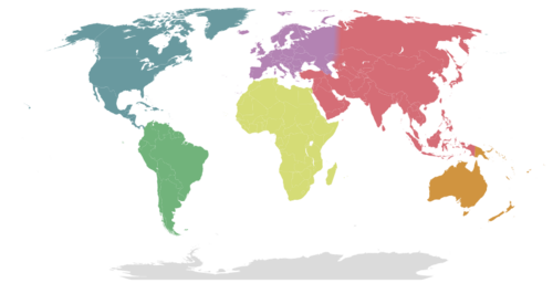
:es has added a clickable map to their main page for continent navigation. I'd love to see us do the same here. --Peter Talk 17:52, 8 January 2013 (UTC)
- French Wikivoyage does the same thing, but with a much larger image. If someone wants to put together a sandbox version of the main page that includes the map image, but does so in a way that doesn't take away from our featured articles, then I'd be in support of including a map. -- Ryan • (talk) • 19:02, 8 January 2013 (UTC)
- I've redone the map a bit and made it a template. --Peter Talk 23:17, 8 January 2013 (UTC)
- I like the idea. Template is also a good ides. Similar templates for countries could be developed for the continent articles.
- Does anyone see any unintended consequences? • • • Peter (Southwood) (talk): 05:05, 10 January 2013 (UTC)
- Dutch Wikivoyage uses a "Destinations" page in the sidebar for navigation. Maybe an idea for here too? --Globe-trotter (talk) 18:22, 10 January 2013 (UTC)
- Years ago we did something similar to the "Destinations" list on the main page (example: ), but just like we do with the "Cities" list in country articles there was a lot of work to manage what appeared in the lists and to educate new users about the processes for changing the lists. I think our current approach of having DOTM and OTBP is a better way to feature articles, although Peter's map idea might be a way to improve navigation from the main page. Extending clickable maps to other articles might also be a nice usability win in the future. -- Ryan • (talk) • 18:58, 10 January 2013 (UTC)
- Dutch Wikivoyage uses a "Destinations" page in the sidebar for navigation. Maybe an idea for here too? --Globe-trotter (talk) 18:22, 10 January 2013 (UTC)
- I like the idea of extending its use too, although that's probably better discussed at Wikivoyage:Regions map Expedition, and I'll take that discussion there.
- Also, for the record, I'm going to hold off and let others sort out the main page layout. If anyone wants to try using the clickable map in a design proposal, just use {{worldimagemap}}. --Peter Talk 21:16, 10 January 2013 (UTC)
I agree the DOTM and OTBP features are the way to go, but I just meant that as an extra page for in the left sidebar. So we'd have a top-level page from which all destinations could be reached, so to speak. --Globe-trotter (talk) 23:25, 12 January 2013 (UTC)
- I like it. Wish I knew more about coding and I would come up with some mp layout suggestions to include it. Also like the idea of using it in the mobile version – cacahuate talk 02:21, 14 January 2013 (UTC)
A friend who is in front-end web development provided some interesting feedback during lunch today. Having never used this site before he commented that he was able to get to Walt Disney World and the other featured articles, but didn't see how to browse to the rest of the world. The links to the continent articles on the front page aren't very prominent, so Peter's world map might be a useful way to highlight those articles. Additionally, he indicated that he thought there would be something in the left nav but that those all lead to policy and discussion pages, so the suggestion to add a "Destinations" link in the left (perhaps name it something like "Browse destinations"?) might be a way to add an easy navigational aid to all pages. -- Ryan • (talk) • 20:28, 17 January 2013 (UTC)
- Yes I proposed the "Destinations" link too, and already implemented it on the Dutch Wikivoyage. I also think that page could serve as a top-level region in the hierarchy. Because if you're now, say, browsing Amsterdam, there is no way to get to Bangkok using the breadcrumb navigation.
- Also, there should be a better split in the left nav bar for readers and editors. Now that part seems totally focused on editors. In the Dutch Wikivoyage, and also the English Wikipedia, the upper part is for readers, and a sub-menu is used for editors. Globe-trotter (talk) 22:02, 17 January 2013 (UTC)
- Agreed on all counts. I created a very short and to the point Destinations article that we could link to in the sidebar. Moving editor links below the reader links is sensible (since editors are more likely to have a hand on how to use wikis). --Peter Talk 00:11, 18 January 2013 (UTC)
- By the way, I'm right now working on making the in-article continent maps clickable. --Peter Talk 00:15, 18 January 2013 (UTC)
Mobile version
Hi guys. I've been tinkering with the main page to try to get the mobile site working as expected, please feel free to tweak it yourself too if you can per the Wikivoyage-l post by Jon Robson. Thehelpfulone 01:58, 14 January 2013 (UTC)
- I added the portal-column-left, seemed to work out fine. Tried replacing some other stuff too but I don't know enough about the coding, so maybe someone else who does can tinker more – cacahuate talk 02:18, 14 January 2013 (UTC)
- I'm not an admin so can't edit the Main Page now that it is protected. Also, I don't know how the mobile code works. I tinkered with it on test.wikipedia.org however where I have the admin flag and found that the title attribute is optional. What it does is add a title. Duhh. We already use titles that link to stuff. So someone with admin flag here please remove the extra title="..." attribute titles that are creating duplicate titles. At least mobile is working now. Anyone know what fixed it? --Rogerhc (talk) 04:52, 14 January 2013 (UTC)
- Please clarify what needs editing. I'm not seeing it on my desktop computer. Ikan Kekek (talk) 04:57, 14 January 2013 (UTC)
- It only shows on the mobile version of the Main Page. Click on that and note the double section titles, eg "Destination of the month" aligned left, and then again, "Destination of the month" aligned center. Removing the title="Destination of the month" attribute will fix that. Ditto for the other doubled section titles. --Rogerhc (talk) 05:45, 14 January 2013 (UTC)
- Yeah. But I don't know how to edit that version of the page (I don't see a menu that gives me such a choice). And actually, the HTML on the main page is giving me a little trouble; I'm only an intermediate at best at HTML. I'm going to have to defer to another admin who can do this right. Ikan Kekek (talk) 05:51, 14 January 2013 (UTC)
- Oh, okay. I made the edits here. Could you try cutting and pasting the wiki markup from that page into the Main Page? :-) Rogerhc (talk) 05:53, 14 January 2013 (UTC)
- Done. Ikan Kekek (talk) 06:02, 14 January 2013 (UTC)
- Thanks, that fixed it, maybe. Not sure. Even after browser cache clear double section titles still show in mobile version for me in Firefox and on my phone but not in Chrome. Weird.. And now I'm off to bed... bye. --Rogerhc (talk) 06:19, 14 January 2013 (UTC)
- Fixed now. Either the cached double section titles got cleared overnight by time or by a subsequent non-related edit to the Main Page that was done by Peter. --Rogerhc (talk) 17:07, 14 January 2013 (UTC)
- Thanks, that fixed it, maybe. Not sure. Even after browser cache clear double section titles still show in mobile version for me in Firefox and on my phone but not in Chrome. Weird.. And now I'm off to bed... bye. --Rogerhc (talk) 06:19, 14 January 2013 (UTC)
- Done. Ikan Kekek (talk) 06:02, 14 January 2013 (UTC)
- Oh, okay. I made the edits here. Could you try cutting and pasting the wiki markup from that page into the Main Page? :-) Rogerhc (talk) 05:53, 14 January 2013 (UTC)
- Yeah. But I don't know how to edit that version of the page (I don't see a menu that gives me such a choice). And actually, the HTML on the main page is giving me a little trouble; I'm only an intermediate at best at HTML. I'm going to have to defer to another admin who can do this right. Ikan Kekek (talk) 05:51, 14 January 2013 (UTC)
- It only shows on the mobile version of the Main Page. Click on that and note the double section titles, eg "Destination of the month" aligned left, and then again, "Destination of the month" aligned center. Removing the title="Destination of the month" attribute will fix that. Ditto for the other doubled section titles. --Rogerhc (talk) 05:45, 14 January 2013 (UTC)
- Please clarify what needs editing. I'm not seeing it on my desktop computer. Ikan Kekek (talk) 04:57, 14 January 2013 (UTC)
- I'm not an admin so can't edit the Main Page now that it is protected. Also, I don't know how the mobile code works. I tinkered with it on test.wikipedia.org however where I have the admin flag and found that the title attribute is optional. What it does is add a title. Duhh. We already use titles that link to stuff. So someone with admin flag here please remove the extra title="..." attribute titles that are creating duplicate titles. At least mobile is working now. Anyone know what fixed it? --Rogerhc (talk) 04:52, 14 January 2013 (UTC)
Discover section -- move Baden Baden to top to align with its photo
Could an admin please move the Baden Baden list item above the Australia item in the Discover section so that the Baden Baden photo will line up with its text? Alternatively, the image could be moved down below the Australia item. But seems to me the item with a photo should come first as the photo makes it intrinsically more interesting. This ordering issue is especially relevant to the mobile version of the Main Page (click on that, scroll down to the Discover section and then drag your browser window to a narrow width to simulate a phone screen and note how the Baden Baden image pops directly above the Australia item in Discover, which is a tad confusing and which this would correct). --Rogerhc (talk) 05:41, 14 January 2013 (UTC)
- Isn't that handled by Template:Discover? Anyway, the problem is that if we move the the Baden Baden item, it wrecks the ordering and we don't know which one to remove when cycling in a new entry. LtPowers (talk) 13:57, 14 January 2013 (UTC)
- So fix it in the Template:Discover and leave an html comment there to keep track of order. The traveler comes first. Sorry I can't do it myself, I'm not an admin. --Rogerhc (talk) 17:05, 14 January 2013 (UTC)
- Having a subpage sandbox of sorts from which admins could copy edits to the actual Main Page could be very useful. This would allow non-admins to improve Main Page without allowing vandals to mess with the public page. --Peter Talk 18:10, 14 January 2013 (UTC)
- Sure (anyone can make a subpage), but let's fix todays problem this way, which has only just now occurred to me: let's replace the Baden Baden photo with a Western Australia photo. Again, only an admin can do this (let's unlock ourselves). --Rogerhc (talk) 19:29, 14 January 2013 (UTC)
- Peter's solution wouldn't solve the current "problem", which is that Template:Discover can't be edited by non-autoconfirmed users. The real solution is to fix our autoconfirm process (as is being discussed on the Pub). We can't simply find a new image for every Discover item; not all of them will have one available. LtPowers (talk) 19:33, 14 January 2013 (UTC)
 Any location worthy of mention in Discover section will have a photo, I expect. How could it not? Anywho, here are two from Western Australia page. Could an admin replace the Baden Baden photo with one of those on Template:Discover please. --Rogerhc (talk) 19:49, 14 January 2013 (UTC)
- Well, just look at the third current item: "Khajuraho is famous for its Hindu and Jain temples with erotic rock carvings." A generic picture of Khajuraho is not pertinent to that particular Discover item. LtPowers (talk) 19:57, 14 January 2013 (UTC)
- Then find one that is. Why not one of the "erotic rock carvings" for example? --Rogerhc (talk) 20:00, 14 January 2013 (UTC)
- You want to put erotic rock carvings on our front page? I think you're going overboard here; I also think it's going overboard to expect every single Discover item to come with a picture. Regardless, the place for proposing that is Wikivoyage talk:Discover. LtPowers (talk) 21:29, 14 January 2013 (UTC)
- For the record, I think we should always have erotic rock carvings on our front page. --Peter Talk 22:10, 14 January 2013 (UTC)
- Done. Cacahuate updated the image. Thanks, --Rogerhc (talk) 19:31, 15 January 2013 (UTC)
- For the record, I think we should always have erotic rock carvings on our front page. --Peter Talk 22:10, 14 January 2013 (UTC)
- You want to put erotic rock carvings on our front page? I think you're going overboard here; I also think it's going overboard to expect every single Discover item to come with a picture. Regardless, the place for proposing that is Wikivoyage talk:Discover. LtPowers (talk) 21:29, 14 January 2013 (UTC)
- Then find one that is. Why not one of the "erotic rock carvings" for example? --Rogerhc (talk) 20:00, 14 January 2013 (UTC)
- Well, just look at the third current item: "Khajuraho is famous for its Hindu and Jain temples with erotic rock carvings." A generic picture of Khajuraho is not pertinent to that particular Discover item. LtPowers (talk) 19:57, 14 January 2013 (UTC)
- Peter's solution wouldn't solve the current "problem", which is that Template:Discover can't be edited by non-autoconfirmed users. The real solution is to fix our autoconfirm process (as is being discussed on the Pub). We can't simply find a new image for every Discover item; not all of them will have one available. LtPowers (talk) 19:33, 14 January 2013 (UTC)
- Sure (anyone can make a subpage), but let's fix todays problem this way, which has only just now occurred to me: let's replace the Baden Baden photo with a Western Australia photo. Again, only an admin can do this (let's unlock ourselves). --Rogerhc (talk) 19:29, 14 January 2013 (UTC)
- Having a subpage sandbox of sorts from which admins could copy edits to the actual Main Page could be very useful. This would allow non-admins to improve Main Page without allowing vandals to mess with the public page. --Peter Talk 18:10, 14 January 2013 (UTC)
- So fix it in the Template:Discover and leave an html comment there to keep track of order. The traveler comes first. Sorry I can't do it myself, I'm not an admin. --Rogerhc (talk) 17:05, 14 January 2013 (UTC)


Vertical images
Is there a way to fix the width of the 3 purple boxes so that when the window is shrunk, they stay a uniform width? As it gets small (and most obviously when viewing the desktop version on an iphone) the dotm is shrinking much smaller since the image is portrait rather than landscape – cacahuate talk 19:42, 14 January 2013 (UTC)
- Sure, probably many ways. However, I feel it is better to have the page scale that way than it would be to force a wider page width onto folks viewing with a small screen. I don't have an iPhone but on my Samsung phone the desktop version (accessed via a link in the page bottom Wikivoyage pop open section) looks good as is. --Rogerhc (talk) 19:58, 14 January 2013 (UTC)
- I don't want to force a wider page width, I just want the 3 boxes to scale evenly, each purple box getting a third of the width, regardless of size of picture inside it. This is what it currently looks like on an iPhone – cacahuate talk 06:20, 15 January 2013 (UTC)
- I think it would, necessarily, force a wider page width; there's no play left in the middle and right boxes in that screenshot. If the left box was the same width, it'd exceed the width of your screen. LtPowers (talk) 13:53, 15 January 2013 (UTC)
- No, it should shrink the other two images slightly and automatically, to the same size that they will be when the dotm has a horizontal image featured – cacahuate talk 16:10, 15 January 2013 (UTC)
- Sorry, I'm not familiar with the way iPhone handles that. I didn't know it would shrink the images; I've never seen a mobile browser do that. I also don't know how to force it to do so when it's not necessary; the box widths are already set to 33% of the available space each. LtPowers (talk) 16:45, 15 January 2013 (UTC)
- I'm with LtPowers on this. Widths in percent are generally flexibly applied by browsers, as you are observing. This is good flexible Web design. Exact proportional widths of boxes is not as important as fitting the presented information gracefully onto the screen. I don't think we want to force a rigid layout there. The variance from strict 33% width we see there is the way the Web is designed to work and works well there I think. --Rogerhc (talk) 19:45, 15 January 2013 (UTC)
- For a comparison, and in case i wasn't clear, here is what it looks like on a desktop. The 3 purple boxes are respecting each other's 33%. It's only when the window gets shrunk very small that the horizontal images decide they deserve more space. Obviously not a huge issue, but personally it looks crappy to me when they don't maintain 33% consistently – cacahuate talk 06:59, 16 January 2013 (UTC)
- It's quite clear now what you mean; I'm just not sure what we can do about it. We can't control the way the iPhone shrinks images, especially so since that seems to be a feature unique to certain mobile browsers. Of course, I'd like to get rid of the three-across boxes entirely, since it does cause issues such as you describe, or, worse, exceeding the width of the screen in many cases. LtPowers (talk) 16:33, 16 January 2013 (UTC)
- For a comparison, and in case i wasn't clear, here is what it looks like on a desktop. The 3 purple boxes are respecting each other's 33%. It's only when the window gets shrunk very small that the horizontal images decide they deserve more space. Obviously not a huge issue, but personally it looks crappy to me when they don't maintain 33% consistently – cacahuate talk 06:59, 16 January 2013 (UTC)
- I'm with LtPowers on this. Widths in percent are generally flexibly applied by browsers, as you are observing. This is good flexible Web design. Exact proportional widths of boxes is not as important as fitting the presented information gracefully onto the screen. I don't think we want to force a rigid layout there. The variance from strict 33% width we see there is the way the Web is designed to work and works well there I think. --Rogerhc (talk) 19:45, 15 January 2013 (UTC)
- Sorry, I'm not familiar with the way iPhone handles that. I didn't know it would shrink the images; I've never seen a mobile browser do that. I also don't know how to force it to do so when it's not necessary; the box widths are already set to 33% of the available space each. LtPowers (talk) 16:45, 15 January 2013 (UTC)
- No, it should shrink the other two images slightly and automatically, to the same size that they will be when the dotm has a horizontal image featured – cacahuate talk 16:10, 15 January 2013 (UTC)
- I think it would, necessarily, force a wider page width; there's no play left in the middle and right boxes in that screenshot. If the left box was the same width, it'd exceed the width of your screen. LtPowers (talk) 13:53, 15 January 2013 (UTC)
- I don't want to force a wider page width, I just want the 3 boxes to scale evenly, each purple box getting a third of the width, regardless of size of picture inside it. This is what it currently looks like on an iPhone – cacahuate talk 06:20, 15 January 2013 (UTC)
Gray rectangle
I see a gray rectangle on the mobile site under # articles in English on en.m.wikivoyage both on my pc and my Android. Does anyone know why? --Peter Talk 20:06, 14 January 2013 (UTC)
- I see that too. If no one else fixes it first, I will look at it later. --Rogerhc (talk) 19:48, 15 January 2013 (UTC)
- It's purple, and it's from the dotm/otpb boxes backgrounds. I also see beige and grey nonsense right above "discover", from the 'discover' and 'get involved' boxes, respectively – cacahuate talk 07:02, 16 January 2013 (UTC)
- Done. We fixed it by removing 'id="mf-...' from the two Main Page tables that layout the page but are not using in the mobile layout. --Rogerhc (talk) 17:43, 18 January 2013 (UTC)
- It's purple, and it's from the dotm/otpb boxes backgrounds. I also see beige and grey nonsense right above "discover", from the 'discover' and 'get involved' boxes, respectively – cacahuate talk 07:02, 16 January 2013 (UTC)
Centering
The images are not centering in mobile version. Looks bad when phone is held in landscape orientation, because heading is centered but photo is awkwardly at left. I am trying to design (at Wikivoyage:Main Page design) a way to get the dofm, ofbp and ftt photos to center in Main Page mobile version but I am not a Web design expert. Any suggestions? --Rogerhc (talk) 19:58, 18 January 2013 (UTC)
Template:Description
Why is this on the main page (it does not seem to do anything)?:
{{description|Open source travel guide featuring up-to-date information on attractions, hotels,
restaurants, travel tips and more. Free and reliable advice written by Wikivoyagers from around the globe.}}
Maybe answer at Template talk:Description... I'd like to clean up Main Page markup, remove anything we don't need and comment anything weird that we do need so that people are not confused by it. --Rogerhc (talk) 03:22, 18 January 2013 (UTC)
Hidden hr
Why is this on the main page (it is hidden by visibility:hidden and does not seem to do anything)? Can we delete it?:
<hr style="height:0pt; visibility:hidden;" />
Appears to add a small amount of vertical white space. That is kludgey and non-obvious. I don't like this kind of thing. However, I think that is why it is there. I will replace it with appropriate margin-top or margin-bottom style declarations in my Main Page mock ups. --Rogerhc (talk) 03:24, 18 January 2013 (UTC)
- Thanks. This was my poor attempt to fix line spacing. Travel Doc James (talk · contribs · email) 02:21, 19 January 2013 (UTC)
New Main Page Idea
Hi! I was just having a quick play with some ideas for the main page. Every guidebook I've ever seen starts with big glossy images on the cover, and I thought that perhaps the Main Page here could do the same. The mock-up I've made (here:User:Nicholasjf21/MainPage) was made very quickly and was severely limited by my lack of knowledge - I'm not clever enough to do many things yet (though Inkowik's proposed redesign of the Wikipedia Front Page was very helpful.)! Nonetheless, I thought I'd 'plunge forward' and give it a go. At present all the images are in .png format so will take longer to load than they would if in SVG format, but once again I'm limited on that front by my ineptitude and lack of appropriate software. I myself am not completely convinced about some aspects of the design: would a clickable map be a better image to have underneath the 'Welcome to Wikivoyage' bit and then separate the DOTM image elsewhere? Also, do you think that keeping some of the article text from the DOTM, beaten path and travel topic on the images would be a good idea?
Any thoughts, edits, criticism, praise (unlikely!) would be gratefully received! --Nicholasjf21 (talk) 03:00, 22 January 2013 (UTC)
- SVG are vector graphics; they're good for icons, line drawings and diagrams but of no advantage for photographic images. K7L (talk) 03:16, 22 January 2013 (UTC)
- The huge pictures really, really stand out. Looks incredible. 86.45.191.101 03:22, 22 January 2013 (UTC)
- They do stand out, and they look good, but I think they're too big. I even had to scroll right in order to have a full view of any of the photos. Ikan Kekek (talk) 03:50, 22 January 2013 (UTC)
- The pictures do stand out and the layout looks ok. However, I'm concerned that the "Welcome to Wikivoyage"/Continents/types of guides section doesn't stand out enough and this layout should probably incorporate the clickable world map. The descriptions for DotM/OtBP/FTT would be nice to keep. Also, the Discover/Getting involved/sister projects sections get pushed down very far on the page...IMO all the main page's content should be given roughly equivalent focus. Sometimes there aren't many good images for DotM/OtBP/FTT and there may be the occasional featured page that doesn't have an image that would look good in that elongated landscape form or look good with the text in the same position. I think it would be too much work to crop featured pages' photos and position the text appropriately for each update.
- An issue with this layout is that large pictures might take a while to load when used on slower connections...an especially important issue for most 3rd world countries. Some pages (like USA) have a lot of images but, unlike the main page, they're usually for developed nations and aren't very likely to be accessed on a slower connection. Per , the total time to load the proposed redesign on a 56k connection is 30.66 seconds (including 23.41 sec for "Total images").
- Some suggestions: Incorporate the clickable world map at the top with the "Welcome" message & links (which look better in that form than the three columns on the current main page, add Antarctica) on the left & map on right; don't make changes to the Discover/Getting involved content at the bottom; then find creative ways to better format the 3 featured pages, while keeping text off the pictures and keeping them side-by-side (I think we should give them equal emphasis). With regards to the featured pages, the current outline/box around each looks a bit sterile...the images can be wider to the point that they almost touch each other (but this brings the potential of having to crop images and/or overlook good images for one that fits nicely in that spot), then add some style to the titles (bold, different font, different color), and maybe have the name/link of the featured page separate from it's description and close in style (maybe slightly smaller font) to the title (DotM/OtBP/FTT). AHeneen (talk) 04:53, 22 January 2013 (UTC)
- I am a fan of big photos (glossy-style) instead of long texts and boxes. I think it fits a travel guide more, as large images excite the viewer to travel and make him/her want to learn more about the beautiful destinations we cover. Your mock-up is an interesting idea, and shows some of the possibilities, but it still needs work. I think one big image should be used at the top, and really make that destination stand out. Then below one or two smaller destinations could be featured. A bit like Lonely Planet has done. They also put a world map in there, which is also something I'd like to see.
- A problem is that computer users buy bigger monitors with higher resolutions, but also use mobile phones, iPads and other small resolution devices. As we've seen with the current main page, it's a challenge to unite these without falling back to dry and boring walls of text. Globe-trotter (talk) 05:47, 22 January 2013 (UTC)
- Thanks very much for all your feedback. Sorry for my ignorance about things like SVG graphics and the like. I'll keep playing with it and try and integrate some sort of map as well. As for the mobile version of Wikivoyage, does it use a separate, mobile page or just a scaled version of the normal one? --Nicholasjf21 (talk) 10:44, 22 January 2013 (UTC)
- The mobile version appears to use a separate page, as it only displays Welcome (no links to continents, travel topics, etc), DotM, OtBP, FTT, and Discover. AHeneen (talk) 12:25, 22 January 2013 (UTC)
- I've had a go at adding a clickable map, which you can see here: User:Nicholasjf21/MainPage. I should say however, thhat it is not yet clickable - I'm having some difficulty getting the co-ordinates right; any ideas?--Nicholasjf21 (talk) 13:02, 22 January 2013 (UTC)
- Also, would it be better to have the images as '3 in a row' - i.e. not with banners of their own, hence making the page shorter and probably more manageable as a result? --Nicholasjf21 (talk) 13:42, 22 January 2013 (UTC)
- Right, the world image is now clickable (User:Nicholasjf21/MainPage). Any further comments or suggestions? --Nicholasjf21 (talk) 15:20, 22 January 2013 (UTC)
- I've also got a day image of the Earth waiting in the wings if you'd prefer that.... --Nicholasjf21 (talk) 16:21, 22 January 2013 (UTC)
I like this fresh new idea. A couple of comments.
- Could we have a day map during the day and a night map during the night based on a persons IP time zone? Maybe a bit stronger of a boarder around individual countries.
- Before we go live we need to figure out how to make it work on all screen sizes. With one picture across this should be easier than our current format
- We need to make sure that all featured places have great images and someone is willing to take on the formatting going forwards
- How about a nice prominent search box in black area? Right under the number of article bit.
- Also for a major change should we do some testing?
And finally thank you Nicholas for this stellar idea. Our main page needs work and this is revolutionary. Travel Doc James (talk · contribs · email) 20:03, 22 January 2013 (UTC)
- I am impressed, and I cannot shake the feeling that a magazine-like front page is absolutely the way to go. To answer James' questions:
- IP is not a reliable indicator of location. I think it's too much work for little benefit.
- This would likely require different images for mobile vs non-. Probably worth doing nonetheless.
- That's the hard part, but I think it's worth doing. But we also need an alternative for when it's just not possible.
- It's often been considered a bit strange to have two search boxes on the page, but it could be done.
- You shouldn't even have to ask; this is not something we would casually push to the front page.
- To address something mentioned earlier, though, we cannot give all three features equal prominence. It's impossible. Even our current layout puts the DotM on the left, which is more prominent than center or right. But more importantly, we cannot retain the current three-abreast layout; it quite simply does not work on tablet computers, or older desktops with less than 1280 horizontal pixels. It has to change. LtPowers (talk) 20:35, 22 January 2013 (UTC)
- Have you seen this athena stuff ? The tech people at the WMF are interested in look at this direction. We could also speak with tech to see about moving the search box? Shouldn't be that hard to do.
- These images do not format perfectly. I have a long narrow monitor. Is there anyway for the image to be sized according to the screen size? Travel Doc James (talk · contribs · email) 20:43, 22 January 2013 (UTC)
- If we go with these picture increasing the room used for the sister project would provide more balance IMO. What about a layout like on Wikipedia for the sister site? Travel Doc James (talk · contribs · email) 20:55, 22 January 2013 (UTC)
- Hi! Thanks for your very kind comments and suggestions!
- If we go with these picture increasing the room used for the sister project would provide more balance IMO. What about a layout like on Wikipedia for the sister site? Travel Doc James (talk · contribs · email) 20:55, 22 January 2013 (UTC)
- I am impressed, and I cannot shake the feeling that a magazine-like front page is absolutely the way to go. To answer James' questions:
- I too was thinking that it would be nice to have a global picture that changed with the time - perhaps rather than linking it to an IP address we could do it via the time on the user's computer? I've already got a suitable day alternative that just needs a little tweaking to fit with the existing image-map co-ordinates.
- I had been worried about image scaling, but different images shouldn't be too difficult to sort out (I'd hope!).
- Lots of places on here have great images on the commons that whilst unused in their respective articles could, I'm sure, be used as a potential back-up when other pictures are scarce. If this is not possible, we could perhaps use smaller images placed next to each other; a map or even just single image with a similar background colour filling out the rest of the banner. I'd be more than happy to be involved in its formatting in some way if I was wanted. I would hope that as the featured destinations only change on a monthly basis, it would not be too arduous a task for whoever took it on. I've also made the banners at a ration of 3:1 in the hope that this would make sizing the images somewhat easier.
- A search box on the image sounds like a brilliant idea. I'm not quite sure how I could do that, but if anyone knows I'd be very grateful!
- I'll have a look at how Wikipedia deals with the sister sites and I'll see what I can do on that front.
Thanks very much for all your advice and comments! --Nicholasjf21 (talk) 21:29, 22 January 2013 (UTC)
- One final thing - any idea of a picture width that would be better? The monitor on my laptop is an odd size, so it's a bit difficult to see what would be preferable. --Nicholasjf21 (talk) 22:48, 22 January 2013 (UTC)
This is fabulous. My one concern is the width problem--I get stuck using broken down old monitors when traveling in poor countries, and assume that the layout won't work for those. It would probably take forever to load too. Could we have a "loading slow" dialog at the top that would load first, and offer a link to a basic, barebones version?
Also, do you mind if I tweak the imagemap boundaries? Some of Europe is in Asia, and I don't think the Middle East should be its own top level region along with the continents. --Peter Talk 23:27, 22 January 2013 (UTC)
- I'd be very grateful if you'd be prepared to! I just based the regions on the map that FR have used, so please feel free to change anything you like! --Nicholasjf21 (talk) 23:46, 22 January 2013 (UTC)
thumbnail This is what I get on my monitor. Missing the text on both side. Or if I zoom out it goes off the edge of my screen. Travel Doc James (talk · contribs · email) 00:45, 23 January 2013 (UTC)
- Thanks for letting me know! I'll see what I can do to fix that! If you've any idea of what needs to be done, feel free dive in!
I'm really struggling to find a way of making the images/page resize with the user's resolution - any ideas?--Nicholasjf21 (talk) 01:34, 23 January 2013 (UTC)
- Sorry I am not very good with this stuff. Travel Doc James (talk · contribs · email) 02:04, 23 January 2013 (UTC)
- By the way I like more and more what you have done. Great sister links and new colors in the bottom two boxes. Let see if we can fix this imaging formatting issue. Travel Doc James (talk · contribs · email) 07:50, 23 January 2013 (UTC)
- I think you need to modify the site's CSS. 88.148.249.186 09:05, 23 January 2013 (UTC)
- Yes that's what it looks like. Someone commented on it here Travel Doc James (talk · contribs · email) 09:37, 23 January 2013 (UTC)
- Thanks very much for your help - it looks like Javascript might have to be the way round this particular issue, though I'm not quite sure how that fits in to the MediaWiki engine. I'll have a go nonetheless! The sister links are actually from User:Pretzels who designed them for the proposed new Wikipedia front page. Now that contest seems to have ground to a halt, it seems a shame to lose such a great piece of work! I've sent him a message as well to check that he is ok with us using it. If not, I'll have another play myself. Thanks again for your help! --Nicholasjf21 (talk) 10:12, 23 January 2013 (UTC)
- It looks like I'll have to edit the 'common.js' Javascript file in order to make the images resize automatically, but I'm not sure where (or whether) I can find this. Any ideas? --Nicholasjf21 (talk) 10:23, 23 January 2013 (UTC)
- I think using javascript does not recalculate image widths when you turn your smartphone from portrait to landscape, but css does. FYI, the css file is MediaWiki:Common.css and js-file MediaWiki:Common.js, which are--of course--fully protected. If you wish to experiment, see e.g. and try it on the css file for your mediawiki skin (possibly User:Nicholasjf21/vector.css?? I don't remember...). 88.148.249.186 10:48, 23 January 2013 (UTC)
- Now the version for mobile is different than the desktop version. We are just try to make work on more sizes of desktop monitors. Travel Doc James (talk · contribs · email) 13:32, 23 January 2013 (UTC)
- I've had a trawl across the internet and whilst possible, the auto image scaling looks quite complicated, particularly on MediaWiki. I'll keep tinkering but if anyone has any ideas, they'd be much appreciated! --Nicholasjf21 (talk) 16:19, 23 January 2013 (UTC)
- Just a note: the mobile version of our main page is not totally separate; it's generated from the desktop Main Page using a certain set of rules. LtPowers (talk) 16:31, 23 January 2013 (UTC)
- Could splitting them be a way forward? That way you could perhaps have both a better desktop and mobile experience?--Nicholasjf21 (talk) 16:50, 23 January 2013 (UTC)
- Just a note: the mobile version of our main page is not totally separate; it's generated from the desktop Main Page using a certain set of rules. LtPowers (talk) 16:31, 23 January 2013 (UTC)
- I've had a trawl across the internet and whilst possible, the auto image scaling looks quite complicated, particularly on MediaWiki. I'll keep tinkering but if anyone has any ideas, they'd be much appreciated! --Nicholasjf21 (talk) 16:19, 23 January 2013 (UTC)
- Now the version for mobile is different than the desktop version. We are just try to make work on more sizes of desktop monitors. Travel Doc James (talk · contribs · email) 13:32, 23 January 2013 (UTC)
- I think using javascript does not recalculate image widths when you turn your smartphone from portrait to landscape, but css does. FYI, the css file is MediaWiki:Common.css and js-file MediaWiki:Common.js, which are--of course--fully protected. If you wish to experiment, see e.g. and try it on the css file for your mediawiki skin (possibly User:Nicholasjf21/vector.css?? I don't remember...). 88.148.249.186 10:48, 23 January 2013 (UTC)
- It looks like I'll have to edit the 'common.js' Javascript file in order to make the images resize automatically, but I'm not sure where (or whether) I can find this. Any ideas? --Nicholasjf21 (talk) 10:23, 23 January 2013 (UTC)
- Thanks very much for your help - it looks like Javascript might have to be the way round this particular issue, though I'm not quite sure how that fits in to the MediaWiki engine. I'll have a go nonetheless! The sister links are actually from User:Pretzels who designed them for the proposed new Wikipedia front page. Now that contest seems to have ground to a halt, it seems a shame to lose such a great piece of work! I've sent him a message as well to check that he is ok with us using it. If not, I'll have another play myself. Thanks again for your help! --Nicholasjf21 (talk) 10:12, 23 January 2013 (UTC)
- Yes that's what it looks like. Someone commented on it here Travel Doc James (talk · contribs · email) 09:37, 23 January 2013 (UTC)
Quick Update: Thanks again for everyone's input and to Peter for overhauling the imagemap. The quest to find a means of scaling the images automatically to fit different browsers continues. I've trawled the web asked on the MediaWiki site itself and most sources (including MediaWiki) seem to think that JavaScript would be the answer. Have any other Wiki's encountered this issue and come up with a fix? Either way, we shall prevail!
- Is there a page on Meta to discuss cross-wiki development issues like this? There's probably plenty of knowledgeable developers on WMF projects that would be willing to help us, it's just a matter of finding one. AHeneen (talk) 21:44, 23 January 2013 (UTC)
- I'm not sure, but I'll have a look and ask around to see if anyone would be prepared to help out. I'd like to do it myself, but I'm afraid I'm not very familiar with JavaScript. --Nicholasjf21 (talk) 22:33, 23 January 2013 (UTC)
- I've asked here if anyone could help out and I'll see if there are any other places where I could appeal for assistance. --Nicholasjf21 (talk) 22:47, 23 January 2013 (UTC)
- I've asked Jon on Wikipedia, an employee of the Foundation, if he'd be prepared to give us a hand in getting the scaling of both images and text sorted. Are there any other smaller, aesthetic changes that you'd like to see? --Nicholasjf21 (talk) 23:41, 23 January 2013 (UTC)
I've cleaned up the page a little too whilst waiting for the scaling to be sorted - I don't suppose anyone has any other ideas that they'd like to see implemented? --Nicholasjf21 (talk) 21:09, 24 January 2013 (UTC)
- I might recommend reducing the y-axis width of the banner images just a bit, since the page is pretty long. Also, would it be possible to have the disover/get involved row match the x-axis width of the banners? --Peter Talk 00:23, 25 January 2013 (UTC)
- Hi! Thanks for the feedback! I'll have a look at what I can do in terms of making the images thinner and/or grouping two together on the same row perhaps. I'm afraid I think the non-alignment between the images and the boxes is a scaling issue - the boxes scale and the images don't (yet). I've asked around lots of places within the 'Wikimedia Family' but as yet haven't found anybody who is prepared/able to sort it out for us, but I'll keep trying! --Nicholasjf21 (talk) 00:40, 25 January 2013 (UTC)
I think the photos need to be replaced with panorama photos that really make it shine; and three bars is really too much. When I watch the page in a full-screen browser, the sides are cut off on the left and right sides, making it look very weird. Also, I think Other destinations should be added somewhere. The sister sites part looks very professional, but a bit too serious/encyclopedia-like for a travel guide. Maybe an easier font could be used. Globe-trotter (talk) 00:31, 25 January 2013 (UTC)
- Thanks for your comments! I too think that panorama images would be a very good option, but unfortunately, on many articles they just don't seem to exist. Whilst there is one of Walt Disney World, to me it didn't seem to 'pop' as much as the current one, but that's just personal opinion. As above, I think the cutting off problem that you describe is one of dynamic scaling that would hopefully be solved by getting someone familiar with CSS to take a look at the page, which I hope to do soon. I'll find a home for Other Destinations (perhaps in the bar with the Itineraries etc?) too. I agree that the sister site section looks very nice (probably because I didn't make it!) but I will try changing the font there to the default. Thanks! --Nicholasjf21 (talk) 00:45, 25 January 2013 (UTC)
I've now added Other destinations and changed the font of the Sister projects - any thoughts? I may hold off on editing the size of the images until we have some form of dynamic scaling in place. At present it seems a bit futile to perfect their sizes when they're subject to change in the (hopefully!) near future. --Nicholasjf21 (talk) 00:58, 25 January 2013 (UTC)
- This is an amazing idea that will really distinguish us from any other travel site. It just makes the whole wiki feel young and modern. In terms of other suggestions, I feel the Discover and Getting Involved boxes seem very odd and out of place. The width is not the only issue, but the colour is too bland and not as vibrant as the panoramic showcases above. Might I suggest using some of the colours of our logo, which are much stronger, such as the red and turquoise-green.
- I think that descriptions are necessary for the three showcases, and without it, viewers have no idea what they are looking at. Perhaps we could just have a very watered down description of only one or two sentences, at least explaining what the place/topic is and what country it's in.
- I'd recommend a new Expedition to ensure there are always appropriate, hi-res photos available for future showcases. This expedition could also cover the DotM, OtBP and FTT nomination process, and avoid issues where there are no planned showcases a mere 5 days before the changeover (like what we are experiencing now).
- One final idea could be to use our logo's font in the headers of the Main Page, therefore creating some sort of consistency in design. It'll also make the page a bit more exciting, and is a better alternative than bland Arial or whatever is in use now. But overall, a great idea that I'd love to see implemented once appropriately ironed out and tested! JamesA >talk 15:29, 25 January 2013 (UTC)
- Hi! Thanks very much for your kind comments and suggestions. I agree that a minimalist description might be nice, as well as a continuous font for the titles and I'll have a look at new box colours too! I'm afraid I'm away from my computer at present (I'm writing this on my phone), but I'll have a look when I get back home tomorrow. In other exciting news, James (User:Jmh649 - Travel Doc James) has very kindly asked a friend of his to have a look at the design for us and explore how we could make it scale. Hopefully we're on the way to getting this sorted! Nicholasjf21 (talk) 16:56, 25 January 2013 (UTC)
- Sorry for such a quick secondary post, but I've just been thinking - would using the logo font throughout work? I've a fear it wouldn't: as it's a custom font, so people are unlikely to have it installed, any text using it won't render properly. Short of overlaying every image with the title before upload, I fear we won't be able to do this (though I could be wrong!). Therefore would it be worth locating another font or keeping the titles neutral as they are and allowing the images to do the talking?
- Hi! Thanks very much for your kind comments and suggestions. I agree that a minimalist description might be nice, as well as a continuous font for the titles and I'll have a look at new box colours too! I'm afraid I'm away from my computer at present (I'm writing this on my phone), but I'll have a look when I get back home tomorrow. In other exciting news, James (User:Jmh649 - Travel Doc James) has very kindly asked a friend of his to have a look at the design for us and explore how we could make it scale. Hopefully we're on the way to getting this sorted! Nicholasjf21 (talk) 16:56, 25 January 2013 (UTC)
PS Maybe we could change the box colours every month to complement the photos? Nicholasjf21 (talk) 17:14, 25 January 2013 (UTC)
- I think it's great that fresh idea's arise and that we can discuss a new front page. I like big, shiny pictures too. Thanks for the work, Nicholas! On a critical note however, our front page should be a huge thing. From a creative point of view, I kind of feel we're tunnel visioning now :-), trying to tweak this one design, as good as it may be. If we're gonna be the biggest online travelguide (of course we are!), we should think big. Maybe we should have some kind of call for proposals, as with the logo, get some options. Do some more research into what people respond to best. Just a poll could be good, later on, linked in a site notice. For that (and actually, even to improve this specific design), we should come up with a list of demands. What hás to be there, what are the primary goals? Set off design vs usability. I like big images, I do, but first and foremost the front page should be an excellent starting point for clicking further. If this design would bring serious problems loading when checking in from Indonesia, we should think twice. JuliasTravels (talk) 17:39, 25 January 2013 (UTC)
- We might meed two pages where people have the option to click on a second one if they are at slow connections. Gmail does this. We do need to fix the sizing issue before this proposal could go live. IMO it is a whole lot better than what we have now. Would it be fixed in place forever? Of course not. If someone else has a design they wish to proposal please do. Travel Doc James (talk · contribs · email) 19:06, 25 January 2013 (UTC)
- Hi! Thanks for your kind words. As James says a lo-res version would probably be desirable if this design were used, but that shouldn't be any major issue. If anyone would like to edit the design, they're more than welcome to do so. If you have any ideas or changes that you'd like to propose, just post here! Nicholasjf21 (talk) 21:26, 25 January 2013 (UTC)
- Hi Nicholas, replying here from your message on my Meta talk page, unfortunately my level of JS/CSS isn't that high so I don't believe I'd be able to help, but I'll see if I can poke someone that may have the skills to take a look. Thehelpfulone 22:04, 26 January 2013 (UTC)
- Hi there! Thanks very much - that's very kind of you! I really appreciate it! --Nicholasjf21 (talk) 23:05, 26 January 2013 (UTC)
- Hi Nicholas, replying here from your message on my Meta talk page, unfortunately my level of JS/CSS isn't that high so I don't believe I'd be able to help, but I'll see if I can poke someone that may have the skills to take a look. Thehelpfulone 22:04, 26 January 2013 (UTC)
- Hi! Thanks for your kind words. As James says a lo-res version would probably be desirable if this design were used, but that shouldn't be any major issue. If anyone would like to edit the design, they're more than welcome to do so. If you have any ideas or changes that you'd like to propose, just post here! Nicholasjf21 (talk) 21:26, 25 January 2013 (UTC)
- We might meed two pages where people have the option to click on a second one if they are at slow connections. Gmail does this. We do need to fix the sizing issue before this proposal could go live. IMO it is a whole lot better than what we have now. Would it be fixed in place forever? Of course not. If someone else has a design they wish to proposal please do. Travel Doc James (talk · contribs · email) 19:06, 25 January 2013 (UTC)
As suggested, I've just added some short excerpts from each article to the images on the page: User:Nicholasjf21/MainPage. Any thoughts on that or on the issue of fonts? --Nicholasjf21 (talk) 23:06, 26 January 2013 (UTC)
- I've also added a 'Loading slowly?' link to the top right of the page. At present this just links to a clone of the current front page, but I'd hope that eventually it could become a stripped down version of the above proposal. We could also use the 'slow connection' page as the mobile alternative perhaps? --Nicholasjf21 (talk) 23:08, 27 January 2013 (UTC)
Personally, to scale images without JavaScript (albeit crudely) I would use CSS3 media queries. I lack the time to explain in any depth though :( This, that and the other (talk) 10:52, 30 January 2013 (UTC)
The good news - auto-scaling of the images is now functional!!! The bad news: Lots of other things have now ceased to work, but I'll keep looking at it! If any one fancies a play my CSS code that enables it is here. Feel free to have a play! It still requires a lot of work to get it sorted, but one the biggest issues now (appears!) to have been resolved. --Nicholasjf21 (talk) 00:28, 31 January 2013 (UTC)
- Nice work getting the auto-scaling working! But after testing it myself, I see what you mean about "lots of other things". More like "everything else"! I did some minor testing myself but couldn't get it to work, as I have little knowledge of CSS. Have you tried asking here? Seems to be quite active. JamesA >talk 10:26, 1 February 2013 (UTC)
- Thanks very much! You are right though - it appears that the scaling has caused everything else to go haywire too! I have tried yes, but I was then referred on to Stack Overflow where I'm yet to receive a response! --Nicholasjf21 (talk) 11:48, 1 February 2013 (UTC)
- I just checked the stackoverflow query and you just got a response about an hour ago. -- MarkAHershberger (talk) 14:34, 1 February 2013 (UTC)
- Thanks! I'm going to give it a go now! --Nicholasjf21 (talk) 16:13, 1 February 2013 (UTC)
- I just checked the stackoverflow query and you just got a response about an hour ago. -- MarkAHershberger (talk) 14:34, 1 February 2013 (UTC)
- Thanks very much! You are right though - it appears that the scaling has caused everything else to go haywire too! I have tried yes, but I was then referred on to Stack Overflow where I'm yet to receive a response! --Nicholasjf21 (talk) 11:48, 1 February 2013 (UTC)
Now scalable
Hallelujah! Scaling should now work (without destroying the page in the process!)! The globe image does not at present function, but other than that, everything else should work. I'll do some work to try and get the map working. In the meantime I'd be very grateful if some of you could copy the CSS code (here) into your own custom CSS field in 'preferences' and give it a go. If you have any issues could you let me know your screen resolution and internet browser; that way I can dive back into the code and have a play. Thanks very much for all your help and support!--Nicholasjf21 (talk) 20:37, 1 February 2013 (UTC)

- I'm still having issues. The banners are scaling now (!), but the text is getting forced off the sides, the imagemap is no longer clickable, and the "loading slowly" link is forcing the banners left. See the thumb to the right. Using Chromium Version 23.0.1271.97, res: 1366x768. --Peter Talk 21:18, 1 February 2013 (UTC)
- Hi! Thanks very much for the feedback! I too am using 1366x768, so I'm not quite sure why this is happening, but I'll have a play with the text and see what I can do! I've also now found a way to sort out the map, though it will require 11 sets of co-ordinates! Any help would be greatly appreciated! --Nicholasjf21 (talk) 22:25, 1 February 2013 (UTC)
- I'm struggling a bit to get the image-map function to work - I've currently got the CSS set to display a different 'globe' image for each resolution and then I'm trying to input co-ordinates for each image on the page's edit space. However, it seems only to be creating a small image-map in the top left corner - any ideas?--Nicholasjf21 (talk) 23:32, 1 February 2013 (UTC)
- How are you going about generating the coordinates? I've found w:KImageMapEditor to be an easy way of doing it. I guess that you are basically creating 11 image maps? --Peter Talk 00:09, 2 February 2013 (UTC)
- Yep, that's basically the plan - I've been trying to do it with a few different tools on the internet, but I've not seen that one! I'll give it a go! Is the page still displaying incorrectly for you?--Nicholasjf21 (talk) 00:36, 2 February 2013 (UTC)
Right, a quick list of things that still need resolving:
1. The imagemap co-ordinates - scaling appears to do weird and wonderful things to the way in which imagemap co-ordinates work, but this is definitely do-able, just time-consuming. Appears to be sorted (see below). 01:37, 3 February 2013 (UTC)
2. Decide on colours and layout for the discover boxes - JamesA has kindly had a go at this - his results are now on the proposed page. If you have any ideas about that, the conversation is taking place on the discussion on the page itself. A compromise appears to have been reached; feel free to comment though. 01:37, 3 February 2013 (UTC)
3. Sort out any remaining scaling/spacing issues. If you do have an issue could you please let me know what resolution and browser you're using? Screenshots are also very helpful! I've only been able to test the page at resolutions of 1366 width and below. If anyone has a screen bigger than this, I'd be particularly interested in your feedback.
Thanks! --Nicholasjf21 (talk) 11:36, 2 February 2013 (UTC)
- I tried viewing the page on my smartphone (in desktop mode), but it displayed like I had no CSS configured at all, with all widths of the 'continents/map' shown along with oversized images below. I was logged in, so the CSS should have been pulled in from my personal User:JamesA/common.css. Possibly this issue may disappear once we put the code on MediaWiki:Common.css. JamesA >talk 11:47, 2 February 2013 (UTC)
- I think that could be the case, but I've also tweaked my CSS here to try and fix it. I think what was happening was that I'd inadvertently coded it so that resolutions below 640 did not benefit from the CSS at all. This should now have changed. --Nicholasjf21 (talk) 12:22, 2 February 2013 (UTC)
Joyous news - the clickable map now appears (at least!) to be functioning. Please update your CSS from here and let me know what you think. JamesA has also tweaked the front page boxes some more and I think they're looking great! Let me know if you have any problems or suggestions.--Nicholasjf21 (talk) 21:48, 2 February 2013 (UTC)
- I'm really impressed—this looks beautiful even on my Android! If it works on that tiny screen, it will work well on any, I'd think. Great work! (Unrelated, but I'd aim for a Bali pic that doesn't have privacy concerns.) --Peter Talk 22:15, 2 February 2013 (UTC)
- Thanks very much - that's really kind of you! I'm glad it works! I'll try and get another Bali pic if possible - I just chose that one very quickly yesterday.--Nicholasjf21 (talk) 22:35, 2 February 2013 (UTC)
- There we go, the Bali image has been changed. --Nicholasjf21 (talk) 23:09, 2 February 2013 (UTC)
- Thanks Peter I much prefer your banner to either of mine! --Nicholasjf21 (talk) 23:25, 2 February 2013 (UTC)
- The new banners look great! I tried again on my phone and it still doesn't work. I don't think its your coding though, but rather that my browser doesn't work well with CSS. Nearly all users who use a mobile to view Wikivoyage will see the mobile site and the mobile main page, anyway, so it's no biggie. JamesA >talk 01:28, 3 February 2013 (UTC)
- You're right about phones, but I'd be concerned about tablets, which should see the full site, not the mobile site. LtPowers (talk) 04:07, 3 February 2013 (UTC)
- A major issue with tablets is that the page doesn't autmatically scale live, but detects a users' resolution when the page loads and scales it to that. Tablets can be changed to portrait and landscape, and depending on what you loaded the page on, the layout could be weird when you turn it on its side. I don't have a tablet to test this, but if you go to the page and try zooming in and out (Ctrl +, Crtl -), you will see it doesn't actually auto-scale. JamesA >talk 04:19, 3 February 2013 (UTC)
- It scaled properly on my phone when switching between vertical and horizontal. --Peter Talk 04:55, 3 February 2013 (UTC)
- Fair enough. Before the changes to get the text to display correctly, the images would auto-scale on my laptop's browser. Now they are static. But I guess images work different in a mobile environment. JamesA >talk 05:03, 3 February 2013 (UTC)
- I must confess, I don't really know how tablets will react to this page, however I can only see the reports of it working on phones as a good thing! Unfortunately, I don't have access to a tablet, but some testing is needed I think. My eventual hope would be to tweak the mobile site as well to bring it a little closer to this one. As for scaling, I decided that having ultra-responsive images that change size as you re-size the window was perhaps unnecessary. There are very few websites out there that are that responsive and such a system would have made creating the imagemap nigh-on impossible. As it is, the CSS discovers the resolution the device is set to and finds the image that matches that range of resolutions using media queries. I'm not honestly sure whether tablets change their resolution or just their window-size when rotated, so we'd need to look into this. If necessary I dare say we could build a 'super mobile' alternative that would offer great responsiveness.--Nicholasjf21 (talk) 10:06, 3 February 2013 (UTC)
- Fair enough. Before the changes to get the text to display correctly, the images would auto-scale on my laptop's browser. Now they are static. But I guess images work different in a mobile environment. JamesA >talk 05:03, 3 February 2013 (UTC)
- It scaled properly on my phone when switching between vertical and horizontal. --Peter Talk 04:55, 3 February 2013 (UTC)
- A major issue with tablets is that the page doesn't autmatically scale live, but detects a users' resolution when the page loads and scales it to that. Tablets can be changed to portrait and landscape, and depending on what you loaded the page on, the layout could be weird when you turn it on its side. I don't have a tablet to test this, but if you go to the page and try zooming in and out (Ctrl +, Crtl -), you will see it doesn't actually auto-scale. JamesA >talk 04:19, 3 February 2013 (UTC)
- You're right about phones, but I'd be concerned about tablets, which should see the full site, not the mobile site. LtPowers (talk) 04:07, 3 February 2013 (UTC)
- The new banners look great! I tried again on my phone and it still doesn't work. I don't think its your coding though, but rather that my browser doesn't work well with CSS. Nearly all users who use a mobile to view Wikivoyage will see the mobile site and the mobile main page, anyway, so it's no biggie. JamesA >talk 01:28, 3 February 2013 (UTC)
Looks like we are almost there. Spacing and images look good. Appear to scale to my screen on a few different computers. Should we add this as an alternative to the main page with a little tag like -> view new page design Anyone have any idea how to add a second search box below the number of articles present? Travel Doc James (talk · contribs · email) 11:23, 3 February 2013 (UTC)
- On Wikipedia we have this http://en.wikipedia.org/wiki/Template:Search_box Travel Doc James (talk · contribs · email) 11:29, 3 February 2013 (UTC)
- I've added the search box, and it looks quite good. I think the button text "Search the World" piques curiosity, but also sounds a little corny, so please replace it if you have a better idea. I tried adding a greyed out placeholder in the white area that could say something like "Enter your destination". However, that appears not to be working as the InputBox extension is outdated. See mw:Extension:InputBox. JamesA >talk 11:49, 3 February 2013 (UTC)
- I think it is excellent. Travel Doc James (talk · contribs · email) 11:52, 3 February 2013 (UTC)
- I've added the search box, and it looks quite good. I think the button text "Search the World" piques curiosity, but also sounds a little corny, so please replace it if you have a better idea. I tried adding a greyed out placeholder in the white area that could say something like "Enter your destination". However, that appears not to be working as the InputBox extension is outdated. See mw:Extension:InputBox. JamesA >talk 11:49, 3 February 2013 (UTC)
- On Wikipedia we have this http://en.wikipedia.org/wiki/Template:Search_box Travel Doc James (talk · contribs · email) 11:29, 3 February 2013 (UTC)
Tablet viewing


Here are some screenshots of how it currently looks on an iPad, in portrait and landscape – cacahuate talk 17:10, 5 February 2013 (UTC)
Going semi live
I am wondering if we should start giving people the option to use the new main page. I have put it here and added a link to the old main page for those with a slow connection . I guess the last couple of things needed is
- We need to suppress "Main Page New" by editing this http://en.wikivoyage.org/wiki/MediaWiki:Vector.css like we have done for the main page
- We need to set the CSS for everyone else (IP or logged in) as default
- We can than add a link from the old main page to the new one
- We should than alert the signpost so that they can bring this to the wider communities attention.
Travel Doc James (talk · contribs · email) 11:52, 3 February 2013 (UTC)
- Good plan. We would need to decide on the layout and wording of the context box above the current Main Page requesting users to test the new one. We should also create a method of providing feedback on the talk page. We can easily just add a button at the top of the page that automatically opens a new comment on the talk page. Would we want to alert the Signpost before or after full-blown deployment at Main Page? JamesA >talk 12:00, 3 February 2013 (UTC)
- I think as soon as we begin linking from the main page to this new page we should notify the signpost.
- Maybe something at the top of the main page that says We are looking at a new main page design, please come test it Travel Doc James (talk · contribs · email) 12:14, 3 February 2013 (UTC)
- Briliant, thanks very mcuh for doing this - I'm really excited! Have we managed to find a way in which the CSS could be copied across for all users?--Nicholasjf21 (talk) 14:30, 3 February 2013 (UTC)
- Yes, we have. I've sent a message to Andrew at his talk page to see if he can implement the code to auto-scale for everyone and hide the title. JamesA >talk 14:39, 3 February 2013 (UTC)
- That's great! Thanks very much. --Nicholasjf21 (talk) 14:41, 3 February 2013 (UTC)
- I've been following this discussion from afar, and while I'm happy to support whatever UI changes people want, the Main Page/New has some serious issues with CSS, accessability, etc. There are contributors here who can help resolve those issues, but could these discussions be broadcast more widely to ensure that there is consensus for this new main page implementation? Wikivoyage:Requests for comment has no mention of the fact that there is a process underway to change the main page, for example. -- Ryan • (talk) • 21:09, 3 February 2013 (UTC)
- I've added it to Requests for Comment now along with the discussion on this page too. If there are any issues that you can think of, could you let us know? I'll try (despite my status as one-man CSS disaster zone!) to sort them out. --Nicholasjf21 (talk) 21:37, 3 February 2013 (UTC)
Numbers
If we look at the WT main page they quote 83,000 article which is of course all pages (including talk pages). There number of articles is a thousand less than our at 25,989. Should we do anything to address this? Travel Doc James (talk · contribs · email) 02:15, 23 January 2013 (UTC)
- Should we state the number of registered user? Currently 120,479 Travel Doc James (talk · contribs · email) 07:09, 23 January 2013 (UTC)
- That's inflated by the (WT-prefix) user accounts. --Peter Talk 09:27, 23 January 2013 (UTC)
- Where not the new and old accounts merged most of the time? Travel Doc James (talk · contribs · email) 09:38, 23 January 2013 (UTC)
- Only a tiny, tiny fraction have been merged. --Peter Talk 09:40, 23 January 2013 (UTC)
- Where not the new and old accounts merged most of the time? Travel Doc James (talk · contribs · email) 09:38, 23 January 2013 (UTC)
- I think that this is just the sort of game we shouldn't play. Let's focus on what we need to improve our site and let Wikitravel go to seed. — Ravikiran (talk) 03:56, 5 February 2013 (UTC)
- That's inflated by the (WT-prefix) user accounts. --Peter Talk 09:27, 23 January 2013 (UTC)
- Should we state the number of registered user? Currently 120,479 Travel Doc James (talk · contribs · email) 07:09, 23 January 2013 (UTC)
No title displayed
Could someone tell me real quick what trick we use to stop this page from displaying "Main page" at the top? I'm trying to fix up the pt: verson. Texugo (talk) 18:46, 26 January 2013 (UTC)
- I'm also interested in this for the Dutch version. Globe-trotter (talk) 19:17, 26 January 2013 (UTC)
Suppress sitenotice
We've suppressed the sitenotices from displaying on Main Page New, and I think it makes sense to do the same for our current, actual main page. Users, presumably, will visit another page during their stay with us, and will still get to see the sitenotice. But the central notice plus site notice push the Main Page content pretty far down. --Peter Talk 07:16, 8 February 2013 (UTC)
- I thought we could've just waited until the new Main Page is inevitably implemented, but there's no harm in doing it now, I guess. You can post the following code to MediaWiki:Common.css to change it:
/* Hide sitenotice on Main Page */
body.page-Main_Page #siteNotice {
       display:none;
}
--JamesA >talk 07:38, 8 February 2013 (UTC)
- I've gone ahead—I think it looks a lot better. --Peter Talk 07:43, 8 February 2013 (UTC)
New language versions
The MP seems to be fully-protected at the moment, so could someone please add the two newest WV projects, pl: (polski) and ro: (română). Thanks, This, that and the other (talk) 10:40, 13 February 2013 (UTC)
- We've passed the launch phase now, so I've returned the main Page to autoconfirmed. --Inas (talk) 16:45, 13 February 2013 (UTC)
Link to new main page in beta
I have added a fairly none intrusive link to the new main page in beta. Feel free to revert. Travel Doc James (talk · contribs · email) 07:04, 24 February 2013 (UTC)
Old revisions
This page no longer contains anything imported from Wikitravel. Would folks be OK with deleting all imported revisions, and then getting rid of the attribution footer? --Peter Talk 23:32, 4 March 2013 (UTC)
- I suppose for purely sentimental reasons I like being able to see how things got started, so if we need to make this change in order to get rid of the attribution footer then I'd prefer moving this page to an archive and creating a new page rather than deleting anything. -- Ryan • (talk) • 23:38, 4 March 2013 (UTC)
- That makes sense to me too. Is there anyway to "split" a page? To move a page to two different pages? That way we could move this in full to an archive without turning this into a fresh redirect. --Peter Talk 23:55, 4 March 2013 (UTC)
- You could do it with Special:import but that page is disabled for me. For you?
- I also note that the history pages don't have the attribution footer. --Inas (talk) 00:02, 5 March 2013 (UTC)
- I'm trying... It seems that WMF limits exports to 1,000 revisions, which only gets me up into 2005. Presumably a full import would be over the 20MB limit too. --Peter Talk 00:38, 5 March 2013 (UTC)
- Why would we need to import anything other than post-split revisions? We could move the current Main Page to something like Main Page/Archive without leaving a redirect, and then import the post-split revisions. That should only be a few dozen revisions I think. -- Ryan • (talk) • 00:48, 5 March 2013 (UTC)
- I don't know how to select the revisions to export. The default is just the oldest 1,000. --Peter Talk 00:51, 5 March 2013 (UTC)
If this were any other page, a split would be feasible. The technique involves deleting the page, then selectively restoring the revisions you want to split out, then moving the restored page to a new title, then restoring the remaining revisions at the old title. But I believe deleting the Main Page causes serious problems on Mediawiki wikis and I have seen some indication that the operation is prohibited in the software. Cf. w:Wikipedia:Don't delete the main page. LtPowers (talk) 00:59, 5 March 2013 (UTC)
- Any attempt to delete a page with over 5000 revisions generates an error - try viewing the "delete" tab for the main page and you'll see the message. That said, I thought we were talking about moving the existing page and creating a new page with the name "Main Page". Is that not correct? -- Ryan • (talk) • 01:42, 5 March 2013 (UTC)
- It probably is, but Peter had asked "Is there anyway to 'split' a page? To move a page to two different pages? That way we could move this in full to an archive without turning this into a fresh redirect." The answer is 'yes', but with the caveats that I and you mentioned that prohibit it from working for the Main Page. LtPowers (talk) 02:14, 5 March 2013 (UTC)
- Given how difficult this is turning out, maybe the way is to just move this page, then create a new Main Page over the redirect, using a note linking Main Page/pre-WV archive in the edit summary for attribution. I'll try that. --Peter Talk 04:23, 5 March 2013 (UTC)
- Well, that was simpler! --Peter Talk 04:27, 5 March 2013 (UTC)
- Given how difficult this is turning out, maybe the way is to just move this page, then create a new Main Page over the redirect, using a note linking Main Page/pre-WV archive in the edit summary for attribution. I'll try that. --Peter Talk 04:23, 5 March 2013 (UTC)
- It probably is, but Peter had asked "Is there anyway to 'split' a page? To move a page to two different pages? That way we could move this in full to an archive without turning this into a fresh redirect." The answer is 'yes', but with the caveats that I and you mentioned that prohibit it from working for the Main Page. LtPowers (talk) 02:14, 5 March 2013 (UTC)
- Comment from WMF Legal
Hi folks,
We've had contact from InternetBrands about this, and they have some concerns with the total removal of the disclaimer. The WMF legalteam would like to work with you to craft some sort of appropriate disclaimer for the main page that we can all live with. As a starting point, we'd like to suggest something like this:
- Parts of this page are based on individual articles, some of which may be derived from articles published on wikitravel.org/en under the Creative Commons Attribution/Share-Alike 3.0 License. More details, and the full list of contributors, can be found through each individual article.
Would this be an acceptable statement to the community here? Philippe Beaudette, Wikimedia Foundation (talk) 20:07, 21 March 2013 (UTC)
- Ugh.. are you telling us that we will never ever ever be able to have a main page free of the mention of that other site? Texugo (talk) 20:12, 21 March 2013 (UTC)
- I don't want to cause any more headaches for Wikimedia - it's hugely dismaying how much trouble the WMF has already had to deal with in launching this project - but it seems completely unreasonable that a site whose home page was based on Wikipedia, and was developed by volunteers not employed by the site's owner (and who are credited in the history of articles here), is now demanding that a brand new home page design here give them any credit whatsoever. If legal thinks this disclaimer is necessary then I'd say do whatever is necessary to avoid further trouble, but I fail to see how a brand new design would require crediting even the authors of the old page, much less the site owner. -- Ryan • (talk) • 23:13, 21 March 2013 (UTC)
- Ugh.. are you telling us that we will never ever ever be able to have a main page free of the mention of that other site? Texugo (talk) 20:12, 21 March 2013 (UTC)
- Let's not give in to their demands so easily. It should be possible to only have text on the main page that does not need to be attributed to WT (either by sufficiently rewriting the excerpt, or because it was written by WV'ers in the first place.)
- On the other hand, WT did clearly take the design of their main page from WP, so they may want to give some attribution themselves.
- Finally, let's not forget that only the copyright owner can take legal action for insufficient attribution, and that owner does not happen to be IB. We should give attribution where it is due, but if we don't then I don't see how IB would be in a legal position to take action against this. —Ruud 23:59, 21 March 2013 (UTC)
- Absolutely no content on this page is from Wikitravel. Should this page have to have a note that the WMF hosts some content that was hosted on Wikitravel? Our portal too? Should we have a notice on our main page that also says that there is content on our site from Wikipedia and other CC licensed projects, that there are images from OpenStreetMap, Flickr, etc.? IB doesn't even hold any copyright over the page that we imported, as all of its content was designed by users (us), not their employees.
- But yes, what Ryan said... --Peter Talk 01:15, 22 March 2013 (UTC)
- Yes, I'd certainly like WMF legal to consider if IB actually have any standing to request this. After all, they have stated fairly clearly in their previous action that they don't own the copyright to the text. That the only thing that they are concerned with is their trademark. Since their trademark isn't in use here, I don't see what their possible issue could be. --Inas (talk) 02:33, 22 March 2013 (UTC)
- M'kay, got it - you're not fond of that language. :) Let me huddle back up with the lawyers and see what they think. Philippe Beaudette, Wikimedia Foundation (talk) 08:10, 25 March 2013 (UTC)
- If we're implementing Main Page New soon, there is actually pretty much no content that could be construed as coming from Wikitravel. The descriptions are short and snappy, and based off the updaters of the Main Page. No longer do we take entire excerpts from articles that may have also come from WT. The Discover section and Get Involved section also consist of new content and design, making IB's claim baseless. JamesA >talk 10:27, 25 March 2013 (UTC)
- JamesA, can you elaborate a bit on this? Specifically, can you elaborate on how the text on the front page will be created? Thanks. --LVilla (WMF) (talk) 20:07, 25 March 2013 (UTC)
- I wrote the blurbs based at least somewhat on the writing in the articles themselves. That makes it a derivative work, and by clicking on the image, you get to the article in question. Which not only has the entire attributions history in the article history, but also a pointer to Wikitravel at the bottom of the page. Internet Brands holds no ownership over any of the content in question whatsoever.
- It would be more appropriate to link the article histories for featured articles at the bottom of the page, since that would actually point to the names of the people who authored the content. --Peter Talk 21:48, 25 March 2013 (UTC)