Latest comment: 11 years ago22 comments7 people in discussion
For the standard image size, I put prefer a 7:1 width to height ratio, instead of it must be that size. The rationale is I think while 7:1 works well in most situations, it starts to look awkward when we have two rows in the TOC (e.g., for Country articles) or sometimes it's just too short to make a good image (e.g., Garibaldi Provincial Park). I'd prefer there to be some flexibility on this. Thoughts? -Shaundd (talk) 04:40, 14 April 2013 (UTC)Reply
I think it starts to look awkward when we have two rows no matter what, but what I think looks much more awkward is having the banner be different sized on different pages. This, for example is completely unacceptable to me; it's more than twice the default size and on my screen here, it pushes the entire article off the screen except for the first line. I feel strongly that 7:1 should be mandatory rather than preferred, for consistency's sake, to have the articles start at the same place when clicking through breadcrumbs or the random page button, and to not push the article off the screen. I would go as far to say that it should be, if possible, built into the template to automatically switch back to the default banner if the selected banner is not at or very close to 7:1. If it's "too short to make a good image", then you simply haven't found the right image yet. Texugo (talk) 13:43, 14 April 2013 (UTC)Reply
The "right" image may not exist. I experimented with Xiamen. If I use the image that is currently in the lede paragraph, it only fills part of the image box (maybe 400 out of 700) and looks awful. It comes out left-aligned; centering would improve it but would not completely solve the problem.
Commons has many Xiamen images. I tried three from the Xiamen:skyline category and all showed the problem Texugo describes above; they use quite a bit of vertical space. Some look fine on my large screen, but they would certainly be problematic elsewhere.
Just using {{pagebanner}} is a partial solution, but not ideal. It would be better if there was a continent-specific map (preferably chosen automatically, but just available & documented would be fine); it looks a bit silly to show a map of Europe & North America for a Chinese city.
I must confess I have a bit of trouble composing good banners at 7:1, since the banners are so slim vertically. Could we change the recommendation to 6:1? --PeterTalk23:25, 14 April 2013 (UTC)Reply
I really feel like 6:1 is too tall, taking up too much of the screen before the article gets started. I especially think it is too much space to take up with the default banner, which is what about 98% of our articles will have for the first few years. Texugo (talk) 23:49, 14 April 2013 (UTC)Reply
Could we perhaps say that 7:1 is the target size and, if possible, all banners should have those dimensions (including the default one). However, where images of a destination are used, proportions up to an absolute maximum of 5:1 are acceptable, but 7:1 will remain the stated aim. --Nick (talk) 00:53, 15 April 2013 (UTC)Reply
Haha... I state that I think 6:1 as too tall, and you reply by suggesting we allow even taller ones? I would in no case like to see anything taller than 6:1, and would like to avoid even that if at all possible. These tall ones are just too prominent and steal too much real estate from the article itself. I would be fairly unhappy allowing more than one set size too, as I feel it ruins some of our consistent look to have the top margin of the article varying anywhere from 1/3 of the way down to practically off the page. It's not as if this would be something easy to go back and fix later once there are already hundreds of banners with images. Texugo (talk) 01:19, 15 April 2013 (UTC)Reply
Facebook users may be familiar with the wizard for uploading the banner pictures for one's profile page, which automatically crops an image to fit the banner space, and has convenient zoom-in/out buttons for helping to select the desired area. It would be fantastic to have a tool like this available for uploading new banners and ensuring they are all the right size. Texugo (talk) 01:23, 15 April 2013 (UTC)Reply
WDW bannerEpcot banner
It would be nice to have a tool to do that, but unfortunately, I think we could be waiting years before we have something that can do that reliably, particularly if we continue to store the images on Commons which would impose an extra layer of bureaucracy.
I confess that my attempt at compromise was a bit of a fudge really:); but it was worth a try! 7:1 does look good when it works, it's just a shame that not many photos are taken with that in mind. When I made the (now removed) Walt Disney World banners (see below), I artificially stretched them as they both contained lots of sky - could something like that work with certain photographs? --Nick (talk) 01:32, 15 April 2013 (UTC)Reply
I think stretching photos or doing other adjustments to create a banner are fine. The default banner had a couple of filters applied plus other adjustments. Pashley's idea of blending photos or a map and a photo sounds interesting. If it can be done and look good it might be a way to deal with the odd dimensions of the banner. Although that said, I really don't think 6:1 is too tall. For Garibaldi Provincial Park, it still leaves half the screen (on my computer). I agree 5:1 is pushing it though, and the Graz banner Texugo referred to above is definitely too tall. For what it's worth, Lonely Planet and Rough Guides both use taller images such that you barely see any text on the screen when you first land there. -Shaundd (talk) 03:54, 15 April 2013 (UTC)Reply
OK, having now put some banners in the articles themselves, I agree with Texugo—6:1 does start to get too big, and 7:1 is ideal. --PeterTalk04:02, 15 April 2013 (UTC)Reply
I also had my hand at a few banners, but it is very difficult sometimes to fit an image into 7:1. Zell am See seemed to have worked well, but Rust, despite dozens of photos on Commons, I had a lot of trouble with. However, like Texugo, I don't want to see the banner taking up most of the page, and 7:1 is the ideal size once you actually look at the finished product. I could let 6:1 pass if we continue having issues that hamper implementation, but it's not preferable. Consistency is important, so we must only allow one size, not a flexible range. I think the key may be expanding skies artificially like Nick did with WDW. JamesA>talk09:35, 15 April 2013 (UTC)Reply
Cool, I think that works just fine for Graz. Glad to see some agreement about 6:1 being too big. As you said above, Shaundd, 6:1 can take up half the screen, which I believe is already too much for a single image but apparently doesn't bother you, but I think even you will at least admit that half of the screen is a lot to waste with a default banner, which will be the case for the vast majority of articles for a good long while to come. And allowing for inconsistency is really not an option here, so I think 7:1 will have to be the way forward. People are already getting a little better at finding ways to make 7:1 images. Perhaps sharing more tips like the sky-stretching thing above will help us. Texugo (talk) 11:21, 15 April 2013 (UTC)Reply
I think some flexibility is in order. If going from 2100x300 to 2100x310 allows you to frame the image properly for a banner, that should be fine. But yes, I'm getting better at forcing the 7:1. --PeterTalk18:58, 15 April 2013 (UTC)Reply
I don't imagine +/- 3% would bother anybody too much but I would imagine its a fairly rare case where an extra 10px is the only possible way to fit something. I do think there should be a hard line somewhere. Texugo (talk) 20:15, 15 April 2013 (UTC)Reply
No worries, I was just throwing the size out there for discussion. It seems like a consensus is forming around 7:1 so I'll see where it goes over the next few days and update the expedition page accordingly. -Shaundd (talk) 03:01, 16 April 2013 (UTC)Reply
I agree that 7:1 is nearly ideal where a suitable image is available; it has high visual impact but does use too much space.
However, where no image that works well there is available, or you do not want to use one because you prefer a nearer-square image in the lede to get all the attention, I do not think the template's current behaviour of inserting a default image is correct. It should just do the horizontal menu, with neither an image nor a blank space for one, if no image is specified. Pashley (talk) 13:39, 18 April 2013 (UTC)Reply
Pashley, I'm not sure I understood. Do you mean you want to get rid of the default banner, with the cool map/compass mashup Shaun made, in favor of just a bar with the section links? --PeterTalk20:08, 18 April 2013 (UTC)Reply
I think consistency is important, and the default banner lets users know there is a potential for a new image. If we were to remove that, we would also need to revert back to the default pageheader, which would look quiet unappealing. JamesA>talk06:43, 19 April 2013 (UTC)Reply
I agree with the comments about consistency being important. The reason for the default banner is so there would be consistency between pages that have a photo banner and pages that don't. The aim is to have some regional default banners, so if someone thinks a nearly square image is better than a photo banner, there is the option to use the default regional banner (admittedly, once they're created) and then have a standard lead photo.
Another possibility is to take a 700 x 300 photo and blend it into a banner with a solid colour on the left and the photo on the right. It would require Gimp or Photoshop or some other image software -- I'm not aware of any way to do this with HTML/CSS and have it look good across all browsers (although my knowledge of CSS and HTML is fairly shallow, so I could easily be wrong). -Shaundd (talk) 03:02, 23 April 2013 (UTC)Reply
Latest comment: 11 years ago8 comments5 people in discussion
Currently the default TOC background is the solid grey box. I think (and I have nothing scientific to back this up) that the translucent black box with white type will be end up being the most common. It certainly seems to look the best. Any thoughts on whether it (or something else) should be the default option. I'm trying to minimize the amount of typing needing to set these up. -Shaundd (talk) 04:40, 14 April 2013 (UTC)Reply
I agree that the black box with white text is the most common and appropriate. I'd suggest making the change now, so that future banners that look best with grey are not left at the default which may change to black (if that makes any sense!) JamesA>talk08:54, 14 April 2013 (UTC)Reply
I really like the look of the white text on translucent black box. But the title with shadow by contrast looks kind of ugly now. Would it be possible to have a translucent black box for the title (instead of shadow), but one that would "hug" the title, rather than extend across the entire top of the banner? Let me know if that's not clear, and I'll illustrate. --PeterTalk02:50, 16 April 2013 (UTC)Reply
I've been experimenting with that look, there's an example at User:Shaundd/Sandbox2. I was thinking we'd have to move there (to the translucent box) because IE doesn't support the shadow at all so some banners wouldn't be readable on IE or we'd have to limit our choice of banners (not a good option). Let me know what you think -- does the black box need to be darker, corners too rounded or not enough rounded? -Shaundd (talk) 02:57, 16 April 2013 (UTC)Reply
That's much better, though it still looks a little odd with the top margin bigger than the bottom. Probably if there was a letter with a descender (j, g, y, p, q) in the name it'd look fine. LtPowers (talk) 14:19, 7 May 2013 (UTC)Reply
Latest comment: 11 years ago2 comments2 people in discussion
Are we any closer to finding out how to hide the new banner TOC when WV pages are being viewed on mobile devices? --Nick (talk) 14:08, 14 April 2013 (UTC)Reply
Latest comment: 11 years ago2 comments2 people in discussion
Would it be possible to add in image captions so that a mouseover would popup text describing the image? For example, Vienna has a nice image, and I was instinctively trying to mouse over it to see what it was, though I did find the actual caption (City Hall) after clicking through the photo. -- Torty3 (talk) 02:13, 16 April 2013 (UTC)Reply
There are still some niggly issues to sort out, I think. The biggest ones that I know of are the appearance of the page name on IE (anything under IE10, anyway, doesn't display the shadow so the page name can get lost easily) and the appearance of the banner on the mobile site. There are also some enhancements, like the geo, star and icons Traveller100 mentions and adding a description on mouseover that was raised above. Plus some regional default banners. Unfortunately, I haven't had time to look into these. The banners do look good though. Not sure if we should roll it out to another small country in the same area, or continue to fill Austria while the other issues are sorted out. -Shaundd (talk) 13:52, 30 April 2013 (UTC)Reply
I agree with all of Shaun's suggestions. I actually think the roll-out of Austria is going quite slow, and people have lost motivation and interest. Unfortunately, we wouldn't want to roll it out to the whole site if there aren't going to be users around to make banners. Let's finish Austria first, seek wider feedback then think about more countries. JamesA>talk11:06, 1 May 2013 (UTC)Reply
It is a pretty time intensive task, although definitely one I enjoy. It would be far, far less time intensive to do these for places I know, though—anything I know about Austria comes from the Sound of Music, a great café in my neighborhood, or the work I've just now done for this expedition;) I'm excited to create custom banners for places like D.C., Baltimore, Chicago, Saint Petersburg, Bogotá, (Republic of) Georgia, Virgin Islands, Maryland, Sierra Leone, etc., etc. --PeterTalk21:50, 1 May 2013 (UTC)Reply
I wanted to say, too, that the generic banner ToC is already a huge improvement over the current floater, and even if we expect the custom banners to take aeons, we'll be better off making the switch anyway sitewide, sooner rather than later. The one blocker, I think, is the IE issues with shadows. I'd suggest a small title box of the same shade as the ToC horizontal box (but not one extending the whole length of the banner—just long enough to wrap around the title). Or we could let people using IE figure out for themselves that it's a crappy browser? --PeterTalk21:53, 1 May 2013 (UTC)Reply
I agree with Peter -- it's more time intensive than I thought, at least for areas where I'm not familiar with it or don't have images handy. If I was focusing on Canada or other locations where I've recently travelled, it would be much easier. There's also a lot of stuff going on right now -- Airport expedition, Search expedition, Dynamic maps, these banners, the Brazil expedition -- and only so many people, so I think interest on any one project is going to come and go. I also agree with adding a small title box, I just haven't had a big block of time where I can sit down and play with it.
Re IE, it's frustrating to have to deal with MS's idiocy, but I don't like saying it sucks to be you to a potentially large part of our audience. From most of the stats I looked at, IE still holds something like 40-50% of the browser market. That's pretty big. -Shaundd (talk) 04:07, 2 May 2013 (UTC)Reply
I thought I'd poke back into this discussion to say that this is becoming a lot less time intensive with practice. There's a learning curve, but once you start to recognize which photos will work just by eyeing thumbs, and once you get (very) familiar with where to look in Commons' infinite category system, things really speed up. --PeterTalk20:10, 5 May 2013 (UTC)Reply
Fantastic! Thanks for all your effort Peter! Are we now in a position where we can consider rolling this out across the site? --Nick (talk) 16:55, 8 May 2013 (UTC)Reply
Latest comment: 11 years ago36 comments8 people in discussion
So do we want to put the title icons into the page banner? If so should they be inside the image or above? If inside should there be a clear white area around them so they are readable? The current templates {{title-icons|star-icon|otbp-icon|dotm-icon}} and {{geo}} I do not think can be directly inserted so there is a need for a rewrite. I had a quick look at these, and adding them and it is a little complicated. Would be good if someone could create a test template. Alternatively the existing templates need correcting so that placement works well when a banner is present. --Traveler100 (talk) 12:04, 1 May 2013 (UTC)Reply
Your icons look really good! I think it might have displayed differently as the template page has a hierarchy line at the top, pushing everything down slightly. --Nick (talk) 15:16, 1 May 2013 (UTC)Reply
Having a rethink about this. Maybe we should keep the title-icons and geo templates as they are as separate entries in the page. Just move the position down. Currently the icons are above the title line, how about moving them to just below the title line so that they are on the same level as the location breadcrumbs? Would then work with or without the page banner without any additional complication to any templates? --Traveler100 (talk) 06:20, 2 May 2013 (UTC)Reply
So if I understand correctly (would like conformation) the star article and similar icons height is control by {{Title-icon}} but I cannot see how the height is controlled in {{geo}}. Anyone know? Also I assume such a global change will need discussion at Travellers' pub? --Traveler100 (talk) 10:14, 2 May 2013 (UTC)Reply
I'm not sure moving the icons onto the same level as the breadcrumbs will work. Some guides have a very long breadcrumb trail that already goes onto a second line. In cases like that, the icons will overlap the breadcrumbs (unless we get the breadcrumb to flow around the icons). There was also a suggestion on another page to have the icons below the page name in the banner. I'm not sure if that would work easier. -Shaundd (talk) 14:25, 2 May 2013 (UTC)Reply
Good point on the long breadcrumb trail. I guess this is the problem with just using height control in the existing templates to bring it into the banner, you cannot be sure of the absolute position on the page. Could some have a look at the sandbox version I created. Not to worried about the logic when they should, that I can fix later but I cannot get more than one linked icon to work. --Traveler100 (talk) 19:41, 2 May 2013 (UTC)Reply
Quick update - I've looked at it a couple of times, but not sure why the links only work for one icon. I'll keep looking at it. -Shaundd (talk) 05:24, 6 May 2013 (UTC)Reply
I'm really not sure why the icons in the sandbox don't link, so I tried adding the code to another test page. The results are at:
The Star article, Previous DotM and Previous OtBP links worked, but I'm a little lost on how to incorporate the {{geo}} template within the pagebanner template. My idea for the title icons, for now, is to set them up as parameters in the template. It would be configured dotm=yes to have the DotM icon appear, star=yes to have the Star icon appear, etc. Thoughts? -Shaundd (talk) 05:40, 7 May 2013 (UTC)Reply
With the titlebox and icons now working, I think it's time to implement the (default) banner ToC sitewide. There are more improvements in the pipelines, but the banner ToC as it stands is IMO far superior to our existing ToC, because of the formatting problems it causes. Shall we put up a notice in the pub? --PeterTalk17:51, 7 May 2013 (UTC)Reply
Sounds good to me! The only other question is just where to implement it - articles in the main-space only? The project namespace and talk pages sometimes have a lot of headers, so might overwhelm it a bit. --Nick (talk) 19:53, 7 May 2013 (UTC)Reply
I'd say all mainspace articles, including those you mentioned. However, we may need to put our creative hats on to come up with banners for phrasebooks! JamesA>talk02:52, 8 May 2013 (UTC)Reply
I can't remember where it was discussed before, but the intent is to include travel topics, itineraries and phrasebooks, as well as destination guides. -Shaundd (talk) 03:09, 8 May 2013 (UTC)Reply
No, it's still a to-do item. Do you think that needs to be in place before we raise it in the pub? I don't think it does, it'll in come in time, but thought I'd double-check. -Shaundd (talk) 04:22, 8 May 2013 (UTC)Reply
Good to you have solved the icon linking. There is however on pages without any icons a small black area top right of the image.Traveler100 (talk) 04:34, 8 May 2013 (UTC)Reply
Presumably we now also need to remove the star icon from the 'starcity/district/airport/park/topic etc' templates, so we don't get two, but so the articles in question still sit in that category and have the bottom bar. --Nick (talk) 20:12, 8 May 2013 (UTC)Reply
There's nothing wrong with that - my question isn't very clear. What I mean is that we are now getting 2 star icons at the top of the page: one on the banner and one above it (see Epcot). What I'm suggesting is that we remove the star icon from the template that puts the banner at the bottom, so we only have one at a time. --Nick (talk) 21:38, 8 May 2013 (UTC)Reply
I think I have worked it out with a bot. Can go through pages that contain {{pagebanner}} and {{title-icons}} add the parameters to pagebanner based on those in title-icons, then remove the title-icons line. Will test today. --Traveler100 (talk) 05:22, 9 May 2013 (UTC)Reply
Looks like it will be a two step. Add banner page then move the title-icon parameters. Example run done on Ann Arbor, also removes the title-icon template if parameter already in pagebanner. --Traveler100 (talk) 05:53, 9 May 2013 (UTC)Reply
Think we should keep the geo template separate as it is in itself complex and candidate for future changes. Suggest moving it a few pixels lower so that it is below the search box on pages with banner but still above the page top line. --Traveler100 (talk) 06:31, 9 May 2013 (UTC)Reply
Do we need a separate FTT icon or should we just have one standard featured article icon? I personally find the OtBP icon (a question mark) a bit disjointed. Another thought I had was whether we can use or modify any of the unsuccessful entries from the logo competition. A variation of those travel luggage icons could work... a suitcase for DotM, a backpack for OtBP, something that looks like carry-on luggage for FTT? -Shaundd (talk) 13:33, 21 May 2013 (UTC)Reply
Yeah, I think some new icons would be very welcome indeed and I do quite like the idea of just a single 'featured' icon. --Nicktalk15:23, 21 May 2013 (UTC)Reply
They all look great actually! I think 1's probably the most well-rounded and reflects several aspects of Austria. --Nick (talk) 21:32, 3 May 2013 (UTC)Reply
I agree that #1 presents the most aspects of what Austria is all about, but it just seems a little "busy". Of course, many of the banners on the individual articles, including ones I made, are very busy, but we have a lot of photos to choose from to create the main Austria banner. Either way, I'm happy with whichever of those you choose. JamesA>talk02:39, 4 May 2013 (UTC)Reply
I added #2 as the banner for the Austria page since it seems the least contentious. I'm not fussed if you want to swap it out for a different image -- just thought it would be good to have a banner on the Austria page itself before the message goes up in the Pub. -Shaundd (talk) 04:08, 8 May 2013 (UTC)Reply
Latest comment: 11 years ago2 comments2 people in discussion
Not sure if people had discovered this handy little tool, but it saves quite a bit of time for me as well as ensuring I adhere to all the legal responsibilities. It's called DerivativeFX, and can be found on the old Commons upload form under upload a derivative. All you have to do is:
Type the name of the Commons photo you used to make the banner on the first page, click OK
Untick "Add Template {{RetouchedPicture}}"
Untick any unnecessary categories below, but keep the main destination category, click OK
Upload the file from your computer and type in a new file name including ".jpg"
Add the appropriate "Category:Wikivoyage banners of " to the bottom of the Summary box.
Tick the last red paragraph, hit Upload file, and it's done!
Sometimes it plays up a bit. I always get an error after hitting the "Upload" button where it redirects me to Commons. In that case, all you have to do is reselect the file from your computer and hit "Upload file" again. Sometimes you also need to manually enter the original author on the last page.
James, I like your "tutorial", it is really helpful. As it is a little hidden here, do you think it would be a good idea to move it to the project page? Danapit (talk) 17:54, 4 June 2013 (UTC)Reply
Latest comment: 11 years ago6 comments5 people in discussion
Unresolved question that I posted at Wikivoyage talk:TOC/Banner#Banners and lead images: What do we do with lead images on pages with banners? I'm inclined to exclude them, especially on region and hugecity articles where the lead image is usually taller than the lead paragraph, leading to the region map being pushed down. What do you think? LtPowers (talk) 14:12, 8 May 2013 (UTC)Reply
I think the banner gives us the flexibility to leave them, move them down a bit, or omit them as makes sense. The lead images are usually pretty good in our articles, so we should make an effort to reshuffle them if removing them from the current position. --PeterTalk15:12, 8 May 2013 (UTC)Reply
I agree too, though I do think they should at least be moved down at least a paragraph-worth or so. It looks weird to have them snug up against the banner. Texugo (talk) 15:55, 8 May 2013 (UTC)Reply
Nick wins for most creative use of new technology. :D My approach so far has been not to mess with the lead image unless the content was too similar to what I put in the banner, but I haven't come across anything that looks horribly cluttered just yet. I guess it's just going to be a case of trial and error on a case-by-case basis. PerryPlanet (talk) 21:14, 8 May 2013 (UTC)Reply
Latest comment: 11 years ago3 comments2 people in discussion
All the page banners suddenly seem to have acquired a black dot in their upper right-hand corner. Is there a reason for this? --Nick (talk) 15:49, 8 May 2013 (UTC)Reply
The black dot is created by the box that holds the title icons. If there are no icons the dot shows up (I thought nothing would display but unfortunately that's not the case). I can turn the background off and that should get rid of the dot - although it may make the title icons harder to see. Once the geo icon can be added to the title icon box this should be much less of a problem because many articles have geo coordinates. -Shaundd (talk) 16:03, 8 May 2013 (UTC)Reply
After a good deal of hard work, particularly on Shaundd's part, the new table of contents design is ready to be rolled out. For a better understanding of how this will look, browse through the Austria articles, which all have the banners in place, and which all now use custom banners. The default banner (another cool design from Shaundd) looks like what you see at the top of the Wikivoyage:Banner Expedition. For more background on the endeavor, the expedition's talk page may be instructive.
The next step will be to simply have a bot add {{Pagebanner}} to every mainspace page (we will keep the old ToC for talk and project pages). From that point, I'd invite everyone to join in the spirit of the Wikivoyage:Banner Expedition and help create custom banners like those seen on the Austria pages!
First, though, is there any reason for us to wait and work on the template further? There are a couple things still being worked on (like getting {{geo}} to produce the icon inside the banner's top-right corner), but I think it's ready. It will be fabulous to lose all the formatting problems that our current floating ToC causes. --PeterTalk17:47, 8 May 2013 (UTC)Reply
I am against this proposal. Today in the morning I tried to open Austria page in Opera. Now I tried several pages using Google Chrome. I always see white letters on (nearly) white background. Sorry, I don't have time to read through all discussions, so I will simply ask here. Invisible TOC: is it a bug or a new cool feature? I think that it leaves very bad impression from our articles. Additionally, I was trying to read pages using not-too-slow mobile internet connections, and I have to say that the banners require at least 15 sec to load. Sometime the loading stops, and I see only half of the banner. This is not good.
Any way you can provide a screenshot to show the display problems you indicate? I don't know if this was tested in Opera or Chrome. As for loading speed, the technology used to make the banner image dynamically scalable means that the loaded banner is always the 1800px thumbnail, even if it's only going to display at, say, 1000px. In the case of Austria, the current banner is over 100KB, which could take several seconds to load on a slow connection. LtPowers (talk) 18:22, 8 May 2013 (UTC)Reply
I've just had a look in Chrome (I don't have Opera) and the banners seem to be appearing without issue there. As for loading time, it is unfortunate, but 100kb is not a huge file size, so loading times should be tolerable if not lightning quick. Personally, I'm in favour of this change, but if there are any issues, let's try and iron them out. --Nick (talk) 18:35, 8 May 2013 (UTC)Reply
I just tested with all four of the browsers I have installed. System is current Xubuntu Linux.
Firefox -- works fine
Chrome -- works fine for me
Dillo (a tiny browser, http://www.dillo.org/) -- horrendous, neither the WV main page nor Austria look decent
Amaya (a browser/editor from W3C, http://www.w3.org/Amaya/) -- awful; picture is OK, but title not visible & menu is a mess
To me, this needs more testing. In particular, since W3C are the standards body for the web I'd say anything that does not work in their Amaya browser should be considered broken; this currently includes both our main page and the Austria test pages. Also, I think testing with a text-only browser is essential since we care about SEO and Google has
"Use a text browser such as Lynx to examine your site, because most search engine spiders see your site much as Lynx would. If fancy features such as JavaScript, cookies, session IDs, frames, DHTML, or Flash keep you from seeing all of your site in a text browser, then search engine spiders may have trouble crawling your site."
I did not test with a text-only browser such as Lynx. Nor did I install Opera just for testing. I can do both if required, but would prefer others do that work. Pashley (talk) 19:06, 8 May 2013 (UTC)Reply
Tried Lynx. There are some oddities, but nothing major. Within the limits of a text-only format, it all works. Adding alt="" text in various places would improve it. Pashley (talk) 19:13, 8 May 2013 (UTC)Reply
I've just tried Amaya myself. Whilst it doesn't display either the main page or the pagebanners properly, I don't think we should be too concerned - having tested that browser with lots of different webpages it doesn't seem to be able to display any webpage particularly well, including Google and the BBC homepage. Even Wikipedia suffers when viewed with that browser, so I'm not sure it should be the benchmark here. --Nick (talk) 19:25, 8 May 2013 (UTC)Reply
Austria: only half of the banner is loadedStyria: the banner is loaded, but the background behind the TOC is missing
Here come the screenshots. Both are from Google Chrome on Android. I can't provide Opera now, because I don't have my laptop with me. Sorry. --Alexander (talk) 19:19, 8 May 2013 (UTC)Reply
The way the TOC appears in those screenshots is the same way it appears for me in Firefox while it's loading. At some point during the loading, it snaps into the proper format. LtPowers (talk) 20:05, 8 May 2013 (UTC)Reply
I should also point out that the banner on the Austria screenshot didn't fail to fully load; it's there, but hidden by the wonky TOC. LtPowers (talk) 20:15, 8 May 2013 (UTC)Reply
I'm not sure what to do here. I've tested the pages on Opera on Mac (12.10), Opera for Android and Chrome for Android, and can't replicate the issue Alexander is having. They've all worked fine, and Opera might actually be the smoothest rendering I've seen. As LtPowers noted, the issue in the screenshots is the TOC, not the picture part of the banner. The TOC is usually rendered last (due to the specificity of the CSS) and that's what it looks like before the last bit of styling is completed. Usually it moves through that stage quickly, although I did find there was a noticeable pause when the Chrome for Android rendered the TOC (moreso than other browsers).
I'll review the CSS to see if there's any code changes that can be made to speed it up. The only other thing I can think of is have any of the default preferences in your browser been changed? -Shaundd (talk) 04:41, 9 May 2013 (UTC)Reply
Now I know. My user preferences are the problem. When I log out, the banner looks fine. Do you have an idea which particular setting could be the reason? I don't want to try them all... --Alexander (talk) 07:57, 9 May 2013 (UTC)Reply
Are you running any custom CSS or JavaScript in your profile? When we were testing and implementing the Main Page I had a few issues with things conflicting. If so, it might be worth clearing it. --Nick (talk) 08:42, 9 May 2013 (UTC)Reply
On the topic of mobile browsers, I don't think we should be trying too hard to make the banners work there. Let's just see if we can hide them and leave things as they are. The banners display horribly on my Windows Phone 7.8 with Internet Explorer 9, as they don't scale properly. Overall, I support the change, but would like to see larger testing and community consultation. I've had no issues on Chrome, IE9 (and 8) and Firefox on Windows 7. JamesA>talk10:31, 9 May 2013 (UTC)Reply
On my iPhone 4S, when viewing the mobile site, the banners are very compressed and there is no separate TOC, although a separate title does appear. If I view the desktop site on the phone, it displays pretty much as it should. --Nick (talk) 10:46, 9 May 2013 (UTC)Reply
I like the new design! Tested on Win7/Firefox (no problem), Linux/Firefox (no problem), mobile Android on Samsung smartfone /default browser (here in full version looks good, but my fingers aren't fine enough to choose from the TOC; in mobile site version it looks mess). Although I can't help with this, I have a feeling the mobile version still needs attention. And I also think the mobile version is quite important, because nowadays many travellers have internet connection and need information on last minute while travelling. Danapit (talk) 17:19, 9 May 2013 (UTC)Reply
What Alexander has been seeing is a partially loaded ToC (which is weird, since the ToC loads before the banner image). I can't reproduce it in any of the dozen or so browsers I've tried across Ubuntu, Windows 7, or Android OS. I don't know why there are occasional complaints about the Main Page or ToC banners in mobile, since the desktop mode on my mobile browsers shows them scaled in a way that is absolutely gorgeous.
I don't think we should avoid any design that doesn't work in every single exotic browser. I use several of them myself (love Midori), but I think anyone using them understands that they may not display sites correctly, and has a more standard browser on hand in case there is an issue.
The banner ToC, though, does not show up correctly in mobile mode (m.wikivoyage) in multiple browsers, because a) the ToC does not load, and b) the banner does not scale—it just shows the leftmost part of the banner, making for a pretty weird aesthetic. (a) doesn't affect usability, since the headers are collapsed anyway, but (b) would be nice to fix. I don't think that's a big enough issue, though, to hold things up. --PeterTalk19:02, 9 May 2013 (UTC)Reply
I think you're right Peter. As James A says above, we might be best hiding them on the mobile site (at least for the moment). Lots of the banners that have now been implemented already look fantastic on the desktop site. --Nick (talk) 19:14, 9 May 2013 (UTC)Reply
Yeah, I would invite anyone who is leery of this change to look at the difference between the old D.C. page and the new one . The new look is just so much more striking, and finally resolves that awful problem where the old ToC kicked the districts map down below a bunch of white space (in order to avoid text flowing into the map, and crushing the districts descriptions between the ToC and map). --PeterTalk20:36, 9 May 2013 (UTC)Reply
The feedback seems to be entirely positive, but I would still appreciate if someone helps me to solve my problem with banners. I don't think that I have any custom CSS (or at least I am not aware of it). It means that any user may ruin the appearance of the page by accidentally switching some setting in the user preferences... --Alexander (talk) 16:25, 10 May 2013 (UTC)Reply
I don't know how to copy-paste it. Basically, I use Vector skin, with "Show table of contents (for pages with more than 3 headings)", "Enable "jump to" accessibility links", and "Enable collapsing of items in the sidebar in Vector skin" activated. All options in the "Misc" page are deactivated. --Alexander (talk) 18:44, 10 May 2013 (UTC)Reply
Here's your issue: you need to tick the bottom box on the 'Misc' tab -'Floated table of contents' - which, as far as I'm aware, is ticked by default. You should then be able to enjoy the beautiful new TOCs!
Unfortunately, it's not the only button people can press that will ruin the appearance of a page, but hopefully, once the new TOC is fully implemented, people will recognise their problem as soon as they deselect that option and be able to rectify the situation accordingly. --Nick (talk) 19:07, 10 May 2013 (UTC)Reply
Is there a way for us to tweak the pagebanner to avoid that problem? Or do we just accept that some of the non-default preferences options are just problematic no matter what we do? Or can we get rid of that tick box altogether? --PeterTalk21:08, 10 May 2013 (UTC)Reply
The "Floated table of contents" Misc option is from mw:Extension:TocTree by Roland Unger and Matthias Mullie. We could delete that extension from Wikivoyage now that we have this gorgeous wowW! um, excuse me, now that we have a replacement for it. That would remove the "Floated table of contents" option. We don't need floating TOC (mw:Extension:TocTree) now that we have this banner TOC, right? Banner TOC is meant to replace the problem riddled floating TOC. So let's remove mw:Extension:TocTree, which is the source of our floating TOC and it's issues. It will be best if the banner TOC handles its own floating independent of mw:Extension:TocTree, which should be removed at this point as no longer needed complexity. --Rogerhc (talk) 21:38, 10 May 2013 (UTC)Reply
The only thing is, we won't be getting rid of all the old style TOCs (for project pages and the like) - would the removal of this extension cause problems on that front? --Nick (talk) 22:07, 10 May 2013 (UTC)Reply
I don't see a problem there. The default non-floated TOC would still appear by default. Anywhere a floated TOC is desired, it could be implemented with a div tag, eg <div style="float:left;">__TOC__</div>, which could even be kept in a template, eg {{toc-left}}. Rogerhc (talk) 23:15, 10 May 2013 (UTC)Reply
The floated TOC actually is the default right now, and without that option checked (it's checked by default) the new TOC doesn't display correctly. Would removing the extension break our new TOC? --PeterTalk23:22, 10 May 2013 (UTC)Reply
I don't know for sure, but my best guess is removing the TocTree extension shouldn't break the new ToC. The horizontal ToC is based on code from en:wp, which doesn't use TocTree, and it works fine there. I actually had to find a work-around at one point because TocTree was interfering with implementing the horizontal ToC. One impact of removing TocTree though is the ToC on non-banner pages will no longer be collapsible -- so the Pub's ToC would get longer. -Shaundd (talk) 04:18, 11 May 2013 (UTC)Reply
Only five lines longer (Pub has only five sub-headings currently), so no problem there.
I'm in favor of removing TocTree to simplify our equation, but I wish we had a test instance of en.Wikivoyage to try that on. I created a test wiki at http://voy-en.instance-proxy.wmflabs.org but it's anemic, doesn't even have parcer functions. To be useful as a test wiki it needs to be a clone of en.Wikivoyage. If anyone with server administration clue wants to help me make that test wiki into a clone of en.Wikivoyage, please let me know. I don't know how to do it. Rogerhc (talk) 05:22, 11 May 2013 (UTC)Reply
I think the idea of having a more attractive top to our articles is great and the horizontal paradigm for navigation is a good one, BUT until and unless we can expand the main (secondary level headers) to have drop down expansion menus to display the tertiary and quaternary headers, then the current banners are simply not ready for prime time. We should not be sacrificing functionality for prettiness.
(And in some cases the results are downright ugly and muddled).-- Alice✉ 22:17, 19 May 2013 (UTC)
New English Wikivoyage banner sometimes produces an ugly result and currently does not allow navigation to the important secondary and tertiary section headings!
The image above is what you get when you roll your browser text size up to 200%, which makes most professional websites look weird at the very least.
The lack of third level headings is a valid concern for perhaps 1% or less of our articles. Even for your example Pyongyang, it has only 3 subsections at this level, all under the same section and (unless you do roll your text size up to 200%) they all appear on the screen at the same time when you click on the Sleep section. This is the case for the great majority of cases except for a minority of our longest pages, and though it may be something we ought to work out, I don't think it is so egregrious to be a roadblock to implementation. Which, if you haven't noticed, is already well underway.
Sadly you're wrong. On my small laptop running Firefox 20.01 under XP SP3 (not an unusual combination), this screenshot was taken at 115% enlargement and the ugly overlap only disappears when it is reduced to 80%!
I agree that the lack of in-depth navigation is not so much of an issue with Pyongyang (only having 5 tertiary section headings) - but Pyongyang is the exception rather than the rule in this case - most of our lengthy and worthwhile articles do have tertiary and quaternary headings that we should display and enable navigation to... -- Alice✉ 23:11, 19 May 2013 (UTC)
I do not think it is remotely true to say that most of our articles have such headings. The vast majority of our articles are small and medium-sized towns which have none, and the vast majority of the ones that do have such headers have such short subsections that they all appear on the screen at the same time anyway. And personally, I think that even most of the longer subsections are of the budget-mid-range-splurge variety, and I think the advantages of navigability in those cases is marginal at best, when weighed against the layout problems the banner template solves. Which leave us with the tiny percent of articles which have long subsections under Understand, Get in, Get around etc. And sure, it would be nice when we have a solution, but I do not think it is remotely so urgent as to hold up the whole project. Moreover, there is already a conversation started about it at Wikivoyage talk:Banner Expedition#Add a "full TOC" button?. Texugo (talk) 23:24, 19 May 2013 (UTC)Reply
I think it would be great to have a full TOC in a 'collapsed' state for the complex articles that could be expanded with a button click. This is not too challenging to do with Javascript, so please let me know if I can help with that. --Andrewssi2 (talk) 00:50, 20 May 2013 (UTC)Reply
I removed the Pyongyang banner (File:Skyline Pyongyang.jpg). It was not the correct specifications, as stipulated at Wikivoyage:Banner Expedition. The expedition recommends 2100x300, but the Pyongyang banner was too narrow at 2100x247. Secondly, it was waaaaaay too large at a whopping 33MB, when we are trying to get banners to be 330 times less than that at around 100KB only! I also want to point out that there are far better images that are representative of the city than its skyline. It's great that we're all jumping in to make banners, but it'd also be great if everyone could take a quick look at the project page:) JamesA>talk10:07, 20 May 2013 (UTC)Reply
Hmmm, those standards do appear to only refer to image width rather than size in KB. I believe it may have been mentioned sometime earlier on the talk page that we try to keep the images as small as possible without making them grainy, to keep page loading times down, which was one of the original concerns. 800KB shouldn't be that bad, but I would try cutting it in half maybe, just my adjusting the image quality. JamesA>talk13:19, 20 May 2013 (UTC)Reply
It is VERY important that we keep the file size to the absolute minimum, because many people access Wikivoyage from slow networks. As long as the image is being loaded, the TOC remains invisible or skewed. Now when Jjtkk mentioned the file size of 800 KB, I understand why the new banners appear so slowly even on a fast (3G) mobile internet connection. Two weeks ago I used a slower network, where smaller Austrian banners were also a problem (loading time 5-10 s). Please, keep this aspect in mind. Travelers typically do not have access to fast networks. --Alexander (talk) 13:47, 20 May 2013 (UTC)Reply
I would say that resolution (pix/inch) is really the issue, which should be defined, I touched the issue already here. Both these files are 2100:300, but sizes are 637 and 75 KB,respectively.
We should remember however that the image file sizes indicated on Commons are not the true values as they appear here on Wikivoyage. The pagebanner template uses a reduced size of these banners (1800px wide) which in turn uses a cached version of the image, which produces smaller file sizes. For example, the Hartberg banner above, whilst 637kb in full, on the page only uses 135kb and the 33mb Pyongyang monolith was only 88kb in situ - a large difference. --Nicktalk15:10, 20 May 2013 (UTC)Reply
Can you clarify the second point? The TOC elements are all text already ("Get in", "See", etc), and the DOTM and other icons all have alt tags already. -- Ryan• (talk) •02:41, 9 May 2013 (UTC)Reply
Regarding the first point, the text is white and it appears on a semi-transparent black background -- so I suspect it's not a problem for colour-blindness. I tested a couple out for their contrast ratio and the results are compliant with WCAG 2.0 AA but mixed with AAA. It depends on the colour of the background image. If we think that's a problem, the opacity of the black background can be changed to strengthen the contrast. -Shaundd (talk) 05:17, 9 May 2013 (UTC)Reply
Latest comment: 11 years ago2 comments2 people in discussion
Earlier in development, the template was designed to allow some customization of the TOC box (i.e., it could be white with black text or black with white text). Out of all the banners implemented so far, the default option of black box with white text has always been implemented. If the other options aren't going to be used, I'd like to remove them from the template. For one, it makes the code cleaner, and for two, I'm hoping it will allow browsers to render the TOC box faster. Thoughts?
I've also gone ahead and removed the option to have the page name appear in black text. Since the page name now appears within a black box, the black text option seems redundant. -Shaundd (talk) 05:23, 9 May 2013 (UTC)Reply
Latest comment: 11 years ago11 comments4 people in discussion
Is it worth using the new page banner to make the page names for some of our districts a little more user-friendly and a little less clinical? At present Epcot, for example, already does this, using the title 'Epcot' rather than 'Walt Disney World/Epcot', but retains that as its 'official' name, so it still fits in with Wikivoyage's article structure. If so, I'd suggest it's probably worth making a redirect to whatever name is used at the top, but this could be a nice way to improve the aesthetic of some of our guides. --Nick (talk) 08:50, 9 May 2013 (UTC)Reply
I thought it was standard, as we'd do with the front page banners, but now that you mention it, there's a problem. If we change the title that displays in the banner, it becomes very hard for the reader to know what the actual page title is (he/she has to look at the URL and translate underscores and HTML-escaped characters). That could be a problem, especially when we start getting to pages with parenthetical disambiguators. I would not be against eliminating the "pgname" parameter from the template and requiring all pages to maintain their proper page name at the top. LtPowers (talk) 14:50, 9 May 2013 (UTC)Reply
I don't think it will be too much of a problem - the 'real' name will be in the places Traveler100 listed and at the top of every tab. There are probably comparatively few situations where the lay-reader has to know a page's exact name. --Nick (talk) 18:18, 9 May 2013 (UTC)Reply
Except we want lay-readers to become editors, and one of the easiest edits is to make a link where one didn't exist before. I don't know what you mean by "tab", as there's no tabs in our UI. Also, the appearance of the page name on the breadcrumb trail is a bug. LtPowers (talk) 20:39, 9 May 2013 (UTC)Reply
By 'tab' I mean within the browser itself or at the top of the window, depending on which software you're using. Either way, the page description reads "Full page name - Travel guides at Wikivoyage". If first-time editors do edit, it's very likely that they'll use the in-built linking tool, which allows them to type in the name of the destination and gives them a list of suggestions that fit it. Not only will that work with destinations that are followed by parentheses but if (as suggested above) we create redirects for the names we use, all pages should work without difficulty.
As it is, I know that in my first edits (I may just be particularly dim in this regard) I didn't take any notice of 'real' page names and created tens of links to the disambiguation page Bolton without realising that it wasn't the correct place. --Nick (talk) 21:05, 9 May 2013 (UTC)Reply
The presence of parentheticals and parent article names in the title bar is a bug too. Rome/Vatican should say "Vatican travel guide" in the browser title bar, for instance. LtPowers (talk) 21:31, 9 May 2013 (UTC)Reply
While understanding LtPowers' point, and liking the ability to quickly highlight & copy page names, I think the aesthetic benefit to dropping the parent name on the banner is compelling, especially when the parent name is long (like "Washington, D.C."). Also, if readers are laity, does that make us travel clergy? --PeterTalk22:28, 9 May 2013 (UTC)Reply
Latest comment: 11 years ago14 comments7 people in discussion
I was dinking around with the new banners today with some mixed results. I thought you guys might want to check them out. It was a little tricky to come up with some good results and I'm not happy with everything, I have some great photos that won't work in that format and some average photos that turned out really well. You be the judge. Puget Sound, Kitsap Peninsula, University District, Southworth, Livingston, Gardiner, Blake Island etc etc
I am going to re-edit some photos to make them work better, and I put in a few headers that could work almost anywhere, but generally I think this is a really cool addition. Lumpytrout (talk) 00:16, 10 May 2013 (UTC)Reply
thanks, but it was more of a learning expedition. Some banners like Purdy happened to have the 'weight' of the picture is to the right so it worked well, but for San Juan Islands I ended up flipping the photo to make it work. I set up the correct ratio for banners in Picasa so I can hammer these out pretty quickly, its more of a matter of finding the right photos now. Lumpytrout (talk) 03:24, 10 May 2013 (UTC)Reply
The Livingston banner isn't wide enough. I've got a blank area on the right-hand side. All of them are great photos, though; good work, Lumpytrout! LtPowers (talk) 13:03, 10 May 2013 (UTC)Reply
Really? I'm doing the same process for all of them so I'm not sure why that one wouldn't work, I will look into it and figure it out. I'm looking on a couple of different computers and browsers to make sure they are working, the only problem's I've run into is with Android devices. Lumpytrout (talk) 15:49, 10 May 2013 (UTC)Reply
Okay, I think I figured out what I was doing wrong, I have 2100 x 300 set up for my preferences but depending on how old low res the photo was originally it won't export that large. I will figure out how to tweek it. The aesthetic challenges are really different than other photos so I'm pretty excited to work on it. Lumpytrout (talk) 23:28, 10 May 2013 (UTC)Reply
Lumpytrout, I saw your attempts with the new banner. I think you are doing really great, I like your banners a lot. I was trying to play around with some Iceland banners (I have plenty of fresh photos). I was using Photoshop Elements for cropping them, setting the crop tool 2100x300 px, but I am not sure about the resolution (px/inch, px/cm). Perhaps someone can help? Also I am not sure how to create a new country and travel topic category in commons. Danapit (talk) 09:03, 11 May 2013 (UTC)Reply
I believe it should be 72 dpi (px/inch). Also you can try to set the crop tool to 7:1 proportion, without defining units. Jjtkk (talk) 09:38, 11 May 2013 (UTC)Reply
Thanks Danapit, I edit images often for my day job so I hope this will be a good place for me to contribute. I will check out what you have been working on. I'm trying to put in some non location specific images like Pacific Crest Trail or Bozeman that could be used for many different locations. I'm also trying to give a general feel for a location without having to repeat what is already in an article. Lumpytrout (talk) 13:18, 11 May 2013 (UTC)Reply
(ec) My cropping tool is set at 7 in by 1 in, with 300 px/inch. I'm not sure the resolution matters as long as the image itself is 2100 pixels wide (or thereabouts). -Shaundd (talk) 13:27, 11 May 2013 (UTC)Reply
Thank you for the replies. And I have already worked out how to insert a new subcategory for the banners at wiki commons. Danapit (talk) 13:38, 11 May 2013 (UTC)Reply
Latest comment: 11 years ago5 comments3 people in discussion
The hover link color of blue (#17498f) does not provide enough contrast in the TOC-Banner. So maybe delete the following from MediaWiki:Common.css, or change it to white:
/* ... or except when being hovered over */.hlist#toc.tocFloata:hover{color:#17498f;}
I was thinking the link colour should be changed. I'm not sure about white though since the TOC text is normally white. What about a light grey or yellow? -Shaundd (talk) 03:39, 10 May 2013 (UTC)Reply
If not white, then maybe a very light blue, eg #bdddfd. The normal link blue is too dark, doesn't show up on the background, but a very light blue works. Maybe not yellow however, because yellow would depart from the link color expectation we have already firmly established. Beautiful work by the way!:-) Rogerhc (talk) 21:59, 10 May 2013 (UTC)Reply
Latest comment: 11 years ago4 comments3 people in discussion
The default banner image is still hosted locally and tagged as experimental. Is it time to move it over to Commons and get rid of the local page? Texugo (talk) 16:44, 10 May 2013 (UTC)Reply
Yes, if an admin there can protect it against new version uploads. Once we add it to every article, it would be a particularly annoying problem if replaced with a penis. --PeterTalk17:08, 10 May 2013 (UTC)Reply
Ah, but Peter, what would be wrong with that? Penises can almost certainly be found in every location for which we have an article, except maybe Oklahoma. :D Texugo (talk) 17:16, 10 May 2013 (UTC)Reply
I can protect the file from uploads and moves once it's uploaded to Commons. Make sure you pick a good descriptive filename! LtPowers (talk) 19:38, 10 May 2013 (UTC)Reply
Latest comment: 11 years ago2 comments2 people in discussion
I see a =page name heading= was added to this page to replace its missing page name. Why is this necessary? Why is the page name missing from this talk page? --Rogerhc (talk) 20:51, 11 May 2013 (UTC)Reply
Latest comment: 11 years ago7 comments7 people in discussion
Let's not flip place images just for the sake of graphical convenience. Place images that have been flipped left to right for graphical convenient are backwards. This unnecessarily cheapens Wikivoyage. North becomes South, East becomes West. This does not help the traveler. I have reverted the "cheat" of the Austria banner image that made it backwards. Comments welcome.;-) --Rogerhc (talk) 21:35, 11 May 2013 (UTC)Reply
I think it looks fine that way, actually. And I'm inclined to agree that we shouldn't be flipping images unless absolutely no one would be able to tell. As in the case with the Bali DotM banner we did a while back. --PeterTalk01:10, 12 May 2013 (UTC)Reply
I don't see a problem with flipping images where the change isn't really noticeable. The Austria image is one of those cases, as far as I'm concerned... except for the word "HOTEL" I just noticed written on one of the roofs. If not for that, I don't see the problem. The traveler is not going to be using our banner images to navigate. LtPowers (talk) 01:29, 12 May 2013 (UTC)Reply
I, too, don't see what the problem is in flipping images when readers wouldn't know unless told. In the Austria case, I'm sure you wouldn't have known if Peter didn't bring it up above. However, it should be rare cases where we allow it. We don't want recognisable landmarks being flipped whereby any local could tell it was done (it would be very obvious to any local if the banner at Melbourne was flipped). Additionally, banners shouldn't be flipped if there is some kind of text or numbering within it (off signs, clocks, etc) JamesA>talk11:09, 12 May 2013 (UTC)Reply
I agree that flipping and indeed manipulating banners is not really something to be worried about. These new TOC images don't seek to be a particular aid to the traveller, but rather give an impression of the destination. Lots of banners already implemented show only parts of paintings or shells which are attractive but of no great utility. I agree with JamesA that, as long as they've not recognisably been flipped, it doesn't really matter. If manipulated images are of concern, there are many others that have been changed to a much greater extent than just flipping that are already in situ. --Nick (talk) 11:26, 12 May 2013 (UTC)Reply
I think we should go as far as to say that we shouldn't use any image that a local could tell has been flipped. Flipping some shells around or stretching the sky is no big deal, but I don't think we should be flipping around whole panoramas of towns or valleys with castles. Texugo (talk) 19:24, 16 May 2013 (UTC)Reply
I have added the banner. I don't know of any way to suppress the TOC but I think it's useful. So I fixed the header levels so that the top-level headings are all h2; that makes them all appear on the TOC. LtPowers (talk) 14:16, 12 May 2013 (UTC)Reply
Would I be right in thinking that, at least for now, we're going to implement these banners 'by hand' (so to speak) rather than using a bot? I have no problems with this (in fact it seems rather sensible); I just wanted to check. --Nick (talk) 15:46, 12 May 2013 (UTC)Reply
I'm indifferent to that idea. On one hand, I'd like consistency between all the articles and the default template provides that. However, doing the templates category by category ensures that a lot of the banners get done and is more collaborative. We could have a fusion of both: get a bot to put the default on an entire category (a country, state, "Star articles", etc), work towards doing about 75% of that category, then choose another one. At the same time, users can create banners for the destinations they are knowledgeable about, which has already been happening. JamesA>talk09:47, 13 May 2013 (UTC)Reply
I'm ok with the above idea of using a bot to put the default banner on an entire category and collaborating on it for a while before choosing another category, but I wouldn't want it to take too long to spread to the entire site. I would suggest a time limit (no more than a week perhaps) for each category rather than a percentage, and I would suggest choosing large chunks at a time (continental sections rather than individual countries or, for large countries like Russia or the US, region categories rather than individual states/oblasts). Otherwise it's going to be two or three years before our site is consistent and whole again. Personally, I'd rather see a bot put the default everywhere and proceed with the coordination of such collaboration. Texugo (talk) 11:53, 13 May 2013 (UTC)Reply
That sounds fair to me. Let's use a bot to implement them site-wide and then use this expedition to co-ordinate the introduction of custom banners to particular categories with a new one each week, perhaps starting with Star articles or Most important destinations?--Nick (talk) 12:01, 13 May 2013 (UTC)Reply
I think a new category each week is a bit ambitious over the longer term, but a COTM sounds good (although, we're probably getting more edits than a typical COTM right now anyway).
If we're going to roll this out site-wide, do we want/need regional default banners? Concerns have been raised before that the current default banner isn't as appropriate for China, SE Asia and the southern hemisphere. If we do have a number of regional default banners to start, what are the right ones? The current one does North America, Europe and Russia pretty well. Others could probably cover off South America & Africa, Asia and Australia/Oceania (that's three more). How granular do we want to make this right now? -Shaundd (talk) 04:33, 14 May 2013 (UTC)Reply
If those three cover our continents, that should be enough, I think. And I'll start on Antarctica's custom banners now;) --PeterTalk05:10, 14 May 2013 (UTC)Reply
That was my plan. I've got a few things going on in the evenings right now so it might take two or three days to make the banners and update the template. -Shaundd (talk) 20:09, 14 May 2013 (UTC)Reply
Would be good to get the continent articles done because they tend to have bad problems with the current TOC opposite a large map. Plus they are the current COTM. Nurg (talk) 10:50, 17 May 2013 (UTC)Reply
I'm unable to get the regionnlist text to overlap the map now. What is your screen resolution? One potential issue might be the length of those descriptions, which is way, way longer than what we recommend, especially for a continent-level article. --PeterTalk16:25, 17 May 2013 (UTC)Reply
I love the banners but don't have many skills with images. If any banner enthusiasts with skills are wondering what to do next, look at our COTM articles that don't have them yet – Africa, South America, Oceania. The present TOC makes an awful mess of Africa. Nurg (talk) 11:11, 4 June 2013 (UTC)Reply
Latest comment: 11 years ago3 comments2 people in discussion
Over the last few days I've noticed that several people have added the page banners to their user pages. I think it looks really quite nice there and allows for a bit of tasteful personalisation too as well as a cohesive 'look' across the whole site. Is it therefore worth rolling this out as default across user pages as well as content pages, perhaps with an opt-out available if people were unkeen? --Nick (talk) 14:59, 12 May 2013 (UTC)Reply
I think wiki-etiquette dictates that we not mess with people's userspace. If anyone wants a page banner on their user page it is easy enough to add, but I suspect that those who do not want a page banner would complain loudly if we automatically added one. -- Ryan• (talk) •16:47, 12 May 2013 (UTC)Reply
Latest comment: 11 years ago4 comments3 people in discussion
Is there a way that we can make the pagebanner template appear by default when new articles are created? That way we wouldn't need to leave a bot running to do this ad infinitum. --Nick (talk) 12:04, 13 May 2013 (UTC)Reply
Well, adding it to the article model templates would mostly take care of this, except for the few cases where people start a stub without choosing a template. Texugo (talk) 12:45, 13 May 2013 (UTC)Reply
In the cases where people don't use an article template, there's not much you can do. These sort of guides should be found and corrected anyway, with the standardisation of headers and copyediting. When that is done, I'm sure editors can also add the pagebanner. The pagebanner bot could be run bimonthly, just in case. JamesA>talk13:04, 13 May 2013 (UTC)Reply
Latest comment: 11 years ago13 comments6 people in discussion
I'm continuing to experiment with banner layouts etc and I've realized the beauty of semi generic images. Banner photos that give a general 'feel' for a location but might be used in several different locations. For example the beach image for Olalla could be used for almost anywhere with a beach in the Pacific Northwest. These are going to come in handy when filling out less popular locations. For example the San Juan Islands have several very popular islands and many more less popular (but still worth visiting) islands that have little or no photos in the commons. Now I'm trying to figure out how to limit the use to keep from over using banner images and I'm trying to use general descriptions with file names. I think that having specific photos is best, but not realistic site wide. Lumpytrout (talk) 19:07, 13 May 2013 (UTC)Reply
This could make sense when it's a picture of a starfish found at the location but photographed elsewhere (or any other animal/plant/etc.), but I'd hate to allow photos of "similar" landscapes, "similar-looking" beaches, buildings, landmarks or anything else potentially recognizable as not actually being located at the destination. Texugo (talk) 19:15, 13 May 2013 (UTC)Reply
I think generic banners can be useful in certain circumstances, but we should be careful. In the Flying section, the main article sections use the same banner recoloured, whilst the other, more specific topics, use the same 'plane and clouds' banner, though I may yet change that! --Nick (talk) 20:13, 13 May 2013 (UTC)Reply
Well, certainly travel topics and other non-destination articles are more flexible in this regard, but I was talking about destinations.Texugo (talk) 20:41, 13 May 2013 (UTC)Reply
Oh yes, I'm in agreement with you - topics are much more suitable than destinations, though generic images might be alright for the latter if they're pretty plain and transferable. --Nick (talk) 20:43, 13 May 2013 (UTC)Reply
Agreed Texugo, but there are going to be a whole lot of areas that are not going to be served well with banner images and I think that we just need to be aware that this is going to be an issue. I'm afraid that the banner images are going to separate the desirable locations from the undesirable locations that nobody wants to work on. Lumpytrout (talk) 02:12, 14 May 2013 (UTC)Reply
Well, as I said, certain types of generic images may work in some situations, but for me having a picture that a local of the given destination may recognize as being fake or incorrect is considerably worse than having just the default image. If the subject is animals or plants, etc., it doesn't really matter so much. But if the subject of the picture shows any recognizable portion of the landscape, cityscape, etc., then I think that only pictures actually from the location should be used (not some similar destination). Texugo (talk) 03:05, 14 May 2013 (UTC)Reply
To Lumpytrout's basic point, the banner images will be just one more way in which articles people care about look better than articles no one has worked on;) --PeterTalk04:12, 14 May 2013 (UTC)Reply
thanks Peter, I've been struggling with this on every aspect of wikivoyage. Urban popular areas are going to be served very well while rural areas are being ignored and banners will be a glaring example of this. Lumpytrout (talk) 14:12, 14 May 2013 (UTC)Reply
To be fair, images in general were already a glaring example of this. An article without images was, more often than not, one that received little care or attention. At least the banner adds something nice to look at... Though I don't disagree with your basic point - sadly, the very nature of a wiki means that more popular things will get more care and attention than unpopular things (save for the rare case when we get a lot of devotion from an individual to an unpopular thing, like some of our OtBP articles). PerryPlanet (talk) 22:25, 14 May 2013 (UTC)Reply
Just to make a parallel with the #Backwards images discussion above, I think in both cases, the criteria must be from the perspective of a local. If a local could possibly tell that an image is not from his hometown/area (or is a mirror-image or otherwise altered image of his hometown/area), it should not be used. Texugo (talk) 19:44, 16 May 2013 (UTC)Reply
I agree with the local test. If you can't tell the difference it doesn't matter. Going up the hierarchy, the same banner could be used for a district, a destination, a local region, a major region, country and continent because it is actually local to all of them, but the problem comes with an image from one destination which is used for another destination but was not actually taken there. I think it is fine if a local expert would not be able to spot it as an outsider.
This means there will be a large to very large number of articles which will need generic banners, ie. banners which are not location specific. In some cases these could be created from maps, coats of arms, etc which are related to the region •••Peter (Southwood)(talk): 09:30, 10 June 2013 (UTC)Reply
Latest comment: 11 years ago2 comments2 people in discussion
If you have not had time to poke around and look at some of what other people are doing with page banners I'm offering up a few highlights. Some areas such as Northwest New Mexico, Perth and Carinthia are naturally suited for the sweeping landscape format that works well with with the wide angle banners. While areas like Hiroshima and South Iceland have come up with some creative and I think really good solutions. Cemeteries and Northern Lights are good examples of giving a general feel for a subject without having too specific of a photo. Denver and Singapore/Chinatown are good examples of banner themes and colors that work really well with other existing photos. There are many more great ones out there, I would encourage looking around for more inspiration. --Lumpytrout (talk) 13:07, 16 May 2013 (UTC)Reply
Instead of a panorama, one can use an interior or close-up image, of something unique, popular and/or well-known. I had trouble finding a good panorama for Stockholm/Djurgården, but got inspiration from the Vatican to look indoors. /Yvwv (talk) 03:03, 23 May 2013 (UTC)Reply
Latest comment: 11 years ago3 comments2 people in discussion
Why do the title and TOC of this talk page have to be inserted manually? I tried taking out the manually inserted title so that the TOC didn't start out completely collapsed, but if I remove the title line and TOC, the page simply has none. What's up with that? Texugo (talk) 19:54, 16 May 2013 (UTC)Reply
It's because this page contains multiple 'pagebanner' templates for Austria (see above), which inhibit both the TOC and page title, despite the fact they're half-way down. --Nick (talk) 20:09, 16 May 2013 (UTC)Reply
Latest comment: 11 years ago31 comments10 people in discussion
Default banner for South American and sub-Saharan AfricaDefault banner for North Africa, Sahel, Middle East and AsiaDefault banner for Central America and the CaribbeanDefault banner for Australia and OceaniaDefault banner for New Zealand
I created some new default banners to better cover other parts of the world. They're all based on the same map so the look is consistent. I'm not sure if they work as well when it gets down to smaller areas like Australia-Oceania and NZ. I also ended up creating a separate NZ banner because I couldn't fit NZ on a banner that also had Australia and the islands in the South Pacific (and even getting those was marginal). Let me know what you think. -Shaundd (talk) 05:16, 18 May 2013 (UTC)Reply
Shouldn't the compass rose have the same size and position in each banner? Other than that, I think they look fine. I don't know if the NZ one was necessary, but I'm sure the Kiwis will appreciate it. =) LtPowers (talk) 14:06, 18 May 2013 (UTC)Reply
Not bad, but I do wonder why you decided to make the compasses different sizes. It think it would be nice if they had the same size and position as LtPowers said. Also, are we just going to leave out central america, the countries on the north end of south america, and southern africa? Texugo (talk) 14:14, 18 May 2013 (UTC)Reply
I personally don't think it's that big a deal to show only part of South America, although Central America might be nice. In any rate, I think these look great, and don't see the size of the compass as an issue, but if others do... --PeterTalk14:42, 18 May 2013 (UTC)Reply
Hmm, I didn't intend to make the compasses different sizes. The compass stays the same size but the size of the cropping box varies depending on which part of the map I was trying to capture. But it does look funny when they're stacked up like that. I'll see if I can make it more consistent. I'll also work on a Central America/Caribbean banner, it looks like a sizable gap right now. I'm not so concerned about the southern part of South America or the tip of Africa though. -Shaundd (talk) 17:30, 18 May 2013 (UTC)Reply
I think the set of default banners Shaundd made are better suited; the subdued, unflashy gray tones are better for the default image since it has to go it hundreds or thousands of articles. Texugo (talk) 13:02, 21 May 2013 (UTC)Reply
I've put up new default banners and added one for the Caribbean/Central America. The page may need to be refreshed. The compass is now more consistent in size and position. -Shaundd (talk) 13:27, 21 May 2013 (UTC)Reply
Looking good. They almost match - if you could fix the size of the compass on the New Zealand banner to match the others, it will be a perfect set. Texugo (talk) 13:39, 21 May 2013 (UTC)Reply
Sigh. I could have sworn it looked right last night, but obviously not. I resized the compass again, it should be very close this time. Cheers -Shaundd (talk) 04:37, 22 May 2013 (UTC)Reply
Default banner for Northern Hemisphere
In my opinion, the current default banners are problematic for a couple of reasons. They display political borders (which are subject to change and dispute), the intentional blur of the map does not match the sharp-edged compass, and foremost: they are 2D images of 3D renderings of 2D maps of a 3D world; that is a rather cumbersome way to create an artistic effect. I have made a new default banner, in grey. What do you think? /Yvwv (talk) 02:44, 23 May 2013 (UTC)Reply
I much prefer Shaundd's banners personally. None of the things you mentioned about them bother me in the least. I definitely don't thing anybody is going to see the antique maps in the banner and freak out because the borders are not up to date. I think the plain maps ones, both the color one and the gray one, are utterly devoid of character. Texugo (talk) 03:02, 23 May 2013 (UTC)Reply
We can certainly see what other people think, but I agree with Texugo. The default banners are meant to be subtle, hence the use of grey tones/sepia and antique look to the underlying map. I find the plain maps are a bit jarring to look at as a banner, even the grey one has fairly sharp light/dark contrast. A lot of this is also personal taste. -Shaundd (talk) 05:32, 23 May 2013 (UTC)Reply
I think we were just waiting for the default banners. Traveler100's bot should be able to apply the pagebanner to each page. LtPowers (talk) 01:23, 28 May 2013 (UTC)Reply
What about similarly-themed default banners for travel topics, itineraries, phrasebooks, dive guides, and airport articles? The defaults for the destination articles could probably work for itineraries, but it would be nice to have different, matching defaults for the other types. What do you think? Texugo (talk) 23:00, 29 May 2013 (UTC)Reply
No, I don't think so either. Anyway, the bot to implement is going to be running category by category to give different regions different default banners. It's just a few more categories. Also, thinking a bit more, it might be interesting to use a closeup of an old highway map of route 66 or an antique map of the silk road as a basis for an itinerary default. Just a thought... Texugo (talk) 06:43, 30 May 2013 (UTC)Reply
With the destination guide deployment well underway (thanks Traveler100!), we should think about default banners for travel topics, phrasebooks, itineraries, and dive guides. Personally, I would recommend keeping them grayscale as with the other banners, to help mark them as also being defaults. Proposals? --PeterTalk06:50, 18 June 2013 (UTC)Reply
Latest comment: 11 years ago32 comments12 people in discussion
The banner should go below any disambiguation hatnote, right? Because the banner is associated with the current article that follows, whereas the hatnote is a navigational guide to other articles and should be at the very top.
I'm thinking the "printDistricts" hatnote for big cities with district articles should go above the banner too (but below the dab note), although I am less certain about this. Compare Chicago and Vienna for the two variations. Nurg (talk) 06:21, 19 May 2013 (UTC)Reply
From an organisational standpoint, I can see why the hatnotes would be at the top. However, to me it looks disorganised and not as effective when displayed that way. From a visual perspective, I really think the banners should be at the very top of the page, above all else. JamesA>talk07:30, 19 May 2013 (UTC)Reply
I disagree. Layout is part of usability. The human eye normally doesn't read a page strictly from top to bottom. It latches on to key elements, typically in the top left quadrant (but not the very top or far left), and reads across and down. The banners are very likely going to be the first thing that most people focus on (regardless of where we place the hatnote) so the next thing the eye will see is the text below it, not above. Based on that, I think the hatnote should be below otherwise we increase the chances users are going to miss the hatnote on their first read through and potentially get frustrated. -Shaundd (talk) 16:34, 19 May 2013 (UTC)Reply
I agree with Shaundd. On pages with banners your eyes immediately jump to the banner so everything above is ignored. By putting it below, it's the first thing people will notice after the name of the page itself. --Nicktalk16:53, 19 May 2013 (UTC)Reply
I also agree with Shaun—if anything, I think we should be trying to move the breadcrumbs below the banner, as my eyes naturally skip anything above it. --PeterTalk20:21, 19 May 2013 (UTC)Reply
I'm not comfortable forcing people on screen readers to get through the banner, caption, and ToC before reaching a hatnote. LtPowers (talk) 01:40, 20 May 2013 (UTC)Reply
I would not like to see anything added above the banner (though I definitely would not like to move the breadcrumbs below the banner, just because it doesn't make any organizational sense to insert the regional (extra-page) navigation between the page navigation (TOC) and page content.) Texugo (talk) 01:48, 20 May 2013 (UTC)Reply
Is there any reason why people with screen readers have to get to the hatnotes straight off the bat, before elements like the name of the article? JamesA>talk09:36, 20 May 2013 (UTC)Reply
I've never heard of a "hatnote" before this discussion (neither have dictionaries), and I don't think our readers will be confused by one being below the ToC. I doubt they'll be too put out by being "forced" to look below the banner, as that is where the article is, which presumably they are considering looking at;) I do think they might miss them if they're above. --PeterTalk16:15, 20 May 2013 (UTC)Reply
Well it's a good (I'd guess) 30 seconds or so for a screen reader to get through the banner and ToC before the user hears a hatnote that allows them to get to the disambiguation page -- and that's only if they already know they're at the wrong article. LtPowers (talk) 18:02, 20 May 2013 (UTC)Reply
There are methods of telling screen readers what content is important and what is not (example: http://www.w3.org/TR/wai-aria/#roles). If someone is interested in starting a usability expedition to improve the usability of the site for screen readers and other users I'd very much be in favor, but in cases like this one (where a technical solution can be implemented to tell screen readers how to read the page) I don't see that organizing text in ways that are sub-optimal for most normal users makes sense. And by "sub-optimal", I mean that a web page section with a full-width banner and overlaid menu items is something that nearly all web pages implement as a top-level navigation aid, and thus users will see it as the "top" of the section and either overlook anything above it or see items above as unrelated to the current section. -- Ryan• (talk) •18:21, 20 May 2013 (UTC)Reply
So we're not willing to consider accessibility unless an expert is willing to help guide us? Because I'm not an expert; I know just enough to be dangerous. And I wouldn't even know where to begin implementing this "technical solution", especially so on a restricted platform like Mediawiki. LtPowers (talk) 19:39, 20 May 2013 (UTC)Reply
I think we are considering it. But improved accessibility for the very few should not come at the cost of reduced accessibility for the vast majority. I think the issue has been stated that the proposed solution of putting the hatnote above the banner would cause it to go unnoticed by most readers, which pretty much defeats the whole point. Texugo (talk) 19:43, 20 May 2013 (UTC)Reply
(edit conflict) Re: "So we're not willing to consider accessibility...", I don't see anyone arguing that accessibility should not be considered. As Texugo notes, however, usability for a minority should not come at the expense of the much larger majority, as I argued in my original comment: "in cases like this one (where a technical solution can be implemented to tell screen readers how to read the page) I don't see that organizing text in ways that are sub-optimal for most normal users makes sense" -- Ryan• (talk) •19:48, 20 May 2013 (UTC)Reply
I strongly disagree that there's any conflict here between sighted and blind users; both want and need important navigational information above the page banner -- that's why the "Page" and "Discussion" and "read" and "Edit" etc. tabs, and the search box, and the user links, are all at the top. I had just hoped that the problems with screen readers would help throw this into starker relief. Please consider this quotation from w:WP:HATNOTE: "Hatnotes are placed at the very top of the article, before any other items such as images, navigational templates and maintenance templates .... Text-only browsers and screen readers present the page sequentially. If a reader has reached the wrong page, they typically want to know that first." LtPowers (talk) 22:30, 20 May 2013 (UTC)Reply
Non-wiki-savvy readers don't usually find the discussion, edit, history, etc. links for a while, in my experience. (Much less know what they mean.) They go straight for the article. There's a fundamental difference of opinion, and it's a pretty subjective one here, that I'm not sure is going to be bridged. --PeterTalk23:32, 20 May 2013 (UTC)Reply
Unfortunately, we don't have the resources to do real usability testing. That's why I think we should go with what Wikipedia has found to be the best practice. LtPowers (talk) 23:54, 20 May 2013 (UTC)Reply
I think there may be some confusion in how the banner is being viewed. Consider:
A sitenotice appears on all pages on the site, and thus goes above an article title so that there is no confusion that it is part of the article.
A hatnote is specific to an article, and thus should appear below the article title (which is in the banner). Putting it above the article title (and banner) takes it out of the context of the article, which is the only context in which it is relevant.
In suggesting we put hatnotes above the banner we would be moving them out of the context of the main article area and into the site context, and I can't see any logic in doing so. The hatnote is still above all article text, just not above the banner that indicates the start of the "article" portion of the page. -- Ryan• (talk) •00:01, 21 May 2013 (UTC)Reply
Re:"what Wikipedia has found to be the best practices". Hatnotes on WP also do not come before the article title, as evidenced by the hatnotes on the hatnote page itself. And I think it's hard to say for certain what they would do with them if they were to implement a banner like ours which fuses the page title with the TOC. As Peter said, a fundamental difference of opinion. The banner has separated the page title from any hatnotes with the TOC, which seems to be unprecedented on any wiki I know of. You are asking us to move the hatnote up before the page title, which would be equally unprecedented, and which a number of us feel would muss up the page-to-page visual consistency which has led us to standardize banner size in the first place. Texugo (talk) 11:31, 21 May 2013 (UTC)Reply
I was thinking of the same point. Our hatnote is a bit ambiguous: "For other places with the same name, see...". If the hatnote is above the article title, someone could see (or hear) the hatnote before they know which page they're on.
I did get an idea for a potential way around this this morning... so if anyone who knows HTML and/or screen readers can confirm this, that would be great. I think screen readers read the alt tags in images. So, what if we create a hatnote icon for disambiguation pages and include it with the other icons in the top right? I can change the HTML so the icon code is directly after the page title in the banner. For a screen reader then, if I understand the process properly, it will read the page title and then read the alt tag and link for the disambiguation icon. The existing text would also stay below the banner for people who are viewing the site normally. Thoughts? -Shaundd (talk) 13:23, 21 May 2013 (UTC)Reply
Sounds like a good idea to me. By the way, I assume banners will be added to full-fledged disambiguation pages too (again, for consistency's sake). What if we give disambig pages their own special default banner? After all, many disambig pages will have destinations from more than one world region... Texugo (talk) 13:31, 21 May 2013 (UTC)Reply
Which is exactly what a distinctive banner could do, without making it look like you've slipped out of the main namespace. Texugo (talk) 14:04, 21 May 2013 (UTC)Reply
Nice, I thought of that but didn't have the parts to build it:)
That would fit in very well with the general theme. So well that it wouldn't be obvious that it wasn't an ordinary article page. This is not necessarily a problem. •••Peter (Southwood)(talk): 06:42, 13 June 2013 (UTC)Reply
The one I made and put up at New York is certainly visually distinct, but other options may work as well or better. Fortunately it can be changed site-wide by just loading a different image to the filename. •••Peter (Southwood)(talk): 17:27, 13 June 2013 (UTC)Reply
I think Jjtkk's banner is simply perfect. If anybody thinks that consisting of three to five lines, perhaps eight, most of them being bulleted, doesn't make a disambiguation visually different from a proper travel article must have been coming across a whole lot of very "outline" articles of late... PrinceGloria (talk) 18:40, 13 June 2013 (UTC)Reply
Latest comment: 11 years ago12 comments8 people in discussion
Just as some of us insisted on consistency from the beginning with regard to banner size at 7:1, I would like us to remain as consistent as possible. I have just gone and undone 10 or 15 banner additions with sizes anywhere from 4:5 to 9:1. I would insist that it is absolutely unacceptable, not even as a "just until we find a better image" measure. If already here at the beginning of the project we are getting this many non-7:1 banners added, then, if we just let this go, the whole site is going to end up being very inconsistent with regards to where each article starts on the page, which was very specifically what I was hoping to avoid by setting it at 7:1. I'm very sorry for reverting the additions of those who put these over/under-size banners, but this is something we need to work out here at the beginning before it gets out of hand. Is there, please please please, some way for the template to revert to the default banner when the image is the wrong size, or to somehow hardcode the ratio of the window so it cuts off images that are too tall? Texugo (talk) 22:38, 19 May 2013 (UTC)Reply
I also think the ratio should be 7:1 in all cases (despite thinking otherwise before). I'd actually say it needs to be 2100:300. --PeterTalk16:15, 20 May 2013 (UTC)Reply
I agree that all banners need to be 7:1 (within a couple of pixels either side) and we need to be consistent with that. I'd be wary of instituting a hard and fast rule that we need images to be 2100 x 300. All images are ultimately scaled to 1800px wide by the banner template and hence the original size does not affect the ultimate file size or dimensions in any way except in ratio. As long as the banner is wider than 1800px, of a high enough resolution to look decent and is not an enormous file when scaled, 7:1 should suffice. --Nicktalk16:52, 20 May 2013 (UTC)Reply
I don't think that the average occasional editor is going to realise that banners need to be 7:1. Is there no way that it can be made to display a 7:1 window on any image? Otherwise we are going to see pages with portrait images being used as a banner. Automating this would also save loads of time if one could simply select the window to be at the top, middle or bottom of the file - I know this would not be as good as a manual edit, but in many cases would be usable. Alternatively can some kind of warning be displayed when a page is saved with an unsuitable aspect ratio image. AlasdairW (talk) 22:36, 21 May 2013 (UTC)Reply
you are absolutely right. That is basically what I was trying to say - it is already a problem even at this early stage. We need something in the script that will either evaluate the size and reject it if it is off, or automatically display whatever file at the right aspect ratio.Texugo (talk) 23:05, 21 May 2013 (UTC)Reply
Is there any easy way we can document either to quickly edit an existing image into the appropriate shape or to compose something that works as a banner by combining several images in more common shapes into a banner collage? Pashley (talk) 23:16, 21 May 2013 (UTC)Reply
I was considering a collage for Walt Disney World, actually. Unfortunately, I'm not aware of any programmatic way to access the dimensions of an image from within wikicode. And besides, what if the image's dimensions change after the fact? LtPowers (talk) 02:58, 22 May 2013 (UTC)Reply
Do we have any way to patrol these other than eyeballing them? (Is there a tool to help find improperly sized banners?) --PeterTalk06:39, 18 June 2013 (UTC)Reply
Latest comment: 11 years ago2 comments2 people in discussion
It looks like our Francophone friends are also using this template (par exemple). It's nice that we'll get some continuity and consistency across the whole of Wikivoyage; is it worth mentioning to some of the other languages? --Nicktalk12:34, 21 May 2013 (UTC)Reply
Looks like fr: has either opted to number their TOC or perhaps doesn't know how to un-number it. Maybe they could use a hand?
Looks great! Non-traditional banners are specially welcome if banners from the region tend to be similar, to create diversity. /Yvwv (talk) 19:56, 23 May 2013 (UTC)Reply
The Rochester one is pretty unusual, but the fact that a banner looks different from what someone might expect a place to look like is not a negative. I'd encourage you to go ahead and continue in the same vein. These are imaginative and good. Ikan Kekek (talk) 20:46, 23 May 2013 (UTC)Reply
Not to be nitpicky, since these are really great, but isn't that particular view of Niagara Falls from the US side? Texugo (talk) 20:51, 23 May 2013 (UTC)Reply
Are you kidding me?!? These are friggen AWESOME! I think that this is a great way for wikivoyage to stand out in the crowd and I hope you continue. Lumpytrout (talk) 20:53, 23 May 2013 (UTC)Reply
Agreed that they are very good and its nice to have a break from skylines and profile photos, something which I am guilty of. Is the one of Finger Lakes an aerial shot? JamesA>talk10:34, 24 May 2013 (UTC)Reply
Joining the chorus: I think all four of these are great. While abstract/artistic shots usually aren't helpful as illustration images within an article, banners seem like a perfect opportunity to exercise creative impulses with an impressionistic image of a destination that provides a visually compelling lead to the article. -- Ryan• (talk) •16:17, 24 May 2013 (UTC)Reply
It's a satellite. I want an aerial shot, but I can't find a good one that shows more than one or two lakes. I'm also looking for a good banner for Erie Canal, but I've come up empty. LtPowers (talk) 18:27, 24 May 2013 (UTC)Reply
Latest comment: 11 years ago38 comments13 people in discussion
I noticed a couple of instances where one banner is being used for three levels of the geo hierarchy. The windmills banner is being used for Europe, Benelux and the Netherlands. A beach banner is being used for Croatia, Dalmatia and Split-Dalmatia. I'm OK with a banner being reused, but prefer not on back-to-back levels or three levels in a row. What to others think? -Shaundd (talk) 14:09, 24 May 2013 (UTC)Reply
This opens up some bigger issues as there are some areas that are just not well served and have little or no images in the commons to work with. In a perfect wikivoyage every entry would have its own banner, but this is simply not possible. I'm guilty of using the same banner multiple times, but if I come across some better image options later I hope to update them. I would rather have some repetition or something generic than nothing at all but you do need to tread carefully. Lumpytrout (talk) 14:22, 24 May 2013 (UTC)Reply
I think repetition in banners is something that should be avoided altogether, just as we don't repeat text (even when it applies to more than one level of the hierarchy). While it takes more work over a longer period of time, having original writing and images on each article is a big part of what makes our guides worth reading and exploring. --PeterTalk17:21, 24 May 2013 (UTC)Reply
I tend to agree with Peter. Plus, if we leave the default until we find unique banners, it will be easier to track and find the ones that need new ones. If we fill the void with copies, the need to change them will only be evident if we stop and intentionally compare them manually. Texugo (talk) 17:39, 24 May 2013 (UTC)Reply
I agree with Peter in theory, but not in practice. I know that in Washington State there are hundreds of small towns that might have a lot to offer travelers and should certainly have an entry, but have little or no images in the commons or info on wikipedia. The classic example I'm dealing with is the San Juan Islands. There are four main islands that are very touristy and have 100's of images in the commons (and are very well covered on other websites and books) but what I find most interesting are the islands that are off the beaten path that don't get many visitors and have very little info online or offline. To me this is the real strength of Wikivoyage. Most websites and books follow the crowds and the money, they tend to write about golf courses, expensive restaurants and casinos not the everyday local things that I find the most interesting and tend to take time to uncover when you are exploring an area. I hope that eventually there will be more content for these locations, but until then we are stuck. I will try not to repeat banners, but I think that it might be unavoidable at least in the short term. Lumpytrout (talk) 18:59, 24 May 2013 (UTC)Reply
Nothing about the presence or absence of a banner will prevent any deserving place from "having an entry". Not having a unique banner does not in anyway delegitimize an article, and copying a banner from another article doesn't do anything to legitimize an article. Also, you might try widening your image search to flickr and other sources which post CC-BY-SA images that we can use. Texugo (talk) 19:21, 24 May 2013 (UTC)Reply
Yep, I agree with all of the above. Apart from for Travel Topics (and even then we should be careful), we shouldn't re-use banners. Not only does it look bad, it also means that some articles could (at first glance) look very very similar. --Nicktalk19:42, 24 May 2013 (UTC)Reply
To respond to Lumpytrout, I find lack of proper photos in the commons to be a fun motivator during travel. Seeing that a place I'm interested has no photos, I'll make an extra effort to head out with a good camera when I get a chance. --PeterTalk22:15, 24 May 2013 (UTC)Reply
@texugo, I disagree. I think photos and especially page banners tend to be one of the biggest indicators on if an article has been well developed or not. If you look at the list of which articles have page banners it tends to be large cities or at least photogenic locations. As I mentioned, I try to avoid duplication if possible but it becomes increasingly tricky when you get into smaller rural areas. I've solved some of this by using generic page banners Mercer Island, Seaview and Gold West Country for example. But I do see the point of how repeating images could start tripping people up on articles and I will go through and reassign some of those images. I used the same image for the Olympic Peninsula and Aberdeen for example. @Peter, I agree but even making an effort on my small scale has proven to be a challenge. Lumpytrout (talk) 00:31, 25 May 2013 (UTC)Reply
I've run into some tricky articles for page banners such as Empire Builder, which is a train route across the NW United States. It didn't seem fair to use an image of Glacier National Park for example unless I knew that you could see that view from the train and it didn't seem fair to use an image from a specific train station when there are so many great stations along the route (maybe I'm mistaken about that). I concluded that it was a good place for a generic sky banner only to later discover that I had come to that type of general conclusion on several articles. My apologies and my repeats have mostly been corrected now. I will be more cautious in the future, but it does make me wonder how this can be policed better in the future when I can't even keep track of myself doing this. Would it be possible to make a bot that searches for and flags repeating images? Lumpytrout (talk) 14:42, 27 May 2013 (UTC)Reply
Came across this image tool. Pretty cool, it searches under category for "Wikivoyage banners" and a depth > 2 to see duplicate images, although this would only work if the banners are categorised correctly. The user search is indeed very slow. -- torty3 (talk) 15:44, 28 May 2013 (UTC)Reply
Have we reached any consensus here regarding repeated banners in guide articles? If so, we should incorporate it in the banner expedition page as a recommendation or a rule. I myself am against reusing them within different levels of geo-hierarchy - I find it a lazy option:-) Danapit (talk) 14:27, 3 June 2013 (UTC)Reply
I came here feeling like it was okay or inevitable and have been convinced otherwise by this discussion. Generally I would say that it should be avoided, but I don't think you will ever get a consensus. Maybe wording that it should be avoided and the reasoning why. Lumpytrout (talk) 22:07, 3 June 2013 (UTC)Reply
I see nothing wrong with reusing a nice banner at some low level destination and a larger region (like Marken and Benelux). It may be "lazy" but we have several thousand banners to put up. But if most are against it, no problem. Jjtkk (talk) 14:45, 3 June 2013 (UTC)Reply
Count me against it. I might consider acceptable in a rare case where they were separated by at least 2 levels of hierarchy and the lower article was not among those directly featured in the city list of the higher one, but I think that would be an odd thing to aim for. I would very much like to avoid situations where someone browsing can end up clicking two or three articles in a row and being presented with the same image - that's what the default image is for, and it will be a lot easier to track what articles need a unique image if we avoid using other images as filler. Texugo (talk) 15:34, 3 June 2013 (UTC)Reply
I would rather see a proper banner (proper ratio, decent photographic quality) re-used in the proper location, than a default banner, or no banner at all. /Yvwv (talk) 16:34, 3 June 2013 (UTC)Reply
FWIW I would rather see a default banner inviting users to browse Commons in search of a good photo than complacently accepting the precedent and then having recycled banners spread through the site, becoming the norm. Making a new banner is lotsa fun and very easy, we should encourage users to be creative and do it, rather than fill every possible page with already available banners. PrinceGloria (talk) 18:00, 3 June 2013 (UTC)Reply
the problem is that making banners is not that easy, the vast majority of people that probably would have something to add to an entry would not be able to properly find, attribute, scale, crop(to correct size), edit and repost a photo to commons. I'm fairly proficient at photoshop and a handful of other editing software and it still took me a few tries to get up to speed and make these correctly. I think it will be a pretty small group of posters that are going to have to do the lions share of this work. Lumpytrout (talk) 22:07, 3 June 2013 (UTC)Reply
[indent reset] I am very surprised by your statement. To me, making a banner is the easiest activity on Wikivoyage, something I do when I really don't have time for any reasonable contribution requiring research and good copyediting. It takes me some 5 minutes per banner, and I don't even consider myself good at photoediting - in fact, I simply use the "Preview" application on my Mac, which I guess is equivalent to Microsoft Office Picture Editor in Windows. Perhaps I make lousy banners, you can check my contributions at the Commons. If I am not doing a major disservice and infesting Wikivoyage with terrible banners, I firmly believe this is something so easy and fun to do that every editor should be encouraged to do it and most probably will just to have fun. I am more concerned that it is so easy and addictive we might come to times when we will have "banner wars" between users as to whose banners are better for a given article PrinceGloria (talk) 04:25, 4 June 2013 (UTC)Reply
Making banners does not have to be a trivial contribution for everyone, but I think everyone who joins in agrees it is very enjoyable and mainly rewarding. We do not have to have custom banners for each page right away, I would prefer quality over quantity. And I am sure that a well maintained article will sooner or later get a representative banner. I can imagine making a nice shot you would like to decorate your favourite article with can sometimes be a reason by itself for making a trip. Danapit (talk) 06:36, 4 June 2013 (UTC)Reply
Sorry PrinceGloria, but I doubt that the vast majority of viewers even know what The Commons is, let alone how to properly edit, tag, load and utilize a page banner. I agree that it is easy and enjoyable for me, but for the majority it is a skill that takes not only some computer and photo editing savvy but an aesthetic sensibility as well that most people lack. Lumpytrout (talk) 12:43, 4 June 2013 (UTC)Reply
So you are saying we need an inviting message and a basic tutorial in making banners? Great idea, would you want to join efforts in working on that!
I guess you are also saying my banners are hurting your aesthetic sensibility. Feel free to replace them with your own at your whim. PrinceGloria (talk) 16:53, 4 June 2013 (UTC)Reply
I wasn't referencing your banners at all, I'm sure they are perfectly nice. You and I just happen to be in a relatively small group of active posters that happen to feel comfortable editing photos, I'm sure most people will visit wikivoyage on the consumer end and perhaps throw in a few lines about an area they might happen to know well. I would be happy to help develop a tutorial eventually, but I think that a few more policies need to be flushed out first to make it effective. Lumpytrout (talk) 17:32, 4 June 2013 (UTC)Reply
The tutorial idea is a great one though. As can be seen from some of the conversations above, there is a bit of a learning curve to making pleasing and effective banners at 7:1, even for those who are comfortable with photo editing, so would be great to share that wisdom with new contributors. Texugo (talk) 17:42, 4 June 2013 (UTC)Reply
I actually already added a tutorial a while ago. Did people not see it, or is it just not very good? FWIW every time I've seen instances of repeated banners, I've been able to find unique ones with very little additional effort—I think repeated banners (as with repeated text, which we do not allow) mostly just looks unprofessional. The whole purpose of the default banner is, as Texugo says, to fill the role when we haven't yet found a good image. I don't know why people wouldn't want to see the default banner, for which we have consensus -1 that Shaundd's design looks really cool and doesn't need improvement. --PeterTalk19:06, 4 June 2013 (UTC)Reply
Hey Peter, that tutorial seems fine. Sorry I guess I saw that awhile ago and forgot. I guess we could add some more search tips, but generally I think you're perfect. I think that most everyone is in agreement that we shouldn't repeat images. Lumpytrout (talk) 21:17, 4 June 2013 (UTC)Reply
So, did we reach a consensus on this? From what I've read, it appears we agree that the same banner should not be used for guides directly next to each other in the breadcrumb hierarchy. Yet I'm still seeing users adding the same banner to, for example, a country and it's capital city. Can we please not just make this a guideline, but a rule? James A ▪ talk07:52, 15 June 2013 (UTC)Reply
Not that I am aware of. There is some argument that suitably different banners may not be available for some destinations. How about a compromise: If anyone objects to a banner on grounds that it is a duplicate, they can replace it with a more suitable banner without need for discussion. •••Peter (Southwood)(talk): 16:09, 15 June 2013 (UTC)Reply
I think that is a very bad idea because it just gives license for people to go ahead and put duplicates everywhere, which makes them untrackable. If people are encouraged to leave the default banner when no unique image is available, it is easy to track which articles still need unique images. Texugo (talk) 17:59, 15 June 2013 (UTC)Reply
I think this is a sensible rule. The default banners exist for the purpose of covering articles that haven't had a unique banner created. I think it would be fair to allow exceptions to be made on a case-by-case basis following a discussion (similar to how we allow exceptions to our external links policy following a discussion on an article's talk page). But the onus would be on the person proposing the exception to make an argument for why duplication would be beneficial. --PeterTalk04:09, 16 June 2013 (UTC)Reply
Also fair enough. If a duplicate is inserted by agreement we can make sure it is categorised as [[Category:Duplicate banners]]. How will we detect unauthorized use of duplicate banners? •••Peter (Southwood)(talk): 07:42, 16 June 2013 (UTC)Reply
Peter, Torty3 found this tool, which is really handy for finding the duplicates (and multiplicates), but still it is rather a pedestrian method with large amounts of banners. It would be great to automate it. Danapit (talk) 15:39, 18 June 2013 (UTC)Reply
I think our flight articles have been using the same banner multiple times, and it does actually look pretty good as a way of visually grouping a set of related articles like that. But then again, we certainly could produce unique banners for each article. I don't feel too strongly either way. --PeterTalk21:06, 18 June 2013 (UTC)Reply
Personally, I'd probably be in favour of exempting Travel topics, though like Peter, I'm not hugely worried either way. I think it's nice to show visually that these articles are part of a larger topic. --Nicktalk22:28, 18 June 2013 (UTC)Reply
Actually, the core flying topics use a VARIATION of the same banner (different coloration). We may discuss if this is appropriate, although to me is. In principle, they conform to the rule. I would loathe to make exceptions, rules work best when they are simple and there are no exceptions. This benefit outweighs, to me, any other that would have resulted from exempting travel topics. If anybody feels any given travel topics suddenly needs more banners because of the rule, let me know and I will be happy to make some. Kindest, PrinceGloria (talk) 04:24, 19 June 2013 (UTC)Reply
I don't like unnecessarily restrictive rules. Where an exception may be useful it should be allowed. Rules work best when they allow you to get the job done. This generally requires some flexibility as it is often difficult to foresee all possible circumstances where a given rule may apply. See our guiding principles. Cheers, •••Peter (Southwood)(talk): 07:01, 19 June 2013 (UTC)Reply
Latest comment: 11 years ago34 comments10 people in discussion
First off, let me start by congratulating you on successfully starting and implementing one of the most important improvements to WV thus far. I am a firm believer in graphic enrichment as a means of both communications and enticing readership and interest. Wikivoyage now looks so much more interesting and unique thanks to the banners, and different from the dire Wikipedia look or the, automatically antiquated, dreaded WT.
I believe making Wikivoyage LOOK different than Wikipedia is very important to highlight that it IS different from Wikipedia, which needs to be communicated very clearly. I believe the difference is not only in the type of content, but also the general format - while Wikivoyage is much more open to content that would not fit into Wikipedia, it is also much more strictly formatted, with most articles falling within one of the predetermined categories with set structures. Highlighting those differences would not only help distinguish between the two and show why is it worthwhile to both visit and contribute to WV (and not only WP), but also help new users better understand and grasp the driving ideas behind WV and find their way around.
Moreover, most travellers are very receptive to visual stimuli (this is what most of us seek sensually, don't we), and most popular travel sites accomodate that, continually improving their looks and layouts. One of the ways they do it is by using the best, most striking, beautiful and meaningful photos available. The other is by providing neat, uniform layouts, using bright colours, fonts, icons / symbols and such.
As a EU directive would say, taking the above into account, I believe it would be important to follow this path and move on the next level - how about pre-formatted, graphic section headings? I am talking of the headings of sections that can be found in almost all location articles, such as "Get in", "Sleep", "Eat" etc. Those banners could tremendously help navigate through lenghty articles most well-covered destinations turn into. As there is little graphic differentiation between different heading levels, a full-size banner over a significant section could help realize how the article is structured and where you are therein. I also believe it would be worthwhile to include "table of content" links to other sections, which would be very helpful when it comes to long and detailed articles.
I am not quite sure if they should use a photo, and if that should be the head banner photo or a standard heading photo per every heading (e.g. "Get in"), or a combination of both, or perhaps just a blank colour banner and an icon. It would be great if the more graphically talented of you guys, if you think this idea is going somewhere, to show your proposals for us to discuss further.
What do you guys think? Anybody interesting in visualizing my idea, which I sadly don't feel able to do convincingly?
I might not mind a small icon at each section heading, and perhaps changing the color or thickness of the existing lines, but I wouldn't want to have different colors for each section (turning every article into a rainbow), I wouldn't want banners any taller than the section headers already are (adding length to the articles), and I think using photos is out of the questions (too distracting). I'm also not sure how possible it would be to do any of these things without breaking the automatically configured table of contents functionality we rely on. Texugo (talk) 13:39, 25 May 2013 (UTC)Reply
Yeah, an icon was what came to my mind while reading this (like a plane for Get in, a fork/spoon for Eat, a bed for Sleep, etc.), but a picture would be too distracting. Plus, I fear a banner or something really flashy over each section would serve to highlight sections that have no content in them by making them look really weird. Even sections that are just short would look odd... not to mention how banners would work in correlation to regular photos already in the article (how would the banner know not to cut into the image?). A small icon is the only way I can think of adding some sort of visualization to section headers, and I don't know enough about programming to know if even that's possible. PerryPlanet (talk) 14:04, 25 May 2013 (UTC)Reply
Even if it is possible, I doubt it is a good idea. Every graphic element adds to overhead on the server, on the wire and in the browser; sensible design can make this cheap, but the cost is never zero. I do not see any large benefit here, so I doubt it is worth it. Also, more graphics may complicate navigation for visually impaired users; this can be dealt with fairly easily, but I'd prefer to just avoid the problem. Pashley (talk) 15:08, 25 May 2013 (UTC)Reply
I think something along those lines might be worth looking at, but as above, we don't want to overload our articles too much, to the point where they're distracting. --Nicktalk19:09, 25 May 2013 (UTC)Reply
I like the look of that. The pastel color scheme and the simple icons make it fairly unobtrusive while also giving the page a little pop. I could certainly live with that. PerryPlanet (talk) 20:28, 25 May 2013 (UTC)Reply
I like the mockup LtPowers uploaded. However, looking at how headers are built by Mediawiki, it might be somewhat tricky to implement as we'd need to style the entire heading ("h2"), but there does not appear to be a way to distinguish between different headings such as "Sleep" and "Buy" to apply unique styles. (note: heading text is distinguished through the <span id="Sleep"> element, but the full heading is always just a plain <h2>). We could maybe do it with Javascript, but that's pretty kludgy. I don't suppose anyone knows if there is a way to modify the way headings are generated that would allow us to use the section text as a class or ID in the heading element? -- Ryan• (talk) •20:55, 25 May 2013 (UTC)Reply
Yes, I was thinking along the greenish lines in the picture on the right indeed:) On consideration, I do agree that perhaps section headings should be contained within the current height, and colour-coding and icons are a better choice than photos.
I am absolutely not buying the "server" argument, we have dozens of photos per large article, and actively encouraging users to add more (which I believe to be absolutely necessary for a travel guide), I guess every other editor clicks the "recent changes", "watchlist" and other search query buttons rather often and we already use many complex database functions built into the MediaWiki engine. I do not believe this is an issue that needs to be paid any attention with regard to adding small colour headings and icons.
As concerns vision-impaired users, I absolutely agree we need to do more to accommodate their needs, and I believe the current way the content is displayed is already ill-fitted to the needs of many of them. If we are serious about accomodating this group, we do need a separate viewing mode for them, much like many other websites have (increased font and contrast, less graphics, less on one page etc.) This should not, however, deter us from using the graphics to enrich the experience of other users.
A travel guide needs to be visually exciting and easy to navigate. This is not a legal document or an epic novel. When it comes to print guides, I much prefer e.g. the Eyewitness Guides by Dorling Kindersley, which use graphics, colours, banners, icons and many other graphic elements and layout tools to communicate information in a clearer way, better suited to the way one usually consumes it (i.e. by looking up specific bits rather than reading page after page). This is also the difference between WV and WP - WP needs to be more toned-down when it comes to content presentation, but allows much more content of different nature. WV focuses on specific, limited content, but can therefore use other tools to make accessing and consuming it easier and more enjoyable.
Perhaps I am the only one buying those Eyewitness Guides and those racks full of them in bookstores around the globe are there just for me, while the small shelf space devoted to plain-black-text-on-white-paper is due to their continually shot supply, as they sell out so fast. Seriously though - there is no doubt that good visual presentation is key in this business. And WV sure is in it.
Thanks for picking up my idea for discussion so quickly and a very constructive discussion indeed. Looking forward to further developments! PrinceGloria (talk) 19:51, 25 May 2013 (UTC)Reply
As I gave you Lincoln's Crotch, now you return the band name inspiration favor with Rainbows of Emptyness. Now I just need a good swoop haircut and oversized glasses for the promo photos... --PeterTalk23:50, 25 May 2013 (UTC)Reply
WV is, for now, emptyness per se, so why not make it at least colourful and gay? Anything to attract more readers and editors, I'd say. PrinceGloria (talk) 20:50, 25 May 2013 (UTC)Reply
I like the looks of this, although I'd be interested to see a full mock-up for a mid-sized article. I too believe graphics are key. We wouldn't necessarily have to implement this idea in ever single article, would we? We could always create a manual opt-in kind of style, where we manually or semi-automatically add the coloured headings to articles that we think have enough content to make it a good fit? Anyway, nice idea. JuliasTravels (talk) 21:16, 25 May 2013 (UTC)Reply
If anybody can make a working template to play with, feel free, but I really believe the rainbow effect is going to be cheesy and far too flashy for our majority of underdeveloped articles, and I would be vehemently and deliriously against breaking the consistency of our articles by introducing opt-in style standards. Texugo (talk) 21:50, 25 May 2013 (UTC)Reply
Personally I'd be in favour of one single uniform colour for all the headers on a page - perhaps it could be a complimentary colour for the banner image? Like Texugo, I'd be against breaking the consistency of the site with opt-ins, but I will have a go and see what I can achieve. --Nicktalk22:08, 25 May 2013 (UTC)Reply
At present it's just a mock-up: it wouldn't inhibit the normal header and the sub-headings are those I've put in it. If people aren't fans of grey, as I say above, we could perhaps make it so that a single colour can be chose for a whole page. Any thoughts? --Nicktalk22:31, 25 May 2013 (UTC)Reply
I'd like to see a lighter shade of gray, and make the TOC font size and divider characters match those in the pagebanner. Texugo (talk) 22:38, 25 May 2013 (UTC)Reply
I'd also like to hear an expert's opinion as to whether it would even be possible to a) use css make section headers display automatically as banners, with the correct icon accomapanying each - it has to be automatic so as not to break the automatic functionality of the page TOC at the top of the page, and b) have it automatically include such a sub-TOC as in your mock-up - since the header still needs to be automatically generated on the standard wiki markup for headings, there will be no way to manually enter the subheadings. If these two things are not technically possible, we may be wasting our time dreaming up such alternatives. Texugo (talk) 22:47, 25 May 2013 (UTC)Reply
Done. You're right though - if this isn't do-able automatically then it isn't worth doing. To implement on every page with correct sub-headings, this would take (almost literally) forever. --Nicktalk22:50, 25 May 2013 (UTC)Reply
And to boot, it would be constant and very difficult-to-track source of maintenance concerns, since sub-headers are changed all the time and the headings would need to be always changed to match. Texugo (talk) 22:57, 25 May 2013 (UTC)Reply
I'm not an expert on CSS/HTML, but I'll comment on the things I know about based on my experience building the banners:
Yes, you can use CSS to add colour to the headings like Nick has. It should be straightforward if they're all the same colour, but it'll become more clunky if we want specific colours for specific headings.
I don't know if CSS can be used to display the icon
To the best of my knowledge, CSS can only modify content that's on the page -- it can't create new content. In this case, the Mediawiki software doesn't create a sub-TOC for each section heading so there isn't anything for CSS to deal with. The Mediawiki software also only allows the main TOC to be displayed once per page, so I don't think it's possible to write a template to pull the sub-TOC info out of the main ToC either (even if we wanted to go down the route of adding a template to every section where there were subheadings). Just based on the banner experience (and I could be wrong) I think the only ways to get a sub-TOC are to manually do it for each one or have someone write an extension so the Mediawiki software creates a sub-TOC that we can display/modify (unfortunately). -Shaundd (talk) 23:36, 25 May 2013 (UTC)Reply
I tried to do that with my mockup, but Learn and Work don't have standard colors, and I missed slightly on the Buy color. =) LtPowers (talk) 02:35, 26 May 2013 (UTC)Reply
Nick, that looks very good. I guess if people find "rainbow colours" and pastels distracting, a shade of gray would do the job nicely, though I agree going for a slightly larger tone would perhaps make the heading less "heavy".
I do not think the heading needs to mention the subsections of the section, it does not today in MediaWiki and it seems people find their way. I would rather have top-level heading names and links display below the actual heading to help people navigate through longer articles. If any section gets too large to navigate through itself, it is time for a new article anywya, IMHO (splitting into districts, separate article for the airport / station / harbour or using a means of transportation within an area etc.)
I am not quite sure how WikiVoyage Maps work for now. If there is a mechanism to automatically put listings on the map based on addresses or geocoordinates, then colour-coding would be the obvious thing to do, despite all the hatred for colours here. PrinceGloria (talk) 07:13, 26 May 2013 (UTC)Reply
I don't understand why you have the impression from this discussion that people hate colors—it seems to me that most people like the idea, actually. Our traditional color scheme for listings is found on static maps like this one. But we are moving towards dynamic maps, which look like this . Since we haven't totally settled on icons (I think) for the dynamic maps, things are still a bit up in the air, but the switch to dynamic maps will mean a uniform, sitewide icon color scheme. --PeterTalk07:34, 26 May 2013 (UTC)Reply
I think the problem is as Shaundd describes above: we're not going to be able to implement these automatically as Media-Wiki does not create sub-headings, so, for the moment at least, these would have to be added by hand which would be very time consuming and complicated. --Nicktalk14:07, 30 May 2013 (UTC)Reply
Yep, technical impossibility at the moment.
At Peter: I'm not currently a fan of the idea of using color banners as a giant key to the map icons because of the aforementioned rainbow effect it would give to about 60% of our articles, but I do think it would be nice if 3 of the prominent icon colors exactly matched our WV site icon and then the other colors were chosen to complement the theme nicely... Texugo (talk) 17:09, 30 May 2013 (UTC)Reply
I would oppose matching colors to that extent, as I don't think we should be sticking with the current logo color scheme long-term. LtPowers (talk) 17:37, 30 May 2013 (UTC)Reply
Regardless of whether you like the current logo, it wouldn't hurt us to stick to 7 unique colors for listings, including the 3 logo colors, instead of 10 unique colors. If the logo changes later, it would be extremely easy to change the color later. Texugo (talk) 18:06, 30 May 2013 (UTC)Reply
You have an interesting definition of "extremely easy". Regardless, a logo change is no longer a matter of "if" but "when". LtPowers (talk) 22:29, 30 May 2013 (UTC)Reply
Easy as in swapping out one hex color code for another. That's the first I've heard about another logo change. Where is that discussion? Texugo (talk) 22:49, 30 May 2013 (UTC)Reply
Latest comment: 11 years ago14 comments8 people in discussion
Based on comments above, I've added some new title icon options to the {{pagebanner/sandbox}}. Changes include:
Previous featured travel topic - uses the DotM checkmark and displayed by adding ftt=yes.
Disamabiguation icon - this was added so people using screen readers will hear and get a link to the disambiguation page right after the page name (rather than having to wait through the rest of the banner and TOC). This is displayed by adding disambig=yes (assumes the disambiguation page is the current page name + (disambiguation)) or disambig=page name (excluding the (disambiguation) part). It also adds the "For other places with the same name..." text below the banner. I've repurposed the question mark icon for this.
Geographic coordinates - uses lat and long to display the little globe icon and link to a map (basically this takes the place of the {{geo}} template).
Changed the icon for OtBP to the check mark icon for DotM (DotM, OtBP and Ftt all use the same icon).
Some pages where these new features are in action are:
Vancouver - disambiguation (using the yes parameter) and geo
Let me know what you think. If people are OK with it, I'll move the code from the sandbox to the main banner template. -Shaundd (talk) 23:02, 25 May 2013 (UTC)Reply
Looks nice! It is slightly unintuitive to have the geo globe grouped among the status icons, but I don't really have a better suggestion. Also there has been some discussion recently of changing the geo icon and listing coordinate icons to both use a single icon that is more intuitive, which may not necessarily end up being a nice round icon that fits with those round status icons. Texugo (talk) 23:25, 25 May 2013 (UTC)Reply
This looks fabulous, and I think it's OK to keep the coordinates icon there—we want it at the top of the article, and there's nowhere else to put it! It's always been next to the featured article icons anyway. We'll need a bot to move the lat/long from {{geo}}, though, since it's used in a lot of articles . --PeterTalk23:42, 25 May 2013 (UTC)Reply
The Special:Nearby stuff should work as long as the whole {{geo}} code is put into the {{pagebanner}}. My concern would be how the German guys scrape data for their geographical database, so there's a need to inform them before anything major changes (like removing the geo template), although if they switch over to the #coordinates parser , then everything will be fine. It may be possible to just leave the geo template as a duplicate for now? -- torty3 (talk) 15:32, 27 May 2013 (UTC)Reply
Regarding {{geo}} code in {{pagebanner}}, it's very similar but not exactly the same. {{geo}} just passes through the first two parameters as coordinates, whereas {{pagebanner}} specifically names them lat and long. I also haven't added the if statement that is at the end of {{geo}} and the whole statement doesn't have id=geocoord. Not sure if these will cause compatability issues with Special:Nearby or not.
Let's be sure to get the if statement and the id sorted and make sure we are not going to mess something up with Special:Nearby or cause lots of coordinate duplication errors before implementing the coordinate part of this. Texugo (talk) 15:59, 28 May 2013 (UTC)Reply
Latest comment: 11 years ago9 comments6 people in discussion
On my browser at least (Chrome), the TOC text on certain pages starts almost exactly at the left margin, like the first letter is practically touching the edge of the picture. Any way we could ensure there is always at least a few pixels of space there? Texugo (talk) 02:29, 26 May 2013 (UTC)Reply
I've seen it on one or two pages in Firefox too. It seems to be unique to certain pages; we need to find out what's causing it. I don't remember where I've seen it; do you? LtPowers (talk) 02:34, 26 May 2013 (UTC)Reply
I see it on the same pages as you guys. I suspected it could be due to the length of the breadcrumb, but after temporarily changing one of them to simply "Europe > _____", the problem was still present. Either way, it's no significant problem. JamesA>talk03:25, 26 May 2013 (UTC)Reply
The parent TOC list has class="tocUl" on the pages that have proper padding. I think that's internally generated by Mediawiki, and I'm not sure what would cause it not to be added in some cases. Could we perhaps change the "#toc .tocUl" CSS rule to "#toc ul"? -- Ryan• (talk) •04:08, 26 May 2013 (UTC)Reply
Ryan - can you pinpoint where in the code the class="tocUl"? I was looking at the Page Source (Firefox) and couldn't find it, but there's a lot of code to go through (I just like to see what I'm changing first!) -Shaundd (talk) 20:14, 26 May 2013 (UTC)Reply
It looks like that class is added by Javascript - I saw it using Google Chrome's "Inspect element" capability. Looking at the source for mw:Extension:TocTree that class is added by Javascript only when there are sub-headings, so if an article like Malibu has only top level headings then it will never get that class. It might work for all articles if we modify the rule in MediaWiki:Common.css to something like (note: untested!):
Marvellously great job, kudos! That said, since you asked, some comments:
Malmo's banner is great visually, but there is more to the city than just the Orseund bridge. The great image could perhaps be used for the Oresund region, if the article for it ever gets created (could be worthwhile to expand on the topics of travelling accross the sund).
I am being petty here, but how about cropping Sigtuna's banner so that the logo of the company is not that prominently displayed? It is cut off anyway, which provides visual distrubance and draws attention it.
In my opinion, an article for a larger region should rather have a re-used banner, than no banner at all. The banner image for a country or a region of decent size, such as Sweden or United States of America, would most probably be the same image of at least one city or low-level region. /Yvwv (talk) 21:40, 30 May 2013 (UTC)Reply
That appears to be happening on all pages I view. It looks like a problem with the Mediawiki DISPLAYTITLE magic word, so possibly a software upgrade issue. -- Ryan• (talk) •15:07, 30 May 2013 (UTC)Reply
Template:Pagebanner is using DISPLAYTITLE in a strange way - basically, changing the page title to include HTML that wraps the title in a "display:none" element. I'm not actually sure that's a valid use of that magic word, so hopefully someone who better understands what's being done can look at the issue and figure out if this is a bug in MediaWiki or a bug in our template. -- Ryan• (talk) •16:55, 30 May 2013 (UTC)Reply
Hey guys, what's up with some page titles not getting surpressed by Template:Pagebanner? My attention was drawn to it @ Frequent flyer programmes, but it also crops up in some of the pages I added banners to, like Zeeland, but some other where I added banners, like Rotterdam, display fine to me. As I always add the banner the same way (I believe), I think this is some systematic issue, but I might be wrong. Are you seeing the same thing that I do? PrinceGloria (talk) 20:03, 30 May 2013 (UTC)Reply
It sure was, I started one later because I didn't notice it, so I merged both. I was looking for a thread mentioning "page title SUPRESSion" and though that if I couldn't find anything like that in a talk page, there is no such thread, rather than reading carefully and seeing this very thread exists but did not use my keyword. WHAT-EVAAAAAH. Any news on the tech front about solving this issue? PrinceGloria (talk) 21:12, 30 May 2013 (UTC)Reply
The template uses DISPLAYTITLE in the way described by the Mediawiki Manual to turn off the normal title -- Method 1 in the manual applies just to the Main Page while Method 2 could be used on other pages. Unfortunately, it looks like Method 2 won't work in the MW 1.22 world , which we were scheduled to be upgraded to anytime after May 27. At this point, I'm not sure how to fix it, I'll need to think about it a bit. Any suggestions are welcome! -Shaundd (talk) 03:46, 31 May 2013 (UTC)Reply
Also, I'm not sure if some of our PHP settings were reset as part of the upgrade since I can't get DISPLAYTITLE to work at all. Does anyone know how to see what the settings are for these parameters?
$wgRestrictDisplayTitle (should be false if we want to display a different page name)
The redundant duplicate titles sure are silly-looking. I wish I were technically capable of helping out. Is any progress be made here? Texugo (talk) 14:40, 31 May 2013 (UTC)Reply
Doesn't really seem like it. So far we have basically been told that the code we were using shouldn't have been allowed to work by the software in the first place, and now that the software has been "fixed" Bugzilla: 26547, our code is broken, but no one has suggested an alternative for us. It wouldn't hurt for everyone to go to Bugzilla: 49015 and vote up the priority level and/or make comments if appropriate... Texugo (talk) 23:13, 5 June 2013 (UTC)Reply
Does anyone know of a different way to handle this? The bugzilla "fix" that broke us was started two years ago and they finally got around to "fixing" it now. Since they have identified why our code stopped working, attention to this bugzilla request has dwindled, and I don't think we want to wait two more years to fix this problem... Is there another solution? Or can we formally protest the previous bug fix to have it reversed? Texugo (talk) 11:33, 6 June 2013 (UTC)Reply
The previous bug fix will not be reversed because it definitely is a valid defect, where our hack worked even when $wgRestrictDisplayTitle was set to true. So we'll need to formally request to change $wgRestrictDisplayTitle in InitialiseSettings.php to false (in the same bug report? since technically the bug title is true better make a new one if including all wikivoyages). -- torty3(talk) 13:00, 6 June 2013 (UTC)Reply
OK. If that will work, let's do that. To whoever makes the bugzilla request, is there a reason why we can't go ahead and specifically request this for all language versions, since a lot of the others are starting to follow with pagebanners too? I know at least es:, pt:, and it: are all playing with them and I think el: and several other versions are implementing/considering them as well. Texugo (talk) 13:29, 6 June 2013 (UTC)Reply
We can request it for all wikivoyages by simply asking to set 'wikivoyage' => false, so it's just a matter of whether all language versions would agree to it. Also depends on whether the tech people want to see a strict consensus. I'm all for it though, standardises everything. -- torty3 (talk) 15:59, 6 June 2013 (UTC)Reply
Considering it won't really affect any versions which may opt not to use the banners, I don't know why a strict consensus would be needed. Plus the effort to effective explain what this is and get even minimal response on the individual versions would take a long time I think. I really wouldn't expect anyone on any version to actually oppose this, so if you think there is a danger that we will have to prove sitewide support across all versions, I suggest we take this up on meta first before making the request. There I think we can fairly quickly demonstrate support from various versions without having to have 13 separate conversations. Texugo (talk) 16:19, 6 June 2013 (UTC)Reply
With no Javascript
Hard to tell really, they seem like sticklers, but they have also accepted pagebanners as a valid use case. Though I would have preferred not to have brought this up at all and just made the request:) -- torty3 (talk) 17:06, 6 June 2013 (UTC)Reply
Welp, should have followed initial instincts. Configuration requests need a lot of consensus and may even take a full month to resolve, unless particularly urgent. I've been rude (!), so I've gone and opened a discussion at meta, but have not made the rounds in the individual WVs. It would help if you can rustle up pt and es, and I haven't found any discussion on de, nl and pl for any usage of pagebanners at all. This might take a while. -- torty3 (talk) 14:31, 7 June 2013 (UTC)Reply
Andyrom75 came up with a nice JS one-liner to hide the title, so I jumped the gun on the config request:( Knowing just enough to be dangerous...
So what do we do now? Because I still feel like this is technically against the rules of changing page titles, or maybe it just shows how easy it is to break MediaWiki. This doesn't work when Javascript is disabled, though that is the least of the worries. No javascript leads the contents box to look weird. Any more thoughts Andy? -- torty3 (talk) 01:38, 9 June 2013 (UTC)Reply
If we're going to do something like that, the following Javascript might be simpler:
if ($('div.topbanner').length > 0) $('#firstHeading span').hide();
I've tried Ryan's JavaScript in my account and it seems to work perfectly. Is this something we could now copy into Common.js? --Nicktalk09:53, 12 June 2013 (UTC)Reply
I've tested mine and it works properly. I have made two alternatives that produce two slight different layout effect:
1) $(".topbanner").closest(".mw-body").children(".firstHeading").hide(); ... this will hide both the page title and the line below it
2) $(".topbanner").closest(".mw-body").children(".firstHeading").children("span").children("span").text(""); ... this will hide just the title, leaving the line below of it.
Clearly JS works only when user hasn't decided to stop it through the proper browser configuration. In that case, the page is shown as it is now.
I really like the version that hides the top line - it makes it look a lot cleaner!:) I would hope that the small minority of people who have disabled Javascript shouldn't be too much of an issue: after all, the page is still usable; it just has double titles. --Nicktalk10:05, 12 June 2013 (UTC)Reply
I like it too. You were asking if it's the right moment to add it into common.js. In my opinion, before make this adding, we should manage the position of the template Geo. Because when you hide the title, the map icon goes in an ugly position. This icon should be treaten as the other icons that you can find here. --Andyrom75 (talk) 10:30, 12 June 2013 (UTC)Reply
I agree. Do we have any indication of when that might be implemented fully? I think there was some concern about compatibility with other things...? --Nicktalk11:18, 12 June 2013 (UTC)Reply
Removing the {{geo}} template and putting the geo coordinates in the pagebanner seems to remove the POI pins for those guides in the map. The sandbox banner code was used for Vancouver (Washington), Vancouver and Garibaldi Provincial Park, and none of their POI pins show up now that the coordinates have been moved. That somewhat defeats the purpose of having the coordinates icon so I think more work needs to be done before the geo coordinates move into the banner. -Shaundd (talk) 14:05, 12 June 2013 (UTC)Reply
Ok - thanks for all your work Shaun! Perhaps then we implement the above JavaScript and play with the current geo icon to move it around a bit so it fits better? --Nicktalk14:12, 12 June 2013 (UTC)Reply
I think that's the right call. The double title looks pretty bad, so let's get rid of that sooner rather than later. --PeterTalk15:18, 12 June 2013 (UTC)Reply
Shaun, could you give me a link on where I can visualize the POI? I can't guarantee a resolution as I did with the JS, but I can have a look at it trying to see if I can understand where the problem is. --Andyrom75 (talk) 21:33, 12 June 2013 (UTC)Reply
Here's a link to the map based on Vancouver (Washington)'s coordinates . If the map was reading the lat and long in the pagebanner, there would be one of those pins in the middle of Vancouver. Hope this helps! -Shaundd (talk) 03:59, 13 June 2013 (UTC)Reply
Shaun, do you know "who" store the coords into the DB read by maps.wikivoyage-ev.org/? It doesn't change in realtime when I change the coord into the article. I've made a try with Gustavus and currently I see no "flag" over the new coords, but I still see the flag on the old coord. So I guess that happens one of the following things:
1) the maps are not update in real time, ad we have to wait for a "refresh event" (whichever it is)
2) there's another way to store those info (through another template, or DB)
3) my PC/NET use some cache that avoid me to see the update (...in this case please check it out...)
Hey Andy, the PoI for coordinates are not dynamic, and as far as I know, the map server is set up to scrape the geodata from Wikivoyage dumps every month from the {{geo}} template. Will have to ask Joachim for more info, but he's due for a vacation soon. The template could be left as a duplicate while removing the map icon, but that means some 14,000 articles will go without the map link until the banner is deployed sitewide (or unless Javascript is used of course). That also means transferring 14,000 different coords to the pagebanner. If it could somehow be left as a separate template it would allow for flexibility.
Coords info can be stored via the coordinates parsers, but changes will have to be made over at maps.wikivoyage-ev.org. The tech guys did say Special:Nearby will not be implemented until they can use Nearby on listings as well. -- torty3 (talk) 07:22, 13 June 2013 (UTC)Reply
Thanks Torty, so the answer is 1, and you explanation makes sense. If he check only the geo template, in my opinion he should review his parser in order to catch more than one template. In the en:voy case the Pagebanner, and in it:voy the various Quickbar* (I've organized the site and the pagebanner in a different way). Generally speaking I would say that the scheduled 1 month update it's such a long time. It's just because we are in an experimental phase or for other reasons? Anyway, we can take advantage of that. If we change with a bot all the templates and if we change the parser accordingly we can update the DB just after that. And (without any bug) the map won't have any impact. I don't any see particular issue on that. For the bot I can also personally helps, but for the parser I can only support Joachim. --Andyrom75 (talk) 08:05, 13 June 2013 (UTC)Reply
Yes, this update is monthly, basis on the last database dumps. Chose layer OD in link to PoiMap for destinations overview map -- Joachim Mey2008 (talk) 07:59, 13 June 2013 (UTC)Reply
I'm not 100% but I think that you can find also more recent dump (not just monthly). Plan B (that from certain point of view can be called Plan A), could you work with the online pages? I'm referring to the subset that use (currently) teh Geo Template (in the future the Pagebanner template). --Andyrom75 (talk) 08:59, 13 June 2013 (UTC)Reply
If, as above, we're going to implement some JavaScript to hide the title on pages that use the banner (personally I like the one that hides the line as well) we're also going to need (at least temporarily) to move the current Geo icon so that it fits better on pages with the title hidden. Does anyone have any idea how we'd go about doing this? I did have a look at Template:Geo, but it looks like it relies on various CSS classes. --Nicktalk22:50, 13 June 2013 (UTC)Reply
Sorry for the late answer but I've been busy with other stuff on it:voy.
Generally speaking I would avoid a mixed JS/CSS solution because JS can be disabled by the user while CSS will work anyway, so we have to apply a solution that in its entirety can be disabled or not. This will grant in any case an exact and predictable layout.
In this case to do that I would apply the following two JS lines:
Note, if you change the second one into $("#geoCoord").css({top:0}); the map icon will be shifted in ALL the pages.
That said, I would prefer to invest time on solving the POI issue because in my opinion the final solution shall pass by integrating the Geo template into other templates (e.g. Pagebanner). --Andyrom75 (talk) 07:53, 15 June 2013 (UTC)Reply
Yes, we are discussing elsewhere how to integrate the Geo template into the pagebanner I believe, which would make moving the display position unnecessary. James A ▪ talk11:46, 15 June 2013 (UTC)Reply
Absolutely; I only intended this as a temporary solution. As Peter says above, I think we need to remove the second title as a priority and moving the Geo icon would be an interim measure until it could be consolidated into the banner itself. --Nicktalk14:08, 15 June 2013 (UTC)Reply
Nick, In this case the interim solution is ready and can be implemented by any admin/sysop that can modify common.js.
JamesA, if you think that I would be helpful on the other discussion, just let me know where it is, otherwise just let me know when it's ready. --Andyrom75 (talk) 22:03, 15 June 2013 (UTC)Reply
You're welcome. Do you know if someone is going to update the common.js? Let me know, because I'd like to keep aligned it:voy & en:voy on the Pagebanner aspect. --Andyrom75 (talk) 06:20, 17 June 2013 (UTC)Reply
Are we now in a position where the above code can be implemented? Hopefully it'll solve (at least temporarily) our current problems. --Nicktalk22:47, 18 June 2013 (UTC)Reply
Bump - Andy's code above fixes the problem beautifully - is it not worth putting it to use, at least for the moment? --Nicktalk19:14, 21 June 2013 (UTC)Reply
Looking at the geo template again, I would really prefer to keep it separate from the banner. It would be better to edit the geo template by itself, especially as it'll be more prone to change. I didn't suggest this before because Javascript wasn't on my mind, but why don't we just insert the geo image directly into the pagebanner instead of merging it in. I posted more technical details at Mediawiki talk:Common.css. I know mixed JS/CSS is not ideal, but we are already using JS for hiding the bar, and the geo template has potential to get more complicated. -- torty3 (talk) 16:39, 29 June 2013 (UTC)Reply
In expressions spaces are not required, but spaces or commas within numbers are not allowed. For expressions use only 1456.78 not 1,456.78 -- Joachim Mey2008 (talk) 07:22, 31 May 2013 (UTC)Reply
Latest comment: 11 years ago3 comments2 people in discussion
The pagebanner template has been updated for a few things:
the banner is now turned off for mobile sites,
a Featured travel topic icon has been added (type ftt=yes to display), and
a disambiguation icon has been added, which also automatically displays the standard disambiguation hatnote after the banner. disambig=yes will link to page name (disambiguation). disambig=Name will link to Name (disambiguation).
Latest comment: 11 years ago4 comments4 people in discussion
I received an information on Commons that Doha banner is going to be deleted since No FoP in Qatar. Architect: I. M. Pei (living). Can we store it locally or it has to be changed? Jjtkk (talk) 13:32, 17 June 2013 (UTC)Reply
Our progress bar has been befuddled by the proliferation of region-specific default pagebanners. Is there a way to get it properly tracking the percentage of custom banner images? --PeterTalk05:52, 18 June 2013 (UTC)Reply
It looks like the template is being used with a parameter (banner file name) which is preventing Category:Needs banner image from being written. I think only one default banner is allowed for in the template design. Check for yourself (last line in the template code
), as my template skills are very sketchy. My interpretation of this line is that if the Pagebanner template is invoked without a parameter it will write the Category:Needs banner image, but if there is any banner file name parameter in the call, such as the name of an alternative default banner, the category will be omitted.
It looks like this is what is happening. Can the bot be set to add [[Category:Needs banner image]] whenever it runs a default banner?
This brings up the question of what happens to the categories when a custom banner image is substituted later by a user. I assume the categories must also be updated manually, or a bot run say once a month to clean up? •••Peter (Southwood)(talk): 07:20, 18 June 2013 (UTC)Reply
The template needs to be changed to add articles to the needs banner image category not only when blank but also when one of the default banners is used. Not too difficult, I think I know how to do this but may be a few days before I can get round to it (so if anyone else can do it feel free). --Traveler100 (talk) 07:24, 18 June 2013 (UTC)Reply
Can the 1600 or more default banners already deployed be corrected by bot or should we do a manual cleanup? The modification to the template will take care of this problem I assume? •••Peter (Southwood)(talk): 07:38, 18 June 2013 (UTC)Reply
Why not put in a switch for the default banners (none/1=North America, 2=South America, 3=Central America, 4=Asia, etc.), which is then overridden (and removed from the maintenance category) when a filename is put in? Texugo (talk) 11:24, 18 June 2013 (UTC)Reply
Regarding the progress bars and the force of the categorisation, I wrote most of that and my coding skills aren't the best. So changes may need to be made to those as well. But the solution mentioned just above does sound like the right way to go about this. James A ▪ talk12:00, 18 June 2013 (UTC)Reply
@Texugo, Your suggestion may be a good idea, but I don't know what it means. Why not try it out and see if it works? (that way I can also get to find out what it means:-) •••Peter (Southwood)(talk): 13:22, 18 June 2013 (UTC)Reply
It means we tell the template which default to use not by filling in the file field, but by putting in an attribute in the template call, like {{pagebanner | default=Asia}}, which, when no other file name is given, tells the template which default banner to use and puts the page in the maintenance category. When a filename is present, it uses that instead and does not put the page in the maintenance category. The code for that should be relatively simple. We'll have to backtrack on the non-primary default banners already implemented via the filename attribute, but that wouldn't be so much work. I can have a shot at writing the code up this evening when I get home from work if nobody gets to it first. (I'm hoping someone who is more adept than me will take it, so I won't have to waste an hour and a half fiddling with it to correct my own errors.) Texugo (talk) 13:53, 18 June 2013 (UTC)Reply
Texugo's solution is the correct one, though I don't know why we'd need to use cryptic numbers. The template call would then look like this: {{Pagebanner|default=North America}}, which would be changed to {{Pagebanner|bannerfilename.jpg}} when a banner is selected. And if, for some reason, the user doesn't remove the default parameter, the code should only use the default if no filename was specified. LtPowers (talk) 14:55, 18 June 2013 (UTC)Reply
Yeah, as you can see from my last post, I realized that numbers would be silly. We can just use the continent/sub-continent names. Texugo (talk) 15:12, 18 June 2013 (UTC)Reply
why add more options to the template when simply adding the file name works? You run the risk of those not so in the know putting a file name and a region. Fixing the progress category content is simpler. --Traveler100 (talk) 19:15, 18 June 2013 (UTC)Reply
So appears to be update to date with 9.6% of the 18,436 with page banner have customer 16,675 have one of the defaults. I will be running the bot further on pages in a few days time. Currently on the road so do not have a fast and secure network connection. --Traveler100 (talk) 20:53, 18 June 2013 (UTC)Reply
Latest comment: 11 years ago9 comments5 people in discussion
This is a little tangential, but the text breadcrumbs line between the banners and the top tabs looks kind of awkward to me (text above the ToC, text below). Could we get a border around them, or a background color, to help distinguish them further from article text? --PeterTalk06:42, 24 June 2013 (UTC)Reply
Completely agree. It'd be interesting to hear everyone's ideas on this. PrinceGloria's idea was what I was thinking of too, though I don't want it to seem we're infringing on the photo from every angle! James A ▪ talk14:14, 24 June 2013 (UTC)Reply
Sample background and border for the breadcrumbs
My understanding from previous discussion is that it isn't feasible to move the breadcrumbs into the banner. But perhaps it would be more feasible to change their presentation anyway. --PeterTalk18:35, 24 June 2013 (UTC)Reply
A background colour, border or both should be feasible. I'm not sure if it can be restricted to just articles with pagebanners through CSS though, so JS might be better. Any colour suggestions? I was thinking a dark grey to be consistent with the ToC or possibly the colour of the infobox or climate box to be consistent with other page elements. -Shaundd (talk) 03:56, 25 June 2013 (UTC)Reply
I'm testing some styles out for the breadcrumb navigation bar. I tried one dark (similar in colour to the ToC box) and one light, similar in colour to the normal ToC. I like the light background better... it distinguishes the breadcrumbs from the rest of the background but doesn't stand out so much that it distracts from the banner. I've posted a screenshot above. Thoughts? -Shaundd (talk) 04:06, 27 June 2013 (UTC)Reply
It looks good, but I had trouble finding it. I'm afraid it looks a bit too much like a sitenotice, and my eye just skipped over it. LtPowers (talk) 11:10, 27 June 2013 (UTC)Reply
Latest comment: 11 years ago10 comments8 people in discussion
I've rolled in a virtual keg to celebrate all of our success on the pagebanner. I hadn't checked the progress bars for a while, but we're up to 9.5% of guides having a customer banner. Very cool! -Shaundd (talk) 03:51, 25 June 2013 (UTC)Reply
I think everyone who's contributed significantly in some way does! Speaking of which, we should probably have an "Imagery barncompass" or a "Pagebanner barncompass" of our own. James A ▪ talk10:13, 25 June 2013 (UTC)Reply
How about celebrating by putting up EVEN MORE cool Pagebanners? There is NOTHING more rewarding then seeing a great banner atop an article that was missing it, not even a barnstar IMHO.
In terms of rewarding individual contributions - more than a Pagebanner Barnstar of any kind, I would very much like to see a "star banner" of some kind, to reward and highlight the best contributions to serve as inspiration for the others. It is really cool to see some of the banners you guys did, they inspire me to look even farther beyond the box and up my standards.
Rather than creating a complicated process, why don't we make a sub-page of this expedition and dedicate it to the cream of WV's banners? If you think a particular image is worthy of celebration, you could post it, cite the creator and put a nice friendly comment below. --Nicktalk20:52, 25 June 2013 (UTC)Reply
I wanted to review how we got to this point, but I can't remember where discussion of the pagebanners began. Anyone remember? LtPowers (talk) 12:53, 25 June 2013 (UTC)Reply
Apparently some issues with small screens, as the TOC floats but the name doesn't. Perhaps this fix could be applied, which doesn't quite solve the problem but may alleviate it. Important bit is @media (max-width: 800px), which affects those with screen size less than 800px, and adjusts the font size and margins of the page name.
Latest comment: 11 years ago32 comments7 people in discussion
Mates, i have the feeling that the banner turn into a unwanted direction. At the moment most expedition users are busy reverting banners from users that don't fit the 7:1 criteria. I guess we need an explicit site notice or better tools. Otherwise loads of users will be frustrated. jan (talk) 15:41, 4 July 2013 (UTC)Reply
I wanted to post to the same effect. A message in the template, or added as a comment below the template by a bot, would be brilliant. That said, it should be prominent on the flip side of this page as well. PrinceGloria (talk) 04:10, 5 July 2013 (UTC)Reply
THAT SAID, can we please agree that BEFORE removing the wrong-sized banner we prepare a cropped version thereof or a different, right-sized banner, and REPLACE the inappropriately-sized banner with it rather than simply delete. Deleting a banner can really be an unpleasant experience for somebody who feels they contributed to the article. Resizing it can be a learning experience for them, and it takes 2 minutes to do so. PrinceGloria (talk) 05:35, 5 July 2013 (UTC)Reply
I don't think it is a good idea. This can be done once with a newbie, but some users might misuse this and continue adding wrong sized banners although they are aware of the banner rules anyway (Leipzig, Hannover). Well, this is REALLY frustrating. Some pictures just look ugly when cropped and it is not a matter of 5 mins to find another picture, which is crop-able. Danapit (talk) 06:05, 5 July 2013 (UTC)Reply
If the image is suitable for cropping, then crop it. If not, then remove and leave an explanation of why it has been removed rather than fixed (an edit summary PLUS a comment in the source text). Cropping a banner is generally less work than finding a suitable image, so if someone has gone to the trouble of finding an image that will work when cropped, take advantage of it.
Those who can't crop or couldn't be bothered to crop could add a maintenance Category:Banner needs cropping to the article so those of us who can and will do the work can find them easily. •••Peter (Southwood)(talk): 06:32, 5 July 2013 (UTC)Reply
On commons you find two categories Wikivoyage:banner and Wikivoyage:banners. Add the tag and it makes live easier. jan (talk) 06:58, 5 July 2013 (UTC)Reply
Peter's idea of a maintenance category sounds good. I can't really look at a badly sized banner and notice whether it will be suitable once cropped, and I don't want to bother going to the effort only to find it's unsuitable. Like Danapit says, we don't want to breed a culture of laziness and "someone else will fix it". Creating a banner is a process, and not just finding random pretty pictures. Adding a category to a page would be much more simple for patrollers and ensure bad sized banners do not get lost in the jungle that is our site. James A ▪ talk07:08, 5 July 2013 (UTC)Reply
I wholeheartedly agree with categorizing a banner rather than removing it. In some cases it is obvious that the image is wrong for use as a banner, but in most cases, it will work just as well after cropped to 2100x300. A banner is a banner, not a landscape picture, it will obviously not be a postcard, but in most cases it is either perfectly croppable in 5 minutes or blatantly inappropriate (in which case, remove as inappropriate for banner). I would also encourage everybody to go to the talk page of the user who originally placed the banner and leave them a message as to why their banner was removed or cropped, so that we spread the word (and aren't lazy ourselves).
BTW, what we need here is a culture of inclusiveness. We are still hovering around 500 active editors, we need 100x that to have a truly vibrant community capable of actually maintaining the site and not just fixing broken pipes. We should do everything for every new user who musters the courage and effort to start editing to feel welcome and included in the community, not policed and unwanted, feeling there are a number of intricate rules they are not aware about and they need to read before starting to read. The best way to learn those rules is as you go - once you make a mistake or break the rule, you are kindly made aware / reminded of it.
And yes, because maintaining the site and adhering to all guidelines and rules is a tough process that has a quite long learning curve, especially if somebody is not a very frequent editor, we need to acknowledge that the more active members of the community will indeed be "cleaning up" after the newbies. We can encourage people to join in the effort, but we need to accept that every new person will be making mistakes and leaving a trail of considerable debris until they really become a part of the community, just like little children do. PrinceGloria (talk) 08:33, 5 July 2013 (UTC)Reply
I think we agree that talking to the user who made a mistake for the first time and explaining the point together with encouraging them to get familiar with the banners rules is the way to go. And categorizing the wrong sized banners is a good idea, it should be implemented asap. Anyone can do it? Or do we need any further discussion and consensus for that? Danapit (talk) 08:46, 5 July 2013 (UTC)Reply
Another example of a user doing exactly what we discussed above: knowingly uploading wrong sized banners. This is really a different category from those inexperienced newbies. Danapit (talk) 09:23, 5 July 2013 (UTC)Reply
Per WV:Categories#Usage of categories there must be a template to add the category for us, {{crop}} perhaps? Categories in the main namespace should never be added manually with [[Category:xxxxxx]].
I think any banner taller than 6.25: 1 or shorter than 7.75: 1 should be simply removed rather than tagged.
Yesterday I saw everything from 3:1 to almost 12:1, and if it is not close, I don't think it is acceptable even as a temporary measure. I do not want to promote the mentality that "any banner is better than no banner". Look at it this way - when we remove these, we are really not losing anything because practically any banner added by someone disregarding the aspect ratio was simply found in the corresponding category on commons and can easily be found again. On the other hand, when we leave them, we not only start to lose consistency but we encourage users to keep adding images with the wrong fit. Texugo (talk) 11:15, 5 July 2013 (UTC)Reply
One more thing: Even with the above caveats, the template/category should be tagged as experimental. I'd like to see how this plays out. If the category grows and grows every day, it will pretty quickly become unacceptable to me. The default banner is intended for cases where no suitably sized image is available - merely nominal consistency is not what we agreed to. Texugo (talk) 11:21, 5 July 2013 (UTC)Reply
No problem with any of those.
How about a notice under the pagebanner stating that the banner is wrong shape and can be removed if not fixed within a given time, say a week? Can be incorporated in the template. •••Peter (Southwood)(talk): 11:31, 5 July 2013 (UTC)Reply
And yeah, {{crop}} has been created and tagged as experimental. It should presumably be inserted first thing after the banner template. Texugo (talk) 11:49, 5 July 2013 (UTC)Reply
For me banner is like any other addition. When new user comes and adds description of a pub he/she really liked and it does not align with our rules we never revert, we listingify, remove 1st person pronouns or what have you. I believe we should behave in similar fashion in this case. "Recidivist offenders" are another matter. Jjtkk (talk) 11:43, 5 July 2013 (UTC)Reply
(edit conflict)
But it's not just like any other addition. Those things you mentioned do not change the layout and header presentation (first impression) of the whole page. Consensus above was for a pretty hard line to preserve consistency in article layout and presentation, and I am not willing to bend very far, especially given that, as I said, they are almost always simply images plucked from the corresponding commons category and can be easily refound by someone willing to take the time to crop. Texugo (talk) 11:49, 5 July 2013 (UTC)Reply
So far the category seems to be helping. It is being emptied about as fast as new items are added. Somebody is working on this pretty efficiently. PrinceGloria? •••Peter (Southwood)(talk): 12:55, 5 July 2013 (UTC)Reply
I've just cropped the banners for Driving in Norway, St. Goar and Norrland (the former was quite petty, it was 318 rather than 300 so I just resized rather than cropped as there was little discernible difference). Took me 2 minutes each while doing a myriad other things , could have been done by the person placing the templates but I am OK with resizing whenever I have a moment. So much better than removing the banners.
Please only do indicate it to the original uploader why their banner required cropping when placing the template. You can do this bit of work if you are outsourcing resizing to somebody else. Even seasoned users could benefit from that - believe it or not, but for me the issue started when User:JamesA deleted a banner for Paris/La Defense by User:Jjtkk, which was perfectly resizeable, and then I jumped to resize it while User:Saqib did a new one in the same time, we could have spared so much time and stress simply informing Jjtkk to resize to.
One of them I just reverted to the default banner because the image was about 4.5: 1 and unsuitable for cropping. Texugo (talk) 12:59, 5 July 2013 (UTC)Reply
Latest comment: 11 years ago12 comments3 people in discussion
From a practical point of view, finding malformed banners is going to be more difficult than correcting them. Once found we can debate the virtues of simply reverting, tagging with a maintenance category or other options.
Prevention is going to be impossible. We can educate and encourage compliance, but we can't stop people from putting in a banner with the wrong aspect ratio except by blocking, which is a bit over the top for most cases.
Finishing the job of custom page banners would probably prevent good faith contraventions, but that is not going to happen overnight.
Per some of the comments in discussions above, it seems that the mediawiki software does not provide any way to read/utilize image dimensions. Maybe it would be somehow possible to do it with a bot? Texugo (talk) 12:23, 5 July 2013 (UTC)Reply
Maybe a bot could find files that are used as banners and don't have "banner" in their name? Most correct banners will have it. Jjtkk (talk) 12:27, 5 July 2013 (UTC)Reply
Maybe. I'm pretty sure it would find a number of false positives though, so I'm not sure a bot should be tagging pages automatically on that basis. Maybe we should have a naming convention added to the expedition page for this purpose? Texugo (talk) 12:54, 5 July 2013 (UTC)Reply
Not sure yet, but I noticed we have a category for articles which have banners, and one for articles which need custom banners, but no obvious way of listing articles with custom banners, which is the group which contains all the malformed banners we need to find. •••Peter (Southwood)(talk): 13:47, 5 July 2013 (UTC)Reply
Yeah, actually, we might want to revisit how that was done. Now that practically all pages have a banner, the "Has banner" category is fairly pointless. Instead, we could make the template put pages with default banners into Category:Has default banner and ones with custom banners into Category:Has custom banner. It would be a pretty simple change to make, I think, and it wouldn't be hard at all to adapt the metrics for the progress bar on the expedition page. Texugo (talk) 13:57, 5 July 2013 (UTC)Reply
As an aside, though, play around with that catscan tool. I discovered it only recently, and have found it to be extremely useful for finding all sorts of things. Texugo (talk) 14:01, 5 July 2013 (UTC)Reply
Its a nifty piece of work. I used it to list has banner not needs banner image and have checked through articles to the end of C (several hundred). I found 18 banners that need work. a few are too small, so don't cover full screen width, and a few are a little bit off 7:1. this is do-able but automated would be better specially when we have near full coverage. By the way, the banners are a stunning collection. I am tempted to slow down to look at them. They really make a good impression, even on one liner stubs. •••Peter (Southwood)(talk): 15:07, 5 July 2013 (UTC)Reply
Latest comment: 11 years ago5 comments4 people in discussion
I have just resized a few more banners from the category created by the {{crop}} template, and I must say some of you guys are pretty petty - I resized banners that, when resized to 2100 width, were between 310 and 330. This is not something that destroys the founding principles of Wikivoyage, that's barely discernible. And if you had the time to calculate that they are not perfectly 7:1, I find it hard to believe you did not have the time to resize them yourselves.
Adding the {{crop}} template is lotsa fun, because it seems like you're doing something very useful which is very easy to do en masse, but in reality, I'd rather focus on the REALLY bad banners first, and would love for more editors to edit actual banners, rather than add templates. Kindest, PrinceGloria (talk) 18:05, 5 July 2013 (UTC)Reply
I second this comment, just seen one of my banners marked as to crop. The ration is 6.99476:1! If people are going to be that petty then contributors are going to give up very quickly. --Traveler100 (talk) 18:14, 5 July 2013 (UTC)Reply
Peter is going through all the banners, and I'm quite happy for him to tag all of them that are off (though 6.99476:1 is close enough for me). If you are only interesting in fixing the really egregrious ones first, you are welcome to, but I am personally glad they are all getting tagged. I'll be there helping with the cropping as soon as I have time at home to focus on it. Texugo (talk) 18:21, 5 July 2013 (UTC)Reply
Sorry if I got a few wrong. I am going through them as fast as I can, using a paper template which is not foolproof. If you find some which you think are good enough, just remove the template. I didn't think I could measure that accurately by eye and a scrap of paper with a line on it. I have calculated nothing, it is all by eyeball, and a pretty tired one by now, but I am nearly finished and would like to get it over with. The fun wore off a long time ago. I will work on fixing and creating more later. I have done a few dozen. Cheers, •••Peter (Southwood)(talk): 18:24, 5 July 2013 (UTC)Reply
By the way, some of the banners may be perfectly correct 7:1 aspect ratio but are too small and don't reach to the side of the page on a wide screen, so check if that is the problem before deleting the template. I have just finished going through 2516 pages by hand. I will not be surprised if there are a few errors. •••Peter (Southwood)(talk): 19:03, 5 July 2013 (UTC)Reply
Latest comment: 11 years ago5 comments3 people in discussion
The page banners seems to be an special en: idea. So.. sorry for not being familiar with the whole discussion. I've just clicked around. Is it really necessary to add a banner just to have one? Sorry, but this one looks - sorry - crappy.
Anyway. One more question. There are a lot of ideas here on en, that are related to all language versions. Please think about
moving the discussions to the meta wiki
drop messages in the lounges of the other languages
inform the WV association, think about joining the association and support the whole project including all language versions.
WV/de is as active as en: We could help (e:g.: we know German speaking countries quite well and we can provide much better banner images. We have an idea what should be shown, and I am sure many contributors have nice pictures on their hard disks and are happy to provide nice banner images. - just ask) -- DerFussi22:20, 5 July 2013 (UTC)Reply
Hi Fussi, We are not trying to be exclusive about banners. If other languages want to use them they are welcome to do so, and also welcome to use the banners created for en: or to make their own. We also don't want to push our ideas for style and layout onto anyone else.
We are trying to create unique banners for each article where possible, not necessarily featuring the expected, but something that is visually attractive and representative of the article subject. It is a very new project and not entirely without problems. It is also a lot of work.
If de: chooses to follow suit we would be happy to discuss and cooperate. One suggestion I would make - and this is mainly a practical suggestion - Go with the same image aspect ratio as en: (7:1) so we can share banners without extra work.
Anyone can add a banner and we ask them to make sure it fits the specifications. If anyone doesn't like a banner, they are welcome to provide an alternative which is better or make a comment on the talk page explaining why the existing one is unsuitable. Lübeck has already been improved. •••Peter (Southwood)(talk): 07:05, 6 July 2013 (UTC)Reply
I've just asked our community to check their favourite sites and their hard disks. I've just some more thoughts.
IMHO a Corporate Design for the whole project would be very nice. So maybe an announcement on all language versions would be nice, when a new expedition starts. And it may reduce redundant work and the participating community may be bigger.
Maybe a request page on commons would be nice? Some of the photographers and contributors to the other projects could provide suitable images. And you don't have to derive the images form others work.
As I can see, my Cottbus hometown is underrepresented her. I 've 360 degree panorama two years ago... You say 7:1? ...ok
Not sure about de: I like it, but i suppose not everybody does.
Ok... Going to check my hard disk now..:) Cheers -- DerFussi
Thanks for the suggestions. I like them. I will be watching Cottbus to see what you come up with. 7:1 and at least 2100px wide. File name Cottbus banner.jpg or something like that. Cheers, •••Peter (Southwood)(talk): 08:39, 6 July 2013 (UTC)Reply
You never know with these expeditions just where they will go, some fizzle out quietly and others take off and run, so when one is started one doesn't feel that notifying the whole project is called for in case it is one of the fizzlers. If it does take off, no-one thinks of spreading the news, they are all too busy working out the details and splitting hairs, then suddenly it is settled and the real work starts, and we all rush off to do it and discover the unexpected consequences. If a project necessarily affects other languages it is much more likely to be announced to all, as someone will point out that affected parties are in the dark. We are not deliberately excluding anyone. I only noticed this project when it was nearly completed... •••Peter (Southwood)(talk): 08:56, 6 July 2013 (UTC)Reply
Dear Fussi, danke sehr for chipping in! Great to see what is going on here is of interest to the German Wikivoyage, who is the Urgrossmutter of all Wikivoyages :D I also do peek into other Wikivoyages frequently to see what they are up to, but can rarely contribute due to language barriers.
There are many banners created in the early phase of the Expedition (I guess we are in the early phase anyway), which were created more with quantity than quality in mind, to give as many destinations a unique banner as possible and spread the use of banners to see how they work. I guess we are all guilty of a few. But the beauty of a wiki, this project and expedition in particular, is that this can be improved anytime by somebody who cares, like yourself!
I know the German tendency is to have everything organized and pre-planned, but with this dynamic community that yet has to find their ways, the organic growth model seems to work well. Some ideas are born with great enthusiasm and massively applauded, but fail in practice and are soon abandoned. Others, even when started with little fanfare, prove very worthwhile and stick around becoming more and more popular. Such is the story with the banners - not only did they become massively popular here, but also the French and Italians seem to have really taken to them, and I've seen the banner used increasingly on other language versions. To me, this is the greatest proof they work, because nobody is pressuring anybody to adopt them.
We are still in the process of determining many of the important aspects of banner implementation and usage, and are tripping across stuff nobody thought about. If we had started this project from the top down, prescribing a set of rules that all Wikivoyages must follow, it might have been a disaster. Moreover, the whole idea might have got lost in futile discussions and theorizing, while here we can actively analyze the living experience and adjust the Expedition to comments from actual users, like yourself.
I do believe the banners serve a good purpose of making the site a really attractive place to visit and linger on once you somehow make your way here (vs., ahem, "other similar sites"), they also help distinguish ourselves from Wikipedia and highlight key differences - the relatively stable article format, the focus on traveller's needs and enjoyability and attractiveness that entice one to travel, rather than just providing dry facts.
It would be great if de.wikivoyage adopted banners as well, but it might be just as good if you don't, if you guess they are not fit for your community of editors and readers. I believe each Wikivoyage should cater to their reader group the best they can, and German-speaking readers may just as well be very different from our readership with regard to that.
HAVING SAID WHICH:
It goes without saying that you are cordially welcome and massively encourage to edit articles on destinations you know and care about, especially with your exemplary command of English and knowledge of Wikivoyage principles. Everybody who edits de.wikivoyage obviously is, and I guess this goes both ways. There is no need to discuss that. I am looking forward to your contributions to articles on German destinations who have not received enough attention yet.
It also goes without saying that if anybody has good images and is a part of the Wiki community, they should be uploading those to the Commons. I know it is cumbersome and also problematic to choose images that are really good and useful, so it is not that often that people do that, but I guess everybody should do just that, regardless of banners or not. We need plenty of good-quality, up-to-date images of our destinations and travel topics for all language versions of Wikivoyage, other MediaWiki projects and all other projects using CC-licensed content.
Latest comment: 11 years ago16 comments10 people in discussion
Here we go with another issue: are collages (Bayreuth) what we want on banners? I personally would like to avoid using them, and there were some discussions before, but do we have a consensus? Danapit (talk) 17:30, 6 July 2013 (UTC)Reply
Why not treat them as any other banner. - if you don't like it, produce a substitute which is better. If it is bad, revert to default. If the original poster objects, discuss on talk page until a consensus is achieved. I think the Bayreuth banner is a bit jarring, though the theme is appropriate, and I would be interested to see what LtPowers is thinking of for WDW. I am against blanket bans on principle, and this is a case where I see the possibility of an appropriate application, but still waiting for a good example. I expect very few good collages because they are very difficult to do well, and require a lot of work compared to a crop and scale job.
If it is considered desirable to display more than one aspect of an article in the banner, I would prefer to see an alternating banner display. (different banner by loading of article, like the day/night image on main page, not changing while you watch). •••Peter (Southwood)(talk): 07:10, 7 July 2013 (UTC)Reply
Like you say, good collage banners will be difficult to create. If we mandate that collages are okay, then we will have inexperienced users creating them left, right and centre to a very poor standard, which is not what we want to see. I also don't want to see collages when there is a perfectly good non-collage alternative. James A ▪ talk07:21, 7 July 2013 (UTC)Reply
If we mandate that they are not OK, we eliminate the opportunity for anyone to create or use a good one. We should address the actual issue here. We don't want tacky banners. Some tacky banners are collages, others are ordinary crops. Many good banners are crops, some good banners may be collages, we should not throw the baby out with the bathwater just because it is an easy solution. We should not mandate that collages are OK, we should warn against poor quality banners of all kinds, and leave it to the skills and judgement of the community to decide what is good. If there is any dispute over a banner, the default banner can be invoked until the issue is settled on the talk page. That is compliant with our core policies. •••Peter (Southwood)(talk): 08:08, 7 July 2013 (UTC)Reply
My guess is that while it is fairly possible to create a nice banner by cropping, creating a good collage banner is very hard to do. Most of the enthusiastic collage-makers will probably fall short of providing a good banner and will feel very disappointed when their hard work will get removed. It is better to warn beforehand, IMHO. And whenever somebody musters the courage and skills to create an exemplary collage, we can always make an exception, can't we? PrinceGloria (talk) 08:15, 7 July 2013 (UTC)Reply
Exactly so. Warn, but don't forbid. I would really like to see what LtPowers has in mind, as WDW is to my mind one of the places most amenable to a photomontage. I imagine something with a sky background and a feature from each of the district articles, with continuous blend from each to the next, making a coherent whole with no sudden discontinuities. In other words, you wouldn't know it was a collage just from looking at it. •••Peter (Southwood)(talk): 10:43, 7 July 2013 (UTC)Reply
I don't know of any reason pagebanner images would be any exception from our already existing prohibition of montages:
Wikivoyage does not use montages, or really any type of image other than maps or simple photography. Montages are problematic in particular for a travel guide, because their aesthetic reminds of a travel brochure, or some other promotional, rather than informational, material. (from Wikivoyage:Image policy)
We have never agreed in any case that there is a need for any montage on any page, and have never allowed even one so far that I am aware of. I can't really imagine why we would want to start now. Texugo (talk) 11:15, 8 July 2013 (UTC)Reply
I also don't see a need. I do however think that page banners are a special case, and that this is an application where a well constructed seamless photomontage could work well. The page banner after all, is promotional of the associated article... (also a special case). •••Peter (Southwood)(talk): 11:30, 8 July 2013 (UTC)Reply
Peter, I agree fully with your point as we discuss it here on an abstract level, but in practice montages always look cheesy;) --PeterTalk07:39, 9 July 2013 (UTC)Reply
You may be right, but I prefer to think that you are only nearly right. We may have to revert a few cheesy banners but I live in hope that a few non-cheesy photomontages will turn up some time. •••Peter (Southwood)(talk): 14:44, 9 July 2013 (UTC)Reply
Latest comment: 11 years ago32 comments10 people in discussion
The use of article style page banners on user pages could cause confusion if there is no immediate indication that the page is not a main space article. While I support the freedom of the user to use the style of their choice on their personal page, I suggest that there should be some way of immediately recognizing that it IS a user page. This gets worse when the username may be confused with a place name or travel topic. I would prefer to avoid any prescriptive rules other than "Make sure that your user page is recognizable as a user page at first glance". An alternative page banner template for user pages is also a possible option. •••Peter (Southwood)(talk): 08:42, 7 July 2013 (UTC)Reply
I agree with you Peter. Allowing usage of current page banner on user-pages may also make a way open for touts as well. --Saqib (talk) 08:48, 7 July 2013 (UTC)Reply
Obvious touting is easy to deal with as we already have a well tested policy to do that. It is just that I have seen a couple of pages which on first glance I thought I was in the wrong place. Nice scenic banner, no User: in front of the username. Didn't take me long to see what was happening, but I am well acquainted with this project by now, and I just wonder if it might confuse a newcomer. I have no problem with using the banner template as long as there is an immediately obvious identification as a user page. •••Peter (Southwood)(talk): 10:34, 7 July 2013 (UTC)Reply
The use of banners in user or talk pages of any kind, including user talk pages, should be prohibited for the reasons given, and mainly for clarity. Ikan Kekek (talk) 23:56, 7 July 2013 (UTC)Reply
Currently there is no policy regarding the use of pagebanners on user pages (not that I can find) and not much policy on user pages in general. Wikivoyage:User page help has a bit of guidance, basically limited to not overloading and not advertising.
I don't think anyone was intentionally hiding their user page with the banner. My suggestion is that if anyone uses a banner on their userpage, they should either modify it so that it is immediately obvious that it is a user page, or put a notice above it stating that it is a user page. This could be easily achieved by a user page banner template, which would be distinctively different from the article space banner.
Another reason for not using the article space pagebanner template is that it assigns categories which are inappropriate to user space.
Therefore my suggestion is not to prohibit the use of banners on user pages, but to restrict the use of the article space template {{Pagebanner}} to article space, and to require that user pages should be made distinctively different in appearance to article pages. •••Peter (Southwood)(talk): 07:16, 8 July 2013 (UTC)Reply
I have a banner on my userpage for the fun of it, I was never trying to hide anything. Is there an example of a userpage that could be mistaken for a destination article or is this just theory? Jjtkk (talk) 07:38, 8 July 2013 (UTC)Reply
I don't think using of banners on user pages should be restricted / forbidden and we should leave the users right to "decorate" their pages as they wish. A notice above when pagebanner template is used stating "this is a user page" might be a good idea then. This would make sure that the user page can not be mistaken for a main space article. Danapit (talk) 09:00, 8 July 2013 (UTC)Reply
@Jjtkk, I didn't see yours. At present is is not likely that anyone would confuse it with an article, as there is no other content. Also your user name is unlikely to be confused with a place name. However I still think it would be better if there was an explicit notice that it is a user page. Two obvious ways of doing this are:
@Danapit, Using the pagebanner template applies maintenance categories. At present only the one, but maybe others will follow. User pages are not subject to the same maintenance as main space. This could lead to conflicts. A userpagebanner template could resolve these problems, or you could cut and paste the necessary code from the template to your user page and leave out the inappropriate parts. This template could include a notice at the top. I will mess around in my sandbox and see if I can make an example to illustrate this. •••Peter (Southwood)(talk): 10:05, 8 July 2013 (UTC)Reply
I have to admit, the first time I came across User:Peterfitzgerald's user page with the banner, it took me a second to realize it wasn't an article page. I would prefer it still said "User:" or something, but it doesn't bother me that much. The fact that it is putting user pages in mainspace maintenance categories however, needs to be corrected since it messes with our statistics for evaluating progress, etc. A separate template would be possible, but since it wouldn't be obvious to new users that a separate template exists, we might still have to police user pages for people who use the original template without knowing. Instead, why don't we just put a switch in the template code so that it only adds the maintenance categories to mainspace articles? Texugo (talk) 11:26, 8 July 2013 (UTC)Reply
(od) So we are looking at the following proposed amendments to the template:
A user page identification notice/banner/box to go above the pagebanner, switched by {{ns:user}}
Categories to be switched by {{ns:0}}:- "Category:Has default banner" for condition of any default banner, "Category:Has custom banner" for condition of any other images.
"Category:Has banner" would then include both above categories, but would not be inserted by the template. User space banners would not take these categories.
If a banner were to be used in a talk page for discussion, it would not take a category either, nor a user space notice. Would we want it to indicate its presence by another category for any reason? It would be nice if it doesn't disable ToC, but that is probably not possible or not worth the effort. •••Peter (Southwood)(talk): 14:24, 8 July 2013 (UTC)Reply
Done and seems to work. User page banner pretty arbitrary at the moment. Can be changed if there are suggestions. I think the categories are working correctly too. •••Peter (Southwood)(talk): 18:55, 8 July 2013 (UTC)Reply
I created the corresponding categories and fixed the progress bars on the expedition page. It may take a little while for them to catch back up. Texugo (talk) 19:05, 8 July 2013 (UTC)Reply
I noticed that categories changed from red to blue while I was busy checking that the template was working.
I must say, I feel like my personal space was pretty violated, just now seeing that giant green "User page" box added to it. We've always been pretty clear that well meaning users can do whatever they like with their personal pages. Anyway, I would think the content would immediately make it obvious that I'm not a destination? All I wanted was a pretty, horizontal ToC... --PeterTalk07:47, 9 July 2013 (UTC)Reply
(edit conflict}
Sorry about that, Peter, and I regret that the change to the template had that effect. However, one of the unavoidable consequences of transcluding a template is that when the template is changed, the change happens everywhere. If you think the template should be allowed unmodified outside of main space, make your case for it. It is as amenable to consensus as anything else here. The Userpagebanner (Giant green box) is in that format because there had to be something and it is just an example until something better is suggested (see above). The idea was to make it obvious that one was viewing a user page, and I think it succeeds in that goal, though possibly overkill.
Can I suggest making a custom banner for your user page which does not use the standard pagebanner template? Something distinctive? The banner you had was a nice shot. Cheers, •••Peter (Southwood)(talk): 08:37, 9 July 2013 (UTC)Reply
I agree with Peter here - that green box is pretty horrid! I'm happy to retain the 'user:' prefix if that would improve the situation, but I'm not quite sure this is the issue it is being made out be. Within my user space I am allowed (and am encouraged) to work on draft articles that may be wrong or just inappropriate for the project; there's nothing to stop users from falling across those if they so desired, but I'm really not sure it's that likely. At present, we have no policies to stop any user from imitating the style of an article page almost to the letter in their user-space; this seems an unnecessary step - can we not just keep the 'User:' prefix? --Nicktalk08:18, 9 July 2013 (UTC)Reply
That's what I was just getting excited about. Not a big deal, but really, this green strip! How about making a Userbanner template just like the Pagebanner keeping the User:, like Nick suggests? Danapit (talk) 08:32, 9 July 2013 (UTC)Reply
I would totally support a userbanner template providing it is obvious that the page is a user page. Then the current pagebanner template big green box would basically be a warning to people who use it in the wrong place. (which would be sure to happen).
@Nick, You have good points, which I will try to address: Generally when you create draft articles, there would be a page name indicating that the page is in user space and this would be fairly obvious. Also these would be relatively uncommon. It is possible that use of top banners on user pages could become quite common, and it is easy to find a user page, intentionally or by accident, whereas a draft article is often quite difficult to find, and very unlikely to be found by accident. Keeping the User: prefix would be a good start. I don't know if everyone would consider it sufficient. •••Peter (Southwood)(talk): 09:06, 9 July 2013 (UTC)Reply
I agree it may be necessary, but was a little overkill before. I've made some modifications to Template:Userpagebanner to make it more subtle but still noticeable. I actually think the text should be smaller than normal text size rather than larger. See Danapit's userpage for an example. Thoughts? James A ▪ talk09:25, 9 July 2013 (UTC)Reply
Good enough for me. Others may have more stringent preferences. This or the {{Userbanner}} option which displays the User: prefix. I would be OK with either/both. The Userbanner could be customised for additional frills if anyone wants. •••Peter (Southwood)(talk): 11:43, 9 July 2013 (UTC)Reply
Thanks, James, this is an improvement. I was actually wondering, if it would be possible to introduce a template (lets say Template:Userbanner), that would produce a banner with a page title in it with the horizontal TOC, just like Template:Pagebanner, but keeping User: prefix. This new template would also not add the maintenance categories like pagebanner does. And the "User:" in title would make it clear that we are dealing with a user page. Would it be lots of additional work when based on Template:Pagebanner? Danapit (talk) 10:21, 9 July 2013 (UTC)Reply
Only the ones you wrote further up the page:) Your dark secrets are safe from me. It is actually the same basic code with all the unnecessary stuff left out. Should we make it distinctive in any other way? Different colour scheme, border, different default image, something like that? I am going to try to put in a switch that will stop it from being used anywhere other than on user pages, but haven't worked out what best to use yet. Suggestions welcomed. •••Peter (Southwood)(talk): 11:37, 9 July 2013 (UTC)Reply
Right:) I just thought I didn't express myself clearly enough above. Thank you for the effort! In my opinion the "User:" is quite sufficient for recognizing it as a user page. In Template:Pagebanner it is possible to change the page title with option pgname, so this might be disabled here. Danapit (talk) 11:54, 9 July 2013 (UTC)Reply
Some of us sign with a different name to our usernames so I would like to give the option to have both displayed in the banner. Still working on how to do it. Also playing around with trivia to learn the code. It is quite easy to make time of day dependent display of several banner image options, for example. •••Peter (Southwood)(talk): 12:59, 9 July 2013 (UTC)Reply
I have provided the option of adding an alternative name which will display in parentheses after the official username, so if you are User:ASD2 and choose to be addressed as Jimmy this can be shown on your banner. •••Peter (Southwood)(talk): 14:52, 9 July 2013 (UTC)Reply
Latest comment: 11 years ago3 comments2 people in discussion
I think it is time to collect the various rules and recommendations for banner style in one place. Eventually this should probably become part of the Manual of Style, but it will be useful to put it together here as a proposal, hack it around until it works, and then get consensus. •••Peter (Southwood)(talk): 08:48, 8 July 2013 (UTC)Reply
This is all good, but it's also a lot of text to try to digest. We already have Wikivoyage:Banner Expedition#Standards (which is a lot more digestible), so perhaps we could work on changing and updating that in an organic fashion, rather than starting from scratch? --PeterTalk22:18, 9 July 2013 (UTC)Reply
And this is the semi-digested version! (bits copied and pasted from various discussions on this page and elsewhere) Doesn't matter where it gets done in the end, this helps me keep track while I work. I can keep track of new suggestions, check for contradictions etc. This can be used as a check against the #Standards when updating. Cheers, •••Peter (Southwood)(talk): 23:05, 9 July 2013 (UTC)Reply
This is a draft, if you don't like something, suggest an alternative.
To create a clean start to the page by having a lead image and horizontal table of contents at the top before the article begins
To make the first impression of our guides more eye-catching
To give our guides a fresh and more modern look
The page banner can be much more than just 'decoration' for an article. The best banners offer a visual introduction to an area AND challenge people's preconceived ideas.
Banner images should be saved as a banner on commons and categorized within the commons Category:Wikivoyage banners. (consensus achieved?)
Aspect ratio 7:1 (give or take a pixel or two from scaling artifacts.) (consensus achieved)
Minimum size 1800px wide, recommended size 2100px wide. (consensus achieved) Smaller images do not display correctly and must be replaced or resized, Larger images are acceptable.
Banners are applied to main space articles using {{Pagebanner}} at the top of the source. (consensus achieved)
Default banners are provided for use when there is no suitable custom banner available. Use the right one for the region. If in doubt, don't specify the image and the overall default banner will be applied.
New default banners must be added to the list in the template for correct categorization. (technical requirement)
Do not re-use banners for multiple articles, unless there is a consensus to make a special exception. (To look for duplicate usage that has slipped through the cracks, use the "File usage details" tab of this tool.)
Namespaces other than Main space should not have standard page banners at the top of the page - banners are intended to show the user that they are viewing an article (banners may be used lower down on talk pages if necessary for illustrative purposes when the subject of the discussion. The template will mess with page formatting and categorization, so avoid if at all possible, rather just use the image) (discuss)
Banners may be used on user pages, but they must be immediately recognizable as user pages. The template will apply a user page banner above the main banner when used in this application.
Malformed banners (too small or wrong aspect ratio) should be corrected or replaced or the page tagged with {{crop}} so that they are categorized for maintenance. Banners can also be categorised on Commons with Category:Wikivoyage banners needing resizing, and Category:Wikivoyage banners needing renaming.
Default banner images should not be changed without consensus. (could be made a rule - discuss) (protected file on commons?)
New default banners for travel topics or subsets of a default template range should be discussed before application. When applied they must be applied consistently throughout the subset for which they are intended. (suggested - discuss)
Changing custom banners
Poor quality banners may be replaced by better quality banners. Banners may be replaced by more appropriate banners. Correctly sized banners are by default more appropriate than incorrectly sized banners. Leave an edit summary explaining why the new banner is more appropriate. If anyone disagrees with a substitution for reasons other than correct sizing, replace the banner with the appropriate default banner and get consensus on the article talk page. (recommended - discuss)
Captions
If it is not obvious what is in the picture, it should have a caption that will be seen on mouse-over. The caption is added as a parameter to the template. (| caption = caption text )
Creating custom banners
If you can't do the image manipulations, and have found a really nice, suitable panorama that is reasonably proportioned, but not quite 7:1 you can use it, but put {{crop}} under the banner template to label the banner for maintenance. (this could be made a rule - discuss)
If you find a nice non panoramic image that you think would be great for a specific article banner, leave a message on WV:Banner expedition/Banner suggestions with a link to the image and to the article for which it could be the banner. The image must be at least 1800 pixels wide.(recommended - discuss).
When cropping an image, do not be tempted to make the aspect ratio different from 7:1. It takes no more effort to do it correctly, and it will have to be corrected when found.
Composite images
Composite images: Collages, photomontages etc, are a lot of work to do well, and unless you are particularly skilled at this kind of work and don't mind having your efforts rejected due to differences in taste, probably not worth the effort. Use them at your own risk. (recommended-discuss)
If there is no page banner, please check that you are editing a main space article. Page banners should not be used on project or talk pages. Use {{Pagebanner}} with the banner file name as the first parameter.
If there is already a default page banner, simply substitute the new banner file name complete with extension for the default file name in the pagebanner template.
Consider adding the other available parameters, particularly a caption.
Consider clicking through the language links in the left sidebar and adding the new banner if the article already has a default banner. This may be integrated with the Quickbar template in some languages (eg it:) Don't add a template unless you know that it is used on that langauge.
Currently (July 2013) page banners are under evaluation in Dutch and are used in:
A banner file name is in three parts in ordinary text:
The required first part is the location name with optional clarification in parentheses, so we know where it can be used.
The required second part is the word banner
The optional but recommended third part is a short description of the image, so users can have some idea of what the banner looks like.
this is followed by the file type suffix, usually .jpg.
Banners for travel topics, itineraries and phrasebooks may use the same structure, or may be adapted as necessary. Try to follow precedent or create a more useful alternative.
Location name is the name of the destination or region. It should be at city or district level if possible, or be the name of a national park or generally accepted name of a geographical feature when outside of a city. This identifies the lowest level article where the banner may be used.
If you think the location name is obscure or ambiguous, add a region and/or country name in parentheses directly after the location name as a disambiguator.
An optional numeral to distinguish the banner from other banners with similar names may be added at the end of the name. For example: London banner Thames 1.jpg, Western Cape banner Table mountain 3.jpg, etc.
The word Wikivoyage is not a standard part of the name. If you include it, put it just before the word"banner", ie. Wikivoyage banner. It does not add anything useful to the name, as the file must be categorized under commons:Category:Wikivoyage banners anyway.
Try not to use unnecessarily long or complicated names, and the use of punctuation and underscores. Use conventional spelling and separate words with single spaces.
Functions
Identifies a destination or region for which the banner applies.
Disambiguates or clarifies which particular usage of the name is relevant (if necessary}
The word banner identifies the file as a banner and splits the name so that other language users can easily identify which part is the location identifier and which is the deacription.
Provides some description of the actual image. This should be provided in more detail in the description section of the file documentation.
The specified order of the components allows for easiest identification of usable banners for a given article, particularly where the language of the file name is not familiar to the user.
Make sure the banner is an attractive, inviting representation of the destination or topic. Not all of the suggestions will be relevant to every article, and we must make the best of what is available.
Banners should showcase the character or scenery and landmarks of a particular destination.
Banners should aim to look distinctive and different to others on the site.
Banners need not represent their destination as an unrealistic idyll, but should be interesting to look at; for better or for worse.
Banners should not feature the same subject as an article's main image. If possible the two should offer contrasting or at least different views of a destination.
The use of skyline images should be limited - there are often much better indicators of a city's character.
An article's lead image is sometimes a better place for a destination's iconic attraction; try to convey some of the 'feel' of the place through the banner.
Avoid pictures with excessive fog/smog/dark clouds/dust clouds/mist unless this is truly representative of the destination and does not overly obscure the subject of the picture
Make sure the picture is of appropriate quality, e.g. not overly blurred or obscured
Remember that the page name will go into a black box in the top left quarter of the picture, and the bottom of the picture will be obscured by the table of contents box with links. Make sure your banner will look alright with them as well.
Latest comment: 11 years ago33 comments7 people in discussion
While the banner at Rome/Vatican is an iconic image anyone visiting there will likely see in person, the banner at 's-Hertogenbosch seems to be just a random artist's impression of how the town looked 120 years ago and likely does not really represent what a tourist is going to see there today, nor is it an iconic image to see while there, if it is indeed on display in the city at all. I am inclined to say that this image does not really meet the "only simple photography" guideline of the image policy. While I think the Vatican banner is great and should stay since it represents a famous attraction, I do not want to see the proliferation of artistic representations of places by whatever artist painted a picture of a place sometime in history. What do others think? Texugo (talk) 20:07, 8 July 2013 (UTC)Reply
No strong feelings on this, particularly if the place still looks like the painting. We will probably end up with large numbers of banners which are pretty but not particularly recognizable images with some connection to the associated articles. If we disallow this on principle we may have a lot of difficulty getting a reasonable percentage of articles decently bannered. However, commons has hundreds of images in the category 's-Hertogenbosch, and I pulled out one of the cathedral of St John which is an attraction mentioned in the article and made a banner from it . My opinion is that if you have a banner you think is more appropriate for any reason you can substitute it for the existing one, and if challenged, argue your case until a consensus is reached. See proposed policy above. •••Peter (Southwood)(talk): 21:20, 8 July 2013 (UTC)Reply
Texugo, you are really getting at is 'what are page banners for?' and that is ultimately a difficult question to answer. I personally feel that they are much more than just 'decoration' for an article and I think that the best page banners are the ones that offer a visual introduction to an area AND challenge people's preconceived ideas. I think that we are too early in this process to start ruling out people's interpretations of page banner guidelines and I really appreciate some of the creative responses that have come from the challenge. --Lumpytrout (talk) 22:09, 8 July 2013 (UTC)Reply
I'm not necessarily trying to rule out anything or stifle creativity, but when things pop up which we have generally avoided in the past (montages, artistic representations, etc), I still believe we need to stop and discuss whether something should be discouraged as being against our image policy/practice or whether singular exceptions or blanket exceptions should be made, or whether the policy itself needs to be changed. As far as I know, there is no reason why the banner images are magically exempt from our long-standing image policy and practices. Texugo (talk) 22:55, 8 July 2013 (UTC)Reply
I think banners can be used a lot more creatively than in-article images. They serve as decoration and to give an interesting first impression about a destination. I think they have a different purpose than in-article images, which usually just show what a particular attraction looks like. The 's-Hertogenbosch example does take it a bit far, and could be replaced with a better one (I agree with Peter on this point). Globe-trotter (talk) 23:53, 8 July 2013 (UTC)Reply
There is no overwhelmingly obvious reason why banners should have the same constraints as in-article images. They could, if it turns out that we want it that way, but they can have different constraints because they serve a different function. From this viewpoint we are not changing the image policy to make banners fit, we are creating a new policy for banners, which happen to use images. •••Peter (Southwood)(talk): 06:34, 9 July 2013 (UTC)Reply
As the author of the banner that sparked this discussion and a big fan of Den Bosch, I feel the need to defend it (the banner, Den Bosch defends itself pretty well). To me, a historic painting represents the long, continuous history that is still permeable in Den Bosch very well. It doesn't matter if the painting is 120 or 520 years old, Den Bosch will still look pretty much the same on it. I just took the pictue I found appropriate in the Commons which felt "Den Bosch" to me. It feels a lot more "Den Bosch" than the cathedral, which I don't think is as famous or associated universally with 's Hertogenbosch as the triangular market square is.
I also believe we need to get creative and not only feature skylines, panoramas and croppings of landmarks in banners. The banner has to be decorative and interesting, while somehow reflecting the spirit of the destination and giving the reader an idea what to expect. I believe a historic painting is a good choice when the place is predominantly historic and picturesque. Some other examples of unusual banners I used that I am quite proud of are those for Birmingham (England) or Delft. Feel free to discuss. PrinceGloria (talk) 07:54, 9 July 2013 (UTC)Reply
Yes, I think all pagebanners should have captions unless the content is painfully obvious (i.e., captions that would simply read "LA skyline" can be omitted). Pagebanner filenames should also follow Commons naming guidelines: File:Bannernewengland2.jpg does not, for example. (On another note, wouldn't that Birmingham banner look better flipped left-to-right?) LtPowers (talk) 14:01, 9 July 2013 (UTC)Reply
I am a filemover on commons, so will go through the banners and rename where the names are unsuitable. See suggested naming conventions in section above. •••Peter (Southwood)(talk): 22:06, 9 July 2013 (UTC)Reply
Filenames should describe the file's content, not its purpose. So "New England banner 2" isn't any better than "Bannernewengland2", because neither one describes what's in the image. It's okay to have "banner" in the name because it describes the shape, but the rest of the filename should be more descriptive. LtPowers (talk) 01:42, 10 July 2013 (UTC)Reply
In which policy or guideline is that stipulated? It does not seem to be a commons policy or guideline mentioned to date in this discussion. Or is that your personal opinion? I may have misunderstood. •••Peter (Southwood)(talk): 08:22, 10 July 2013 (UTC)Reply
It's not rigorously enforced, but that is the general site consensus for how to interpret "Titles of media files should be meaningful and helpful in the language chosen." I actually failed to name many of my banners this way myself, so I don't think it's something that needs to be corrected, just something that should be kept in mind for the future. LtPowers (talk) 14:09, 10 July 2013 (UTC)Reply
That seems a reasonable interpretation of the statement, and a fair request. I would like to reference the general site consensus if it is written somewhere, so if you know where, please provide a link. That would give a bit more substance to any recommendations we come up with here. •••Peter (Southwood)(talk): 20:01, 10 July 2013 (UTC)Reply
I don't know, Peter; as a filemover, you should know as much about naming issues as I do. But if it's codified somewhere, I don't know where. Commons folks aren't as keen on documenting procedures as Wikipedians. LtPowers (talk) 23:22, 10 July 2013 (UTC)Reply
One does not need to know a lot to be a filemover. Like most wiki functionaries, there is no exam. I will spend a bit of time and effort looking through the commons policies and guidelines. Cheers, •••Peter (Southwood)(talk): 07:23, 11 July 2013 (UTC)Reply
The more I read on Commons, the more evidence of lack of consensus becomes apparent. I think we could just as well provide our own guidelines and hope that most users will follow them. There is no way we can enforce what anyone does on Commons. the most we could do is disallow the use of disapproved file name on Wikivoyage, or change them on commons under the Harmonize set of images condition, which is what I do. Banner file names would just be another area for gnomework. •••Peter (Southwood)(talk): 08:06, 11 July 2013 (UTC)Reply
Are you saying that "bannernewengland2.jpg" is a good filename? Or just that there's no explicit policy written down on Commons that says it's a bad one? LtPowers (talk) 13:40, 11 July 2013 (UTC)Reply
You choose a fine example of what I would consider a poor choice of filename, though by no means the worst, and one which would probably (hard to tell with some of them) be discouraged by most at commons. It is not, however, actually forbidden, as far as I can tell, though I think most people who can read English would be happy to see it changed to separate the component words at the least, and put back the capitals in the proper names. I am changing this type of name to the type suggested in the draft guideline, as it makes it easier to find what you are looking for, and it makes the Wikivoyage banners category more consistent. It is a slow process as there are lots of banners and quite a few have these run together names. When I change a name I also try to put in some form of description, but often the information is not directly available and I have to do a bit of research. I am also tagging banner files with other problems. I hope to finish Europe today. •••Peter (Southwood)(talk): 14:52, 11 July 2013 (UTC)Reply
I do consider "New England banner.jpg" to be better than "Bannernewengland.jpg", as it is much more legible. The name suggests both purpose and to a small degree, content, as one could reasonably expect the subject of the photo to be something in New England. The file description is the correct place to describe the subject, but this is not always done in a useful way. Many of the banners were created and linked before we had much guidance available. People just did what seemed like a good idea at the time. They probably will continue to do that even after we have a good, clear, complete, logical, accessible and simple to find set of policies and guidelines, because that is how it happens on wikis, but at least it should happen less often. •••Peter (Southwood)(talk): 15:14, 11 July 2013 (UTC)Reply
Well, I didn't mean to imply it was something that the Commons community would see and immediately rename. Commons simply isn't that responsive. The only point I was trying to make is that filenames with more information in them are generally better than ones with less. LtPowers (talk) 18:59, 11 July 2013 (UTC)Reply
Just double-checking—when you move files on Commons, does that automatically update the filelinks on the various WMF projects that use the image? --PeterTalk22:49, 11 July 2013 (UTC)Reply
That would be lovely, wouldn't it? By default, a redirect is left in place, which should work as expected. There is a also a Commons Delinker bot which is intended to update uses to the new filename, but I believe it's not currently operational. LtPowers (talk) 23:39, 11 July 2013 (UTC)Reply
There may be a bug with file redirects that causes them to not work correctly on pages where the images were in use before the move; I'm not clear on whether it's been resolved or not. LtPowers (talk) 23:41, 11 July 2013 (UTC)Reply
It is astonishingly easy and user friendly. You wouldn't believe you were working in wikimedia. It is almost fully automated. You click on the little arrow in the tab which activates a drop-down menu, select "Move and Replace" and the page greys out with a dialog box in the middle. This shows the old name, asks what you want the new name to be. You edit the old name into a new name. add your reason as an edit summary in the box which asks for your reason for moving the file, and hit "Proceed". It then goes through a series of processes, which appear in the box while you watch until it is done. The down side? You must not close the tab until it is finished. It can it can take maybe 20 seconds, sometimes faster, sometimes slower, but you can work in another window or tab while you wait. It has a default option to automatically try to replace usage immediately using your user account, which has worked every time as far as I have checked (presumably only within WMF projects) or you can do that manually. I have never tried manual as automatic seems to work flawlessly. There is also an "option" to leave a redirect behind, and I don't think you can deselect it. I have never wanted to anyway. Maybe it is only available to admins. There are a few things that could be improved but I am not complaining.
So to answer Peter's question, It does leave a redirect, but even better, it automatically updates all the links in WMF projects anyway. LtPowers: if there is a bug like you say, I have not seen evidence of it, but I am not sure how to look for it.
From what I've read, only admins can choose not to leave the redirect behind, because only admins can delete pages (which is how "don't leave a redirect" is implemented behind-the-scenes). LtPowers (talk) 13:33, 12 July 2013 (UTC)Reply
That is more or less what I had in mind, It makes sense. Have you seen the rather neat slideshow viewer for a commons category? Green button top right. Lets you click through a whole category to look for the photo you want, and to check quality at fairly high resolution. Spotted that today, but it could have been there a long time... •••Peter (Southwood)(talk): 14:54, 12 July 2013 (UTC)Reply
As people begin to swap the default banners to actual destination pictures, I can't help but feel that many of them are not being placed with much thought. Many of them are either unattractive/show the destination in a bad light and/or unrepresentative of what the destination is about.
The first instance this came up was with New York State where it was pointed out that the chosen image looks smoggy, which I completely agree with. I also feel that Wuhan has a similar feel and in addition, the same picture used as the lead image for the city is also the banner. Senegal falls in this category too.
I brought up on the talk page of Osaka that the banner is completely unrepresentative of the city's vibe and what draws people to it. I now notice Nagoya now has an image, but it looks like a parking lot or construction site. Even Tokyo's picture isn't exactly the best representation of Tokyo with its focus on Mount Fuji which is far away.
Can we reign these in a little? I like the idea of the banners, and pages like Paris and Israel use attractive and representative images but in the cases I've listed above and I fear many more, I would personally much prefer the default no-image banner over strange/ugly/unrepresentative banners. Better to leave the page as-is than to force a random image in there. ChubbyWimbus (talk) 15:03, 5 July 2013 (UTC)Reply
I must agree, though is this kind of blurring our mission of providing the on-the-ground truth and being frank about what a destination is really like? I'm sure there are very pretty places in Somalia and Lagos, but at the end of the day, they're pretty much hellholes, and our policy is to tell travellers that. James A ▪ talk15:17, 5 July 2013 (UTC)Reply
@CW: We have two problems: Bad and/or wrong sized banners. The whole change is a bit out of control and several user try to find solutions for the wrong sized banner. Your topic is true for German articles as well e.g. Travemünde and Kassel are good examples of it. The main problem is that most users are inexperienced to do banners (including me). I think we need a good template and guidance on how to do it. There is a lot of frustration at the moment and we need to find a way to regain control. jan (talk) 15:18, 5 July 2013 (UTC)Reply
A few ideas as to banner guidelines (excluding the imperative that its dimensions are 7:1):
Banners should showcase the character or scenery and landmarks of a particular destination.
Banners should aim to look distinctive and different to others on the site.
Banners need not represent their destination as an unrealistic idyll, but should be interesting to look at; for better or for worse.
Banners should not feature the same subject as an article's main image. If possible the two should offer contrasting or at least different views of a destination.
The use of skyline images should be limited - there are often much better indicators of a city's character.
An article's lead image is sometimes a better place for a destination's iconic attraction; try to convey some of the 'feel' of the place through the banner.
Well, the bit about the lead picture can always be resolved by moving, replacing, or eliminating the lead picture, but yes, it should be mentioned. Anyway, to these I might add:
Avoid pictures with excessive fog/smog/dark clouds/dust clouds/mist unless this is truly representative of the destination and does not overly obscure the subject of the picture
Avoid pictures where the most interesting aspect is in the upper left where it may be covered by the title
I agree with Nicholas' points for the most part, as for Texugo's, I would rephrase:
Make sure the picture is of appropriate quality, e.g. not overly blurred or obscured
Remember that the page name will go into a black box in the top left quarter of the picture, and the bottom of the picture will be obscured by the box with links. Make sure your banner will look alright with them as well
I believe we need to appeal to the user's common sense and not create rules like "do not use photographs taken in rainy weather unless it rains in this location often enough that it is representative, but then not when people only go there when it is not raining, although if the picture looks good with the rain, then you can use it, but not when it's September 6th and past 5:56 PM". Kindest PrinceGloria (talk) 17:55, 5 July 2013 (UTC)Reply
I am not suggesting we get that specific, but photo quality does not address several of the ones Chubbywimbus pointed out above, such as the New York image. And using a needlessly cloudy shot can make the place look excessively gloomy - people may feel compelled to post shots like this last one if they are the only panorama in the commons category, but they really shouldn't use them. Texugo (talk) 18:27, 5 July 2013 (UTC)Reply
I do not agree with all the points Chubby raised above, and I actually think some of the examples he used are of the contrary (Israel is not really that good - it is a banner for Jerusalem, and Israel is far more than just that), but I agree the one that you pointed to is not stellar. How about:
Make sure the banner is an attractive, inviting representation of the destination or topic.
Also, if it is not obvious what is in the picture, it should have a caption (that will be seen on mouse-over). I hope the {{crop}} templates won't have to stay long on the pages that have them. It reminds me of the mid-90s when a lot of web pages had "UNDER CONSTRUCTION" slapped across them. It would be good if there was a less obtrusive way of giving the crop message. Nurg (talk) 21:58, 5 July 2013 (UTC)Reply
I prefer obtrusive. I don't want to see us get lazy about fixing these things, and the "obtrusive" message is a real motivator. Texugo (talk) 22:31, 5 July 2013 (UTC)Reply
More than half have already been fixed. There are 35 left out of a peak value of 98. Another day or so should see them all done - until the next time... Quite a large percentage were made before the aspect ratio was fixed, (mostly for Austrian articles), a fair number were original panoramas, uncropped, and maybe a third were badly cropped. A few were undersize but the right aspect ratio. Cheers •••Peter (Southwood)(talk): 20:13, 6 July 2013 (UTC)Reply
Terrific progress Peter. I'm not worried about the obtrusive crop message now, given there are not many instances and they are disappearing fast. Nurg (talk) 21:54, 6 July 2013 (UTC)Reply
I'm late to the party, but I've also been biting my tongue at questioning addition of some pretty inscrutable choices of dull images—ones that almost seem like they were picked at random, then cropped and added. Compare all the gorgeous images available of Canada with the current banner , for just one rather prominent example (of many). It's great to see all the custom banners going up, but why bother if the image isn't beautiful, illustrative of something important, or just generally meaningful in some way? What's going on? I find myself replacing custom banners more often than I replace default banners, because I don't want to see something lifeless be presented as an example of the work we do. --PeterTalk04:12, 9 July 2013 (UTC)Reply
There are hundreds of banners of very low quality that make the destinations uninspiring and boring. I tried to replace some of them, but this often leads to reverting by the one adding the previous banner who still is under the impression it's a better image. Just look at Veneto, Macau, Corsica, Poland, and I'd even say Nice, which I tried to replace with File:Nice banner.jpg, but was reverted with the reason that the original is better. It's kind of ironic how this feature, which was supposed to make Wikivoyage look more professional, makes the site and its destinations look dull and amateuristic. Can't we just take these banners down, or at least categorize them somehow? I rather have the default banner than these banners. And while I have replaced dozens of them, this will take a long time considering there are so many bad quality ones. Globe-trotter (talk) 13:05, 10 July 2013 (UTC)Reply
Like everything else, banner disagreements will have to be hashed out on talk pages. It may not be pretty, but that's how we work. For the record, while I agree the Nice banner is a bit hazy, I much prefer its composition. And even though it's a bit hazy, it's still 10 times better than some of the banners I've seen. LtPowers (talk) 14:15, 10 July 2013 (UTC)Reply
The thing I find so confusing is why anyone would take the time (which granted isn't a ton of time, but still significant) to download, crop, and re-upload when the original image is of such low quality. We're not talking about banners for places where it's hard to find good images, either—I'm talking about banners for entire countries, U.S. states, etc. Instead of using the multitudes of beautiful works out there, we're getting grainy, dark, and unbelievably dull banners. Why? It makes us look like we hardly care. --PeterTalk18:49, 10 July 2013 (UTC)Reply
That's what surprises me, too. To take the time to make a banner out of these pictures blows my mind. Honestly, I cringe whenever I read something about an added banner in the edit description. The rules outlined above seem reasonable to me, although I like PrinceGloria's "Make sure the banner is an attractive, inviting representation of the destination or topic." rather than the "for better or worse" part. I would say the banners should always be attractive and let the text address the 'worse' part of the destination. ChubbyWimbus (talk) 11:34, 11 July 2013 (UTC)Reply
I also think banners should try to be inviting (show the destination in a positive light). Our policy is "provide honest information", but just because X is foggy most of the time does not mean we should show a foggy picture of X. The best articles are written by local people who are proud of their town, and a uninviting picture makes these local people hate the article they see (and can't change because changing a banner is not easy for Wikivoyage newcomers). Nicolas1981 (talk) 05:05, 12 July 2013 (UTC)Reply
Do you wish to propose a solution? At present there is no policy, guideline or rule requiring the content of a banner to be aligned in any specific way. On the other hand a banner image is just like any other content. You are free to produce and substitute a banner which you think is better than the current banner. If more people agree with you than the original banner proponent, your banner will be the new banner for that page, until someone else comes up with a better one again. You could also make a comment on the talk page, maybe some will do something about it. •••Peter (Southwood)(talk): 10:48, 21 July 2013 (UTC)Reply
I have no problem with tilted images if there's an arty thought behind it, but usually there's not. And in those cases the horizon should be horizontal, since it is IRL. Pros use a spirit level when they shoot landscape. Armigo (talk) 12:32, 21 July 2013 (UTC)Reply
Not many pros making banners for us, but go ahead and replace as many as you like. I think part of the problem is that many users don't have software to make small rotations. If it can be done with Gimp, I have yet to find out how. Photoshop will do it, but is there any freeware? If we can put some instructions on how to do it into the instructions for making a banner, maybe there will be fewer tilted horizon banners.•••Peter (Southwood)(talk): 17:24, 21 July 2013 (UTC)Reply
In Gimp it is Shift+R or Tools->Transform tools->Rotate. Gimp can do pretty much anything, if you know its secrets, so we should keep adding tips in the tutorial as we discover new needs/common problems. (While I'm no pro photo editor, I'm familiar with most of its features, so please feel free to ask.) --PeterTalk17:32, 21 July 2013 (UTC)Reply
IrfanView does tiny rotations, and it also has lossless JPG cropping and lossless JPG rotation (though only increments of 90 degrees can be lossless). It's a smaller program than the Gimp so it's good for quick stuff like that. The only drawback is you have to guess what rotation factor you need. I'll try Gimp next time I need to do a rotation. LtPowers (talk) 00:51, 22 July 2013 (UTC)Reply
The banner template only uses a 1800px version of the image, no matter how large the original is. 1800px is the minimum size at which the template will work, but banners of this size are not necessarily bad - that depends on their initial resolution; if they started at 300px and have been scaled up, they'll probably look terrible, but if it started at 1800px (or thereabouts) it should look just as good as one that is 10,000px wide. --Nicktalk20:25, 10 July 2013 (UTC)Reply
Yes, I would think that if the template sizes to 1800px, anything larger is irrelevant, though in no way harmful, and may be a bit of future-proofing. Less than 1800px dont display correctly. I have scaled up several banners which were loaded at slightly less than 1800px. Some of them look OK, some not so wonderful. A lot depends on the quality of the original. A really good photo of 1600px will often produce a better result than a crappy 3000+px •••Peter (Southwood)(talk): 20:53, 10 July 2013 (UTC)Reply
I just removed the sentence with at least "2100x300 pixels", at least until we find consensus other than 1800 px. I also think we shouldn't push the limit higher than necessary - that might exclude some potential pictures for banner use. Danapit (talk) 08:53, 11 July 2013 (UTC)Reply
Latest comment: 11 years ago1 comment1 person in discussion
About 2000 articles in main space still lack a banner. Can we run the bot on Disambiguation pages and Itineraries (default banners as above)? We still need a default banner for Phrasebooks. •••Peter (Southwood)(talk): 13:17, 11 July 2013 (UTC)Reply
Hi Andyrom75, It is not actually a policy, in that it could not be enforced. It is just a recommendation that should make the banner names easier to use.
The rationale is that there are three functions for the banner name:
Identify it as a banner. The word banner is suitable for this purpose and has been used as default. Two positions were independently chosen for this. One was at the beginning of the name, and the other at about the end.
Another part of the name is usually to identify a destination or region for which the banner applies. This is also useful. I have chosen to put it as the first part of the filename for easier searching, which means that "banner" must go after it. This part is most useful if it identifies the lowest level article where it would be applicable, so it would be the destination, in most cases a city, but sometimes a geographical or architectural feature. In some cases disambiguation is desirable, I recommend in parentheses (), so it is clear that it is disambiguation or similar regional identification.
There is a strong feeling among some of our members that more description of the actual image is useful. So far this has not been included in the name very often, and so I have put it in third position. It is up to the uploader what to put here, and as it may be in any language, putting it after the word "banner" helps to identify it as non-critical information if one cannot read the language.
In this way the word "banner" is used to both identify the file as a page banner file, and to separate the critical regional information from the less critical description, and by standardising on a single word over all languages, it would make inter-language use of the files more convenient.
The destination name is likely to be recognized even by people who know nothing else of the language. Even English speakers will generally recognize the native names for cities, as long as they are in a roman type font. It will be more of a problem with Greek, Cyrillic, middle eastern and Asian fonts, but at least we will all know that the text that comes before "banner" is the part we need to translate to use the file in the right place.
Using separate words with conventional capitals makes the names easier to identify for people who may not be familiar with them A foreign name made up of several unfamiliar words strung together with no spaces and no capitals is difficult to recognize, particularly as place names do not always follow logical structure.
I hope I have not caused any problems at it: with the name changes. All the cases I checked made correct redirects.
Considering that the renaming activity has already started I suggest you to systhetize the nomenclature rule somewhere to help all the users to put the right name on the banner. We have just add one few hours ago but this rule hasn't shared earlier.
Once done, please send me the link in my it:voy talk page, so that I can spread it in our policy too
Generally speaking, before starting an activity that involve more than just one wiki could be nice to let those wikis aware about it. Also inviting people in the discussion could be nice, because we can give the chance to contribute with ideas. ....don't get me wrong, it was easy understandable what you were doing, and I agree with it, it's just a matter of form, because I've received several question via talk and IRC.
Hi Andyrom, Better communications would be great. Sometimes we slip up for obscure reasons. In this case we started a project on en:, which was taken up by other languages. That is a good thing, because it spreads the effort. It would also be helpful if someone from the other language Wikivoyages which choose to use banners would join our discussions, even if only as an observer, so what we do does not come as a surprise. Obviously this can only work if they can read and write English, but a plan can be made. I started to do maintenance work on this project, and didn't think of the possible effect on other language projects. For this I apologize, but communication works both ways. I suggest you put this page and the expedition page on your watchlist. If you think a centralized discussion off en: would be appropriate, go ahead and propose it.
To monitor all the wikis it's quite difficult for anyone. Maybe in el:voy they are creating something great but me and and you don't know anything about it. So my suggestion, in order to enforce the sense of interlingual community, is to share proactively the relevant news and/or activities. I think it makes sense. --Andyrom75 (talk) 12:31, 12 July 2013 (UTC)Reply
I agree with you, but who should do the notification? this is a wiki and somewhat anarchic. Also the matter of when to notify. Not every idea gets off the ground. Some look like great ideas and never happen, others just suddenly leap into life and before you know it everyone is running around making changes and no-one thinks of the other languages until they find out by accident. This is not because we don't want them to know or don't care, it often happens that no-one thinks of it or assumes someone else will do it. I was not even one of the original expedition, It never entered my mind that I should notify other languages. Peter Fitzgerald has alreadystarted a monthly announcement system at the meta:Wikivoyage/Summit for this kind of notification. •••Peter (Southwood)(talk): 12:56, 12 July 2013 (UTC)Reply
In fact I'm glad that Peter F. has taken the lead of the summit initiative, it could be a small step towards the change of everyone's attitude (obviously me included). --Andyrom75 (talk) 13:50, 12 July 2013 (UTC)Reply
I just read through the reports from the other languages at Summit, and took a look at a few pages on it: Your people are doing some nice work.
Thanks a lot for your appreciation, but the path to reach, what I consider, a "stable situation" is still long, but we are doing our best:-) --Andyrom75 (talk) 18:06, 12 July 2013 (UTC)Reply
Shorter than it was, perhaps. Where we can share we can save resources. I don't know about on it:, but on en: more constructive change may happen in a month than in a year back on WT. •••Peter (Southwood)(talk): 19:24, 12 July 2013 (UTC)Reply
I agree, because at the end, wikis like companies, is made by people and not by brands. I can say the same for it:voy. As you have read by my report, since January I've introduce more changes than in the last few years (trying to repair at the same time to some anarchy disaster that has occurred...). A further organic grow could come from an interlingual wikis organization and cooperation where is possible; for example, keeping the focus on the banner, when someone add a new Pagebanner it could be add into the other wikis that are currently implementing them. It's a similar logic of the one that I was expressing above: who introduce something news, should feel the ownership of spreading it. Personally, I'm doing this with tehc. aspects (JS & Template) when an improvement is "so obvious" I just implement it in en:voy, when it's a matter of choice (or when the change affect pages that only a sysop can change) I ask in talks. --Andyrom75 (talk) 06:55, 13 July 2013 (UTC)Reply
Hi Andyrom, Are you suggesting that if someone creates a new custom page banner and substitutes it for the default banner (or adds it if there is none) they should click through the language links for that page and substitute or add it in all languages which do not already have a custom banner for that page? I like the idea, but if a language does not use banners we should probably not push it on them, so I would limit this to substituting for default banner, on the principle that if there is a template, the language has opted in. •••Peter (Southwood)(talk): 14:34, 13 July 2013 (UTC)Reply
You have exactly expressed what I was thinking: cooperation between the wiki that shares the same idea (on a specific topic) but don't push the others as far as they prefer to proceed with their different opinions/approaches. I've seen that you have already amended the guide, and I'm fine with that. Question: once "completed" which is the best place for the guide? Wikivoyage:Banner Expedition? The top of Wikivoyage talk:Banner Expedition? Other places? --Andyrom75 (talk) 21:22, 13 July 2013 (UTC)Reply
Wikivoyage:Banner Expedition sounds good, because it gives a panorama of the expedition and it could give also the rules to support it, unless it's not intended somewhere else that the rules/policy should stay in other dedicated pages. In that case Wikivoyage:Page banners or maybe better Wikivoyage:Pagebanners (like the name of the template) could be a good candidate. Who could be the best people to clarify this doubt? --Andyrom75 (talk) 12:22, 14 July 2013 (UTC)Reply
These things happen by consensus. We all have to wait and see. My opinion is as weighty as anyone else's, and so is yours for that matter. Whether my guess is good remains to be seen, but those look like the logical options. My personal preference is for Wikivoyage:Page banners as it describes what it is about and should be an easy guess for a search string. •••Peter (Southwood)(talk): 13:32, 14 July 2013 (UTC)Reply
I'll reformulate. I was wondering if someone knows where these kind of info are supposed to be because maybe it has been already decided a sort of framework. If not, clearly it must be discussed and maybe not only for the pagebanner but for all the expedition (just to speed up future activities). --Andyrom75 (talk) 15:21, 14 July 2013 (UTC)Reply
Not that I know of, but I might have missed it. There seems to be a general reluctance to formalize processes if it can be avoided, though again, that might just be my interpretation. I spent a lot of time and effort before and during the migration working on rationalizing the policy documentation on en: with the intention of making it easier for new users to find out what the policies actually are, and the Wikivoyage:Policies page is largely the result of that work. The Wikivoyage:Manual of Style document is also more of a directory to component style guides and cut and paste article framework templates. I think you could reasonably say that most of our policies and guidelines are relatively short documents, tied together reasonably coherently by those two directory pages, so I would expect more of the same. I would say that any policy or guideline should be linked to from Wikivoyage:Policies, and any article style guideline should be linked from the Wikivoyage:Manual of Style directory, but occasionally we find one which is not. In those cases we generally add a summary and links to one or both of those pages. We try to keep the linkage to any given document as shallow and obvious as possible. •••Peter (Southwood)(talk): 16:40, 14 July 2013 (UTC)Reply
In it:voy the situation is similar, but my interpretation is that writing policy is so boring (and I agree:-D), but it's necessary to avoid misunderstanding and waste of time. --Andyrom75 (talk) 17:24, 14 July 2013 (UTC)Reply
A banner file name is in three parts in ordinary text:
The required first part is the location name with optional clarification in parentheses, so we know where it can be used.
The required second part is the word banner
The optional but recommended third part is a short description of the image, so users can have some idea of what the banner looks like.
this is followed by the file type suffix, usually .jpg.
Banners for travel topics, itineraries and phrasebooks may use the same structure, or may be adapted as necessary. Try to follow precedent or create a more useful alternative.
That is the current recommendation as it makes them more portable between languages and more easily and reliably useful. Very few actually meet the ideal. "Locationname banner.jpg" is about average, and at present accepted without comment. That doesn't mean we shouldn't aim high. Its not as if following these guidelines is much work - were only talking about two to maybe ten words at a stretch.
When it comes to the crunch we have no way of stopping people from calling them anything they like, and not bothering to categorize them at all. We will still use them if the image is good for the job, and will probably fix them after the fact to make them more usable.
A strong set of logical guidelines and maybe most of them will be named usefully. We can but try.
On the other hand, If you have a better idea, go ahead and suggest it. First though, put yourself in the place of someone who doesn't read English, who wants to find a banner for a little known destination in a country that uses a third language, also unfamiliar, and bear in mind that machine translation is not very good with obscure place names. •••Peter (Southwood)(talk): 19:57, 19 July 2013 (UTC)Reply
I forgot to mention, there is no requirement to use English names or descriptions, nor even latin characters (except for the word banner which is a marker).•••Peter (Southwood)(talk): 20:06, 19 July 2013 (UTC)Reply
The best way for non-English speakers to find images is via Commons' category system. I would be wary of anything that makes it too easy for all Wikivoyage versions to have the same banners for every location. LtPowers (talk) 01:41, 20 July 2013 (UTC)Reply
The category system gets you to the country, occasionally to the region, and in a few cases the city. Then you have to select based on the file name, and depending on the country there may be anything from half a dozen or more suitable files for your target destination, to, more commonly, none at all. Unless you can reasonably easily identify the destination from the file name it would on average, be less work to create a new banner from scratch.
I think it is in the spirit of the project and of free wiki culture in general to accept whatever the other versions choose to use for banners with equanimity. If they use the same banner that we do, it suggests that the banner is widely acceptable. This also works the other way, other languages may create excellent banners which we would like to use, and we have more need for banners than the others as we have more articles. Any system that helps both ways should be seen as evidence of willingness to cooperate and share. Any effort we can save each other is effort that can be redirected to other constructive areas. Many of us are active on several WMF projects, and prefer to see useful things being spread around a bit.•••Peter (Southwood)(talk): 12:30, 20 July 2013 (UTC)Reply
Another point. The easiest way to find a usable banner is to click on the article in another language, and just copy that banner to your own. Making it easier to identify appropriate banners from the file name actually makes it easier to find suitable banners that have been created but not yet used, which might otherwise be completely neglected. There are quite a few. •••Peter (Southwood)(talk): 12:35, 20 July 2013 (UTC)Reply
Any language version could buck the trend very effectively by either not using banners or by specifying a different banner aspect ratio, layout or something like that. It goes against commons policy to try to stop your images from being used by other projects, on or off WMF - once a banner is licensed CC-by-sa or similar it is out of your hands. If we wanted something exclusive we would have had to go a different route. By going this way we implicitly agreed that it is available for anyone else to use who wants to use it.:::::::::Incidentally I am very happy to see other projects using the banners, either on the equivalent article or anywhere else, and would have no objection at all to all of the language versions using identical banners for the same article if they wanted to do that. Equally I am not going to try to convince any other language project either to use or not to use banners, but I will do anything I consider reasonable to help them if they want to work together with us. •••Peter (Southwood)(talk): 10:31, 21 July 2013 (UTC)Reply
Latest comment: 11 years ago1 comment1 person in discussion
This has become an inter-language issue. There is a request from it: for a stable guideline, so their people can create banners with the same name structure as ours. This will be generally a good thing (they have created a large number of banners, generally rather good ones), so I request you all to take a look at the naming guidelines at #Banner file names and if you don't like them, make suggestions for improvements. The input from it: is they are OK with the convention as it stands, and would like to translate it as soon as it is stable so that less time is wasted later making changes. •••Peter (Southwood)(talk): 13:28, 12 July 2013 (UTC)Reply
Latest comment: 11 years ago37 comments14 people in discussion
I noticed the flag in the banner for Myanmar, thought that was a good idea, and added one for China. Then it occurred to me I should ask here if that is or should be a general policy.
Also, I'd say all banners should include an image caption, mainly for accessibility to visually impaired readers.
Captions are already recommended for banners where the subject is not obvious. You could push for a more rigorous requirement. Enforcing it would just be another maintenance job for the gnomes. A problem with captions for the non-obvious subjects, is that in many cases it is difficult to work out what the subject is from the image history on commons. I would go with strongly recommended, but to make it compulsory would require new banners in many cases. I am not too keen on that at this stage, as we are not even up to 10% coverage, and getting good banners is, to me, far more urgent than deleting banners for which we cannot come up with a caption.
Flags is a different can of worms. I would oppose putting a flag permanently into the image as it would make it unsuitable for other purposes (and be a huge amount of extra work). Adding a flag as an overlay via the template would be fine (similar to adding an icon). Otherwise a flag can be included in a Quickbar template as used on Italian Wikivoyage. •••Peter (Southwood)(talk): 17:10, 15 July 2013 (UTC)Reply
Some folks at Template talk:Quickbar aren't too fond of the flags, so there's some disagreement here. As for captions, I think some banners don't need them. They're largely decorative, so visually impaired users aren't missing much if there's no description of them. It's best to err on the side of including them, though. LtPowers (talk) 18:15, 15 July 2013 (UTC)Reply
Flags will look OK in some articles, but awful in others. Depends on the background (banner photo), the typeset used to display the banner caption (I believe it depends on the user settings), the caption itself (whether it has characters reaching downwards, like g, p, j, y, q, or not) and the flag itself. This will generate potential issues that will be hard to settle and I guess we do not want those. E.g. Somaliland and Qatar look rather awful to ne.
For those who aren't aware, consensus was seeked over a number of years for a reduction in the size of the quickbar, and over a number of weeks in terms of shifting the position of the flag. Also for those who aren't aware, the discussion regarding flags and the quickbar's purpose seems to have been restarted here. James A ▪ talk07:50, 16 July 2013 (UTC)Reply
If we do decide to use flags in country article banners, we should look at formatting.
The flag should be displayed against a background that is reasonably natural and provides enough contrast. This can be tricky as the default translucent dark grey is not good for some flags.
The flag should be vertically aligned to suit the text and the background
I just came across this discussion when i saw on NZ the flag entered in the banner. I think this topic is hot because on countries like Kosova and Abkhazia it will be contested by nationalist. This is going to create problems that we are treating countries different. I understand that there are cases where the flag and the pic match but do we really want the political debates? I would be very reluctant with that. jan (talk) 12:12, 18 July 2013 (UTC)Reply
Well, if we consider the status quo, the flags are (well not now, temporarily) displayed in any article that currently has a quickbar. Those that have a quickbar are countries which we consider to be self-governing. Articles like those you mention have specific messages that say we are only there to inform, and are not politically endorsing either side. James A ▪ talk12:24, 18 July 2013 (UTC)Reply
I don't think we should be adding a flag to the banner for a number of reasons:
It's distracting and doesn't fit with the banner - it's overlaying one (usually very nice) graphic with another. As pointed out above, sometimes this works and sometimes it doesn't, depending on the quality of the flag image and the background banner.
The flag isn't that important - that page title spot is one of the primest pieces of screen real estate in our guides, it doesn't make sense that one of the first things someone will see is the country's flag. I like to see a country's flag, but I also don't think it's vital information for a traveller -- in my mind, it's more appropriate in the quickbar or the Understand section than the banner.
Patrolling - I can see this opening a can of worms. People are going to see a country flag in a banner and some are going to go ahead and add it for a state or province or any other entity with a flag. I'd prefer to keep it clean and just say no flags in banners at all.
There is a contingent that thinks the flag is necessary. So where do we put it? People don't like it in the banner. If it's in the Quickbar, that causes real formatting problems. --PeterTalk04:36, 19 July 2013 (UTC)Reply
Link to Wikipedia, its encyclopaedic;-)
Understand or Respect are the logical headings it could go under, as it is a political aspect, and some places are inordinately defensive of the dignity of their emblem.•••Peter (Southwood)(talk): 06:51, 19 July 2013 (UTC)Reply
This got me thinking "what if we design a horizontal infobox to match the banner style?" If we chose to do something like that we could discuss where to put it - append it to the bottom of the banner, put it at the top/bottom of the understand section etc. Doing so would probably require that all location maps are of the same type and that the fields no longer be optional, but with only about 7 info fields and a fixed number of countries, that probably wouldn't be so much trouble. I made just a very quick mockup at User:Texugo/Horizontal_QB/Brazil. My mockup is not very flexible, but maybe you can get the idea. Is this something we might want to consider? Texugo (talk) 22:52, 19 July 2013 (UTC)Reply
I'd be pretty happy with that idea, but several users in the past have objected to moving the quickbar to the understand section, which should be below the navigation sections (once we move it back there). --PeterTalk23:01, 19 July 2013 (UTC)Reply
That could grow on me. My concern with putting it under the pagebanner, though, is that with a sitenotice, banner, and quickbar, the beginning of the article might get pushed off the screen. LtPowers (talk) 01:45, 20 July 2013 (UTC)Reply
I would like to see a mock-up for each of these ideas before I form an opinion. At this stage I share LtPowers' concerns about space, but Texugo's mock-up looks OK on my screen. •••Peter (Southwood)(talk): 12:43, 20 July 2013 (UTC)Reply
Keeping the quickbar information at the top of the page improves its utility as a quick reference. Mock-up 3 fails this point.
I was surprised that just under the page banner looks so much better than expected. (on my wide screen)
I could accept any of options 1, 2 or 4. If Understand section is to be moved down that would eliminate option 1.
Directly under the pagebanner would have the most consistent appearance as lead sections may vary considerably in length.
If the position directly under the page banner is chosen, I suggest a combined template, which would automatically enforce consistency of style. (Much like the system on it: though different in appearance). Thanks for the quick work. •••Peter (Southwood)(talk): 13:57, 20 July 2013 (UTC)Reply
I'd like to see it with the flag and the location map swapped. It probably looks the best under the banner but I'm still concerned about how far down the page the article proper starts. LtPowers (talk) 14:18, 20 July 2013 (UTC)Reply
I'm also concerned about how far this pushes content down (try looking at it with a lower resolution—all you can see is the banner and Quickbar. I'd be perfectly happy with it in the understand section, but that would need more comment. We also should move this back to Template talk:Quickbar. --PeterTalk17:32, 20 July 2013 (UTC)Reply
I still don't think any of this is necessary, but am willing to see a change if that's how people feel. I only really like Option 2 directly under the pagebanner. It is standard to put our get in/around information at the top of all articles, and countries should not be an exception. Putting it in the understand section would then be too far down the page. I understand concerns about its dominance, though. I question whether we just need to do some cleanup in the parameters. I really don't think we need population estimate dates, nor a clarification it only includes France proper (that should be assumed). Official name can be stated in prose. The electricity parameter is also far too long; we should just say the plug used, and leave detail to the Cope (or Understand) sections. Making the map and flag smaller, that should shave off a few lines. See User:JamesA/Horizontal QB/France. James A ▪ talk01:45, 21 July 2013 (UTC)Reply
How about we limit the text to one column and the height of the map? That should prevent the quickbar from expanding downward on narrow or low-resolution screens. The map is useful, but there is a limit to how small it can be made and be legible. Agree in general with JamesA on unneccessary detail. Electricity doesn't need more than voltage, frequency and plug standard name. (though a plug standard icon showing the socket slot configuration could be an option). Small flag is enough to show appearance, and doesn't crowd a narrow screen. •••Peter (Southwood)(talk): 08:51, 21 July 2013 (UTC)Reply
I think this is a step in the wrong direction—it puts too much information before the article text (double banners). I'd rather keep the current Quickbar with the flag in the banner, a flag thumb in the understand section (which sounds like a simple, unobtrusive solution), or just not have a flag (c'mon, it's travel relevance is minimal). Why are we reintroducing fields, when removal of fields was the result of discussions lasting 5-6 years? --PeterTalk18:51, 21 July 2013 (UTC)Reply
Support from me for adding a flag next to the title for country articles, but we should do so using a "flag" attribute in the banner template so that we can easily track banner articles with flags and make sure it doesn't spread to non-country articles. Doing so is a nice way to distinguish country articles from other article types, particularly now that the quickbar is being de-emphasized. For those arguing against flags in article pages altogether, it's worth noting that since the very earliest days of the site the country flag has been a part of the country article, and they do seem to be standard parts of country articles on nearly every travel guide I've ever used, so they serve as a useful UI element for helping readers understand what an article is about. -- Ryan• (talk) •15:53, 25 July 2013 (UTC)Reply
I think it's fine to have a flag somewhere in the article, but I'd rather it not be in the pagebanner. (It was nice when it was in the quickbar, in my opinion.) I also see no reason why only country pages should have flags. Why discriminate against state, provincial, and city flags, which can be interesting and nice? I think, for example, that it's interesting, significant, and fun that Berlin's flag has a bear on it. And institutions larger than countries, such as the EU, also have significant flags. Ikan Kekek (talk) 18:42, 25 July 2013 (UTC)Reply
I'd rather it not be in the page banner as well, but please leave any suggestions of allowing non-country flags for a separate discussion, as that would be something completely new (and strongly opposed by at least a few of us, inluding myself). Texugo (talk) 19:16, 25 July 2013 (UTC)Reply
There's also the issue raised earlier that the flags are often hard to see depending on what the banner image behind them is. LtPowers (talk) 20:14, 25 July 2013 (UTC)Reply
I also support the addition of flags to page banners. I can understand the concern about the flag icons not matching with the pictures of the banners, but generally and in my personal opinion, I think that they look good next to the country name and are placed appropriately there. I do understand the need for a consensus as well, but I'm in favor of adding flags there. There are some great counter points above too; looking forward to see what decision is reached. Vacationer (talk) 13:46, 26 July 2013 (UTC)Reply
What to do about flags and coats of arms being added to banners now
Latest comment: 11 years ago10 comments6 people in discussion
There's a user who's been adding flags to lots of banners. As far as I can see, there has been no consensus to support flags in banners, which means that all edits to include little banner or coat of arms thumbnails in pagebanners should be reverted. Please correct me if I'm wrong. Or are we going to allow this change willy-nilly because it will be a pain to revert so many pages? Ikan Kekek (talk) 15:26, 25 July 2013 (UTC)Reply
Ikan, some others started with flags, too. I think we need consensus because otherwise facts will be made. I'm opposed to flags because i will raise emotions in disputed countries and everybody will cry for equal treatment. jan (talk) 15:29, 25 July 2013 (UTC)Reply
There has been no consensus for flags in banners (flags are only for country articles, and discussion is underway as to where they should go) and there is zero precedent for allowing coats-of-arms anywhere (generally considered irrelevant to the traveller). I would say they should be reverted. Texugo (talk) 15:34, 25 July 2013 (UTC)Reply
Somebody has actually added countries' coats of arms to banners!? That's a bit too much even if I'm personally in favor of having flags in banners for countries. ϒpsilon (talk) 06:52, 26 July 2013 (UTC)Reply
I would dispute that there was "no consensus" to include flags in banners, as it was discussed for some weeks before a decision was made. But considering the situation is currently being re-evaluated, users should not really be adding flags until we have some kind of new consensus. James A ▪ talk07:17, 26 July 2013 (UTC)Reply
Latest comment: 11 years ago24 comments7 people in discussion
I suggested it once before in another discussion and it was shot down and dismissed pretty quickly for some reason, but do we really not want the template to have a switch for easier selection of default banners, so that we don't have to remember filenames like:
Mena-asia_default_banner.jpg
S-amer africa default banner.jpg
Caribbean default banner.jpg
Australia-oceania default banner.jpg
NZ default banner.jpg
TT Banner.jpg
Generic flying banner.jpg
Default Scuba diving banner.JPG
Itinerary banner.jpg
I cannot seem to memorize all those exactly and I get tired of having to run back to the expedition page to check the filenames every time. Can't we just teach the template so we can just type default=Asia or default=Middle East or default=Oceania, etc.? Texugo (talk) 13:52, 26 July 2013 (UTC)Reply
I think it can be done, but will take quite a bit of code, with lots of conditionals. Part of the problem is that we have multiple default banners, and several of them have more than one area of application so there would be a large number of switches, and any time a new default banner is added, more switches, and then you have to remember all the names of the default parameters instead of the banner filenames, so though the names are simpler, there will be more of them to remember.
An alternative way of dealing with the problem would be to create copies of the default banners with easier names, and put them in the list of options. For example, the Mena-asia default banner could become: "Middle East default banner.jpg", "North Africa default banner.jpg" and "Asia default banner.jpg" but I don'Does anyone knw of a better way? t think this is a significant gain. •••Peter (Southwood)(talk): 14:19, 26 July 2013 (UTC)Reply
Yeah, not much at all. The switch was already there, so I just added some lines to it, took 5 minutes, and there is no need to even type "default=". You can just put {{pagebanner|Africa}}, for example. Now, any of the following things will sort out the right default banner:
I found the switches for the Category were not updated, so have made the edit. It seems to work, but I think there are a large number of cached articles inflating the custom banner count. •••Peter (Southwood)(talk): 12:42, 17 August 2013 (UTC)Reply
Here's a potentially unpopular opinion. Personally, I think we might do well to get rid of our current crop of default banners, for several reasons. Firstly, whilst they can look quite nifty in isolation, the grey and black colours make our articles look quite... well... depressing, particularly if you hit them repeatedly whilst navigating through one of our hierarchies. It will take a long time to get a custom banner on every article, so this isn't a problem that will go away soon. I also think that we perhaps have too many banners: the list above shows how bewildering it has become. Whilst our geographical fidelity is admirable, it doesn't always bear fruit - the New Zealand default banner makes the country look like a smudge. I'm certainly not denigrating Shaundd's work on these banners but, en masse, they can bring you down a little.
As a solution, I would be quite happy to follow in the footsteps of our Russian friends and use some inoffensive, ambiguous and colourful images in their stead. We already seem to be heading that way with some extant banners (I'm thinking of Flying and Phrasebooks), so there is a precedent for this sort of thing.
Fortunately if we decide on a new batch of default banners, the change is trivial IF we stay with the regional distribution we are using at present. I agree that the existing banners are somewhat on the dull side.
I think one of the arguments for using the current B&W banners is that they clearly encourage users to replace them with article-specific ones. I find this argument very valid, however nice the proposed banners might be. We might have lost some steam since the introduction of the banners, but we are still doing fine in terms of banner placement, I can hardly come across an article which doesn't have a localized banner unless it is a very stubby stub or an obscure destination/topic. And if I do, I often can't help making a banner for it. So I wouldn't despair here, let's just keeping giving those articles brilliant local banners! PrinceGloria (talk) 07:32, 18 August 2013 (UTC)Reply
@Peter - I'm glad you agree about the current banners. I think the Russians have implemented theirs randomly - could that be done easily? If not, we could always put them in place geographically, though it might make some of the hierarchies look a little odd.
I think the current default banners are a bit dull, not that replacing them by random banners that have no relevance to the article is a good idea. I would be prepared to consider brightening the existing banners up a bit, but replacing them in any way other than by an equivalent set of banners with relevance to the same range of regions would not be worth the hassle. The work would be more effectively used to create more custom banners. •••Peter (Southwood)(talk): 18:09, 18 August 2013 (UTC)Reply
@PrinceGloria - I I agree that the current banners do make people want to change them, but I fear that's perhaps because they're so grey. We're always going to have some default banners in position, so it might be nice, from my point of view, to introduce a brighter alternative. --Nicktalk09:59, 18 August 2013 (UTC)Reply
I strongly disagree. There's nothing wrong with a grayscale banner, and if it encourages people to change them, so much the better. LtPowers (talk) 15:48, 18 August 2013 (UTC)Reply
Surprisingly, LtPowers and I agree on two totally separate accounts today. I may actually need a pinch. But since we agree it means that probably there is merit innit.
I know there is a strong sentiment inside each of us that such nice banners shouldn't got to waste, so my proposal is to use them for travel topics or other pages that are unlikely to get a really good specific banner, but are nonetheless not "incomplete" in anyway and thus shouldn't look like those.
Let us celebrate reaching this conclusion by starting another drive to give a specific banner to every article above "outline" status that doesn't have one yet! PrinceGloria (talk) 16:58, 18 August 2013 (UTC)Reply
There are around 2700 usable + guide city articles. I believe a large portion thereof has banners already, but I don't know how to do a cross-check on categories to count that. I simply propose that if you see an article within your area of interest that is not a total stub, consider adding a custom banner. PrinceGloria (talk) 18:31, 18 August 2013 (UTC)Reply
My count is 6130 main space articles without custom banners which are not outlines. 2044 usable and guide cities which need custom banners. (Assuming I have used the correct queries.) •••Peter (Southwood)(talk): 19:46, 18 August 2013 (UTC)Reply
I guess as the creator of the admittedly awful NZ banner, I should comment.:-) I'm not fussed either way about what happens but I do think this is mostly a style thing, and regardless of which banners are used for a default, just seeing the default(s) so many times is going to be too much for some people. I really like the City Lights banner Nick did above... but I think it would drive me nuts if I saw it on many pages. Would more people like colour banners vs greyscale? I don't know, but I think some good points were raised above about the amount of work involved to change the defaults and the encouragement the greyscale banners provide to create custom banners. My preference would be to leave the defaults as is and focus on creating more custom banners (and apologies for not doing much on this front, I've got a lot going on outside of WV). -Shaundd (talk) 06:52, 19 August 2013 (UTC)Reply
Latest comment: 11 years ago21 comments7 people in discussion
Hi! These banners are coming along brilliantly! At present there are still a couple of areas however, that haven't been graced by their presence: itineraries and the project namespace. I think it would be good to implement the template on the former and at least discuss the possibility of doing it for the latter, but perhaps a little differently. All pages in the WV namespace would use the same banner (presumably involving the logo, whatever that may be) which would hopefully give a clean, uniform look to our policy pages. The WV vs WT page is currently using a banner (but with the Travel Topic image) mainly because the normal TOC interferes with the table, but perhaps that could be a starting point. Any thoughts welcome! --Nicktalk21:11, 11 August 2013 (UTC)Reply
There are still a fair number of namespace articles without banners. These should get at least default banners. I think that disambiguation pages and redirects may be the majority of these. There is a standard banner for disambiguation, but there is no useful purpose to be served by a banner on a hard redirect as the casual user will not normally see these at all.
I am with LtPowers on using banners to highlight mainspace articles. If we really want to distinguish policy pages, this should be done by using something very obviously different to the mainspace page banners. I would consider this a low priority, there are still nearly 90% of mainspace banners to customise. •••Peter (Southwood)(talk): 07:43, 12 August 2013 (UTC)Reply
I can run a bot over all itinerary and disambiguous pages anding the appropriate default banner if that is desirable? Can also rerun over destination mainspace pages. Note however the total number of mainspace articles number is incorrect. I have run scans over lists by different methods and it is about 70 pages too high. --Traveler100 (talk) 12:02, 12 August 2013 (UTC)Reply
I think you can go ahead with the bot run for itineraries and disambiguation page, then we can look at what is left.
I don't see how the page count in main space can be high. That would imply that {{NUMBEROFARTICLES}} is returning a false result. Is this possible? Is it not more likely that other scans are missing something?
OK will run a bot. Maybe a few day though before get round to it as currently do not have the laptop with me that has my bot code on it. --Traveler100 (talk) 16:02, 12 August 2013 (UTC)Reply
Done Itineraries and disambiguation pages. What about Phrasebooks? Have created a banner but maybe someone could come up with a better one. --Traveler100 (talk) 07:56, 16 August 2013 (UTC)Reply
Thanks for your effort, but I would much prefer we didn't use any image that showcases specific textbook/dictionary publishers. Texugo (talk) 11:13, 16 August 2013 (UTC)Reply
Was this Welcome banner intended as a default banner for phrasebooks, or a custom banner? At present it is being treated as a custom banner - the template is adding Category:Has custom banner to the articles. •••Peter (Southwood)(talk): 13:00, 17 August 2013 (UTC)Reply
as default for phrasebook. So yes the template needs to be updated so counted correctly.
There are still 2233 mainspace articles without banners, but I have no idea what they are. I have manually added the template to articles created since your run. •••Peter (Southwood)(talk): 20:00, 22 August 2013 (UTC)Reply
Yeah, it would be nice to figure out why the NUMBEROFARTICLE parameter is wrong. On pt: it is off by 609 articles, which means it inflates our real count by almost 20%. Very frustrating... Texugo (talk) 20:34, 22 August 2013 (UTC)Reply
Latest comment: 11 years ago1 comment1 person in discussion
Is it just me or has the gap between the bottom of the banners and the start of the text suddenly grown quite a bit? Has something gone awry? --Nicktalk23:38, 11 August 2013 (UTC)Reply
using page banner in other wikivoyage language project
Latest comment: 11 years ago9 comments6 people in discussion
Not that it is ultimately that important, but I find it kind of funny that the Expedition to replace default banners with custom ones has itself a default banner at the top. What should we put there? Texugo (talk) 20:03, 20 August 2013 (UTC)Reply
Strictly speaking, according to banner policy, it is a project page and should not have a page banner at all. This is specifically stipulated on that very page, in the first paragraph in the subsection on usage. I was wondering when someone else would mention it. •••Peter (Southwood)(talk): 07:05, 21 August 2013 (UTC)Reply
Sure, nothing to stop us from making an exception for this case, as it serves as an example to illustrate the policy and makes sense for it to be there. I doubt that there would be serious opposition. Following that reasoning it would be a bog-standard implementation, preferably with a banner that is obviously not a mainspace banner. I don't have any good ideas for the image - any suggestions? •••Peter (Southwood)(talk): 19:41, 21 August 2013 (UTC)Reply
^ This. A screenshot of the page with the banner, and within that banner a smaller screenshot of the page with the banner, and within that banner a smaller screenshot of the page with the banner, and within that banner a smaller screenshot of the page with the banner, and within that banner a smaller screenshot of the page with the banner, and within that banner... PerryPlanet (talk) 22:10, 21 August 2013 (UTC)Reply
As much as I like the idea of an infinite recursion, they do tend to be heavy on processor time. Also there is the slight technical problem of aspect ratio and page width. To keep the banner at page width, an infinite recursion would produce an infinite page length, which could compromise the servers and the user's computer display, and would tend to use up your bandwidth if it is capped. To comply with the 7 to 1 aspect ratio requirement, the banner would have to be compressed vertically each iteration, which would compromise legibility. I think we will have to reject this proposal. •••Peter (Southwood)(talk): 06:42, 22 August 2013 (UTC)Reply
Latest comment: 11 years ago11 comments7 people in discussion
I've not seen any other instance of this, but the Pine City article banner contains superimposed text that seems quite tout-y in tone. Is this permitted by our guidelines? Personally, I don't think it illustrates the subject area particularly well and seems fairly unnecessary, so I'd be keen to lose it. Any thoughts? --Nicktalk16:33, 26 August 2013 (UTC)Reply
This is awful, obviously unacceptable and in very bad taste. Should not be allowed - if it is not outright, we need to make an explicit policy here. PrinceGloria (talk) 17:07, 26 August 2013 (UTC)Reply
PS. Seems like this person is behind this crap. It's ridiclous, only in America I guess...
I'm not really sure what being an American has to do with it (I'm fairly certain touting exists in the rest of the world), but otherwise very glad to see that awful banner removed. PerryPlanet (talk) 18:10, 26 August 2013 (UTC)Reply
It just seemed very American to me to write oneself an apoteosis on Wikipedia based on having written a "2010 non-fiction history Images of America series book about Pine City" and the proceed to turn an article on said Pine City into a travesty. It almost sounds like a Family Guy episode only that we're witnessing it real. PrinceGloria (talk) 19:01, 26 August 2013 (UTC)Reply
Yeah, that is completely unacceptable and violates our "simple photography" guideline. I have removed it. Incidentally, that article needs a lot of other work too. Things are not categorized into the appropriate sections (see/do/buy), Eat needs to be rearranged into Budget/Mid-range/Splurge instead of a hybrid system of cuisine type and location, and the Cope section very likely does not neet 4 dentists, 11 hair salons, 8 pet care shops, 14 ordinary churches, etc. Texugo (talk) 17:25, 26 August 2013 (UTC)Reply
I agree with all of the above - it was pretty ugly. I just wanted to be sure that I hadn't missed the 'Word-art in Banners' memo... Nicktalk17:50, 26 August 2013 (UTC)Reply
No, but they are the preferred and by far the most common division scheme, and the division scheme in place is unacceptable because it is not comprehensive- having some sections by type and some sections by location doesn't work. Anyway, if we take out the two nationwide fast food joints which probably shouldn't be there, there is barely enough to warrant subdivision in the first place. Texugo (talk) 15:09, 27 August 2013 (UTC)Reply


 Caption1
 Caption2
 Caption2
 Caption2


_banner_Horseshoe_Falls.jpg)
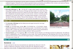


_banner_Bridge_over_the_Tay.jpg)
_banner_Clock_tower.jpg)
 . My opinion is that if you have a banner you think is more appropriate for any reason you can substitute it for the existing one, and if challenged, argue your case until a consensus is reached. See proposed policy above. • • • Peter (Southwood) (talk): 21:20, 8 July 2013 (UTC)


