
Wikivoyage talk:Regions map Expedition
Add topicSwept in from the pub:
I realize I skipped that "soliciting advice in the pub" step again before launching another Wikivoyage Expedition, so I might as well do it now. Suggestions? Criticism? Advice? Initially, I was just going to make these lists in my userspace, but I figured it might be more wiki to put this out in the Wikivoyage namespace, since it might be useful to others and might promote collaboration, which is always good. --(WT-en) Peter Talk 23:10, 31 July 2008 (EDT)
- Good expedition. I'm short on time, but will join up is a week or two. I've been wanting to sort out the regions in Portugal, Botswana and Mozambique for a long time now. It's good to have the list, that way we have something to work against. --(WT-en) Nick 01:28, 1 August 2008 (EDT)
- Suppoort. I agree with the rationale for the expedition. I put in quite a bit of work to revise the region boundaries in Washington (state), and I'm about to do the same with the Lower Mainland, British Columbia, Canada. Your point that maps help eliminate overlap in region boundaries is a particularly good one from my experience. (WT-en) JimDeLaHunt 01:52, 1 August 2008 (EDT)
Additional goals
[edit]I offer to extend the expedition with additional goals:
- to translate map to other languages
- to find not copyrighted geo data
-- (WT-en) Sergey kudryavtsev 02:08, 1 August 2008 (EDT)
- I think your first suggestion (translation) is probably beyond our scope here, since it is an English-version Expedition, and most contributors here have only limited knowledge of other languages. My feeling is that interested users from other language versions should just check Wikivoyage Shared, to see if there are regions maps of interest that they could translate.
- I definitely agree, though, with your second proposal. Just finding a good base for map traces can be a pain, so if someone sees a good one, they should put a link next to the article name in the lists. I'll add a note on the Expedition page about this. --(WT-en) Peter Talk 03:36, 1 August 2008 (EDT)
- A map is easy thing to translte. The map makers should always keep a translation ability in their minds. I suggest to publish maps in a easy translatable form (single svg with several language layers). One person draw English-labeled map (a difficult process), others may reupload map with their native language traslation added (a relatively easy process). -- (WT-en) Sergey kudryavtsev 04:49, 1 August 2008 (EDT)
- Right. So one of the goals, then, is not to translate the map, but rather to "ensure that the maps can be easily translated." I think that's a legitimate goal for a single language project. (WT-en) LtPowers 09:05, 1 August 2008 (EDT)
- Ah, understood—that should definitely be one of our developing standards for regions maps. The way I like to do things is to create an "en" subsection for all text layers. That makes it really easy to then create additional sublayers for each additional language, as they are translated. --(WT-en) Peter Talk 19:01, 2 August 2008 (EDT)
- Wikimedia Commons has county locator maps for every U.S. state, in SVG format, and released into the public domain. I've used them to easily create the region maps for Florida, Vermont, and Rhode Island. Takes an hour or two, and most of that is figuring out which counties are in which regions, and locating the cities. (WT-en) LtPowers 09:05, 1 August 2008 (EDT)
Standards
[edit]Our region maps may never be completely consistent in style. To some extent, that's because different regions have different requirements. Nonetheless, we can establish some basic standards to try to lend a uniform look.
When I was modifying Peter's map for New York (state), my guide for color selection was the maps at Ohio and Texas. I like their look of a clean white map; with the states, I don't think we need the context of the border states so much. They also have a distinctive color scheme, using low-saturation, medium-luminosity colors that come out bold without being garish (as was the case with California's old map).
At the same time, though, the Texas and Ohio maps are almost too spare. I think a balance can be struck between the blankness of Ohio's map and the busy-ness of California's map, and I've tried to hit that with Florida, Rhode Island, and Vermont. (I've currently got Florida without the cities because it looked so darn cool, but I think the cities are needed and will probably be changing it soon.) Each one of those three is slightly different (Rhode Island in particular because its regions are its counties and they're not further subdivided), but I think they all are clearly "Wikivoyage".
Thoughts?
-- (WT-en) LtPowers 09:38, 1 August 2008 (EDT)
- 1) I think it would be really worthwhile to come up with a standard color palette of some 15 colors that we'll stick to. It might be good to open a separate thread to work on this goal.
- 2) One clear way (in addition to including cities & linked other destinations) to make the regions maps less spare is to include relevant subregional boundaries (usually counties). They give extra context to help readers/contributors understand where to stick information. And I really like the aesthetic of the maps on New York (state) and Florida, for example, that have faint and thin white borders for subregions and bolder white boundaries for the top-level regions.
- 3) I agree re: showing border states for US states, and I really like the simplicity of leaving the "background" clear. But I know there are cases when showing bordering countries/regions is useful. The Russia map, for example, looks kind of bad without showing boundaries along Eastern Europe and Central Asia. It makes it hard to tell where major geographical features are (like the Caspian and the Black Sea), and the Kaliningrad exclave looks downright silly. Ditto for country regions that lie along long borders. For example, the Central Russia map really benefits from having border countries shown (even if the map isn't too nice), since visitors to Western Russia are pretty likely to also visit Belarus or Ukraine. --(WT-en) Peter Talk 19:24, 2 August 2008 (EDT)
- Thoughts:
- 1) Perhaps, although I like having flexibility when choosing colors. 15 would still give a good amount of flexibility (if we have 15 subregions it's usually time to group them into superregions), but what I did with Rhode Island and Vermont was set a specific saturation and luminosity, then eyeball four or five hues that were sufficiently different from each other. It'd be easier if our eyes saw the colors the same way the computer does (the green hues are relatively hard for our eyes to distinguish from each other, for example).
- 3) Absolutely, most region maps should have context to them. That Russia map makes it look like an island, especially because it uses the "ocean" background all around. Perhaps this is my own national bias, but the U.S. states (and probably Canadian provinces, too) have such distinctive and well-known shapes that they don't need the context. I can understand, though, if consistency demands we include bordering areas for all region maps.
- -- (WT-en) LtPowers 10:33, 3 August 2008 (EDT)
Font
[edit]Oh, and can we agree we should be using Blue Highway as the font for all maps? (WT-en) LtPowers 10:50, 3 August 2008 (EDT)
- We're sort of in the middle of mapping turmoil at the moment, with new developments like Open Street Map that will change how we create maps, and Wikivoyage Press which is changing a few ways in which we do things... unfortunately the map guideline pages that are currently around need serious updating and syncing, so apologize that you're arriving in mapland in the midst of that... but glad that you're here to help us sort it out! Re: font, we used to recommend Blue Highway, but recently have shifted to Bitstream Vera Sans... it prints much clearer when small, and is a native font to most operating systems. – (WT-en) cacahuate talk 16:46, 3 August 2008 (EDT)
- In the midst? The discussion was almost a year ago, and buried in a section ostensibly about map colors. Are the color recommendations on that page wrong, too? Not to mention the fact that I find Bitstream Vera Sans rather unsightly and generic. Blue Highway at least has the advantage of being distinctive. (WT-en) LtPowers 20:35, 3 August 2008 (EDT)
- Yes, as I said, a bit of turmoil. We once had a pretty clear map guide, with about 3 total users who knew how or were interested in drawing maps. Over the last year or so we've gained several new mapmakers, and a few things have happened that have started changing how people are doing things, and at the moment there's not one clear way; we're forging a bit of a new one right now... and Project:How to draw a map is getting pretty outdated in some ways. Soo... Jpatokal suggested we use Bitstream which works better for print. Peter and I, maybe more, seem to have adopted it ok, and there haven't been any complaints until now, but if you feel strongly about it, then well, keep using blue highway. As for colors, you should read that whole section here... at least some of it is likely to be worked into the how-to, and a new official map template that is still-to-be-created – (WT-en) cacahuate talk 21:35, 3 August 2008 (EDT)
- The Blue Highway is a prettier font than Bitstream Vera Sans, but Bitstream Vera Sans (especially when bolded) is much clearer at small resolutions. But there's another problem—Bitstream Vera Sans doesn't have any additional alphabet support. That adds an extra step to linguistic translation that can eat up a lot of time when a map has any significant amount of text. So I'd recommend we use an identical derivative font that does: DejaVu Sans Bold. I don't know of a better font for our purposes, and would recommend we start using it for all our maps.
- And yes, the color recommendations are kind of wrong too—we've sort of been moving towards Jani's recommendations (at least I've been using those colors, since I work for him ;) ). But that relates to city maps, which are beyond the scope of this Expedition (and are unresolved, since we'll probably move towards using auto-generated maps from OSM data, which will likely have a different color scheme by necessity). --(WT-en) Peter Talk 22:51, 3 August 2008 (EDT)
- Well, I figured out why Vera Sans looks too generic to me -- it's very similar to the Windows typeface Verdana, which has been one of the default Windows fonts for about ten years now. In addition to their (or at least Verdana's) ubiquitousness, they also both have another, more significant, problem in my book: they are too wide. Words take up far too much space, especially so when used on a map, where space is precious. I just installed and tried DejaVu; DejaVu Sans Condensed is better, but I worry that it might still be too wide.
- I did test Blue Highway and I agree it's hard to read below 7 points or so. Minimally, then, I'd recommend use of DejaVu Sans Condensed, though I personally would love to find a free-use typeface that's a little more distinctive.
- --(WT-en) LtPowers 13:31, 4 August 2008 (EDT)
- Totally agree – (WT-en) cacahuate talk 13:49, 4 August 2008 (EDT)
- Why bold? I like it for some things like region names, but city names I think look better unbolded – (WT-en) cacahuate talk 00:32, 5 August 2008 (EDT)
- Because the bolded fonts are much more readable at small resolutions. I suppose it would be fine to use unbolded text when it is very large on the map (like for bordering country names?), but I've gotten used to just switching between bold & bold/italic. --(WT-en) Peter Talk 01:23, 5 August 2008 (EDT)
- I've gotta say, my dislike of bolded city names is growing... I really think it's overbearing and unecessary... if dejavu sans isn't printing clear enough at smaller resolutions then perhaps we haven't yet found the right font? – (WT-en) cacahuate talk 02:56, 1 September 2008 (EDT)
- I think you have a point. On a crowded city map, the bolded names are just necessary to make it readable--to get the street names to stand out from all the various details around them. But on the regions maps, since they're the only real text around, they do look too overbearing. Time for some experimentation. --(WT-en) Peter Talk 03:03, 1 September 2008 (EDT)
- There are limited font options available that are supported by Mediawiki, unfortunately. (WT-en) LtPowers 11:31, 1 September 2008 (EDT)
- I'm not a fan of the bolded city names either. I've been experimenting with bold-italicized city names and larger non-bolded region names on the current map I'm working on. It doesn't look as overpowering, although the map isn't finished yet, so that may change. (WT-en) Shaund 23:27, 2 September 2008 (EDT)


- Bold-italics are an idea, they do look less harsh than straight bold, but for me, they raise the question, "why italicized." That could just be unfamiliarity. The happy medium between bold and normal (where text is thick enough to be readable even over complex background, but doesn't look garish) is attainable, but only in a goofy way: select normal, then add a stroke fill and adjust the stroke wideness as desired. That's an ad hoc way to get it just right, but I'm not sure I want to recommend it in our standards sections—I'd like to keep things simpler than that. Maybe a request to the DejaVu font maintainer to create a middle-of-the road option for DejaVu Sans Compact? --(WT-en) Peter Talk 23:36, 2 September 2008 (EDT)
- I think a request to the font maintainer is definitely in order! But I agree on italicizing -- I wouldn't be doing it in the first place if I wasn't trying to avoid the bold lettering. I might try the stroke fill/wideness method you mentioned to see how it works. It's a shame we can't specify boldness on 1-9 scale like you can in HTML/CSS. It would come in handy. (WT-en) Shaund 00:12, 3 September 2008 (EDT)
- Adding a stroke outline should probably be avoided; it messes with the shapes and spacing of the characters in perhaps undesirable ways. (WT-en) LtPowers 09:47, 3 September 2008 (EDT)
- I haven't noticed any problems yet with using strokes on dejavu sans compact, but perhaps I haven't experimented enough to know. Anyway, I've put up an example of using stroke outlines on the normal font to achieve a balance of readability and aesthetics—the latest Russia map. We can send a request to the font maintainers here, although I myself will not, since I'm not sure how to frame the request (my tech literacy doesn't extend too far beyond wiki). --(WT-en) Peter Talk 19:53, 3 September 2008 (EDT)
- Using normal, unbolded fonts isn't out of the norm at all in cartography, I find them readable... Central America or SE Asia, for instance? – (WT-en) cacahuate talk 20:53, 3 September 2008 (EDT)
- Right, but those maps have way less going on than the Russia map to the right (and I still intend to put major highways on that one!). Since the city/other destination labels remain the most important feature on the map, I think it's important that they be instantly readable. To get the same result with the Russia map, I'd have to increase the font size significantly if I were to remove bold & the stroke outline. --(WT-en) Peter Talk 23:46, 3 September 2008 (EDT)
- How about and ? And my revised California... I have faith in you Peter! Squeeze the region names in there too! ;) – (WT-en) cacahuate talk 00:49, 4 September 2008 (EDT)
- Those maps absolutely would not be readable in article on Wikivoyage. And there's no way I can fit the region names on that map (try Kaliningrad Oblast!) Anyway, I put up two example maps showing what it looks like with normal font and with bold font (from normal to stroked to bold).
- Seeing them together, I actually like the bolded better than the stroked version. But I'm torn—the city names are way easier to read when bolded, but they do overwhelm the other features. Perhaps the normal font would be workable, although that would probably require increasing map resolution in articles. --(WT-en) Peter Talk 19:43, 4 September 2008 (EDT)
- I think the top one with unbolded looks way more harmonious and map-like... that's a beautiful map by the way... I'm still not convinced that maps have to be fully readable in article, If I were traveling across Russia I would definitely print that map as a full page regardless, but maybe that's just me. I really feel though that our top priority should be making awesome maps that rival any other guidebooks, and if turns out that they're also readable at 350-400px or whatever within an article, then it's a bonus, but I don't think we should form our guidelines around (at least what I see as) a secondary goal – (WT-en) cacahuate talk 20:41, 4 September 2008 (EDT)
- A beautiful illustration of why using a stroke on the text is less than ideal. =) You can see how much it muddies the text compared to the bold. As for the other two options: I think it depends on the goal. If the goal is to show where the nine highlighted cities are, then the bolded version works best. If the goal is to show a map of the country/region, then the unbolded works best. (WT-en) LtPowers 21:22, 4 September 2008 (EDT)
- Yeah, what's holding up this discussion is that we haven't yet seriously discussed the goals of our maps! --(WT-en) Peter Talk 00:31, 5 September 2008 (EDT)
I'm finally coming around on this one. That Russia map is still readable, and a good deal more nice looking, with the normal font. I'll try to keep using it on maps and see how it works for me. --(WT-en) Peter Talk 00:35, 5 September 2008 (EDT)
- I'm a bit late on this discussion, but I'm also coming around to the normal font. Purely on looks, I like the second, but I agree that if the goal is to show a map of the country/region (I guess that's the point after all :-; ), the unbolded works best.
- Just to throw my thoughts in on whether or not a map should be readable within the article, I feel it depends on what we're trying to do... If it's to show how the regions, major cities and destinations relate to each other, I think making the map readable within the article is good. If it's to provide a lot of detail about the region, its cities, how to get around (like a city map), then we shouldn't worry about making it readable in the article. Personally, at the region/country level I like the first approach, and since we're only listing nine cities, nine other destinations and major roads, I think we can squeeze that on and still be readable (I'd like to try anyway!). (WT-en) Shaund 01:34, 5 September 2008 (EDT)
Amount of info on maps
[edit]I'm all for trying to get more info onto maps while making them look good in the process. I'm not at all a fan of having 4 or 5 different maps on an article. I'd like to see at most two... one with regions, major cities, and the "other destinations" noted on it (and maybe even major freeways), and a second with much more detailed highways and towns. I'd love if we could make this all happen in just one map, but I think the one thing that is adding to much to the puzzle is the region sections / labels.
(WT-en) Nick was on a roll with region map experimentation for a while for South Africa, and I think came up with some good elements. He did a good job of getting lots of info on maps, but I think it largely works because he kept it grey-scale... but what gets lost in this mix is the subregions boundaries, which are barely noticeable. See South Africa Northern Cape, Western Cape. I still like multi-colored maps, I've been muting my colors more than I used to, but maybe we need to get even softer to if we want to find a way to fit everything into 1 map. – (WT-en) cacahuate talk 16:46, 3 August 2008 (EDT)
Roads / trains
[edit]LtPowers has a good point about the color of highways/roads... my one attempt at adding all the info that I wanted to see to Pakistan wasn't a resounding success :) Our current (outdated) how-to recommends white... which is a very confusing on this example. On India I wouldn't even attempt major roads, there's just too much and it wouldn't look right. We're very much in experimentation mode I think right now with region maps, so let's all keep doing just that and see if we can come up with some good combinable ideas. But it's definitely going to be hard to establish a set criteria that works for all regions – (WT-en) cacahuate talk 16:46, 3 August 2008 (EDT)
- I don't think we necessarily have to have one set of standards for all regions. Different types regions have different requirements. Even within a type of region (say, U.S. states), some may need slightly different information showing than others do. (WT-en) LtPowers 20:35, 3 August 2008 (EDT)
- My general feeling is that roads are best done in McDonalds colors—mustard & ketchup. I'm not joking, those actually work really well IMO.
- Railroads are a pain, and I don't have a good solution to them. Since we're leaning white for region boundaries, that makes it easier to distinguish black lines as railroads, but without cross lines (tracks), they still aren't obviously railroads. The way I've done these is to set stroke style to contain StopM midpoints, and then fill up the railroad path with extraneous nodes. But that's not an ideal way of doing things, and I'd be very happy if someone came up with a better way. --(WT-en) Peter Talk 22:58, 4 August 2008 (EDT)
- Agree, I used yellow in the CA maps on the right and I think it works well, red sounds good too. For railroads, the only time I've attempted it was on Pakistan, and I did exactly as you describe above... it wasn't too much of a pain, especially since it's a very curvy route to begin with – (WT-en) cacahuate talk 23:50, 4 August 2008 (EDT)
- How do you create those railroads? I can only make the black-white-black-white railroads now, they are nice for some maps, but cluttering for others (for example, it looked awful on the Czech Republic). --(WT-en) globe-trotter 15:01, 13 March 2010 (EST)
- See Project:How to draw a map#Railroads. I'd recommend the second of the two methods there (the "hairy dash" rather than the mid-stroked line), but both work. --(WT-en) Peter Talk 04:09, 14 March 2010 (EDT)
Other regions
[edit]I think it's important on all regions to show context... someone traveling around Southern California may well be heading to Las Vegas next, and they should be able to see that it's just over the CA border and what highway to take there on the California map... we should be aiming to make our maps at least as useful as LP etc, and they always do this... I rely on it personally. Agree with Peter, it's very helpful to show neighboring countries/regions and not just have a "floating" region... it makes no sense to me to turn each region into an
At the very least, for countries anyway, I propose showing neighboring countries, capitals (that fall within the map borders), and cities that are going to be encountered when crossing land borders, similar to what I did on Afghanistan, or took a step further on Pakistan where I added a few international roads. – (WT-en) cacahuate talk 17:11, 3 August 2008 (EDT)
- Actually, I tend to agree with LtPowers on this one. It seems clear to me that it's fine to leave out bordering states for U.S. states. If things work as they should, the region map one level above the state should show the major cities & routes in between them, so a reader can just refer to that map when curious about how to move in/out of the state. But I'm having trouble identifying what exactly it is that makes this ok for U.S. states, and not for, say, Mexico (which I'm now revising to include bordering countries). I dunno, I'll have to think about this one some more. --(WT-en) Peter Talk 23:01, 3 August 2008 (EDT)
- Having thought about this more, I've identified that there is, in fact, no reason why this is ok for US States and not for other regions. It's always useful to show a bare minimum of context around the mapped region, and this can be as easy as drawing a couple white lines on a background and then labeling the external regions. --(WT-en) Peter Talk 12:39, 9 February 2009 (EST)
Color palette
[edit]I've been thinking the same thing, and I agree we should, but this will be difficult for a couple reasons... firstly, getting everyone to agree on a palette, and secondly, finding one that translates into multiple scenarios. I found some that I like, and have been using on multiple maps,... but it's amazing how the same colors can work differently depending on the map – (WT-en) cacahuate talk 17:11, 3 August 2008 (EDT)
- Actually, now that I think of it some more, I'd recommend coming up with a set of palettes, each with 15 colors that go well with each other. Because yes, it would be too hard to get everyone to agree on a single palette. Also, it's sometimes worth doing to have a "single color" palette, like the shades of green I used for Ireland. --(WT-en) Peter Talk 23:23, 3 August 2008 (EDT)
Inclusion/Exclusion
[edit]In the past, we've tended towards multiple maps of regions to show different things. In particular, we've separated transport maps from "regional breakdown" maps (e.g., Ireland). We also sometimes have maps separate from regional breakdown maps to show linked cities/destinations (e.g., USA). I think, particularly with the aid of external keys like the regionlist template, we can include all these things on one map, without it looking overly crowded. The only example I can think of offhand is the one on Finger Lakes (er, actually it doesn't identify the regions, but it's still a nice example). --(WT-en) Peter Talk 19:24, 2 August 2008 (EDT)
- Finger Lakes doesn't have any defined sub-regions yet, so I left it all one color (the same color used on the New York region map, by the way). I'm not sure the level of information currently present requires subdivision yet, anyway. The one map I can think of that has both region breakdowns and some transport information is on California. The old map already had all that; I just fixed up the colors and the highway shields, not wanting to futz with the status quo too much. I'd like to see some more examples of a combined map before endorsing it, though; it can be hard to find a color for the road lines that is visible on all of the different region colors. (WT-en) LtPowers 10:21, 3 August 2008 (EDT)
- I think he's confused by the multiple shades of each color that are in use on finger lakes, what do they denote? @ Peter, I like when a map works as a total standalone if it were printed, meaning the region names should be written on each region, not just in the article's regionlist template – (WT-en) cacahuate talk 17:15, 3 August 2008 (EDT)
- The only multiple shades I used there were to fade the surrounding colors to gray. Is there something else you mean?
- On many maps, the sub-region names can be hard to fit into the map aesthetically. I think the map at California is a little crowded, for example. Perhaps only use them when the subregions are defined political areas (as in, for example, Mid-Atlantic) rather than Wikivoyage-defined regions? I'm not sure (for example) that the map at New York (state) would benefit from having region names crammed in. (WT-en) LtPowers 20:19, 3 August 2008 (EDT)
- I think he's confused by the multiple shades of each color that are in use on finger lakes, what do they denote? @ Peter, I like when a map works as a total standalone if it were printed, meaning the region names should be written on each region, not just in the article's regionlist template – (WT-en) cacahuate talk 17:15, 3 August 2008 (EDT)
- Hmmm, I seem to be confusing something else I read, clearly tired :) I was thinking of the Florida map, ignore above. Re: regions, I don't think California has too much info on it, rather it just needs more tweaking. I'm all for our maps looking pretty, but the #1 goal should be function, for a traveler, and at the moment our maps our giving travelers about 1/4 of what a LP map would offer – (WT-en) cacahuate talk 21:24, 3 August 2008 (EDT)
- Regarding the value of "standalone" maps, I'm still hesitant to show regions with names, simply because they take up a lot of space we could be using for other purposes (while letting colors do the work for the regions). Also, this adds another step to translation.
- Ideally, regions maps should display in article at a resolution high enough so that you can print the article, rather than the map, and still have the map be legible. The only big downside to leaving the region names off the map, though, is that you can't understand them when printed black & white. I might have to mull this one over a bit more too... --(WT-en) Peter Talk 23:30, 3 August 2008 (EDT)
Map size
[edit]Continued from 23:30, 3 August 2008 (EDT), in this section.
Is it even possible to have a map that is legible at 250px when printed with an article but detailed enough to be useful when printed standalone at 800px? Maybe we need different maps for different purposes; in the context of this discussion, we could, for example, have one map without region names (and with bigger text for legibility) for use when printing an article, and another map with region names (and smaller text to make room for them) for use when printing a standalone map. (WT-en) LtPowers 10:56, 4 August 2008 (EDT)
- This is the first I've heard of that being a goal, I've always thought of maps as stand-alones. I think aiming for anything other is just adding one more difficult hurdle to mapmaking – (WT-en) cacahuate talk 13:51, 4 August 2008 (EDT)
- Well, take, for instance, Wikivoyage Press. On page nine of the Chicago book (which is only 4.25" wide) the top of the page reprints Image:Chicago districts map.png, with the text of the article starting beneath. (WT-en) LtPowers 15:31, 4 August 2008 (EDT)
- IMO that's something WTP has to sort out with their special bookmaking contraption, our aim should be to make the best maps for use on the site and individuals who print them... hopefully those maps translate well for WTP too, but if not, then I would leave it up to the editor of each WTP edition to modify the respective map for their purposes, no? – (WT-en) cacahuate talk 17:22, 4 August 2008 (EDT)
- Well you would know better than I whether people print the articles without maps, but I don't see the purpose of printing the maps without the articles. (WT-en) LtPowers 19:43, 4 August 2008 (EDT)
- Honestly I've never printed either one, but had always thought that if I did, I would print them separately... but now that I just tried that, it seems I can't... printing is rediculously non-customizable, or am I missing something? We should at least be able to print without images, or control their size – (WT-en) cacahuate talk 20:23, 4 August 2008 (EDT)
- To print the image alone as I want it, I have to download the image & then use an app to do it right. But I think it's actually pretty doable to make most maps readable as print out in-article. If you check a WTP book (or some lesser guidebook), maps use small text. The WTP maps print in the book at a mere 3.95"x6.875", which isn't so bad on a 8.5"x11" sheet of paper. This one is perfectly readable at that size, and is jam-packed with text and graphics. But moreover, regions maps need not take up nearly as much space as a city map, since they convey less information (and have way less text).
- I think it's a worthy goal to have the maps be readable within the article, at least insofar as it's possible. The fact that it's otherwise hard to print makes this an even more important goal.
- For Y-axis-heavy maps, I think we can go as high as 400-450px without destroying the article's appearance; for X-axis heavy maps, we can abandon the right-aligned format and run the map across the top of an article section. (Although this is something I don't think I've seen done before, I can't see a good reason not to.) Square maps are the hardest, but can still be pushed to 450px—this one is eminently readable at 450px even on a 1200x800 screen, and has room for transport graphics (and would still be readable even at a lower res). --(WT-en) Peter Talk 22:52, 4 August 2008 (EDT)
Map template
[edit]
Here's a very bare-bones svg file with (I think) all objects that belong on a regions map. I've put up a thumb of what it looks like. I left out layers, since I generally like to have control over exactly which layers make it on to a map (too many extraneous layers makes future editing more difficult). Is this missing anything, or otherwise wrong, or should I move it into the article proper? --(WT-en) Peter Talk 14:13, 12 August 2008 (EDT)
- Note: the scale is convertable into a km only version, for translation into virtually any language other than English. --(WT-en) Peter Talk 14:15, 12 August 2008 (EDT)
- 1) What's the thin green rectangle outline for? 2) The "1" and "10" boxes should have rounded corners like the blank one does. 3) The digit "1" in the "1" box appears different than the digit "1" in the "10" box, but they should probably be the same. (WT-en) LtPowers 19:10, 12 August 2008 (EDT)
- The green rectangle is just what I use as a frame, to clip maps that need clipping. I'll just get rid of the numbered boxes, since we anyway want people to label right on the map, not in a separate key-box. --(WT-en) Peter Talk 22:42, 12 August 2008 (EDT)
- OK, I've fixed this up now—look good? --(WT-en) Peter Talk 21:52, 17 August 2008 (EDT)
- Hate to nitpick so much, but... the city dot isn't circular (needs to be taller). I'm also wondering if we could get a gray outline on the capital star like there is on the dot, so that they kind of "match". (WT-en) LtPowers 22:24, 17 August 2008 (EDT)
- How about a darker grey box for the "other regions". Also we should probably discuss a standard title design... Peter's been using straight black underlined which is a hand-me-down from the old template when the title was within the "key". Personally I think it's a bit harsh (and often a bit big)... I've been (WT-shared) trying to use blues to tie it in with the scale and the arrow which I think is nice, but I'm open to ideas that improve upon it... unless everyone just prefers the chunky black – (WT-en) cacahuate talk 00:58, 18 August 2008 (EDT)

- Nitpicking is very welcome—I'd like to really nail this down well, and I'd be happy to work on it for some time. I fixed the city dot, and here are two additional possible capital icons that incorporate the gray city outline. For "other regions" do you mean the background color? I'd worry that darkening that color further might decrease the visibility of black text. (We should also work out what shades of grey are best for text outside the foreground regions.) I agree regarding the title box; I've now redone it to include a more Cacahuatesque title box. That color scheme definitely looks great for maps with a water background—I'm not sure if it does as much for a land background map, but I like the idea of matching the text color to the key & compass rose.
- To clarify what everything is here, the brown square is the color I use for buildings on city maps. Not too many buildings will show up on regions maps, but I can imagine the Great Wall, or maybe Area 51 showing up in that color. I used a darker version to show exposed rock in Antarctica. The green forest pattern is good for parklands and the sea pattern for water. I don't have a good solution, though, for main waterways like rivers, which don't show up well against foreground color regions if they're done in the same color as the sea pattern. Also, regarding the patterns: to avoid the line breaks between pattern squares, you can just duplicate the object, fill it with the basic sea pattern color, move it below the patterned object, and group the two. The light gray is for non-colored foreground (I usually use it beneath translucent foreground colors). The yellowish-beige is what I've used for sand, be it desert or beach.
- Also, I could include non-Latin alphabet compass roses, but do other languages actually use them? I've been using a Cyrillic С for north on my Russian maps, and Sergey hasn't told me I'm wrong, so I figure I'm right to do so. Would it be useful to create a host of non-Latin Compass Roses? The obvious ones beyond Cyrillic would I think be Japanese/Chinese. We could link them in a file from this page. --(WT-en) Peter Talk 06:26, 18 August 2008 (EDT)
- Translucent foreground colors over a gray background make it difficult to match the colors in the map with the colors in the {{Regionlist}} template; I would suggest using opaque fills for that reason. The dot is circular now, but the gray outline is now thinner than what I've been using; would you consider thickening it back up to about 15% of the circle's diameter? (WT-en) LtPowers 13:28, 18 August 2008 (EDT)
- Oh, and I do like the star with the circle behind it. Can't qualify why, but I do. =) (WT-en) LtPowers 13:30, 18 August 2008 (EDT)
- Translucent foreground colors over a gray background make it difficult to match the colors in the map with the colors in the {{Regionlist}} template; I would suggest using opaque fills for that reason. The dot is circular now, but the gray outline is now thinner than what I've been using; would you consider thickening it back up to about 15% of the circle's diameter? (WT-en) LtPowers 13:28, 18 August 2008 (EDT)
- Also, I could include non-Latin alphabet compass roses, but do other languages actually use them? I've been using a Cyrillic С for north on my Russian maps, and Sergey hasn't told me I'm wrong, so I figure I'm right to do so. Would it be useful to create a host of non-Latin Compass Roses? The obvious ones beyond Cyrillic would I think be Japanese/Chinese. We could link them in a file from this page. --(WT-en) Peter Talk 06:26, 18 August 2008 (EDT)
- Oh yeah, sorry, I meant the background color, it's already represented there as well, the background... my bad. No need to darken. Though I've been using light grey text against it, which I think breaks it up nicely from the foreground regions. I like the new title, I think it looks sharp. Also like the circle behind the star, looks nice. could also live with the upper right option too – (WT-en) cacahuate talk 14:47, 18 August 2008 (EDT)
- Yeah, I've been using light text on other regions too--maybe it would make sense to have a couple regions map templates, one for countries, one for continental sections, one for sub-countries, and then one for small areas. The translucent colors over gray backgrounds aren't as hard as you think to convert to html codes—just hover the eyedrop tool over the region, and the color code will appear at the bottom of the screen (way easier than copy/pasting from the color tool). Lets go forward with the circle backdrop to the star; I like it best too. If anyone has a better suggestion later, we can switch. --(WT-en) Peter Talk 18:00, 18 August 2008 (EDT)
- That sounds complicated, it would be ideal to be consistent no matter what kind of region, but admittedly I'm mostly working on the country level and higher right now, so if there's reasons that the same things can't apply to lower levels you're more clued into that than I – (WT-en) cacahuate talk 18:07, 18 August 2008 (EDT)
Text color
[edit]I like straight black for most map labels; it shows up very clearly always.
Rivers
[edit]This one is causing problems for me. The color of the water pattern Jani made doesn't always show up well against light region colors (or even the light grey foreground color).
Beach/Desert
[edit]I like the one on the above proposed template—it shows up nicely against the other standard colors even in black&white. --(WT-en) Peter Talk 00:20, 20 August 2008 (EDT)
Parks, lakes, oceans
[edit]I like Jani's high contrast patterns for these, but we may want to adjust the water colors—when used for rivers, the existing pattern seems too light to show up against some region colors. Then again, maybe the solution is to adjust the region colors palettes, so that the water pattern shows up well even for rivers. --(WT-en) Peter Talk 00:20, 20 August 2008 (EDT)
Palettes
[edit]This section will placehold for palette ideas. --(WT-en) Peter Talk 14:13, 12 August 2008 (EDT)
Master palettes
[edit]
It will probably be easier to have some master palettes, from which to draw colors for the actual region map palette suggestions we'll develop. Here's one. The very light colors might be most useful, since they tend less to interfere with colors of roads, rivers, etc. --(WT-en) Peter Talk 00:15, 20 August 2008 (EDT)
Proposal discussions
[edit]The following palette was used by (WT-en) Nick for his maps of the U.S. regions (such as South (United States of America)), slightly tweaked by me for readability:
The following palette was used by User:(WT-en) Fastestdogever for the map of Ohio:
Note (if you view the code for this section) that the color values are all 66, 99, or (more rarely) 33 or CC, which contributes to the consistent feel of the colors. Other colors in the same pattern could include:
The following palette was used by User:(WT-en) Troy34 for the map of Texas:
I used the following palette for the map of New York (state), basing it primarily on Fastestdogever's Ohio patterns:
(I used similar colors (keeping very close to the same saturation and luminosity while varying the hue) for my other state maps.)
-- (WT-en) LtPowers 13:29, 19 August 2008 (EDT)
- Oh and here are California's palettes. First, the original version by (WT-en) Ryan:
- Second, my revised palette. I tried to keep close to Ryan's colors but had to make big changes in a couple of cases in order to make each one distinct:
- -- (WT-en) LtPowers 13:41, 19 August 2008 (EDT)

- I quite like #s 1, 5, & 7. I'll add some more suggestions in a short while --(WT-en) Peter Talk 22:25, 19 August 2008 (EDT)
- Here's the simple color palette I used for West Africa. For whatever reason, I liked the way this regional color scheme looked. --(WT-en) Peter Talk 00:23, 20 August 2008 (EDT)
Help!
[edit]Anyone understand why template:regionlist is breaking here? --(WT-en) Peter Talk 00:53, 19 August 2008 (EDT)
- Unclosed link brackets. Fixed. (Colors are way off though.) (WT-en) LtPowers 08:42, 19 August 2008 (EDT)
Aim
[edit]We should establish what our priorities are in our maps, and rank them, to help us focus on what's most important. The only one set a priori is "tourist-style map showing all the linked destinations... and routes between them." (from Project:Region guide status). That's for a star article, though—I don't mean to discourage contributors from making simpler regions maps for more immediate purposes. Any way, here goes a first draft:
- Demonstrate and define regional boundaries
- Identify & locate all linked cities & destinations
- Show routes between said cities & destinations
- Show major routes in/out of the country
- Keep map readable in-article
- Ensure ease of translation
- Show major geographic features
- Enable further use for subregional maps
#1–4 are the basic bread and butter of our maps, and fulfill the star article requirements (note that we don't actually have a single star region guide yet).
I know Cacahuate isn't a huge fan of #5, but I think it's really a very important goal. It takes time & multiple programs to print out the article and then also maps, whereas two clicks can do it with a well constructed map. Also, in comparing our maps to other guides' maps, remember that they are constrained by print page sizes, and therefore also must figure out how to cram info onto small spaces. Moreover, I don't think it's been a problem to achieve this goal—I've done it easily with countries as small as Costa Rica to frikkin' Russia.
The number 8 is a bigger question though--it's ideal when you can do this, but it's not always going to work, I think. I'll sure try to make it work for Russia, but the curvature along the projection makes this hard. It also requires a high level of detail (and therefore patience in tracing it) to be able to use the existing map to create subregion maps.
7 isn't always necessary, just when geographic features are really relevant for travel. So in Russia, those rivers are often major ways of getting from point A to point B and should be included, while in the US probably only the Mississippi would be important enough to get on the map, IMO. --(WT-en) Peter Talk 00:31, 5 September 2008 (EDT)
- So, then, you'd like to move away from simple maps like (say) Image:Map of Vermont Regions.png and Image:Map-USA-Cities01.png, toward maps like Image:Map of Pakistan.png? (WT-en) LtPowers 09:35, 5 September 2008 (EDT)
- Ideally, I'd like the regions maps to have all this information. But a simple map showing the regions breakdown is much better than no regions map at all. It also provides a base to work with in creating a more detailed map. --(WT-en) Peter Talk 09:49, 5 September 2008 (EDT)
- I think it's ideal to have all that on a map too, if it can be made to work... Vermont just needs roads added, USA would be ideal if we could combine the 2 maps that are currently in the article instead of having a regions and a cities/other destinations map (and if possible the major interstates should be added), and Pakistan actually does have pretty much everything of relevance to a traveler - all the major roads, trains and destinations are there, it shows which borders are open to foreigners and which are closed, and shows the route to all four of the possible cities that you could be heading for once you leave.
- Regarding readability in-article, I'm not against it, I just don't want to define our style around it... no other guidebook would give a major country or region map just a 1/3 page and wrap text around it, it would take up at least a page if not a double page spread... which is why I don't think it's weird if the map needs to be printed separately – (WT-en) cacahuate talk 00:38, 6 September 2008 (EDT)
- I agree with those aims, particularly 1-7, although I worry that someone new to maps might find it overwhelming and decide not to start one. If someone can do all eight, that's fantastic, but even if we can get a bunch of maps with just 1 and 2 (as a start) I think it would improve our country, and particularly, region pages a lot.
- With #4, should we be placing airport and ferry terminals and border crossings on country maps? I see the border crossings on the Pakistan map, but I haven't noticed any airports or ferry terminals on other country/region maps.
- I think it was discussed briefly before, but should we also design the maps so they work in black and white as well? I'm guessing that some people still print in black and white and I find that with a lot of mid-luminosity colours, it's difficult to distinguish between regions when I print a map in B&W. I've been experimenting with this in the Belgium map -- I'll upload some samples later. (WT-en) Shaund 00:48, 6 September 2008 (EDT)
- To Cacahuate: unlike WT printouts, guidebooks are not 8" by 11" so a map that displays on a standard pc resolution for Wikivoyage will be similar in size to that of a printed guidebook. (I've got a good handle on that one from WTP Chicago, which is even smaller than most other printed guidebooks.) Again, these aims are ideals, and there's no reason to try and "force" contributors to meet them. Rather, I think #1–5 is what we should require for star articles (although we don't have any star regions!).
- To Shaund: I think major airport + ferry terminals are great, but not always feasible, given constraints of finitude. Especially airports are hard to show since they overlap completely with cities. More ferries + vague dotted lines showing routes, however, would be awesome, but only in the case that you can show where they lead (i.e., the destination country should be visible on the map—if it's not, I say leave the ferry off).
- Black & white is standard for WTP maps, and there isn't IMO a good fix for this. My "solution" is to have two layers for the color regions, one for color and one for black & white only. Colors just muddle up b&w maps, so it's better to go grayscale. Printing in B&W is never optimal for maps, though, since you can't make out other details very well--like primary versus secondary roads, for example. --(WT-en) Peter Talk 01:31, 6 September 2008 (EDT)
- For the record LP's country maps are often 8" x 10", believe it or not, across 2 pages – (WT-en) cacahuate talk 22:25, 8 September 2008 (EDT)
USA map
[edit]
[[Image:Map-USA-Regions01A.png|thumb|400px|'''Revision A''' - Removed some cities, upped font size especially for 9 cities, capitalized regions for clarity, etc]] [[Image:Map-USA-Regions01B.png|thumb|400px|'''Revision B''' - Highway font suggestion, swapped out and added suggested cities, swapped a few region colors per LtP, remove extra dots etc]]
- I combined the 2 USA maps, it does get a little busy in the northeast, but... comments? – (WT-en) cacahuate talk 05:38, 7 September 2008 (EDT)
- Interstates 84 (in Oregon and Idaho) and 25 (through Denver and Cheyenne) are not labeled. (Neither is I-4, but it's too small.)
- I don't think state and provincial capitals are particularly useful to the traveler, and they certainly overcrowd the northeast. If the nine cities from the article aren't enough, add some more popular travel destinations.
- I'm not a big fan of the palette; the state names in the Northwest, Southwest, and South are particularly hard to read, and I think some of the adjacent regions have colors that are too similar (Northwest/Southwest, Southwest/Mexico, Mid-Atlantic/South, and maybe Mid-Atlantic/New England).
- I'm undecided on the highways. At this scale, I'm just not sure how useful it is to the traveler to have the basic road network.
- The Hawaiian islands are labeled in the same font and size as the states; they should be de-emphasized significantly.
- The labels on the two Russian cities are unreadable, even at the PNG's full resolution. I'd say either leave them off or make them at least the same size as the Canadian and Mexican cities' labels.
- -- (WT-en) LtPowers 10:06, 7 September 2008 (EDT)
- I combined the 2 USA maps, it does get a little busy in the northeast, but... comments? – (WT-en) cacahuate talk 05:38, 7 September 2008 (EDT)
- Agreed about state capitals — I think it would be OK to go over the 9 cities on the map, since the country is so big, but cutting back on the cities would definitely make the map more readable. I really like the highway map, though, and would keep it. I'm also glad you left off the railroads, since they are a much less common form of transport in the US and would crowd the map. As you can guess, I'd recommend really bumping up the size of the text labels for at least the nine listed cities. Fantastic work, though! --(WT-en) Peter Talk 10:41, 7 September 2008 (EDT)
- Ok, round two to the right... I deleted some cities in the northeast due to overcrowding, but generally I think we should have more when they fit ok, it makes the map more useful for planning, in addition to just showing where the 9 highlighted cities are. I adjusted the palette a bit LtP, you were right on the west, but there's still several shades of purple going on, I kinda like it though and it's hard to not use multiple shades of 1 color once you go beyond 7 or 8 regions... are you liking this more or still hate it? I enlarged the 9 cities to stand out, and then IMO there was just way to much similarity between the various text elements so I capitalized the state names, I think it's a good way to break things up, is that agreeable?
- And then is anyone else having the same ovelapping issue with text when you have 2 lines? See North Dakota – (WT-en) cacahuate talk 00:02, 8 September 2008 (EDT)
- I'm not a map maker, but as a map user one suggestion I'd make is to cut out more of Canada to shrink the height - I assume the extra height was to fit Edmonton, but I don't think that's necessary. Otherwise I like it a lot - the roads are helpful and the extra cities are a useful addition. The northeast is a bit crowded as you've pointed out, so if there was some way to make that more readable it would be good, but this map seems like a nice improvement/consolidation. -- (WT-en) Ryan • (talk) • 00:15, 8 September 2008 (EDT)
- The second map looks really good and I like the interstates and extra cities being on there. On the nit-piky side, the New England state capitals without city names look a bit strange -- do we need to include the city dots if we don't have the name? It might also be more useful in some states to have the biggest city instead of the capital (Portland instead of Salem in Oregon, Milwaukee instead of Madison in Wisconsin, etc.)
- If you're using Inkscape, have you checked the line spacing of the text? That's the only thing I can think of, I've had to fiddle with it a couple of times to make two lines of text work. (WT-en) Shaund 01:32, 8 September 2008 (EDT)
- Agreed with Shaund - also Orlando instead of Tallahassee, Niagara Falls instead of Albany, and possibly even Calgary instead of Edmonton. Also I'd add Kansas City and Albuquerque. As for colors, I agree it may be unavoidable to have multiple shades of purple -- but they don't have to be next to each other. A couple of color-swaps should resolve that. (WT-en) LtPowers 07:00, 8 September 2008 (EDT)
- Also Fargo instead of Bismark, Twin Cities instead of St Paul, Orlando instead of Tallahassee, add Albuquerque (so we know which way to turn), Louisville not Frankfort (and move highway 65 from Frankfort to Louisville), add Kansas City.
- Consider changing the other destinations to black. Those are linked destinations and should be obvious, but it took me 5 minutes of staring at the map before I even realized they were on there. And, while it's a major pain to do so, bolding the highway numbers would be a big improvement, since they're pretty illegible right now. Awesome work on culling the highway system to the most essential roads, btw. --(WT-en) Peter Talk 10:18, 8 September 2008 (EDT)
- I knew there was something bugging me about the shields; if we're going to use the Interstate shield, we should use the proper font. SVGs for all Interstates (and U.S. Highways and most state routes) are available on Wikimedia Commons and are in the public domain. (WT-en) LtPowers 13:14, 8 September 2008 (EDT)
Ok, Revision B to the right... I got most things, but... Tried getting font for Interstate shields from commons, but the svgs don't use text, the #'s are an image... Found a version of Highway Gothic that would work here, but his license isn't fully compatible. What about bold Arial as a substitute for now? It's closer anyway... see highways 15 and 25 for example. I know there are separate shields for each and every highway on Commons, but that would be a royal pain in the ass to not be able to just alter the #, imagine trying to get the sizes to match of each one on a map like USA with such liberal use of them. Ryan I couldn't figure out how to crop out part of Canada without doing something sloppy like creating two different blueback layers... anyone have thoughts on that? Also blackened the OD's, liked having color for separation but you're right, hard to see – (WT-en) cacahuate talk 22:15, 8 September 2008 (EDT)
- cacahuate: here are SVGs that can be used to generate new shields by typing new text. =) You'll need the roadgeek font, though. Typefaces are not eligible for copyright protection in the United States, but our position on the issue here at Wikivoyage may go beyond "what's legal", and of course there's a difference between "typeface" and "font", as well as the ethical issues of using the font creator's work. If you still want to use an absolutely free typeface, Blue Highway is probably the closest available; it appears to be loosely based on the official FHWA Series fonts. (WT-en) LtPowers 10:52, 9 September 2008 (EDT)
- I could try taking a whack at Canada, if you're not currently working on the SVG. --(WT-en) Peter Talk 11:52, 10 September 2008 (EDT)
- Alright, I uploaded the new svg, I can't stare at the USA anymore! I've left the font for the shields as dejavu for now, it's a lot of work to change, so we should figure out first whether we're going to settle for Blue Highway, or pursue permission for Roadgeek. Didn't feel like bolding them tonight but agree it could be done, feel free if you like Peter – (WT-en) cacahuate talk 22:22, 10 September 2008 (EDT)
- Could I ask why some cities' dots are different sizes? (Compare Niagara Falls with Chicago and Detroit, for example.) (WT-en) LtPowers 13:27, 11 September 2008 (EDT)
- Alright, I uploaded the new svg, I can't stare at the USA anymore! I've left the font for the shields as dejavu for now, it's a lot of work to change, so we should figure out first whether we're going to settle for Blue Highway, or pursue permission for Roadgeek. Didn't feel like bolding them tonight but agree it could be done, feel free if you like Peter – (WT-en) cacahuate talk 22:22, 10 September 2008 (EDT)
- When Nick first created it he used larger dots for state capitols and smaller for other cities... our original map template had 2 dot sizes, 1 for "major cities" and one for "minor cities". On another note, have you seen my talk page? can you try opening that svg and see if you have the same problem as Peter, and let us know if you're on a pc or mac? – (WT-en) cacahuate talk 17:51, 11 September 2008 (EDT)
SHAZAM!
[edit]Wow! I've been watching maps appear throughout the site lately and must say that you guys are doing a ridiculously amazing job. Maps and regional breakdowns were previously the single greatest shortcoming of this site (IMHO) and in a matter of months you guys have made significant headway into making it one of the greatest strengths of this site - many of the maps are as good or significantly better than what are found in most print travel guides. Kudos all around on an amazingly well-done job! -- (WT-en) Ryan • (talk) • 11:04, 6 September 2008 (EDT)
- Thanks! And it's only been one month ;) --(WT-en) Peter Talk 14:43, 6 September 2008 (EDT)
New sub-project
[edit]We're near to finishing the goal of having regions maps for all Continental Sections, which is great! These projects, of getting regions maps for a narrow category (i.e., narrower than countries), are easier to work on since there is a reachable end in sight. I'm going to reorganize both the country and US state lists by parent region (so countries by continent/continental section, US states by top-level region). That way we could start going after one parent region at a time and get the satisfaction of finishing smaller lists.
But what to do with the empty column being vacated by the continental sections in the near future? We could feature the regions of another country, preferably a large one that has well developed content and available regions map base material, but lacks good regions maps (so not the UK, which has good maps throughout). Australia and Canada come to mind immediately, although an obstacle would be that most of their provinces don't yet have a well-developed subregions structure. Maybe China or India? I don't know whether the base material is good enough for their regions, though. --(WT-en) Peter Talk 12:53, 9 February 2009 (EST)
- I think we could pick two or three countries and see how it goes. The next level of regions down in China and India look well defined and hopefully Commons would have some decent maps that would help (but I haven't looked, so don't hold me to that!). The next level of regions in Canada is also pretty well defined, other than Quebec. If we move to individual provinces, it gets a bit messier though. France and Brazil also have a well-defined second tier of regions. (WT-en) Shaund 00:14, 14 February 2009 (EST)
- India looks like a gargantuan task—lots of the states are subdivided by district, and there are a ton of states. It may be better to put that one off for a bit. China has 7 articles ready for region maps (the top-level regions), and that would be very easy to knock off quickly. By my count, Canada has 7 articles ready for regions maps as well (and it would be nice to clean up the region scheme for Quebec, and to create hierarchies for some of the others in the process). Australia has 2-3 regions that look like they are prime for regions maps, but the others look a bit convoluted. I lean towards featuring China first, Canada second. --(WT-en) Peter Talk 04:17, 12 March 2009 (EDT)
- Cacahuate is likely busy enough where that Space map won't be done anytime soon. And since it's not so much a continental section, I'm going to call that sub-project finished, and put up China's top-tier regions in its place. --(WT-en) Peter Talk 21:40, 21 March 2009 (EDT)
Color examples
[edit]Our palette discussion died, so I thought we might try a different tack. Add maps to the gallery below that have in your opinion a good color scheme, then comment below the gallery on which color schemes work well/poorly and why. Rather than developing a master palette (which may be too difficult or even undesirable), this should give contributors a pool of palettes that have worked in the past. I've added a few with color schemes that I like (off the top of my head):


- I'm a pretty big fan of the Mali color scheme, and will experiment with it more. --(WT-en) Peter Talk 14:40, 9 February 2009 (EST)
- Added Australia, which I think turned out really well. --(WT-en) Peter Talk 00:17, 13 February 2009 (EST)
I agree Mali is nice. I don't think the Alberta or West Africa colors work well; the former is a little garish (but Shaun was only putting it up as a test, so it's ok), and the latter has colors that don't contrast well with the surrounding ocean.
Some ideas from me:


I should note that I like the selection of colors for Europe, but not their distribution. (WT-en) LtPowers 17:33, 9 February 2009 (EST)
- Peter seems to prefer less saturated colors than I do. (WT-en) LtPowers 10:01, 13 February 2009 (EST)
- I think that's because I'm putting a lot of small details on the maps that might not show up otherwise—I'll try using that Texas palette on my next map, and see whether that's the case. --(WT-en) Peter Talk 13:02, 13 February 2009 (EST)
- That could be it. Note I had to use white for some of the city names on the New York map. (WT-en) LtPowers 14:23, 13 February 2009 (EST)
- I really like our US map, which was what I was trying to emulate with the new map of Europe. LtPowers, could you try to explain what's wrong with the distribution? as I was again trying to emulate our US map on this aspect as well. --(WT-en) Stefan (sertmann) Talk 20:52, 14 February 2009 (EST)
- All of the warm colors are concentrated in the western part of the map, and the cooler colors used in the rest of the map don't have enough contrast with each other to make the boundaries distinct. I'd have to experiment to be sure, but something as simple as swapping the colors of Iberia and the Balkans might solve the problem -- it's mainly the Balkans that seem to blend in with Central Europe, Belarus-Ukraine, and Greece. (WT-en) LtPowers 10:01, 15 February 2009 (EST)
- I really like our US map, which was what I was trying to emulate with the new map of Europe. LtPowers, could you try to explain what's wrong with the distribution? as I was again trying to emulate our US map on this aspect as well. --(WT-en) Stefan (sertmann) Talk 20:52, 14 February 2009 (EST)
I like the Mali map too, as well as the Ohio and New York ones. But, I have to admit I have a pretty strong preference for saturated colours (hence the Alberta map, which does need some colour tweaking). Other maps I like are cacahuate's India map and my NZ map (although, it's dominated by two regions so it's not much help for maps with many regions). I think I'll work the Mali and Ohio colour schemes into maps I'm currently working on. I'd like to see if Ohio's colours hold up as well when the background is grey or blue instead of white. (WT-en) Shaund 21:47, 13 February 2009 (EST)


- I've used some of the colours from the Ohio palette for the Botswana map. Some of the detail stuff needed to be adjusted so it looked OK, but overall I think it works. Except maybe the parks? Any thoughts? (WT-en) Shaund 02:18, 18 February 2009 (EST)
- I think it works except for that olive color for the northern region. It's too close to green and too dark. Try something with less green and more red or blue in it. =) (WT-en) LtPowers 09:52, 18 February 2009 (EST)
- I updated the Botswana map with a bit of pink/red for the olive green. Details are definitely more readable now. BTW, I've also updated the Alberta map based on the Mali colour scheme. I think the garishness has been toned down a few notches. (WT-en) Shaund 00:32, 11 March 2009 (EDT)
- I think it works except for that olive color for the northern region. It's too close to green and too dark. Try something with less green and more red or blue in it. =) (WT-en) LtPowers 09:52, 18 February 2009 (EST)
- Both look nice :) – (WT-en) cacahuate talk 03:01, 11 March 2009 (EDT)
- Botswana looks good, although it is a little hard to tell which region the central game reserve is in. =) Or is it its own region? For Alberta, I'd like to see a little more color -- you have several shades of low-saturation yellow and green in there. But that's just me; others have shown preference for lower saturation values. (WT-en) LtPowers 09:22, 11 March 2009 (EDT)
- Both look nice :) – (WT-en) cacahuate talk 03:01, 11 March 2009 (EDT)

- Regarding saturation, I have played around with that more, and I do prefer the higher saturation colors for distinguishing regions. The popular USA/Europe color palette is especially nice. But I have found the low saturation palettes more or less necessary for very crowded country maps (and still attractive). Small size details show up much better on a low saturation regions palette.
- For any map with details, I'd recommend experimenting with both to see which works better—my Baltimore districts map, for example, has a relatively high level of detail, but the higher saturation scheme still works quite well. I'll add that bolding small text on a higher saturation map helps a good deal with readability, although our preference for non-bolded text may tilt the balance back in favor of low saturation colors.
- By the way, I tried to denote the two harbor tunnels on that Baltimore map by making the highway line densely dotted and by decreasing the opacity a little bit—was it a successful method? --(WT-en) Peter Talk 06:01, 16 March 2009 (EDT)
- Reasonably so. =) I couldn't tell the line was dashed on the image description page; I had to view it full-size. But it still worked; it just looked like a lighter, thinner line. (WT-en) LtPowers 07:54, 16 March 2009 (EDT)
- Agree on both counts. The dashes aren't really visible except at full-size, but it does look different from the regular highway lines on the smaller sized maps. I like the effect on the full-size map. Also agree on the low-saturation versus higher saturation. I like the higher saturation to make the regions distinct, but the low saturation colours make it easier to blend in the details, especially if there are a larger number of regions (above six or so). (WT-en) Shaund 23:15, 16 March 2009 (EDT)
Route icons
[edit]We should aim to use official(esque) route icons when marking roads on our maps that are best known by their number. Since those commons shields all use uneditable paths for their route numbers, I created an svg with the basic 4 route icons for US routes. It would be nice to have the same for other countries as well. --(WT-en) Peter Talk 16:24, 9 February 2009 (EST)
- You may use the frames in wts:Category:Roads in Israel, which i created several month ago for template. -- (WT-en) Sergey kudryavtsev 10:14, 18 February 2009 (EST)
Map template 2
[edit]I've finally figured out why the template that we recommend is so disproportionately large—there was a ton of invisible "flowed text" objects in there. I have no idea what they are, or how they got there, but they're gone now. So if you want the template sans the extraneous 1MB, it's available now. --(WT-en) Peter Talk 02:40, 4 June 2009 (EDT)
- "Flowed" text is, I believe, text that has been attached and shaped to an object. (WT-en) LtPowers 10:00, 4 June 2009 (EDT)
- I have made a few additions to the template:
- added dotted line for sea routes
- added capitalised text for OTHER COUNTRY NAMES
- created all the recommended layers. Important I think if standardisation is a goal. Otherwise, with the best will in the world, layers will rarely be the same. --(WT-en) Burmesedays 23:24, 19 November 2009 (EST)
- I have made a few additions to the template:
- Keep in mind, though, that having the layers in the template can really complicate things when building a map off of an existing SVG (almost always from Wikimedia Commons), as importing the template will cram all those layers into sublayers of the import layer... I don't care much either way, though, since I keep a slightly modified template for myself to accommodate any idiosyncrasies of how I deal with maps. --(WT-en) Peter Talk 12:36, 20 November 2009 (EST)
- Yes indeed. I had an interesting experience along those lines the other day with an SVG created in Adobe Illustrator and then opened in Inkscape. Still, I think it is helpful for new mapmakers to have a regional template with the layers defined as standard by this expedition. --(WT-en) Burmesedays 12:42, 20 November 2009 (EST)
- The layers seem to be inverted. Now background is at the top, while names are down below. This way you cannot read the text. Also, a "Base" or "Temp" layer is missing. --(WT-en) globe-trotter 19:52, 9 January 2010 (EST)
- Please just go ahead and change it GT. That was probably me. My current thinking is that the layers a not really necessary anyway. --(WT-en) Burmesedays 23:23, 9 January 2010 (EST)
- Oh, I already wrote about this before! :P OK, I'll just change them. --(WT-en) globe-trotter 13:58, 15 January 2010 (EST)
Low level sub-region maps
[edit]I have just created a low level sub-region map for East Bali here. Thanks are due to both Peter and Stefan for some pointers on a suitable format for a low (third) level region map. I think it works quite well. The only really negative comment I have is that the yellow secondary roads are fairly indistinct from the grey of the region when printing in greyscale. A distinct, strong darker colour would be better (purple came to mind) but that would go against the Wikivoyage map standard for roads. Any thoughts? Or indeed any comments at all on this map before I start rolling out the other five Bali sub-region maps? --(WT-en) Burmesedays 03:42, 2 November 2009 (EST)
- I don't see any reason the secondary roads have to be yellow, or even that particular shade of yellow. Feel free to find something suitable. =) For comparison, my attempts at subregion maps can be found at Finger Lakes, Niagara Frontier, and Southern Tier. (WT-en) LtPowers 10:10, 2 November 2009 (EST)
- Thanks for the feedback. I am trying to get consistency in the Bali Region maps and I think it is working. Please have a look at the 3 completed so far:
- http://en.wikivoyage.org/wiki/Image:Bali-Central-Bali-Region-Map.png
- http://en.wikivoyage.org/wiki/Image:Bali-East-Bali-Region-Map.png
- http://en.wikivoyage.org/wiki/Image:Bali-West-Bali-Region-Map.png --(WT-en) Burmesedays 11:00, 3 November 2009 (EST)
- The first one looks a little dark; I prefer the lighter gray used in the East and West maps. (WT-en) LtPowers 11:58, 3 November 2009 (EST)
- Good spot. The darker grey in the Central Bali map is actually a mistake... will put that right tomorrow. Thanks for the feedback.--(WT-en) Burmesedays 12:08, 3 November 2009 (EST)
- Thanks for the feedback. I am trying to get consistency in the Bali Region maps and I think it is working. Please have a look at the 3 completed so far:
What's next?
[edit]I'm currently on a tear, and the US states are almost done. I'd like to next feature a single continental section in the middle column. I'm also inclined to pick one that we could knock off quickly, to generate a little motivating excitement among our Expedition members. We don't have a good Japan regions map, which is criminal considering how exceptional much our Japan content is, so I'm leaning towards East Asia. Other suggestions? --(WT-en) Peter Talk 05:12, 5 November 2009 (EST)
- Well, I'd really like to see Europe finished off too, but too bad I can't really contribute at the moment. As for the column; East Asia seems reasonable, loads of regular work on Chinese destinations by Claus and Pashley, and Japan is second to none it term of content + the remaining maps seems pretty easy to do. --(WT-en) Stefan (sertmann) talk 05:52, 5 November 2009 (EST)
- As soon as the Bali Map Project is finished (10 complete now, another 10-15 to go) I will very much be up for helping. East Asia seems good. --(WT-en) Burmesedays 08:40, 5 November 2009 (EST)
- Getting all the US states finished is some achievement - very well done. --(WT-en) Burmesedays 03:39, 19 November 2009 (EST)
- I will second that. If there is someone prepared to give a little coaching and suggest a source bitmap or whatever, I would like to have a go at producing a WT region map. Burmesedays, if you would like to subcontract one of your Bali map regions, let me know. -- (WT-en) Peter (Southwood) Talk 04:17, 19 November 2009 (EST)
- I certainly would have Peter but I am right now finishing the 2nd last Bali map (phew, relief). I am more than happy to pass on some coaching though. My learning curve was steep and mostly thanks to excellent, patient advice from (WT-en) Peter. Although I still have a lot to learn, I can certainly try to pass that on - give me a few days as a little busy right now. I have found sources a big issue for detailed city maps but for the broader regional maps required by this expedition, OpenStreetMap ought to nearly always do the job.--(WT-en) Burmesedays 05:03, 19 November 2009 (EST)
- Two other good sources for base files are the PD maps created by the U.S. Government at the Perry Castañeda Collection and the assorted maps at Wikimedia Commons, e.g., commons:Category:Maps of Taiwan. It would be great to have a new member to the Expedition! --(WT-en) Peter Talk 09:49, 19 November 2009 (EST)
Should Hong Kong really get a region map? The article uses the huge city template. (WT-en) LtPowers 11:40, 19 November 2009 (EST)
- It should get a districts map, which is essentially the same thing, I think. --(WT-en) Peter Talk 12:54, 19 November 2009 (EST)
- Very nice job done with Hong Kong. Might I suggest showing the major ferry routes? Only the major ones. --(WT-en) Burmesedays 23:19, 20 November 2009 (EST)
- Done. --(WT-en) Peter Talk 12:58, 23 November 2009 (EST)
So what will be in the East Asia column? I suppose the regions of Japan?
Hokkaido, Tohoku, Kanto, Chubu, Kansai, Chugoku, Shikoku, Kyushu, Okinawa
(WT-en) Globe-trotter 08:11, 9 December 2009 (EST)
- Apart from Japan, East Asia is now empty (Hong Kong, Taiwan and North Korea (at least)) were there when the current What's Next was decided. I am not sure whether specific internal region maps were intended to be covered now or not. If so, then the Japanese ones make sense. --(WT-en) Burmesedays 08:17, 9 December 2009 (EST)
- Ah, in case that was not intended, then we can first work off the list of Europe, and maybe Southeast Asia. I'm working on Thailand at the moment, trying to improve my map-making skills ^^ (WT-en) Globe-trotter 08:19, 9 December 2009 (EST)
- Lets do SE Asia then, since we have momentum. --(WT-en) Peter Talk 17:22, 26 December 2009 (EST)
- Nice work on Japan! I already finished Thailand, but unfortunately I haven't been to the other listed countries there. Is it a problem? (WT-en) Globe-trotter 19:34, 26 December 2009 (EST)
- It shouldn't be—I've made countless maps for places to which I haven't been... --(WT-en) Peter Talk 22:27, 26 December 2009 (EST)
- Very nice job on Japan Peter. South East Asia is a good region to finish off. Malaysia will be an interesting problem given the enormous distance between Peninsular and East Malaysia. As I have already done Cambodia and Laos, I may as well do Vietnam. --(WT-en) Burmesedays 01:22, 27 December 2009 (EST)
- For Malaysia, it may make sense to have three maps on one image—a small "zoomed-out" box showing the entire country, one box for Peninsular Malaysia, and another for East Malaysia. I'm sure it would become clearer whether this was the best approach when actually drawing up the map. --(WT-en) Peter Talk 21:30, 27 December 2009 (EST)
- I'm not sure if that's even necessary. Indonesia also worked out fine, and it's much larger. And both parts of Malaysia are not that far off (and there are islands in between as well). But that's a choice for the mapper :) I just finished off Czech Republic, still working on Austria. (WT-en) Globe-trotter 00:49, 28 December 2009 (EST)
It was fun to see SE Asia knocked off in less than a week! Any ideas as to what we should feature in that column next? I'd suggest South Asia or South America, but I'd like to make sure that other expedition members are interested. --(WT-en) Peter Talk 17:38, 31 December 2009 (EST)
- Yes indeed, great to see South East Asia knocked off so quickly. Some of those maps were quite complex. Burma took me ages as the regionalisation work had to be done as well as the map. And well done Peter for doing Malaysia... as ever, it was sat there as the ugly duckling of the region. South Asia is very staightforward, so maybe stick that up next. The regionalisation is already done for Bhutan and Nepal and I do not think that Maldives needs a regional structure; rather just a map. --(WT-en) Burmesedays 23:50, 31 December 2009 (EST)
- Wow that went really fast. I also thought about South Asia :) --(WT-en) globe-trotter 12:38, 1 January 2010 (EST)
- As an aside, unusually strong colours for you in that Malaysia map Peter :). And in case it gets lost, please see my comment about Labuan being a top level region here. --(WT-en) Burmesedays 13:00, 1 January 2010 (EST)
- Yeah, initially we wanted to have a standard palette for these maps, but each map really has different color needs. I've switched to South Asia, which only has three, so lets finish it! --(WT-en) Peter Talk 13:27, 1 January 2010 (EST)
- Done with Nepal :) Was a lot of work to sort those regions out, and getting the breadcrumb trail back in order. —(WT-en) globe-trotter 20:26, 2 January 2010 (EST)
- Very well done. Doing the regionalisation as well as the map is always a chore. Might I politely suggest you take the region names off the map as these make it look very cluttered? --(WT-en) Burmesedays 01:51, 3 January 2010 (EST)
- (IMO better to just reduce their font size, and keep them.) --(WT-en) Peter Talk 10:47, 3 January 2010 (EST)
- Maldives, unfortunately, is turning out to be a disaster for tracing (there are no available SVGs), particularly because of the ambiguity regarding what is land and what is not... I'll eventually complete this in a way that satisfies me, but I'd recommend that for now that our expedition members focus on other regions—this could take a little while. --(WT-en) Peter Talk 23:08, 2 January 2010 (EST)
- Good luck with that :). The lack of existing SVGs is easily overcome (I rarely use them anyway, preferring to draw my own trace with more detailed lines) but not sure what you will do with the ambiguities over what is actually land (especially as these are changing almost as I write.... ). --(WT-en) Burmesedays 01:51, 3 January 2010 (EST)
- I think it would be cool if we could actually finish off Asia, we only have some countries in Central Asia and the Middle East (many of which have already been created, but just need proper regions). --(WT-en) globe-trotter 18:02, 5 January 2010 (EST)
- So where is it to be? Finish Asia or off to Europe or South America? In the meantime I am working on some sub-region maps of areas that especially interest me. --(WT-en) Burmesedays 04:05, 9 January 2010 (EST)
- Finishing Asia would be a great feeling, and we're moving rapidly in that direction, so lets stick to it. The Middle East is a bigger mental hurdle from my perspective, so why don't we tackle it next. (I'm actually really looking forward to doing Central Asia, and incline towards saving the best for last.) --(WT-en) Peter Talk 16:32, 9 January 2010 (EST)
- Done Bahrain and will do UAE (groan). Please see comment on the Bahrain talk page re regions. It really should not have any. A lump of dusty rock less than 40 miles end to end. I know that anyone who has been to Bahrain will find some humour in the thought of it being regionalised :) --(WT-en) Burmesedays 02:54, 10 January 2010 (EST)
- UAE done. In case anyone wonders if I have made mistakes, the minor northern emirates really are disconnected like that. It makes no sense when you are there either. Indeed you may well be in a different country (Oman) without knowing it. A bizarre map for a bizarre nation. Very good work on Iraq Peter. --(WT-en) Burmesedays 05:58, 11 January 2010 (EST)
So Asia is done excluding Kyrgyzstan, Tajikistan, Turkmenistan and Uzbekistan. It would make sense to me if those four were all done from one master map. And given his enthusiasm for this region, I suspect Peter would like to do that? If so, can we please confirm that it is South America next after Asia? I will then get going with drawing a few country outlines at least.--(WT-en) Burmesedays 02:25, 14 January 2010 (EST)
- Ah yeah, I forgot that I had already done the bulk of the SVG work for all the countries in Image:Kazakhstan regions map.svg—I suppose it will make life easier if I just go ahead and create maps straight from that one. There aren't all that many countries in the Americas, so lets do South America next. Of course, if people want to make more dents in the Europe list while I finish off CA, it would be nice to see that list shrink too. --(WT-en) Peter Talk 10:34, 14 January 2010 (EST)
I have just added my first regional expedition map and really would appreciate any comments. I realise the route markers are not there yet (see Talk:Taiwan). Have I neglected anything else? Any style issues? Cheers. --(WT-en) Burmesedays 10:34, 20 November 2009 (EST)
- I believe you've matched the predominant style perfectly. Great work. (WT-en) LtPowers 12:58, 20 November 2009 (EST)
Regions maps and the U.S. states
[edit]swept in from the pub
Time for a bit of bragging on behalf of the Project:Regions Map Expedition. We've just finished regioning and mapping every last of the fifty states of America! Go ahead, click on any U.S. state, and you'll see a pretty map and a well organized set of regions. (If you'd just like to see a crazy one, click here.)
This is a huge milestone for the expedition, and arguably for the site, so I'm breaking out a little bottle of champagne:
                *
                 *
*       *       []
 _*    *_       ||
|*|    |*|     |* |
|_|    |_|     |__|
\*/    \*/     | *|
_|_    _|_     |__|
The next goal, and perhaps the biggest fish in the sea, will be all the countries in the world! --(WT-en) Peter Talk 23:52, 18 November 2009 (EST)
- What was the last one? (WT-en) Rastapopulous 00:07, 19 November 2009 (EST)
- Kentucky#Regions --(WT-en) Peter Talk 00:27, 19 November 2009 (EST)
- A very, very big kudos to you and the rest of the map-making team. Having well defined regions and these amazing maps is probably the single most valuable contribution that anyone could make towards pushing Wikivoyage forward, so a HUGE and hearty thanks from this sadly Inkscape-illiterate admirer of what has been accomplished. -- (WT-en) Ryan • (talk) • 02:02, 19 November 2009 (EST)
- Fantastic job. That is some achievement. Large thanks and huge congratulations to everyone involved. --(WT-en) Burmesedays 04:27, 19 November 2009 (EST)
- Congrats! Now all we need is the rest of the world :P (WT-en) Jpatokal 05:24, 22 November 2009 (EST)
Given the generally excellent standard of our US state region maps, I think somebody should look at doing a proper map for Tennessee. --(WT-en) Burmesedays 11:29, 23 November 2009 (EST)
- I'd call that a "usable" map—far from the level of perfectionism of a "star" quality map, but it fulfills the basic criteria that we want from a regions map—it makes the regional division clear as day. It would be great to see existing maps improved, but personally I tend towards spending time on maps for regions that are in more dire need of them. --(WT-en) Peter Talk 12:20, 23 November 2009 (EST)
- Fair comments and point taken. I did actually think it was a corrupted file when I first opened the page :). That though, speak volumes for the extremely high standard of maps I have become used to seeing here. --(WT-en) Burmesedays 12:27, 23 November 2009 (EST)
- Ohio and Texas have similar maps, and they've been up for years. In fact, they're what many of our color schemes are based on, as well as my guide in coming up with an aesthetic for New York and Florida. (WT-en) LtPowers 12:28, 23 November 2009 (EST)
Israel
[edit]
No surprise this would become a pickle.. Anyway, the regions are hard already, but what about the actual territories covered? I now did it as shown on the map, any ideas on how to improve it? --(WT-en) globe-trotter 20:13, 12 January 2010 (EST)
- I've been worried about this one, and was hoping someone else would sign up for it ;) We should jump start the discussion at Talk:Israel#Regions.2C_again, and try to finally put this long open question to rest.
- As for how you've shown the borders & realities for travelers, I think that looks great. --(WT-en) Peter Talk 20:50, 12 January 2010 (EST)
- Why do you think I studiously ignored this one while taking on the insignificant boredom of Bahrain? :) :). A map of Israel is a poison chalice. In the meantime, well done GT. --(WT-en) Burmesedays 22:14, 12 January 2010 (EST)
Template
[edit]Aren't the layers in the template wrong? I see them as exactly being the wrong way around. Background is up top, while key is all the way down below. I feel they have to be the other way around? --(WT-en) globe-trotter 20:53, 14 January 2010 (EST)
- They are not wrong, but are probably in the wrong order. I replied to your point about this in Templates2 section above. :) --(WT-en) Burmesedays 21:57, 14 January 2010 (EST)
UN Maps
[edit]Peter is dead right that they are very useful - I think the PDFs have been created using an SVG compatible tool and therefore have editable paths. Howewer, I am worried about copyright :
- COPYRIGHT NOTICE:
- Unless otherwise noted, the maps included on this web site are produced by the Cartographic Section and are copyrighted by the United Nations. Reproduction of any part without the permission of the copyright owner is unlawful. Reproduction of any part without the permission of the copyright owner is unlawful. Please contact us for any questions regarding publication permissions. --(WT-en) Burmesedays 00:22, 15 January 2010 (EST)
- I guess that the "unless otherwise noted" bit is key. I am trying to find where such notices are though? --(WT-en) Burmesedays 02:15, 15 January 2010 (EST)
- Heh, trust that I would not have invested so much time and energy into derivative works of UN maps if I wasn't sure of what I was doing. See wikipedia:User_talk:ChrisO/Archive_6#UN_works_as_PD.3F—the UN cartographic section has given permission to use their maps basically as copyrighted free-use, with very limited restrictions. Wikimedia has taken to calling them PD, but I'm not sure that's quite right—wts:Template:UN-derived is I think a little closer to what Mr. Bessarabov was stipulating. --(WT-en) Peter Talk 02:22, 15 January 2010 (EST)
- I was sure you must have dug further and thanks for that:). Not trying to stir things up, but are we happy to take the word of one Wikipedia user to over-rule the copyright statement on the UN website?Wikipedia seem happy enough and have a template quoting the UN Cartographer as well as OTRS verfication (I think, can't be bothered to open a special account to check that!). --(WT-en) Burmesedays 02:38, 15 January 2010 (EST)
- Not just any old wp user too—a 6-year-old admin. I think this is very much a safe source, and that Wikimedia would have at some point over the past 5 years unearthed the scandal if there was one. --(WT-en) Peter Talk 03:28, 15 January 2010 (EST)
- I would say that is dead right. Very useful source this for countries where the UN is suitably active. A lot of Africa maps there which will certainly prove helpful.--(WT-en) Burmesedays 03:37, 15 January 2010 (EST)
Low level sub region maps
[edit]
I have just finished an interesting sub-region map which I kind of like, and think that it could reasonably be put forward as our desired standard look for such maps. It is a similar format to the Bali sub-region maps, but rather more developed. The only slightly non-standard thing is that I took off the national park patterns, as they both looked messy and the boundaries are very tough to pin down. It works quite well I think. --(WT-en) Burmesedays 11:56, 15 January 2010 (EST)

Map of Barkly Tableland - I think it's hard to make lowest-level regions as there are no region-colors used (and the grey maybe looks a bit flat and boring). I tried the following for Barkly Tableland. --(WT-en) globe-trotter 12:30, 15 January 2010 (EST)
- Gray is boring. Check out Finger Lakes, although it will be subdivided sooner rather than later. I based the color on the corresponding color from the New York (state) map. (WT-en) LtPowers 14:19, 15 January 2010 (EST)

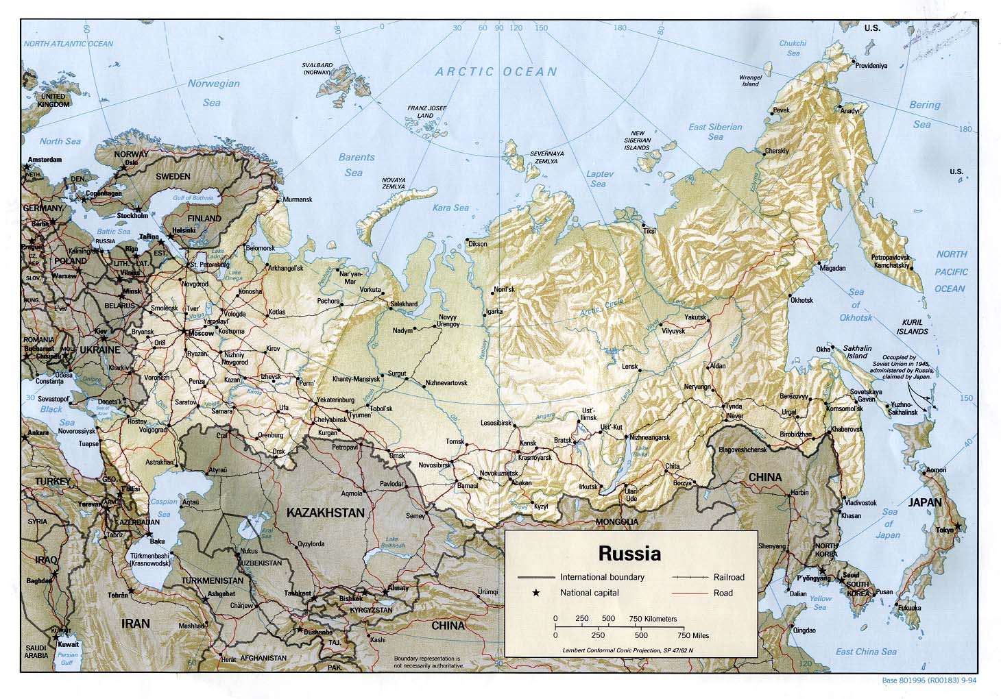
- The light grey color is planned out to print well in black & white with regards to the other colors and patterns we use. No harm in using a less boring color, but it would be good to do a practice print to see how it looks. And yes, I realize this is a problem with our colored regions maps generally, but the higher level maps are more important on-site than off (for navigation), while a bottom-level region map, like the ones to the left, is going to be really handy for travelers to print out and stick in their pocket. (And color printing is often a rare commodity in internet cafes around the world.) --(WT-en) Peter Talk 14:47, 15 January 2010 (EST)
- I personally like the green colour I adapted the US region map template, and used on the Far Eastern Russia maps (Sakhalin, Karbarovsk Krai and Primorsky Krai), but I don't have a printer to check with, they're a bit darker, so it could spell trouble for black and white prints. But if they don't work, maybe we could experiment a bit, I think some shade of green is a nice colour for such maps, "green for land - blue for water" is a pretty widespread practice. Maybe the green used for North Balitimore or Northern Territories, they are bit lighter, and still look good. --(WT-en) Stefan (sertmann) talk 15:26, 15 January 2010 (EST)

Green is a nice idea. I do think as a matter of principle and consistency we should stick to out of region areas being dark grey, as we do with country regions map. Readability when printed in black and white should be a key objective. I actually do like the grey as per the East Java and Barkly maps, but that might be a personal thing. Undeniably though, the pale grey gives very good definition to the maps in both colour and black and white. Here is an example using green that does work in grey tone.--(WT-en) Burmesedays 21:23, 15 January 2010 (EST)
- Don't know what it is, but I like it on the Barly map (and some of our good South African maps, like this one), but I think green looks better on the Bali map, hmmmm, maybe it's the wave pattern that makes the difference. --(WT-en) Stefan (sertmann) talk 21:30, 15 January 2010 (EST)
- I am very anti fluoro colours (dont get me going on that pink used for the poor old Philippines here :) ), so not really keen on the bright lime green. I might be the wrong person to be doing this as I am very enamoured with desaturated, soft colours. Importantly though, they do print well. Black text out of soft, desaturated pastels is a tried and tested graphic design principle (as well as looking very nice!). Harder, darker colours might be OK if you are not showing much detail, but not for a map with the level of detail of the East Java example. --(WT-en) Burmesedays 21:39, 15 January 2010 (EST)
- OK, get ready for some big images below the following whitespace:


- #9 is our standard grey, several of the others are taken from other maps on our site (LtPowers' #2, Burmesedays' #3, Big Bend NP #4, Stefan's #5)—the rest I just made up on the spot. I think the ones that manage to preserve a good contrast with the other colors, but are not so bright as to make white paths hard to read, (and which are not simply ugly in color), are #s 2, 3, 4, & 8. Of those four, I think the best in B&W is 4/8 (very similar) or 3/6 (ditto). Of those, I prefer 4/8 when in color. They are both a fairly natural green, not too bright—yellow paths don't look like they show up well on #3. If I had to pick a personal favorite, it would probably be #4, as it is quite distinctive but unoffensive, and eminently readable in both B&W and color, as its duller color makes other colors (like yellow paths) more distinct. (Try to find the yellow paths in B&W on the other maps.) --(WT-en) Peter Talk 16:34, 16 January 2010 (EST)
- I prefer #5 in colour and #8 in B&W, but #4 would be my second choice in both. As Peter said, it's readable in both so I think it makes it a good choice.
- I was wondering if anyone else found it difficult to distinguish between the road and the river on the B&W map? If the river name is nearby, it helps. Maybe rivers could be a narrower width than the road? (WT-en) Shaund 21:24, 16 January 2010 (EST)
- Thanks for that large effort Peter. #9 is still my favourite - the grey is definitely the most elegant to my eyes. Of the coloured ones, 4 would be my favourite and it also works best in greyscale.--(WT-en) Burmesedays 01:24, 17 January 2010 (EST)
Macau
[edit]We still need a map of Macau, but I cannot find a good source=(. I found this map of the area, but it's hopelessly out of date (two bridges are missing, the airport is missing and the entire neighborhood of Cotai was not there yet at that time). The 2008 edition is freakishly small and undetailed . OpenStreetMap.org barely shows Macau as well, so I don't really know a good source. Anyone knows any other options I could try? --(WT-en) globe-trotter 20:50, 17 January 2010 (EST)
- The good news is that there are quite lot of Macau maps at Wikimedia Commons. I do not think any one of these in isolation will do the job but in combination, maybe. Also, it might be worth searching government sources more deeply as Macau govt publications are apparently not protected. However, the Macau Govt Tourist Office site completely contradicts that ! --(WT-en) Burmesedays 21:11, 17 January 2010 (EST)
- Macau done :) Now East Asia is totally done. --(WT-en) globe-trotter 15:34, 31 January 2010 (EST)
Africa
[edit]It is no secret that producing region maps for the 32 remaining African countries (virtually all of which have yet to be regionalised), is going to be quite some task. With that in mind, I have tried to elicit some help from AHeneen with the regionalisation. --(WT-en) Burmesedays 11:19, 20 January 2010 (EST)
After Burmesedays invited my help with Africa, I've gone ahead and created schemes to divide a couple African countries which I had a notion of where to start into regions(sorry they aren't big ones). See my suggestions on the talk pages of the Seychelles, Somalia, & DRC. I didn't find mapmaking easy when I tried about a year ago and have since ruined my laptop so that I am currently using an 8 year old desktop...so I don't think making maps will be easy for me with this sluggish dinosaur, sorry. The three countries I've started with are quite straightforward and Somalia & the DRC have large maps showing region boundaries which you can use. I have a good idea for regions a few more countries should be divided into (incl. Niger & Nigeria), but I am trying to figure out exactly where boundaries for these regions should lie and a map or other way of conveying what I think to you. (WT-en) AHeneen 00:15, 21 January 2010 (EST)
- On top of those three Equatorial Guinea is very straightforward: Bioko Island, Annobón Island, & Rio Muni (the mainland, includes a couple tiny islands/islets in Corsico Bay). São Tomé and Príncipe is just two islands (can you guess their names?) with a couple negligible islets off each. So there's five countries you can get started on! (WT-en) AHeneen 00:25, 21 January 2010 (EST)
- You are a star. You have no idea how helpful advance work like this will be.! --(WT-en) Burmesedays 00:44, 21 January 2010 (EST)
- Alright, I've carved up one of the big ones...Nigeria! See its talk page. That's now six African countries now ready for maps. (WT-en) AHeneen 04:50, 21 January 2010 (EST)
After discussion on Talk:Africa, I've moved some countries to different regions and need the maps updated.
Central Africa: remove Rwanda, Burundi, & Zambia- Southern Africa: add Zambia & Mozambique
East Africa: add Rwanda, Burundi, & Mauritius; remove MozambiqueAfrica: make above changesDone --(WT-en) Burmesedays 12:14, 29 January 2010 (EST)
The listings to the left of the maps have already been updated, with additions colored black. Also, the Saharan Africa map will need to be updated pending a name change (likely The Sahel). (WT-en) AHeneen 11:43, 29 January 2010 (EST)
- I've moved Saharan Africa to Sahel and updated the map accordingly, in addition to updating the Central and East Africa maps. That's all for today though, so if someone else would like to do the Southern Africa map, please go ahead. --(WT-en) Peter Talk 17:14, 29 January 2010 (EST)
Where next (2)?
[edit]So Asia is done, with the final few maps under discussion (Jordan and Syria by the way have been hanging out there for 7 months; time to implement I think).
Peter is doing Paraguay, I am doing Uruguay, and that is South America done.
I believe we should tackle Africa next. Huge job. How do mapmakers feel about that? --(WT-en) Burmesedays 21:23, 20 January 2010 (EST)
- Other good possibilities would be to finally finish Europe or to go on with Central America to finish off the Americas. I'll admit, though, that I would indeed be a little more excited to get to work on big African countries about which I know less. --(WT-en) Peter Talk 22:20, 20 January 2010 (EST)
- Africa is vast and it's going to take a long time before it is done (it has the most countries of any continent). I'd rather finish off at least Europe and maybe Central America first, I think they are more important. Finishing off the Americas will be hard, I think the Caribbean is also a part of it? --(WT-en) globe-trotter 04:27, 21 January 2010 (EST)
- I know what you mean. Selfishly though, I am much keener to tackle interesting African countries and educate myself along the way, than I am small Caribbean islands (most of which do not need regionalising) and the few remainders of Europe. You could also argue that African maps are more important as few (or any) travel maps exist for some of these countries.--(WT-en) Burmesedays 04:55, 21 January 2010 (EST)
- Central Africa looks to have legs, so I'm happy to put it in the central column, and let the last three Asian countries solve themselves (since I think we're just waiting for more comments at Talk:Turkmenistan#Regions and for the SVGs for Jordan & Syria to be uploaded). I've done this, let it be reverted if people want to discuss this further first. --(WT-en) Peter Talk 18:53, 22 January 2010 (EST)
- Good move I think. Apart from anything else, Africa seems to have motivated others and we are getting some invaluable assistance. --(WT-en) Burmesedays 21:55, 22 January 2010 (EST)
- We seem to have momentum with Africa which definitely is a good thing. I don't know much of the continent though, so I might just continue on some other maps. I just finished Macau. --(WT-en) globe-trotter 12:03, 23 January 2010 (EST)
- Yes, nothing wrong with concentrating efforts elsewhere also. I am right into Africa at the moment. The fact that I know so little about most of these countries is actually motivating me more! Tiny Gambia is the only African country I have been to south of the Sahara and that was longer ago than I care to admit. --(WT-en) Burmesedays 12:38, 23 January 2010 (EST)
- Central Africa done! I hardly thought that would be possible. Probably the toughest region anywhere in the world for this purpose. I see AHeneen has already promoted West Africa to the centre column. Discussion is well advanced for 6 of those countries, so probably a good idea. --(WT-en) Burmesedays 11:29, 27 January 2010 (EST)
- In five days no less (10 countries)! For the first time, it's starting to look like the finish line (for country maps) may be on the horizon. --(WT-en) Peter Talk 11:54, 27 January 2010 (EST)
- Seven, actually. I thought about puting N & Saharan Africa there to finish those regions, but none were ready to map like WA is. (WT-en) AHeneen 13:55, 27 January 2010 (EST)
- In five days no less (10 countries)! For the first time, it's starting to look like the finish line (for country maps) may be on the horizon. --(WT-en) Peter Talk 11:54, 27 January 2010 (EST)
- Hmm, now I get nine . This is why I'm not active on WikiAccounting. --(WT-en) Peter Talk 14:01, 27 January 2010 (EST)
- I was refering to Burmesedays' comment "Discussion is well advanced for 6 of those countries", which was why my comment had been indented just one from his (and in line with your comment, not further indented as if I was referring to your's). Now that I've got you confused, I've since broken up Cameroon so there are 8 countries ready for a map (and you can get started on Cameroon). (WT-en) AHeneen 15:02, 27 January 2010 (EST)
- Hmm, now I get nine . This is why I'm not active on WikiAccounting. --(WT-en) Peter Talk 14:01, 27 January 2010 (EST)
- After a fairly prolific run, I have been quiet on the region maps front. This is mostly as I am having a very serious 2nd go at the Bali articles, and that is consuming my Wikivoyage time. When that job is finished I will definitely be back onto Africa and its very interesting maps. --(WT-en) Burmesedays 09:44, 22 February 2010 (EST)
- No worries, it's clear we've hit a fresh round of burnout (although I'm getting back into it after a break). That last run was clearly the most productive in the history of the expedition! I'm thinking we should burn through the nearly-done African regions next, as a little reward for finishing the two hardest, before tackling East Africa ;) --(WT-en) Peter Talk 17:19, 22 February 2010 (EST)
- I've also worked less on the maps due to my work on Thailand's hierarchy and Bangkok. I did finish Syria though, so that means we've done all of the Middle East! Not just Turkmenistan and all of Asia is completed! --(WT-en) globe-trotter 21:03, 22 February 2010 (EST)
- Yeah, I've been distracted by the Olympics and visitors (there's a party going on here in Vancouver, you know!). Company is gone now, so I should be able to squeeze a few maps in once I finish Senegal. (WT-en) Shaund 00:53, 24 February 2010 (EST)
I agree with Peter's edit comment - let's deal with The Sahel next. Should be quite quick and they are very interesting countries. The list of outstanding African maps is looking way more manageable with the end in sight!--(WT-en) Burmesedays 02:42, 3 March 2010 (EST)
- With The Sahel polished off very quickly, how about we tackle the remnants of North Africa and Southern Africa next? Just four countries to do. Then on to West Africa and the whole continent will be finished. Amazing really in such short time.--(WT-en) Burmesedays 02:41, 6 March 2010 (EST)
Should we create region articles or not?
[edit]This came up at Talk:Burundi and should really be discussed here I think. Two posts from that talk page:
- That brings up a point which should probably be discussed elsewhere. Do you not think we should create region articles as a matter of course when we do the regionalisation? I do. A map which meticulously shows regions that do not exist seems a bit odd. --(WT-en) Burmesedays 12:00, 23 January 2010 (EST)
- Agree with Burmesedays, I think we don't just create maps, but that after making the map we should also get the regional division in place. The purpose of the map is to illustrate the travel regions. --(WT-en) globe-trotter 12:36, 23 January 2010 (EST)
I think it would be useful to have a policy on this. I make a point of creating region articles when the map and regionlist table is posted. A redlinked regionlist table and a map showing a bunch of regions that do not exist on WT, slightly weakens the superb work undertaken in this expedition. --(WT-en) Burmesedays 21:10, 25 January 2010 (EST)
- It makes sense to mention this on the expedition page. I update the regions and try to update the breadcrumbs and check the intro paragraph of the city/other destination articles whenever I add/update a region map. I'm not sure how far down that list we should go as policy though. Depending on the number of regions and linked destinations, it can take a while to completely do the job (sometimes more than one sitting from my experience). Perhaps we should say any new region pages should be created, appropriate destinations listed and the breadcrumbs updated. If it looks like it will take a while, a to do list should be created in the Talk page. (WT-en) Shaund 21:42, 25 January 2010 (EST)
- In the cases of Israel and Nepal it took me pretty much half a day =P Maybe it doesnt have to be completely re-arranged, but at least the regions should be there I think. Otherwise the map doesn't make sense. --(WT-en) globe-trotter 21:55, 25 January 2010 (EST)
- Yes, countries with developed tourism are a lot of work in this respect. I seem to remember that the region articles and breadcrumbing for both Vietnam and Burma took me as long as actually drawing the maps. I quite like Shaun's proposal.--(WT-en) Burmesedays 22:11, 25 January 2010 (EST)
- We should not be mapping regions or countries that have yet to be regionalized. If you wish to devise a regionalization scheme explicitly so that you can map it, then yes, of course that scheme ought to be implemented. (In other words, I agree with you that we should not have maps that specify regions for which we don't have articles, but we should keep the focus on the maps; not all mapmakers are adept at regionalizing, and it shouldn't be expected that they do so.) (WT-en) LtPowers 22:01, 25 January 2010 (EST)
- Yes of course. That is one of the reasons I have tried to enlist help with regionalising the African nations for example. And the help has been forthcoming in a spectacularly impressive fashion. That was not my point though. Rather, if a map is drawn, with regions on it, should the region articles be created? I think your answer to that is yes. --(WT-en) Burmesedays 22:11, 25 January 2010 (EST)
- Basically, but my point was more that the region articles ought to be created before we even start on a map. =) (WT-en) LtPowers 06:58, 26 January 2010 (EST)
- Ideally yes. In my short experience here though, the two usually go hand-in-hand. The current collaboration between regionalising and map-making for the difficult African countries is though going very well indeed. --(WT-en) Burmesedays 07:23, 26 January 2010 (EST)
We marked South America as all done, but I am a little unsure about French Guiana. There is no discussion on the country talk page but we do have a nice map which seems to show three regions. I am not sure if this is intended for illustrative purposes and that the country is not being regionalised or that we should regionalise along those lines? Also, I guess the pale apple green areas are national parks? Could we please clarify the intention of this map. --(WT-en) Burmesedays 00:12, 4 February 2010 (EST)
- It was more of an experiment from my early days, not sure if it's applicable. FG is officially split into two arrondissements (East and West). With the insights to our regionalization I've gained since I drew that map; I'm thinking we should either drop the regions altogether, or make a Coastal and Interior region instead.
- Though if content is not a concern, I still like the concept, The coast are connected by roads, and inland transportation is mainly done by rivers flowing along the East and West borders, so the 3 way division would make perfect sense if the articles were more developed.
- In a nut-shell, it could probably use some discussion, and yes, the green area's are forest preserves. --(WT-en) Stefan (sertmann) talk 09:36, 15 February 2010 (EST)
- We probably ought to decide one way or the other about this. And, I have just noticed that the Falkland Islands has no map, so South America definitely is not done!--(WT-en) Burmesedays 11:15, 2 March 2010 (EST)
- I say we reduce it to two regions, coastal & inland, since it is a country of the size of Austria (which is fairly small, but not so small that it can't have regions). And despite its tiny population, we do have seven cities/towns on the map to give the inland article an acceptable skeletal structure.
- I'll take care of the Falklands map—should be very easy. --(WT-en) Peter Talk 01:53, 3 March 2010 (EST)
- Whoa! The Falklands have regions! Great map Peter. Not what I was expecting at all. --(WT-en) Burmesedays 04:59, 3 March 2010 (EST)
- That map of the Falkland Islands is really amazing! --(WT-en) globe-trotter 15:08, 6 March 2010 (EST)
Regions with island chains
[edit]There are a good number of nations/territories where regions will be groupings of very small islands, e.g., Seychelles, Maldives, etc. I have been handling these maps by creating inoffensively light and transparent shapes enveloping the islands of a region (see Image:Seychelles regions map.png or Maldives#Regions for examples). I've tried putting the shape under or over the island objects, and I'm not sure which I like more.
There is an optical illusion problem though: the light region colors look quite different when surrounded by our water color than when surrounded by white (as they are when displayed online via the regionlist template). In this example the regionlist colors and the colors used on the map are identical, as I eyedropped them straight from the map, but they don't look the same. I then tried to play around with the colors so that the ones on white background would align with those on the map, and came up with this . The second example looks better, despite the fact that the colors do not in reality match with those on the map.
It was a pain to get these colors to match, so I have created a template, Image:Island chain colors.svg, which contains the ten translucent colors I used on the Maldives map, as well as a skeletal copy of the regionlist template with the altered colors that match when displayed online. That way, you can use the existing colors on the map, and then paste the regionlist form into the article, and avoid any time-consuming experimentation.
I hope this rambling post isn't too confusing.
This will all be pretty relevant when we get to Oceania ;)
On a separate but related note, please take a look at Talk:Seychelles#Regions, as the options being discussed for the Inner Seychelles breakdown will set another important precedent for island chain breakdowns. --(WT-en) Peter Talk 21:32, 12 March 2010 (EST)
- If I may, I have to admit I found the Maldives map confusing until I looked at the Seychelles map and saw what you were doing. I thought the colored areas on the Maldives map were the islands, and I was wondering what all those little spots were. Well, of course they're the islands; I know that now, but not then. I see what you were trying to do, but I wonder if perhaps more polygonal shapes would make it clearer than the organic curves you have there now. (WT-en) LtPowers 23:21, 12 March 2010 (EST)
- Excellent idea and technique Peter. It will be so important when we finally get to Oceania. It might be worth trying with polygonal shapes as LtPowers suggests. I did get it first time with the Maldives, but I can see why there might be some confusion. I am also wondering whether setting a heavy(ish) dotted stroke on the translucent shape might help? All-in-all, a very good idea I must say. As an aside, I also think we should show long/lat lines on island group maps when there is no major land mass visible. You did this with the Falklands, and it struck me then as a smart move. For Oceania, it would be relevant for almost every map. --(WT-en) Burmesedays 23:36, 12 March 2010 (EST)
- Oops, I should have mentioned the big difference between those two maps. I'm using color regions to group clusters of atolls/islands for the Seychelles, whereas the color regions for the Maldives are very much representative of the individual physical atolls, which are partially submerged, depending on the day, season, etc. This map makes it clearer. --(WT-en) Peter Talk 23:39, 12 March 2010 (EST)
I have uploaded a version with polygonal color regions for comparison:
I'm not sure which I prefer. The polygonal color regions look a bit better aesthetically, but the organic shapes make it a bit clearer where there are islands and where there are not (since the islands are all so small on the map). Stroking the color regions does make it look better, but only when kept extremely faint, for the same reason: darker lines overwhelm the visual presence of those tiny islands. I prefer a very light solid line to a dashed one, because dashes appear marginally more similar to islands. --(WT-en) Peter Talk 13:27, 13 March 2010 (EST)
- I think the rectangles look remarkably better. But what about a circle around the islands? Could that work out or would it look bad? --(WT-en) globe-trotter 14:44, 13 March 2010 (EST)
- Symmetric circles are hard to fit on the rectangular map, but oblongs are certainly possible. They're a little harder to work, though, and I think the rounded rectangles look better.
- For the heck of it, I tried adding radial gradients, to the atolls at least—take a look and tell me what you think. --(WT-en) Peter Talk 17:06, 13 March 2010 (EST)
- I like the rounded rectangles, but I can see how that might not work for the atolls of the Maldives. The gradient is fine but doesn't really add much; it would just make me wonder why it was there, I think. Maybe use a border of some sort as Burmesedays suggested? I don't know. (WT-en) LtPowers 22:17, 13 March 2010 (EST)
- I like the rectangles too. FYI re: Oceania, I once had a cruder version of the idea before we redid that areas hierarchy – (WT-en) cacahuate talk 22:46, 13 March 2010 (EST)
- Another vote for rounded corner rectangles. Looks clean. As an aside, I assume you drew those rectangles with the square/rectangle tool? Where is the setting to round off the corners? Instinctively I right click the tool, and up comes a settings box....... or not (of course). Inkscape is never instinctive :).--(WT-en) Burmesedays 03:49, 15 March 2010 (EDT)
- Select the rectangle object with the node selector tool (F2); click the circular handle in the top right (I think top right), and drag it to round the corners. --(WT-en) Peter Talk 05:22, 15 March 2010 (EDT)
- Thanks Peter. So you have not discovered a setting to make the rectangle tool actually draw that way? There must be one. I will dig into the manual. --(WT-en) Burmesedays 05:32, 15 March 2010 (EDT)
- Ah.. got it. You do that just once and then it remembers to draw all rectangles in that fashion until you change it again. Not bad. --(WT-en) Burmesedays 05:35, 15 March 2010 (EDT)
- Looks like I'm in the minority here... I prefer the curves (and I think they'd look better with the gradient), but the boxes look fine too. (WT-en) Shaund 00:00, 16 March 2010 (EDT)
Just remembered (a month later) that I wanted to make sure that everyone understood that I used the gradient emphasize the atoll nature of the Maldives, as the "land portion" of an atoll exludes the lagoon in the center. Not sure if that was clear. --(WT-en) Peter Talk 13:36, 21 April 2010 (EDT)
Amazing progress
[edit]Peter has the remaining Horn of Africa countries in hand, I have just finished Kenya and Uganda, and will do Libya. That leaves just one African map left to do (Tunisia). Amazing progress - on January 20th 2010 there were 32 African maps outstanding! Even more impressive when you realise how tough some of these countries are to regionalise. The regionalisation has gone hand-in-hand with the map making. --(WT-en) Burmesedays 03:37, 15 March 2010 (EDT)
Tidying up Africa
[edit]I am in the midst of the large task of adding all city and OD descriptions as well as detail on the regionlist tables, for all of the top level African regions. This has highlighted a few issues related to the African maps, and I will list those here:
- Cameroon is marked as done by this expedition but it isn't. We have a great map, but the regions are all redlinks. Stands out like a sore thumb here. This job could be finished by anyone with an hour to spare - create the region articles, add all the destinations as appropriate and sort out the breadcrumb trail.
- Cape Verde. I know island groups present unique problems, but so we really need all those regions for a country of 400,000 people? Could they be consolidated a little, or even have no regions at all, and each island using a city template? Also, two of the regions are red links. --(WT-en) Burmesedays 00:59, 27 March 2010 (EDT)
- In a technical sense, Cape Verde actually only has one region article, for Santiago. All the rest of the islands are covered with unitary articles using the standard small-city article template.
- I see you added all the sub-country regions to the regionlist template at West Africa. I actually would recommend against doing that per Project:Geographical hierarchy#Listing sub-regions?, as it clutters up the section with potentially confusing information—the context given at Côte d'Ivoire#Regions is necessary to understand what Eastern Plantations means. All this additional information subverts our goal of having our lists of 7±2 being a quick, simple, navigational tool.
- The regionitems field really should only be used to clarify what the regionname means. For example, showing the U.S. states under the U.S. regions helps clarify what is meant when we say "Midwest" or "Great Plains," as the states are a better understood unit than our own region designations. --(WT-en) Peter Talk 03:22, 27 March 2010 (EDT)
- Ah. So all those articles we have listing region items are wrong? Apologies for assuming the regionlist had that function. Before I remove all the ones I have added (from many articles, not just West Africa), please confirm! Thanks. --(WT-en) Burmesedays 03:28, 27 March 2010 (EDT)
- Which ones? The USA one is in line with the answers provided by that discussion. Other articles use the regionlistitems to show small additional bits that you might not realize are included under the regionlistname, like the islands mentioned in the items for Sumatra at Indonesia#Regions.
- I don't want to quite say that this is a general rule, but more times than not it's fine to just leave the items section blank. It's there mostly to define/clarify what the region is precisely (Maldives#Regions does this by providing the alternate names). It can also be useful as a way to "jump" past one layer of the hierarchy to the level that the reader knows he/she is looking for. So someone looking for Colorado can bypass Rocky Mountains (United States of America) from USA#Regions. It's far less likely that a casual reader of the West Africa page will want to bypass Senegal to reach Tambacounda Region!
- Sorry to be catching this after you have no doubt spent good time working on these lists—I've become unexpectedly busy! --(WT-en) Peter Talk 03:44, 27 March 2010 (EDT)
- OK, I get the principle. Yeah it was a bit of work as a side task of adding city and OD descriptions, but not to worry.--(WT-en) Burmesedays 04:01, 27 March 2010 (EDT)
Cameroon now done.--(WT-en) Burmesedays 23:59, 2 April 2010 (EDT)
Where next (3)?
[edit]To all intents and purposes Africa is done. So where do we fancy next? I pitch for finishing off Europe before moving on to tackle all those island states (they won't be very interesting maps!).--(WT-en) Burmesedays 22:09, 10 April 2010 (EDT)
- Agree with finishing Europe. I made a start with Montenegro. I also added a map and regions to Serbia, but it is a "usable" map, not the kind we're used to making. --(WT-en) globe-trotter 12:37, 15 April 2010 (EDT)
- OK.. let's have a go at Europe then. I have recently done a couple of microstates (Malta and Monaco).--(WT-en) Burmesedays 12:50, 15 April 2010 (EDT)
- I have fairly rattled through the Balkans and Albania, Bulgaria, Croatia and Serbia are all done. Kosovo will be a simple extract from the Serbia map, and Moldova is in hand. That leaves just Bosnia and Herzegovina. This one is far from straightforward and there is a lengthy discussion here which has been dormant for a year. Input certainly required to get that one finished off. --(WT-en) Burmesedays 03:01, 21 April 2010 (EDT)
- The Caucasus is partly weak covered with maps. Disputed territories like Abkhazia have no map or like South Ossetia have non-standard maps. I don't know if i simply add them on the article list or shall we discuss first on how to approach them because it is likely that this rise some tensions... Especially Abkhazia is sensitive as the current location map was uploaded by the administration and it implies that Abkhazia is not part of Georgia (country). (WT-en) jan 11:25, 21 April 2010 (EDT)
- What matters to me is whether WT treats a disputed territory as a country. If we do, then it should have a proper map and should be on our list to tackle. And vice versa. On that basis, Abkhazia should be part of this expedition and have a proper WT map. Whilst it would be nice to have a South Ossetia map, it is not vital as part of this expedition. --(WT-en) Burmesedays 11:41, 21 April 2010 (EDT)
- It would be good to create an Abkhazia map (ditto N-K), but what is wrong with the S Ossetia map? It's old, but it's pretty clearly in line with our basic standards, I think—it does the job fine. My old Azerbaijan and Armenia maps are terribly ugly and could use a facelift, but our strategy in this Expedition has been to focus only on regions that currently lack regions maps. Once we finish all the world's countries, it might be nice to go and identify which maps really need to be redone, but I'd prefer that we finish that big goal first.
- And I am inclined to agree with Burmesedays, as disputed territories tend to be a lot less travel-important than countries (better to finish the countries first). Although I recognize that we haven't followed this advice to a tee—we put Western Sahara on the list. Doing "territories and dependencies," as well as "de facto states" might be a good list to follow our countries goal. --(WT-en) Peter Talk 11:46, 21 April 2010 (EDT)
- Yep. Good idea. Once we have "conquered the world", I was thinking we could have a tidying up expedition: improving some of the older maps and checking we have actually covered all countries (I found the Faroe Islands had been forgotten the other day), amongst other things. Disputed territories could become part of that. Talking of finishing, it is really not too far off now is it?--(WT-en) Burmesedays 12:05, 21 April 2010 (EDT)
- Yeah, amazingly it does look like the grandiose task of "conquering the world" may be finished in just a few months. I wouldn't have thought that possible at all when I started this! The one pitfall will be to keep up momentum for the island nations. I'm actually really looking forward to them, but am not sure if they appeal to the rest of our mapmakers. --(WT-en) Peter Talk 13:40, 21 April 2010 (EDT)
- Yep. Good idea. Once we have "conquered the world", I was thinking we could have a tidying up expedition: improving some of the older maps and checking we have actually covered all countries (I found the Faroe Islands had been forgotten the other day), amongst other things. Disputed territories could become part of that. Talking of finishing, it is really not too far off now is it?--(WT-en) Burmesedays 12:05, 21 April 2010 (EDT)
- I must admit that the prospect of mapping little specks of rock surrounded by ocean does not fill me with joy. The upside is that they should not take long. --(WT-en) Burmesedays 20:38, 21 April 2010 (EDT)
- I agree with the points above and will add Abkhazia on the list. S-O has a general map but no regions. As it is tiny we might not need some but i just wanted to discuss both points before i add them. (WT-en) jan 12:08, 21 April 2010 (EDT)
Transnistria has appeared on the list and I do not think it should be there as we do not treat it as a separate entity from Moldova. I think it is well covered by the Moldova map. Thoughts?--(WT-en) Burmesedays 11:36, 23 April 2010 (EDT)
- Took me 10 mins ;) --(WT-en) Peter Talk 12:39, 23 April 2010 (EDT)
- I do think, though, that for now we should be sticking to actual countries. Lets worry about the rest for once we hit our big milestone. If we keep adding stuff to the current lists, that will move us further from the milestone, and that will be discouraging. --(WT-en) Peter Talk 12:41, 23 April 2010 (EDT)
Stefan's name has been on both of these maps for more than a year. As he is "currently not participating in this wiki", I have plonked my name on Croatia (not wishing to upset anyone, but it needs doing).--(WT-en) Burmesedays 13:23, 15 April 2010 (EDT)
More on island groups and starting to tackle Oceania
[edit]
| Babelthuap |
| Koror |
| Rock Islands |
| Peleliu |
| Angaur |
| Sonsorol Islands |
Given that the "speck of rock" Oceania countries have to be tackled eventually, I had a go at Palau, knowing it would present issues with 20,000 inhabitants spread across about 500 miles of small islands and tiny atolls. I was though pleasantly surprised to discover a UN map, and I really like the way their cartographer dealt with the scale problems, and kept everything on one map. I have shamelessly copied that format, and tried to blend Peter's excellent approach to the Seychelles which is discussed above. The map is not yet finished, but I think it works quite nicely and could provide some inspiration for the other tricky Oceania island group nations. What do folks think? --(WT-en) Burmesedays 11:28, 4 May 2010 (EDT)
- Nothing to add, it looks great I think! --(WT-en) globe-trotter 07:59, 10 May 2010 (EDT)
- Thanks G-t. I have had a bit of a run at these Oceania maps and got a few done, but I must say I am a bit burned out. They are not the most exciting maps to produce.--(WT-en) Burmesedays 09:56, 10 May 2010 (EDT)
Oceania maps are awful quick to do if you use the SVG files at commons:Category:SVG_locator_maps_of_countries_of_Oceania_(16:9_regional_location_map_scheme)! --(WT-en) Peter Talk 22:44, 25 July 2011 (EDT)
Caribbean nations
[edit]Is there a reason why so many Caribbean nations have been left off the list of maps to do? Am I missing something or is the omission of Virgin Islands, Guadeloupe, Aruba, Saint-Barthelemy and so on, just an error? --(WT-en) Burmesedays 11:13, 11 May 2010 (EDT)
- Because they are not nations ;) --(WT-en) Peter Talk 21:21, 11 May 2010 (EDT)
- In theory that is true, but in practice they are "countries" and certainly so from the traveller's point of view. If we are treating say Martinique as a region of France, then something is wrong :) I have taken the liberty of adding a list of overseas territories etc. I hate making the list longer, but we should not pretend these places do not exist. --(WT-en) Burmesedays 01:09, 12 May 2010 (EDT)
Actually, given previous discussions, it probably makes more sense to keep that list here for now. These must not be forgotten. Here it is the list:
- Caribbean overseas territories, dependencies etc
- Aruba
- Anguilla
- British Virgin Islands --(WT-en) Peter Talk 17:40, 12 May 2010 (EDT)
- Cayman Islands
- Guadeloupe
- Martinique
- Montserrat
- Netherlands Antilles
- Puerto Rico
- Saint Barthelemy
- Saint Martin
- U.S. Virgin Islands
--(WT-en) Burmesedays 07:16, 12 May 2010 (EDT)
- Aruba is considered a country and so are the Netherlands Antilles (though they remain a part of the Kingdom of the Netherlands). However, the Netherlands Antilles will be disbanded by October 2010, and will turn into 2 autonomous countries (Curacao and Sint-Maarten) and three special municipalities of the Netherlands proper (Bonaire, Sint Eustatius and Saba). So it seems like we have a lot more maps to create. --(WT-en) globe-trotter 07:38, 12 May 2010 (EDT)
- A handful of these may resemble nations from a travelers' perspective, but the rest really don't. What they do have in common, though, is that they are second-level regions, as are nearly all countries on Wikivoyage. I'm all for adding them to the list, and actually looking forward to join in on the islands effort, provided I have any time to do so! --(WT-en) Peter Talk 17:15, 12 May 2010 (EDT)
Improving US states
[edit]There are already maps for all these states, but I think they could be improved:
Need more information
[edit]These do not have any information (besides regional divisons)
Need to be changed to Wikivoyage style
[edit]Need to be color coded
[edit](WT-en) –sumone10154 00:15, 23 March 2011 (EDT)
More on Russian maps
[edit]Copied from User talk:(WT-en) Peterfitzgerald#More on Russian maps
Hi, Peter! I have a question to the same point. You could have noticed that I outlined the maps for Vladimir Oblast (and also Tula Oblast as well as subregions for the Russian version), but the style I used is a bit different from what you chose for Novgorod Oblast and Moscow Oblast and probably other regions as well. Should we arrive at a common style for these maps? Personally, I am not very happy with the "translucent" maps (from OpenStreetMaps?) that are not well readable. I also have a problem with their manner of drawing secondary roads with very faint lines. Well, it does take more time to draw the roads by hand, but isn't it worth the effort? What's your opinion? (WT-en) Atsirlin 15:32, 12 July 2011 (EDT)
- The approach towards creating region colors for the Moscow Oblast map was very rushed and unprofessional on my part ;) and I think that's what you are referring to when you say "translucent maps". Every style on that map, though, is my own—I chose the size and colors of the secondary road lines, trying to achieve a balance between the roads and the other details being shown, and basing all of this on our ever-evolving standards at the Project:Regions map Expedition. I'm still trying to come up with a way to re-do the regions layer well for that one particular map, but do you think these are readable: Image:Moscow_Oblast_map_(ru).png and Image:Novgorod Oblast map.png? The main difference between what I have done in the past and what I am doing with these latest maps is including all the public lands/forests and also the urban districts that come in the OSM maps. Is this just a sensory overload? --(WT-en) Peter Talk 15:58, 12 July 2011 (EDT)
.png?action=edit&redlink=1)
- OK, now I get it. The forests and urban areas are indeed masking the roads and other stuff, especially when you put colored subregions on top. In Russia, forests are (nearly) everywhere, so they are, to my opinion, less important than roads and rivers. Honestly, I still opt for the "former" style with uniform colors and gray background highlighting the region.
- PS. Without colored subregions, Moscow oblast looks better indeed. (WT-en) Atsirlin 17:46, 12 July 2011 (EDT)
- I've of the opinion that at city-scale or larger, "green areas" should only be parks (public greenspaces, not just forest or swamp). At district-level, or very small villages (like Childs, which I just did), then you can show forests. I found the green spaces on the Oblast maps above to be very busy and to distract from the useful content of the maps. (WT-en) LtPowers 18:58, 12 July 2011 (EDT)
- I like the *idea* of including forests on the maps, but it looks pretty busy in the Moscow Oblast and Novgorod Oblast maps (maybe it's the three different shades of forest/parks that were distracting). For region maps, my thought is we should focus on what the subregions are, major roads, etc., so I also prefer the uniform colours and gray background.
- I do like the urban areas, especially on the Novgorod Oblast map. I think it looks more professional than the circles we usually use and it helps convey a sense of how big the cities are. I'm not sure if it would work in all situations though (like a high-level region map that has subregions -- it might get too busy again). (WT-en) Shaund 01:04, 13 July 2011 (EDT)
- Sounds like a developing consensus against the forests—I still like them, but the point that it distracts from more useful content (especially, I think, in the Moscow Oblast example) is valid. For point of comparison, here is a unforested Novgorod Oblast map. --(WT-en) Peter Talk 10:53, 13 July 2011 (EDT)
- I think this is a decision that can sensibly be left to the individual map-maker. Personally, I like the forests as well, and they convey information I am interested in. If though, the presence of a forest pattern completely distracted from other important information on any map, I would probably choose not to show them. I am not sure we need a policy as such on this.--(WT-en) Burmesedays 11:05, 13 July 2011 (EDT)
- Yes, I strongly prefer the unforested map. I agree with (WT-en) Burmesedays that one should not make a strict rule about the forests, but let's avoid them for (most of) Russian regions, where we have many other things to show. (WT-en) Atsirlin 12:17, 13 July 2011 (EDT)
- I agree with Alex. Arkhangelsk Oblast has taiga forest totally. And huge forests intresting for mushroom's seekers or hunters, but no for turist. (WT-en) Digr 09:25, 15 July 2011 (EDT)
- Yes, I strongly prefer the unforested map. I agree with (WT-en) Burmesedays that one should not make a strict rule about the forests, but let's avoid them for (most of) Russian regions, where we have many other things to show. (WT-en) Atsirlin 12:17, 13 July 2011 (EDT)
- Recently I've made maps of Arkhangelsk Oblast and railroads of Sochi. Planning to make Sochi city map and maps of other Russian regions. Can I continue, or this work is already somehow centralized? (WT-en) Andrey Selskiy 03:19, 15 July 2011 (EDT)
- Very good and thank you! All efforts to make maps are highly valued. You might want to look at the contents of this talk page and the main expedition article about the way in which we have tried to standardise Wikitiravel region maps (colours, fonts, patterns etc). Thanks again. --(WT-en) Burmesedays 04:24, 15 July 2011 (EDT)
A reprise of where we stand and what might be next
[edit]After an enormous burst of new maps in 2009 and early 2010, this expedition has come to something of a standstill. I thought it would be helpful to have a quick assessment of what remains to be completed on the original list, and what we might tackle next.
Three large and quite important travel countries remain outstanding:
- Portugal. The key hold up here was the regionalisation plan. That was agreed in February 2011 and Peter is onto it. This map ought to appear soon I fancy :).
- Panama. After a long impasse, Vidimian proposed a region structure. Would be great if interested members could comment on that here.
- Papua New Guinea. Long discussions about this at Talk:Papua New Guinea. I have had the map ready (in a least 3 different forms!) for about 15 months, but there is no agreement on what the region spilt should be. This is a bit frustrating to say the least.
The other outstanding maps are tiny islands (easy but very uninspiring to draw) and Haiti. I will certainly knock off as many of the island maps as I have time for. Does Haiti need travel regions or will a country map suffice?
Finally what might we tackle next? I would like to see a project to Wikivoyageise some of the less standard looking maps - we can make a list. Any other ideas? --(WT-en) Burmesedays 09:17, 19 July 2011 (EDT)
- Yeah, this Expedition will go from white hot to dead cold every now and then, and has done so for years. I'm feeling another big round coming up, though. If you are up to it, I'm up for it, and if we can get just one or two more people working on finishing the countries, we'll have them done in no time.
- At some point the probably unfair and emphatically subjective notion got into my head that Portugal is irredeemably boring (I'm not a huge Western European travel fan anyway), and for that reason I have not been making any progress. I'd be happy to upload what I have if someone else would like to carry it for the final yards?
- Fixing up older maps seems like a fine next major goal. --(WT-en) Peter Talk 22:55, 19 July 2011 (EDT)
- I am definitely up for it :). --(WT-en) Burmesedays 07:10, 20 July 2011 (EDT)
- I can finish the Portugal map. Is the SVG file at Shared the most recent version or do you have a better one to use that hasn't been uploaded yet? I'm going to be away for a bit during August but I'll try to chip in on some of the island maps. We're awfully close... although I think we're missing Bermuda on the list too.
- Fixing up older maps is a fine idea to me as well. (WT-en) Shaund 00:42, 20 July 2011 (EDT)
- Yes, wts:Image:Portugal regions map.svg was the last time I worked on this. *feeling sheepish* --(WT-en) Peter Talk 18:46, 22 July 2011 (EDT)
- After finalising the country maps, a next step could be to make maps for all top level regions with further subdivision. This is of course a huge task but would be great fun. I might start out preparing a list (which in itself would take some time), --(WT-en) ClausHansen 04:36, 20 July 2011 (EDT)
- Great to see many of "old gang" re-emerging :). I very much hoped that would happen.
- On Bermuda Shaun - it is another of those overseas territory type places which is not actually a country but may as well be from a travel point of view. There is a list of those above to which Bermuda should be added. I think we need to tackle these as part of the expedition. Otherwise, Bermuda ends up being a region of the UK and that will not do :). I suspect there are more of these anomalies to clear up and that the Caribbean does not have a monopoly.--(WT-en) Burmesedays 04:56, 20 July 2011 (EDT)
- I agree with (WT-en) ClausHansen, would be good to select some countries which we could make subdivision maps for. We've already had the US, but there are many countries left. --(WT-en) globe-trotter 08:07, 20 July 2011 (EDT)
We have two ways forward suggested below. I'm leaning towards top level regions, since I think we are all a little weary of mapping island archipelagos and atolls. It would be good to get the bolded entries for territories, dependencies, and de facto states done, though, as there are some glaring omissions (Puerto Rico!). --(WT-en) Peter Talk 10:02, 8 August 2011 (EDT)
- Yeah, I am leaning that way also, and for the same reasons. Interesting top level regions have reignited my WT map-making spirit. I will though try to get a few of the more important island territory maps done - have stuck my name on Bermuda and The Channel Islands. As a critical key aim of the expedition will be fulfilled in a few days (assuming no more spanners in the works for Papua New Guinea), maybe we ought to announce as much on the main page? It is, I feel, Wikivoyage's greatest ever single achievement.--(WT-en) Burmesedays 10:22, 8 August 2011 (EDT)
- On second thought, we could just move both sections onto the Expedition page, since we seem to be using them both here in that way anyway. --(WT-en) Peter Talk 16:08, 12 August 2011 (EDT)
- Yeah, sounds like a good idea. --(WT-en) globe-trotter 19:09, 12 August 2011 (EDT)
Top regions
[edit]If we decide to work on top level regions with further subdivision, this table could be a basis: <cut>
--(WT-en) ClausHansen 15:53, 21 July 2011 (EDT)
- Woah, that's a big list! I think it'd be better if we'd single out some countries we'd feel have more priority. --(WT-en) globe-trotter 12:01, 24 July 2011 (EDT)
- Agreed. And first I think we ought to finish off the list of countries and overseas territories. There are a number of (admittedly uninteresting) maps left to do. Great work in preparing this ref list though Claus. Thank you. --(WT-en) Burmesedays 12:08, 24 July 2011 (EDT)
- Below is a shorter list (leaving out countries done, countries where the subregional plan does not appear to be fully developed yet, and also some smaller countries where the subdivision does appear to be less needed), --(WT-en) ClausHansen 18:35, 25 July 2011 (EDT)
<copied to main page>
--(WT-en) ClausHansen 18:35, 25 July 2011 (EDT)
- Thanks Claus, this will be a great list to go on. Makes me feel like the ridiculous goal I put on my user page of "having region maps for every last region article on Wikivoyage" may actually be a distant possibility! --(WT-en) Peter Talk 17:34, 30 July 2011 (EDT)
Territories, dependencies, and de facto states
[edit]I forgot another bit I was hoping to see done after we finish with the sovereign states of the world: major territories and dependencies, and de facto states. Here are the ones without maps:
<copied to main page>
--(WT-en) Peter Talk 16:07, 31 July 2011 (EDT)
- I see that the Crown Dependencies of Jersey and Guernsey have been added. If we are going to that level of detail then so should Alderney and Sark. I think better would be one map of the Channel Islands covering all of those. Something along the lines of this. Any objections to that approach? --(WT-en) Burmesedays 01:41, 3 August 2011 (EDT)
Oceania again
[edit]Just an FYI, I'm working on a new map of Oceania, from which it would be easy to create sub-region maps. --(WT-en) Peter Talk 16:07, 31 July 2011 (EDT)
- And it's now done. Let me know what you think! --(WT-en) Peter Talk 17:36, 31 July 2011 (EDT)
- I hate to be critical of such a well-crafted map, but I wonder if the region borders might not look better with more organic shapes rather than squared-off. Might not be practical, though... (WT-en) LtPowers 20:37, 31 July 2011 (EDT)
- Marvellous job Peter.--(WT-en) Burmesedays 20:45, 31 July 2011 (EDT)
- I went with the rectangular shapes in part because of the discussion above, but also after trying circular/freeform shapes and rectangles with rounded edges. The former got messy and the latter was just too hard to work when they bounce up against each other. --(WT-en) Peter Talk 00:52, 1 August 2011 (EDT)
- Fair enough (and I can see how I seem to have contradicted myself. In my defense, my prior comment was about atolls, and the shapes are tightly bounded to the edges of the atolls, which made them look like islands. For grouping large groups of items, I was hoping splines and such would produce a more pleasing map, but if it's not practical, then so be it.) (WT-en) LtPowers 09:42, 1 August 2011 (EDT)
- I went with the rectangular shapes in part because of the discussion above, but also after trying circular/freeform shapes and rectangles with rounded edges. The former got messy and the latter was just too hard to work when they bounce up against each other. --(WT-en) Peter Talk 00:52, 1 August 2011 (EDT)
What is a region?
[edit]Ongoing Kudos
[edit]This expedition continues to do absolutely, mind-bogglingly, superlatives-are-not-enough-to-express things, so an ongoing congrats to all involved. With the completion of the country maps the site took a huge leap forward, but the ongoing efforts to produce top-level region maps is taking things to a new level. Regional definitions were at one time the absolute weak point for Wikivoyage, and this expedition has not only changed that, but the level of hierarchical organization is now actually a strength of the site. So yet another huge pat on the back to everyone who has contributed from an armchair observer who hasn't yet started using Inkscape for fear of what that might do to his little remaining free time :) -- (WT-en) Ryan • (talk) • 22:15, 24 August 2011 (EDT)
- Thanks! I think we should celebrate that we now have maps of all countries! Or do you guys want to wait till we have all the de facto states and dependencies done as well? --(WT-en) globe-trotter 01:40, 4 September 2011 (EDT)
Licence consistent with CC-BY-SA?
[edit]I've been trying out some GIS software to create maps since OSM data is starting to get too large and crashes my computer. I've found a site with good Canadian data -- GeoBase -- but I'm not sure if the licence is consistent with CC-BY-SA. The key point looks like section 2.0(1) of the GeoBase Unrestricted Use Licence Agreement, which states:
- Subject to this Agreement, Canada hereby grants to the Licensee a non-exclusive, fully paid, royalty-free right and licence to exercise all Intellectual Property Rights in the Data. This includes the right to use, incorporate, sublicense (with further right of sublicensing), modify, improve, further develop, and distribute the Data; and to manufacture and/or distribute Derivative Products derived from or for use with the Data.
Section 3 asks that if the data is used, that GeoBase be listed as the source.
I think I'm OK to use this data for WT maps, but wouldn't mind having a few other people take a look at it. The full license is here.
Thanks. - (WT-en) Shaund 01:47, 9 June 2012 (EDT)
- It looks good to me, but I've asked on Commons because they have a lot of licensing expertise over there. (WT-en) LtPowers 13:32, 9 June 2012 (EDT)
- I've seen this one before. It should be fine, as it's essentially the same as CC-by. I would just note the attribution on each relevant file page, and copy the text of their license agreement. --(WT-en) Peter Talk 13:44, 9 June 2012 (EDT)
Use of Topography maps
[edit]
I just uploaded a draft map of the Yukon that I've been working on. I've been fascinated by the similar maps that Wikipedia has been creating and was wondering if we think it would be appropriate for Wikivoyage in certain circumstances. I think it would be difficult to do if there is more than one region and may not be worthwhile if the region is flat, but it could be useful, say, for some of the parks in BC where the major activities are outdoors and elevation info can be very helpful. Thoughts? - (WT-en) Shaund 09:52, 19 July 2012 (EDT)
- Ooh, aah! The big question, though, is how did you go about making that? I've done a couple maps with topography/bathymetry, but only when the work has basically been done for me by someone else on Commons—I just Wikivoyageized them (e.g., File:Haiti regions map.png, File:Falkland Islands regions map.png).
- But yes, I definitely think it would be good for us to work on these types of maps, in particular for smaller more rural region maps, or for areas that have particularly interesting topography. Some maps would get overwhelmed, though (particularly ones with a lot of roads)—it's a question of balance between putting as much interesting content in the map as possible and keeping it legible, and that will necessitate different content approaches for different destinations. --(WT-en) Peter Talk 01:30, 20 July 2012 (EDT)
- Agree regarding the need for balance. If there are too many elements, it should come down to showing those elements that are going to be most useful to the traveller when using the map.
- Now that I've made one, it shouldn't take much time, but it was definitely frustrating along the way. I made the map using Quantum GIS - it's free open-source GIS (Geographaic Information System) software that's fairly user-friendly. The GIS software will import geocoded data (like digital elevation files (DEM), geotiffs, KML (Google Earth), shapefiles) and render it as a map. Depending on the dataset you have, some of them will have additional info about the geographic features. For example, a roads file might have the highway number, it's location, whether it's paved or not, it's classification (freeway, arterial, resource access road), etc. The GIS software can then use those different attributes to render it differently in the map. For the Yukon map, I had it differentiate paved roads, unpaved roads and winter-only roads. QGIS can also customize elevation data so it's colour coded and can take elevation data and create shaded relief maps from it. Once I was happy with all the elements in QGIS, I exported it as a SVG file and then touched it up in Inkscape. That's an brief overview -- some parts of the process are quite simple, but others have lots of detail (like the SVG export process, making a shaded relief map, dealing with data that has different map projections). I should take some time and write down what's in my head on a sandbox page... there's information out there on QGIS, but it doesn't deal directly with what we do. -(WT-en) Shaund 10:25, 20 July 2012 (EDT)
- If you could write up an outline of the process you followed on Project:How to draw a map, that would be awesome. --(WT-en) Peter Talk 12:44, 20 July 2012 (EDT)
Clickable maps
[edit]I've proposed adding a clickable world map to the main page for continental navigation, which I figure probably will be adopted at some point. Is there interest in extending this feature to other region pages? I'd certainly like to add it to the continent articles, at least. Possibly we could aim to include it in all region maps? They're surprisingly easy (if clunky) to make using w:KImageMapEditor.
The disadvantage to adding more of these maps is the amount of code involved . I solved that problem for the main page by hiding it in a template, but I assume we wouldn't want to do that for every region article. --Peter Talk 21:20, 10 January 2013 (UTC)
- I like and support the idea of clickable maps, but don't understand the software side of things. Is it really a huge issue to create individual templates? At least for continents & countries. Clickable region maps could also be used in the go next section as an alternative to the geographic navigation template if the template could be coded to exclude the region that matches the page name. For example, the go next section of New South Wales would have a map of Australia which a user can click to navigate to other states/territories except NSW. AHeneen (talk) 06:28, 11 January 2013 (UTC)
- Regarding the templates, I guess we could make them all sub pages to keep things tidier. If we do this for all region maps (and that seems worth doing to me), that will mean an enormous amount of such templates. But perhaps my quest to keep special:allpages/template navigable is unrealistic and/or not worth pursuing?
- I like the idea of integrating these into the go next section. To keep going at the World -> Continent level, would that mean we put Template:Worldimagemap in each continent's go next section? --Peter Talk 07:18, 11 January 2013 (UTC)
- I think clickable maps are a neat idea, but I need convincing we should do it for all region maps (at this point). With the region list template, there's a list of and link to every region in the map right next to it. It seems like we're adding a bonus feature to something we're already good at (assuming we have a region map in the first place). -Shaundd (talk) 15:05, 11 January 2013 (UTC)
- Provided we can figure out how to manage the technical side of creating the clickable maps coordinates (ie clicking on x,y takes you to article Z) then I'm fully in support of using this feature for all region maps. With users of today's internet used to Google maps, clickable maps on Wikivoyage would be yet another standard tool that users expect to see when navigating geography. -- Ryan • (talk) • 23:58, 17 January 2013 (UTC)
{{oceaniaimagemap}}
- It sounds like a consensus to at least put clickable maps on the continent articles, so I've created the templates. I've put the Oceania one here for discussion—actually it's here because I want to show off how cool it is! There's one clear problem, though: the imagemap template forces the regionlist template below the map, rather than beside it (see example). Do any template gurus know how to fix this? --Peter Talk 03:53, 18 January 2013 (UTC)
- I'm no template guru, but right aligning the map seems to work. --Avenue (talk) 12:36, 18 January 2013 (UTC)
- Yup. LtPowers (talk) 15:18, 18 January 2013 (UTC)
- Well that was simple ;) --Peter Talk 20:30, 18 January 2013 (UTC)
- Yup. LtPowers (talk) 15:18, 18 January 2013 (UTC)
- I'm no template guru, but right aligning the map seems to work. --Avenue (talk) 12:36, 18 January 2013 (UTC)
- It sounds like a consensus to at least put clickable maps on the continent articles, so I've created the templates. I've put the Oceania one here for discussion—actually it's here because I want to show off how cool it is! There's one clear problem, though: the imagemap template forces the regionlist template below the map, rather than beside it (see example). Do any template gurus know how to fix this? --Peter Talk 03:53, 18 January 2013 (UTC)
I have now added imagemaps to all continent articles. It sounds like people like them, so should I start working on continental sections and country articles? I find them pretty satisfying. I intend to make them all sub-pages of Template:Regionsimagemap, to avoid having thousands of various imagemap entries in the template space. --Peter Talk 21:13, 18 January 2013 (UTC)
- Maybe we should hold back a bit and see if we have any unintended consequences. How do you make them? It seems like it'd be a pain to define all of those boundaries. LtPowers (talk) 21:30, 18 January 2013 (UTC)
- It's actually pretty easy. You can freehand them or use polygons using w:KImageMapEditor, which then generates the code. There are probably even easier ways out there that I haven't tried. --Peter Talk 21:41, 18 January 2013 (UTC)
- I'm in full support, although this discussion might be easier if there was some brief documentation somewhere that explained how to create an imagemap and guidelines for usage (example: always create as a template? tools to use when creating? etc). -- Ryan • (talk) • 05:13, 14 May 2013 (UTC)
- Sure, I'll write it up (tomorrow) as a draft on this Expedition page. --Peter Talk 05:38, 14 May 2013 (UTC)
I like the idea of clickable maps, but using templates to hide the code looks like a hack which may cause some problems later. Here is how we could do it instead: for every clickable map (say, the map of Antarctica), upload a file ImageMapData-Antarctica.txt containing only the polygons of the imagemap (in the mediawiki <imagemap> format), then modify the regionlist template to add an argument "regionimagemapdata" containing the name of the image map data file (or even containing just "true", if the files are consistently named). Then it’s probably easy to test in the regionlist template whether regionimagemapdata is defined and do whatever is appropriate. I’m willing to try to implement it, the only thing I’m not sure about is where am I supposed to upload the ImageMapData-Antarctica.txt file? It seems that Wikimedia Commons only accepts media files and Wikivoyage only accepts non-free images (?). Thanks. Fractal (talk) 14:05, 26 July 2013 (UTC)
- Good point. I would upload it here with a note in the image summary pointing to this discussion, which should keep it from being deleted. --Peter Talk 21:50, 29 July 2013 (UTC)
- Per RFC: I have no objection to clickable maps in principle. As Shaundd points out there is a slight redundancy in region articles, but that does not lose me any sleep. They should probably remain optional, even for star articles. • • • Peter (Southwood) (talk): 10:39, 3 August 2013 (UTC)
Handling of disputed/claimed territories
[edit]There is some discussion at Talk:India#Map.3F, but the issue is more general than just the India/Pakistan dispute, so I'll raise it here too. What should we do about areas claimed by more than one country? I think there are only two choices. My preferred one (see link above) is to just show the de facto situation.
An alternative would be to show claims as well, but then we need to show them both ways and to very clearly distinguish between controlled-but-there-is another-claim and claimed-but-not-controlled. Maps like the one currently used at Pakistan, showing Pakistani claims on ground now held by India but not showing Indian claims in areas held by Pakistan, are a mistake. It is not enough to just mark some areas disputed.
I feel rather strongly that such disputes are a can of worms we need not open. Link to Wikipedia & let them deal with the whole (often long-running and complex) mess. We should show only the de facto borders. Pashley (talk) 17:18, 21 January 2013 (UTC)
- I think Wikivoyage:Be fair#Political disputes is the guideline to follow here - show who controls the territory, since that's what is relevant to a traveler. For example, we note that the Falkland Islands are claimed by Argentina, but they would not be included in the Argentina map. In the case of Kashmir the same advice should apply. -- Ryan • (talk) • 17:23, 21 January 2013 (UTC)
- I think that's a good plan. As usual, the traveller comes first. --EvanProdromou (talk)
- Per Evan, It is of practical use to the traveller to know who controls the territory. Comments that it is disputed can be mentioned in the text, and discussed at length in Wikipedia. • • • Peter (Southwood) (talk): 17:44, 21 January 2013 (UTC)
- I did revert an edit recently claiming the Falklands as part of Argentina. K7L (talk) 17:49, 21 January 2013 (UTC)
- I couldn't agree more with everyone's points. Well done, and let's keep resisting politically-motivated edits that do not serve the traveller. Ikan Kekek (talk) 04:53, 22 January 2013 (UTC)
- Here's what I think is an important post-script: If you look at my user talk page, you'll see that the cause of the controversy on India and Pakistan on this site is that a Gujarati newspaper wrote an article pointing out that our map on the Pakistan guide has cross-hatching across Jammu and Kashmir, which is de facto a state of India, though claimed by Pakistan (I haven't tried to translate the Gujarati-language text, but I'm guessing the newspaper made rabble-rousing accusations of intentional bias or something). Please look at Talk:Pakistan for a follow-up discussion, and weigh in about Pakistan-specific map issues there. I think it will be important for us to check the maps we're using for all disputed regions and make sure we are being consistent in not showing merely claimed areas as either parts of countries that don't control them or with cross-hatching. For example, the Palestinian territories are a special case because of the various levels of Israeli and Palestinian control, but what about the Golan Heights? If we are going to be consistent about recognizing de facto control, should we treat the parts of the Golan Heights annexed by Israel as part of Israel without the cross-hatching that's on this map? Without a doubt, a visit to Palestinian areas is quite different from a visit to Arab communities in Israel proper, but is a visit to the Israeli-controlled part of the Golan Heights really "remarkably different from a traveler's point of view," as stated in the Israel guide? (I have yet to visit the Golan, so I couldn't give a personal opinion on this.) Sorry if I'm opening up a can of worms, but given the increased visibility and traffic for this site, I think we have to be prepared for how we would deal with any foreseeable type of politically-motivated accusations of bias and inconsistency on our part, and some that we won't be able to foresee. Ikan Kekek (talk) 14:41, 22 January 2013 (UTC)
- In response to Ryan, way up above, while I agree with using de-facto control to show areas contested by two UN members (and this includes the Golan Heights), I think we should also consider de-facto independent territories. And in this regard, I like what we do with, for example Georgia (country) and Abkhazia and Abkhazia: the Georgian map shows Abkhazia and South Ossetia as part of Georgian territory by grayed out (not part of the Georgia travel guide), while Abkhazia and South Ossetia are under Caucasus (not Georgia) in the directory. I think this is a good system. Show it on the map of the country that the majority of countries recognize as controlling the territory, while having the de-facto territories as separate "countries."
- I'm less happy with the way we deal with Serbia and Kosovo or Somaliland. In the former case, Kosovo shows all of Kosovo, even the Serbian-administered parts, while Serbia shows Kosovo as integral (same color) on the main map, but all of Kosovo as grayed out in the travel regions map. I feel like since northern Kosovo is in Serbian customs territory (and if you travel first to the Republic of Kosovo and then try to travel to the Northern part, you will be denied entry), it should go under "Serbia" and not Kosovo. As for Somaliland, while I'm not sure if stable de-facto states with no recognition from any UN member should fall under the recognized country (though I note Transnistria, which is only recognized by fellow renegades, goes directly under the Balkans), I think that the map should only show territories actually controlled by the Somaliland government, rather than, as currently, all claimed territories. —Quintucket (talk) 20:52, 22 January 2013 (UTC)
- There's one serious problem with using "areas contested by two UN members" as a criterion for anything. Taiwan. The UN took away both their membership and security council seat to give both to commie China. In terms of official diplomatic recognition, many nations which nominally have turned their back on Taiwan diplomatically in order to appease Beijing would not tolerate a mainland invasion of Taipei, were one attempted. I'm not prepared to pretend that Taiwan doesn't exist because the UN is acting in a blatantly political manner by listing "Taipei, province of China" instead of officially respecting the right of the Taiwanese to self-determination. K7L (talk) 13:45, 23 January 2013 (UTC)
- I think there are two fundamental principles we need to be guided by: (1) Making sure the maps show clearly who is in charge of which land, for the benefit of travelers; (2) Consistency in how the maps represent (or do not represent) areas that are (a) under military occupation but not annexed, (b) annexed but either not internationally recognized or recognized by only some countries and not others, or (c) de facto independent. As a travel site, I don't think we should hesitate to recognize Somaliland as a de facto independent state and provide a map showing what territory they control (and, indeed, none of the territory they claim but don't control). This also has implication for mapping Somalia. What do we do in situations with civil wars? I think the answer there is, as long as they are not secessionist, we just provide a map of the country and note the conflict in prose. We surely don't want to get bogged down in political arguments, but that's why we need to develop some kind of consistent policy, and your examples relating to Kosovo are well taken. My suggestion is that Kosovo can be defined as mostly an independent state recognized by many countries and not others and partly as a region of Serbia under Serbian rule, and that a map of Kosovo showing the division in de facto control of the region would be ideal. The map of Serbia should show only the territory controlled by Serbia, because - correct me if I'm wrong, which would make this more problematic - Serbia is a nation and not also a regional designation. Ikan Kekek (talk) 21:43, 22 January 2013 (UTC)
- With Somaliland, I shaded the disputed territory with Puntland, simply because who controls that area is an open question with shifting answers. Somalia could make all this way more confusing, though, since individual warlords control territory, not the central government. But I'll put that worm back in the can ;) --Peter Talk 23:11, 22 January 2013 (UTC)
- I think there are two fundamental principles we need to be guided by: (1) Making sure the maps show clearly who is in charge of which land, for the benefit of travelers; (2) Consistency in how the maps represent (or do not represent) areas that are (a) under military occupation but not annexed, (b) annexed but either not internationally recognized or recognized by only some countries and not others, or (c) de facto independent. As a travel site, I don't think we should hesitate to recognize Somaliland as a de facto independent state and provide a map showing what territory they control (and, indeed, none of the territory they claim but don't control). This also has implication for mapping Somalia. What do we do in situations with civil wars? I think the answer there is, as long as they are not secessionist, we just provide a map of the country and note the conflict in prose. We surely don't want to get bogged down in political arguments, but that's why we need to develop some kind of consistent policy, and your examples relating to Kosovo are well taken. My suggestion is that Kosovo can be defined as mostly an independent state recognized by many countries and not others and partly as a region of Serbia under Serbian rule, and that a map of Kosovo showing the division in de facto control of the region would be ideal. The map of Serbia should show only the territory controlled by Serbia, because - correct me if I'm wrong, which would make this more problematic - Serbia is a nation and not also a regional designation. Ikan Kekek (talk) 21:43, 22 January 2013 (UTC)
- It's true that the borders do shift somewhat, though I'm not sure how much. If possible, I think we should shade the regions that Somaliland sometimes controls, and gray out the ones it never does. As for warlords, there;s no reason to show them, unless they've declared independence and maintained it in practice, in such a way that a guide on getting into their territory would be useful (see my comment below). —Quintucket (talk) 23:20, 22 January 2013 (UTC)
- I don't object to showing Somaliland as de facto independent, however I can understand if people wouldn't want to (it's currently under Somalia). I would however suggest that we not show separatist-controlled regions as independent until the conflict has somewhat settled. I can think of recent cases where people on Wikimedia projects sort of jumped the gun, for example treating Azawad as a full-blown country (in some cases, even after the separatists were ousted by Islamists seeking to control all of Mali), or users who kept trying to treat the Libyan Republic and Qaddafi's regime as separate states. I'd say that there's a strong case for waiting until a conflict is more or less frozen, and it's clear that separatists both aren't going anywhere, have declared independence (ruling out, for example Wa State), and have their own visa regime in place. —Quintucket (talk) 23:17, 22 January 2013 (UTC)
- I agree. That's very sensible. Ikan Kekek (talk) 23:46, 22 January 2013 (UTC)
Railroads
[edit]Would it be possible to add railroads to the template? I'd like to add them to the map I'm working on for Aegean Turkey, and possibly all of Turkey, if I can fit it in. Of course I know that railroads are usually represented sort of like ++++++ but even if we wanted to do it that way, I'm sure there must be a way to do it in Inkscape, even if I don't know how. Alternatively, we could use a different color. But I'd really like to be able to include railroads. —Quintucket (talk) 01:12, 23 January 2013 (UTC)
- Sometimes we draw railroads as two layers. The bottom line is solid black. Then duplicate (CTRL + D, I think) that line and change the top line's properties so that it is (i) about 65-70% thinner, (ii) white, and (iii) dashed instead of solid. That produces an alternating black/white pattern that is sometimes used to depict railroads on other maps. -Shaundd (talk) 04:23, 23 January 2013 (UTC)
- We had a (pretty dated) discussion about this a while back. Sometimes I think it works better with a solid line on bottom and sparsely dashed line on top of the same color, but also a thicker width. Here are examples of the two basic styles: File:Germany Regions Routes.png, File:Ukraine regions map.png. Sometimes one looks better than the other, depending on the map—and possibly the quality of rail travel. The sleek black and white dashed version that looks right for modern rail travel in Denmark, doesn't seem right for a railroad through Ethiopia. --Peter Talk 06:39, 23 January 2013 (UTC)
Réunion & Namibia maps
[edit]Who can I ask to develop some new color-coded maps? For example the first I need is for Réunion, color coded with the following regions: north, south, east, west and central. It would also be great to have a "nicer" and homogeneous color-coeded map for Namibia. Let me know. --Andyrom75 (talk) 23:16, 9 March 2013 (UTC)
- Not sure what you mean by 'homogenous' when it comes to maps... since we already have one, maybe you can edit it yourself for the colors you want (don't forget to edit the source SVG first). As for Reunion, the island doesn't have any subregions, so normally we don't show regions on the map. Do you intend to subdivide the article into subregions? LtPowers (talk) 14:24, 10 March 2013 (UTC)
- LtPowers let me be more specific about the homogeneity. Most of the color-coded map that I've seen & used for the African states are like this one, but the ones in Namibia and Reunion are different. Furthermore in the French article they have mentioned 6 regions that mainly can be converted into 5 (i.e. north, south, east, west and central) regions. I have not e-drawing skills (my apogee is to flood an delimited area with a color like this one), that's why I'm asking for support. Does my request sounds more clear now?
- Making a map takes a long time. I will try to create a nice Reunion map in Wikivoyage style, but please give me a week or two (I need to find time to make the map). AHeneen (talk) 06:37, 11 March 2013 (UTC)
- AHeneen thanks a lot for your support. I'll wait for your feedback. PS If someone would improve also the Namibian one it would be great :-) --Andyrom75 (talk) 09:58, 11 March 2013 (UTC)
- Regarding the Namibia map, you'll probably find that expedition members are more focused on new regions maps rather than aesthetic improvements to existing, functional maps. But it's really easy to make that kind of edit yourself, if you want to try. Just install Inkscape (freeware), open the SVG file with Inkscape, click a region, hit ctrl+shift+F and you should be able to figure it out from there. Afterwards, File -> Export to export a PNG. Loads more details at Wikivoyage:How to draw a map. --Peter Talk 16:14, 12 March 2013 (UTC)
- Peter, what you say it's right. My only concern is that the map of Namibia is the only one completely different from all the rest, so in my opinion is very close to not have a map. Maybe I'm just a "standard-maniac" ;-) Regarding your suggestion of using Inkscape, I'm limiting myself to thank you, because honestly I'm more skilled in developing articles and programming code, I'm definitely more helpful to the community in these areas. --Andyrom75 (talk) 16:50, 12 March 2013 (UTC)
- I started to rework the Namibia map a while back but never finished it. It's fairly close to completion, so I'll dust it off and post it on the weekend. -Shaundd (talk) 14:08, 13 March 2013 (UTC)
- Sounds great! Thanks Shaundd, I'll look forward for your post. --Andyrom75 (talk) 15:05, 13 March 2013 (UTC)
 Done (Namibia)
- Excellent job Shaundd! I've just implemented the Namibian's map in it:voy as well. --Andyrom75 (talk) 10:26, 17 March 2013 (UTC)
- Thanks, glad you like it. If you see anything missing/wrong, let me know. -Shaundd (talk) 14:25, 17 March 2013 (UTC)
- I have had trouble trying to get good quality map data to create the Reunion map. I have downloaded the map of Reunion from OpenStreetMap.org, but it is too big (59MB) to run in the software program to edit. The only map with a license that can be used to create a Wikivoyage map is this map from 1976. I have spent several hours trying to find different programs to reduce the size of the Reunion OSM map before editing. Sorry I still do not have a map, but I promise when I do create the map, it will be a very good quality. AHeneen (talk) 18:29, 17 March 2013 (UTC)
- Thanks for the update AHeneen. Keep me posted, so as soon as you complete the map, I'll update the it:voy page. --Andyrom75 (talk) 23:51, 17 March 2013 (UTC)
- The only way to get the OSM import down to size is to delete the light gray background layer (for land). It's maddening, but it's probably downloading all of Africa when you export... If you can get the file open, delete that path, save, and then restart, you should be good. If not, let me know, and I'll try to do it and upload you the file sans gray object. --Peter Talk 04:38, 18 March 2013 (UTC)
- Thanks for the update AHeneen. Keep me posted, so as soon as you complete the map, I'll update the it:voy page. --Andyrom75 (talk) 23:51, 17 March 2013 (UTC)
- I have had trouble trying to get good quality map data to create the Reunion map. I have downloaded the map of Reunion from OpenStreetMap.org, but it is too big (59MB) to run in the software program to edit. The only map with a license that can be used to create a Wikivoyage map is this map from 1976. I have spent several hours trying to find different programs to reduce the size of the Reunion OSM map before editing. Sorry I still do not have a map, but I promise when I do create the map, it will be a very good quality. AHeneen (talk) 18:29, 17 March 2013 (UTC)
- Thanks, glad you like it. If you see anything missing/wrong, let me know. -Shaundd (talk) 14:25, 17 March 2013 (UTC)
- Sounds great! Thanks Shaundd, I'll look forward for your post. --Andyrom75 (talk) 15:05, 13 March 2013 (UTC)
- I started to rework the Namibia map a while back but never finished it. It's fairly close to completion, so I'll dust it off and post it on the weekend. -Shaundd (talk) 14:08, 13 March 2013 (UTC)
- Peter, what you say it's right. My only concern is that the map of Namibia is the only one completely different from all the rest, so in my opinion is very close to not have a map. Maybe I'm just a "standard-maniac" ;-) Regarding your suggestion of using Inkscape, I'm limiting myself to thank you, because honestly I'm more skilled in developing articles and programming code, I'm definitely more helpful to the community in these areas. --Andyrom75 (talk) 16:50, 12 March 2013 (UTC)
- Regarding the Namibia map, you'll probably find that expedition members are more focused on new regions maps rather than aesthetic improvements to existing, functional maps. But it's really easy to make that kind of edit yourself, if you want to try. Just install Inkscape (freeware), open the SVG file with Inkscape, click a region, hit ctrl+shift+F and you should be able to figure it out from there. Afterwards, File -> Export to export a PNG. Loads more details at Wikivoyage:How to draw a map. --Peter Talk 16:14, 12 March 2013 (UTC)
- AHeneen thanks a lot for your support. I'll wait for your feedback. PS If someone would improve also the Namibian one it would be great :-) --Andyrom75 (talk) 09:58, 11 March 2013 (UTC)
- Making a map takes a long time. I will try to create a nice Reunion map in Wikivoyage style, but please give me a week or two (I need to find time to make the map). AHeneen (talk) 06:37, 11 March 2013 (UTC)
- LtPowers let me be more specific about the homogeneity. Most of the color-coded map that I've seen & used for the African states are like this one, but the ones in Namibia and Reunion are different. Furthermore in the French article they have mentioned 6 regions that mainly can be converted into 5 (i.e. north, south, east, west and central) regions. I have not e-drawing skills (my apogee is to flood an delimited area with a color like this one), that's why I'm asking for support. Does my request sounds more clear now?
[re-indent] The Reunion map will (hopefully) be done soon. I decided to download a free trial of Adobe Illustrator and finally got the Reunion map data from OpenStreetMap (went from a 31.6MB SVG file that Inkscape kept crashing every time I opened it, down to 2.2MB after doing a lot of clean up)!!!! I am now trying to create a shaded relief (elevation) image to combine with the map, because the volcano, "cirques", and hiking through the hills are major attractions of the island. I promise it will be a great map when completed. AHeneen (talk) 00:15, 23 March 2013 (UTC)
- I'm sure it will! Thanks for your effort. I'm anxious to see it :-) --Andyrom75 (talk) 12:55, 23 March 2013 (UTC)
- Any update on the work in progress? --Andyrom75 (talk) 11:36, 13 April 2013 (UTC)
North Arrow variation
[edit]I've been tinkering with the north arrow on some of the recent maps I drew. Mostly I wanted to differentiate it from the old colour scheme so I tried to incorporate some of the new logo colours. A couple of samples are:
Any thoughts on how it looks / is it worthwhile to pursue further? And I guess a larger question, should we change any of the other elements so the maps have a fresher Wikivoyage style? -Shaundd (talk)
- I like the shape, although I miss being able to tie it in more directly with our logo. The colors are highly contrasting and, I feel, might clash a bit with each other. But I tried and failed to come up with a better idea when I made my most recent map, so you're one up on me. =) LtPowers (talk) 00:53, 18 March 2013 (UTC)
- They do look good. Particularly for the North Vancouver map, is there a template for the icons somewhere? I've been making some new district maps based on File:Template_for_districts.svg, and wasn't too satisfied with the markers (being of uneven sizes for one). The district maps might be made obsolete with the newer dynamic maps though, but that might still be a little while off? For the compass colours, perhaps green rather than red will be less of a clash. -- Torty3 (talk) 03:19, 21 March 2013 (UTC)
- I also like the new arrow, although I think it could still use a bit more refining, possibly to give it just a slightly more 3-dimensional appearance. To Torty3, we may wind up with dynamic maps before the year's end, but those would only be for bottom-level articles that contain listings (usually meaning small cities or districts). Our regions maps will probably still be static, because we need them to be. We could possibly use dynamic maps with the shapes on them, but those usually look pretty ugly. --Peter Talk 21:55, 21 March 2013 (UTC)
- I like the general idea of the compass, and also agree we should think about customising other aspects of our region maps to make things more uniform. Although I've always disliked the listing markers on the city maps, considering we are actively moving towards dynamic maps, we could probably leave it be. If we wanted to tie it more directly with our logo, could we possibly superimpose our logo on top of the compass above the "N". It could be in the same place as where the circle is on our current/old compass. JamesA >talk 12:42, 26 March 2013 (UTC)
- I like the "lean" proposed arrow, but I like as weel the James proposal of placing the voy logo on the map and maybe the easiest spot is in place of the compass (round blu shape over the N). --Andyrom75 (talk) 19:47, 30 March 2013 (UTC)
- I like the general idea of the compass, and also agree we should think about customising other aspects of our region maps to make things more uniform. Although I've always disliked the listing markers on the city maps, considering we are actively moving towards dynamic maps, we could probably leave it be. If we wanted to tie it more directly with our logo, could we possibly superimpose our logo on top of the compass above the "N". It could be in the same place as where the circle is on our current/old compass. JamesA >talk 12:42, 26 March 2013 (UTC)
- I also like the new arrow, although I think it could still use a bit more refining, possibly to give it just a slightly more 3-dimensional appearance. To Torty3, we may wind up with dynamic maps before the year's end, but those would only be for bottom-level articles that contain listings (usually meaning small cities or districts). Our regions maps will probably still be static, because we need them to be. We could possibly use dynamic maps with the shapes on them, but those usually look pretty ugly. --Peter Talk 21:55, 21 March 2013 (UTC)
- They do look good. Particularly for the North Vancouver map, is there a template for the icons somewhere? I've been making some new district maps based on File:Template_for_districts.svg, and wasn't too satisfied with the markers (being of uneven sizes for one). The district maps might be made obsolete with the newer dynamic maps though, but that might still be a little while off? For the compass colours, perhaps green rather than red will be less of a clash. -- Torty3 (talk) 03:19, 21 March 2013 (UTC)
Saint Helena, Ascension and Tristan da Cunha
[edit]Is there someone that would create the map for this not independet state? The three areas will be the three islands. In the article is missing as well the use of RegionList template. Once the map is done I can take easily implement the template for both it:voy and en:voy. --Andyrom75 (talk) 00:02, 25 March 2013 (UTC)
- Whew, you had me worried, since I could have sworn that I already made such a map—I guess it was just for Saint Helena, though. It would be good to have a map for the territory as a whole. --Peter Talk 02:55, 25 March 2013 (UTC)
- Maybe it could be good if the whole map would be smaller (less height) than the current one, keeping at the same time an idea of the distance between the islands. Maybe with some "zoom effect"? --Andyrom75 (talk) 08:24, 25 March 2013 (UTC)
- Something along these lines would probably work best, as you suggest. I'll add my name to it, but cannot realistically get started on it for several weeks. If someone else would like to do this, please usurp me. --Peter Talk 15:24, 25 March 2013 (UTC)
- Question: you mention to put your name next to it. There's apage where you do that? Just to check the WIP. --Andyrom75 (talk) 11:26, 30 March 2013 (UTC)
- Something along these lines would probably work best, as you suggest. I'll add my name to it, but cannot realistically get started on it for several weeks. If someone else would like to do this, please usurp me. --Peter Talk 15:24, 25 March 2013 (UTC)
- Yup :) Wikivoyage:Regions_map_Expedition#Africa_2 JamesA >talk 12:11, 30 March 2013 (UTC)
- Thanks JamesA! Previously I haven't noticed the nicknames next to the country's names :-P --Andyrom75 (talk) 13:28, 30 March 2013 (UTC)
- Done
- Thanks JamesA! Previously I haven't noticed the nicknames next to the country's names :-P --Andyrom75 (talk) 13:28, 30 March 2013 (UTC)
- Yup :) Wikivoyage:Regions_map_Expedition#Africa_2 JamesA >talk 12:11, 30 March 2013 (UTC)
Funen and Surrounding Islands
[edit]It seems that from the map used in this region, the sub-region are four instead of three. Can someone give me more details about it? --Andyrom75 (talk) 11:24, 16 May 2013 (UTC)
- The other "region" on the map is Sydfynske Øhav, which is listed as an "Other Destination" instead of as a subregion of Funen and Surrounding Islands. The Sydfynske Øhav article is bottom-level, with listings, and not a region article, so it would be a little odd to treat it as a subregion. But since it's colored on the map, maybe we should. If we don't, then it should probably be labeled more clearly on the map. LtPowers (talk) 12:05, 16 May 2013 (UTC)
- Yes I think that we have to decide to treat it as a subregion or not.
- In the affirmative case we have to move Sydfynske Øhav into the region list.
- In the negative case we have to change the color in the map (same color of the main island: Funen).
- In both cases I would suggest to insert the labels of the various regions.
- In case someone would touch the map I also suggest to rectify the yellow color of a small unnamed island (top-left). I think it should be green (as Funen). --Andyrom75 (talk) 21:04, 16 May 2013 (UTC)
- I don't know about coloring either Sydfynske Øhav or the yellow island as green, since neither one appears to be covered in the Funen article. LtPowers (talk) 00:48, 17 May 2013 (UTC)
- I simply added an appropriately colored box next to Sydfynske Øhav in Other destinations using the regionlist template. Does that resolve the problem? --Peter Talk 04:54, 17 May 2013 (UTC)
- Partially solved (in my opinion). Adding a colored box, means that you consider it as a subregion and I can agree on that but I would move it from other destination into regions (see the italian version).
- The last thing that I would fix is changing the yellow color of a small island in the map into the green color of Funen island. --Andyrom75 (talk) 23:59, 19 May 2013 (UTC)
- But that island doesn't seem to be covered in the Funen article; we should figure out what it is and if it has an article first. LtPowers (talk) 01:37, 20 May 2013 (UTC)
- I was assuming that the map was correct, but you are right there is a different mistake.
- The two islands near the outlined line are Brandsø (the yellow one) and Bågø (the gray one).
- Bågø it's an inhabited island belonging to Assens Municipality of Funen so this island should become green (from gray).
- Brandsø uninhabited island that according to the map of Jutland it's already a part of it. This map confirm the previous stament as well. So it shuold become gray (from yellow).
- Said that I would remove the outlined line as well because there's no sense to have it.
- Let me know, --Andyrom75 (talk) 07:10, 20 May 2013 (UTC)
- We run into this bit of confusion now and then about our region templated articles and the colloquial definition of a region, which I think is a confusion only for the people here doing the organization work, not for readers. Sydfynske Øhav is a subregion, regardless of how we organize the content, and it isn't therefore strange to present it as such on the map. Whether to move it to regions? I don't know ;) --Peter Talk 16:10, 20 May 2013 (UTC)
- An analogous situation was at Papua New Guinea#Regions, where Bougainville is unquestionably a subregion of the country, but we don't treat it as a region article with subdestinations, because it just doesn't make sense to do so. Maybe we should follow that precedent here and move Sydfynske Øhav to the regions section. We should also probably move this discussion to Talk:Funen and Surrounding Islands. --Peter Talk 16:19, 20 May 2013 (UTC)
- Peter I would separate the issues. About the smaller islands I've express my point on the post above but regarding Sydfynske Øhav as per my understanding I would say that the content of the template regionlist should reflect the color-coded (sub)regions shown in the map. Now, not being an expert of that territory I've trusted the map and I've inserted Sydfynske Øhav into the regionlist template, but if we think that Sydfynske Øhav it's not a region, we should modify the map to englobe Sydfynske Øhav into another region. If you think that we should move into another discussion, feel free to move the whole thread .... I didn't expect to discuss so long about it :-) --Andyrom75 (talk) 19:56, 20 May 2013 (UTC)
- Has been taken a decision over this map in terms of: it must be changed or it must be as it is? --Andyrom75 (talk) 22:29, 22 May 2013 (UTC)
- I think it's probably best to leave the map as is, but move Sydfynske Øhav into the regions section, as was done in the Papua New Guinea example. --Peter Talk 01:40, 23 May 2013 (UTC)
- Ok, thanks for the answer. I've already done it few days ago in it:voy. Being this agreed, I'll change it in en:voy as well for your convenience. --Andyrom75 (talk) 11:28, 23 May 2013 (UTC)
- Not done
- Ok, thanks for the answer. I've already done it few days ago in it:voy. Being this agreed, I'll change it in en:voy as well for your convenience. --Andyrom75 (talk) 11:28, 23 May 2013 (UTC)
- I think it's probably best to leave the map as is, but move Sydfynske Øhav into the regions section, as was done in the Papua New Guinea example. --Peter Talk 01:40, 23 May 2013 (UTC)
- Has been taken a decision over this map in terms of: it must be changed or it must be as it is? --Andyrom75 (talk) 22:29, 22 May 2013 (UTC)
- Peter I would separate the issues. About the smaller islands I've express my point on the post above but regarding Sydfynske Øhav as per my understanding I would say that the content of the template regionlist should reflect the color-coded (sub)regions shown in the map. Now, not being an expert of that territory I've trusted the map and I've inserted Sydfynske Øhav into the regionlist template, but if we think that Sydfynske Øhav it's not a region, we should modify the map to englobe Sydfynske Øhav into another region. If you think that we should move into another discussion, feel free to move the whole thread .... I didn't expect to discuss so long about it :-) --Andyrom75 (talk) 19:56, 20 May 2013 (UTC)
- An analogous situation was at Papua New Guinea#Regions, where Bougainville is unquestionably a subregion of the country, but we don't treat it as a region article with subdestinations, because it just doesn't make sense to do so. Maybe we should follow that precedent here and move Sydfynske Øhav to the regions section. We should also probably move this discussion to Talk:Funen and Surrounding Islands. --Peter Talk 16:19, 20 May 2013 (UTC)
- We run into this bit of confusion now and then about our region templated articles and the colloquial definition of a region, which I think is a confusion only for the people here doing the organization work, not for readers. Sydfynske Øhav is a subregion, regardless of how we organize the content, and it isn't therefore strange to present it as such on the map. Whether to move it to regions? I don't know ;) --Peter Talk 16:10, 20 May 2013 (UTC)
- But that island doesn't seem to be covered in the Funen article; we should figure out what it is and if it has an article first. LtPowers (talk) 01:37, 20 May 2013 (UTC)
- I simply added an appropriately colored box next to Sydfynske Øhav in Other destinations using the regionlist template. Does that resolve the problem? --Peter Talk 04:54, 17 May 2013 (UTC)
- I don't know about coloring either Sydfynske Øhav or the yellow island as green, since neither one appears to be covered in the Funen article. LtPowers (talk) 00:48, 17 May 2013 (UTC)
Hokkaido
[edit]The article has two maps:
- The first one NOT in wikivoyage style, but shows the 4 circuits division described in the article
- The second one in wikivoyage style, but DOESN'T show the 4 circuits division described in the article
Don't you think that could be good to convert into just one that is in wikivoyage style AND that shows the circuits? --Andyrom75 (talk) 21:54, 27 May 2013 (UTC)
- Yes, and it should be pretty easy to do, since we have a WV-style SVG for the map already. I'll see if I can't get to this tonight. --Peter Talk 23:08, 27 May 2013 (UTC)
- Sounds good! :-) Let me know, when you have done that I'll update the en:voy and I'll import the map in it:voy. Thanks, --Andyrom75 (talk) 09:07, 28 May 2013 (UTC)
- And Done. I've added it to Hokkaido#Regions. --Peter Talk 06:57, 29 May 2013 (UTC)
- Excellent job! (...as usual... ;-)) I'll update it:voy. Thanks, --Andyrom75 (talk) 13:09, 30 May 2013 (UTC)
- And
- Sounds good! :-) Let me know, when you have done that I'll update the en:voy and I'll import the map in it:voy. Thanks, --Andyrom75 (talk) 09:07, 28 May 2013 (UTC)
Kyushu
[edit]I've seen that the article has two maps instead of one. I've studied a little bit the island and I would make the following changes on the maps and on the article:
- Kyushu should have only one map, and the map should be a revision of the first one. The change consist on addind/showing the Satsunan island as a part of Kagoshima prefecture (same color)
- The second one should be removed by that article and a revision of it should be moved in the Kagoshima article. The change on the map consist in showing completely th portion of Kagoshima prefecture that is in the main island.
What do you think about it? --Andyrom75 (talk) 23:02, 3 June 2013 (UTC)
- Any follow up? --Andyrom75 (talk) 12:48, 10 June 2013 (UTC)
- Satsunan Island has been shown as part of Kagoshima prefecture (same colour on both the maps). --Saqib (talk) 16:32, 10 June 2013 (UTC)
Goa & below
[edit]I was looking at the maps in Goa, North Goa and South Goa. All of them have inside the map the legend (that should be removed). Furthermoe, only the first one use correctly the Template:Regionlist correctly. I can add the template without any problem, but to avoid redundancy it's better to eliminate it first from the maps. --Andyrom75 (talk) 12:51, 10 June 2013 (UTC)
- Done I've removed the legend. --Saqib (talk) 14:26, 10 June 2013 (UTC)
- Thanks a lot Saqib. Could you do the same work for North Goa and South Goa? --Andyrom75 (talk) 15:43, 10 June 2013 (UTC)
- Done. Anything else? --Saqib (talk) 16:01, 10 June 2013 (UTC)
- Thanks for your promptness! :-) If you have some more spare time, you could take a look at the uncompleted request that I've made above. Take a look for example at Wikivoyage_talk:Regions_map_Expedition#Saint Helena, Ascension and Tristan da Cunha. Peter was in charge of that but (as he said) I think is too busy in this period. --Andyrom75 (talk) 16:13, 10 June 2013 (UTC)
- Hmm? That map is already complete and in the article! --Peter Talk 18:11, 10 June 2013 (UTC)
- You are right, I was checking this page instead of the article :-) I've marked all the map already done to highlight them. If I'll find anything incomplete or future needs I'll inform you. Thanks, --Andyrom75 (talk) 22:29, 10 June 2013 (UTC)
- Reviewing the previous discussions I've noticed that Réunion is still pending. I don't know if it's the case to contact the person that was in charge of it. --Andyrom75 (talk) 22:35, 10 June 2013 (UTC)
- Hmm? That map is already complete and in the article! --Peter Talk 18:11, 10 June 2013 (UTC)
- Thanks for your promptness! :-) If you have some more spare time, you could take a look at the uncompleted request that I've made above. Take a look for example at Wikivoyage_talk:Regions_map_Expedition#Saint Helena, Ascension and Tristan da Cunha. Peter was in charge of that but (as he said) I think is too busy in this period. --Andyrom75 (talk) 16:13, 10 June 2013 (UTC)
- Thanks a lot Saqib. Could you do the same work for North Goa and South Goa? --Andyrom75 (talk) 15:43, 10 June 2013 (UTC)
There is a nice Regions section but unfortunately the map is missing. Can someone add it to the article? --Andyrom75 (talk) 23:19, 9 July 2013 (UTC)
- I'm willing to create one, but need base image. --Saqib (talk) 21:10, 17 July 2013 (UTC)
The map used in the article it's not in wikivoyage style. Can someone adjust it? --Andyrom75 (talk) 12:37, 17 July 2013 (UTC)
- Hmm. That's the style that all the UK articles at one point used, so it might be a challenge of creating more than one new map. But I'm very interested in Scotland, so yes, I'll do it ;) --Peter Talk 19:33, 17 July 2013 (UTC)
- Done. --Saqib (talk) 20:45, 17 July 2013 (UTC)
- Thanks Saqib for the main map. And thanks Peter for thinking on revise the whole set of map... that at is point is recommended. --Andyrom75 (talk) 22:16, 17 July 2013 (UTC)
- Just one note on the Scotland map, could you add the "gray land" on the south like in the other maps? Otherwise it seems the "Scotland Island" :-) --Andyrom75 (talk) 10:03, 18 July 2013 (UTC)
- Peter, please consider (as you always do) the same observation for all the Scottish map, because the currents have the same issue. --Andyrom75 (talk) 17:38, 18 July 2013 (UTC)
- Ah, I was actually thinking of creating a really nice detailed map of Scotland, akin to Yucatán Peninsula. But that will take some time, and my mapping software will have to be more cooperative than it is right now :( --Peter Talk 04:46, 19 July 2013 (UTC)
- Excellent! Always exceed expectation with the maps! :-) I'll wait patiently, take you time. --Andyrom75 (talk) 06:09, 19 July 2013 (UTC)
- Peter, any news on Scotland maps? --Andyrom75 (talk) 11:57, 15 August 2013 (UTC)
- Unfortunately the data for Scotland is so rich that Maperitive is utterly unable to download it :( I'll need a different solution, but I have no idea when I'll get to that. I have a lot of real life distractions on the horizon. --Peter Talk 23:28, 15 August 2013 (UTC)
- Ok, at least I hope that are "good" real life distractions ;-) --Andyrom75 (talk) 05:59, 16 August 2013 (UTC)
- Excellent ones, thanks ;) --Peter Talk 06:22, 16 August 2013 (UTC)
- Ok, at least I hope that are "good" real life distractions ;-) --Andyrom75 (talk) 05:59, 16 August 2013 (UTC)
- Unfortunately the data for Scotland is so rich that Maperitive is utterly unable to download it :( I'll need a different solution, but I have no idea when I'll get to that. I have a lot of real life distractions on the horizon. --Peter Talk 23:28, 15 August 2013 (UTC)
- Peter, any news on Scotland maps? --Andyrom75 (talk) 11:57, 15 August 2013 (UTC)
- Excellent! Always exceed expectation with the maps! :-) I'll wait patiently, take you time. --Andyrom75 (talk) 06:09, 19 July 2013 (UTC)
- Ah, I was actually thinking of creating a really nice detailed map of Scotland, akin to Yucatán Peninsula. But that will take some time, and my mapping software will have to be more cooperative than it is right now :( --Peter Talk 04:46, 19 July 2013 (UTC)
- Peter, please consider (as you always do) the same observation for all the Scottish map, because the currents have the same issue. --Andyrom75 (talk) 17:38, 18 July 2013 (UTC)
- Just one note on the Scotland map, could you add the "gray land" on the south like in the other maps? Otherwise it seems the "Scotland Island" :-) --Andyrom75 (talk) 10:03, 18 July 2013 (UTC)
- Thanks Saqib for the main map. And thanks Peter for thinking on revise the whole set of map... that at is point is recommended. --Andyrom75 (talk) 22:16, 17 July 2013 (UTC)
Can someone update the map (removing legenda & color the islands) and adding the Regionlist template? I'd like to implement it on it:Hawaii. Thanks, --Andyrom75 (talk) 22:01, 30 July 2013 (UTC)
- I've done the new map, but am out of time for putting it in the article. --Peter Talk 23:12, 30 July 2013 (UTC)
- Done thanks, --Andyrom75 (talk) 14:26, 4 August 2013 (UTC)
Can someone upgrade the current map in order to show the parishes? A color coded map for the parishes can be found on it:Bermuda, but clearly it's not in voy-style. Thanks, --Andyrom75 (talk) 12:00, 15 August 2013 (UTC)
- Isn't it just administrative/encyclopedic information? Is it truly necessary/useful to the traveller? After all, we only have 6 destination articles to begin with... Texugo (talk) 12:36, 15 August 2013 (UTC)
- I was following the existing content both in it:voy and en:voy. If anyone want to modify the en:voy with a different turistic organizazion I'm fine. Just let me know. --Andyrom75 (talk) 16:00, 15 August 2013 (UTC)
Map Requests
[edit]All of the recent topics on this page have been map requests from Andyrom75. Should we create a separate place for requests like these, to keep this page for collaboration discussions? Or perhaps Andyrom75 would like to learn how to create maps himself? ;) LtPowers (talk) 15:15, 15 August 2013 (UTC)
- ahahahahha As stated since the beginning I don't like to work on graphics. Even when I was on developing SW business I've always found someone else who take care about layout & Co. :-P I'm confident to be more useful to the project working on other aspects .... at least I hope ;-) --Andyrom75 (talk) 16:03, 15 August 2013 (UTC)
The region division is already set, but the map is missing. Can someone create a map that match this division? --Andyrom75 (talk) 18:57, 18 August 2013 (UTC)
In the article have been described three region but the map doesn't show them. Can the map be redesigned accordingly? --Andyrom75 (talk) 12:54, 29 August 2013 (UTC)
In the article there's a well done district division, but without a map it's difficult to understand correctly where they are and which are their borders. Can someone create this map? --Andyrom75 (talk) 08:58, 1 September 2013 (UTC)
- I once thought of creating map for Mumbai but unfortunately couldn't able to find source map. Need to know boundaries in order to create one. --Saqib (talk) 09:28, 1 September 2013 (UTC)
At the first glance the map shows a strange division for this region. Anyone knows if it's correct? --Andyrom75 (talk) 19:40, 2 September 2013 (UTC)
- I've just seen that wikitravel has the right version of this map, but I don't know if it's available for voy. --Andyrom75 (talk) 19:45, 2 September 2013 (UTC)
The maps in all the Manhattan distriscts (not Manhattan itself) have a legenda that IMO has a couple of issue:
- is too small to be read from any media
- it's not flexible (for the update) as the wikitext and it's redundant
what do you think about removing them (the legends from those maps)? --Andyrom75 (talk) 07:29, 13 September 2013 (UTC)
- Removing the maps? How would that help? I just looked at the Manhattan/Financial District article, and you are correct: The map needs to be enlarged. But unless you'd rather substitute a different file for the map, removing it is definitely worse than leaving it. I'll see whether I can enlarge it in a reasonable way. Ikan Kekek (talk) 07:43, 13 September 2013 (UTC)
- Wait, do you mean removing the legends? Ikan Kekek (talk) 07:45, 13 September 2013 (UTC)
- I enlarged the map to 740px. What do you think now? Ikan Kekek (talk) 07:48, 13 September 2013 (UTC)
- 740 is too large to fit on some screens, or so I thought we decided once before. Regardless, I'm not sure what this has to do with region maps. LtPowers (talk) 13:20, 13 September 2013 (UTC)
- The subject of "removing them" are the legends not map :-) Sorry for the confusion. In the past other guys has removed it and now that article is cleaner. --Andyrom75 (talk) 13:44, 13 September 2013 (UTC)
- 740 is too large to fit on some screens, or so I thought we decided once before. Regardless, I'm not sure what this has to do with region maps. LtPowers (talk) 13:20, 13 September 2013 (UTC)
- What's the upper limit of map size? Ikan Kekek (talk) 21:05, 13 September 2013 (UTC)
- Wikivoyage:How to add an image#Sizing suggests 500px as an upper bound for maps. I'm not sure what that's based on, but I remember a discussion somewhere about keeping images below a certain pixel size to insure readers don't get horizontal scrollbars showing up. I would suggest we move this discussion to Wikivoyage talk:Image policy or Wikivoyage talk:How to draw a map, as this expedition is only intended to coordinate the creation of region maps. LtPowers (talk) 23:06, 13 September 2013 (UTC)
- I've gone over 500px in a few instances, but only when it's really necessary—usually involving a very horizontally oriented map like this or that. To LtPowers, I think the Manhattan districts map is within the scope of this expedition. District maps are just a specific type of region map. They differ only in that they cover an urban region. The distinction in maps really is between those that illustrate the geographical breakdown of our hierarchy and those that show where listings are placed (for bottom level articles). --Peter Talk 23:26, 13 September 2013 (UTC)
- Er, yes, if we were talking about the map on Manhattan, but we're not. =) Andy specifically excluded it in his first post. I, too, have gone over 500 for a region map: Southern Tier. But I gave it its own space without wrapping text around it. I think a better solution if these Manhattan district maps aren't readable, is that they need to be remade so that they are. LtPowers (talk) 00:43, 14 September 2013 (UTC)
- OK, I reduced it to 500px, but the numbers relating to the legend are again unusable at that size. And that's only one of the Manhattan district articles. Ikan Kekek (talk) 02:16, 14 September 2013 (UTC)
- For the sake of clarity I've excluded Manhattan itself because the first map is in accord to the voy standard. But the second map has the same issue, the presence of a legend. Furthermore I would say that the second map it's redundant, and in this case it could be eliminated (while all the others just revised). Thanks to the great job done by de:voy, we can managed all the POIs through a dynamic map, IMO the maps with legeneds came from WT when a static map was the only choice, but being so small its use is very limited (for WT as well). --Andyrom75 (talk) 07:08, 14 September 2013 (UTC)
- OK, I reduced it to 500px, but the numbers relating to the legend are again unusable at that size. And that's only one of the Manhattan district articles. Ikan Kekek (talk) 02:16, 14 September 2013 (UTC)
- Er, yes, if we were talking about the map on Manhattan, but we're not. =) Andy specifically excluded it in his first post. I, too, have gone over 500 for a region map: Southern Tier. But I gave it its own space without wrapping text around it. I think a better solution if these Manhattan district maps aren't readable, is that they need to be remade so that they are. LtPowers (talk) 00:43, 14 September 2013 (UTC)
- I've gone over 500px in a few instances, but only when it's really necessary—usually involving a very horizontally oriented map like this or that. To LtPowers, I think the Manhattan districts map is within the scope of this expedition. District maps are just a specific type of region map. They differ only in that they cover an urban region. The distinction in maps really is between those that illustrate the geographical breakdown of our hierarchy and those that show where listings are placed (for bottom level articles). --Peter Talk 23:26, 13 September 2013 (UTC)
- Wikivoyage:How to add an image#Sizing suggests 500px as an upper bound for maps. I'm not sure what that's based on, but I remember a discussion somewhere about keeping images below a certain pixel size to insure readers don't get horizontal scrollbars showing up. I would suggest we move this discussion to Wikivoyage talk:Image policy or Wikivoyage talk:How to draw a map, as this expedition is only intended to coordinate the creation of region maps. LtPowers (talk) 23:06, 13 September 2013 (UTC)
- What's the upper limit of map size? Ikan Kekek (talk) 21:05, 13 September 2013 (UTC)
Joining the information on Vienna#Districts related to the article structutre with the map on Vienna#Orientation related to the administrative districts, should be easy for a designer to develop a map for the ResgionList template of Vienna. --Andyrom75 (talk) 07:26, 17 September 2013 (UTC)
- I'll do it later Andy. --Saqib (talk) 07:52, 17 September 2013 (UTC)
- Thanks Saqib! --Andyrom75 (talk) 06:12, 18 September 2013 (UTC)
- Done. --Saqib (talk) 09:38, 22 September 2013 (UTC)
- Thanks Saqib! --Andyrom75 (talk) 06:12, 18 September 2013 (UTC)
Lombardy Map
[edit]I have recently created a wikivoyage map for Lombardy (File:Lombardia_Wikivoyage.svg), but I'm not able to remove municipalities' borders, could someone help me? I'm not able to add roads and railways to. Thanks --Lkcl it (talk) 17:58, 19 January 2014 (UTC)
- Ciao, Lkcl it! I had a look at your map and I'm afraid you need to remake it. When making maps different things need to be put in different layers (save some other region map to your computer and open it with Inkscape to see what I mean). Secondly, the borders between the municipalities should preferably be removed before coloring the areas. If you do it now, you will end up with a white "spider web" where the borders were, hard to fill in completely as Inkscape doesn't behave like Paint :P. Ps. I've made just a couple of maps (but a ton of mistakes while making them) myself so I'm not an expert. E.g. User:Saqib will probably be able to help you better. Ps2. if you're familiar with Lombardy you would perhaps be interested in Talk:Milan#Districtifying? ϒpsilon (talk) 18:33, 19 January 2014 (UTC)
- I've removed rather hide the municipalities' borders but yes, better the map is re-made. Anyway, let me know if I can be of any further help. --Saqib (talk) 19:20, 19 January 2014 (UTC)
- Thanks. --Lkcl it (talk) 19:54, 19 January 2014 (UTC)
- Great work for your first try! Keep going; you'll get the hang of it! Powers (talk) 18:13, 20 January 2014 (UTC)
- Thanks. --Lkcl it (talk) 19:54, 19 January 2014 (UTC)
- I've removed rather hide the municipalities' borders but yes, better the map is re-made. Anyway, let me know if I can be of any further help. --Saqib (talk) 19:20, 19 January 2014 (UTC)
Map symbols
[edit]I've seen many top-level travel maps but our region and country level maps are very simple as compared to those. I mean most of the travel maps I've seen not only include block dots but also symbols of temples, archaeological sites, national parks, wildlife sanctuary, sometimes a symbol (▲) to tell the high elevation points and whatnot. While we use a blue box for all such other destinations but I think a specific symbol is more better especially when the attraction do not have its own article. Travelling is fun, travel writing is fun and creative, and travel maps should be fun and creative too. I'm going to insert various attractions in Sindh in its region article per discussion here so definitely I'll add the symbols into Sindh map. I'm here to ask the community whether you guys have any objection if I use specific symbols relating to attractions instead of that squared blue box and do you have guys any suggestion which symbols should I use in the map? I've seen this list but I didn't found any symbol that I can use. --Saqib (talk) 09:47, 18 March 2014 (UTC)
- I don't object to you using different symbols, but I hope it will be viewed as an experimental step toward a standardized set to be used in all our maps, so keep that in mind when designing and try to come up with good all-purpose symbols rather than anything too specific. I don't want to see us start having as many symbol sets as we have maps. Texugo (talk) 11:38, 18 March 2014 (UTC)
- Sure, I won't go for too many symbols. There's a national park in almost every country so I think its a good idea to highlight a national park using a symbol specific to a national park such as a symbol of a tree. --Saqib (talk) 11:47, 18 March 2014 (UTC)
- We used to have a standard set of symbols at Wikivoyage:How to draw a map/Common map symbols, but when we moved to WMF, there were a lot of name conflicts. Some of the symbols are still there, but about half of the images showing there are not what was originally intended. We should work toward rebuilding a standard set of things that can be used. Texugo (talk) 11:59, 18 March 2014 (UTC)
- The problem with including multiple symbols is that they often come with multiple colors, which complicates finding a color scheme for the map regions. By using just black for cities and blue for other destinations, we allow almost the full spectrum of colors for region delineation. Powers (talk) 23:55, 20 March 2014 (UTC)
- We used to have a standard set of symbols at Wikivoyage:How to draw a map/Common map symbols, but when we moved to WMF, there were a lot of name conflicts. Some of the symbols are still there, but about half of the images showing there are not what was originally intended. We should work toward rebuilding a standard set of things that can be used. Texugo (talk) 11:59, 18 March 2014 (UTC)
- Sure, I won't go for too many symbols. There's a national park in almost every country so I think its a good idea to highlight a national park using a symbol specific to a national park such as a symbol of a tree. --Saqib (talk) 11:47, 18 March 2014 (UTC)
The map shows the wrong capital, Dar es Salaam instead of Dodoma. Could you correct it? --Andyrom75 (talk) 20:21, 22 March 2014 (UTC)
- The article also lists Dar es Salaam first under Cities, as if it were the capital. I suspect this was done on purpose due to the still-incomplete transfer of government business to Dodoma. Powers (talk) 15:35, 23 March 2014 (UTC)
- In 1996 the transition has been completed; transition started in 1974 (and not in 1973). So I suggest to updated the map to not spread wrong information. As you noticed, also the city ranking shall be changed accordingly. PS As far as I recall the only countries that has more than one effective capital are South Africa and Swaziland. --Andyrom75 (talk) 07:13, 24 April 2014 (UTC)
- Our Dodoma article says "Most ministries and all embassies are still in Dar es Salaam. Although Dodoma retains the title of capital city of Tanzania, government officials only travel to Dodoma for a few weeks each June when the government is in session." Is this inaccurate? Powers (talk) 13:33, 24 April 2014 (UTC)
- Sorry for late answer, I forgot this discussion. The answer is yes, it's inaccurate. See here. --Andyrom75 (talk) 21:59, 9 May 2014 (UTC)
- My apologies, but the link you provided doesn't really contradict the quotation from our Dodoma article. Powers (talk) 21:19, 10 May 2014 (UTC)
- Strange... Could you be more verbose about it? --Andyrom75 (talk) 11:11, 12 May 2014 (UTC)
- Well unfortunately your link is down right now. I can't now recall what I read there. Powers (talk) 20:36, 12 May 2014 (UTC)
- The national website it's up again (maybe they have got problems in Tanzania). Please take a look at it again (or consult other updated websites) and let me know. I think that it's important to show in the map the right capital, at least that's what I would spread through it:voy. --Andyrom75 (talk) 22:21, 13 May 2014 (UTC)
- It's very much clear that our map is misleading. I've made the requested changes. --Saqib (talk) 00:16, 14 May 2014 (UTC)
- Thanks Saqib, --Andyrom75 (talk) 06:04, 14 May 2014 (UTC)
- Okay, the exact quotation from your link is "These days, the government legislature meets in Dodoma, and divides its time between the inland city and Dar es Salaam on the coast." How evenly that time is divided is not addressed, which is why I feel it doesn't contradict our text. Powers (talk) 17:43, 14 May 2014 (UTC)
- It's very much clear that our map is misleading. I've made the requested changes. --Saqib (talk) 00:16, 14 May 2014 (UTC)
- The national website it's up again (maybe they have got problems in Tanzania). Please take a look at it again (or consult other updated websites) and let me know. I think that it's important to show in the map the right capital, at least that's what I would spread through it:voy. --Andyrom75 (talk) 22:21, 13 May 2014 (UTC)
- Well unfortunately your link is down right now. I can't now recall what I read there. Powers (talk) 20:36, 12 May 2014 (UTC)
- Strange... Could you be more verbose about it? --Andyrom75 (talk) 11:11, 12 May 2014 (UTC)
- My apologies, but the link you provided doesn't really contradict the quotation from our Dodoma article. Powers (talk) 21:19, 10 May 2014 (UTC)
- Sorry for late answer, I forgot this discussion. The answer is yes, it's inaccurate. See here. --Andyrom75 (talk) 21:59, 9 May 2014 (UTC)
- Our Dodoma article says "Most ministries and all embassies are still in Dar es Salaam. Although Dodoma retains the title of capital city of Tanzania, government officials only travel to Dodoma for a few weeks each June when the government is in session." Is this inaccurate? Powers (talk) 13:33, 24 April 2014 (UTC)
- In 1996 the transition has been completed; transition started in 1974 (and not in 1973). So I suggest to updated the map to not spread wrong information. As you noticed, also the city ranking shall be changed accordingly. PS As far as I recall the only countries that has more than one effective capital are South Africa and Swaziland. --Andyrom75 (talk) 07:13, 24 April 2014 (UTC)
Small edit request for Boston map
[edit]Hello, could somebody fix an error on commons:File:Wikivoyage Boston map.svg (and commons:File:Wikivoyage Boston map PNG.png)? The label "Missionary Hill" is incorrect; it should be "Mission Hill." I would fix it myself, but I don't have Inkscape anymore. –sumone10154(talk) 01:13, 30 April 2014 (UTC)
- You might want to ask User:Ypsilon directly. Powers (talk) 14:39, 30 April 2014 (UTC)
- Will do. ϒpsilon (talk) 17:06, 30 April 2014 (UTC)
Can someone correct the color of East Timor that is identical to the one of Vietnam? I would suggest for East Timor a "bright" color to be easier to find it over the map, due to its small dimension.
After the fix, I would suggest to pass over each language version to patch the regionlist template, to keep consistency between image and legend. Thanks, --Andyrom75 (talk) 22:02, 9 May 2014 (UTC)
- Done. --Saqib (talk) 22:37, 9 May 2014 (UTC)
- Thanks Saqib. New East Timor is pretty visible. Could you confirm me that its color is different from the one of Laos? Last thing, could you update the color code in the regionlist template, so that I can update that code in the template of each language version? Thanks, --Andyrom75 (talk) 09:25, 10 May 2014 (UTC)
- Done. --Saqib (talk) 11:51, 12 May 2014 (UTC)
- Thanks Saqib. New East Timor is pretty visible. Could you confirm me that its color is different from the one of Laos? Last thing, could you update the color code in the regionlist template, so that I can update that code in the template of each language version? Thanks, --Andyrom75 (talk) 09:25, 10 May 2014 (UTC)
If someone wants a quick little project, the map for Eastern Cape does not match the actual regional breakdown - the two easternmost coast regions need to be joined. Texugo (talk) 02:40, 7 August 2014 (UTC)
- Done. --Saqib (talk) 03:00, 7 August 2014 (UTC)
- Perfect, thanks! Texugo (talk) 03:26, 7 August 2014 (UTC)
Guinea
[edit]Another quickie, if anyone's game. On the map for Guinea, Kankan is mispelled as "Kankari". Texugo (talk) 12:46, 7 August 2014 (UTC)
- Actually, you can fix the SVG yourself even without Inkscape. Just open it in a text editor and fix the spelling. (Though you will need Inkscape to export to PNG.) Powers (talk) 21:16, 7 August 2014 (UTC)
- Done. --Saqib (talk) 21:39, 7 August 2014 (UTC)
- Thanks again, Saqib! Sorry I didn't get around to your email quick enough... Texugo (talk) 21:55, 7 August 2014 (UTC)
- No problem. Please upload the SVG. I'm having problem uploading it. --Saqib (talk) 21:59, 7 August 2014 (UTC)
- Actually, I get an error message too. Weird. Texugo (talk) 22:10, 7 August 2014 (UTC)
- No problem. Please upload the SVG. I'm having problem uploading it. --Saqib (talk) 21:59, 7 August 2014 (UTC)
- Thanks again, Saqib! Sorry I didn't get around to your email quick enough... Texugo (talk) 21:55, 7 August 2014 (UTC)
Yunnan
[edit]I just noticed that Deqin is in the totally wrong place on the map at Yunnan. Pashley also pointed this out nearly a year ago on the talk page but it didn't seem to get noticed. If anyone has the time to fix it, it would be greatly appreciated... Texugo (talk) 17:50, 26 August 2014 (UTC)
Luzon
[edit]Can someone please make a region map of Luzon? The island of Luzon in the Philippines is divided into 8 regions. Miguel raul (talk) 15:34, 13 June 2015 (PST)
- The Luzon article already seems to have a region map. Are there errors in that one, maybe? ϒpsilon (talk) 08:03, 13 June 2015 (UTC)
- Yes unfortunately the island of Palawan is not included on the map and I think it would be better if the map on the article will be Wikivoyage style. Miguel raul (talk) 18:59, 20 June 2015 (PST)
East Africa and the East African islands are now two different regions, with Somaliland described as a country separate from Somalia. This also means that the Africa map should be redrawn.
Grateful for new maps. /Yvwv (talk) 17:33, 6 March 2017 (UTC)
map region/district colors
[edit]Wondering if we can consider more distinctive colors for map areas? Take for example Austin, I find the difference between the green shades too subtle. Finding I have to move back a forward between the map and the district list a couple of times to make sure I have the correct color. --Traveler100 (talk) 08:01, 4 December 2018 (UTC)
- @Traveler100: The colours for Austin look like they came from the region map template. I suggest that we sometime soon suggest some better colours for that template, seen cricism on said template's colours were recently also brought up here. Let it be said though, that I agree with what you said above. I'm sure that if we were to apply a colour-blindness filter to it, it wouldn't make the situation much better.
-- Wauteurz (talk) 13:07, 4 December 2018 (UTC)
Could some kind mapmaker assist me with adjusting the region's map for Manitoba? I am adjusting the regions as discussed on the article's talk page. The first step is to combine the Western Manitoba and Parkland regions into Prairie Mountain, but I can't figure out how to change the map. Many thanks. Ground Zero (talk) 01:46, 29 April 2020 (UTC)
- Map updated. -Shaundd (talk) 03:06, 29 April 2020 (UTC)
@Shaundd: many thanks. I will complete the mergers in the coming week or so. Ground Zero (talk) 15:47, 29 April 2020 (UTC)
- To update a static map, you need software. For small changes, GIMP could probably be used, but for larger-scale edits, there are other software tools, the names of which I can't remember right now. --Comment by Selfie City (talk | contributions) 15:50, 29 April 2020 (UTC)
- Thanks. So it's outside of my skillset then. I will ask when I need help, and am grateful that others are will and able to take on these tasks. (I don't often muck around with regions, but there seemed to be a good argument for it here.) Ground Zero (talk) 15:53, 29 April 2020 (UTC)
- I have merged Pembina Valley and Central Plains into Central Manitoba, so anytime you feel like updating the map to reflect that.... Ground Zero (talk) 17:06, 29 April 2020 (UTC)
- Hi Ground Zero, I updated the map on my computer but see the list of regions on Manitoba hasn't been updated yet. I'll upload the new map once the region list is ready. I'll also work on a proper map as time permits. -Shaundd (talk) 22:34, 29 April 2020 (UTC)
- I have merged Pembina Valley and Central Plains into Central Manitoba, so anytime you feel like updating the map to reflect that.... Ground Zero (talk) 17:06, 29 April 2020 (UTC)
- Thanks. So it's outside of my skillset then. I will ask when I need help, and am grateful that others are will and able to take on these tasks. (I don't often muck around with regions, but there seemed to be a good argument for it here.) Ground Zero (talk) 15:53, 29 April 2020 (UTC)
Some sub-regions of this part of Colombia have been merged. I would be grateful if someone were to update the map. Please see Talk:Andino. Thank you. Ground Zero (talk) 16:18, 13 July 2021 (UTC)
Help with Niigata static map
[edit]I recently started working on a page for Awashima in northern Niigata, I was going to add it to the Niigata map but it is static not Dynamic can someone label the Awashima on the map and also add the ferry route from Murakami to the map, Thank you! Tai123.123 (talk) 05:41, 14 August 2021 (UTC)
- Also can you remove the Teradomari-Akadomari ferry route from the niigata and Sado map as it is no longer in operation as stated here. Tai123.123 (talk) 05:48, 14 August 2021 (UTC)
#/media/File:Japan_Niigata_Pref_Map.png)
The Little Karoo region has been merged into Western Cape Karoo region. I would be greatful if someone would update the map on the Western Cape article to merge the yellow and olive-coloured parts. Thank you. Ground Zero (talk) 02:00, 1 June 2023 (UTC)
- @Ground Zero: I was going to say, "Sure, I'm currently doing it", but the SVG file is a pigsty and without the vector file (i.e. the SVG), there's no way to edit the PNG file without starting from scratch (which takes hours; my limited afternoons unfortunately don't allow that :-(). The creator, NJR ZA, also has not been active since 2015, which doesn't help either.
- It looks like that map needs to be drawn from scratch but with a proper SVG file. Pbsouthwood, do you know any other ways to handle this without having to draw this from scratch (pinging you since you've drawn hundreds of static maps of places in Western Cape before)? SHB2000 (talk | contribs | meta) 11:43, 1 June 2023 (UTC)
- Sorry, no ideas. Almost everything I did involved drawing the lines myself. Cheers, • • • Peter (Southwood) (talk): 12:03, 1 June 2023 (UTC)
- @SHB2000, Pbsouthwood: thank you for taking a look at this. Ground Zero (talk) 12:10, 2 June 2023 (UTC)
- Sorry, no ideas. Almost everything I did involved drawing the lines myself. Cheers, • • • Peter (Southwood) (talk): 12:03, 1 June 2023 (UTC)
- Hi @Ground Zero:, @SHB2000:, I fixed up the Western Cape map and uploaded a new version. It's a bit of a hack job since I edited the PNG directly, but it works. Longer term, I agree with SHB2000 that the SVG should be redrawn from scratch (if anyone has the time). -Shaundd (talk) 17:23, 2 June 2023 (UTC)
- A thousand thanks, Shaundd. That looks great to me. Ground Zero (talk) 18:33, 2 June 2023 (UTC)
- Thank you, Shaundd, for the fix! SHB2000 (talk | contribs | meta) 21:03, 2 June 2023 (UTC)
Edit request for Nevada map
[edit]
Hello! Can anyone who's good with static maps please help with a correction? Idaho is mislabeled as Colorado in this map of Nevada. —Granger (talk · contribs) 04:13, 17 October 2023 (UTC)
- Done -Shaundd (talk) 02:06, 4 November 2023 (UTC)
- Thank you! —Granger (talk · contribs) 02:57, 4 November 2023 (UTC)
Edit request for Bay Area map
[edit]
Hello, another edit request. This map of the Bay Area only includes the southern part of Sonoma County, but as John Broughton says (and I agree) at Talk:Bay Area, all of Sonoma County is part of the Bay Area. In practice I think this is how we have treated the county on Wikivoyage for some time, with Sonoma County covered in one bottom-level region article, breadcrumbed to the North Bay (Bay Area), instead of split into two. Would Shaundd or someone else be able to help with this please? —Granger (talk · contribs) 22:53, 24 November 2023 (UTC)
- Hi Granger, I haven't looked at the SVG yet but I should be able to fix it. It'll probably take a week or so. -Shaundd (talk) 03:20, 27 November 2023 (UTC)